All posts by Oscar V
Filters
Evaluation – Photobook
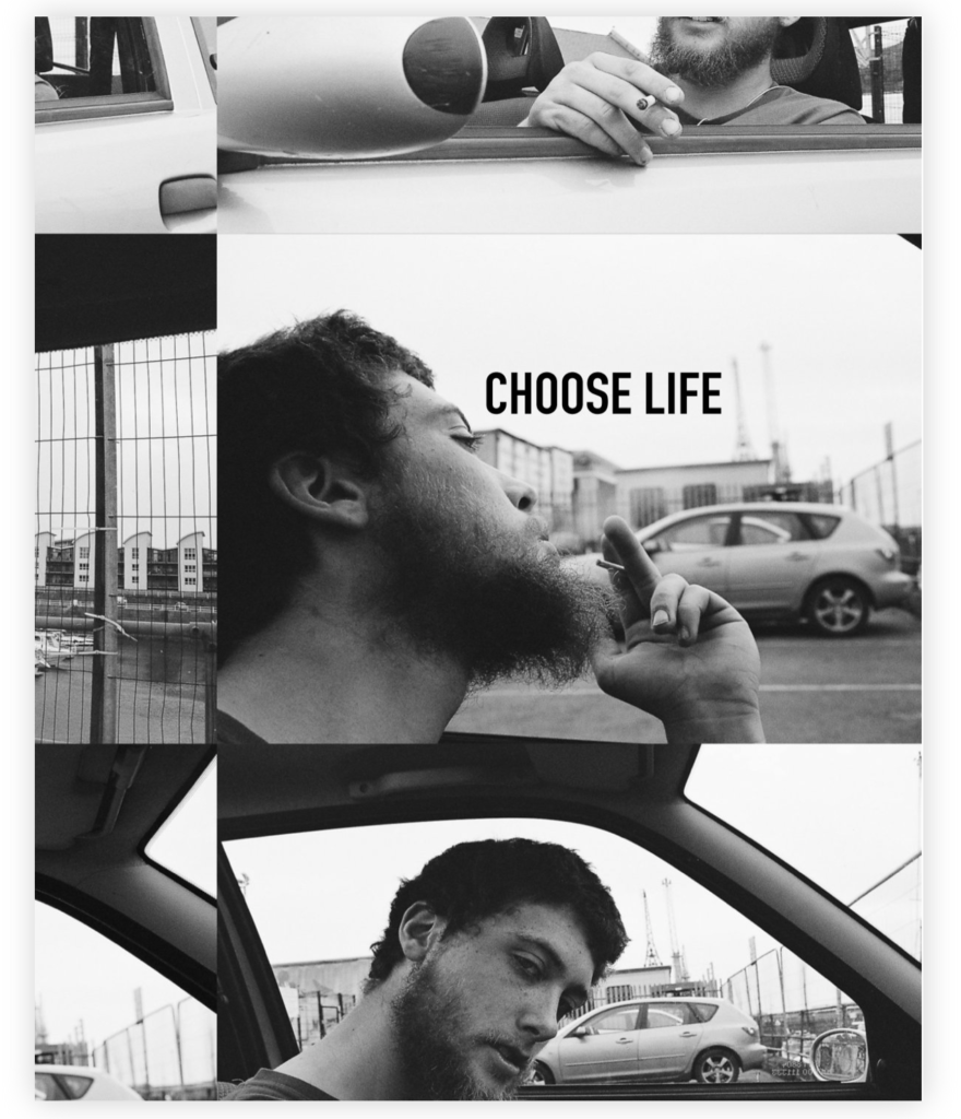
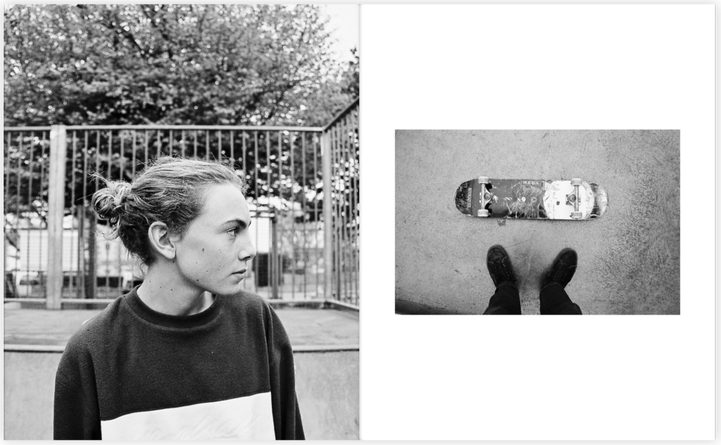
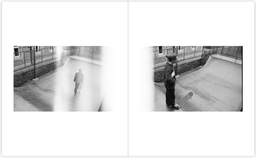
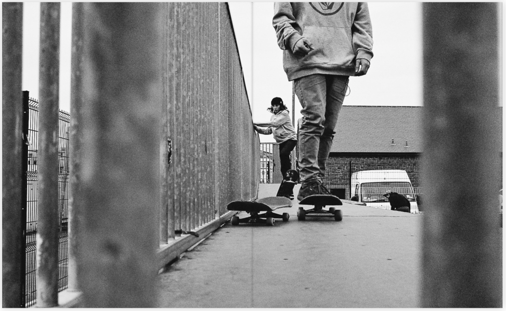
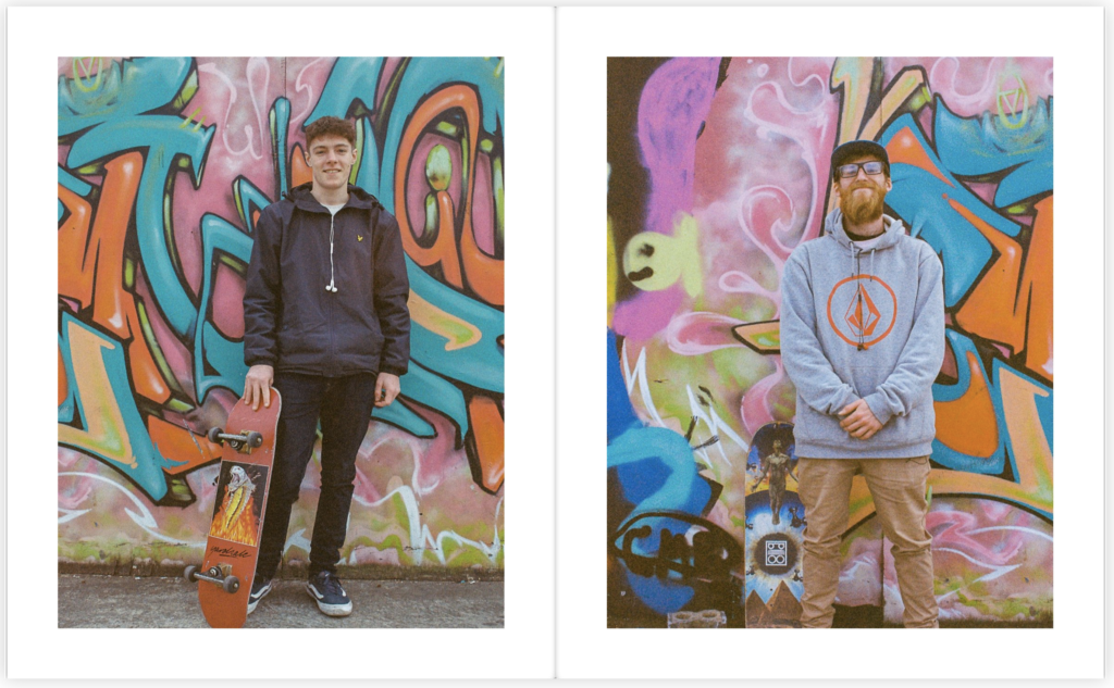
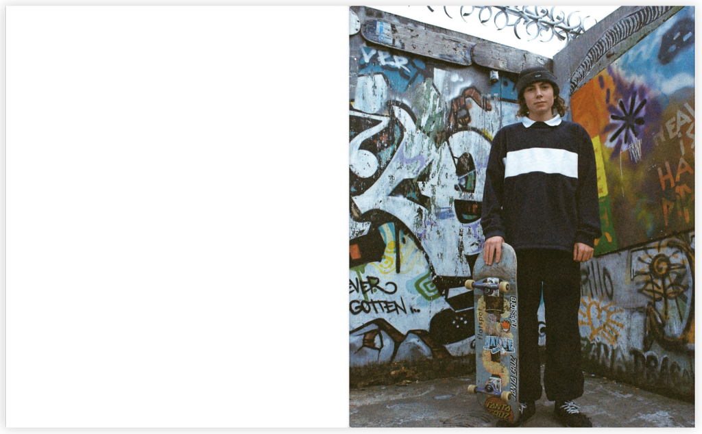
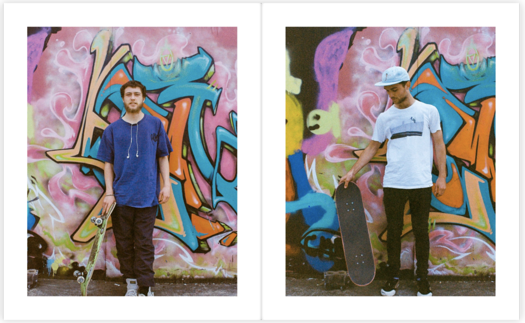
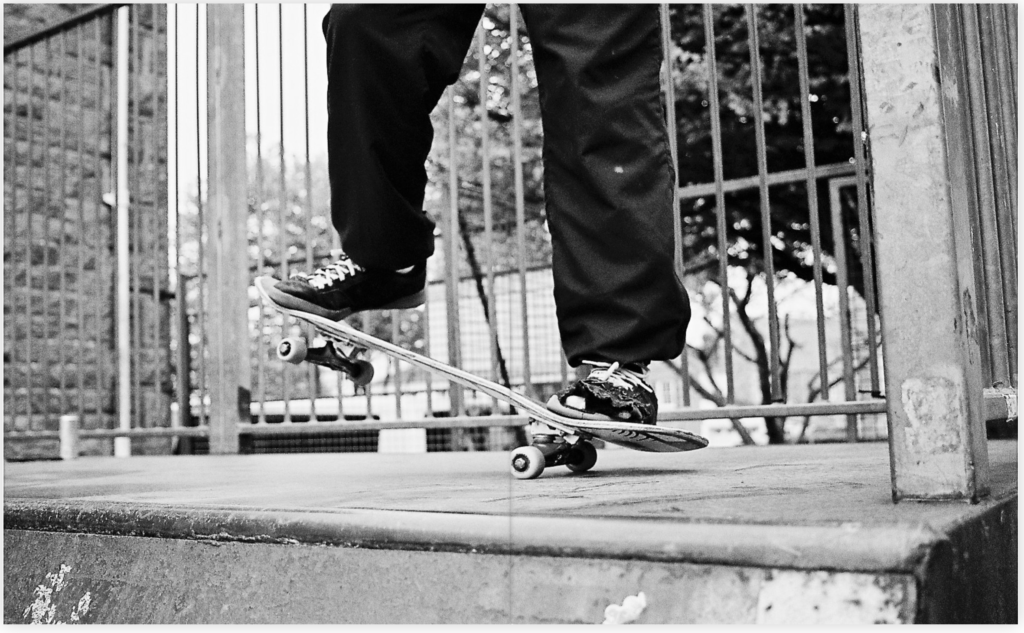
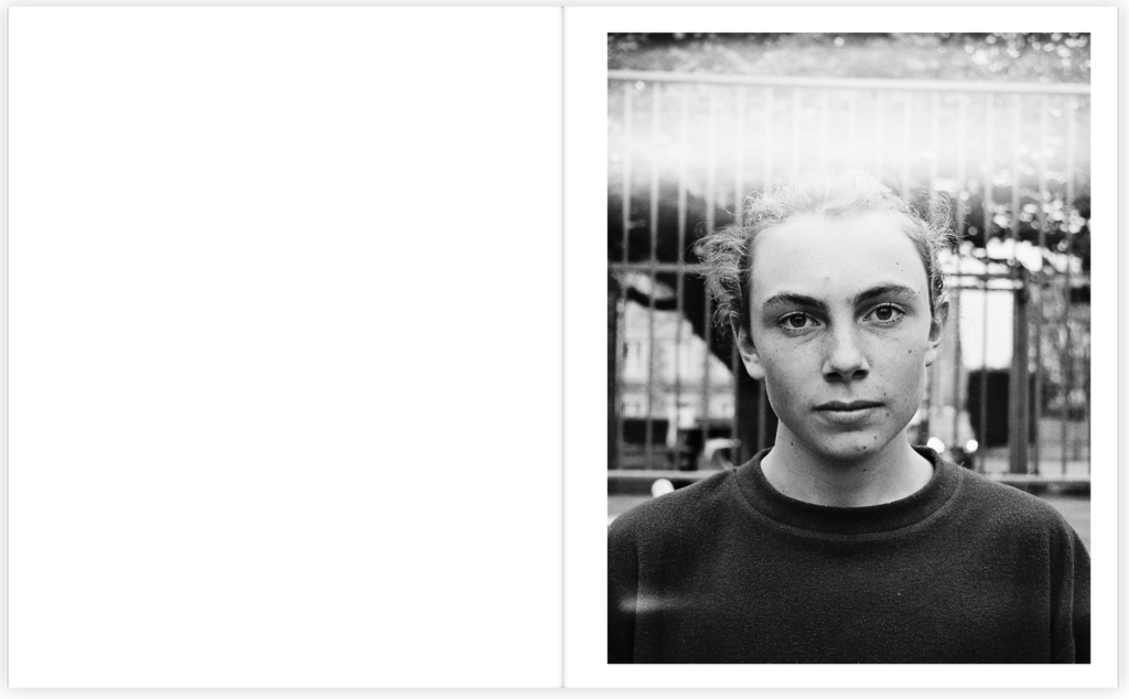
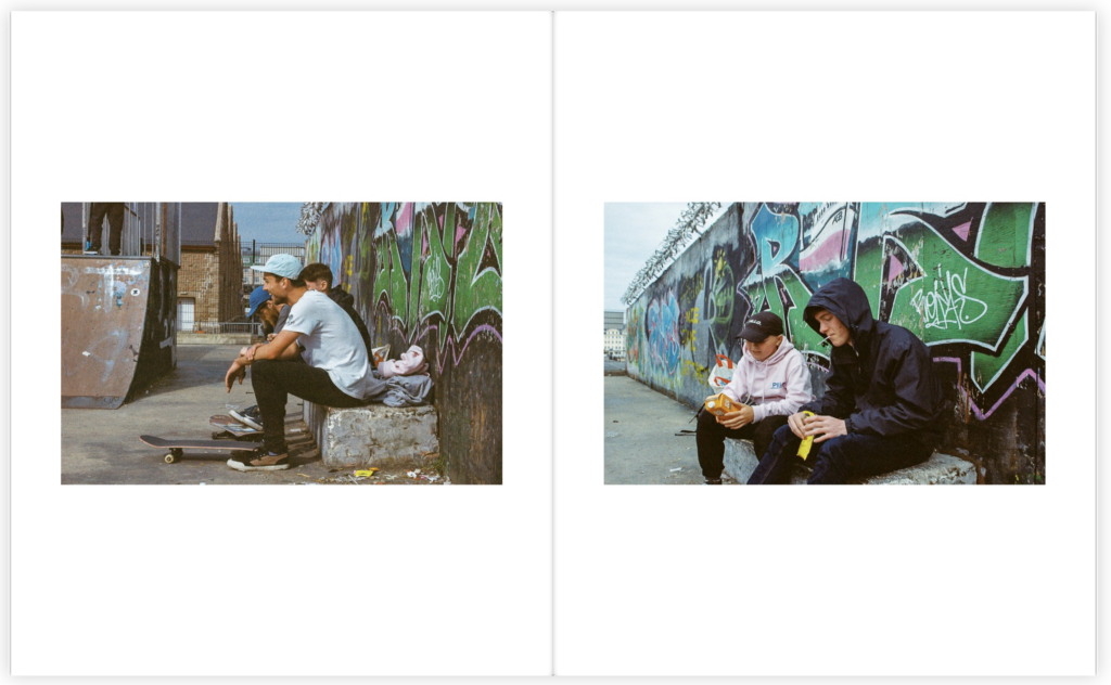
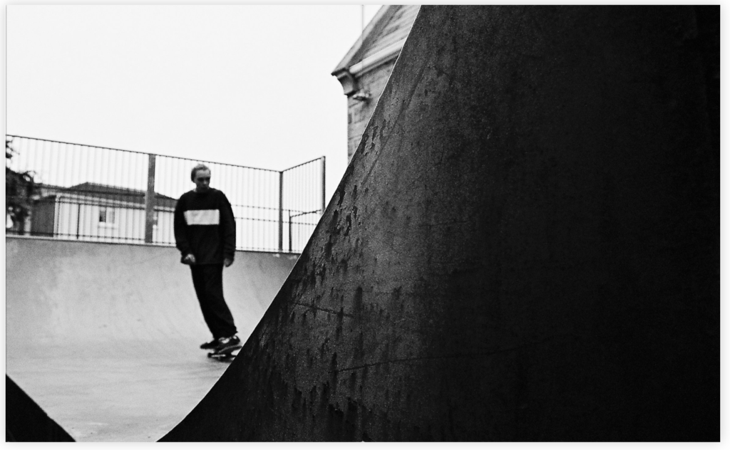
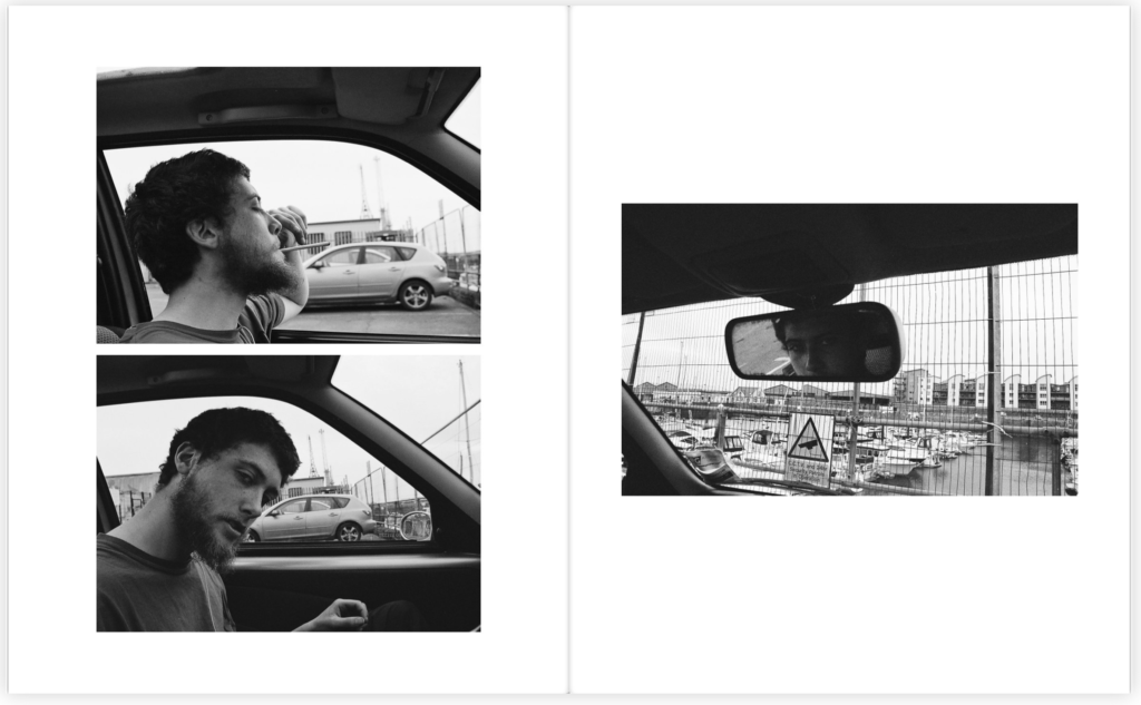
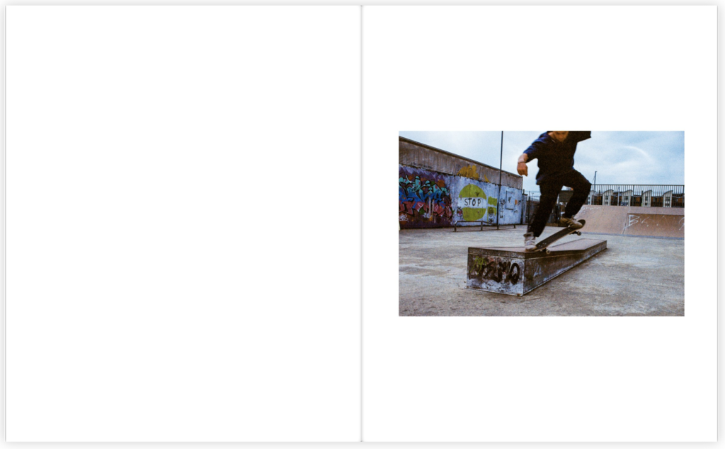
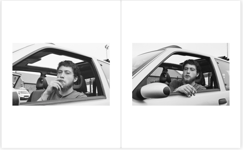
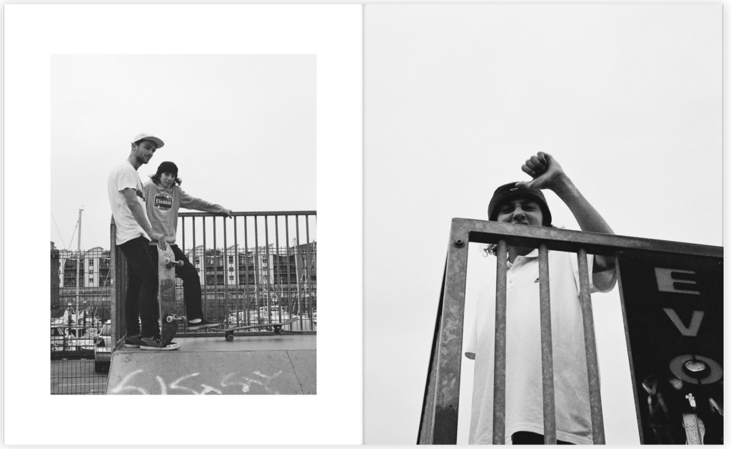
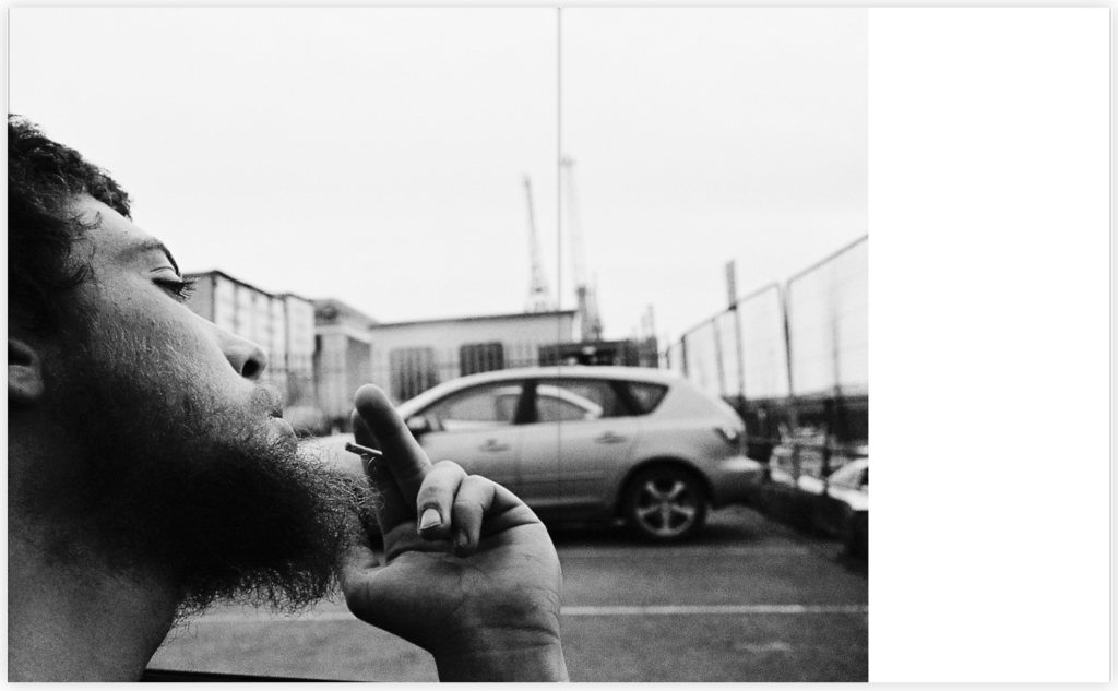
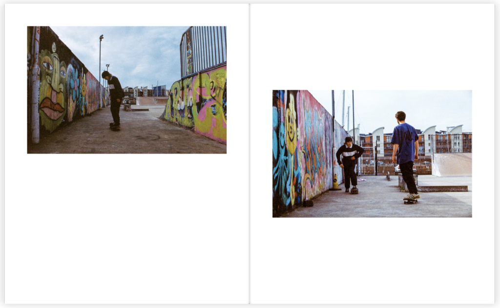
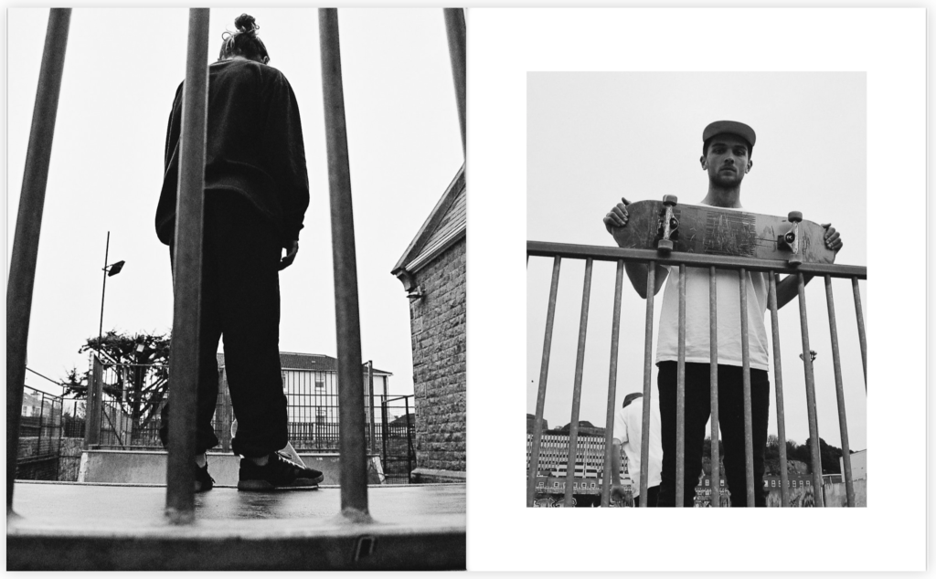
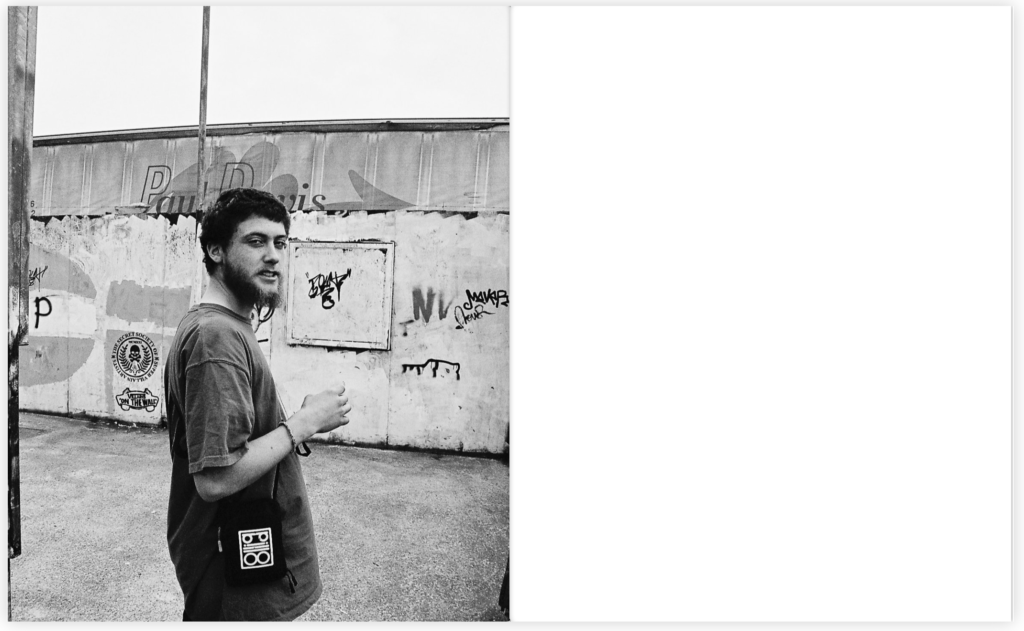
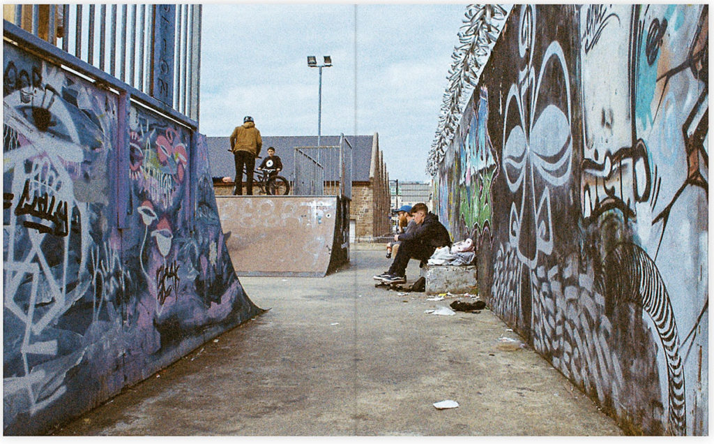
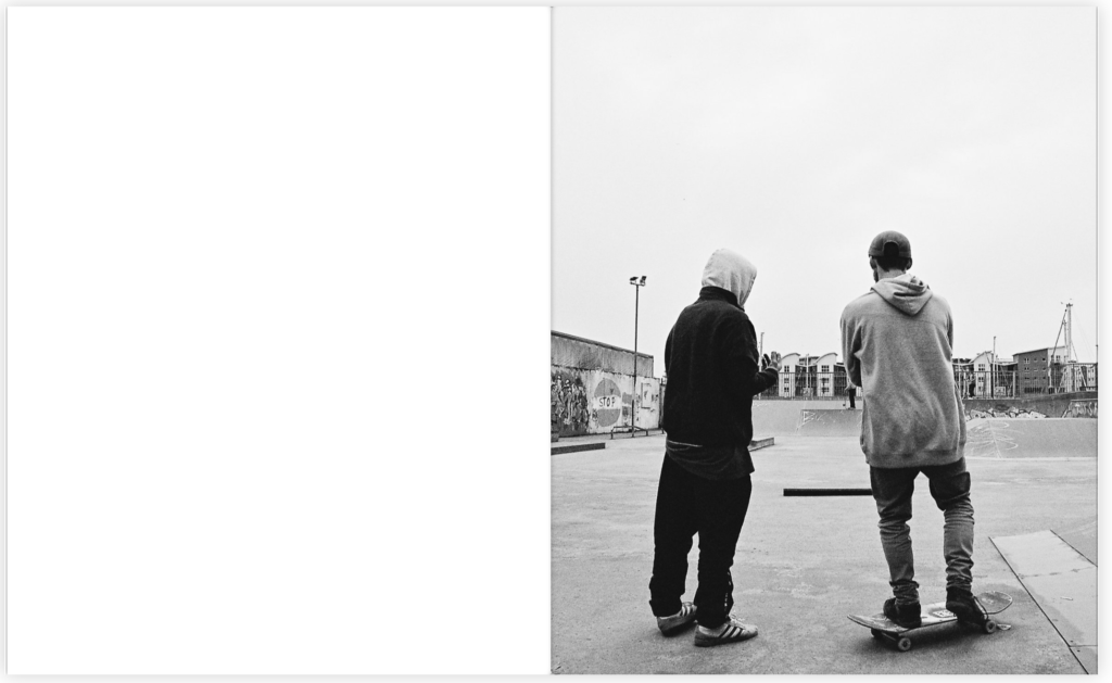
To introduce my book I wanted to make it clear to the audience this sense of lifestyle which is the ongoing theme within my book. This set of images on the opening page show these ideas of variation through the outfits worn to the locations being visited by these individuals. Another main focus within my book was to highlight the lifestyles seen throughout and to focus on the individuals through the skateboarding lifestyle but within the sport itself. Throughout the book I used multiple different layouts as I believe it created a strong variation throughout which has kept the book Interesting and consistent. Furthermore, Within the book I focused heavily on documentary photography as I found the photographers I looked at, their work fell heavily into the documentary style which I believed would create an interesting concept throughout. In addition, these photos were taken on film in both black and white and colour and are pretty much untouched when being edited. I wanted my book to have a raw feeling to it as I found that these photos told the story of each individual without having been altered or manipulated in anyway. I believe by having done this it has created a documentary style theme throughout the book emphasising each individual image. The name of the book comes from a very well known film which I thought would be an interesting title for this book as I was focusing on the lifestyle of these boys. The actual meaning of choose life was to promote an anti drug movement, within this lifestyle drugs play a large part within these subjects lives. By having choose life as the title of this book I believe it represents this lifestyle as a whole ranging from the highs and the lows. To finish the book I implemented the image of the two boys turned away from the camera, I used this image in particular to close the book as I believe it has connotations of them turning away from all the problems and accidents that this lifestyle has had within their lives and allowing for them to focus and enjoy on the positives that this lifestyle holds.
Choose Life
Evaluation – Final Prints
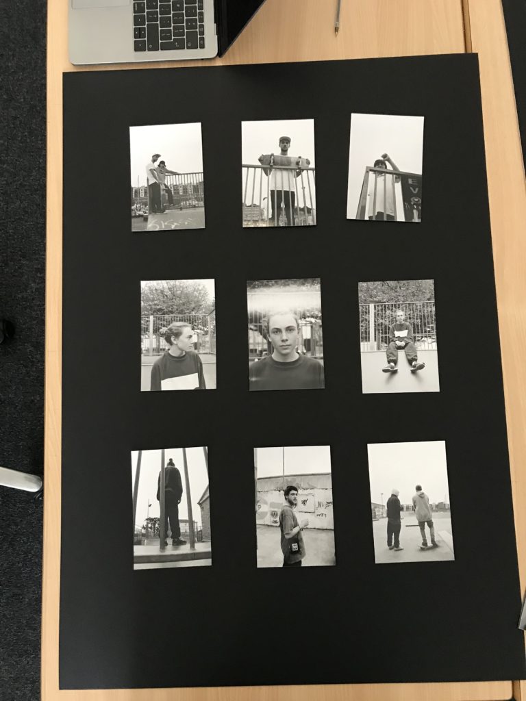
I wanted to incorporate the typologies theme throughout my final prints as I felt this theme conveyed a contact sheet style which I thought would have an interesting outcome for my final images. I wasn’t sure how to display my images, so I came up with multiple different layouts however the three layouts above where the ones I decided on and thought where the strongest layouts and had the strongest images in throughout. However, when looking at a traditional typology or contact sheet they were all portrait which allowed me to narrow down my decision and resulting in me using the two portrait orientation layouts for my final decision. Furthermore, when displaying my images I wanted to create window mounts for my display as I believe my images would be suited better with a little white boarder round the outside of each image and allowed for a stronger effect then if I had just stuck them onto the black mounting card. I decided on using these images as I believed that each individual one had some sort of relation to each other and found they complemented each other strongly within the set. When laying out the images I found I wanted to relate to the theme of the project ‘Variation and Similarity’. I was able to use this theme when laying out and selecting my images as I wanted to include images as part of a set however I also wanted to create a bit of variation within the layout by having a juxtaposing image run through the middle of the the two similar ones. I found by doing this changed up the layout of my images including an obvious variation between the layout and the images. I believe this created a strong effect on the layout which I believe allowed for it to be a more interesting final outcome.
These where my final outcomes.
Reviewing and Reflecting
How well have ideas developed? – I feel as if my work has developed into a sustainable idea that is consistent with its approach and has a clear focus. The focus within my work is the lifestyle of a skateboard/ s and the reality of something they do everyday. I wanted to capture the things that aren’t always seen and to focus more on them rather than the sport itself.
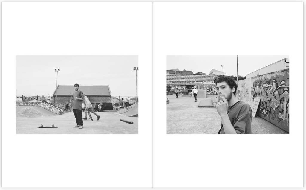
How many responses/ shoots? – I have completed 5 photographic responses to my ideas associated around skateboarding lifestyle. The first shoot consisted heavily of the sport and movement however, when progressing through I found focusing on the skateboarders themselves I was able to capture more interesting photographs. the second and third shoot where heavily focused on lifestyle not so much on the skateboarding. I found by having variation between my shoots would allow for me to have stronger outcomes and a larger variety of ideas and also images. The fourth and fifth shoot I decided to heavily focus on the skateboarders lifestyle as I found I wanted to combine the sport and the lifestyle together as I wanted to create strong documentary style images which I wanted to conclude this project on. I used film for both these shoots as I believe it would create that more raw feeling to each image which I found when working with the developed images I was able to really show that.
Command of camera skills/ photographic techniques and processes –I have clearly demonstrated my use of camera skills and my ability to adapt the settings to meet the particular requirements of the location and lighting. I also experiment with different cameras using both film and digital throughout. When focusing on the skateboard I was able to focus on the right setting as I wanted to capture the skateboarders movement in the best quality when moving quickly.
Understanding of composition/ considering quality of light. What are the overall quality of the images? – I think my images are strong in the way they have been composed and framed. With the absence of any digital manipulation. I have strongly captured my ideas within my photographs and have clearly displayed them within my final pieces. I have made sure that my images are aesthetically pleasing and draw the viewer in. I feel as if there are potential areas for improvement to get a little more creative with my images however I believe that the overall outcomes of my images are strong and are to the best quality.
How do they respond to research and artists references? – My photographic images were inspired and therefore respond to the research I have completed on Larry Clark, Craig Stecyk and Theo Gosselin. I feel I have clearly responded to the artists I have studied however I have also put my own twist to each and every image by integrating skills I have previously learnt. I believe that this has resulted in stronger outcomes as I have gained inspiration from strong artists however with my own skills incorporated with it.
How do they interpret exam theme? –The variation of people I focused on within my 5 shoots all from different backgrounds and classes has allowed me to capture different lifestyles however, the similarity being that they are all part of that same community with that hobby. These people I have focused on would probably not have associated with one another however, this lifestyle has bought this variation of people together. This shows that there are a variation of people within this community and lifestyle however, they all have that one similarity due to the fact that they are all interested in the same thing being skateboarding.
Possible final layout
Once I had come up with a layout with the images I had previously had developed I had the images scanned so I could come up with a digital copy. However, when copying the layout I found that some of the images didn’t work well together as some of the images where too much together and just didn’t look right which resulted in me moving them round and changing it up. These were some of the images I found didn’t look right together however, looked right once I had played around with it.
Before and After


Possible final layout – photo book
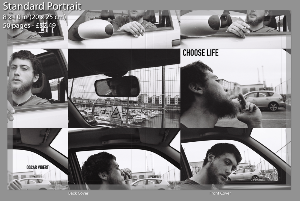


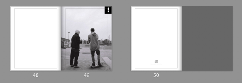
Photo book planning


Once I had got both sets of film developed I placed all the images out and put each images into groups as I wanted to single out the strong images within each set. I displayed them out onto a big board where I could clearly see them making it easier to find the stronger images. The images that I thought weren’t good enough I would remove from the board. Once I had removed all the bad images I began playing around with them and trying out different layouts. I had multiple different layouts however, some of the layouts didn’t reflect my images in a strong enough way as some of the images didn’t fit with each other the way I wanted them too. In addition, my last experiment really reflected my images in a way that created a relationship between each image and displayed them in a way that allowed for them to really compliment each other. The yellow stickie notes where to indicate the images I was going to use as a double page spread and the green stickies where used to show the images I wanted to display as a set.
Photo book research
A photo book is a book in which photographs make a significant contribution to the overall content. A photo book is related to and also often used as a coffee table book.
Reymond Meeks – Halfstory Halflife
Halfstory Halflife is a book by Raymond Meeks an American photographer who is best known for his focus on memory and place, and captures daily life with his family and also the local youth. Meeks was documenting the local youth who adventure to the Catkill Mountain region in New York during summer breaks. Halfstory Halflife is a distillation of the photographs made in the shadows of these waterfalls, marked each summer by the exposure of young adults sat at a cliff both in space and in their lives.


The technical aspects to the very minimalistic layout consists of images embedded traditionally in the centre of each page with an opposing image on the next page both being A4 portrait orientation with a slight boarder round each image. For the most part, the images take up the whole A4 page however, there are some images which are A5 which are set to the right hand side of the page. I believe by having a variation of layouts throughout keeps the book interesting as it grandly becomes easier on the eye as your not consistently looking at the same layout all the way throughout the book.
As the book has a strong monochrome pallet throughout it creates strong contrasts and shadows within each images however due to the use of natural lighting, soft glares are seen on multiple images. These two factors create a strong juxtaposition due to the fact that it shows the darkness of the area and maybe their youth however the soft glare could contribute to the happiness in their lives and this location could be a spot for which allows them to proceed in being happy.
As the images are in black and white it allows for a more unrealistic interpretation of the images. I think this helps the viewer interpret these images in a different way and to connect with the pictures differently as we don’t view the world in black and white so it can be seen in an usual way. All the pages in the book are consistent, using the same style of white paper which juxtaposes with the images which alter each page with contrasting environments and a lack of colours. There are a total of 144 pages including the unused pages and a total of 78 images which is supported by a soft cover with a fold out jacket. To me, this photo book is essentially a narrative that projects the lack of youths happiness when exploring the environment, landscape today is bound up with a sense of the loss of natural space.
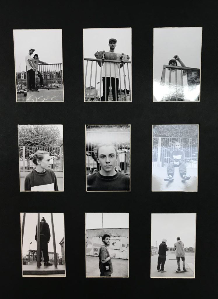
Incorporating typologies
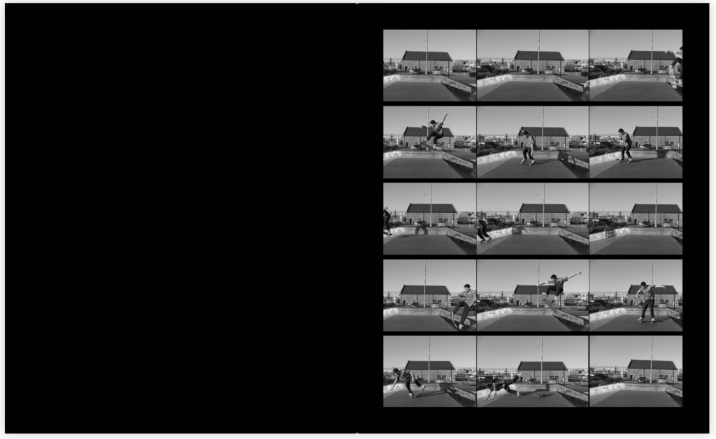
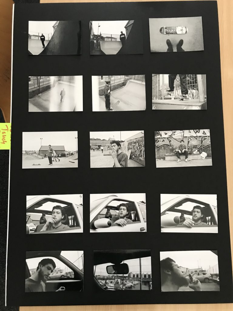
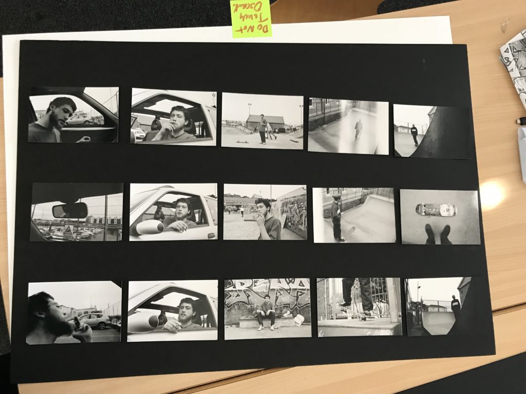
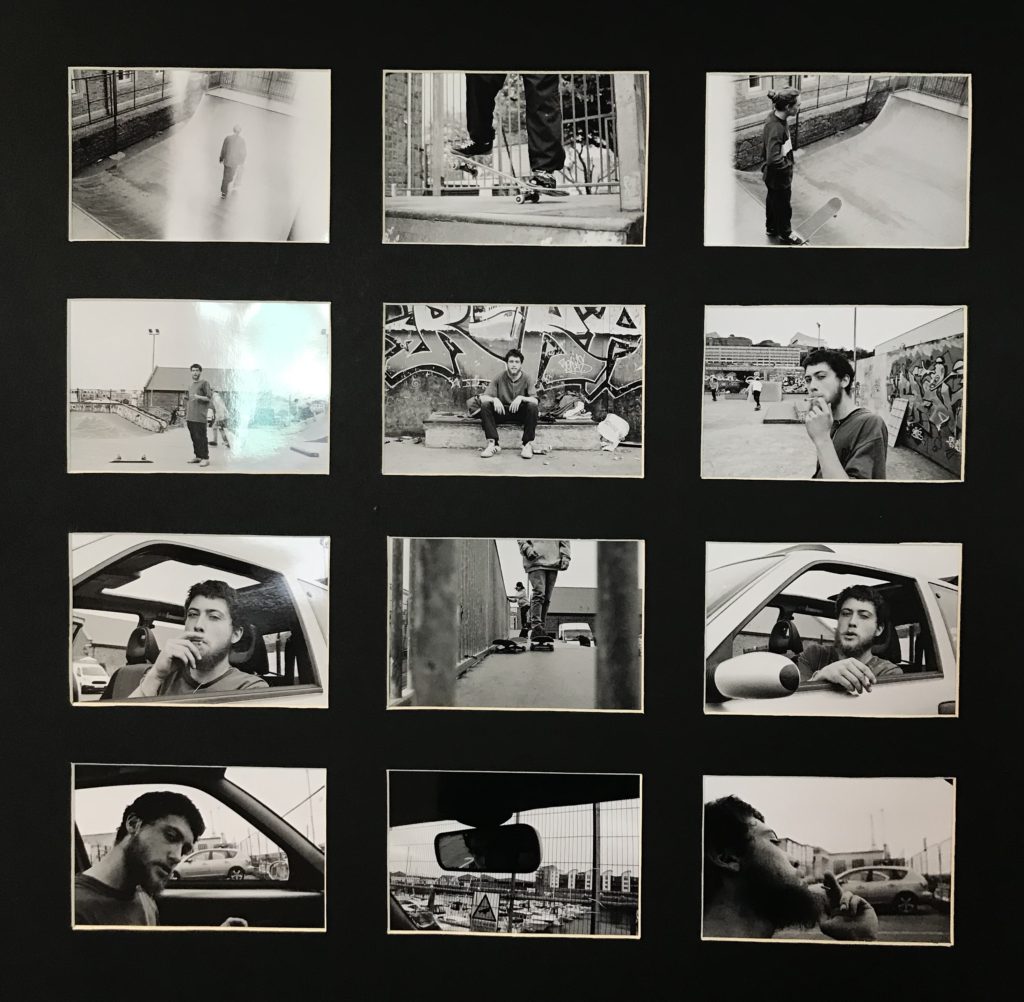
I wanted to use typologies within my book as I thought it would create a sense of similarity within each experiment however, it also consisted of variation as the images are in someway different to each other even tho they are capturing the same subject. furthermore, displaying my images as a typology in a way creates a contact sheet and further allows me to display my images in a creative way. As I had taken some of my images on film I was left with the negatives which I believe in a way is a different type of contact sheet. I also wanted to incorporate the negatives within the book. However, the images on the negatives where very small and hard to see which gave me the idea of making my own negatives but as a contact sheet. These where my outcomes.


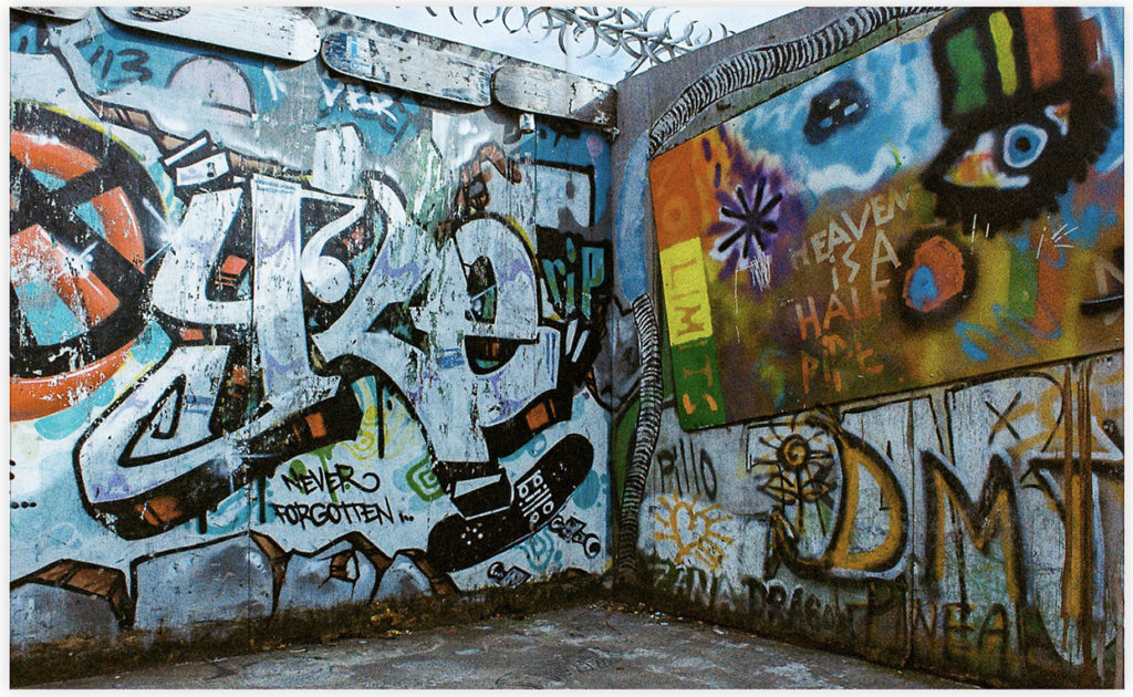
I decided on incorporating one of the contact sheet as the front cover as it creates a very documentary style feel to it which I wanted to heavily focus on when producing and displaying my images. By having this as the front cover it doesn’t give away too much about what the book is about allowing for an element of surprise when opening it and looking at it for the first time. Furthermore, I didn’t believe that any of the images from the first contact sheet were strong enough to have single images within the book which is why I incorporated this contact sheet as I believe that focusing on the sport itself was also important and I feel will create a sense of variation throughout the book.


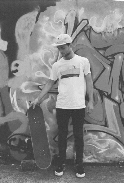
Larry Clark photoshoot 2 – Black and white film

Favourite edited images


Evaluation
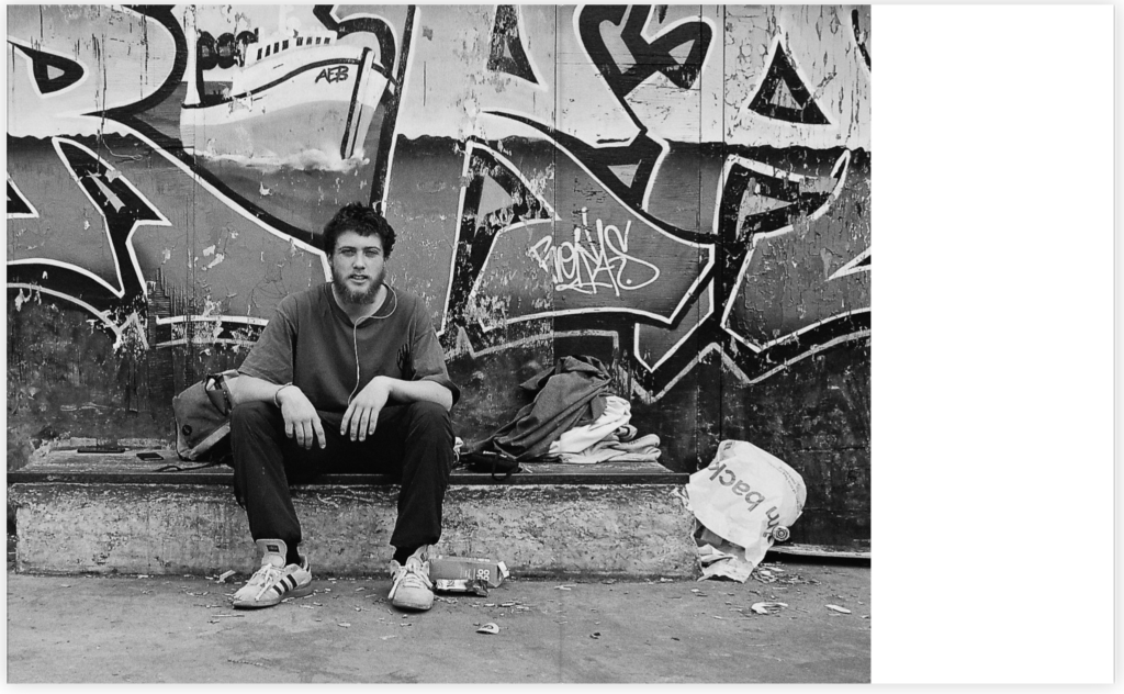
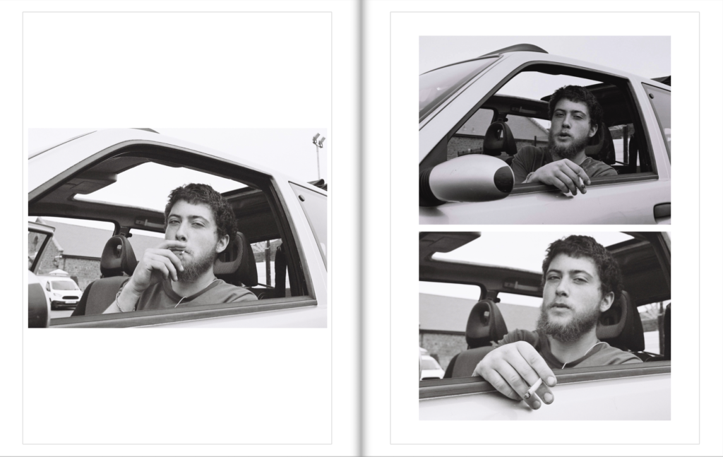
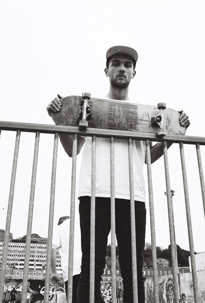
When taking these photos I focused heavily on images in the style of Larry Clark. I found that the black and white film really allowed me to capture the vintage, documentary feel to it as the images are seen to be quite grainy and consist of a strong contrast throughout. Using black and white film allowed for me to use a monochrome palette which created heavy shadows to give a fairly raw, gritty look to the images. I aimed to produce a set of images that represented the skateboarding lifestyle in a straight forward, traditional documentary style. By using a more documentary approach to these images it allowed for me to fray away from the sport itself and show more of an insight into the subjects without a skateboard as I believe that it creates a more interesting story behind the images and also allows for stronger final outcomes.
Larry Clark photoshoot 1 – Colour film

Favourite edited images