Over the ‘Variation and Similarity’ Project I have explored photographers, artists and movements that have inspired me when creating my photography and led me to create a final pieces that represent my theme and have had a successful outcome. I Started off with my project focusing on the power of a brand looking at commercialism which then lead me onto looking at Commercialism of which i infused with Typology photography as well as looking at pop art, inspired mainly by the Becher’s photography and Andy Warhol artworks.
When I first approached the topic ‘Variation and Similarity’ I had the idea that I wanted to look at Commercialism and Consumerism as a theme to explore how Brands and products make up everything that we do in our everyday lives. I started this looking at an interesting way of exploring this which was to show how brands end up becoming part of everything and are everywhere to represent this in my photography I created a night-time shoot in a woodland area where i projected brands into the landscape to represent how people are consuming brands so much that they are loosing or forgetting the outside world around them. I experimented the images i took creating GIF’s as well as editing their colours to give asthetic qualities to the images.
GIF-ADDIDAS
These images were successful, however i thought that i could explore this project in another way which was more obvious with the message of consumerism behind it. After Looking at the Becher’s for their Typology I realised that this would be an interesting way to incorporate into my work. I then also explored the pop art movement looking particularly at Andy Warhol and his prints of the ‘Campbell soup tins’ which then led me onto the idea for my next shoot. After this i decided to photograph lots of different products that would be found in everyday homes. To keep the images focused on the products I photographed them with a white background so that it was only the products with a clean background. This fit with the theme of commercialism perfectly as it highlighted the brands which would just be consumed without much recognition of the actual product. In the editing i experimented with typologies as well as creating pop art within photograph editing the hue colours of the images. The overall outcome of this final outcome of this shoot clearly fits with the exam theme ‘Variation and Similarity’ as it shows the variations between the products in the way they are produced to fit to the demand of consumers as well as showing the similarity between the way they package their products.
Concluding my project, I believe that my work successfully represents the Exam topic ‘Variation and Similarity’ which is visible in my final outcomes. I feel that my final outcomes and presentation shows an aesthetically pleasing view of everyday products and brands that we all consume without realising and they bring a closer view of these products to the consumers. The use of very vibrant Images as well as presenting the opposite of black and white images shows two different dimensions to the products.
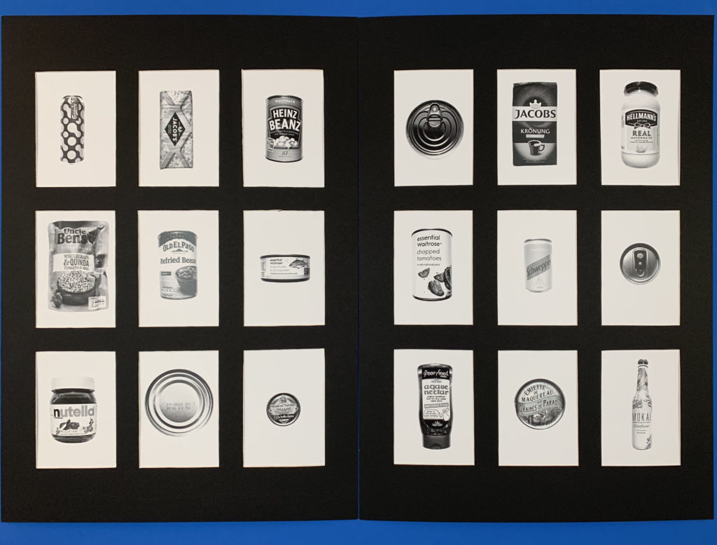
For these images i presented them in 3×3 a5 window mounts. This worked best for a typology as the images had equal space between them as well as having a clean border that works perfectly for a typology as they are meant to be the same size to show the individual differences. The contrast between the white of the background and the black board works well as it draws the images forward making the actual products stand out more. The equal divides between each image is interesting as it makes each image more individual giving them their own space. The tonal range and contrast in each of the products gives the image a deeper dimension as it is drawing away from the vibrance of the products which is used to draw consumers in and instead focuses on the products shape and illustration.
For my first idea i wanted to produce a large scale image showing my typology’s of products showing the consumerism. I wanted to print off the image at a large scale so I want to print the image too A1 size. The reason for it being at a large scale is to show that these products that are usually quite small and often overlooked will become visible and will be put as the the main focus. The image bellow is the order of the image I want the layout to be and also i want the images to be in colour to show the detail of the illustrations.
Second Idea:
For my second idea I wanted to use the same typology images as they are being highlighted but this time i wanted to separate the images more so there would be more focus on each individual product this time. To achieve this i was going to cut window mounts onto two boards splitting each board into 9 a5 images. For these images I wanted to Produce them in Black and white as this time i wanted to look at their tonal qualities.
For my Final Selection I choose the edits that i thought worked best and that I thought would be most successful to take to print.
1.
I chose this typology as a collection as the image works well as it highlights more then just a singular image and drawing the viewer of the image to several products and make them look at the branding and packaging of the products more then they may usually as mostly they are consumed without thought. The image fits perfectly with the theme of consumerism displaying a wide variety of everyday products.
2.
I Chose this typology of images as well as it was interesting as the images gave a completely different feel once edited in black and white. The tonal range and contrast in each of the products gives the image a deeper dimension as it is drawing away from the vibrance of the products which is used to draw consumers in and instead focuses on the products shape and illustration.
3.
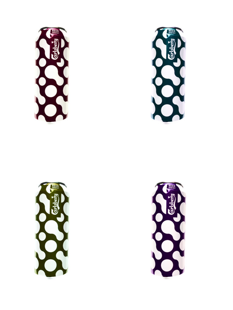
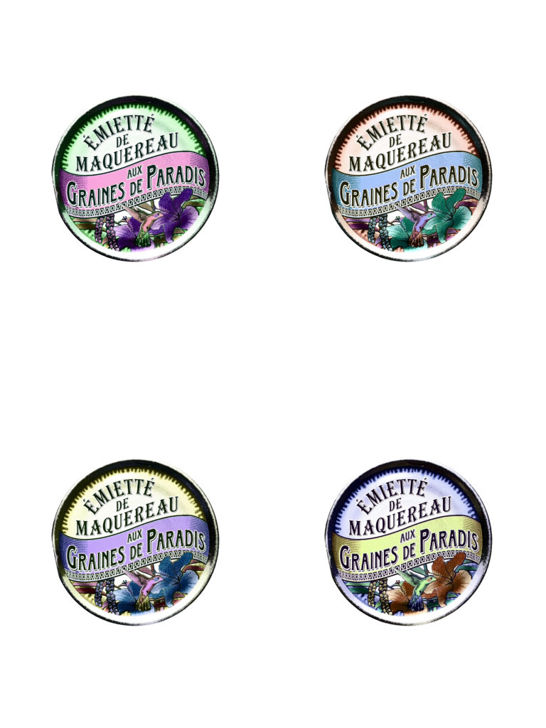
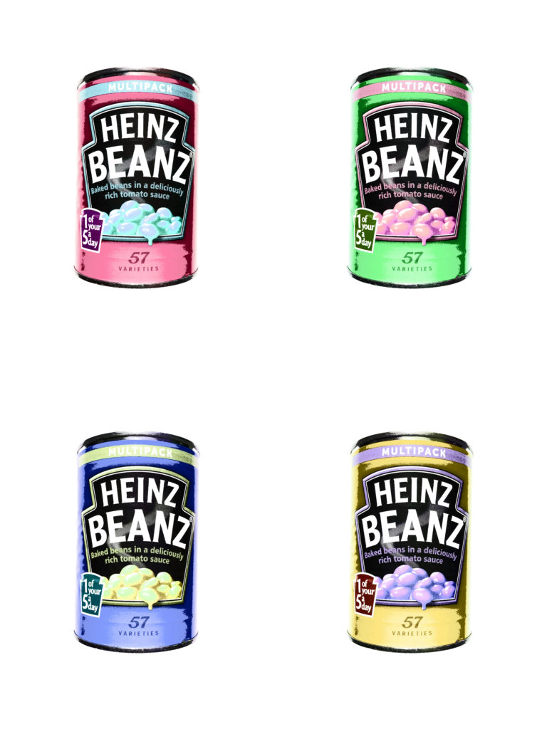
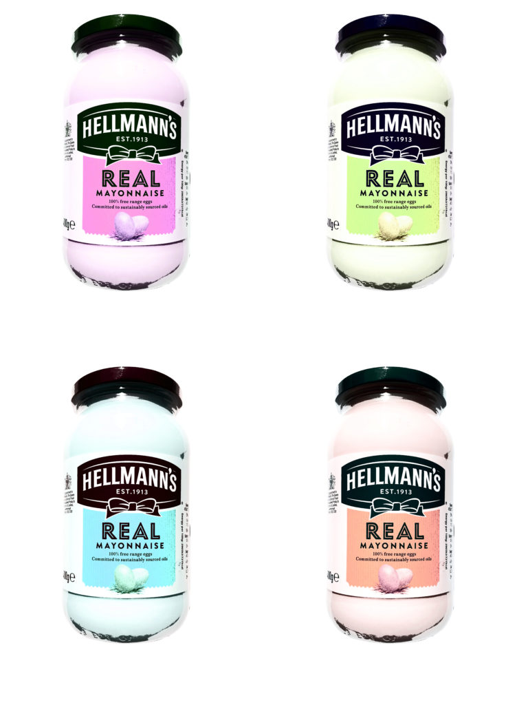
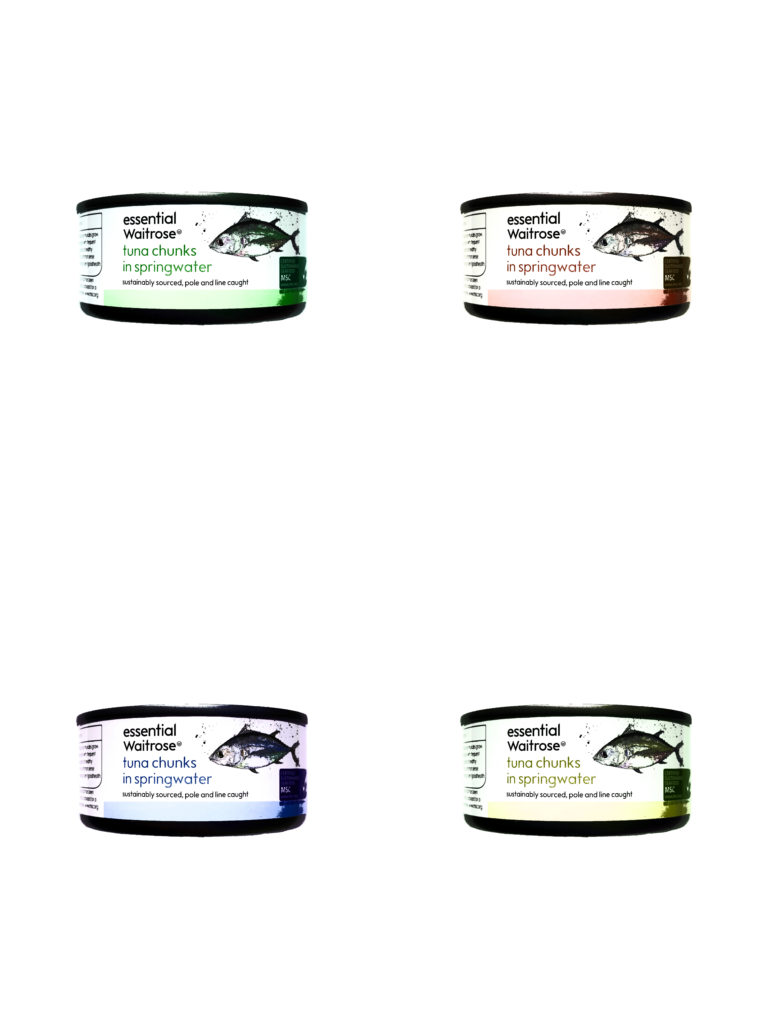
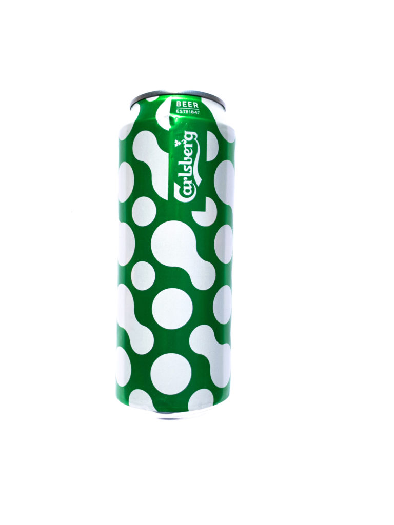
I chose this Image as it worked well in response too Andy Warhol’s work. The image shows an interesting view of this product which wouldn’t be seen normally. The illustrations of the product as well as the vibrant altered colours forms a aesthetically pleasing image with the unusual colours highlighting the parts of the product which would not usually stand out.
The image uses artificial lighting from the lights in the store which gives a cold feel to the light in the image. The use of the store lighting gives a more natural feel to the photograph but has slight over exposure which is nice as it creates perfect reflections on the roof in the background of the image reflecting the products bellow. The overall image has a large tonal range in both colour and shadow having a very high contrast. This image was most likely taken using a wide angle lens as the image has a very wide view but would have also had a higher number of F-stops as all of the image is in focus and has a large depth of field. The image most likely was taken using a tripod as the image is perfectly upright and the shutter speed would have been a reasonably high speed but low enough to give it a slight over exposure. The ISO would have been very low as the image is very sharp and crisp without any grain or blur.
VISUAL:
The image has a very large tonal range as well as range in colour. The image has a very wide range in vibrant colours seen in the bright packaging of the products ranging from bold red and orange colours to poping blues and pink colours. The image also has very soft neutral colours which are seen on the walls of the shop with cream colours and in the shop logo. In the image there is very clear lines which give strong compositional structure to the image from the lines in the rows dividing the products to the lines in the beams of the building which create a very interesting aesthetic to the image. The reflection on the roof almost is almost unrecognisable as it could almost be mistaken for more rows of products with its almost perfect reflections giving an aesthetic which is particularly interesting to the image.
CONTEXTUAL:
The image was produced by Andreas Gursky in 1999 as a part of a two-part photograph. The image was printed into a single large-scale image which is a digital montage from multiple images taken in a 99 Cents Only store in Los Angeles, the seemingly endless rows of stuff, with shoppers’ heads floating anonymously above the products, more closely resemble abstract or Impressionist painting than contemporary photography. Gursky who is a German Architect and photographer is known for using digital manipulation to create scenes that turn almost everyday experiences into art. In 2006, in the in the days just before the Great Recession, 99 Cent sold for $2.3 million at auction. At the time this broke the record for a contemporary photograph but this also moved contemporary photography into the auctions alongside paintings and other highly expensive artworks.
CONCEPTUAL:
The image is a very clear reflection consumer culture which we live in, where their is almost an infinite choice in what to buy and a constant demand for different and fighting for brands to be on the top choice. The image is almost like a criticism on how we live our lives with the rows and rows of products that are all consumed in different ways and almost questions the viewer of the image to say is all of this consumption needed and are we thinking about what we are actually buying.
For these images i wanted to create images similar to Andy Warhol’s Screen prints like his Campbells soup cans. When creating these images I wanted to produce a printed like effect.
Steps to Create this effect:
Start by turning the image into a layer and then Duplicating the image.
Select one of the layers, then click on Threshold
Then adjust the threshold so that the main features are still intact (text or shapes)
Finally select the other layer which is the original image. Then click on opacity bringing it down so that there is a faint colour.
For the editing of these images I wanted to create focus on the tone and shade of the images which gave a different view of these products removing the colour and it meant the focus was more on shape and illustration used in the products. I think the images worked well in black and white as it took back from the vibrant colours which are used to draw people in to buying these products. This meant that the focus looked more at the objects themselves rather then the products they contain.
For this photoshoot I wanted to create images that would highlight how people both consume brands even when they are choosing their food and drink. In this i wanted to highlight everyday products that people may consume and make the viewer think about the brands behind the products which they may not even notice when compulsively buying these items.
For the Editing of the images I had to go back into each photograph to remove the shadows which were causing a contrast between the product and the shadow which was bringing away from the direct focus on the product. Using Photoshop I was able to remove the shadows as well as unwanted marks in the background.
TYPOLOGY EDIT :
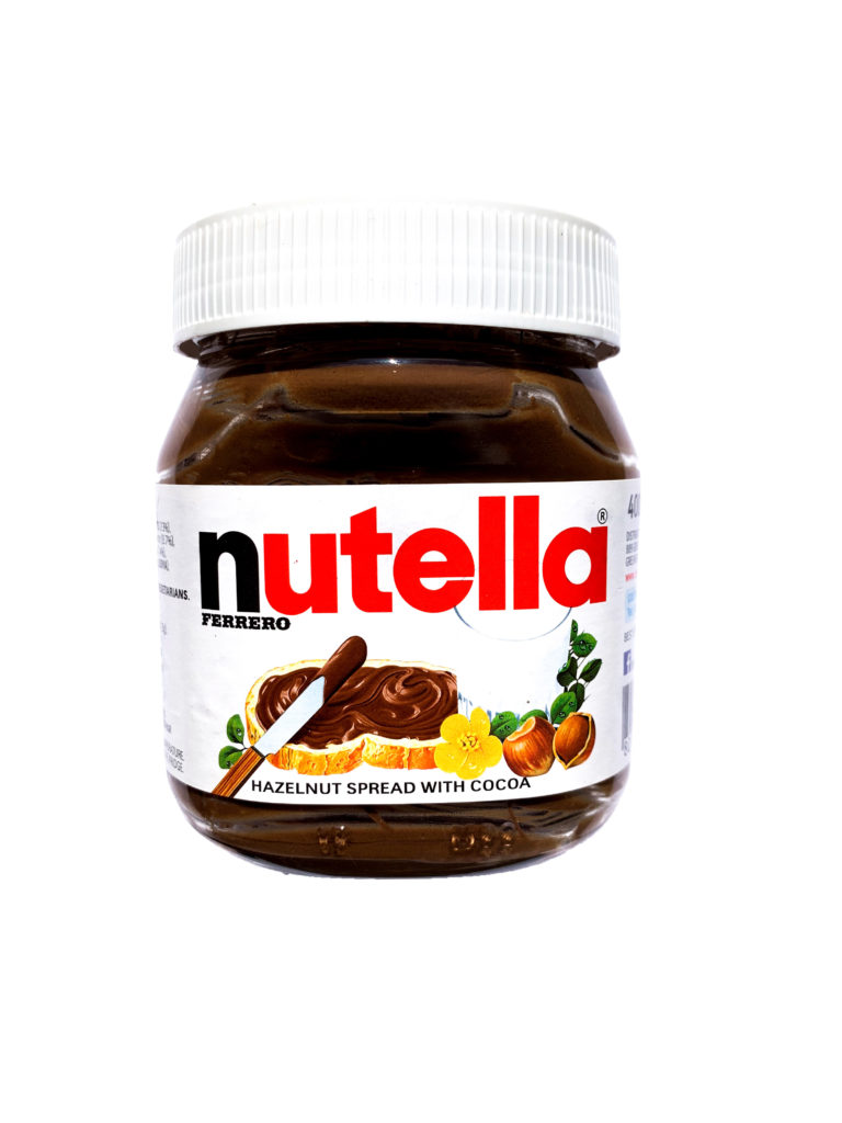
For these images I wanted them to create a typological order and feel to the image so i had clean backgrounds so it is just focusing on the products. For these image i slightly increased the exposure to give the background a cleaner feel making the products stand out as well as increasing highlights and contrast of the images so that the detail in the images such as text or shapes stood out.
For this Shoot I set up a booth to photograph these object using a large white sheet to reflect the sunlight and so the background would be clean. Unfortunately this cast heavy shadows but they were easily removed when editing in photoshop to clean the background.
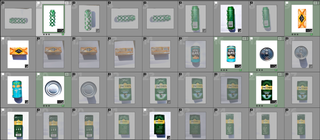
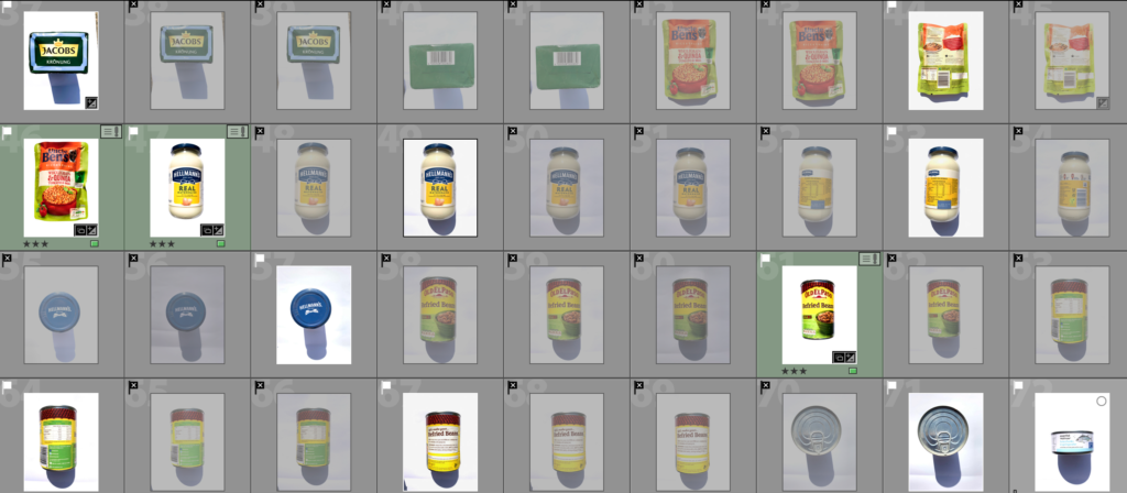
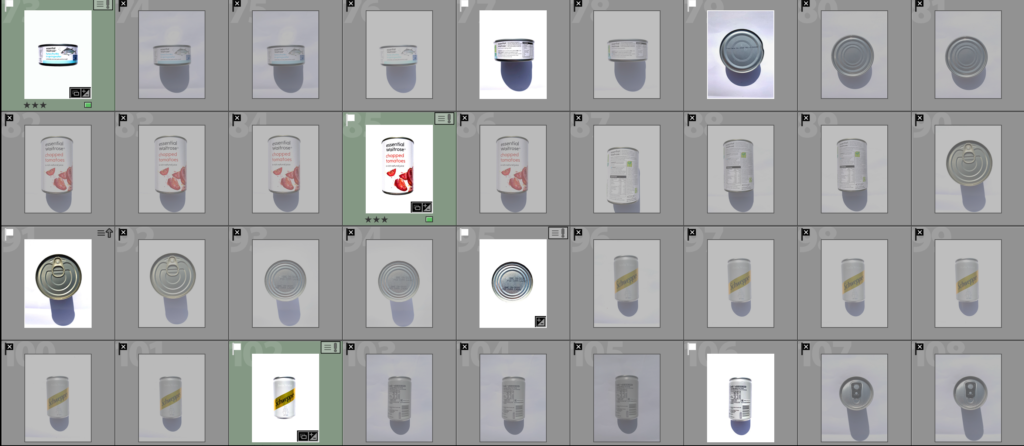
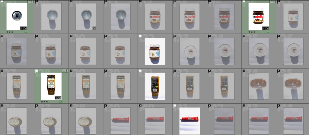
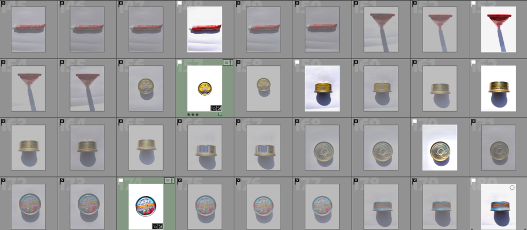
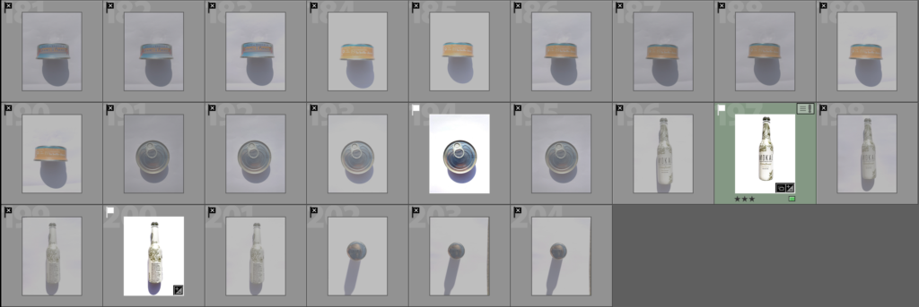
The Screenshots bellow show my selection process that I have done reducing the images to the most successful ones which have a white flag and the ones that didn’t work as well with a black crossed flag. The Images in green are the images that I selected as they worked best and edited them.
For my first photoshoot I want to focus on the theme of Commercialism and Consumerism looking at how brands make up everything we do during our life. For this shoot i want to find lots of different brands in my household environment so looking how different products are advertised such as food packaging as well as clothing and even down to items or objects your wouldn’t think had brands. When editing I will look at creative ways to Collage images or brands.
Photoshoot 2:
Following with the theme I want to create images as a response to pop art and specific artists such as Andy Warhol as his work is highly Commercialised. I want to create portraiture that responds in a very commercialised sense. For this shoot i will take portrait photography that i will heavily edit to recreate a pop art style in the images. I could also for this shoot look at creating images of brands in a pop art style similar to Warhol’s style with his Campbell soup Prints.
Photoshoot 3:
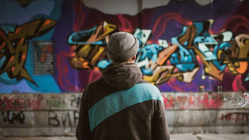
For Another Shoot I want to do an Environmental shoot looking and how people use brands in their clothing or in their everyday life and using editing highlight their brands showing how they make up basically everything they do.