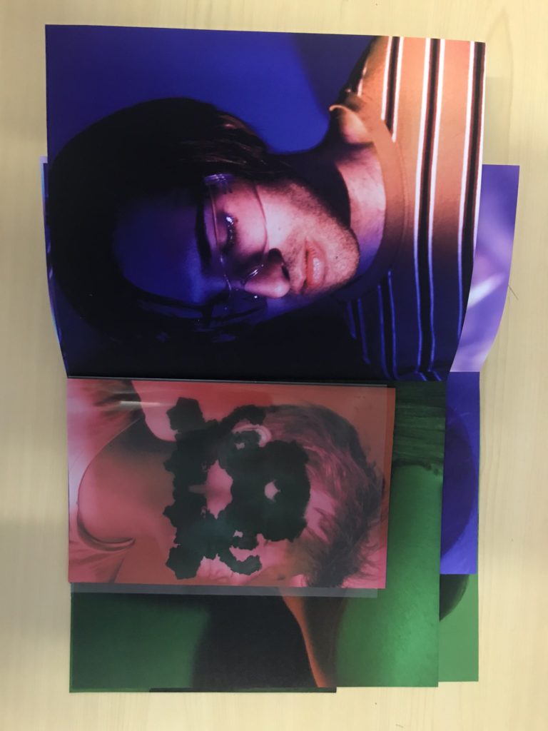
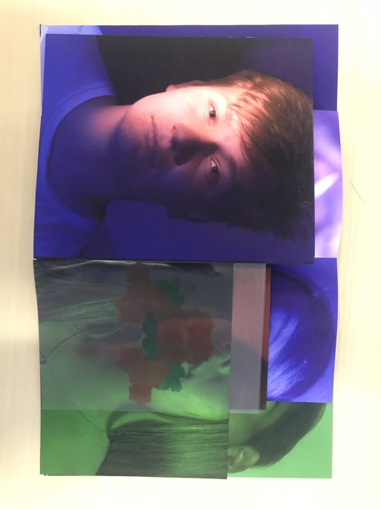
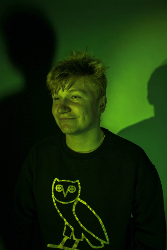
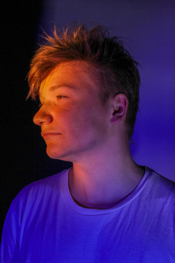
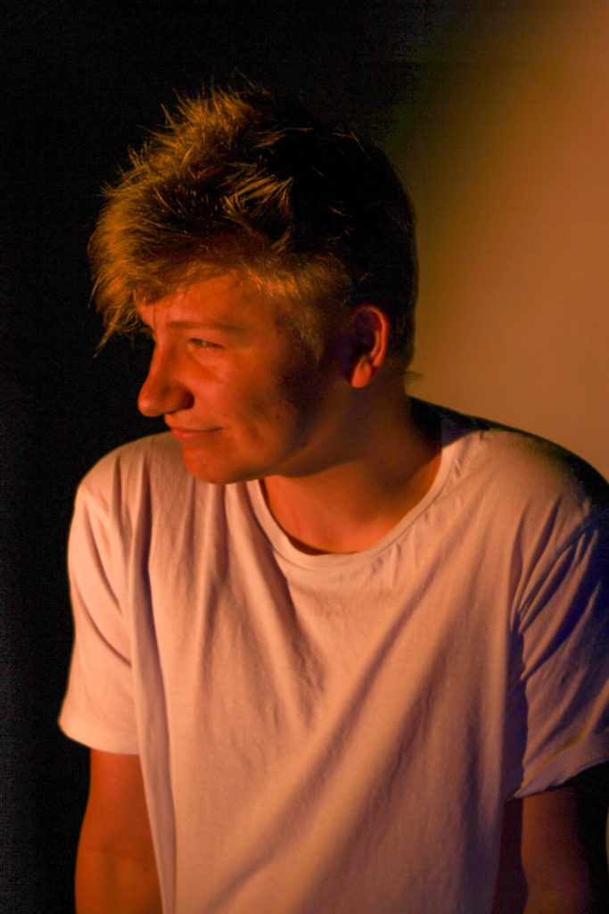
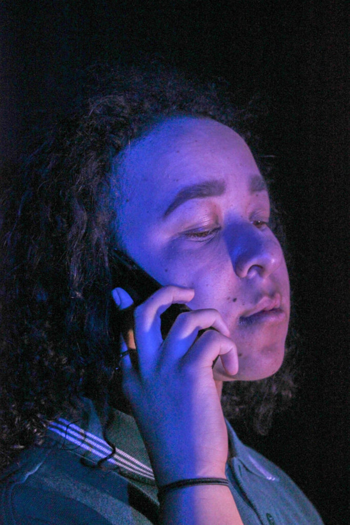
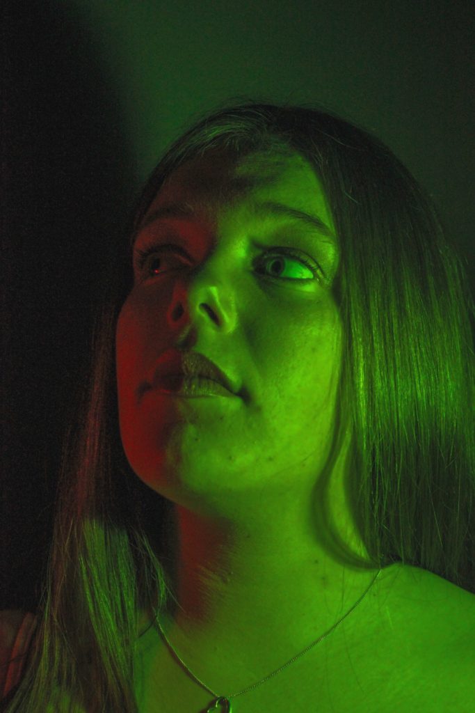
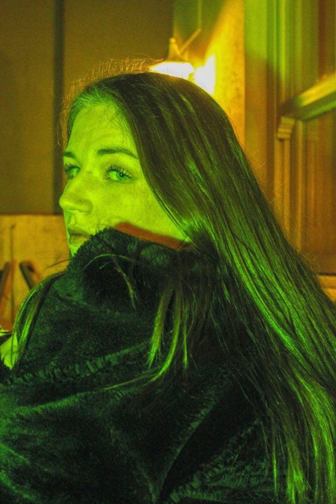
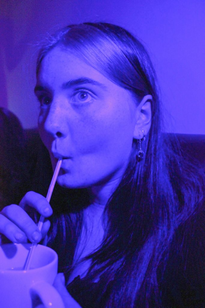
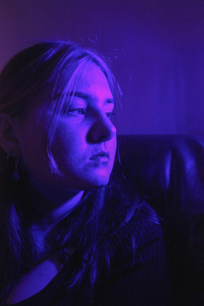
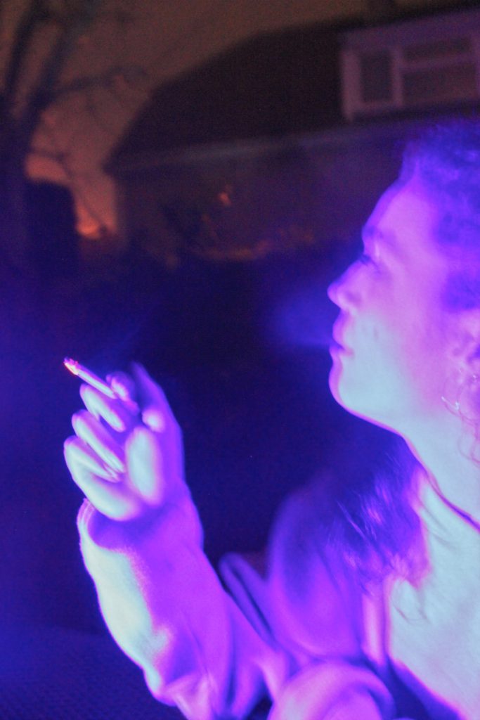
Overall, my project builds relationships between psychological theories and portrait images through colour. Images are paired with ink blot tests that reflect the mental processes of the people in the images, however the shapes are interpreted differently by each viewer who sees it. The entire project is completely up to interpretation, even subtle features in the subject’s faces can portray one emotion to one person and be viewed differently to someone else. The idea of variation is shown through changes in colour and shapes and emotion although similarity comes from us all being human.
All posts by Nicholas G
Filters
Final Outcomes

My final outcome consists of the book I created as well as 3 page covers featured inside placed on foam board. I raised the middle image by sticking extra pieces of foam board under it to create a 3D effect.
Book Specification
How you want your book to look and feel:
I want my book to be simplistic yet still powerful. The professionalism will come from printing full scale images with good ink. I will hold all the images together using purple and red ribbons, similar to the way Satoshi Fujiwara uses an elastic band to hold his book together.
Format, size and orientation:
- 40 pages including acetate
- The cover will be printed A3 size (297 x 420mm)
- Other pages included inside will be printed Square (296 x 300mm), A4 (210 x 297mm), Rectangle (250 x 420mm) and Small Rectangle (180 x 420mm)
- Acetate will be printed A4 size
Rhythm and sequencing:
I will pair images together based on the shapes in each image. For example, pairing close-up head shots with further away shots for contrast.
Structure and architecture:
Some images will be cropped to fit the scale of the paper, this will prevent the viewer from seeing certain features of a portrait. Other images will be flipped upside down.
Narrative:
The book will look at the individuality between males and females as well as the differences between human beings and their psychological processes.
Title:
The book will not be given a title, as like Rorschach’s ink blot tests, in which there is no text, it is down to interpretation. I want the viewer to create their own relationship between the ink blots and the portraits partnered with them rather than be hinted at with the use of a title.
Images and text:
No text included
Colour and B&W (or a mix):
All images are different colours including red, green and blue. As the pages are different sizes, when the pages are folded, it will become layers of different colours.
Paper and ink:
Unlike Satoshi Fujiwara, I will only use matte paper to produce my book. For two reasons; 1 being that it is what is available for the printer that I will be using and 2 in that it will help blend all the images together into one big ‘book of colour’. The Rorschach ink blots that I have produced will be included as acetate pieces so that the images can be seen through them.
Code Unknown – Satoshi Fujiwara
In Michael Haneke’s 2000 film Code Unknown, there is a scene in which the protagonist’s lover, a photographer, secretly snaps pictures of passengers sitting across from him on the train.
Inspired by the film, Satoshi Fujiwara used the same approach to shoot people on Berlin trains. In contemporary society, it is not acceptable to publicly display pictures of people’s faces that were taken without their permission. Thus, Fujiwara shot and edited his pictures in a way that makes it impossible to identify the individual people who served as “models, using the shadows created by the direct sunlight pouring in through the windows, various compositional approaches, and digital processing to keep their identities anonymous.
Satoshi Fujiwara is ultimately a street photographer; he carries a camera with him in his day-to-day life and shoots people and events that catch his eye. The pictures were taken over a period of several months and show people from a diverse range of ethnic backgrounds, German, English, and other European languages, but also many languages from the Middle East and Asia.
The artist describes being inspired by the unfamiliar, chaotic qualities of European visual culture in relation to the homogeneity of his native Japan. He has brought aspects of this fascination with the West back to Japan.
Award, Shortlists
2018 Foam Paul Huf Award, shortlist
2017 Prix Pictet Japan Award, shortlist
2015 Outset | UNSEEN EXHIBITION FUND, shortlist
2014 Japan Photo Award
Published in 2015 by Amana/IMA Photobooks
Deconstruction of the physical and narrative features of the book:
Format, size and orientation: 58 pages (multiple sizes), The cover is 27 x 37 cm
Images and text: Includes an essay by the artist on a loose sheet, explaining the inspirations behind the project.

Book in hand: The book is loosebound and comes with an elastic band to hold all the images together. The Soft cover has a glossy finish.
Paper and ink: 56 colour and black and white reproductions on several paper stocks (matte, glossy, white bordered, thin/thick etc.). The use of different paper stocks and/or of different page sizes can be a very simple way to organize information in a tactile and/or visual sense. An attentive reader will realise that there is a difference in meaning behind two images if they consist of different materials.
Structure and architecture: The unconventional construction of the photobook created by a folded layering effect presents a twisting collage of mixed body parts. His portraits are oriented in all directions. Some spreads feature a cropped face on one side and on the other, an extreme close-up detail from that same face, but rotated ninety degrees.

Rhythm and sequencing: The narrative is provided by the book’s dynamic design which highlights a distinct sense of immersive motion. Faces swirl and overlap, building on one another (sometimes on the same page), becoming an interwoven mixture of disconnected features, just like the swim of passing faces on a crowded train. This is a case where the packed density of the photobook form is likely the fullest manifestation of Fujiwara’s vision. While certain individual faces stand out and will make striking large scale prints, it is the pleasingly jumbled public/private experience found in the book that thrums with visual and conceptual richness.
Title: The title “Code Unknown” is taken from Michael Haneke’s film of the same name. It also links to the unfamiliar qualities of European culture, being that Satoshi is native to Japan. Code Unknown signifies an outsider looking in, noticing detail that make us all the same and removing all social convention.
Paul Graham Shoot 3:
Edits:
I took these images in the studio against a white and a black background.
For these images I used a slower shutter speed to create a sense of movement
Rorschach Test Response
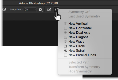
Using custom “wet ink” paintbrushes that I found online, I created Rorschach Ink Blots. I changed the colour of the background to beige (R:245, G:245, B:220) to resemble that of the original prints. I painted in symmetry mode so that the shapes were the same on both sides.
These are the brushes I used: 1 & 2
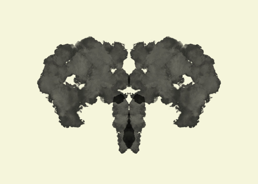
Inkblot 1 
Inkblot 2 
Inkblot 3 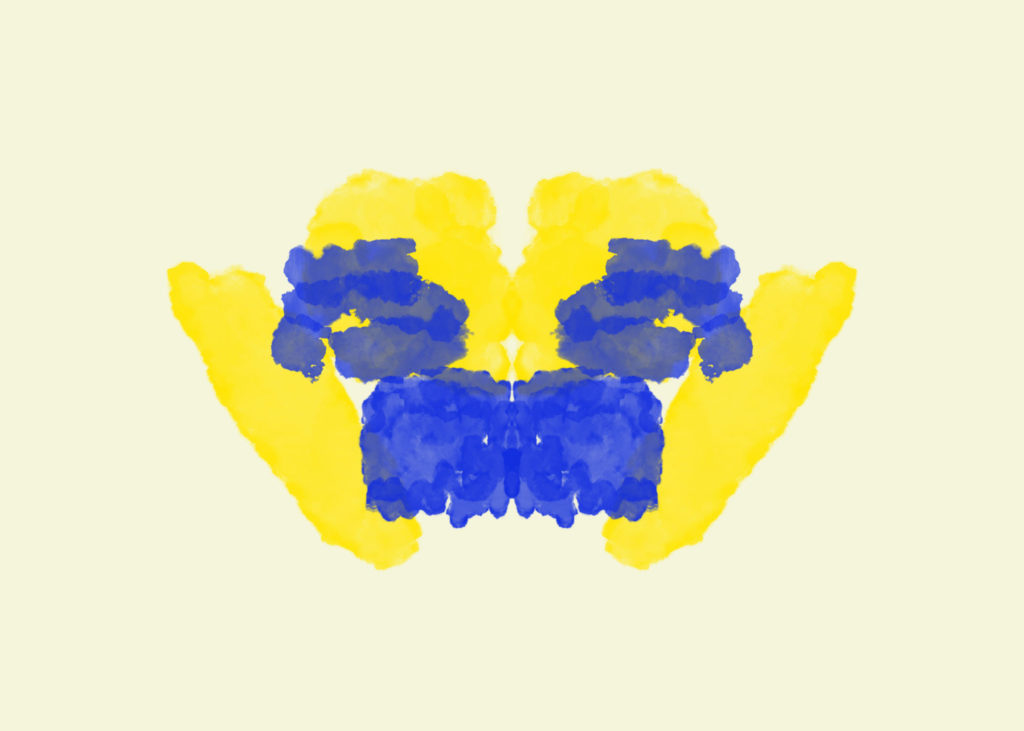
Inkblot 4 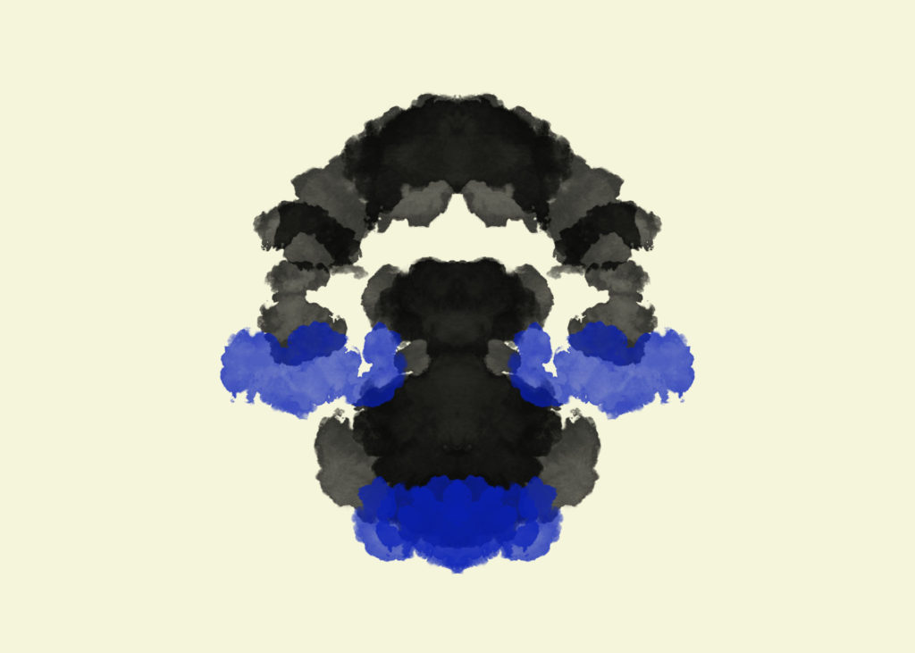
Inkblot 5 
Inkblot 6 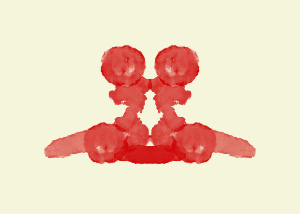
Inkblot 7 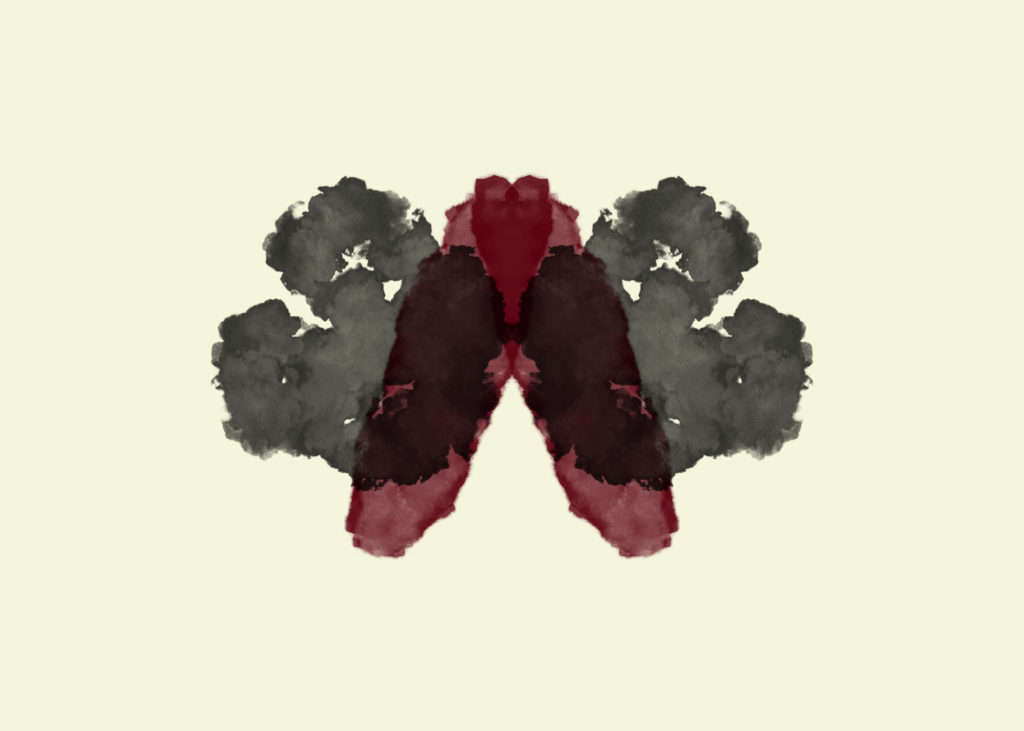
Inkblot 8 
Inkblot 9 
Inkblot 10 
Inkblot 11 
Inkblot 12
After completing the 12 ink blots, I asked a selection of people to respond to what they perceive the shapes as. I received a variety of responses as different people have interpretations, however there was also some common responses.
Popular Responses:
Inkblot 1: Skull, Uterus, Bull, Elephant, Two people looking at each other
Inkblot 2: Clown, Carrot
Inkblot 3: Two people holding two babies
Inkblot 4: Spider, Two cupid angels, Two shaggy dogs
Inkblot 5: Frog under a rainbow, Lake with arch, Angry dog
Inkblot 6: Dog, Gorilla, Tarantula, Muscular person
Inkblot 7: Two women back to back
Inkblot 8: Moth, Diseased lungs
Inkblot 9: Two rabbits
Inkblot 10: Skull, Shouting man, Beetle, Bird, Frog
Inkblot 11: Two people kissing, face, Two statues, Gloves, Two Japanese women
Inkblot 12: Butterfly, Heart
Paul Graham Shoot 2:
Edits:
All images were taken with an aperture of around f/4.0 and a shutter speed of around 1/50 sec. One image I decided to change the colour hue to red as I felt it would make the image more dramatic.
Rorschach Plan:
Concept: To create an interpretation of Rorschach’s original inkblots, used to examine a person’s personality characteristics and emotional functioning.
Procedure: Starting with a blank landscape page, I will change the background colour to beige to resemble that of the original prints. I will use ink brushes found online to create the same watery effect. In symmetry mode, I will choose the vertical option, which will create a line down the center of the page. Anything I draw on one side of the line will be replicated exactly on the other. Like Rorschach, I will also experiment with various colours in order to create different shapes for people to perceive. Once completed, I will ask a selection of my peers to tell me what they see in each image. This sample will also include the people I have chosen to photograph.
Rorschach Test
The Rorschach test is a psychological test in which subjects’ perceptions of inkblots are recorded and then analysed using psychological interpretation, complex algorithms, or both. Some psychologists use this test to examine a person’s personality characteristics and emotional functioning. It has been employed to detect underlying thought disorder, especially in cases where patients are reluctant to describe their thinking processes openly. The test is named after its creator, Swiss psychologist Hermann Rorschach. In the 1960s, the Rorschach was the most widely used projective test.
Using interpretation of “ambiguous designs” to assess an individual’s personality is an idea that goes back to Leonardo da Vinci and Botticelli. Interpretation of inkblots was central to a game, Gobolinks, from the late 19th century. Rorschach’s, however, was the first systematic approach of this kind. The ink blots were hand drawn by Rorschach.[
It has been suggested that Rorschach’s use of inkblots may have been inspired by German doctor Justinus Kerner who, in 1857, had published a popular book of poems, each of which was inspired by an accidental inkblot. Kerner pioneered Klecksography, the art of making images from inkblots. French psychologist Alfred Binet had also experimented with inkblots as a creativity test, and, after the turn of the century, psychological experiments where inkblots were utilized multiplied, with aims such as studying imagination and consciousness.
After studying 300 mental patients and 100 control subjects, in 1921 Rorschach wrote his book Psychodiagnostik, which was to form the basis of the inkblot test (after experimenting with several hundred inkblots, he selected a set of ten for their diagnostic value).

Inkblot 1 
Inkblot 2 
Inkblot 3 
Inkblot 4 
Inkblot 5 
Inkblot 6
Popular Responses as according to various authors:
Inkblot 1: Beck: two humans (grey), Piotrowski: human figures (72%, grey), Dana (France): human (76%, grey)
Inkblot 2: Beck: bat, butterfly, moth, Piotrowski: bat (53%), butterfly (29%), Dana (France): butterfly (39%)
Inkblot 3: Beck: two humans, Piotrowski: four-legged animal (34%, grey parts), Dana (France): animal: dog, elephant, bear (50%, grey)
Inkblot 4: Beck: animal hide, skin, rug, Piotrowski: animal skin, skin rug (41%), Dana (France): animal skin (46%)
Inkblot 5: Beck: bat, butterfly, moth, Piotrowski: butterfly (48%), bat (40%), Dana (France): butterfly (48%), bat (46%)
Inkblot 6: Beck: animal hide, skin, rug, Piotrowski: animal skin, skin rug (41%), Dana (France): animal skin (46%)
Inkblot 7: Beck: human (orange), Piotrowski: none, Dana (France): none
Inkblot 8: Beck: crab, lobster, spider (blue), Piotrowski: crab, spider (37%, blue), rabbit head (31%, light green), caterpillars, worms, snakes (28%, deep green), Dana (France): none
Inkblot 9: Beck: animal: not cat or dog (pink), Piotrowski: four-legged animal (94%, pink), Dana (France): four-legged animal (93%, pink)
Inkblot 10: Beck: human heads or faces (top), Piotrowski: heads of women or children (27%, top), Dana (France): human head (46%, top)

Inkblot 7 
Inkblot 8 
Inkblot 9 
Inkblot 10
Rorschach never intended the inkblots to be used as a general personality test, but developed them as a tool for the diagnosis of schizophrenia. It was not until 1939 that the test was used as a projective test of personality, a use of which Rorschach had always been skeptical. Interviewed in 2012 for a BBC Radio 4 documentary, Rita Signer, curator of the Rorschach Archives in Bern, Switzerland, suggested that far from being random or chance designs, each of the blots selected by Rorschach for his test had been meticulously designed to be as ambiguous and “conflicted” as possible.
The interpretation of the Rorschach test is not based primarily on the contents of the response, i.e., what the individual sees in the inkblot. In fact, the contents of the response are only a comparatively small portion of a broader cluster of variables that are used to interpret the Rorschach data. Other significant information can be gained from the time taken before providing a response for a card (taking a long time can indicate “shock” on the card) as well as by any comments the subject may make in addition to providing a direct response.
Determinants and location are often considered more important than content, although there is contrasting evidence. Determinants are the factors that contribute to establishing the similarity between the inkblot and the subject’s content response about it. They can also represent certain basic experiential-perceptual attitudes, showing aspects of the way a subject perceives the world. Form is the most common determinant, and is related to intellectual processes. Colour responses often provide direct insight into one’s emotional life. Movement and shading have been considered more ambiguously, both in definition and interpretation. Rorschach considered movement only as the experiencing of actual motion, while others have widened the scope of this determinant, taking it to mean that the subject sees something “going on”. More than one determinant can contribute to the formation of the subject’s perception. Fusion of two determinants is taken into account, while also assessing which of the two constituted the primary contributor. For example, “form–color” implies a more refined control of impulse than “color–form“. It is, indeed, from the relation and balance among determinants that personality can be most readily inferred.
Location refers to how much of the inkblot was used to answer the question. Administrators score the response “W” if the whole inkblot was used to answer the question, “D” if a commonly described part of the blot was used, “Dd” if an uncommonly described or unusual detail was used, or “S” if the white space in the background was used. A score of W is typically associated with the subject’s motivation to interact with his or her surrounding environment. D is interpreted as one having efficient or adequate functioning. A high frequency of responses coded Dd indicate some maladjustment within the individual. Responses coded S indicate an oppositional or uncooperative test subject.
“Popularity” and “originality” of responses can also be considered as basic dimensions in the analysis.The goal in coding content of the Rorschach is to categorize the objects that the subject describes in response to the inkblot.
Subject’s responses are categorised into one of 27 established codes. The codes include terms such as “human”, “nature”, “animal”, “abstract”, “clothing”, “fire”, and “x-ray”, to name a few. Content described that does not have a code already established should be coded using the code “idiographic contents” with the shorthand code being “Idio”.
Paul Graham Shoot 1:
Edits:


