All posts by Megan Woolsgrove

Filters

Author:
Category:

Photoshoot 2

For this photo shoot i decided to explore shooting videos to portray nature as i wanted to show the movement which isn’t shown in a still image. I particularly wanted to show the flow of water in a stream or lake and thought that a reservoir would be a good place to shoot as it has different aspects of nature surrounding the water i.e. plants, trees, and animals that i could capture in video. I was also interested in recording the sounds in the landscape. As I walked around the area I took videos and pictures of aspects of the landscape that I found interesting and beautiful. I also took inspiration from abstract art in this shoot, trying to focus on lines and shapes in the landscape.

Videos

One aspect I like about creating videos of what I was originally photographing is that the different shots change after each other, comparing each angle to the one before. I also like how in each video there are different sounds of the surrounding wildlife because I am in different areas. I wanted to emphasise the fragility, beauty and existence of the plants and water and think I did that effectively. I like how in some of the shots you can tell that I am holding the camera up because of the movement giving the video a more personal effect, emphasising how I have just noticed these aspects of nature on a walk.

Images
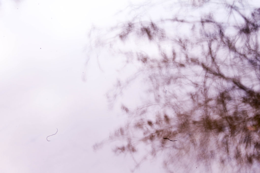
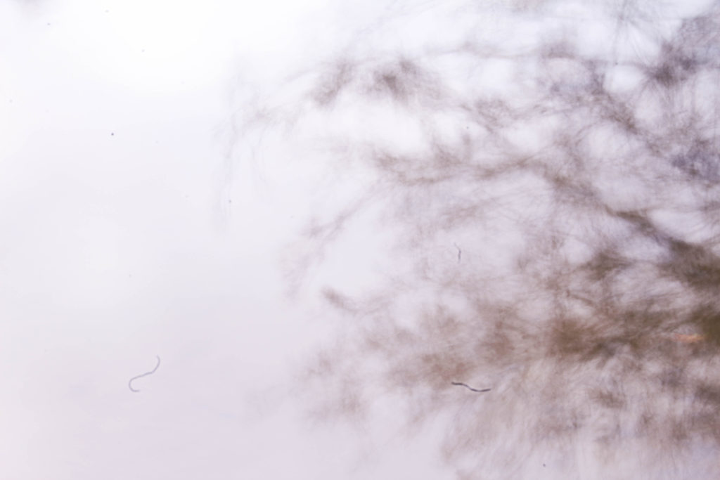
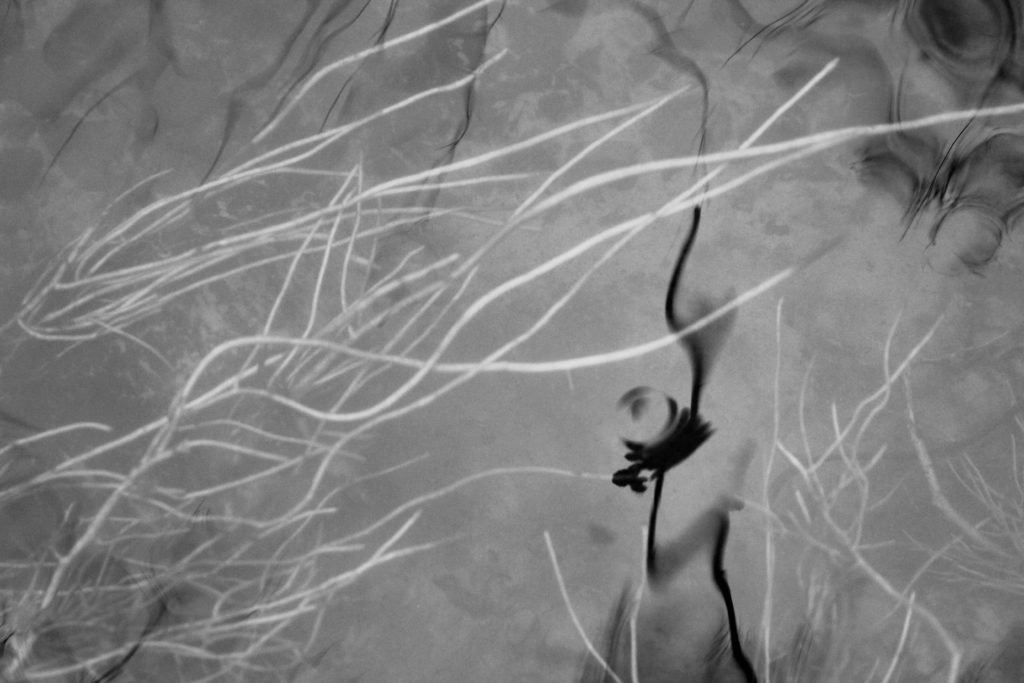
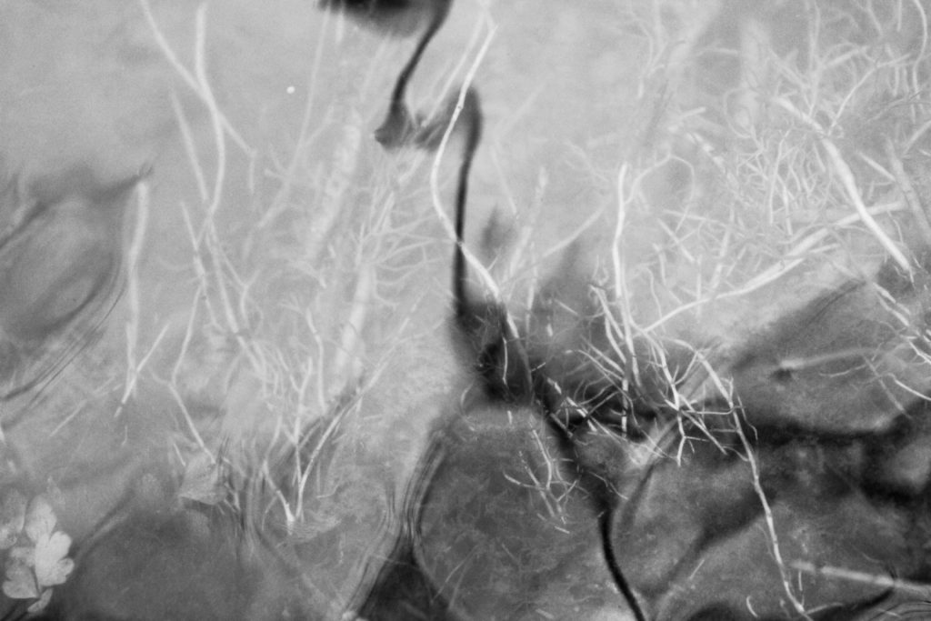
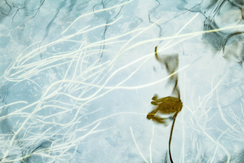
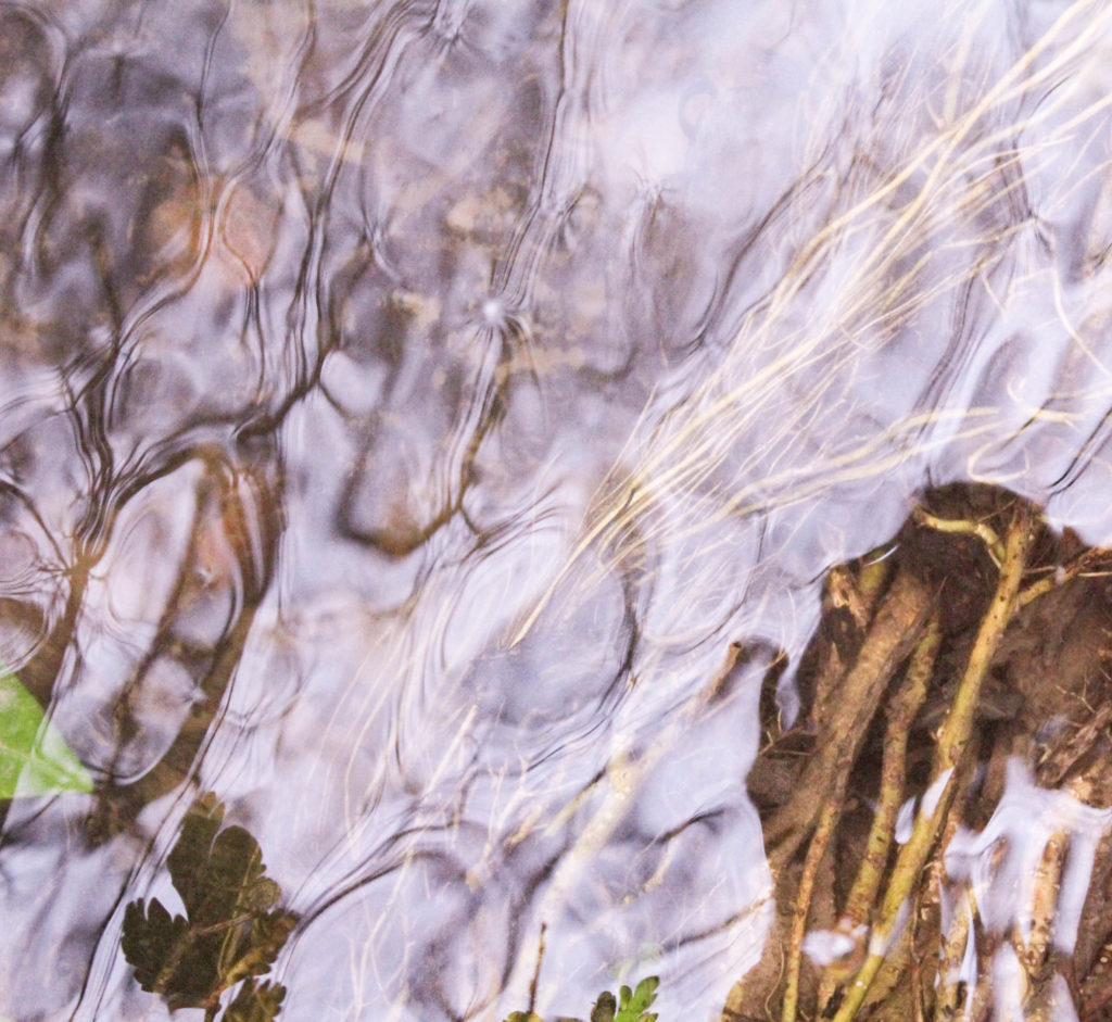
I took photos as well as videos on this shoot so I could compare to see which was most effective. I also wanted to experiment with these images by manipulating the colours and tones within them to see if they make a more interesting image. I first started experimenting with shutter speed as I wanted to see how the images would look when I photographed moving water and the reflection of a tree. I thought that this would create an interesting series of images of the same subject of nature.
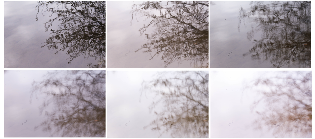
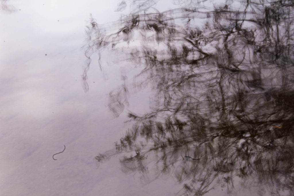
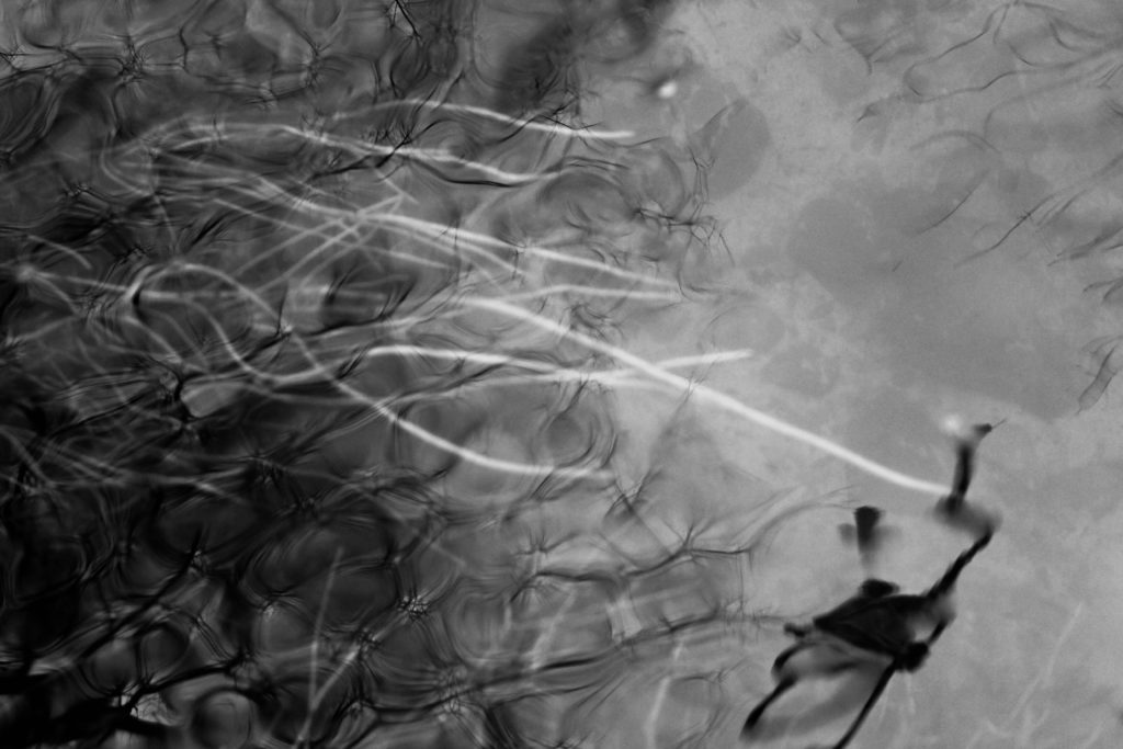
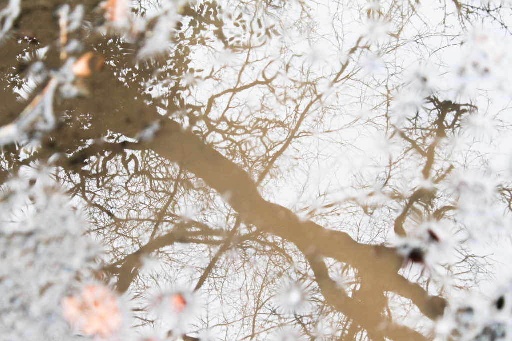
I like these images displayed together as it shows the different effects created by the faster and slower shutter speeds. The first image I chose to display was the third shutter speed I experimented with. I like this image as it still shows the details of the branches and the shapes of the leaves, but has a blurred effect from the movement of water. I don’t think that it’s bios that this image is a reflection in water and makes the reader questions what the image is of. The second image I chose to display shows less of the details in the branches and has a more exposed appearance, making the image brighter. The shares of the branches are still noticeable against the white water, but it still contrasts to the first image which is darker. If i wanted to edit these images further i could manipulate the tone and underlying colours in these images so that they could contrast even more i.e. i could edit one to be a cool tone and emphasise the warm tones in another. The third image I displayed is the slowest shutter speed I used and is the mot exposed. I also like this image as it creates a emphasised blurred effect that contrasts to the other two images, making it even harder for the audience to see what the image is of. I think that this series of images really reflects the fragility of nature through the soft blurred lines of the slow shutter speed that making the plants seem more transparent and other worldly.

In future shoot where i want to experiment with shutter speed i could use a tripod to see the effect o the water of the camera being even more still. I could also experiment with different aspects of the landscape that aren’t moving, and physically move my camera to created blurred effect.
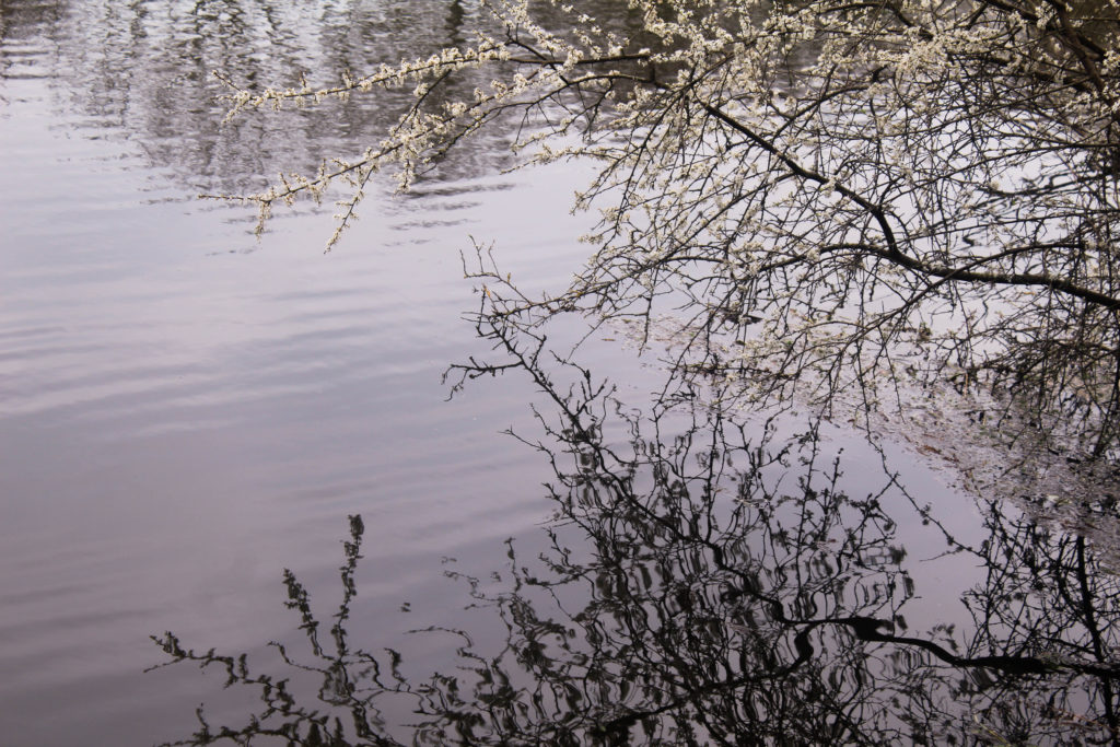
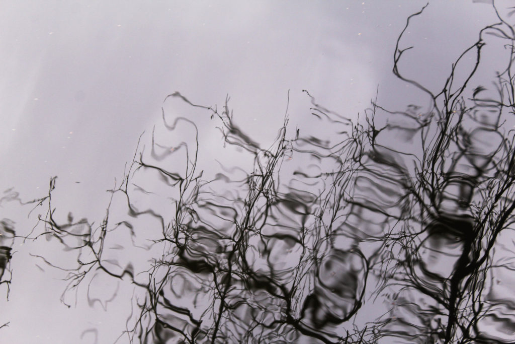
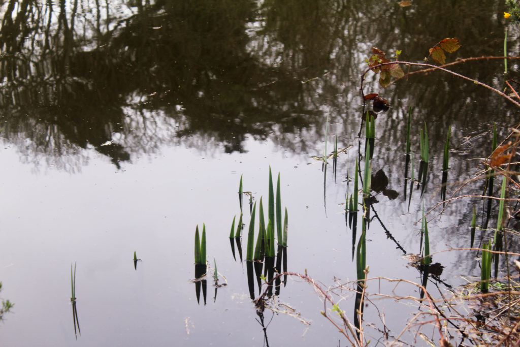
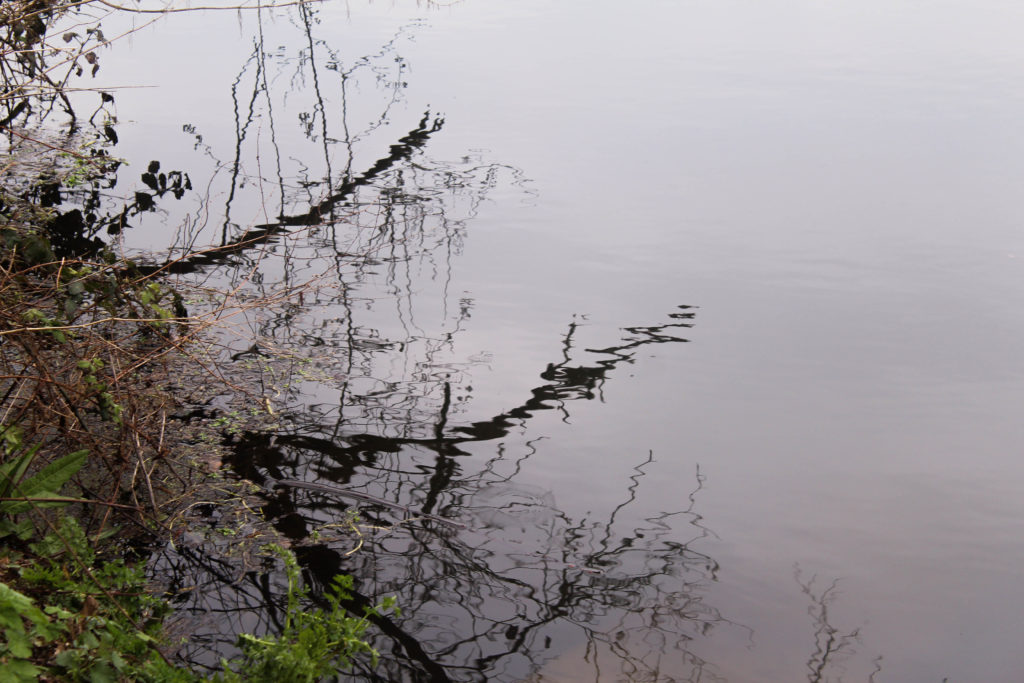
I like these two images of elections of plants o the water as they contrast with my images from my experiment with shutter speed as they are much more detailed as they were taken with a faster shutter speed. This allow for the different directions of the ones and shapes of the branches to be noticeable. In the first image I wanted to include the tree with flowers as I thought this reflected ideologies of beauty and thought that the shape it created in the reflection was interesting. One aspect I don’t like about this image is the composition as I think that they is too many details that are over powering. I think that the combination of the flowers on the tree and the reflection is effective, but I think that the reflection in the top left of the image makes it too chaotic. If i wanted to use this image as a final outcome, I could edit out the reflection in theta left to make a more atheistically pleasing image.

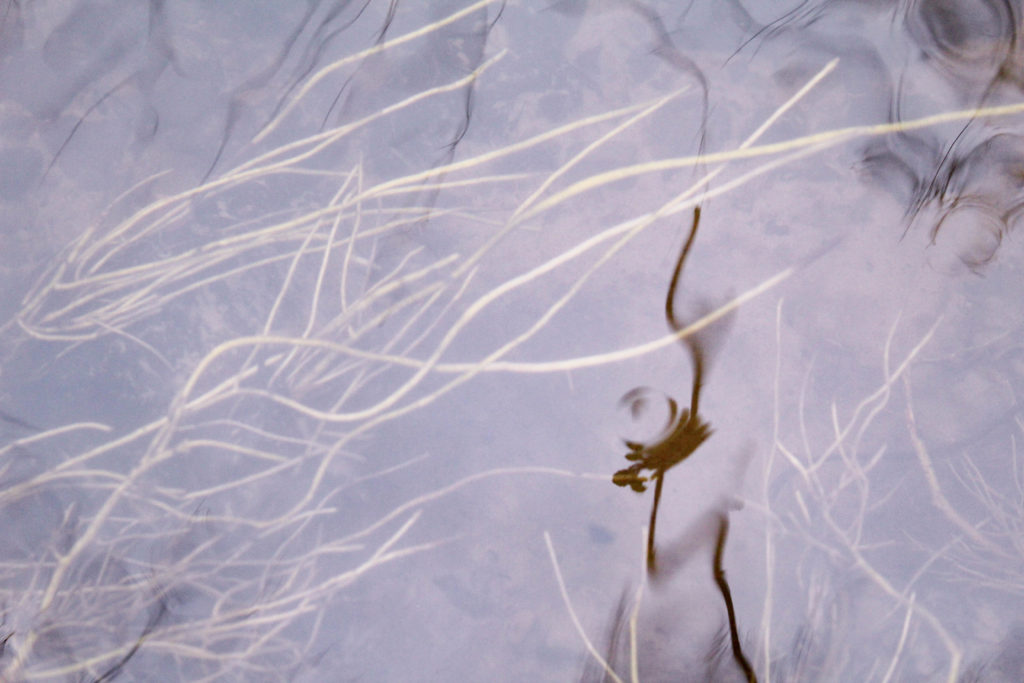
The second image is he more abstract image and is harder to identify as a reflection than the first image.This is my favourite image out of the two as its composition isn’t too overpowering with the negative space at the top of the image which is then continue in the pattern of the reflection. I also like how the plant is distorted through the ripples in the water as creates stretched blurred shapes which makes a more interesting image.
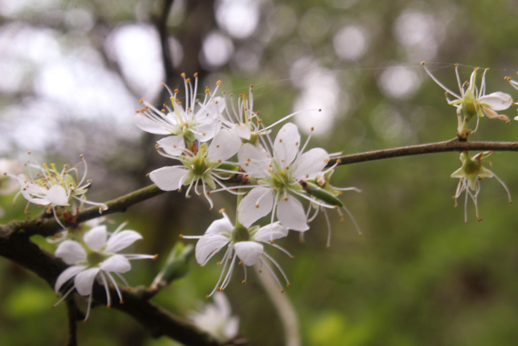
I also focused flowers and plant in this shoot by themselves and in water. I chose the first image above of the whit flowers as I liked how the background was out of focus with the flower in the foreground being in focus. This makes the colours the background blend together, making the areas where the sky is more brighter. One reason I took this image is the spider web which is hanging from one flower to another on the branch. I also like the round shapes on the flowers that emphasise stereotypically feminine shapes.

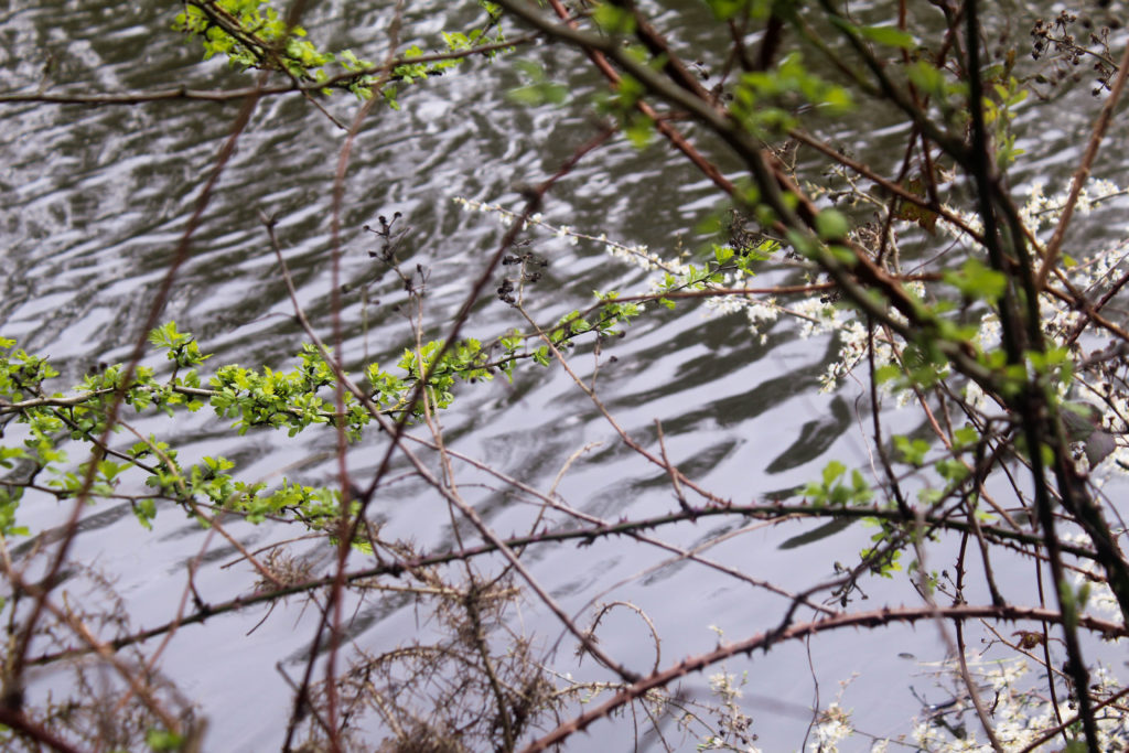
I displayed the second image looking through plants to show moving water. This was one of the angles I used in my video. I wanted to display it as an image as well as i thought i could compare the two. I think that the video is more effective as it showing the fast moving water in the background which isn’t shown in the still image. Also the movement of the plants in the wind shows them more naturally. I liked the composition of this angle as the surrounding plants and leaves frame the image and make it seem as though you’re looking down through the plants. I think that the plants in the foreground being blurred is effective, with the water being in focus, as it turns the audiences attention to the bright water. I also like how the plants go across the frame in different direction as it creates a more detailed, intricate composition and how the pattern made by the ripples of the water contrasts to the pattern made by the plants.

I included the third image as it reminded me of an image I took in my first photoshoot with the same type of plants in water. This image is completely different to the first as it shows the reflection of the trees above the water. I like how the shapes and branches of the trees are still noticeable even in the reflection and make the composition of the image much more interesting than the first. I also like how there are a few brown plants in the right side of my image, adding to a range of different colours in the image.
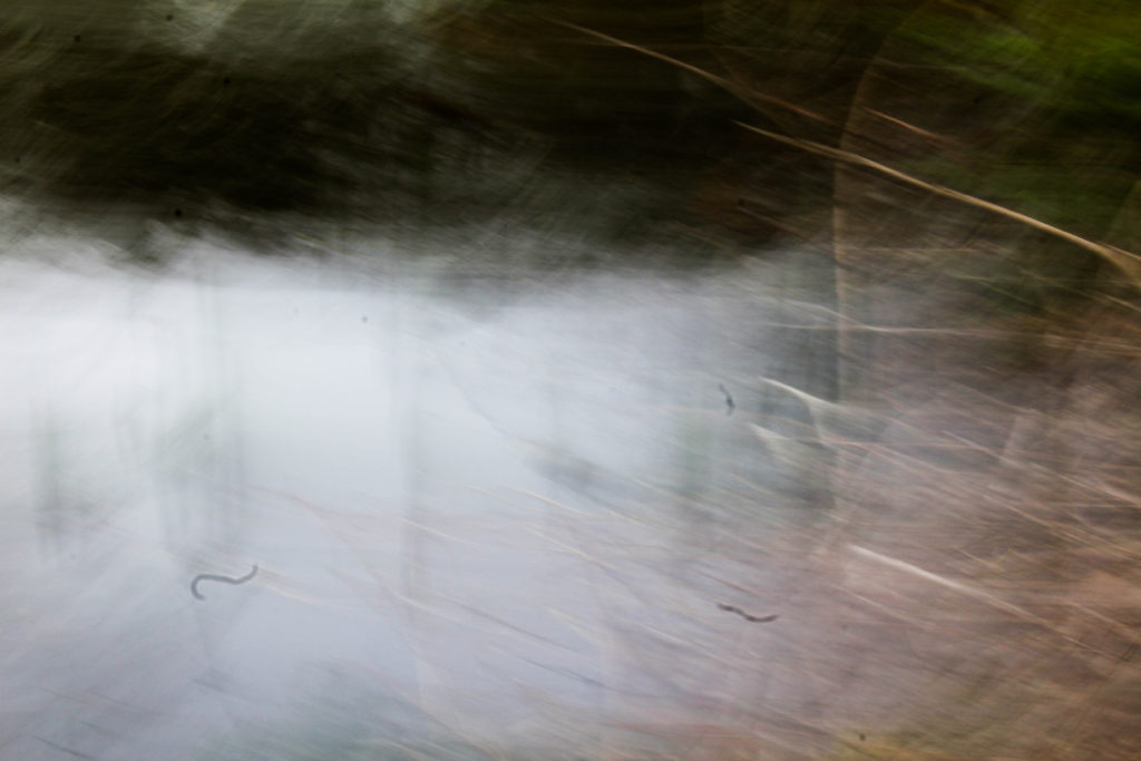
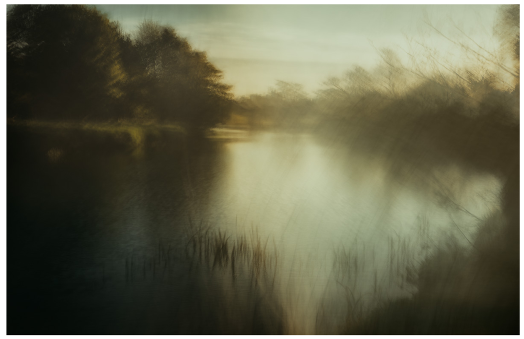
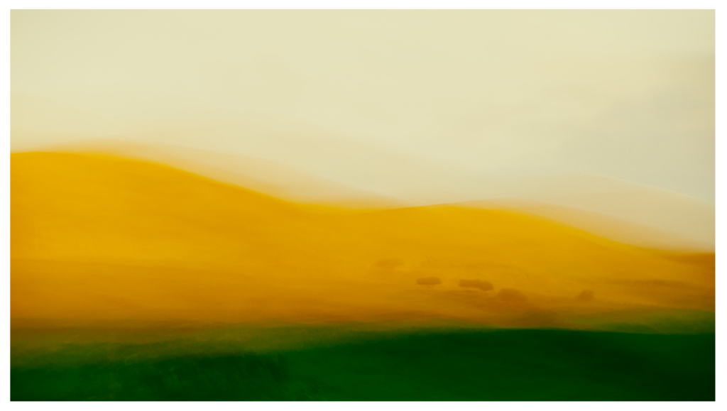
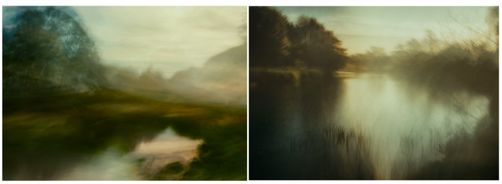
This is another image where i experimented with shutter speed. I found that this image reminds me of the photographer Andrew S. Gray’s work who explores abstract landscape photography by moving his camera when taking pictures. He says that ‘The looseness and ability to play without being tied by the light or weather affecting the scene you’d normally be shooting is the style’s appeal to me, also the chance of creating a scene that was not necessarily there’. I think that this concept is seen in my image as the detail of the branches in the right side of the image are still noticeable, but are blurred enough with the trees in the top on the image to create an image of ‘something thats not necessarily there’. I also like the composition in this image as it’s split into three sections of different colours, reflecting ideologies of abstract art. I want to experiment with this camera technique more i future photoshoots as I think it’s effective. I will look more into the work of Andrew S. Gray.

Examples of his work:
Evaluation

Overall I think this shoot went well in exploring the movement of nature and the sounds in the surrounding area. I think that shooting videos was good way to show plants ad water naturally. For this project I still feel as though I don’t have a developed concept so I will continue to research different artists and art movements to inspire me and give me ideas. I also want to explore more with shutter speed and the movement in nature linking to fragility in nature and draw more inspirations from abstract art.

Beautiful and Sublime

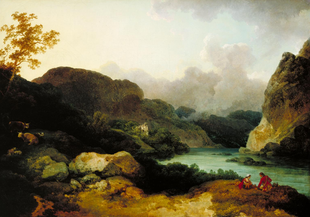
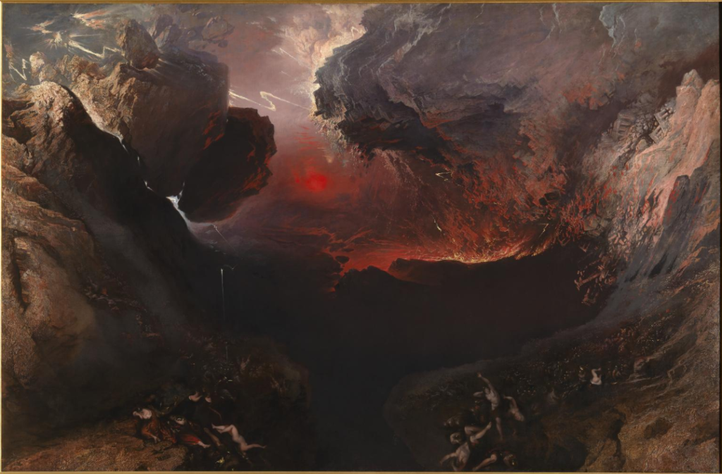
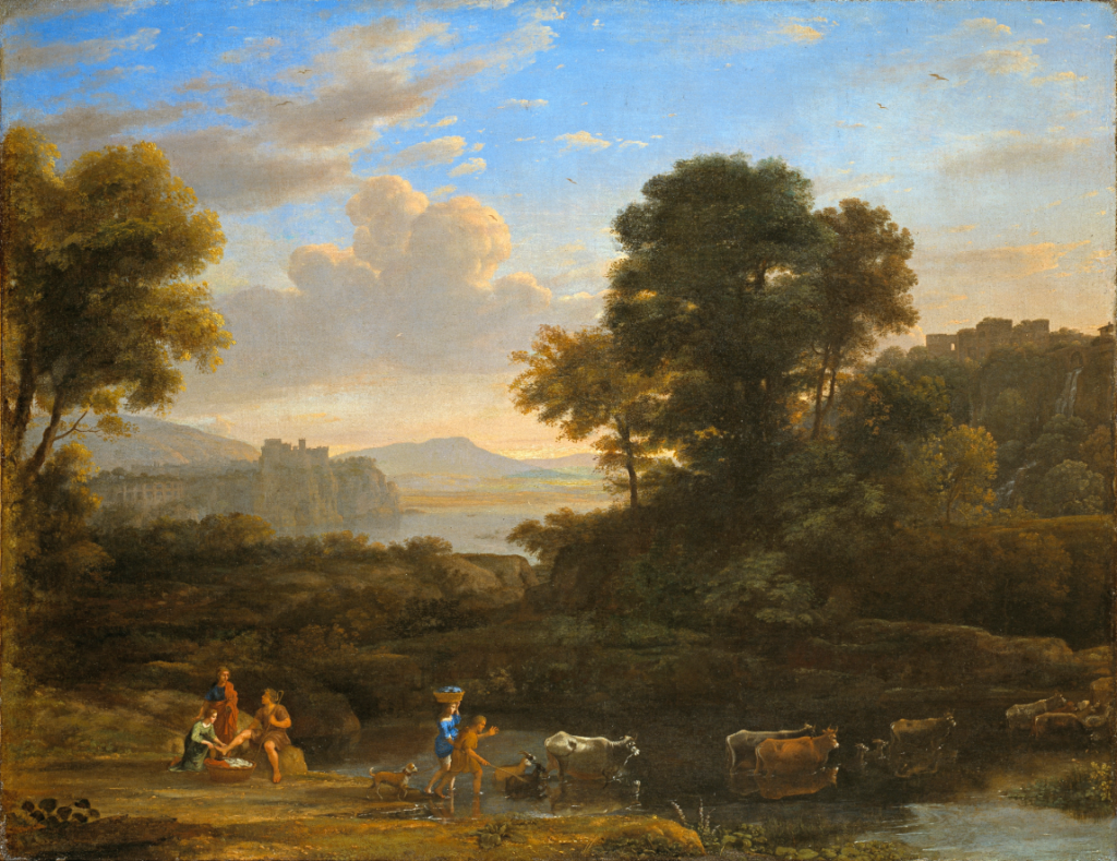
The 19th century was the golden age of landscape painting in Europe and America. Three aesthetic concepts established during the Romantic era divided the natural world into categories: the Pastoral, the Picturesque, and the Sublime. The first two represent Nature as a comforting source of physical and spiritual sustenance. The last, as articulated by Edmund Burke in his Philosophical Enquiry into the Origin of our Ideas of the Sublime and Beautiful (1757), refers to the thrill and danger of confronting untamed Nature and its overwhelming forces . This Romantic conception of the sublime proved influential for several generations of artists. Burke associates qualities of “balance,” “smoothness,”and “color” with the beautiful, while he speaks of the sublime in terms such as “vastness” and “terror”.

Beauty/ Pastoral

Beauty is a widely employed term, referring typically to aesthetic experiences that are pleasing, while to some extent transcending preferences and needs that are specific to an individual. That is, the experience of something beautiful will please a subject for reasons that reach beyond the subjective inclinations of the subject and that can be experienced also by many other subjects. The scenes are peaceful, often depicting ripe harvests, lovely gardens, manicured lawns with broad vistas, and fattened livestock. Man has developed and tamed the landscape – it yields the necessities we need to live, as well as beauty and safety.

Picturesque

Picturesque arose as a mediator between opposed ideals of beauty and the sublime, showing the possibilities that existed in between these two rationally idealised states, seen as being artistic but containing elements of wildness or irregularity. Derived from the Italian pittoresco, “from a picture,” the term picturesque de nes an object or view worthy of being included in a picture.  It is an aesthetic category developed in the eighteenth-century to describe, in the words of artist and author William Gilpin (1724 – 1804) in his 1768 art treatise Essay on Print, ‘that peculiar kind of beauty which is agreeable in a picture’. It was associated with fashionable landscape gardening, however its cultural significance extended far beyond this.

A picturesque view contains a variety of elements, curious details, and interesting textures, conveyed in a palette of dark to light that brings these details to life. In later publications Gilpin developed the concept more fully. The picturesque may be thought of as halfway between the beautiful, with its emphasis on smoothness, regularity, and order; and the sublime, which is all about vastness, magnitude, and intimations of power; the picturesque must combine aspects of both of those. A picturesque landscape would have characteristics of roughness (which includes textured or variegated surfaces) — indeed, Gilpin wrote that “roughness forms the most essential point of difference between the beautiful and picturesque” 

By the last third of the 18th century, Enlightenment and rationalist ideas about aesthetics were being challenged by looking at the experiences of beauty and sublimity as being non-rational. Aesthetic experience was not just a rational decision – one did not look at a pleasing curved form and decide it was beautiful; rather it came naturally as a matter of basic human instinct. 

“Disputes about beauty might perhaps be involved in less confusion, if a distinction were established, which certainly exists, between such objects as are beautiful, and such as are picturesque—between those, which please the eye in their natural state; and those, which please from some quality, capable of being illustrated by painting.”

William Gilpin, ree Essays on Picturesque Beauty, 1794

Sublime

According to Burke, the Beautiful is that which is well-formed and aesthetically pleasing, whereas the Sublime is that which has the power to compel and destroy us. The preference for the Sublime over the Beautiful was to mark the transition from the Neoclassical to the Romantic era. Burke connected the sublime with experiences of awe, terror and danger. Burke saw nature as the most sublime object, capable of generating the strongest sensations in its beholders. This Romantic conception of the sublime proved influential for several generations of artists.

Causation can be divided into formal, material, efficient and final causes. The formal cause of beauty is the passion of love; the material cause concerns aspects of certain objects such as smallness, smoothness, delicacy, etc.; the efficient cause is the calming of our nerves. 

“What is most peculiar and original to Burke’s view of beauty is that it cannot be understood by the traditional bases of beauty: proportion, fitness, or perfection. The sublime also has a causal structure that is unlike that of beauty. Its formal cause is thus the passion of fear. He believed that “terror is in all cases… the ruling principle of the sublime.” 

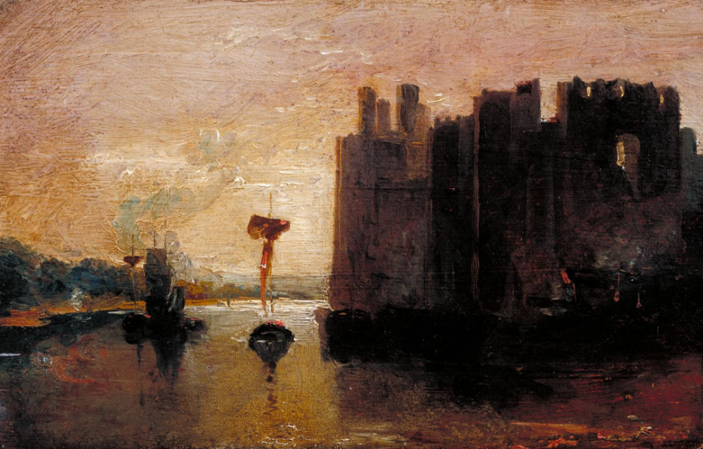
In landscape the sublime is exemplified by J.M.W Turner’s sea storms and mountain scenes and in history painting by the violent dramas of Henry Fuseli. The notion that a legitimate function of art can be to produce upsetting or disturbing effects was an important element in Romantic art and remains fundamental to art today. Painters like Turner and Constable wanted to express the sublime in visual art. They were landscape painters and, although in different ways, they emphasized the strength of natural elements and studied the effects of different weather conditiond on the landscape. In 1814 the  English landscape painter John Constable put this in his own words when he said the beauty of nature generates a train of associations that leads “to the contemplation of higher, spiritual values”(Anne Lyles, Sublime Nature: John Constable’s Salisbury Cathedral from theMeadows, Tateand his idea is illustrated in Salisbury Cathedral from the Meadows 1831.  Constable’s dark, passionate clouds, are in contrast to the sunlight of the foreground, where you see the church scene as gothic, and negative.  These aspects of the painting widens towards sublimity: God, nature and man. Burke favoured this aesthetic idea over Beauty because, he said, ‘astonishment, obscurity and vastness cause a more powerful physical reaction in us than Beauty’s orderly calm’

Because the sublime is emotional, it is traditionally considered something one must experience alone.  It’s no coincidence that Rousseau’s last work was titled Reveries of a Solitary Walker.  Traditional Romantics associate the sublime directly with nature, and the artist, poet or simply the Romantic experiences the sublime directly witnessing the beauty of nature.  But it’s important not to confuse or reduce the sublime with simple beauty, rather, Romantics are interested in natural experiences that utterly consume us, perhaps moving us to tears, and giving us a humbling sense of the wonder and majesty of the natural world.

Experimentation

I first started experimenting with the images from my first shoot by editing them black and white. Doing this emphasises the reflections on the water and highlights the shadows under the water, creating more depth in the image. I also think it emphasises the white on the plants under water making them contrast more against the shadow which is the main focus of the image. I like the range of tones created in the image, the darkest point being the plant closest to the water and the most noticeable reflection, the ground underneath the water is the mid tines, and the lightest point is the plants underwater, growing in the direction the water is going. I think that the black and white edit creates a different effect than the image in colour as it removes the warm/pink tones. This makes the image look less inspired by Rinko Kawauchi as it doesn’t emphasise the light on the water. I think that this images reflect more abstract ideas, providing responses to my research into abstract artists and photographers. I also think that it links to my research into the romantic era, looking at ideologies like beauty which i think is emphasised by the soft, round shapes in this image.

This image is one of my favourite black and white edits from this shoot as I think it reflects the abstract research I have done previously in my project. I particularly like the lines created by the movement of the water and the geometric shapes that all different tones, portraying juxtaposing colours. I think this reflects ideas of abstraction as at first glance it is difficult to identify what the image is of. I like how the plants underneath the water are shown in the light areas and less in the darker areas as it makes them stand out more.

This image in particular i think looks at the beauty of nature effectively as it emphasises the delicate aspects of water and plants through the soft tones and lines. I also like how the different tones in the water create texture showing the different shapes of the waves. One photographer in particular that this image remind me of it Andrew S. Gray who creates intricate work from shaking his camera. He produces abstract landscapes inspired by the paintings of the old English masters of pictorialism.

Colour Edits

I then went on to edit the images in colour on photo shop and tried to emphasise the different shapes portrayed in the images. I did this in various ways like adjusting the hues of the images to create different variations of the same image. I think by experimenting with different colours it creates interesting images that are exploring beauty and fragility in nature, bringing inspiration from other art movements. 

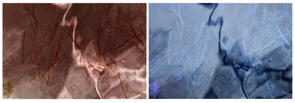
I chose to display these images as I like how they work in a series, contrasting from one another , each one one portraying a different atmosphere. The first two images use pink and purple, experimenting with the idea of what stereo typically considered feminine. I think these two images reflect ideologies of romanticism and beauty from the the soft, pastel colours that I edited them in. The first image uses a darker purple, which is emphasised by the even darker brown lines of the plants underneath the water. This all contrasts to the plant in the foreground of the image which is white. I also like how some of the waves on the water have turned white as well which complements the plant in the foreground and creates a more aesthetically pleasing image.

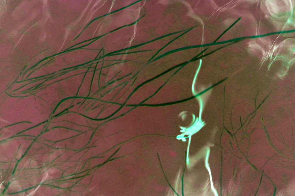
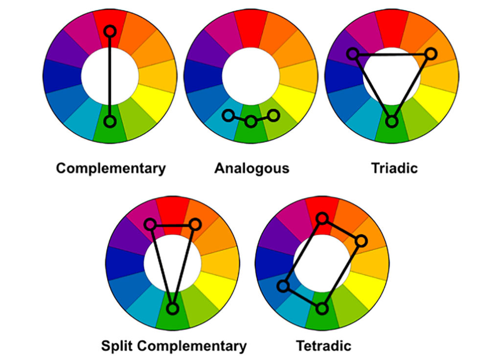
In the second image I edited a light pink to be in most of the image which contrasts to the plants underneath which are white in this image. To me, this work is more inspired by the photographer Rinko Kawauchi, through the use of pale pink and white in the image. The green of the plant in the foreground looks at traditional colours in nature, which contrasts to the pale pink. For the third image I chose to experiment by editing a bright red into the image and contrast it with the green, which are complementary colours. I think that this image is more bold and powerful as red isn’t a colour which is normally associated with nature and beauty. I think that displaying these images together is effective as each image makes you notice something new, through the different colours of the same aspects.


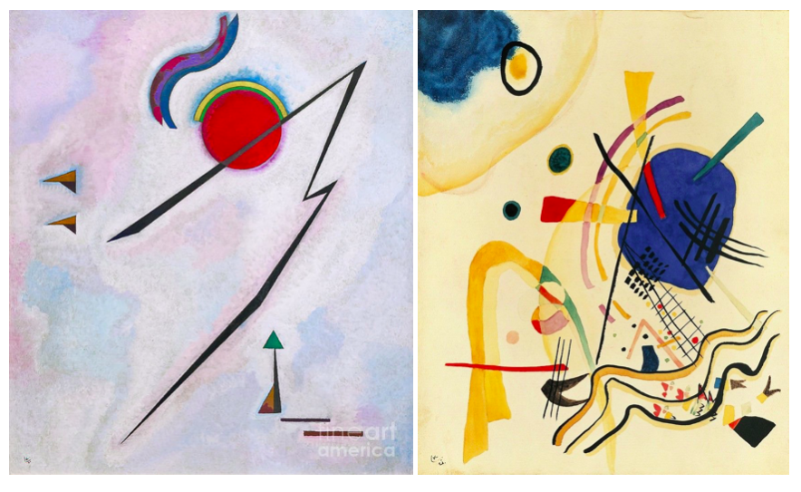
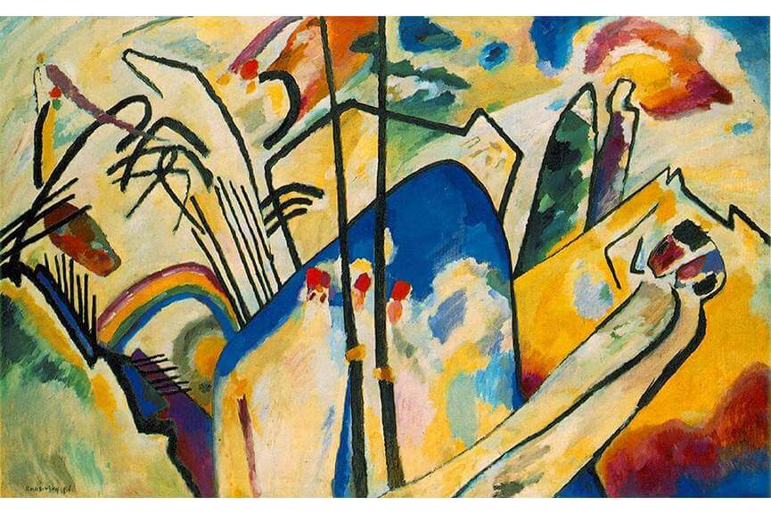
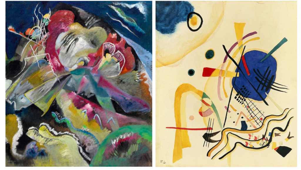
I took inspiration from Wassily Kandinsky in these images who was a pioneer in abstract art. He first began to use expressive color masses separating them from forms and lines. Soon after that, he started to merge geometry with abstraction. I think that this relates to the images I have edited as I have tried to emphasise the different shaped lines which are curved or straight against the background colour of the image. I also tried to use colours that arenet traditionally associated with nature. For many of his painting he uses lines which are round and curved which is an aspect that links are work together. In my images the rounded shapes of the plants underneath the water going in different direction reflect this. Also the plant in the foreground is an interesting shape which has a solid block colour, reflecting ideologies of abstraction.
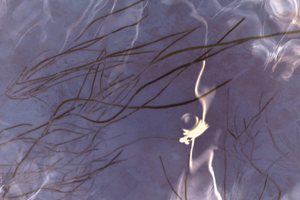
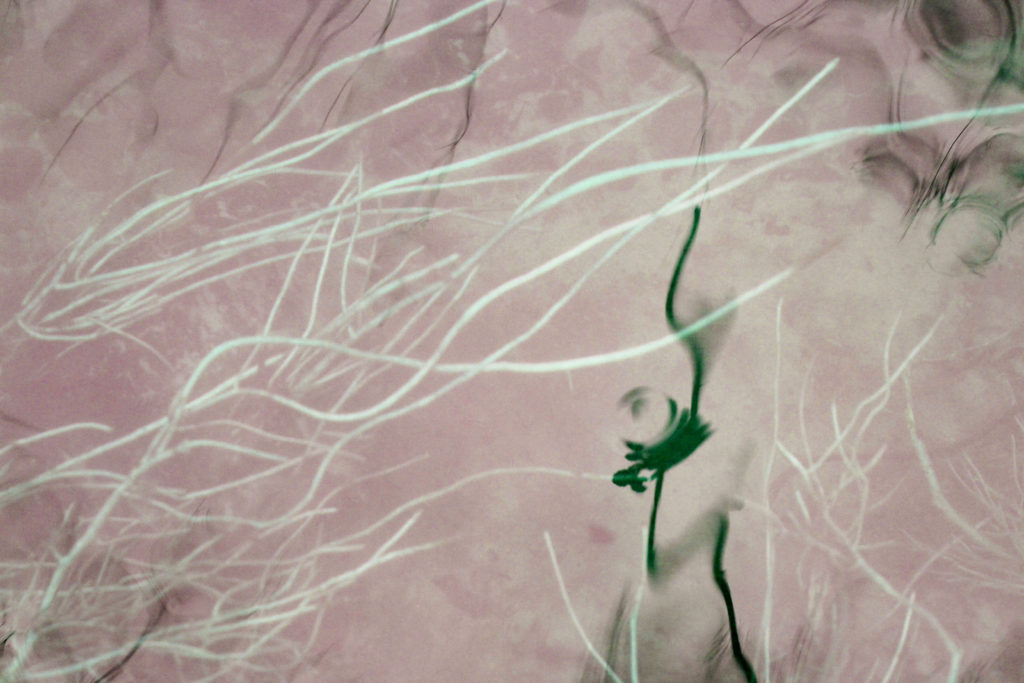
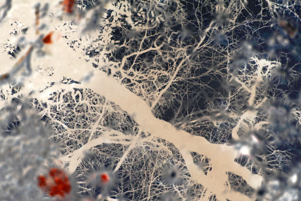
I then started experimenting by inverting the images I took in my first shoot. I chose this edit to display as I think that the inverted effect emphasises the natural shapes and fragility of nature that weren’t as obvious before. This makes the overall image have a different atmosphere, through the dark blue colours that weren’t there before contrasting with the bright white. The edit also makes it harder to tell what the image is of. Even in the original image, the way the image way taken through a puddle wasn’t too obvious, with this edit it makes it even harder, also reflecting ideologies of abstraction. One particularly aspect I like in this image is the red shapes on the left side of the image as I think they contrast effectively to the navy blue and white colours in the rest of the image, making it more interesting.

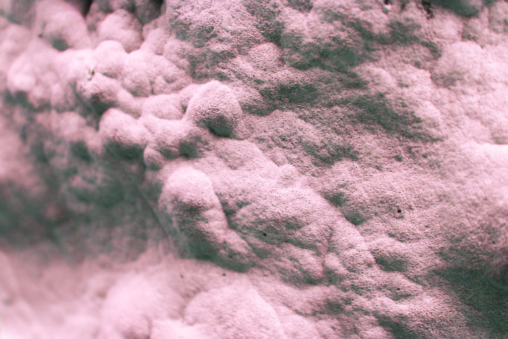
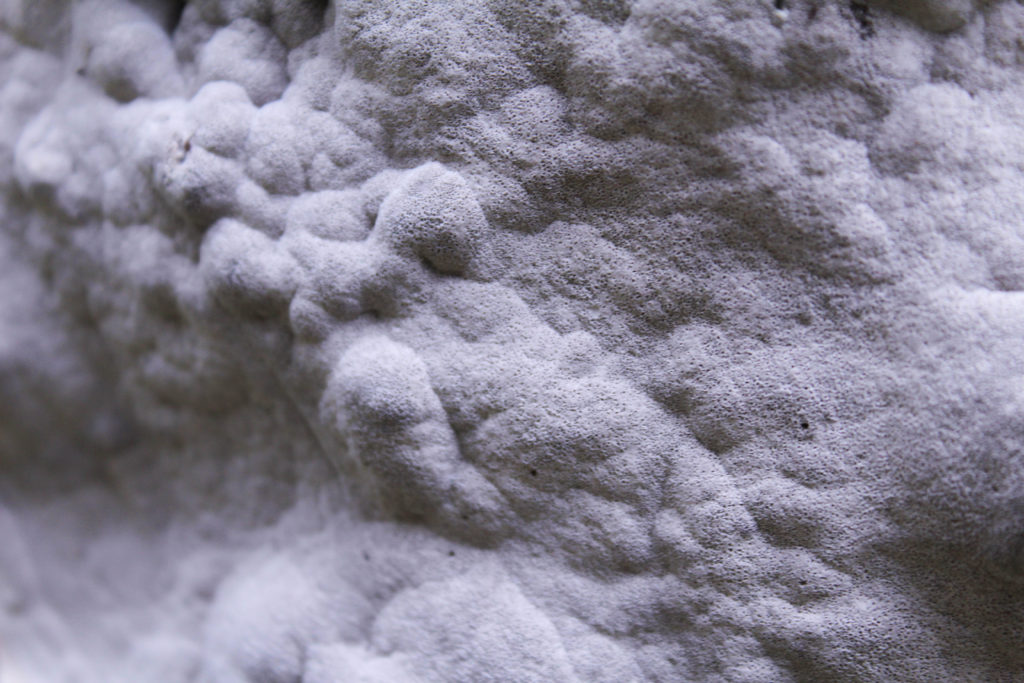
To experiment with this image I decided to play with the idea of pastel colours to emphasise the beauty and femininity . I like this image as it is an aspect of nature that isn’t normally related with beauty. By taking the photo close up to fill the frame and emphasisng warm pink tones I think it effectively reflects my ideas of fragility in nature, through the soft rounded shapes. I experimented by adjusting the colour balance and tones in the image, making some versions colder colour, and some warmed colours to see which was the most effective, I think that the warmer colours are most effective as they play on the ideas of traditional beauty through something that isn’t considered beautiful.

I also experimented by inverted the image to see what effect it would have. I found that it created an image where the shadowed parts are much darker than the original and the lighter white/ pink areas were brighter, almost looking as if they were glowing. Although I thought that this edit made an interesting image, I think that for my project where I slightly emphasise and manipulate the colour to change the overall appearance of the image works better. This is because the the slightly edited version still reflect the nature that was there when I took the image originally. With the over edited images I think that the nature that was there orginally is less obvious in the final version, taking away from the ideologies of beauty and fragility I have been looking at in my project so far.

Rinko Kawauchi

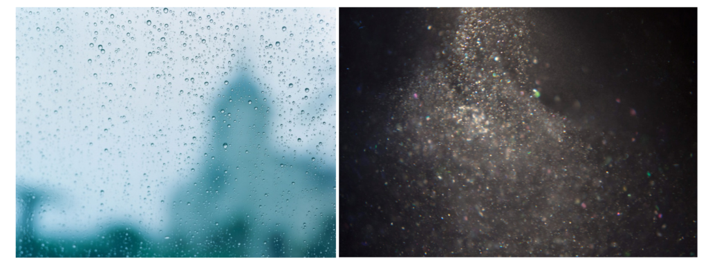
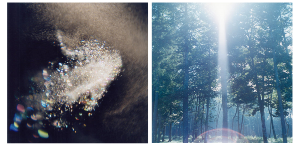
I think that this image goes well with the previous edited image as the blue and pink tones and the rounded shapes complement each other. I edited this image to have more cooler blue tones which I could contrast to my warmer toned images. I think that this is effective in giving me a variation of images that were taken in the same place. I think that this image takes more inspiration from Rinko Kawauchi as I think it follows how she takes photos depicting the ordinary moments in life and ‘the mindful awareness of what is special in simple things’ like in her images I displayed above. . Patterns created by falling and moving water is an ordinary moment and may not be something that many people notice in their day to day life which is why I think my work relates to Kawauchi’s. I also like this image as I think that the reflection of the sky on the water is emphasised by my editing. I also like how the bubbles in the bottom left corner are slightly blurred further emphasising the effect of moving water.

Abstraction


Abstraction

Abstract is a term often used in art to describe artworks that may appear to be without a recognisable subject. It can refer to artworks that use forms that have no source at all in external reality. Or to forms that are ‘abstracted’ from the real world – based on subject matter found in reality but reduced in shape, line and colour to their simplest forms. It uses a visual language of shape, form, color and line to create a composition which may exist with a degree of independence from visual references in the world.

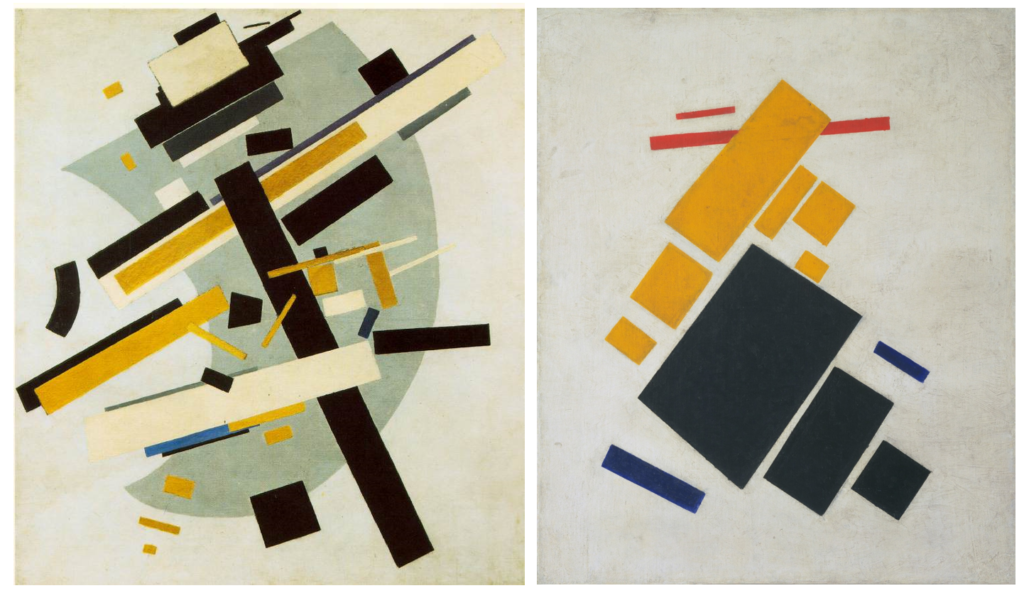
As it does not try to represent the material world, abstract art has often been seen as carrying a moral dimension, embodying such virtues as order, purity, simplicity and spirituality. Pioneers of abstract painting in the early twentieth century include Kandinsky, Malevich and Mondrian, while Naum Gabo was an early pioneer of abstract sculpture. Since then abstract art has been indistinguishable from what we now know as modern art.

Abstract Artists:

Wassily Kandinsky

modern figurative page art abstract painting artists paintings artist new works expressionism work cubism robert art abstract painting artists modern

Wassily Kandinsky is one of the pioneers of abstract art. His practice spans through different abstract art techniques and styles that would later be used by generations of abstract painters. Kandinsky first began to use expressive color masses separating them from forms and lines. Soon after that, he started to merge geometry with abstraction, thus participating in creation of geometric abstract art. Although geometric forms were not something Kandinsky was particularly interested in, in his art we see the first encounters of geometry and abstraction. Finally, his work at the Bauhas cannot be ignored. Here, Kandinsky theoretically examined the use of colors, and under the influence of Gestalt psychology, he began to focus on straight lines, which led to the contrasting tones of curved and angled lines on final compositions.
Painting was, above all, deeply spiritual for Kandinsky. He sought to convey profound spirituality and the depth of human emotion through a universal visual language of abstract forms and colors that transcended cultural and physical boundaries.

Kandinsky viewed non-objective, abstract art as the ideal visual mode to express the “inner necessity” of the artist and to convey universal human emotions and ideas. He viewed himself as a prophet whose mission was to share this ideal with the world for the betterment of society.

Kazimir Malevich

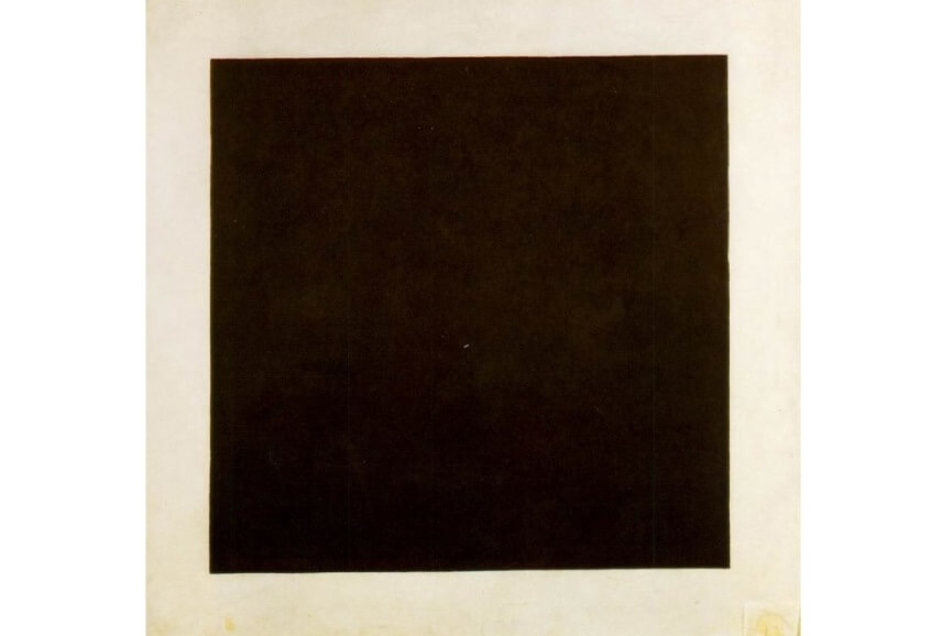
Malevich is also one of the pioneers of abstract painting, but he was also the creator of one of the most radical abstract art movements ever – Suprematism, a term which expressed the notion that colour, line, and shape should reign supreme over subject matter or narrative in art.  The main interest of Malevich (and his fellow Suprematist artists) was to search for the so-called zero degree of painting, the point beyond which the medium could not go without ceasing to be art. As a consequence, they used extremely simple motifs, subjects and forms.
The whole composition is focused on basic geometric forms, such as circles, squares, lines, and rectangles, painted in a limited range of colors. Because of his contacts in the West, Malevich was able to transmit his ideas about painting to his fellow artists in Europe and the United States, thus profoundly influencing the evolution of modern art.

More radical than the Cubists or Futurists, at the same time that his Suprematist compositions proclaimed that paintings were composed of flat, abstract areas of paint, they also served up powerful and multi-layered symbols and mystical feelings of time and space


Yves Klein


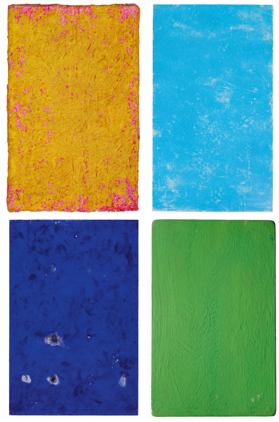
Yves Klein was the most influential, prominent, and controversial French artist to emerge in the 1950s. He is remembered above all for his use of a single color, the rich shade of ultramarine that he made his own: International Klein Blue. For many, Yves Klein has been associated with minimalism and performance art. However, his legacy within the realm of contemporary abstract art is indisputable. As Klein said himself: Blue…is beyond dimensions, whereas the other colors are not. All colors arouse specific ideas, while blue suggests at most the sea and the sky; and they, after all, are in actual, visible nature what is most abstract.
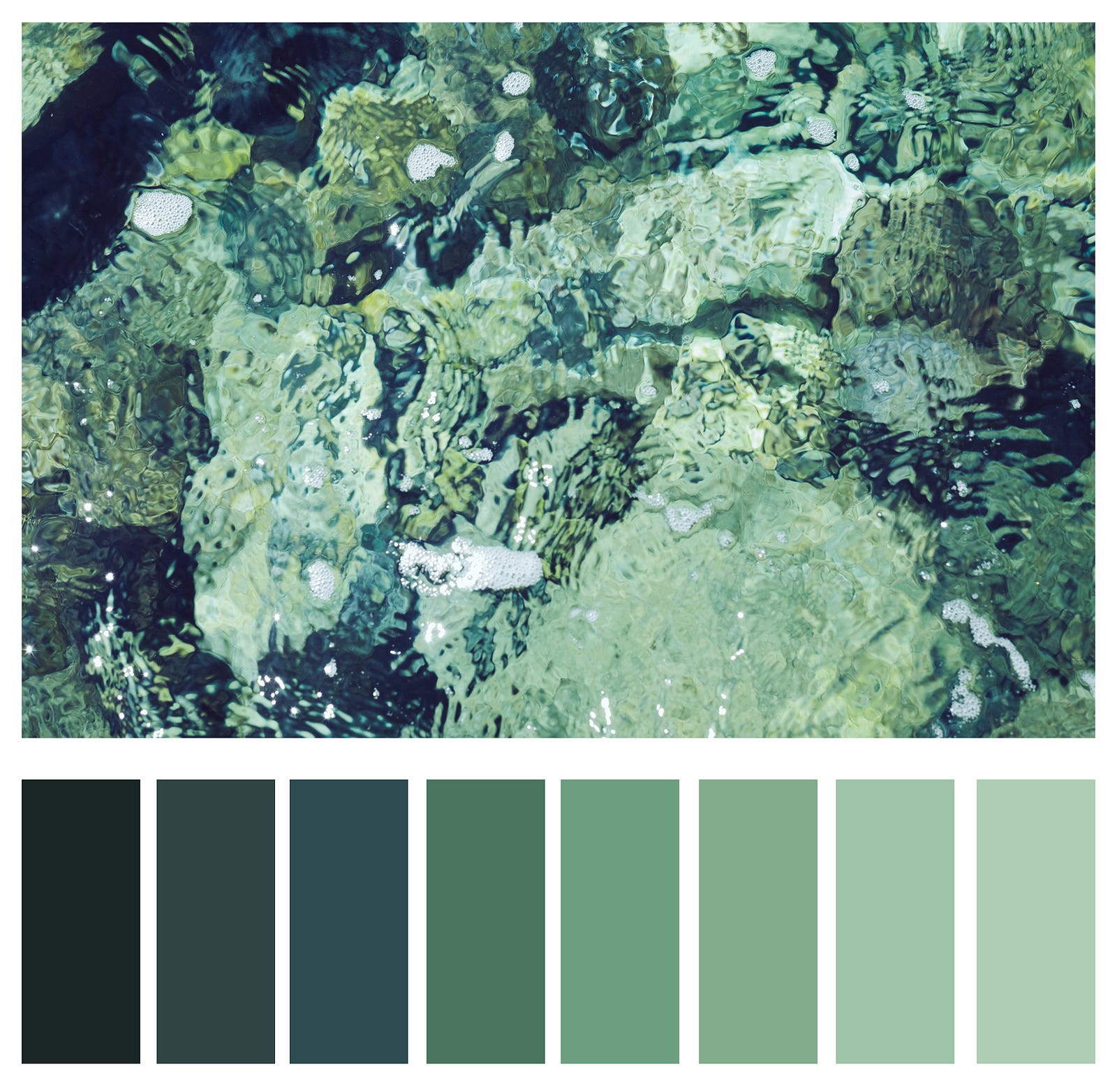
“Never using the line, one has been able to create in painting a fourth, fifth, or whatever other dimension – only color can attempt to succeed in this exploit. The monochrome is the only physical way of painting – permitting us to attain the spiritual absolute.”

http://www.yvesklein.com/files/filter_file_91.mp4

Excerpt from the film Yves Klein, La Révolution Bleue

The abstract painting that dominated French art in the 1950s was invariably premised on the notion that an artist could communicate with the viewer through the power of abstract form. But skeptics of modern, abstract art have always alleged that the viewers, like the faithful devotees of a false god, do more of the work than the artist, investing the forms with their own feelings rather than discovering the artist’s. Viewed in this light, Klein’s monochrome blue paintings might be read as a satire on abstract art, for not only do the pictures carry no motif, but Klein insisted there was nothing there at all, only “the void.”

“… I thus seek to individualize color, for I have reached the conclusion that each color expresses a living world and I express these worlds in my painting. My paintings affirm the idea of absolute unity in the context of perfect serenity, an abstract concept represented in an abstract manner (…).”

Abstract Photographers

Ola Kolehmainen

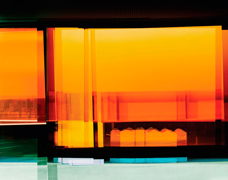
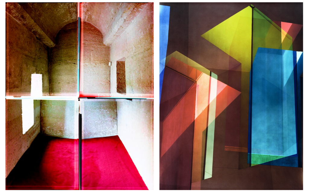
Ola Kolehmainen is a Finnish photographer whose exceptional work could easily fit into the abstract genre as we previously defined. He uses architecture as both a starting point and as his main source of inspiration. Instead of portraying architecture in a direct form, he reveals it as an examination of space, light and color, all of which reflect and question our typical, human way of looking at things.

It is intriguing to follow how Ola’s representation of buildings evolved from a direct approach into an artistic vision thanks to his closer examination of structures. Because of his unique perspective, Ola developed a more abstract and independent language that allowed him to distance himself from architecture as it is.

Recently Kolehmainen has shifted away from his traditional minimalism, and expanded into a complex approach dealing with space, light, and colour in his first exhibition centered around historical architecture. Kolehmainen photographed religious buildings in Istanbul for half a year. In addition to their historical dimension, the artist probes the buildings’ architectural volumes and light ratios: the buildings’ interiors and structural details reveal the changing light of days and seasons.

Andrew S. Gray

From intricate and nearly impossible points of view to elegant camera shakes, abstract can be done in a variety of ways from simple to complex, all of which produce elegant results. Inspired by the paintings of the old English masters of pictorialism, Andrew S. Gray creates beautiful abstract landscapes with a unique style using intentional camera movement as well as well-planned color palettes.

He personally prints his work, which speaks volumes about his workflow mastery. In fact, Gray is so generous that he even helps people around the globe with one-on-one sessions and video tutorials in addition to offering online help for anyone trying to create landscapes (or other imagery) with a similar style of abstraction.

” Inspired by the paintings of the old English masters with a mix of camera techniques and post processing I have developed these painterly impressionist images of both recognisable and abstract scenes into a style that goes beyond what many consider photography.

The looseness and ability to play without being tied by the light or weather affecting the scene you’d normally be shooting is the style’s appeal to me, also the chance of creating a scene that was not necessarily there. Using a tool of which its sole function is to capture exactly what is in front of it and then making it almost become a brush with which we “paint” is a joy. The results I have achieved since first experimenting with intentional camera movement (icm) have been more satisfying than any photograph I’ve made previously. “

Maija Savolainen

The artist, Maija Savolainen is a recognized photographer from the Helsinki School. For this specific topic, we will focus on her project called paperworks in which she created abstract and minimalist representations of landscapes using a colorful palette. Much like watching a pastel ode to Hiroshi Sugimoto, Savolainen demonstrates through her work that the simplest resources can lead to the most beautiful simplifications and abstractions.

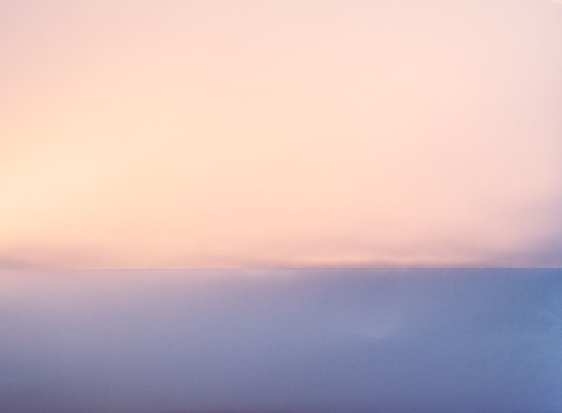
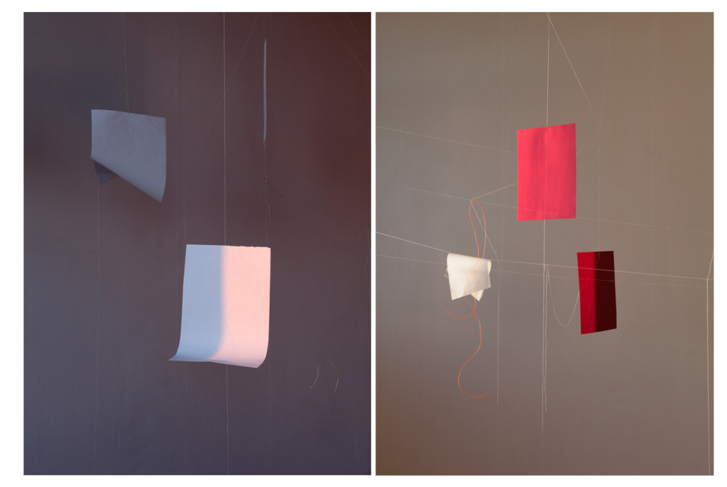
The series, Paperworks is a study on the colors of sunlight and the photographic way of seeing. The images are made with a folded, white A4 sheet placed in direct sunlight at different times of the day and year. When looking at the picture at a distance, one might see a horizon line. When taking a closer look, it becomes clear that there is something strange about the view. The horizon appears to be a fold on a sheet of paper, the colors are reflections of sunlight on the white surface; a little bit of information makes the eye see something else than before.

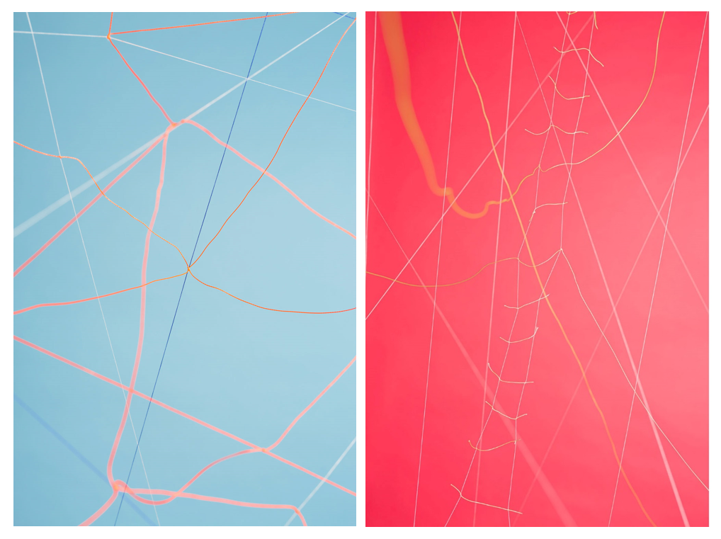
In her series ‘Works on Light’  uses recurrent materials, paper, thread, sand and reflecting surfaces in her photographs to showcase the different properties of light and the illusory possibilities of photography. “They are the elements from which other things can be formed through a photographic gesture. When the light hits a round glass plate on my hand from a certain angle it might resemble the full moon in an astounding way.”

Works on Light

Rail Baltica

“To illustrate this feature, the Helsinki-based photographer Maija Savolainen has created still-life imagery that responds, on an abstract level, to the themes raised by Rail Baltica and the Talsinki tunnel. The sets which are built from paper and yarn, evoke notions of social and economic networks, overlapping and incompatible structures, parallel and twinned cities, and liminality.”  – Crystal Bennes

Colour

Colour is the aspect of things that is caused by differing qualities of light being reflected or emitted by them.

To see colour, you have to have light. When light shines on an object some colours bounce off the object and others are absorbed by it. Our eyes only see the colours that are bounced off or reflected.Light waves carry energy, determined by frequency, carried by small packets known as photons. This energy provides the basis for human vision, solar power and digital photography.

In color photography, electronic sensors or light-sensitive chemicals record color information at the time of exposure. This is usually done by analyzing the spectrum of colors into three channels of information, one dominated by red, another by green and the third by blue, in imitation of the way the normal human eye senses color.

HOW DOES COLOUR WORK?

Before colour could be reproduced the nature of light and how we perceive colour had to be clearly understood. The scientific investigation of colour had begun in the seventeenth century. In 1666, Sir Isaac Newton split sunlight with a prism to show that it was actually a combination of the seven colours of the spectrum. Nearly 200 years later, in 1861, a young Scottish physicist, James Clerk Maxwell, conducted an experiment to show that, in fact, all colours can be made by an appropriate mixture of red, green and blue light.

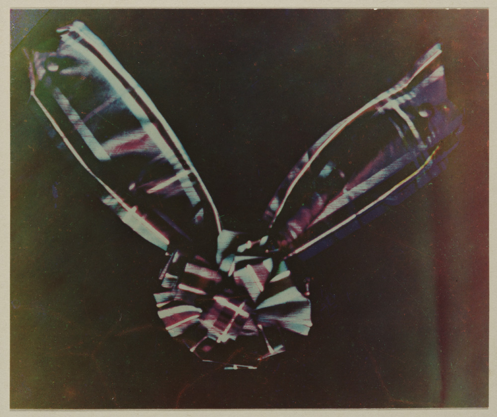
Maxwell took three separate lantern slides of a tartan ribbon through red, green and blue filters. These slides were then projected through the same filters using three separate magic lanterns. When the three images were carefully superimposed on the screen, they combined to make a coloured image which was a recognisable reproduction of the original. While Maxwell’s experiments demonstrated clearly the basic principles of colour photography, in practice, his demonstration should not have worked at all. Although the physicist didn’t know it, the photographic emulsions that he used were insensitive to red light. Fortunately for Maxwell, the red cloth in the ribbon reflected ultraviolet light. This was invisible to the eye but did register on the emulsion.

Luminance – The Absolute Measurement of Light

  • Luminance measures the absolute intensity of light, that hits the eye, after reflecting off an object.
  • Luminance is measured in candela per square meter
  • Luminance is a measured value such as velocity or weight. It does not depend on the human eye or setting, only measured physical attributes.

Brightness – Our Perception of Luminance

  • Brightness is used to denote how the human eye perceives the luminance of an object.
  • For example, a computer screen at maximum luminance looks brighter in a dark room than it would outside in the sun.
  • Although the luminance of the computer screen is the same our eyes perceive it’s brightness differently, depending on the conditions for viewing.
  • Brightness can range from dim, at the low end, to brilliant at the high end. Brightness is perceived value. It is not measured. It changes dependent of surroundings.

One person may interpret light differently than another person.  There are instances two individuals seeing the same object interpret different colours. Scientists are uncovering some interesting data on how we interpret light waves. Even though two people are seeing the same wave length they may still interpret the object to be a different colour than the other. New research suggests this can be due to things like mood and experiences.

Warm vs Cool

The distinction between “warm” and “cool” colors has been important since at least the late 18th century. The difference seems related to the observed contrast in landscape light, between the “warm” colors associated with daylight or sunset, and the “cool” colors associated with a gray or overcast day which make you feel calm, relaxed and refreshed . Warm colors are often said to be hues from red through yellow, browns and tans included. They are associated with heightened emotions and passion as well as joy and playfulness. Cool colors are often said to be the hues from blue green through blue violet, most grays included. There is historical disagreement about the colors that anchor the polarity, but 19th-century sources put the peak contrast between red orange and greenish blue.

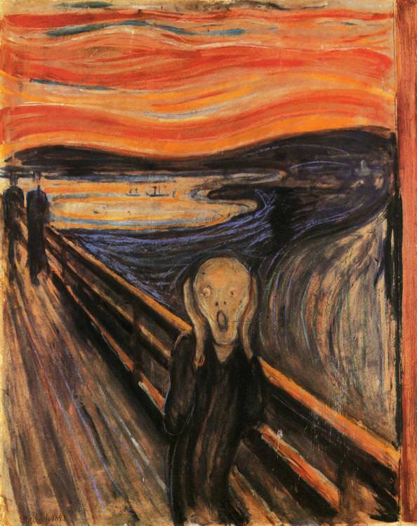
The Scream, Edvard Munch, 1893

According to Munch, “I painted this picture – painted the clouds like real blood.  The colors were screaming.[”, warm and cool color intensified fear and the feeling of hopelessness respectively, the combination of opposite color tone made the contradiction more significant and thus affecting the emotion of the audience more. 

Color theory has described perceptual and psychological effects to this contrast. Warm colors are said to advance or appear more active in a painting, while cool colors tend to recede; used in interior design or fashion, warm colors are said to arouse or stimulate the viewer, while cool colors calm and relax.

Colour Psychology

Color psychology is the study of hues as a determinant of human behaviour. Color can indeed influence a person; however, it is important to remember that these effects differ between people. Factors such as gender, age, and culture can influence how an individual perceives color.  

White:

Just as black is total absorption, so white is total reflection. In effect, it reflects the full force of the spectrum into our eyes.

Positive: Clarity, Purity, Cleanliness, Innocence, Simplicity, Sense of Space

Negative: Sterility, coldness, barriers, unfriendliness, elitism

BLUE:

Blue is the colour of the mind and is essentially soothing; it affects us mentally, rather than the physical reaction we have to red. Strong blues will stimulate clear thought and lighter, soft blues will calm the mind and aid concentration. 

Positive: Intelligence, communication, trust, efficiency, serenity, duty, logic, coolness, reflection, calm.
Negative: Coldness, aloofness, lack of emotion, unfriendliness.

YELLOW:

The yellow wavelength is relatively long and essentially stimulating. In this case the stimulus is emotional, therefore yellow is the strongest colour, psychologically. The right yellow will lift our spirits and our self-esteem; it is the colour of confidence and optimism. 

Positive: Optimism, confidence, self-esteem, extraversion, emotional strength, friendliness, creativity. 
Negative: Irrationality, fear, emotional fragility,

RED:

Positive: Physical courage, strength, warmth, energy, basic survival, ‘fight or flight’, stimulation, masculinity, excitement. 
Negative: Defiance, aggression, visual impact, strain.

Being the longest wavelength, red is a powerful colour. Although not technically the most visible, it has the property of appearing to be nearer than it is and therefore it grabs our attention first. 

BLACK:
Positive: Sophistication, glamour, security, emotional safety, efficiency, substance. 
Negative: Oppression, coldness, menace, heaviness.

Black is all colours, totally absorbed. The psychological implications of that are considerable. It creates protective barriers, as it absorbs all the energy coming towards you

Photoshoot 1

For my first photoshoot I went to St Catherines woods to explore repetition within nature, focusing on the fragility and rounded shapes that are created. I also wanted to focus on light and reflections, starting to take inspiration from the photographer Rinko Kawauchi .

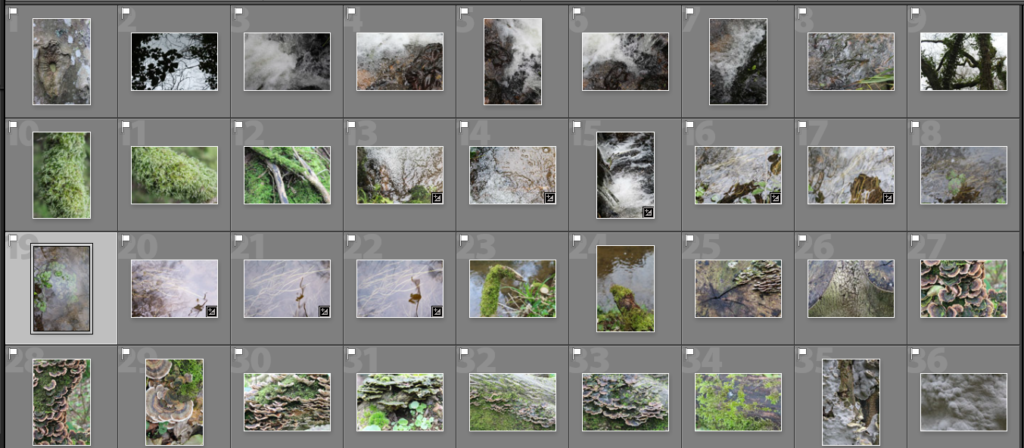
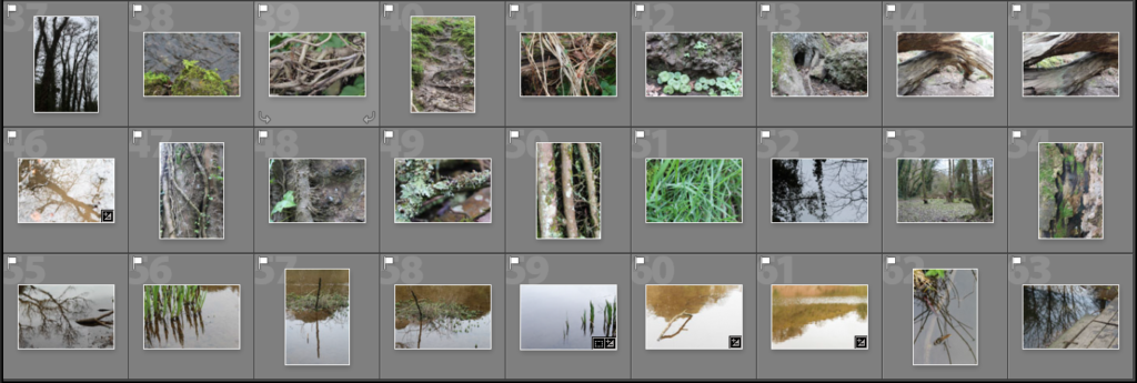
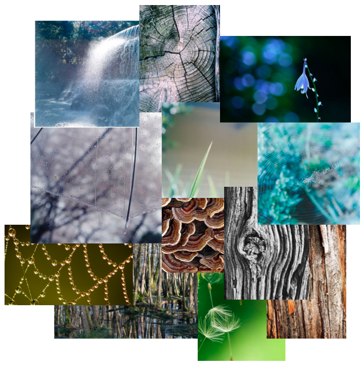
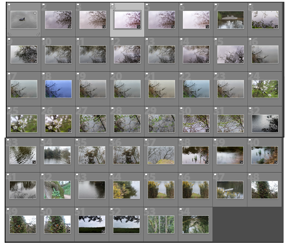
I narrowed down the 250 images i photographed to 63 and displayed them in a contact sheet below. I found that I liked the images that were close up of detailed patterns.

Reflection and Water

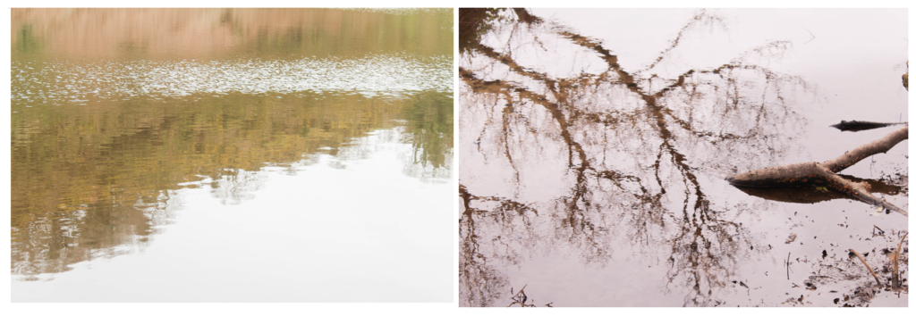
I particularly like these two images from my shoot because of the use of light in the reflections on the water. In the first image I emphasised the yellow tones of the landscape by photographing the reflection of a tree in muddy water. I tried to highlight the fragility and beauty of the tree and nature, even though it’s photographed through something that isn’t normally considered aesthetically pleasing. The mud in the water makes the reflection of the tree a yellow/brown tone which emphases the shape more. I decided to have my point of focus in the center of the image with the edges out of focus, this causes all the attention on the reflection rather than the floor around it. I also increased the exposure when taking the photo to emphasise the brightness of the sky and to interpret the work of Rinko Kawauchi. I think that this is a interesting image as instead of a straight forward photo of a tree, it uses another aspect created by nature to portray it. I also like how the tree trunk goes diagonally across, creating an interesting composition, with the detailed branches coming off the sides. I also displayed my other image below it as I think these two images work well together, both using light to emphasise the beauty of nature, both having increased exposure.

In the second image i focused on what was underneath the water and the colour of the plants, as well as the reflections of the surrounding plants. I like this image as the water moving in the stream makes the reflections of the plants blurred, creating interesting shapes. The slight reflections at the top of the image, frame the photo and create depth between the plants underneath the water. I also like how these plants are all growing in the same direction from the way the water is travelling down the stream, which is them contrasted to the reflection going vertically down at the top of the image. To me , the main focus point of the image is the darker reflection of the plant that off center. This is because its the closest aspect to the camera, and is the darkest point so is the first thing the audiences eyes are drawn to. Also because it is the only reflection that the audience can tell is a pant, as it closer and more of it is shown. I think that the nature in this image is emphasised as there isn’t anything man made, and portrays the plants how they have naturally grown. Another aspect i like is the drop of water that has created a ripple on the plant shadow as it also creates a blurred effect. In later photo shoots i could experiment with creating ripples like this on water. I think that both images take inspiration from Rinko Kawauchi but still look like my own style and interpretation. For further photo shoots I could look more into how Kawauchi takes her photos to interpret her style more.

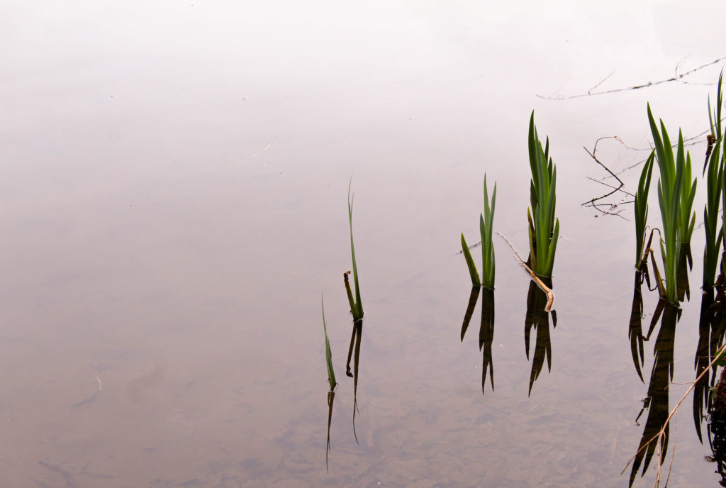
I also like this image because of how I used the negative space to make the plants and reflections stand out. When photographing, I tried to zoom in on just the plants in the water and to take out anything else. I chose this image to display as i like the reflections combined with the plants that make interesting shapes. I wanted to emphasise a feeling of calm by using the over cast weather that day to my advantage through the reflection from the sky on the water being grey/white. I like how the water goes from white at the top of the image, to darker grey/brown tones towards the bottom starting to show the ground underneath. This creates depth in the image emphasising another aspect of nature. The bright green colour of the plants is contrasted to the colour of the water, making it the first point the audience looks . To edit this image i could crop it so the space above and below the image is the same, creating a more aesthetically pleasing image. I could also experiment by changing the tones in the water to see if any other colours would go well with the green on the plants, as well as edit the water to all be the same tone so that there weren’t any darker areas. This would further emphasise my use of negative space.

Repetition

I also wanted to explore repetition and round shapes in nature as well as reflection. I think these images are completely different to the images of the first half of my shoot as i wanted to experiment by photographing in different ways to see if I prefer one technique over another, and to generate new ideas for my project.

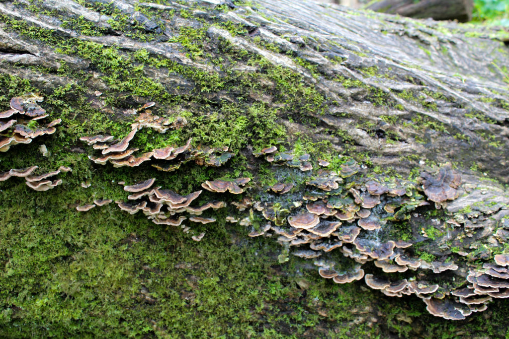
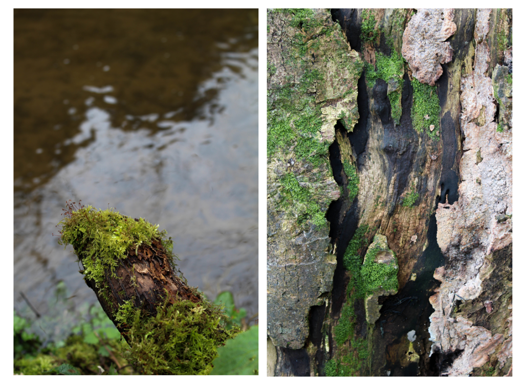
I found i was focusing on close up patterns of different textures as they look interesting when there’s more to look at. The first image is of a tree trunk on its side as I thought that the different sections of patterns create an interesting photo. The top part of the image is the pattern created from the bark on the tree. The detail is emphasised by the ranging dark to light colour, highlighting the curved lines. The center part of the image is of ” naturally grown, this section adds even more texture to the image and is a completely different pattern to the other parts of the image. These shapes interested me as they were different to any other shapes I found, the light to dark brown colours contrasting against the green on the bark adding more emphasis to them. The bottom section of the image is green and brown textured pattern which again contrast to the other sections. I like how in this image the pattern are diagonal across the image, emphasising on how the tree has naturally grown until it fell over. Overall I like this image and think that it would go well paired with another image if I were to use it in a photo book or display as the green/brown tones will complement or contrast well to other colours in nature.

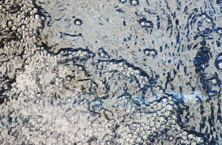
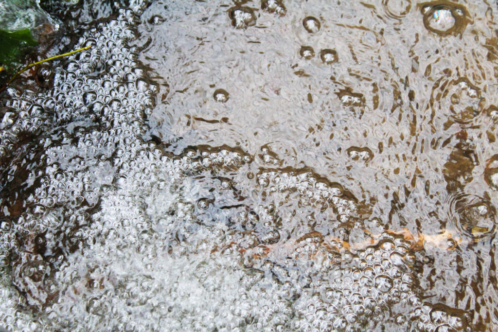
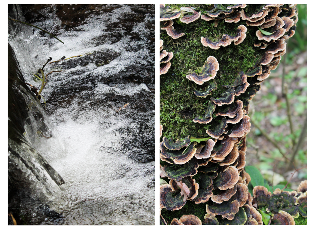
The second image I took of the bubbles creates by the stream where the circle pattern is repeated. I photographed the image so that this pattern took up just over half, which is then contrasted to the water with a different rippled pattern. I also tried to emphasise the white in the image, that is the white sky reflected on the water as I think this emphasises the shadows as there is more contrast. I like how theres a division between the bubbles and the rippled water from the shadows as it makes the patterns looks more textured and noticeable. In also like how the darkest point of the image is the right side, where the darker rock is beneath the water, which is then contrasted to the white bubbles in the center of the image, which is contrasted to the brown/white tones on the right side. This splits the image into three different sections and creates an interesting composition. I think that this image would work best displayed with another image, rather than by itself as I think that if it was contrasted to another pattern it would be more powerful.

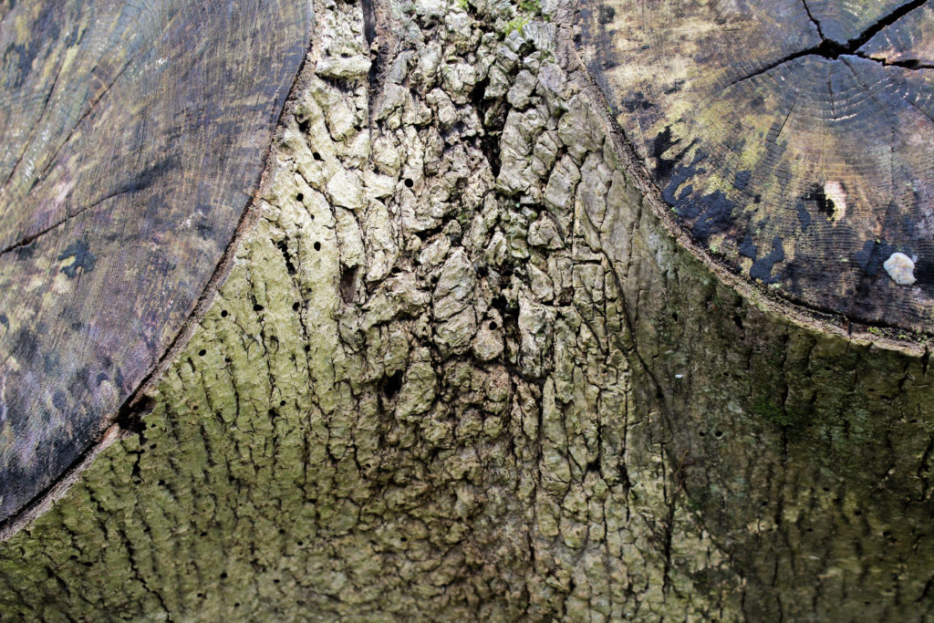
In the third image I focused on the patterns on the bark of a tree and the different tones that are portrayed . I particularly like the composition in this image as the two parts where a branch has been cut off are on the top and left corners, not showing the whole circle. I like this as it fills up the whole image with interesting patterns and create a symmetrical image. The image is not completely symmetrical as the branches have grown naturally as different sizes and in different places, emphasisng how nature is unpredictable. I think that the colour of the two cut off branch dark brown/green contrasts well with the colour of the light green bark. I focused the camera on the center section of the image as I wanted to emphasise the texture and shadows that the bark had created and the beauty within it.

Conclusion

Overall, I think this photo shoot went well and gave me more ideas the I can experiment with in future shoots. For my photo shoot where i look at the movement of water, i want to try and add more ripples to flat water, like in one of the image in this shoot to see the outcome. I also want to interpret the work of Rinko Kawauchi further by focusing more on light and perhaps focusing on fragility more in a feminine way. I think that the final outcomes from this shoot were good but i want to develop the concept of my project further and find the meaning behind the images other than my own personal appreciation fro nature. To do this I will research more artists and find inspiration from them.

Photoshoot 1- Planning

For my first photoshoot I wanted explore repetition in nature, looking at the soft shapes that plants and natural objects create and to emphasise the fragility and beauty in the shapes using light. I am taking some inspiration from the photographer Rinko Kawauchi as i like how she focuses on everyday situations and objects, emphasising their beauty, especially in nature.

I want to go to a natural area to take photos and I think that a woods would be a good place to explore as there many different things i can take images of and would be easy to find repetition. I plan to take pictures including water i.e. the shapes of waves/ripples, reflections of trees and plants on water, things you can see through the water underneath. I also want to take photos of patterns on trees, plants and in the landscape, hopefully helping me generate more ideas for my project. The lighting in the photos i take will depend on the weather that day.

Taking inspiration from Rinko Kawauchi where she looks at the opposition of light versus shadows and life versus death, Rinko believes the fleeting nature of these dualities is what ultimately determines our fragile existence.  According to Shinto, all things on earth have a spirit, hence no subject is too small or mundane for Kawauchi’s work; she also photographs “small events glimpsed in passing, conveying a sense of the transient. 

Beauty and Nature

The beauty of nature can have a profound effect upon our senses, those gateways from the outer world to the inner, whether it results in disbelief in its very existence as Emerson notes, or feelings such as awe, wonder, or amazement.  

Emerson offers is that “the simple perception of natural forms is a delight.”  When we think of beauty in nature, we might most immediately think of things that dazzle the senses – the prominence of a mountain, the expanse of the sea, the unfolding of the life of a flower.  Often it is merely the perception of these things itself which gives us pleasure, and this emotional or affective response on our part seems to be crucial to our experience of beauty. Nature is beautiful because it is alive, moving, reproductive.  In nature we observe growth and development in living things, contrasted with the static or deteriorating state of the vast majority of that which is man-made.

(Harvard University- Beauty in Nature)

I want to try and emphasise these concepts within my photography and throughout my project. I think that this is an interesting concept and is something I have yet to explore in my other photography projects. I will also look more into ideologies of beauty and picturesque in my project. For this shoot i plan to start generic images that i can develop from in my next photoshoots. I also want to photograph relations in water as I think it’s an interesting way to look at an objects from another perspective, epically in nature.

Specification

How, Who, When, Where and Why? 

To start my project I intend to explore ideas of sublime and beauty within nature, focusing on emphasising light and fragility within the natural world. I want to be able to express an emotion through my photos, whether that be using shapes, shadows, reflections and light.

The photographer Rinko Kawauchi is an artists who interested me, inspired by Japanese art and her ethnic religion, looking at portraying nature in a feminine light. This is where I will explore ideologies like beauty and the sublime and styles of Japanese art, as well as form and shape related to femininity. When I do a shoot in this concept I will emphasise the light, similar to Kawauchi.
I also want to explore uses of colour and texture and the opposing shapes and forms that are associated with the ideas of masculinity and femininity. For example to explore stereotypical views on masculinity i could photograph geometric bold structures in the urban environment, I could juxtapose these images to natural ones to represent stereotyped femininity. I will focus on soft shapes in comparison to angular ones and create a contrast between the two, perhaps looking for similar shapes within the images to connect them.
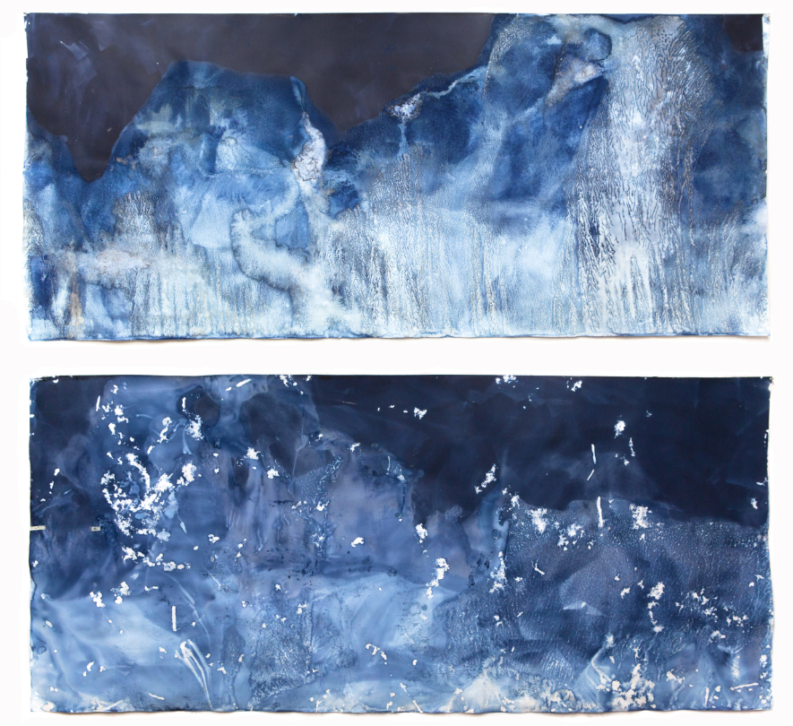
I am also inspired by the artist Meghann Riepenhoff who produces seascape without a camera looking at the tidal patterns made by ocean waves creating more abstract images. She describes her photos as a 'series of camera-less cyanotype'. I am interested in exploring her work and interpreting it as for my political landscape project I explored ideas of light sensitive paper and cynotypes and tried to recreate them. Exploring that in this project will follow on from my previous work and gives me a better understanding.
The work of Meghann Riepenhoff also links to the work of Susan Derges which is another photographer I will take inspiration from in my project. She also specialises in cameraless photographic processes, most often working with natural landscapes. Exploring the movement of water and the texture it creates is an concept i want to explore in my project.To interpret their work I will try to create cynotypes myself. I want to do this as I think it creates an interesting aspect to my project where they are photos that aren't taken by a camera, creating an effect that wouldn't be produced with a digital images.

Example Meghann Riepenhoff Work:
Example of Susan Derges:
As I continue through my project I will develop it further by evaluating what I have done successfully and work from that. I will start by exploring shapes and forms within nature that soft and rounded linking the ideas of beauty from a feminine point of view in my first shoot.  I then plan to explore the movement of water/ocean in my second shoot and will continue by researching cyantypes by Susan Derges and  Meghann Riepenhoff to do an interpretation in my third shoot. I then want to focus on abstract shapes looking at light and shadows within a landscape in my forth shoot. I am particularly interested in exploring nature and beauty as I consider it something that influences me as an individual.  

Rinko Kawauchi

Rinko Kawauchi is a Japanese photographer Her work is characterized by a serene, poetic style, depicting the ordinary moments in life.
Kawauchi’s art is rooted in Shinto, the ethnic religion of the people of Japan. According to Shinto, all things on earth have a spirit, hence no subject is too small or mundane for Kawauchi’s work; she also photographs “small events glimpsed in passing, conveying a sense of the transient. Kawauchi sees her images as parts of series that allow the viewer to juxtapose images in the imagination, thereby making the photograph a work of art[ and allowing a whole to emerge at the end; she likes working in photo books because they allow the viewer to engage intimately with her images

Kawauchi’s photographs have been described as ‘visual haikus’. Like haikus, they take note of a simple beauty in an uncluttered, non-metaphorical manner. It makes sense, therefore, that she composes haikus to accompany many of her photographs. 
Haiku is a very short form of Japanese poetry in three phrases.

Whatever her mood, Rinko Kawauchi says that taking pictures is as natural to her as drinking tea: she seizes upon anything that strikes her; insects, children, animals, scraps of ordinary life, tiny scraps of life that embody – more often than not – the ephemeral (lasting for a very short time). Inexhaustibly, her work constructs a new kind of inventory, the unacknowledged purpose of which is to emphasize the connections between human beings and the natural or animal world.


Illuminance

She simultaneously released a series of three photographic books – UTATANE, HANABI, HANAKO from Little More publisher, which created an overnight sensation in the photography world in Japan. According to Shinto, all things on earth have a spirit, hence no subject is too small or mundane for Kawauchi’s work. 

“The mindful awareness of what is special in simple things—which Rinko Kawauchi dedicates herself to in her photographs—must be contemplated on the background of the aesthetic concept of wabi-sabi. This philosophy postulates reduction, modesty and a symbiotic relationship with nature and is applied to many areas of life, whether architecture, dance, tea ceremonies or haiku poetry. Wabi-sabi allows room for “mistakes.” Applied to photography, the goal is not the “perfect photograph;” rather, expressivity and depth make a picture meaningful—and therein lies its beauty.” —LensCulture

AILA

The subject of Rinko Kawauchi’s  work “Aila” (which means “family” in Turkish) is the depiction of the essence of life: animals, plants and people are shown in a sequence assembled by free association, which also includes both birth and death. Rinko Kawauchi’s fascination in fleeting beauty, the subjects of creation and destruction, and life and death are communicated in her images.

” Kawauchi’s subject matter is intimate, personal and almost sentimental, but her photographs are not trite. She seems to take pictures from the perspective of a girl who spent too much time gazing out of the window at school, studying bugs on leaves or watching dandelions disperse in the wind. “- Frieze, review.

Seen in the opposition of light versus shadows and life versus death, Rinko believes the fleeting nature of these dualities is what ultimately determines our fragile existence. Her ‘Light and Shadow’ Project (2011) explores this theme with a poignant series of images focused on one black and one white pigeon. All proceeds from the sale of the publication went to disaster relief funds for northeast Japan

 Her images document everyday things, yet could not be described as documentary. They are generally light in tone, yet somehow dark in mood. They are almost hallucinatory, yet seem to capture something fundamental about the psychological mood of modern life.” – (Garry Badger on Rinko Kawauchi’s book “Utahan”)

I decided to explore the work of Rinko Kawauchi and to take inspiration from her in my project as i specifically like how she emphasises the light and soft colours in nature and beauty. I like how she photographs things that are ‘ephemeral’, that won’t last for long, addressing concepts like life and death in her work. I also like how photographs everyday situations and objects and emphasises the beauty that most people would.t notice, which is something i would like to do in my project as well.

John Baldessari

The American conceptual artist John Baldessari (born June 17, 1931) is known for his work featuring found photography and appropriated images. He has influenced several generations of younger artists, and since the 1960s, has consistently renegotiated his own working practice – from his earlier text paintings to reworkings of old film stills.  His work is primarily regarded as an extended humorous meditation on the nature of art itself; he is notorious for cremating his own paintings, commissioning others to make his artwork, and admonishing himself to make no more boring art.

In 1970 he began working in printmaking, film, video, installation, sculpture and photography and abandoned painting altogether, makng a diverse range of media . He has created thousands of works that demonstrate the narrative potential of images and the associative power of language within the boundaries of the work of art. 


John Baldessari
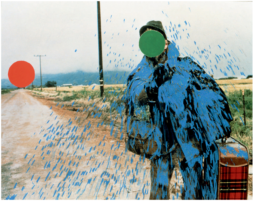
Hitch-hiker (Splattered Blue) 1995

“You know, when you’re sitting in a dentist office or doctor’s office, and you look in a magazine and, and you go, ‘What was that?’ I would like people to have that feeling, you know, that, ‘Wait, what did I just see?’ ” Baldessari says with a laugh. Like with the colored dots pasted onto photographs — they’re actually price stickers. Over the years he’d been collecting black-and-white news images — pictures of people at various civic occasions.

“I just got so tired of looking at these faces,” Baldessari says — faces of mayors shaking hands with firefighters, faces of local officials at ribbon-cutting ceremonies.

He invariably works with pre-existing images, often arranging them in such a way as to suggest a narrative, yet the various means he employs to distort them – from cropping the images, to collaging them with unrelated images, to blocking out faces and objects with colored dots – all force us to ask how and what the image is communicating


John Baldessari, Fissures and Ribbons,2004

Using two found photographs, one color, one black-and-white, and eradicating the faces in both photos with his trademark dots and color silhouette techniques, Baldessari presents two protagonists, one implicitly heroic, the other not so much. Wearing a military uniform, arms crossed, sitting upright, the hero figure is carried on the shoulders of a crowd of celebratory men, draped in streamers and balloons. The scale of the image, together with the grandeur of his pose, invoke history painting, as well as movies about World War II.  The second section is marked with orange painted lines, echoing the orange and blue painted streamers that festoon the hero’s celebration, yet here the painted lines represent lines of fracture—fissures—which show how this world is coming apart, as if under the strain of its own contradictions.

“If you can’t see their face, you’re going to look at how they’re dressed, maybe their stance, their surroundings,” he explains.

Defining of his practice was an embrace of humour, and a tendency towards producing art that, while it may appeal to more cultivated sensibility, is also accessible. For example, in his video I Am Making Art 1971 we see him repeatedly reciting the title as he raises one arm after the other consecutively.

John Baldessari
Prima Face (Third State): From Aloof to Vapid 2005


A crucial development in Baldessari’s work was the introduction of text to his paintings. It marked, for him, the realization that images and texts behave in similar ways – both using codes to convey their messages.


PRIMA FACIE (THIRD STATE): FROM AGHAST TO UPSET, 2005

Much of Baldessari’s work from the 1980s participates in a dialogue with a number of his contemporaries who were exploring questions of sexual identity and representation through photography and text. Baldessari’s interest in making the gaze explicit, in a number of works from this period, such as Man and Woman with Bridge (1984) and Spaces Between (Close to Remote) (1986), belongs to this historical moment. During this period, Baldessari also produced a series of works that explicitly deal with issues of masculinity and representation. Arguably, he shifts away from the category of Conceptual art to take up some of the political and aesthetic concerns of a younger generation


John Baldessari: Talking Art (talking about his career)

https://www.tate.org.uk/context-comment/video/john-baldessari-talking-art