All posts by Megan Woolsgrove

Filters

Author:
Category:

Spirituality and Nature

The realities explored in science and spirituality are often assumed to be unrelated to one another. Science explores the outer world with a series of questions beginning with the basic query, “What is this? What is this world all about?” while spirituality begins with the question, “Who am I?”.

In the ancient world these two forms of knowledge were not in conflict but were understood to have a deep and subtle connection. Man’s knowledge of himself complemented his understanding of the universe and formed the basis for a strong and healthy relationship to the creation in which he lived. It is the disconnect between these two types of knowledge that is causing many of the challenges that we face as a global community today.

Ancient wisdom describes human beings as having five layers of experience: the environment, the physical body, the mind, the intuition and our self or spirit. Our connection with the environment is our first level of experience, and one of the most important. If our environment is clean and positive, it has a positive impact on all the other layers of our existence. As a result, they come into balance and we experience a greater sense of peace and connection within ourselves and with others around us. Historically, nature, mountains, rivers, trees, the sun, the moon have always been honored in ancient cultures. It’s only when we start moving away from our connection to nature and ourselves that we begin polluting and destroying the environment.

Religion

While many human beings choose to measure the importance of Nature through economic value or scientific worth, the most difficult of Nature’s gifts to “measure” is its connection to our spirituality. While the spiritual self is not always linked to religion, it is more than relevant to explore the revered place that Nature has been given in so many of the world’s religions.

Christianity tells the story of a paradise on Earth, rightly situated in the beauty of a garden, and documents the efforts of Noah as he’s commanded by God to save two of every species on the planet. Buddhism teaches that all life is sacred. Muslims believe that Nature was given to humans as a gift from Allah. Indigenous cultures all over the world have celebrated the existence of Nature as their “mother”.

 Humans & Nature

Japanese Shinrin-yoku had compared how the body reacts to being immersed in nature (woodland), to being in an urban environment. The results of the analysis supported the story told above. Finding that being in the woods was calming, activating the parasympathetic nervous system associated with contentment. Whereas the urban environment stimulated the sympathetic nervous system associated with drive and threat. There’s plenty of evidence that exposure to nature is good for people’s health, well-being and happiness.

Research has consistently shown that increased connection with nature results in decreased stress, anxiety, anger, aggression, depression, and a sense of gloom; while it increases a variety of measures of physical health.

“From the smallest microorganisms to the largest animals, all life on Earth has a common ancestor.  Everything is connected to everything. ” Our relationship with nature has historically been one of imbalance and overuse.  Nearly every step in human history has unfortunately been accompanied with a leap in environmental degradation.  At first, humans were incredibly in-tune with their surroundings.  With advancements in technology and agriculture though, humans began to find more efficient ways of sustaining themselves.  These advancements allowed for more permanent settlements, which led to rapid population growth and a distancing from nature.

Nature and Mental Health

New studies find evidence in support of what we see clinically. It found that virtually any form of immersion in the natural world, outside of your internal world, heightens your overall well-being and well as more positive engagement with the larger human community.

Exposure to nature has been shown to evoke positive emotions, as well as strengthen individual resilience (Marselle et al. 2013) and coping skills (van den Berg 2010). Getting into nature has been shown to have positive impacts on concentration, learning, problem solving, critical thinking capacity, and creativity as well as enhance mental health and wellbeing through encouraging physical fitness and social engagement.

One study is from the University of British Columbia. It highlights an essential dimension of true “mental health” – the realm beyond healing and managing conflicts and dysfunctions. Mental health includes the capacity to move “outside” of yourself, and thereby Increase and broaden your mental and emotional perspectives about people and life in general. That’s the realm that grows, for example, from meditation – the mindfulness state of being grounded in awareness of the present moment. 

Sir David Attenborough talking about Nature and Mental Health

Rinko Kawauchi who i have previously looked at, believes the fleeting nature of these dualities is what ultimately determines our fragile existence. I like how she photographs things that are ‘ephemeral’, that won’t last for long which are unified by an unapologetically sublime aesthetic, a sense of wonder, and by her linking of the earthly and the celestial, the physical and the spiritual. Wassily Kandinsky, who I’ve explored also looks at spirituality in his book ‘Concerning the Spiritual in Art’ where he writes about his beliefs on how art links to humans and spiritual life. “The spiritual life, to which art belongs and of which she is one of the mightiest elements, is a complicated but definite and easily definable movement forwards and upwards. This movement is the movement of experience. It may take different forms, but it holds at bottom to the same inner thought and purpose.”-Kandinsky.

Our Spiritual Connection to Nature: https://www.huffpost.com/entry/our-spiritual-connection_b_648379

http://www.globalharmonycrew.com/nature-and-spirituality-the-earths-role-in-human-happiness

https://www.humansandnature.org/humans-nature-the-right-relationship

http://www.exploringroots.org/blog/2017/5/25/the-relationship-between-humans-nature-and-health-what-the-research-tell-us

https://www.ncbi.nlm.nih.gov/pmc/articles/PMC4157607/

Photoshoot 4

In this shoot I have displayed images where I have tried to focus on close up aspects on the environment that may not be as noticeable, especially on bold colours that stand out from the background of the image, drawn from abstract concepts. I also focused on lines and patterns made from branches. I think that this second photoshoot at Queens valley was successful in me discovering the full concept of my project concerning the relationship between nature and humans.

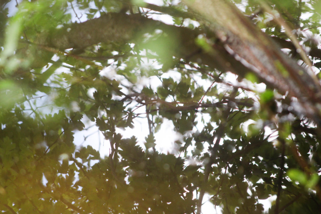
This is one of my favourite images from this shoot. I especially like how the whole image is filled with patterns and texture. I tried to focus on light and the soft colours, so zoomed in on the reflection of the trees on the water and had the leaves close up to the camera so they are blurred, creating a relationship between the camera and nature. I think that this draws on the concept I want to explore of the relationship and connection between humans and nature. By taking the photo within the plants and trees it creates the illusion of being completely surrounded by natural world as the entire frame is filled with natural objects. By focusing on aspects of light on the water reflection, and even in the close up leaves in the left corner, I think this image really draws from ideologies of spirituality and nature being connected in many ways. This is a concept I want to explore and research more in my project to get a better understanding of how nature and humans are connected in ways that many people may not know.
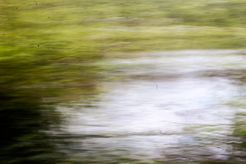
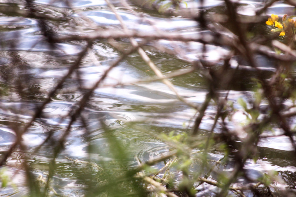
I also like the composition of this image and how the branch in the right corner is out of focus, but creates a break in the image and adds another aspect to look at. I think what makes this image stand out to me is the contrast of the bright white reflection from the sun on the water thats contrasted with the natural green and brown tones surrounded it and reading interesting patterns. I also like how the leaves from the plants that are surrounding the camera are only shown in the reflection of the water.

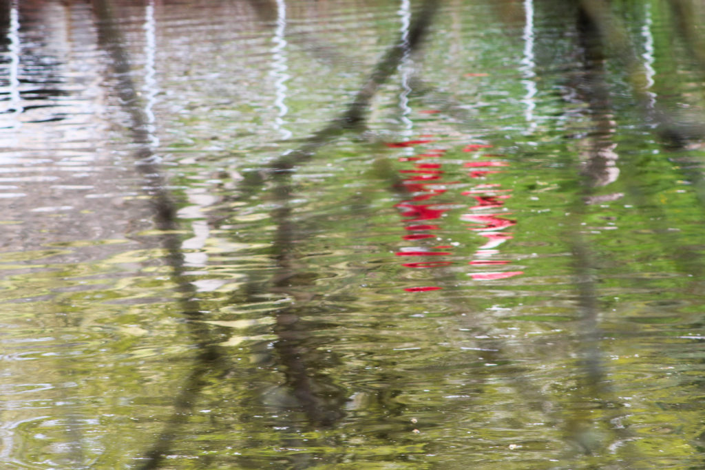
I also tried to focus on bold colours that were different from the surrounding landscape, which I think these two image above do well. The first image is of a reflection of a person walking along the path in a reflection. I chose this as an image to display as I don’t think its easy to tell that the red reflection is a person. I also liked how the red colour was completely different to the surrounding greens and browns, reflecting ideologies of abstract. I also think that the branches in front of the camera that are out of focus create another aspect to the image that makes it more interesting, and creates a similar effect to the first image in my shoot, where the camera is immersed in the nature, creating the the appearance of being surrounded by the natural world. I also think this reflects the theme of humans and nature being connected, as in this image an reflection of a person is shown on the reflection on something natural, connecting the two together.

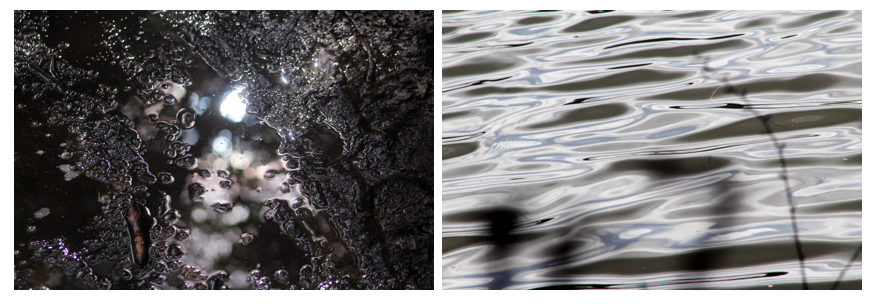
In the second image I liked the bright orange colour and the shape of the leaf contrasting against the white and brown background. What makes this image more interesting is that patterns created from the sky in the reflection water, the white colour contrasting to the patterns of orange and brown in the image. I like the composition of the leaf in the foreground and the blurred background that is divided into sections of darker and lighter. One aspect I don’t like about the composition is how the second of the orange leaves is half way out of the frame, which doesn’t create a as aesthetically pleasing image to me. Although this composition may be interesting to use in my final images as I normally take images symmetrically or which fit in the frame aesthetically, this image contrasting from what I usually do. I think that the orange colour in this image really emphasises the spirituality of nature and plants, as it stands out from the less bright background of brown, focusing on a smaller aspect of nature and it’s ethereal beauty.

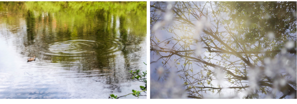
This image stood out to me when selecting my final images for this shoot as I think that has a simplistic and calm appearance that not many of images had. I think this is because in this image the lines/ripples in the water are repetitive and consistent, whereas in most of the other images, I photographed things in the landscape which were more unusual meaning that the patterns and lines were not consistent and more disorderly. I this image the ripples start light towards the foreground of the image and gradually become darker towards the background, creating a more aesthetically pleasing range of colours and composition. What makes this image interesting is the duck which is placed in a unusual place in the frame. Instead of photographing the duck towards the centre of the image, i decided to place it at the top left corner so both the ripples in the water and the duck are seen. I think that this image also reflects ideologies of spirituality and nature through the ripples made by the duck in the water and the undisturbed, tranquil appearance which further emphasises the peaceful nature.

I think this is an interesting image that builds from some f the images I took in my first photo shoot of the same type of water plant in a different area. In my first image i only focused on the plant, with the surrounding water being flat, whereas in this image the plant is surrounded by leaves and sticks fallen from the surrounding nature. This creates an interesting pattern that contrasts from the vertical green lines of the plant coming out of the water. I focused on only photographing one of these plants as i wanted it to seem out of place within the background of the image which is what I think I achieved. In comparison to the background the green tones of the plant are bright an is similar the second photo in this shoot, focusing on a smaller aspect of nature and it’s ethereal beauty. I also like how this plant is growing out of the water as I think it reflects concepts of new life and nature having a spirit.

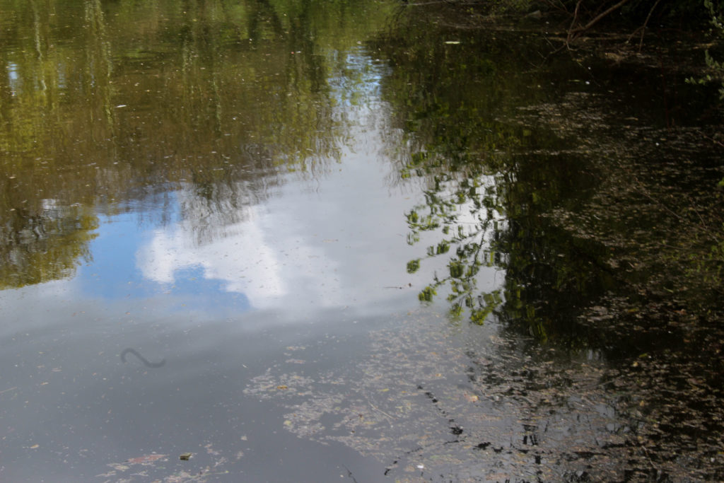
I also decided to take a photo in the same place as my second photoshoot of the reflection of the same plant, as I was interested in how an image of the same natural object can look so different at diffrent time of the day and with different weather. On my second photoshoot the weather was slightly cloudy and overcast, whereas for this shoot the sky sky was blue, which is why the reflection on the water creates a different appearance for the image. I tried to photograph this emphasising the light and the reflection of the blurred white cloud against the water as I think this creates an image that is more spiritual and focuses on the beauty of nature.

Abstract Reflections

In this shoot I also focused on shapes in the landscape that had sections of bold colours, as I wanted to explore ideas of abstract more and thought that by photographing reflections in water creates a distorted appearance of bright colours. The weather on this shoot was good as the bright blue sky contrasts against the clouds in the sky, which I could then juxtapose to the colours in the landscape.

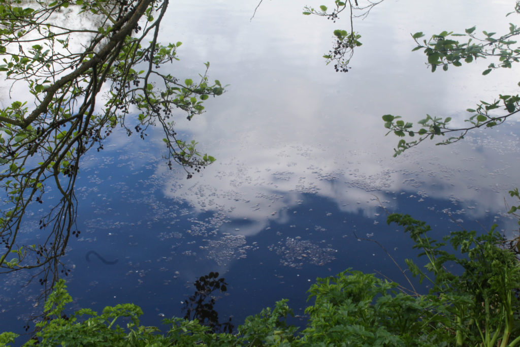
For this image I used a slight longer exposure than the rest of the images when photographing abstract shapes. I think this was effective as it captured the slight movement of the water which made the clouds look less like a reflection and more like part of the water which I think adds to the spiritual quality of it. I like the composition of how mage is framed by the surrounding plats, especially on the left side where the branches from the trees goes close to the water. I also like how the bottom section shows a different type of plants that is more green and is apart of the plants on the ground. I think that this contrast between the green of the leaves and the bright blue and, that is the sky reflected on the water, is effective. It creates sections within the image of different colours with different patterns that I think reflect abstract art and photography.

Andrew S. Gray

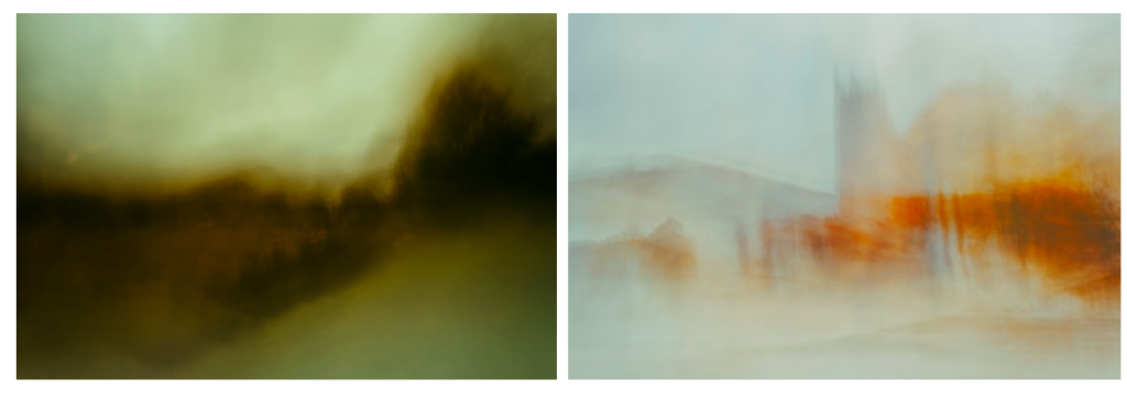
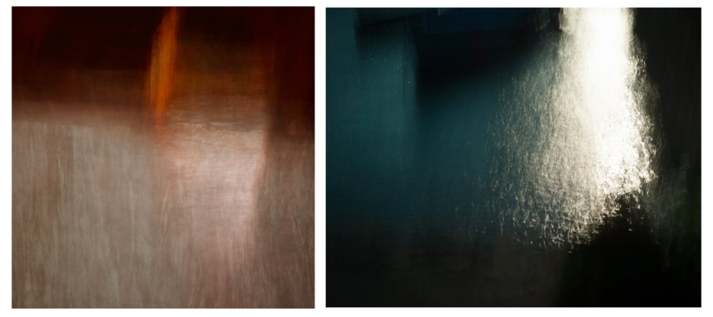
I think this shoot also reflects the work Andrew S. Gray similar to my previous shoot, as in some of his landscape images he captures bright solid sections in his blurred photos. In this shoot where I looked at abstract shapes I think that the solid colour sections reflects Grays work. When editing these images I could alter the hues in the natural aspects to be more brightly coloured and abstract. One difference between both out images is that in some he doesn’t pick up the details of the landscape (like the image on the left whereas in my images I still includes the patterns, shapes of leaves and light reflection on water as I thought that these elements were necessary. I didn’t try to blur the images in these shoot, like my previous shoot, as I wanted to try interpreting his work in a different way.

Experimentation: Warm vs Cool

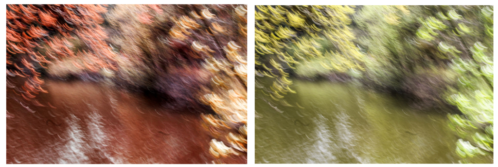
When editing these images in light room and photoshop I tried to emphasise the warm tones and cool tones by creating different variations of the same image, looking at orange, red and blue tones. I think for this image, emphasising the warm tones orange and red was more effective as I feel it further emphasises the spiritual quality that the image has. The colours yellow, orange and red remind me of positive emotions rather than negative. For example, the colour yellow. Nearly all cultures tie this colour to a sense of warmth, both physical and emotional. In Japan it represents bravery. Many religious groups, particularly those from Ancient Egypt and in Hindu tradition align the colour yellow with the Divine. Consider that the halos of the angels typically appear in a yellow or gold colour. Spiritually speaking it represents the element of fire, our sense of vision, energy, harmony and personal identity. Orange is sacred in Hinduism. It is in the Fifth Ray of 7 that classifies humans mystically. In general symbolism, orange brings happiness and health into our lives. In the Tarot it symbolises the intellect and spirituality. Cool colours i.e. blue is often connected with spiritual studies, meditation, and Magical practitioners use blue or purple to represent the Water element. To me the colours orange and red make the image have a warmth and spiritual quality that couldn’t be achieved with cool colours. I also like how this image the close up leaves that are are out of focus from being close the camera are still noticeable and are emphasised with the colour yellow. Because you can see through these sections, it makes the leaves look transparent and emphasises the range tones in the image. The cool editing has a different appearance and an atmosphere thats calming and tranquil, creating a more peaceful image.

Wassily Kandinsky Work

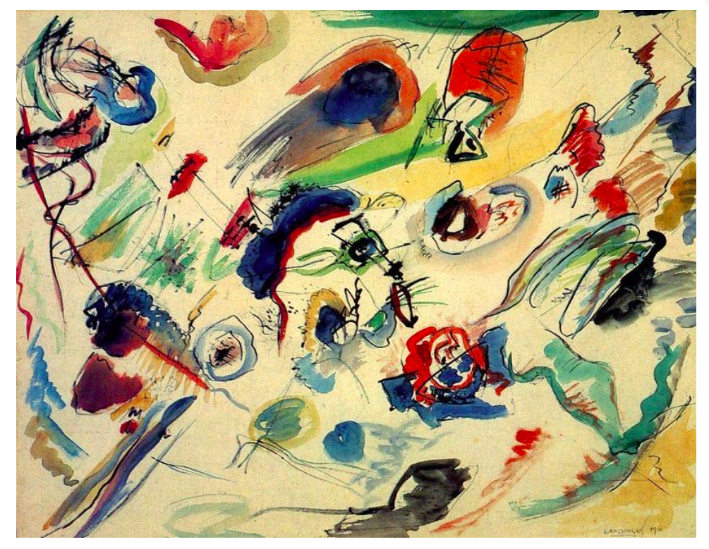
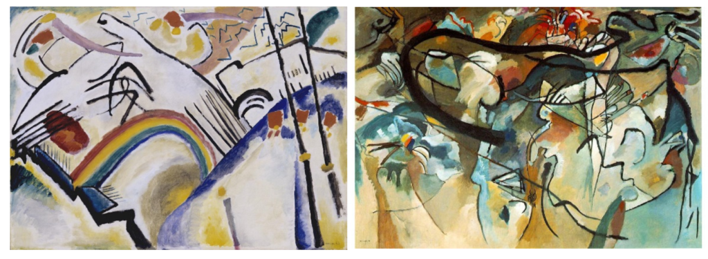
My image above reminds me of this artwork by Wassily Kandinsky through many different aspects. One way is through the colours used, ranging from blue, to orange to red, similar to me editing where I emphasised the cool and warm colours. I also think it links to this piece through the shapes and lines. In my image the reflection of the leaves on the water show the light shine through the leaves, creating circular and interesting shapes, which I think are shown in Kandinsky’s painting where he emphasises circular shapes and rounded lines. The rounded shapes in my image are the small branches that are shown to be above the water, contrasting against the pattern of the leaves the water. One difference between mine and Kandinsky’s painting is that he uses abstract shapes with geometrical patterns, my image does not contain these as they are not shapes that are created in nature and represent Kandinsky’s theories in his book ‘Concerning the Spiritual in Art’ where “This essential connection between color and form brings us to the question of the influences of form on color. Form alone, even though totally abstract and geometrical, has a power of inner suggestion. A triangle (without the accessory consideration of its being acute — or obtuse — angled or equilateral) has a spiritual value of its own.The case is similar with a circle, a square, or any conceivable geometrical figure” I think I could further emphasise these theories in my future work. For example I could like at different shapes as Kandinsky believed that “The mutual influence of form and color now becomes clear. A yellow triangle, a blue circle, a green square, or a green triangle, a yellow circle, a blue square—all these are different and have different spiritual values.”

“Like symphonies, Kandinsky’s great abstract paintings speak directly to our senses and feelings. Their constellations of mysterious marks are like waves of sound that trigger emotions.” For him, the world they pointed towards was a spiritual realm, a hidden truth. I think that some of the images in this shoot, especially the ones where I focused on abstract landscapes, reflect some of Kandinsky’s earlier work where he focused more on landscape. For example in Kandinsky’s painting above, he used tones of the same colour in different sections of the painting, which I think is reflected some of my images, especially when I edited them to have different hues. The difference between these images are that Kandinsky focused on landscapes whereas I looked at reflections on water because I thought that the distorted image of the aspects in the landscape would be effective.

Photoshoot 3- Landscape Experimentation

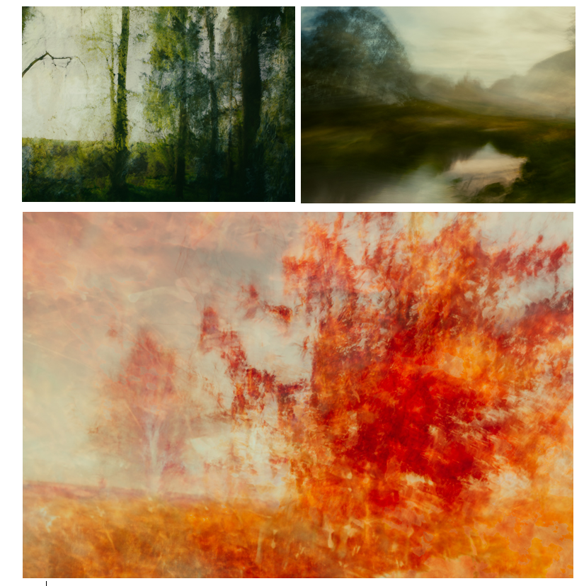
On this photoshoot I narrowed down the 400 images I took to 68 so I could look through them am pick which ones I like the most and the ones I want to be my final outcomes. On this shoot I focused on abstract shapes in some of the images and also took inspiration from the photographer Andrew S. Grey where he moves his camera when taking the images, to create a blurred effect which he takes inspiration from early english landscape painters. I think that some of the image I took whilst moving the camera were effective, but a lot of them weren’t as it was only the second time I have experimented with this technique. I chose the ones I thought were most effective and displayed them below. I also displayed the images where i focused on abstract shapes in a separate blog post that have bold solid colours. I separated this into two photoshoots so i could display my experimentation and edits with them and also because I thought that the images I took were completely different styles with different techniques.

Andrew S. Gray Interpretations

When taking these photos I found it hard to create goos compositions of the landscape as I couldn’t see exactly what the final image what turn out like until i had taken the image. This want had had to many different variations of images of the same angle to find a good composition. I also found it hard to fins the right shutter speed to use when photographing so experimented with a variety to find one to make the image blurry, but not so much that you can’t see the outlines of the shapes e.g plants and tress in the image.

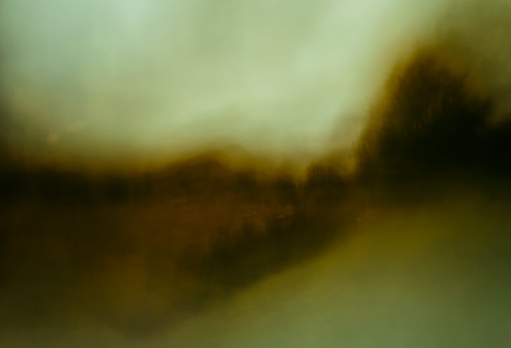
I think that this image is a good example of this, as you can still see the outline of the tree on the right see of the image, the bright water, and the trees along the horizon. I also think that the colours in this image complement each other well with the bright pale blue on the water, with the variation of green tones from darker to lighter. I think that this is one of the better compositions i took in this shoot as it’s divided into section, all contrasting one another from the colours. I think that this represents the work of the photographer Andrew S. Gray well as I think resembles the work of early english landscape painters, where the blurred lines look like brush strokes of a paintbrush.

I think the this style of photograph greatly contrasts from the other photos i have taken in this project and portrays nature from a different perspective. Instead of the detailed, sharp, in focus photos i have previously taken where I focus on the outline and patterns, these images are blurred and in the moment shots. I think this gives them an effect like I have taken the photo as I’ve quickly passed the scene. I think that this linked to the photographer Rinko Kawauchi who i have previously looked at as she believes the fleeting nature of these dualities is what ultimately determines our fragile existence. I like how she photographs things that are ‘ephemeral’, that won’t last for long. I think this concept is represented in this style of work through the blurriness, creating movement and represents the ‘fleeting nature’.

I particularly like this image as I like how the lines from moving the camera are even more noticeable than in the other images. I think that this effect takes the bright and darks parts of the image more noticeable as they’re separated from the rest of the image. As the tree was in the foreground when the image was taken with a moving camera this part is more i focus than the background go the image where the trees are completely blurred. I like the colours that are i this image, as they range from brown to green to bright green which all complement each other and emphasise the effect of the natural landscape. I also like this composition the most out of all the images I took with this technique as it was hard to see where the different aspects of the image were placed in the frame. I like how the sections are created by the edge of the reservoir with the two trees in the foreground.

Work by AndrewS. Gray

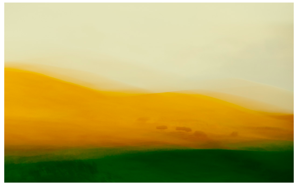
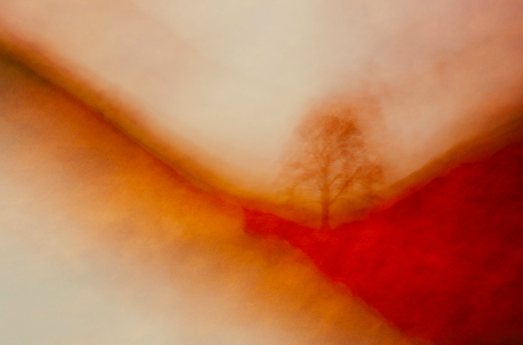
I think i have successfully taken images taking inspiration from Andrew S. Gray where he creates camera in motion images. A technique called intentional camera movement mixed with various editing processes create his abstract landscapes. Some are recognisable vistas, whereas some form from feeling and emotion as if from a paint brush. I eel i interpreted his work well,even though i haven’t experimented with this technique a lot. This might explain why in some of his image there s more focus in some areas thelawdscape than other, through practising this technique Andrew S. Gray has developed his own style. In my images there are less areas in the landscape that are i focus. Also in Gray’s he emphasises light and reflections, and warm colours, especially in the image above. In my images I tried to emphasises the earth tones like green and brown as I thought the contrast between the sky and the green was effective.

I think that this photoshoot was good in developing the style of images I want to take in my project and allowed my to experiment with different camera techniques.

Experimentation

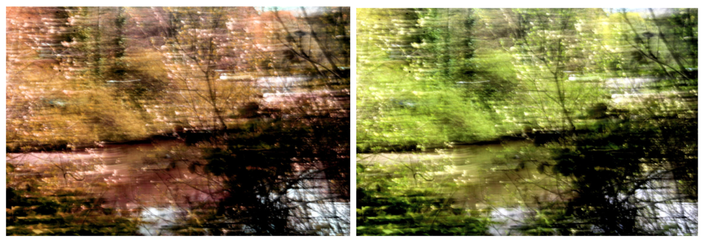
I wanted to try and experiment with different hues in the images to create more abstract appearance with bright bald colours. I edited the same image and created different variations with warming colour colours. This edit makes the image less identifiable as a natural landscape, making it more abstract as it hard to tell what it’s taken of. Some of the patterns and textures are still shown in he image, but the image looks unnatural through the bright colours that wouldn’t necessarily found in a natural landscape. I like these edits of this image, but think that my project will be most effective you can see more of the natural aspects the abstract landscape.

I also experimented by slightly adjusting the tones and colours in the image to more natural colours, so that the landscape is still recognisable. I think that these images are more effective for my project and touch on concept of spirituality through the blurred light lines on the landscape to me looks other-worldly, especially with the warm colours emphasised. I also think that these edits interpret the work of Andrew S. Gray more effectively sin many of his images he uses editing to emphasises the natural colours and brighter abstract colours to make the landscape stand out more. I found that liked to emphasise warm colours within his work which is what I tried to do in these experimentations. I also think that these works represent the of the early English painters more as the lines created by the movement of the camera is further emphasised by the shadows and highlights I emphasised.

Evaluation

I think that this shoot was successful in interpreting the work of Andrew S. Gray and in experiment with different camera techniques that I haven’t tried before. These photos are completely different from the detailed and focused images I normally take which is why I enjoyed this shoot as it allowed me to experiment with a different style of image. I also think allowed me in a different light, emphasising the ideas that things are ephemeral’, that won’t last for long emphasising the fragile existence of nature. I think these images link to this idea of fragile existence’ as the blurred effect makes the plants and natural objects seem momentary and delicate, which is an effect that wouldn’t be achieved through in focus images. In future shoots I want to link in humans to this existence and how they are connected.

I think that some of the final images from this shoot could be used within the final photobook and final images of this project as although they are different from my other images, they could create a different aspect to my work that makes my final project images more interesting.

Andrew S. Gray

Inspired by the paintings of the old English masters with a mix of camera techniques and post processing I have developed these painterly impressionist images of both recognisable and abstract scenes into a style that goes beyond what many consider photography.

The looseness and ability to play without being tied by the light or weather affecting the scene you’d normally be shooting is the style’s appeal to me, also the chance of creating a scene that was not necessarily there. Using a tool of which its sole function is to capture exactly what is in front of it and then making it almost become a brush with which we “paint” is a joy. The results I have achieved since first experimenting with intentional camera movement (icm) have been more satisfying than any photograph I’ve made previously.

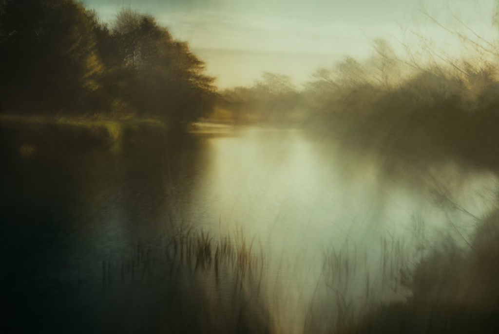
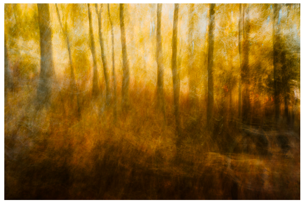
I like this image as you can still see the details of the plants in the foreground, becoming more blurry towards the back of the image. This is effective as it creates a balance between movement and detail on the landscape. I also like how in this image he only emphasised the natural colours in the landscape, rather than changing the colours in editing after the image was taken which is something he does in his photos. I like him emphasising the natural colours as it makes the landscape look more realistic and a true depiction of nature. On the other hand, it takes away from the abstract qualities of his other images where he emphasises bold shapes and bright colours. I also like how he contrasts the bright parts in the middle of the image, to the darker parts around the edges of the image, as it makes it more interesting and emphasises the composition.

With Northumberland as a home its iconic but subtle landscapes, coastline and nature in general have shaped my vision from an early age and continues to inspire me – though the thought of the challenge of a change of scene does appeal now and again. ended up with me all but abandoning the “reality” of photography and instead I use the old English master painters of the 19th century, along with the later impressionists as my inspiration to create the work I currently do. A huge influence and someone I actively try and mimic in form and colour scheme is JMW Turner.

I chose Andrew S. Gray as an artist to take inspiration from as I wanted to experiment with the way I photographed images and thought that the technique he uses, by shaking his camera and editing the images to emphasise the colours, was a good way to do this. I also like how he takes inspiration from old English painters and the impressionist movement through the movement and looseness of the lines in the images, creating a blurred effect, but still being able to see the aspects and colours of the landscape which are important. I also like his focus on abstract shapes and colours which I have done previous research into. He focuses on emphasising the bold shapes in the landscape which is something I will try to interpret. I think that by interpreting this work it will contrast from the way I normally taking photos which is very detailed and precise, always focusing on the composition. By doing this technique it doesn’t allow me to find a good composition as easily through the movement of the camera. With my images that I produce, I want to be able to compare them to images I’ve previously taken in the project and see whither they would be effective to use as final images for this project.

Wassily Kandinsky

Spirituality

Russian-born artist, one of the first creators of pure abstraction in modern painting. After successful avant-garde exhibitions, he founded the influential Munich group Der Blaue Reiter (“The Blue Rider”; 1911–14) and began completely abstract painting. His forms evolved from fluid and organic to geometric and, finally, to pictographic. A sensitive and reflective child, Kandinsky was fascinated by the fanfare of sensory experience that childhood affords, through colour and sound and music

An event that effected his abrupt change of career in 1896: seeing an exhibition of French Impressionists in Moscow the previous year, especially Claude Monet’s Haystacks at Giverny, which was his first experience of nonrepresentational art. The impressionists used values of color and light to show their subjects rather than painting in fine detail. and then hearing Wagner’s Lohengrin at the Bolshoi Theatre. Kandinsky chose to abandon his law career and move to Munich to devote himself full-time to the study of art.

He began with conventional themes and art forms, but all the while he was forming theories derived from devoted spiritual study and informed by an intense relationship between music and color. These theories coalesced through the first decade of the 20th century, leading him toward his ultimate status as the pioneer of abstract art. Color became more an expression of emotion rather than a faithful description of nature or subject matter.
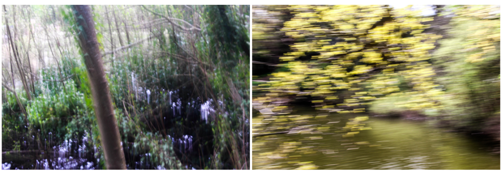
Concerning the Spiritual in Art  Book

Kandinsky’s book ‘Concerning the spiritual in art’ explains Kandinsky’s own theory of painting and crystallizes the ideas that were influencing many other modern artists of the period. Along with his own groundbreaking paintings, this book had a tremendous impact on the development of modern art.
Kandinsky’s ideas are presented in two parts. The first part, called “About General Aesthetic,” issues a call for a spiritual revolution in painting that will let artists express their own inner lives in abstract, non-material terms. Just as musicians do not depend upon the material world for their music, so artists should not have to depend upon the material world for their art. In the second part, “About Painting,” Kandinsky discusses the psychology of colors, the language of form and color, and the responsibilities of the artist.

“The spiritual life, to which art belongs and of which she is one of the mightiest elements, is a complicated but definite and easily definable movement forwards and upwards. This movement is the movement of experience. It may take different forms, but it holds at bottom to the same inner thought and purpose.”

He goes on to offer a visual metaphor for our spiritual experience and how it relates to the notion of genius:

The life of the spirit may be fairly represented in diagram as a large acute-angled triangle divided horizontally into unequal parts with the narrowest segment uppermost. The lower the segment the greater it is in breadth, depth, and area.

“When religion, science and morality are shaken … and when the outer supports threaten to fall, man turns his gaze from externals in on to himself. Literature, music and art are the first and most sensitive spheres in which this spiritual revolution makes itself felt. They reflect the dark picture of the present time and show the importance of what at first was only a little point of light noticed by few and for the great majority non-existent. “

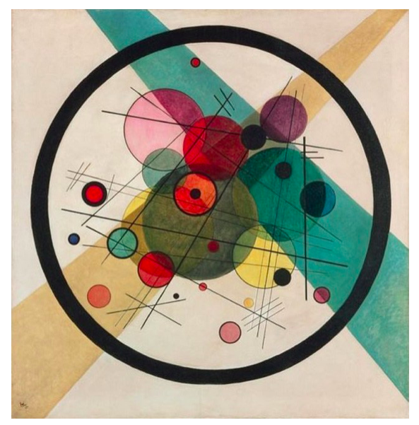
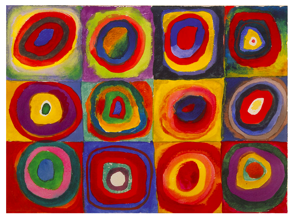
Wassily Kandinsky, ‘Several Circles’ (1926)

“This essential connection between color and form brings us to the question of the influences of form on color. Form alone, even though totally abstract and geometrical, has a power of inner suggestion. A triangle (without the accessory consideration of its being acute — or obtuse — angled or equilateral) has a spiritual value of its own. In connection with other forms, this value may be somewhat modified, but remains in quality the same.

I chose Wassily Kandinsky as a main artist to take inspiration from in my project, especially his theories on spirituality and art, as I think it links to my previous work and is a concept i can build on in my future photo shoots and will develop my work conceptually and contextually. “This essential connection between color and form brings us to the question of the influences of form on color. Form alone, even though totally abstract and geometrical, has a power of inner suggestion.” He states that shapes have spiritual value which is something I want to draw on in my images.

Shape and Colour Theories

Like symphonies, Kandinsky’s great abstract paintings speak directly to our senses and feelings. Their constellations of mysterious marks are like waves of sound that trigger emotions. For him, the world they pointed towards was a spiritual realm, a hidden truth.

‘For Kandinsky, art was a spiritual and emotional experience. He wanted his paintings to transcend recognized forms and express feelings through colors and shapes. Kandinsky argued that artistic experiences were all about feeling, and different colors affected mood. Colour had the ability to put viewers in touch with their spiritual selves. For Kandinsky, yellow could disturb, while blue might make people feel good. Kandinsky’s thoughts on color were similar to Johann Wolfgang von Goethe’s belief that different colors can convey certain emotions. The warm colors – red, yellow, and orange – are usually considered lively colors that can sometimes be harsh. The cool colors – green, blue, and purple – are considered more peaceful and subdued. Kandinsky was especially fond of blue. He also discussed the neutrals, black, gray, and white. White is silence and quiet, and black is completely devoid of possibility. Gray can go either way.’

He formulates two core sensory distinctions between yellow and blue in terms of movement:

  • Yellow moves towards the viewer, outward from the picture plane. Blue recedes, that is, moves away from the viewer.
  • Yellow moves out of itself, that is, a yellow colour area seems to expand. The blue moves within itself, concentrically.

Kandinsky links yellow with human energy:

“The first movement of yellow, that of approach to the spectator (which can be increased by an intensification of the yellow), and also the second movement, that of over-spreading the boundaries, have a material parallel in the human energy which assails every obstacle blindly, and bursts forth aimlessly in every direction.”

Yellow is an “earthly colour”, which therefore can never have a profound spiritual meaning. This is the prerogative of blue: “The power of profound meaning is found in blue, and first in its physical movements (1) of retreat from the spectator, (2) of turning in upon its own centre. The inclination of blue to depth is so strong that its inner appeal is stronger when its shade is deeper. Blue is the typical heavenly colour.” In other words, his interpretation of this colour contrast is anchored to familiar fundamental dualities: “matter” against “spirit”, “earth” against “heaven”, “man” against “God”, etcetera (admittedly, he doesn’t actually use the word “God”).

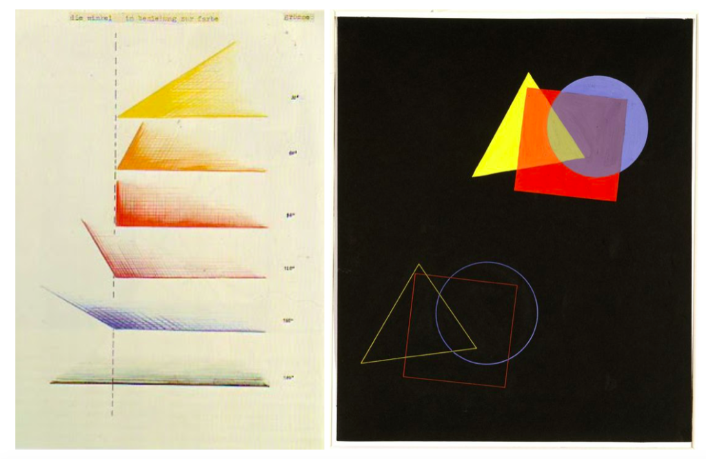
The Spatial Effect of Colours and Shapes, author: Eugen Batz, 1929

The Color theory was published in 1911 and meant to explain the painter’s palette in two ways: the effect on the eye (person’s physical understanding of the color) and “inner resonance”, phycological effect, when it effects your spiritual experience.
The theory describes not only the colors but the geometrical objects and it’s impression on the viewer:

“According to Kandinsky…, a dull shape like a circle deserves a dull color like blue. A shape with intermediate interest like a squaredeserves an intermediate color like red. A dynamic, interesting shape like a triangle deserves an enegetic, luminous, psychotic color like yellow.


Photoshoot Plan

Photoshoot 3

For my third photo shoot I plan to explore the fragility linking the relationship between human and nature, and ideologies of beauty. Doing this will allow me to develop my previous ideas further. I want to take inspiration from the photographer Andrew S. Gray who is inspired by
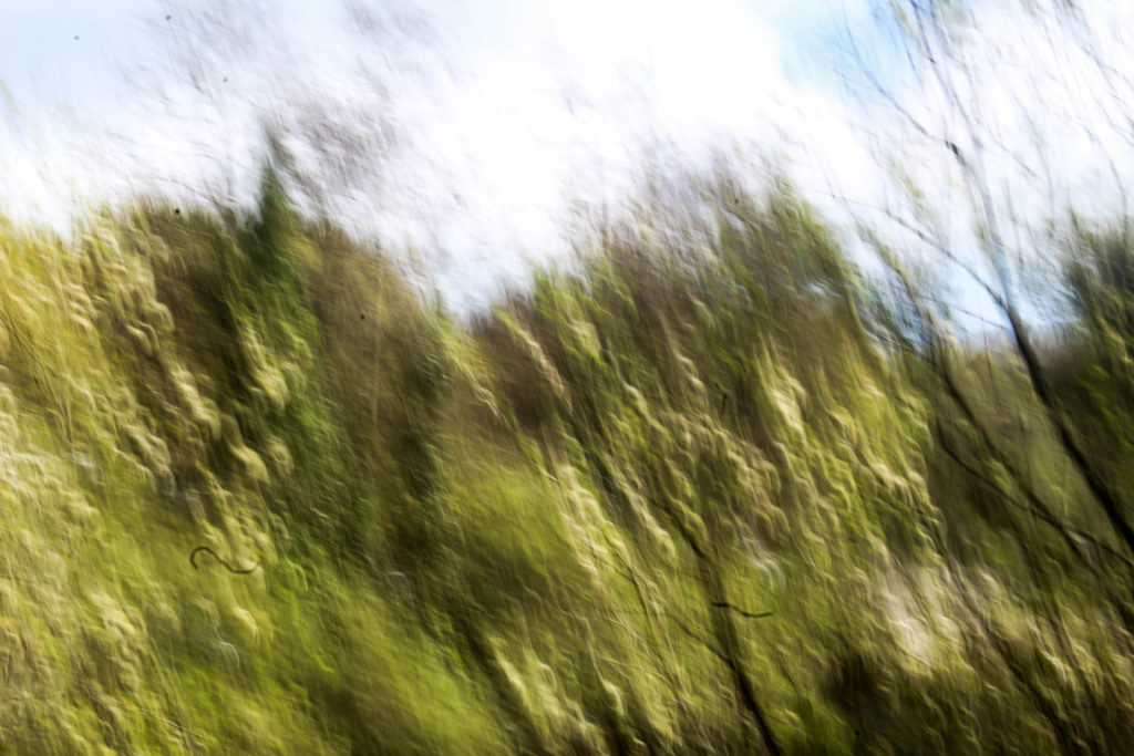
paintings of the old English masters  who through camera techniques and post processing have developed painterly impressionist images of both recognizable and abstract scenes. I started experimenting with this in my second photo shoot by adjusting the shutter speed when taking photographs of the reflection of a tree in moving water. Doing this made interesting shapes and lines that were blurred and that I think were effective. I want to develop this further in my third photo shoot exploring photographing landscapes and moving the camera, as well as photographing moving water and reflection. Doing this expresses spirituality in nature and the fragility through the soft blurred lines.

By trying to interpret the work of Andrew S. Gray I will be exploring abstract photographing in a different way to how I am looking at the artist Kandinsky’s work. This is because in this shoot I will focus more on landscape and emphasising the colours, rather than the shapes and details in the lines. In my fourth photo shoot I want to focus on the details of plants and water. I still want to pay attention to the textures of the branches and trees, but will focus on emphasising the fragility and the delicacy in the landscape. I also want to experiment in this photo shoot by photographing at different times of day as I want to see how photographing at dusk would be different from photographs taken early in the morning. This will allow me to create a variety of images with different levels of light.

Photoshoot 4

For my fourth photo shoot I plan to interpret the style of the artist Wassily Kandinsky who was a pioneer of abstract art, similar to my work in my first photoshoot, but developed. I want to focus on the shape and textures of plants and branches, whether that be in water or not. I want to focus on how Kandinsky argues that the impact of colour on the viewer could be two-fold; both physical and spiritual, ‘Colour is a power which directly influences the soul’. So in this photoshoot I will focus on the colour and experiment with editing them to make them resemble abstract art more. I think that emphasising the spirituality in nature in my photos will add another aspect to my project, focusing on that as well as the relationship between the self and nature.
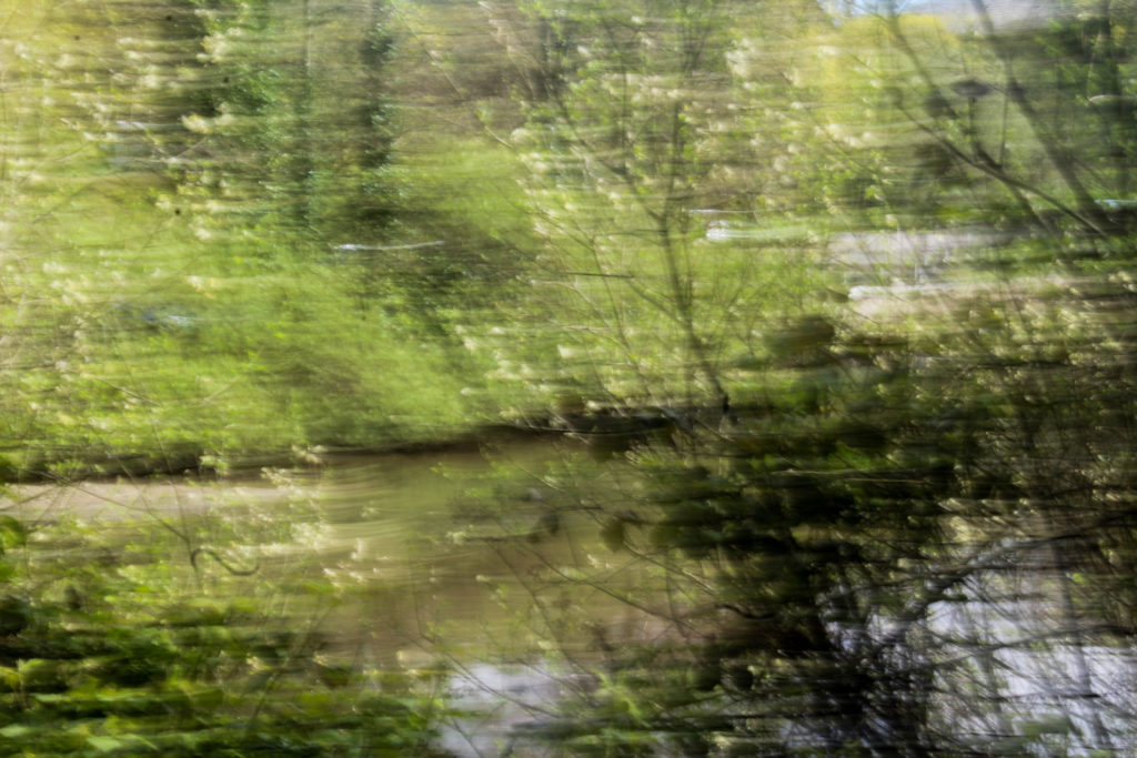
Photoshoot 5

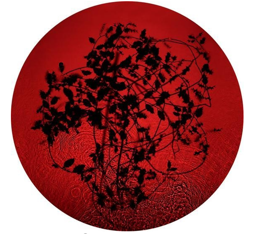
For one of my photo shoots I want to explore the work of Susan Derges who
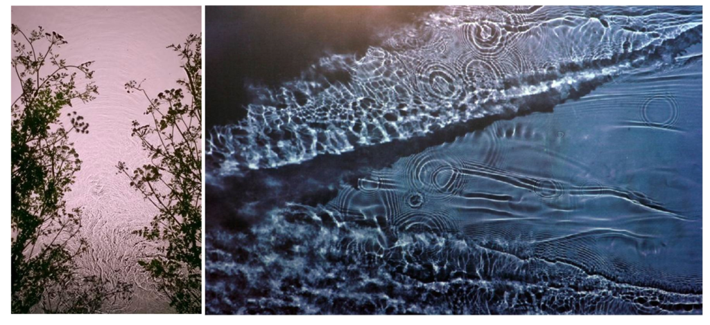
specialises in camera-less photographic processes, most often working with natural landscapes. Her work revolves around the creation of visual metaphors exploring the relationship between the observer and the observed; the self and nature or the imagined and the ‘real’.
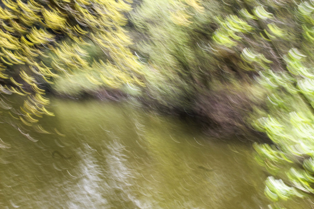
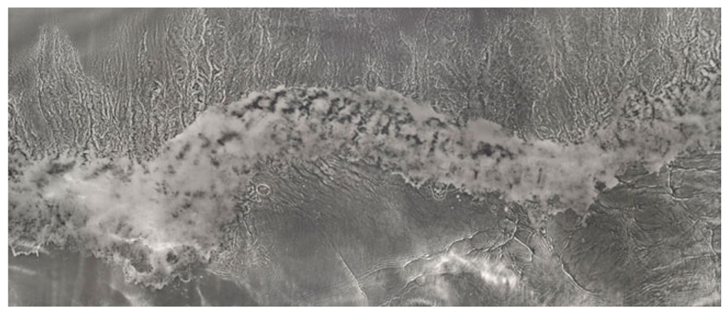
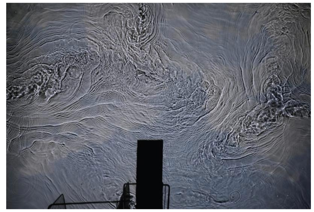
To interpret her work I want to photograph waves and ripples in water. I also want to experiment by using light sensitive paper, like she does, if I can find the materials as I think that this work help me understand how shes works. From researching photo grams of the movement of water I have found out that the process if very difficult. This may make it hard to produce work that I can use as a final outcome to my project, but I think that doing it will help with my experimentation. If i am unable to do this technique then I plan to take images of water and edit them to interpret the appearance of a photo gram.

Susan Derges

Susan Derges (born 1955) is a British photographic artist living and working in Devon. She specialises in camera-less photographic processes, most often working with natural landscapes.

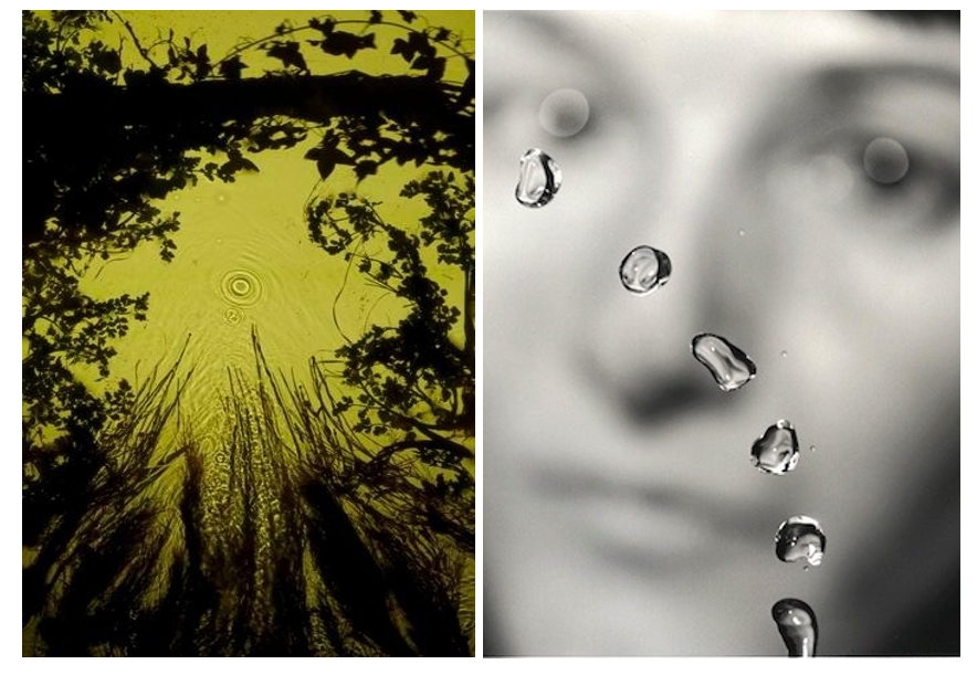
Derges’s 1991 series The Observer and the Observed explored the relationship between object and viewer, and art and science. Propelling a jet of water through the air, Derges used a strobe light to capture the suspended lens-like droplets set against a blurred image of her own face. During the 1990s, Derges became well-known for her camera-less photographs and her pioneering technique of capturing the continuous movement of water by immersing photographic paper directly into rivers or shorelines. Often creating work at night, she works with the light of the moon and a hand-held torch to expose images directly onto light sensitive paper.

Her work revolves around the creation of visual metaphors exploring the relationship between the observer and the observed; the self and nature or the imagined and the ‘real’.  Ambient light affects the colour of the images which ranges from blue at full moon to green at new moon. Stormy weather conditions whip up sand in the water, which appears as dark vortices and spirals within the image of the wave. 
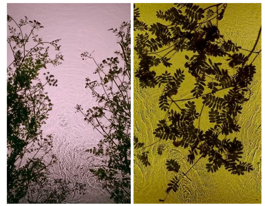
Her 1997 River Taw series exemplified this direct interaction with the landscape. Using the river near her Devon home as a lens, Derges captured fragments of ivy, ice, and debris reflected in or passing through the water. 

It was the river Taw that gave Derges the idea that transformed her work. “I was fed up with being the wrong side of the camera. The lens was in the way. I was stuck behind it and the subject was in front. I wanted to get closer to the subject. I had longed liked the idea of the river as a metaphor for memory. The river being a conscious thing containing memories – all the things it carries with it such as rocks, pebbles, shale. It is nature’s circulatory system. I was interested in the science of complexity – mathematical descriptions, information and stimuli, which are supplanted when a more ordered group of descriptions, information and stimuli come in. I was also working with beehives at the time as a model – seeing a connection between how human beings operate and how nature operates – studying the bees was a way of looking at human structures.”

It was working with a waterfall that Derges realised how fully involved she was with her subject matter. When unrolling a print of a waterfall, she was mystified to discover that there were two columns of information recorded. She realised that the second column was actually her fingertips, which had been holding the print in place. She found herself in the arena of her work, actually part of it. “In making the waterfall prints I could not help being part of them.

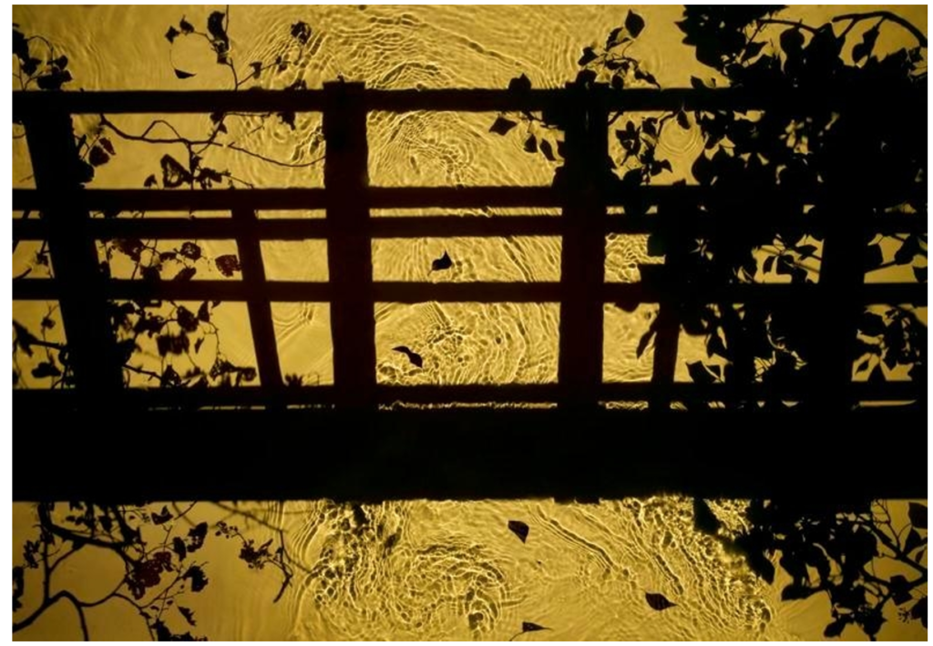
Derges’s images of botanical organisms and flowing water are metaphorically rich, alluding to the connections between ourselves and the natural world. Her 1997 River Taw series exemplified this direct interaction with the landscape. Using the river near her Devon home as a lens, Derges captured fragments of ivy, ice, and debris reflected in or passing through the water.

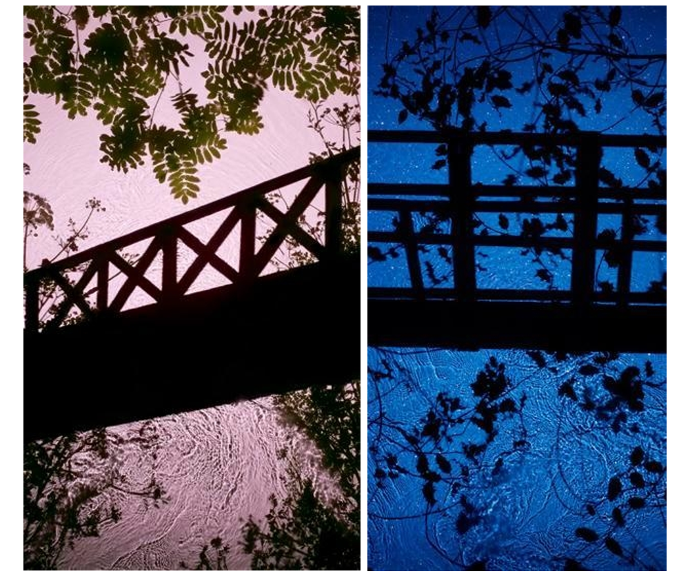
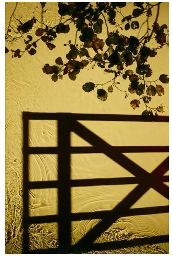
The structures and bridges in some of her images she stated were made with constructed silhouettes. It’s a reference back to growing up. It’s an imaginary place with the branches brought in. It’s a digital print made with a digital camera.”

Derges expressed an early interest in abstraction because “it offered the promise of being able to speak of the invisible rather than to record the visible”. She turned to camera-less photography after experiencing frustration at the way “the camera always separates the subject from the viewer”. Much of her subsequent work has dealt with this relationship – of separation and connectedness with the natural world. In Derges’ photography, nature imprints patterns and rhythms of motion, growth and form directly on the light-sensitive surface of the photographic emulsion, such as falling water drops etc.

 Recently she has begun working in the studio combining analog and digital techniques to create new forms and perspectives hitherto impossible to capture. Her practice reflects the work of the earliest pioneers of photography but is also contemporary in its experimentation and awareness of both conceptual and environmental issues.

Adroplet of mercury lying in the bottom of an upturned speaker cone, which reflects the lens of the recording video camera, is subjected to a sweep of sine waves. The sound disrupts the spherical form of the mercury droplet into ordered shapes of increasingly complex geometrical structures until it passes beyond the range of response of the mercury and the camera ‘eye’ re-emerges on the surface of the droplet.
Exhibitions

Behind the Lens

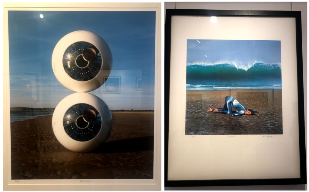
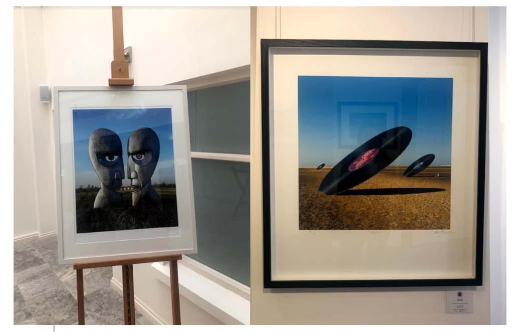
I visited the CCA gallery which had an exhibition called ‘Behind the Lens’ by
Mike McCartney, Carinthia West and Rupert Trueman looking at Britain in 1960s-70s, pop/counter culture, sexual revolution, rock documentary.

This image stood out to me in this exhibition as the mirrors had been physically put into the landscape rather than being digitally manipulated in. I liked this as it shows nature in a different way to other images I’ve seen. I like how the landscape looks artificial, but still shows the natural waterfall and grass in the background and foreground of the image. I also like the simplicity of the image, and how the tree is the main aspect of the image, with the shadow along the floor.

Pop Icons

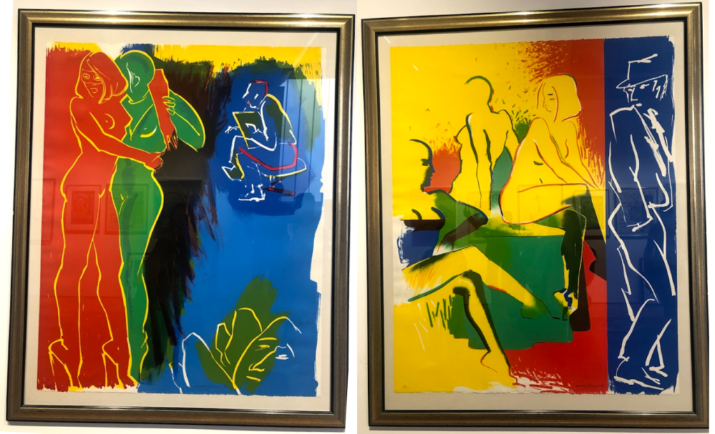
The second Private gallery I visited looked was called ‘Pop Icons’ and looked at Pop-art, reflecting on mass consumerism, advertising, celebrity culture, iconography. Artworks by Andy Warhol, Roy Lichtenstein, David Hockney, Peter Blake and other artists were displayed.

1950’s in Britain and late 1950’s in America, Pop Art reached its peak in the 1960’s and went on to become the most recognisable art form of the 20th century. It began as a revolt against the dominant approaches to art and culture and traditional views on what art should be. I particularly liked these two pieces above by the same artist because of their use of primary colours and the sections in which they’re divided into. I think i have slightly explored this in my project where i focused on block colours when editing the original images. Adjusting the colours in these images make them link to the work in pop art, although they are not a bold colours, this is something I could explore in my project further. I also like the use if cured lines and shapes representing the figures i the images as I think they relate to shapes and lines that you fins in natures and plants, linking to my projects.

Gallery Director Chris Clifford said, “Pop Art often takes imagery that is currently in use in advertising. Product labeling and logos figure prominently in the imagery chosen by pop artists, seen in the labels of Campbell’s Soup Cans, by Andy Warhol who is one of the artists featured in this exhibition. I also liked this image I displayed above as the repetition of the curved lines and colours, links to the theme of variation and similarity. I also liked how the patterns in the 2D images looked 3D like they wee coming off the image. In his image I thought that the blue colours linked to colours in nature and water, and the bright orange also links to my experimentation where I have included colour which arena normally found in nature within my images to make them stand out.

Being Human –

Feminism, representation of women artists in the art world, alternative voices etc.

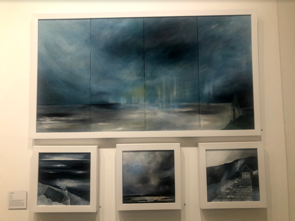
I think the this exhibition related well to this project as a lot of the work focused on nature, emphasising the representation of woman artists. This relates to my work as one aspect i am exploring is femininity in nature, looking at soft shapes that follow a stereotypical view of woman. I particularly liked these pieces above as I think that they represent ideologies of sublime, with the storm and dark clouds above the landscape, creating movement. The tones in the image are cool and emphasis the shadows, looking at the vastness in the scene. This relates to the work I am doing now as I have explored the ideologies behind sublime and beautiful, this type of image being something I could explore more in my project where I look at the other dangerous side to nature, rather than the fragility that i have focused on so far. So far i have explored warm, soft tones and colours in my images, this contrasts to these pieces where predominately cold dark colours are used, and is another aspect that i could look at in my work, contrasting cool and warm tones.

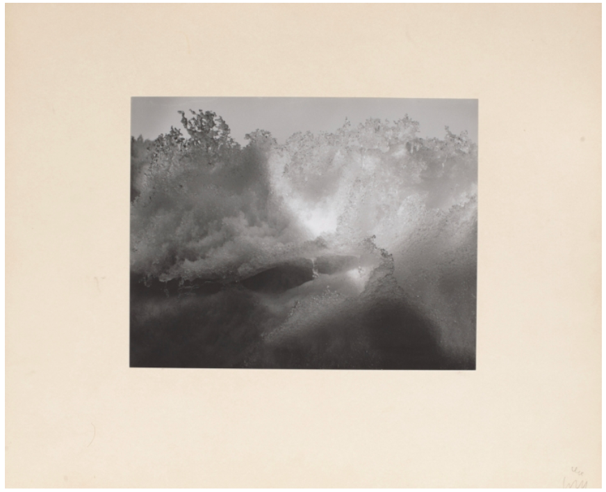
Minor White

Landscapes

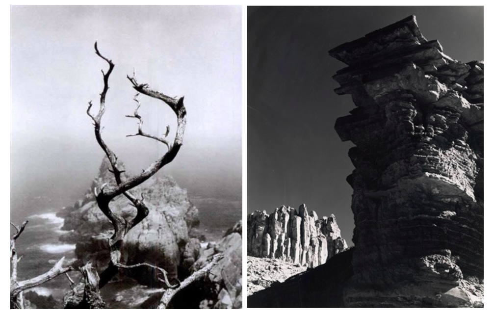
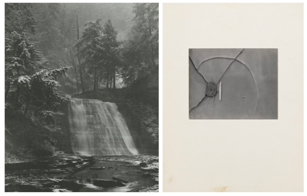
Minor White was an American photographer and editor whose efforts to extend photography’s range of expression greatly influenced creative photography in the mid-20th century. White’s interest in Zen philosophy and mysticism permeated both his subject matter and formal technique. “At first glance a photograph can inform us. At second glance it can reach us,” he once said.

White made thousands of black-and-white and color photographs of landscapes, people and abstract subject matter, created with both technical mastery and a strong visual sense of light and shadow. White’s pictures were abstract, black-and-white closeups of rocks, wood and water. The gleaming images were spiritual and intense. He arranged them in sequences, leading viewers from one picture to another, slowing us down and forcing us to see connections and relationships between the shapes.

In 1945 he moved to New York City, where he became part of a circle of friends that included the influential photographers Edward Steichen and Alfred Stieglitz. His contact with Stieglitz helped him discover his own distinctive style. From Stieglitz he learned the expressive potential of the sequence, a group of photographs presented as a unit. White would present his work in such units along with text, creating arrangements that he hoped would inspire different moods, emotions, and associations in the viewer, moving beyond the conventional expressive possibilities of still photography. White considered his approach to this form one of his most important innovations. The sequence seems to have gratified an important psychological need for White. He also learned from Stieglitz the idea of the “equivalent,” or a photographic image intended as a visual metaphor for a state of being. Both in his photographs and in his writing.

In 1946 White moved to San Francisco, where he worked closely with the photographer Ansel Adams. Adams’s zone system, a method of visualizing how the scene or object to be photographed will appear in the final print, formed another major influence on White’s work. 

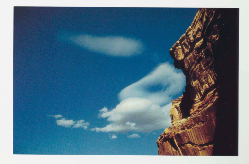
White traveled throughout the United States in the late 1950s and early ’60s and began to experiment with colour photographs.

Colour Photographs

Among his best-known books are two collections, Mirrors, Messages, Manifestations (1969), which features some of his sequences, and Minor White: Rites and Passages (1978), with excerpts from his diaries and letters and a biographical essay by James Baker Hall.

Through his mystical approach to photography, Minor White has become one of the most influential photographers of the postwar era. His landscape photographs often create abstract images that disorient the viewer and penetrate beneath the surface of the subject. White developed sequences for these pictures that underscored the meditative possibilities of reading photographs as a means of spiritual self-knowledge, a practice that continues to inspire many contemporary photographers.

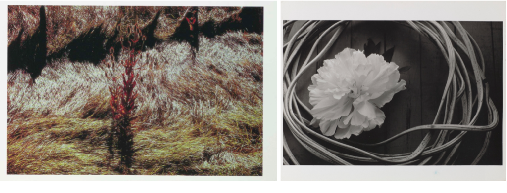
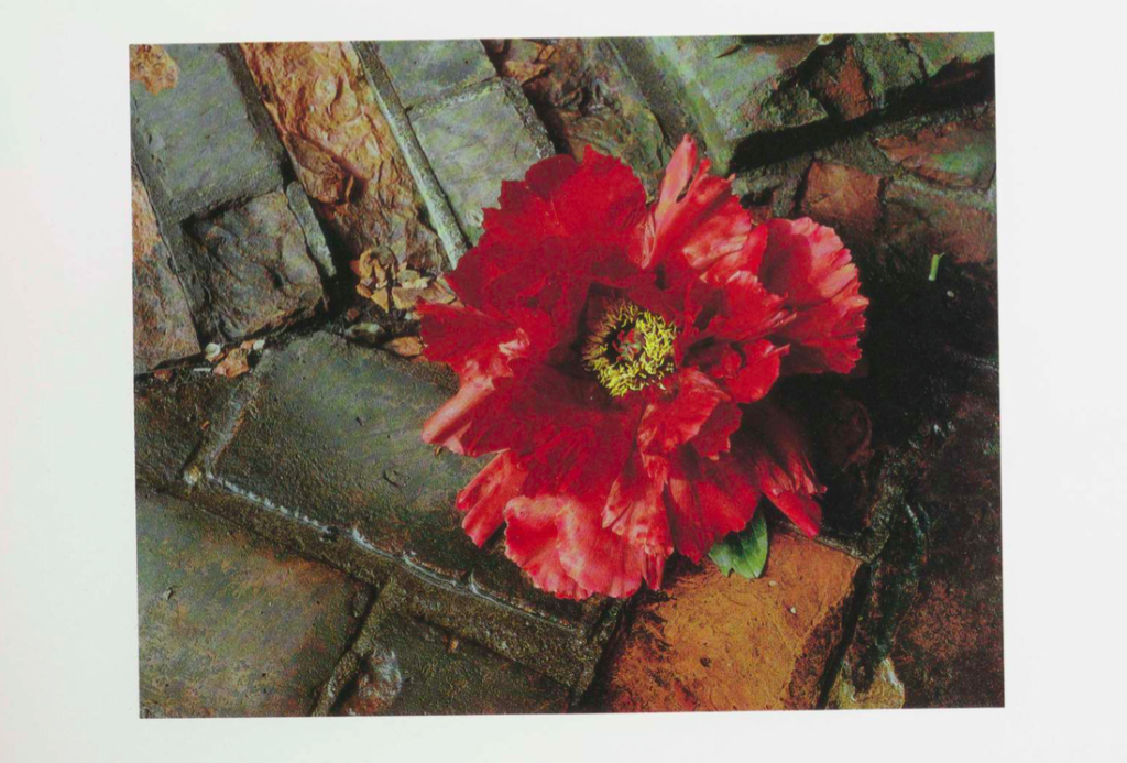
I chose Minor White as a photographer to research as I first liked how he portrayed nature spiritually and intensely. I am particularly interested in his colour photos as I like his use of bold colours against different shapes in nature, For example, the first colour image of the red/pink flower stood out to me when i saw his photos. This was because of how he portrayed the flower beautifully, even though its on a stone floor. I think that the colours complement each other well, the warm brown tones of the floor linking to the yellow center of the flower with the bright flower contrasting. I think this reflects his interest in Zen philosophy and mysticism, finding deeper meaning behind everyday objects. I also like how he considers carefully the order in which his photographs are displayed, hoping to create different moods, emotions, and associations in the viewer, moving beyond the conventional expressive possibilities of still photography. This is something I will take inspiration from in my project.

Reviewing and Reflecting

How well have ideas developed?

In my project I still feel as though I need to develop the concept and meaning behind my images in more depth. I started my project exploring ideas related to nature and beauty as it is something that interests me personally. My first idea for the project Variation and Similarity was to look at repetition in nature and planned to explore that in my first shoot. I then backed this up with research into photographers. As I’ve continued in my project I found that I wanted to add another concept to the project to make my images have more of a story behind them and to feel more conceptual. I think that exploring the use of videos in my work has developed my work well as it gives my project another element.

Are they sustained and focused?

I think that my blog posts are sustained and focused so far, exploring and researching different photographers styles and the concepts behind their work to inspire me. I still feel as though I need to explore more photographers to find a definite concept behind my project. My blog posts are not as focused as I want them to be and can only become sustained when I find another concept. I also want t add my photographers analysis to understand in more depth how various photographers take their image, and also analyse how they display their work i.e in a photo book.

Are they reviewed and refined?

I think that my blog posts are reviewed and refined as I explore the concepts and meanings behind how the photographers take images the way they do and why they do it. I also explain why I chose those photographers to look and and how they link to my project. For my photo shoots I think that I review my work well by analysing my images technically and conceptually and also evaluating the shoots, stating what I could work on and develop further in my project. To make my work more reviewed and refined I could explain more throughout my project what I am doing, and evaluate each week how my ideas are developing.

How many responses/ shoots?

I have done two shoot of my own so far where i have and gone to natural areas. In the first shoot I visited St Catherine’s woods and looked at repetition in pattern and shapes in nature to start generating ideas for my project. I also took some inspiration from Rinko Kawauchi in some of the images looking at light and exposure. I think that the images from this shoot were successful at starting off my project and leading me into my second shoot. For the next shoot I visited Queens Valley Reservoir and looked at the beauty in nature and took videos of aspects I found interesting in the landscape. For this i wanted to capture the movement in nature that wasn’t portrayed in a still image i.e the movement of water, the wind blowing leaves. I think that both these shoots were successful, but i still want to push my work to develop it further. I have also done responses to photographers in class such as John Baldessari, inspired by his book ‘Throwing Three Balls in the Air to Get a Straight Line’, representing Baldessari’s interest in language and games as structures. I also created a response to typologies at the start of my project, taking inspiration from Hilla and Bernd Becher and Andy Warhol to start generating ideas.

Command of camera skills/ photographic techniques and processes
Understanding of composition/ considering quality of light

In my photo shoots I have tried to focus on light and negative space, inspired by Rinko Kawauchi. I feel as though my work is inspired by her, but doesn’t directly interpret her work which is something I wanted to do. In all my images so far I have consider the composition of the natural objects and how the patterns are portrayed. For example, some of the images in my first shoot i made the patterns fill the entire frame as I thought it made the image most effective and the markings stand out more. So far when I have gone out to take images the lighting has been over cast and cloudy, in my future shoots I plan to go at different times of day like early in the morning or later in the afternoon towards dusk. This way I could play with the lighting more and experiment with different exposures.

What are the overall quality of the images?

I think that the overall quality of the images are good and I feel as though they continue on from my last project where I looked at a natural area as well. This means I have a good understanding of photographing natural objects and landscapes. I have tried to make interesting compositions ie. making the shapes symmetrical or using the rule of thirds. I think so far that my images are taken well technically but not conceptual enough meaning that they aren’t the best they can be. Moving forward I plan to do shoots towards a particular concept to refine my work.


How do they respond to research andrelate to artists references ?

My shoots respond to the research I have done on different art movements, like the romantic era looking at sublime, pastoral and picturesque in the 19th century. They also respond to the research on abstraction as I’ve focused on negative space and bold colours within the natural landscape. My earlier responses respond to typologies ie. Hilla and Bernd Becher where I photographed different versions of the same object to create series of images. My videos are responses to my research into video art and performance art, as well as the work of Edward Muybridge who was important for his pioneering work in photographic studies of motion and in motion-picture projection. I did my own interpretation of this, looking at nature and movement.

How do they interpret exam theme?

My images and videos so far interpret the exam theme as they were inspired by looking at similarities and variations in nature. From this point I developed my idea to explore beauty within the natural landscape. Also looking at fragility and femininity when photographing. In my photo shoots I have focused on emphasisng the light in the images, looking at negative space and exposure to create the right appearance.