All posts by Megan Woolsgrove

Filters

Author:
Category:

Final Photobook and Evaluation

A link to my photobook:
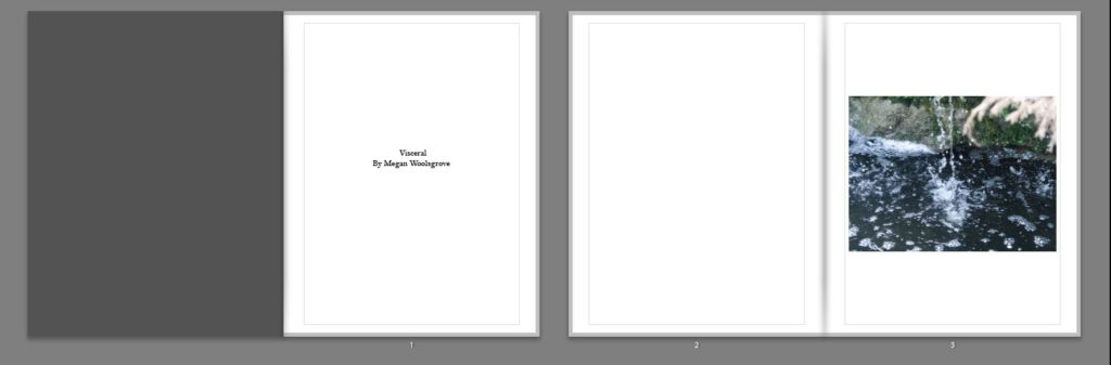
Visceral

Analysis of Photobook and Evaluation

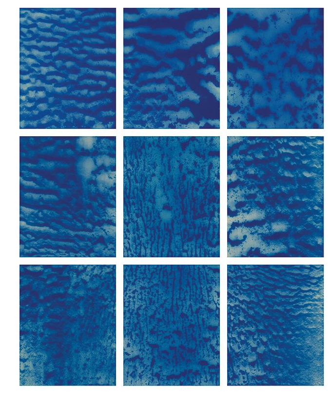
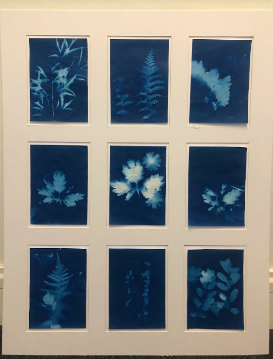
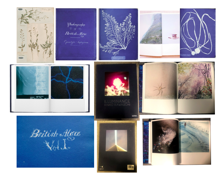
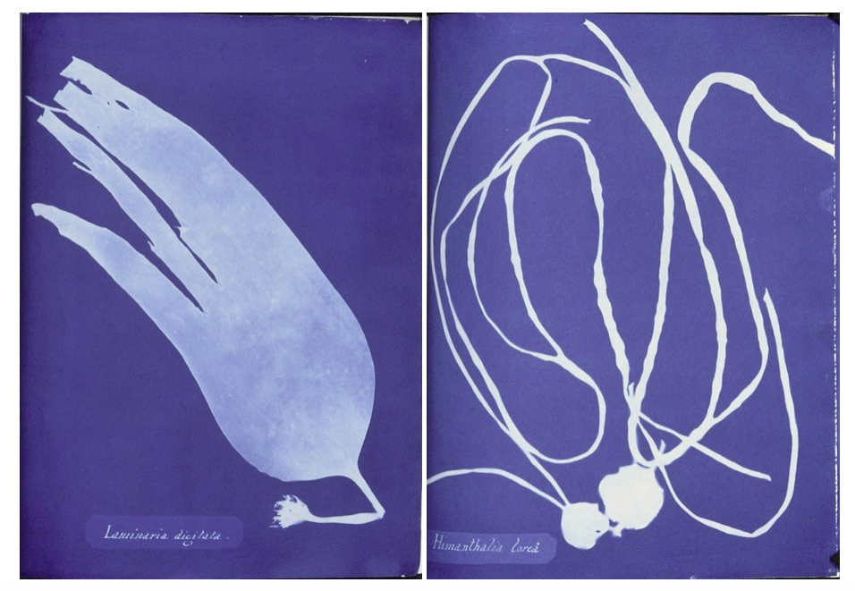
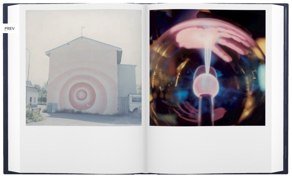
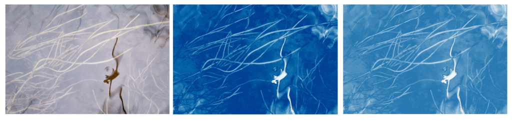
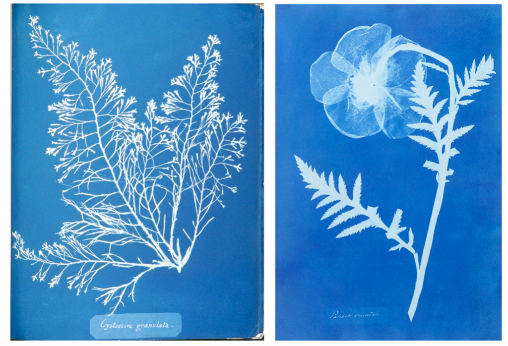
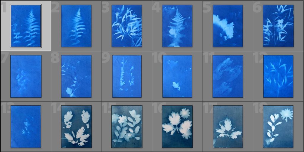
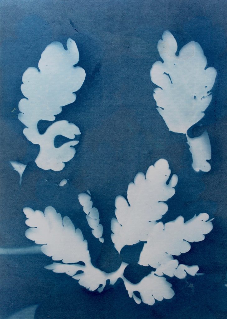
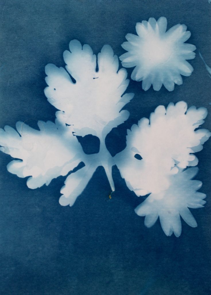
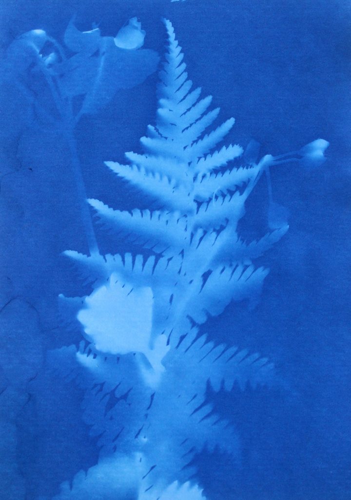
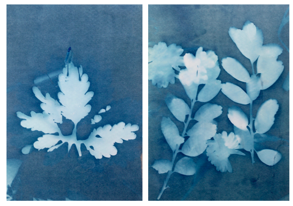
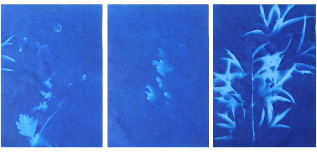
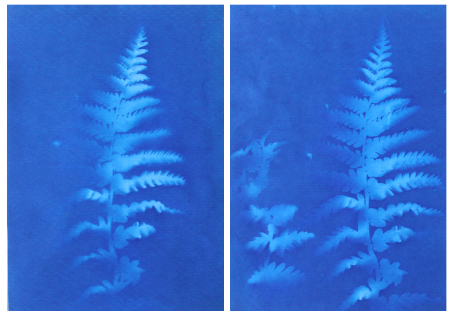
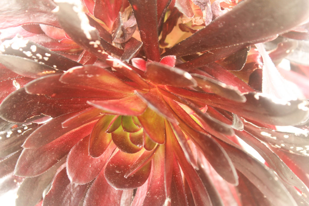
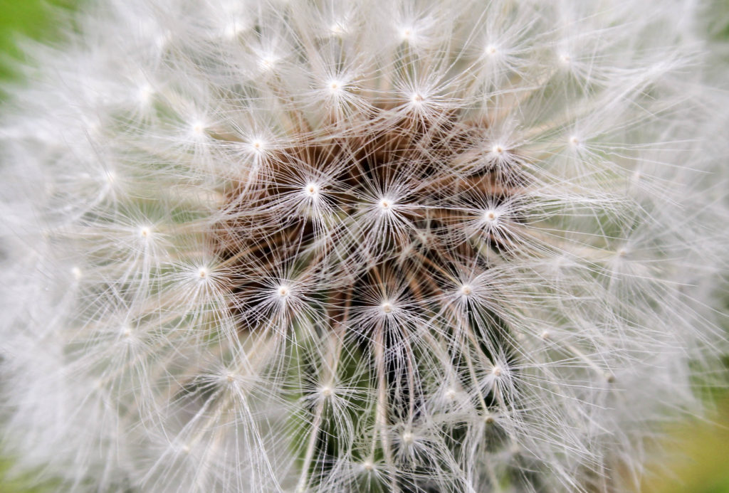
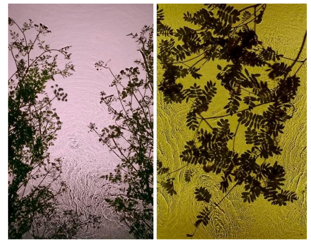
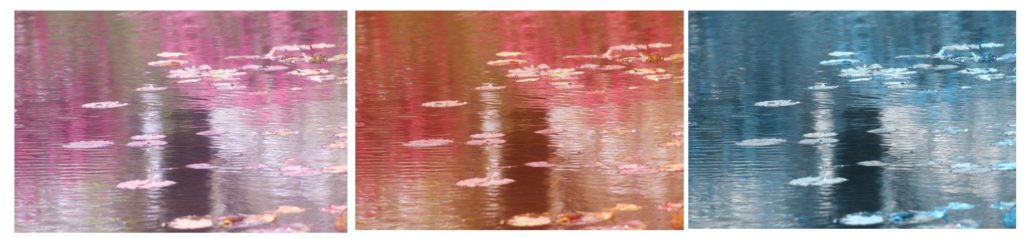
In conclusion, I think that I have explored the concept of variation and similarity successfully, developing my ideas thoroughly and consistently throughout. I started off my project with the intention to explore ideas of sublime and beauty within nature, focusing on emphasising light and fragility within the natural world. I wanted to able to express an emotion through my photos, whether that be using shapes, shadows, reflections and light. I explored the work by the Japanese photographer Rinko Kawauchi as I liked how she photographs things that are ‘ephemeral’, addressing concepts like life and death in her work and how photographs everyday situations and objects and emphasises the beauty that most people wouldn’t notice. I tried to take inspiration from this in my first photoshoot where I focused on emphasising the soft shapes and patterns I found in nature, as well as the fragility. This shoot inspired me to keep photographing emphasisng the fragility and nature, but to also build on this linking it to spirituality. I experimented by making videos of the movement in nature and focused on sounds created in the natural landscape which I think was effective in building my concept of spiritual qualities and energies in nature. I then started exploring the artist Wassily Kandinsky, specifically his book named ‘Concerning the spiritual in art’ and his theories on shapes and colour. “This essential connection between color and form brings us to the question of the influences of form on color. Form alone, even though totally abstract and geometrical, has a power of inner suggestion.” He states that shapes have spiritual value which is something I wanted to draw on in my images. I took inspiration from Kandinsky theories in my next photoshoots, particularly photoshoot 4 and 5, and decided that I wanted the concept of warm and cool colours to be a main element in my project. I think that my fifth photoshoot was my most successful as I think that the images produced represent the concept of my project well, where I focused on light, textures and movement, as well as warm and cool colours, expressing the interconnection between aspects of nature and humans. Towards the end of my project I wanted to add another type of image to my collection of images, and discovered the photographer Anna Atkins who was the first woman photographer to make a photobook. The type of image was a camera-less photograph which I decided to interpret. I wanted to create and portray them in a way that is different to how they were seen in the 1900s when they were first created, which was scientifically. I wanted to emphasise the spiritual quality through the fragile and round lines of the objects on top of the light sensitive paper. I thought this was effective which is why i decided to include some of the photographs inside my photobook, and also as some of my framed final prints.

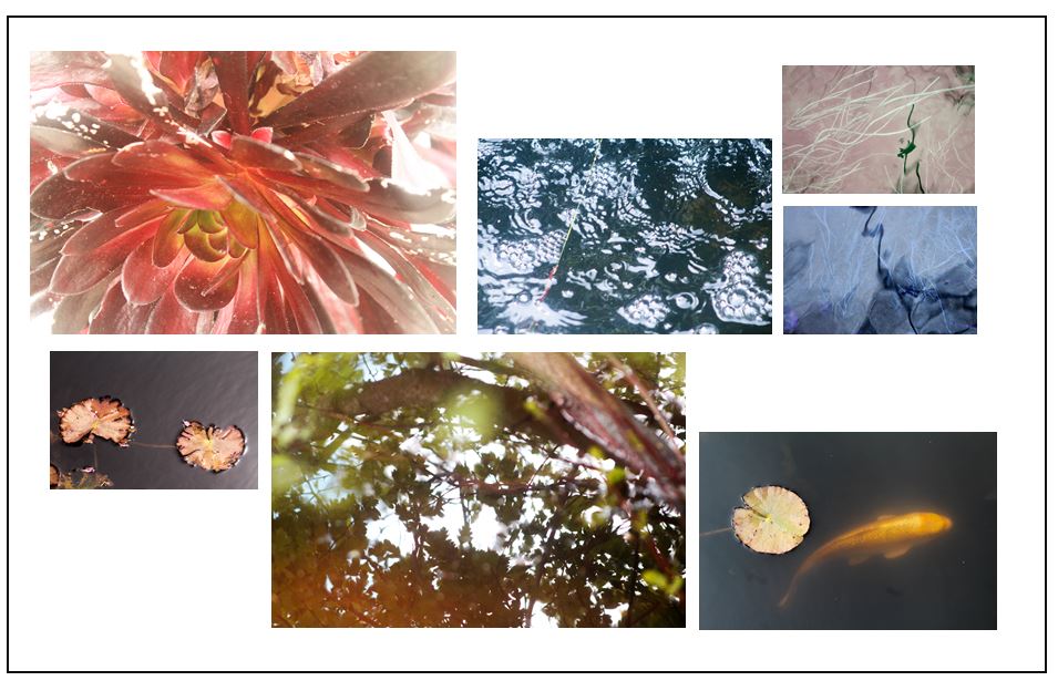
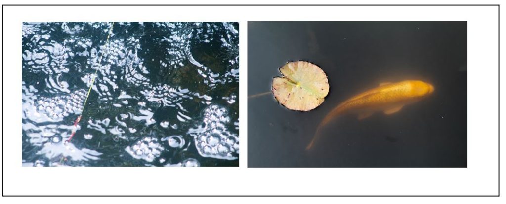
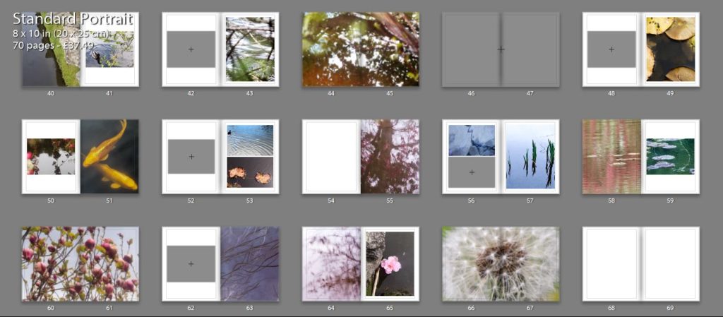
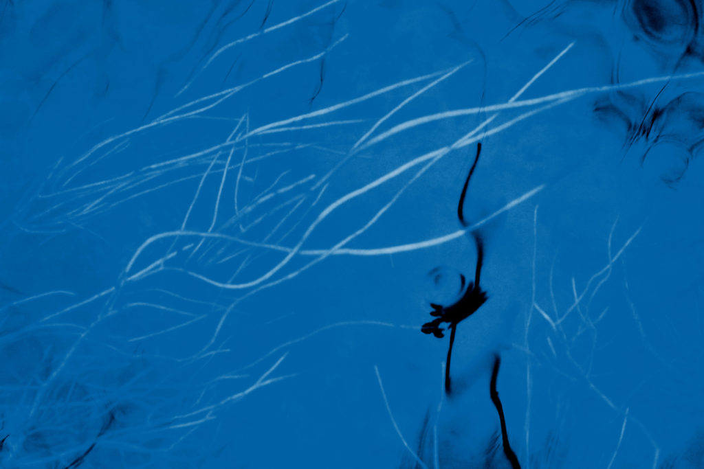
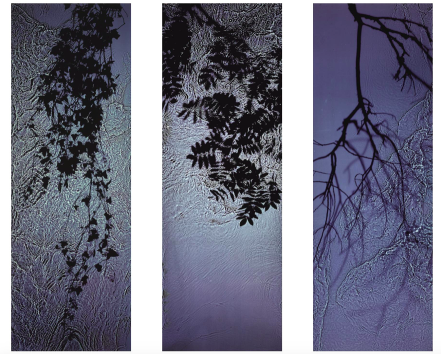
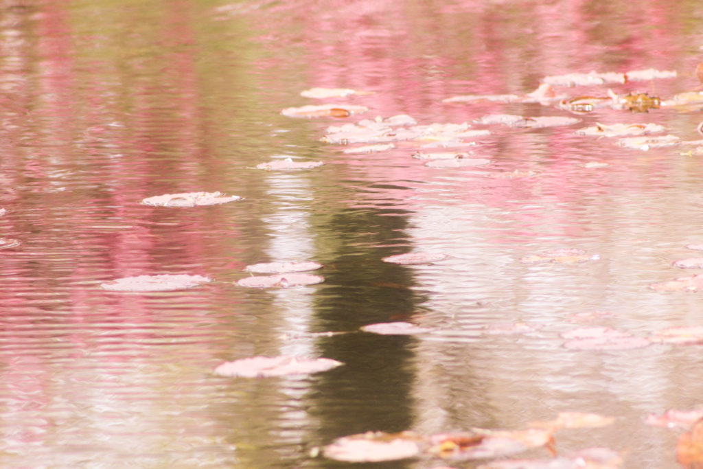
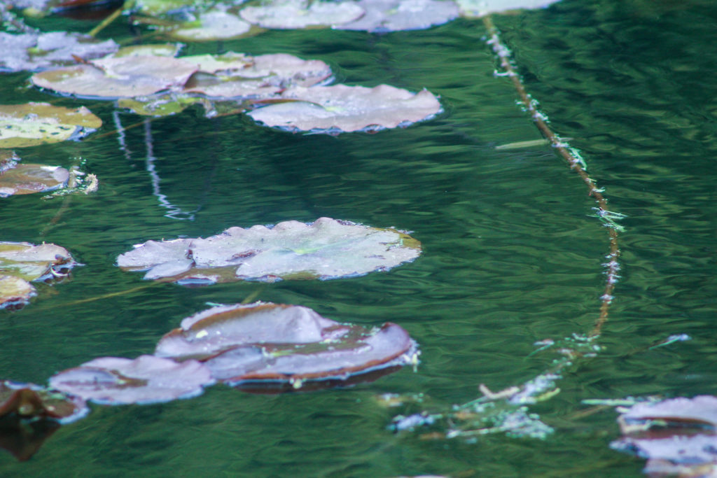
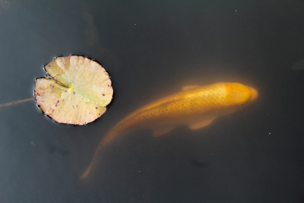
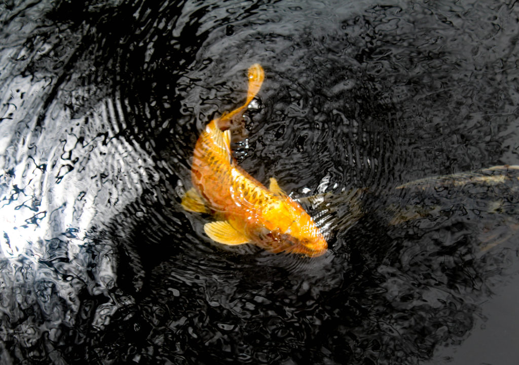
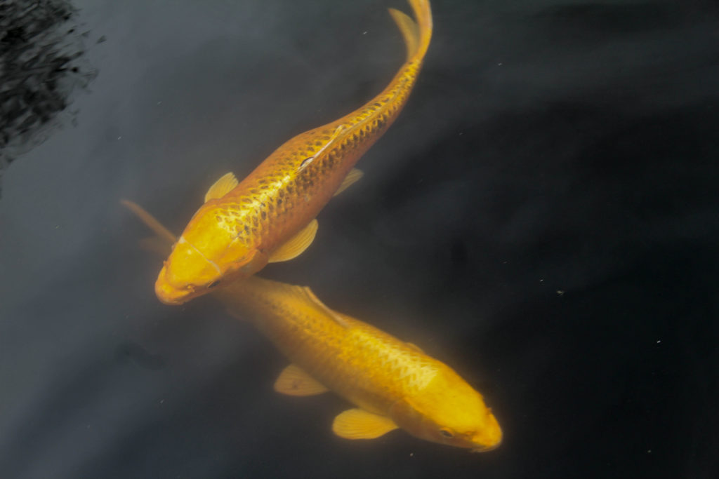
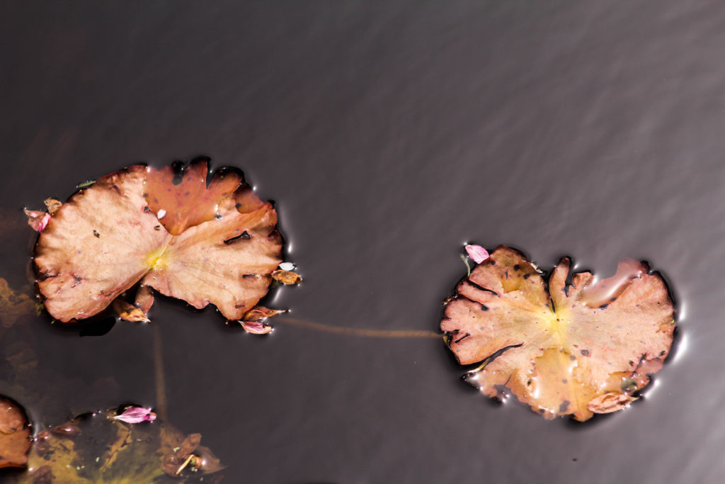
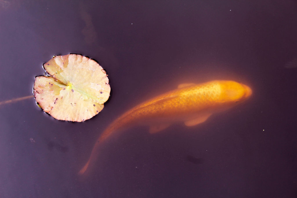
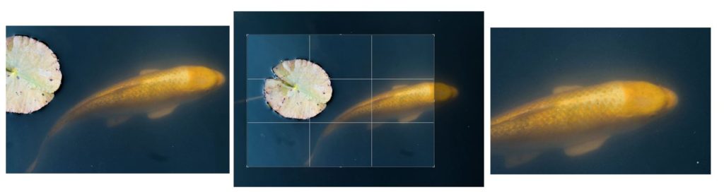
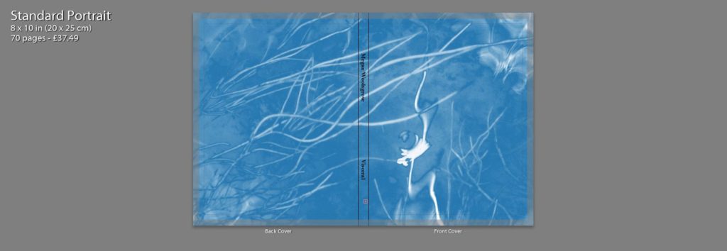
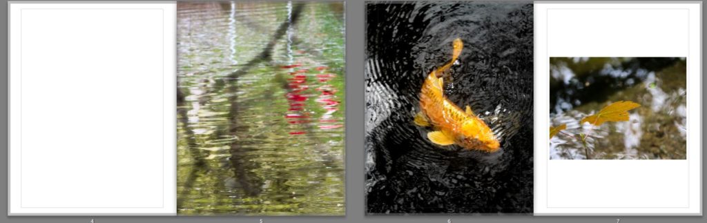
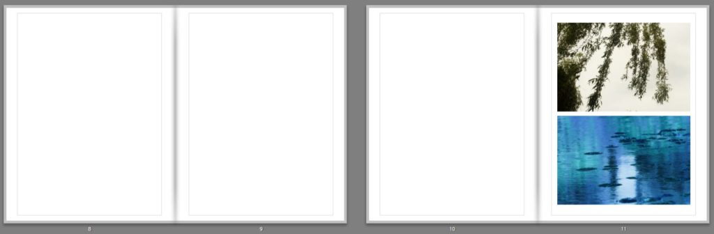
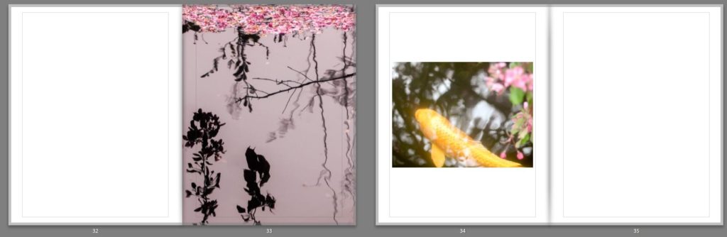
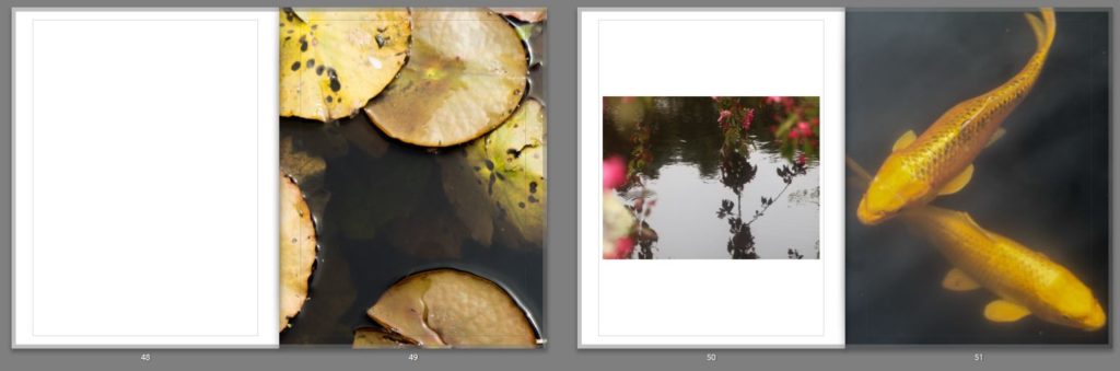
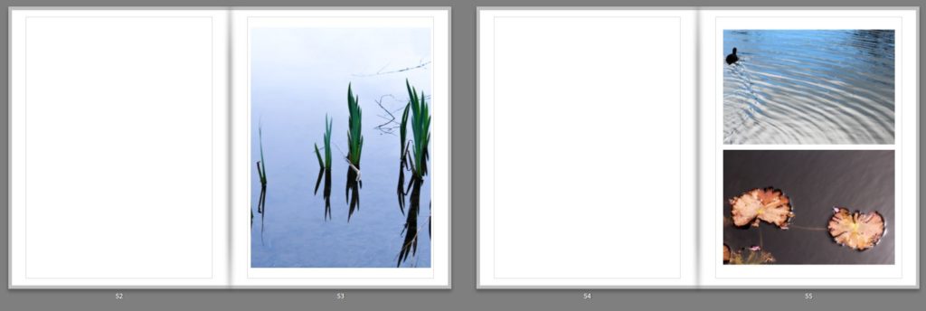
For the front cover of my photobook I decided to use one of my digitally edited interpretations of a cyanotype as I think this image indicates to the reader the spiritual nature of this photobook and it’s focus on the natural world. I like the pale blue colour that contrasts to the white of the plants and ripples in the water, as they’re soft colours that reflect the delicate features within the book. It also links to the physical photograms that will be included in the book, having a similar appearance. I decided to wrap this image around the front and back cover of the book as I think it works best full page, and by reducing it so its smaller on the page, it wouldn’t be as powerful. This is a difference between mine and Rinko Kawauchi’s photobook cover, where she included two smaller separate images on the front and back. The first page inside the photobook has the title: ‘Visceral’ in the middle which i chose as it is ‘relating to deep inward feelings’ which i think links to the spiritual nature and energy of my project and how nature provokes emotions within humans. The first double page spread displayed one image on the right side of the page. I wanted to start the book of simplistically and think that by displaying this image singularly of water falling emphasises it. I chose this image as the first one as I think the centred picture of the drops of water falling has the appearance of a peaceful and undisturbed landscape, starting the book off with a tranquil image that emphasises texture and beauty. On the next double page I also only included one image on the right side, but this time made it a full page image. I chose this image as I think it links to the first images through the ripples and textures on the water, but also looks at abstract colours and shapes. This is through the reflection of the person in the water, which isn’t noticeable a person. It also links to the first image through the branches in the foreground on the image that are out of focus as the first image also shows a section of a plant in top right in the foreground. The next double page spread I decided to use an imagoes both of the pages. The first is a full page image of koi fish, which I particularly liked as it shows the movement of the fish through the ripples in the water, linking the previous image. I think that is is a powerful image as the orange of the fish is greatly contrasted against the black of the water. I think displayed a landscape image of a closeup angle of a leaf, with the background of water. This links to the koi fish image as leafs also orange and both have the background of water. The next pages I have left blank in my design as I intend to physical insert the photograms that I made in envelopes on these empty pages. I think this will give my photobook an interactive aspect the will intrigue the reader by making them have to physically open the envelopes. I have left four blank double page spread throughout my book to put in the photograms.

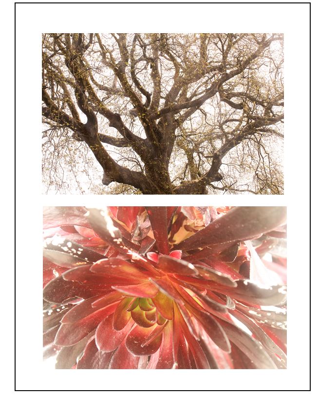
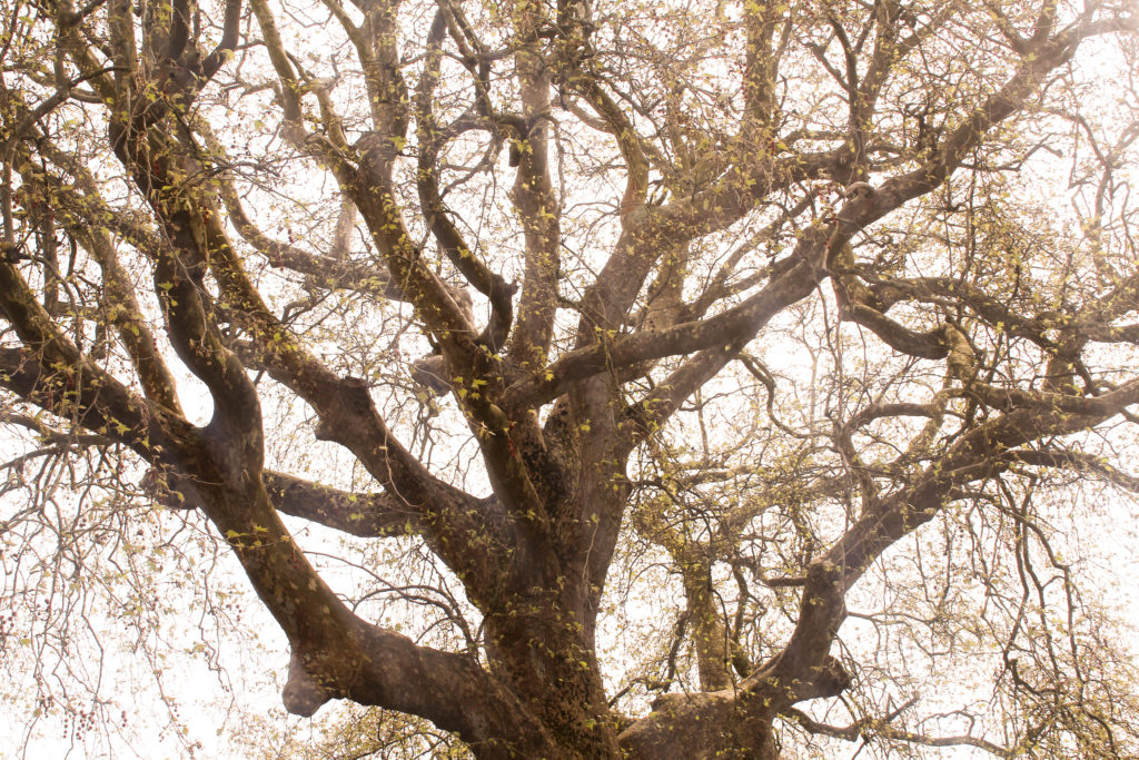
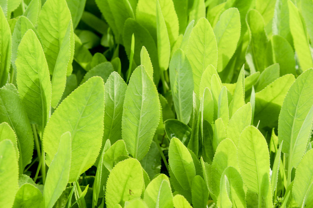
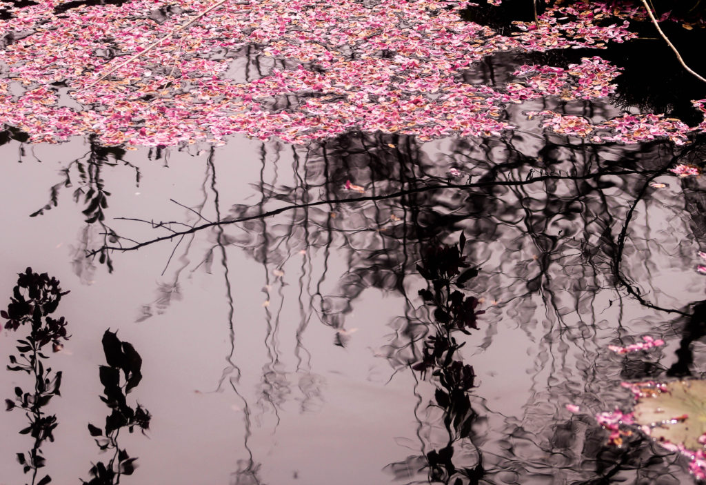
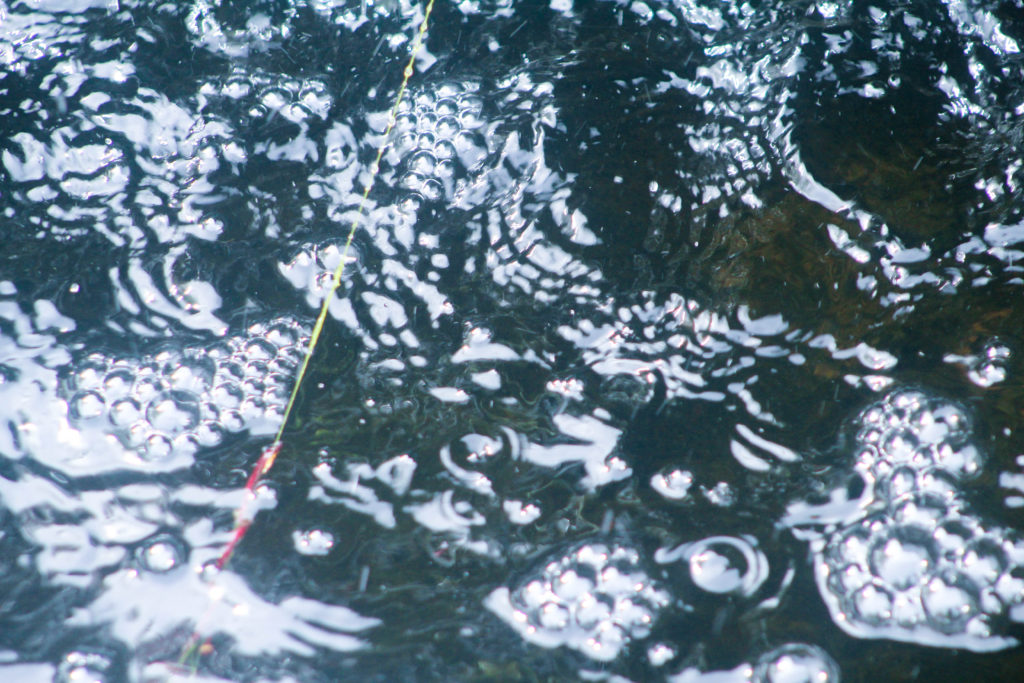
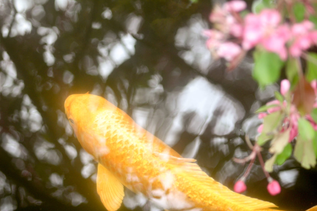
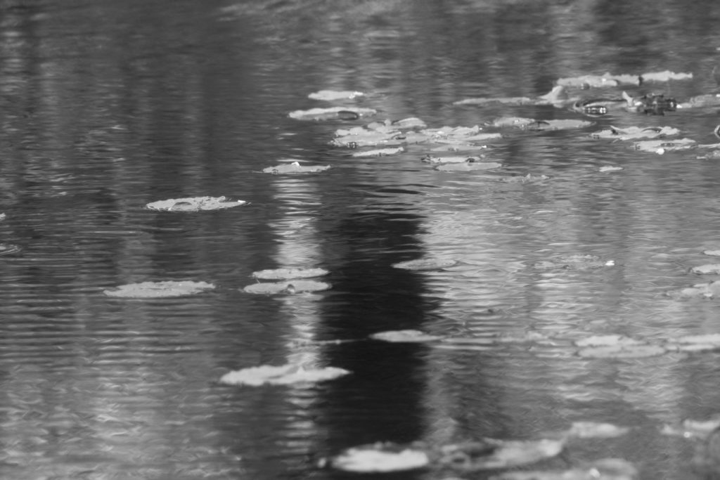
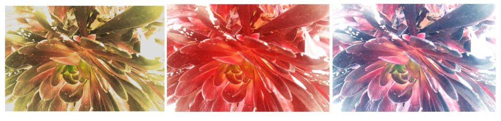
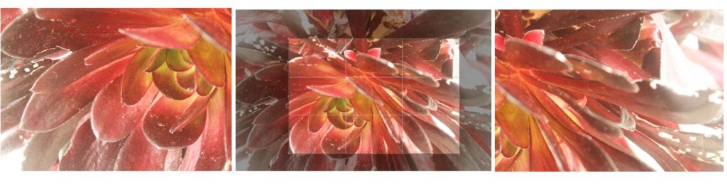
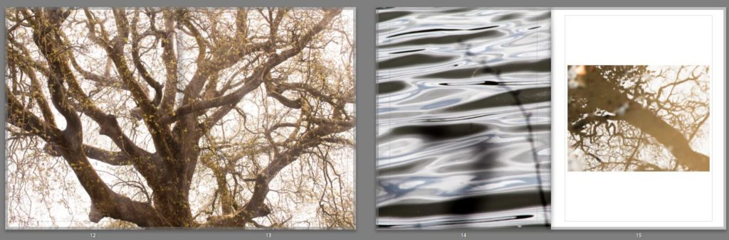
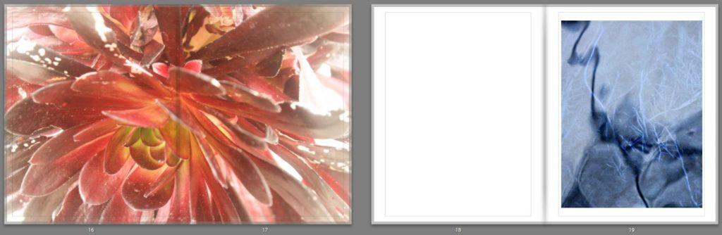
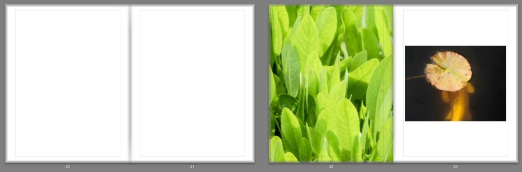
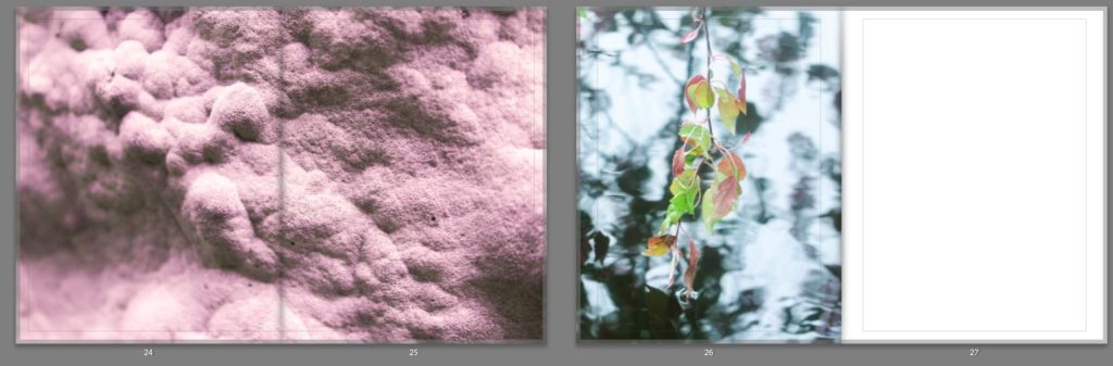
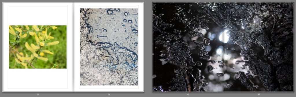
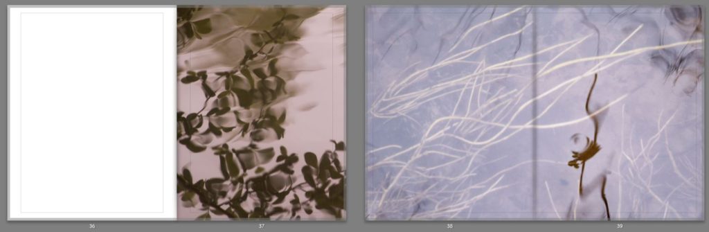
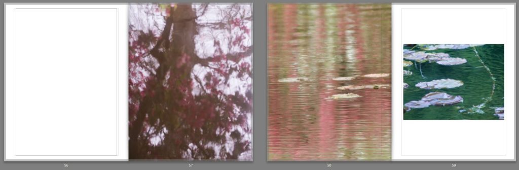
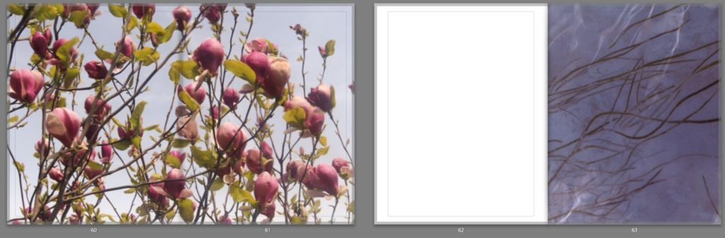
I decided to use my landscape image of a tree as my first double page image as I think that this emphasises the detailed patterns of the branches that may not be as noticeable if it were smaller. I like how the trees in the centre of the image, so the tree trunk id along the spine of the book and the branches are coming out diagonally onto each page as it creates an interesting composition. On pages 14 ad 15 I used a zoomed in image all a full page image of the ripples on the water were i have reflected the light and have contrasted this with an image of a tree taken through the reflection of a puddle. I think that these images links as they are both focusing on the light and patterns in water. In the first image you can see branches in the foreground which are out of focus which links to detailed branches of the tree in the reflection. Pages 16 nd 17 I added another double page spread of a closeup image of a plant where i have emphasised the warm colours and the light. I think that this is the most effective double page spread through the bold colours ranging from yellow to red on the leaves. On pages 22 and 23 I decided to contrast the cool green colours leaves, with the warm orange tones of the koi in the water. Although these image contrast each other, they are also like through the rounded shape of the leaves in both the image, the second being a lily pad hiding the fishes face. I think that these pages are effective and stand out through the use of bold colours, I used this combination to keep the reader interested. I then displayed an image of mould which i edited to be a soft pink colours on double page spread. I like this image as it took something which isn’t normally considered nice to look at and changed it into something aesthetically pleasing. I also like how the textures and emphasised even more though the edit which is why I decided to display across two pages. Another double page spread that I think is effective is on pages 30 and 31 which I think this has a different appearance then the rest of my images. I like how the dark background of mud emphasises the reflection of the sun in the puddle, making it seem as though this picture was taken at night time when it wasn’t. I think this image is another example of photographing something which isn’t considered beautiful, puddle in mud, and making it aesthetically pleasing. I continued my photobook with combinations two images across two pages and wth double page spreads. At the end of my book i left space for my to insert a photogram. I think this is good way to end the book as it focuses on a different type of photograph that I have physically created, still relating to the spiritual qualities of nature through the delicate lines and shapes.

I think that my photobook is a good representation of my work in this project, the images showing the final outcomes of my developed ideas. By using both natural landscape and camera-less photograms I think this successfully links to my concept of nature relating to spiritual and personal connections. Photographing natural landscapes I think developed my ideas and theories from my last project and made me produce work to a higher standard a having more knowledge of techniques and contextual references.

Final Prints

I started experimenting with different layouts that I could display my final prints as, arranging the photos digitally. I found the by doing these experimentations I was able to try different pairings and combinations to plan what do when I framed my images. I experimented with pairing two images together to se what they would look like displayed, and also all my images together to see which ones look the best. I also found the artist Alexander Mourant to take inspiration from when racing my cyanotypes.

I thought that these two images worked well together as the warm tones in them both links them together. I also like how the they are both centered as the compositions complement each other. To me, the bottom image is the most powerful and stand out more than the top image through the bright natural red colour and the light yellow centre. This yellow connects to the top image, as it has yellow/brown tones throughout. However I think that this combination of images doesn’t show the audience enough about m project, because of this i won’t use this layout to frame my final prints.

I think that by displaying my images all together on a board, the audience gets to look at the different aspects of nature i have explored, and an idea of what is inside my photobook. I placed the A3 images near the edges of the frame and fitted the A4 and A5 ones around the as I think this makes a good layout. I placed the A4 images of the koi fish and the bubbles next to each other as I think they make a good pair, where the textures contrasts to one another, but is still linked through the subject of water. I displayed two of the A3 ones together on the top left of the frame as I also think these two complement each other, through the warm tones and emphasis on light. I placed the A5 photos where I have manipulated the colours (blue and pink) near the edges of the frame as I think that spacing them out makes them more effective as images then together.

Alexander Mourant

I am taking inspiration from the photographer Alexander Mourant and the way he displays his photography in grid format. I also want do this with the photograms i produced, displaying 9 of them together. I think this will be effective as it presents them in a way that they can be contrasted against one another, but still shows the variation and similarity between them. I think this also links to the scientific background of cyanotypes when I display them precisely. When I do this I want to make the cyanotypes coming off of the page slightly, to give them a more personal and authentic look, rather than placed flat against the background. I also want there to be a frame around them so will leave space between the outside of the cyanotypes and the frame board I will cut in a grid format, so thats there is a white space separating them. This will also makes them seem as though they coming off the display.

Final Prints

Photobook Design Experimentaion

I thought that my close up image of the orange leaf would pair well with one of my koi fish images as both the main subjects in the images have orange tones which make them both connected. I experimented with two different koi fish images, one showing two fished overlapping each other and the other showing the movement of one fish through the ripples in the water. The first image is a calmer image, the water in the background being flat which gives it a more peaceful appearance. I like how the two fish are swimming near each other and are overlapping as they create an interesting shape in the water. This is contrasted to the second image which shows one fish coming to the top of the water, creating waves which i tried to emphasise when I edited the image. This image isn’t as calm as the first image and shows the texture of the water.

I think that the second combination is the best double page spread as the single koi fish swimming the water links better to the single leaf and has a similar rounded shape which is why I will use it in my photobook. Also the background of the images complement each other as they both reflect the light from the sun and have bright white sections, creating similar shapes on the water. I think hat this combination is the most effective and makes for the most interesting layout.

This double page I am planning to use as the first page in my photo book. I experimented by using a combination of two images on the pages, and a single image to see which was the best layout. The first double page with two images I like as the ripples in the water on the left side linking to the patterns in the second image of falling water. I like the first image as it draws on theories of abstraction through the bright red reflection of a person on the water that are warped and distorted. I also like how there are out of focus branches near the lens of the camera that add another natural aspect to the image and contrasting against the horizontal ripples of the water. This connects to the second image on the right page as there is also an section of a plant out of focus in the top right corner. The second double page is the single image of the water falling on the right side. I think that this is also effective as it focuses the reader onto that particular image so they aren’t distracted by the shapes the image that’s on the left of the other layout. I think this makes the appearance more peaceful which is why i am going to use the single image in my first page, and the image that was on the left on the page after. This is because both images are very detailed and think that they work best displayed alone.

I chose these two images to display as double pages as I think that the patterns are more detailed and noticeable when the image is filling the entire frame. I like how the first image has the bright red tones that range from right to dark, with the brightest pint being where the sun is hitting the leaves. I think this really links to my projects concept of spiritual qualities in nature emphasising the bright lights against it and the small patterns on the leaves.I also think that the second image is effective as a double page spread as there is a lot of detail in branched of the tree creating a very intricate pattern. I think this is why I will use it as a double page as I want to emphasises these aspects. I also think that this image links well to personal and spiritual aspects of nature through the yellow tones and the brightness of the image making it look peaceful and ethereal.

Book Specification

Write a book specification and describe in detail what your book will be about in terms of narrative, concept and design.  Produce a mood-board of design ideas and consider the following:

Narrative: What is your story?
Describe:

A sentence

Spirituality and personal connections in nature.

A paragraph

My photo book is looking at personal connections and spirituality in nature, focusing on warm and cold colours, textures, and concepts of abstraction to express how the natural world had it’s own energy and can provoke emotions in humans. I also want to bring a scientific aspect into my photobook, looking at photograms and camera-less images in a spiritual and delicate way.

Title options:

Visceral:

-‘Relating to deep inward feelings rather than to the intellect.’

-‘Being or arising from impulse or sudden emotion rather than from thought or deliberation’

•Ethereal

-‘Extremely delicate and light in a way that seems not to be of this world.’

Transcendant

-‘Beyond or above the range of normal or physical human experience.’

Structure and architecture, Design and layout, Editing and sequencing, Images and text:

On some of the pages in my photo book I want to contrast the images where I’ve emphasised the warm colours, with images where I’ve looked at cold colours. I think this will be effective in making the images stand out and be more powerful. On other pages I want to use two images that have a link between them, whether than be through a shape or colour that are in both the images. Doing this links to Rinko Kauwauchi’s book Illuminance where on each of her double page spreads the two images are connected in someway. I think that this will create a more interesting photo book and will make it easy to look through, rather than having images that are not connected at all. I also want to physically include some of the photo grams that I created in my 6th photo shoot within my book. I want to do this by having them inside small envelopes on a few pages in the book. Because there won’t be many in the book, it will create a mystery for the reader to see what it is. This will make the reader have to physically open and take out the photogram to look at, creating a interactive quality. This is taking inspiration from Anna Atkins photo book ‘Photographs of British Algae: Cyanotype Impressions’ which is said to be the first photo book made. I think this will give my book more of a scientific appearance, looking at nature in a more objective way, that I can then contrast with my more personal and spiritual images. I want my photo book to be portrait and relatively small so it’s easy top pickup ad open. This means that the photograms inside the book will have to be small, which I think is effective as it will make them seem rare and precious, creating a more authentic and special appearance for them. I want the layout of my image to be simple as most of the natural images I’ve taken are quite detailed and patterned, but displaying them simply it would allow the reader to look at them without being distracted by other images if there were too many on a double page spread.

Photobook Analysis

Historical Photobook- Photographs of British Algae: Cyanotype Impressions (1843–53)

English botanical artist, collector and photographer Anna Atkins was the first person to illustrate a book with photographic images. Her nineteenth-century cyanotypes used light exposure and a simple chemical process to create impressively detailed blueprints of botanical specimens. 

Anna’s innovative use of new photographic technologies merged art and science, and exemplified the exceptional potential of photography in books. Andrea Hart, Library Special Collections Manager at the Museum, says, ‘With the introduction of photography, you get a whole new opening up of how natural history and science can be presented in print. Before the invention of photography, scientists relied on detailed descriptions and artistic illustrations or engravings to record the form and colour of botanical specimens. Anna’s self-published her detailed and meticulous botanical images using the cyanotype photographic process in her 1843 book, Photographs of British Algae: Cyanotype Impressions. With a limited number of copies, it was the first book ever to be printed and illustrated by photography.

‘Before Atkins’s book on British algae and the photographic process, botanical images would have been restricted to the traditional printing processes of engraving or woodcuts, although the art of nature printing was also in its early stages around Atkins’s time’.

Because there are limited copies of this book in the world i couldn’t physically hold this book to analyse the whole inside, but I wanted to use this book as inspiration for my photobook and especially the ways Atkins displayed her cyanotypes very simplistically on each page. This links to my 6th photoshoot where I produced my own photograms responding to my research into Anna Atkins and the history behind how they were first created.

Contemporary Photobook- Rinko Kawachi: Illuminance

I also chose Rinko Kawauchi photobook ‘Illuminance’ to take inspiration from when creating my photobook as I explored her work at the start of my project and think that the concepts of my project now were built from researching her photography and why she takes photos.

” In Illuminance, Kawauchi continues her exploration of the extraordinary in the mundane, drawn to the fundamental cycles of life and the seemingly inadvertent, fractal-like organization of the natural world into formal patterns. Gorgeously produced as a clothbound volume with Japanese binding, this impressive compilation of previously unpublished images is proof of Kawauchi’s unique sensibility and her ongoing appeal to lovers of photography.

  • How does the book to look and feel, Cover The book is A4 with a hard cover which is clothbound with Japanese binding, displaying square debossed image printed onto a linen material on the front and another image in the same place/size on the back. I think that these two images are good representations of what is inside the book and interests the reader.
  • Paper and ink: use of different paper/ textures/ colour or B&W or both. The title ‘Illuminance’ is a different material to the front cover of the book where is spelt in shiny dots spelling title and her name underneath, linking to the title Illumininace. The colours of these dots link to the colours seen in the image above the writing. The colour of the front and back colour is a dark blue/purple, which complement the glowing pink colour of the plant in the image in the centre of the cover. I think that both these images link together, the image of the back displays a beam of light against a structure, the image in the front as it looks as though light is directly shining on the flower. These links together as through the emphasis of light and making it seem as though the beam of light on the back is on the flower on the front.
  • Title: Illuminance I think that this title intrigues the reader as it indicates how the images in her book emphasise light.
  • Narrative,Structure and architecture:: what is the story/ subject-matter. How is it told? The images in her book, Illuminance, span 15 years of work, both commissioned and personal projects, and have the ability to make the mundane extraordinary, leaving poetry in the viewer’s mind. A distinctive trait of her work and the book lies in the sequence and the juxtaposition of her images. This editing, she says, “differentiates between a photograph and an artwork. Seeing two images next to each other opens up the imagination and gives birth to something else. Flipping through the pages of the book, it can arouse feelings of excitement, sadness, or happiness—things that are hard [for me] to do with words.” At first glance, her photographs seem simple. But her talent lies in the way she is able to evoke the primal in all of us: a depth of raw human emotion. “It’s not enough that [the photograph] is beautiful,” says Kawauchi. “If it doesn’t move my heart, it won’t move anyone else’s heart.
  • Design and layout: image size on pages/ single page, double-spread/ images/ grid, fold- outs/ inserts. Most of her pages display a square image, starting at the top of the page and leaving white space at the bottom. This occurs on every page on the book, except for a few double page spreads where theres only one out of the two pages that has an image. Kawauchi probably did this to emphasise those particular images and to create a few breaks in the sequence of the book.
  • Images and text: are they linked? Introduction/ statement / use of captions (if any.) At the end of the book there is a body of text called Weightless Light – David Chandler at end of book which talks about some of her other photo books and and the concepts and meaning behind her images. “Her dramatic twists of subject matter and mood, , leave an overall impression of a first person narrative.” “From page to page ‘Illuminance’ builds into a sustained meditation on light’s miraculous qualities and revelatory power, at the heart of which is a reminder that light is the source of all seeing, and the fundamental property of photography.”

“In the rendering of light in Kawauchi’s work, in the continual sense of matter dissolving or evaporating into air and space, the idea behind to settle of the elemental state where the interconnection between things is also a merging, a form of immanence that suggests the possible terms of the sublime, sensory integration of our being with the natural world. “

I think that by taking inspiration from both Anna Atkins and Rinko Kawauchi when designing my photo book I will produce a body of work that will link together. I will try to interpret the way Kawauchi has connections between her images in her double page spreads. She says that “Seeing two images next to each other opens up the imagination”. This is why I will try to display combinations of images that connect e.g. through colours, patterns or texture. Taking inspiration from Anna Atkins cyanotypes will also add a different aspect to my photo book that will interest the readers and will complement my landscape image.

Experimentation

I wanted to digitally edit my images to interpret the appearance of cyanotypes, but I also wanted to experiment with the solarize tool on photoshop which I have previously researched looking at the creation of sabattier effect and solarization relating the the photographer Man Ray. With the cyanotypes, I am taking inspiration from Anna Atkins who is said to be the first woman photographer and made the first photo book. Taking inspiration from both these techniques and editing them digitally, rather than the effect being created inn real life is quicker and easier. I will compare the photograms I made myself using sunlight with the images I’ve post edited to see which ones I like better and to see which ones I will include in my final outcomes for this project.

Creating solarization and the appeance of a cyanotype:

  1. I made the original image image black and white
  2. Then used the solarize tool on photoshop to create the appeance that
    image was recorded on a negative or a photographic print that’s wholly or partially reversed in tone.
  3. I then created a layer and inverted the image to make the darker area lighter, which is what is seen on a cyanotype and adjusted the curves in the image.
  4. With another layer, I chose a solid block colour, simialr to the colour of cyanotype and overlayed both.
  5. I also added a blue photo filter to emphasise the blue tones in the image even more.

I think that this process of editing creates a similar appearance of a cyanotype is effective in changing the appearance of my images to make them seem more scientific. I also like how it creates a version that looks completely different from the original and has a completely different atmosphere to it. In the image above I think that the cyanotype edit emphasised the movement and shape of the lines/branch of the plant on the right, as the dark parts became light, and the light arts became dark. This made the lines much more brighter against the water in the background which I think is effective. Because of the slow shutter speed I used to take this image, the edit emphasises the movement and blurriness of the plant, which makes it look more spiritual and other worldly. Although this was not the aim of cyanotypes originally, which were used to make copies of drawing and to scientifically look at plants, I think that this effect builds on the original motives of a cyanotype and emphasises the transcendent qualities, in a not so scientific way.

I decided that I wanted to make solarisation and cyanotype edits of images I have previously taken in this project to experiment and create different versions of the same image to see if this appearance would be more effective for my final outcomes of this project.

Cyanotype Edits

I think that is edit was one of the most successful as I think it interprets the appearance of a cyanotype the most. This is because of the large amounts of negative space that I turned blue, similar to how in a cyanotype, a lot of negative space is normally seen (especially with plants) as the light only prints the objects on the paper. If this were a real cyanotype then the plants underneath the water would be were the plants would be placed. One aspect that takes away from the appearance of a cyanotype is that I kept the dark reflection of the plant in the water. This wouldn’t happen in a real cyanotype as where the object is placed turns white and not black. I decided to do this as I thought that the contrast of the dark in the foreground to the white plants in the background was effective and created a more interesting image. I also experimented with different tones and intensity of blue as the background from light to dark and found this one was the best as I didn’t want the blue to be too light and take away from the negative space that’s seen.

Solarization Edits

I also experimented by using the solarisation tool on photoshop to respond to my research on the sabattier effect and solarisation and the photographer Man Ray where his experiments with photography included rediscovering how to make “cameraless” pictures, which he called rayographs. Using the tool on photoshop is a much quicker and easier way way to create a similar appearance.

Cyanotype Edits

I think that these edits are also effective as the details of the branches and lines are emphasised even more by turning them from the darkest points to the lightest points of the image. I also think that the balance of light blue to darker blue is good as the darker parts are around the corners of the image, with the lighter parts in the centre, drawing the audience’s eyes to that point. I feel like this is one of the images that looks the most spiritual with this edit, this is because you can still see the connections of the small lines and branches of the tree, through the reflection that are quite far away. I also like how you cannot obviously tell that this image was taken through the reflection of a puddle on the floor, which i think the edits hides even more. The surrounding floor has turned into a blurred pattern around the corners, framing the image.

Solarization Edits

I experimented by using the solarisation tool to edit many different images take I’ve taken and found that the most effective were close up images that focus of the pattern in the nature. For example the edits of the water above were effective by completely change the appearance making it harder to tell what the image is taken of. I think that this makes the image more interesting and creates a mystery behind it that wouldn’t be achieved with the original. I also like how the waves on the water are emphasised even further through the different light and dark tones of grey, making it look like a material to me than an aspect of nature. Both of these edits are very different, the first one emphasising the light on the water, by turning the dark areas the image light making it seem softer and more exposed. The second image emphases the dark and shadows through the solarisation tool, which makes the rare light parts of the image stand out even more. I would chose the first edit as a final outcome as I think that it links well to my concept of texture and spirituality by emphasising the light and softer parts of nature.

Cyanotype Edits

When editing this image I found that I preferred how the blue colour wasn’t as intense as the other images and liked how the light pink is emphasised. I think this was because the original light colour of the bubbles is highlighted and the overall appearance of the image is softer. I think that this image will be good to use a final image as it contrasts with other images in my project where i have emphasised the contrast between light and dark colours. In this, the colours complement, rather than contrast which i also think makes the image have a more spiritual quality as i’s focusing on the light. I like how the texture of the bubbles is still noticeable against the light pink background.

Evaluation:

I think that both the physical photograms I’ve created, and the digital experiments I have done with solarisation and cyanotypes were successful. To decide which ones I will include in my photobook, I will try out different combinations of images to see which are the most effective displayed together. I think that I will use a combination of both the physical photograms and the digital edits as they both add a different aspect to my project that wouldn’t be achieved with only my natural landscape images and would create more of a story within my book. I will try to contrast some of these edits with my other landscape images on double page spreads as I think I will like the contrast from personal images that have a spiritual quality to the edits that have bright cool colours.

Photoshoot 6- Photograms

Photoshoot Plan

For this shoot I plan to experiment by creating images, like Anna Atkins, by using light sensitive paper and placing natural objects on top to create a print. I wanted to take inspiration from Anna Atkins as I think her images have a spiritual quality to them and I think by producing similar image, it will give my project a different type of photos, other than the landscape images, that will take my project further. I plan to see the outcomes of this experimentation and decide if i want to use them in my final outcome. If the outcomes aren’t as effective as I thought they would be, I plan to produce similar looking images from natural objects by editing, that have the same appearance of Anna Atkins images. I also think these images will reflect the work of Susan Derges as she also used light sensitive paper to create her images of the natural aspect water. I plan to take inspiration from both these photographer in my photoshoot.

Anna Atkins
Susan Derges

Light Sensitive Paper Experimentation

I think that these three photograms were the most effective in this shoot as they are the most clear and defined compared to others. I think this is specifically in the first image were I think that the shadows that were created by the plant on the paper were printed, making the outsides of objects on the paper darker, emphasising the brightness against the dark background. I like this as it makes the objects seem more 3D like they are coming out of the page. Other images in this shoot didn’t have this but were still effective. I also like how the specific rounded shapes of the leaves are precisely shown and noticeable against the blue background because i left it out in the sun for a long period so that the light sensitive paper had a long time to to change colour. I experimented in this shoot by leaving light sensitive paper out in the sun for different amounts of time and found that when I didn’t leave them for long, the outline of the object on the paper wasn’t as noticeable and as emphasised against the blue background. I think that both of these effects are successful as the blurred create a different look in comparison to the precise ones where I left them out in the sun for longer. I decided for some of the photograms, like the first one, to place multiple natural objects on the paper as I thought that this would create a more interesting composition when they printed. I also experimented with only one object and found that I preferred multiple.

In the second image the natural objects had moved because of the wind but because of this the plants have two different outlines, one being more faint than the other. I think that this was effective, not being as precise as the first one, as it adds different ranges of blue tones on the plants. It also creates a blurred effect making it look as though the plants are moving. I also like how in this photogram that some of the plants overlap each other, I did this to create a more interesting composition.

I also like this photograms as it has more shapes than any of the other ones because I used multiple of the same plant placed over each other, creating an interesting patterns against the blue background. By having the solid colours of the leaves more noticeable, it makes what the photogram is of more apparent. I like the smaller leaves that are coming from the stems as you can noticeably identify that they are leaves, linking to nature. The plants towards the top of the photograms are less clear than the ones in the middle, becoming more blurred as the edges. I think this is because the edges of the plant had started coming off the paper as it was left in the sun, but i think it’s effective as it focuses the audiences attention to the centre of the photogram. I think this is also emphasised by how it becomes darker towards the edges of the paper, highlighting the white colours in the middle. Another aspect I like is how the plant goes off the edges of the paper, as I think it contrasts nicely to the other photograms that are placed precisely in the middle or around each other. This is like Anna Atkins where she doesn’t let the plants she places on the light sensitive paper go over the edges. I thought that by doing this I would be creating my own interpretation of her work, but not directly copying the way she displays plants.

I tried to use a variety of different plants on the paper to create a range of different appearances and compositions. I tried to find plants that had interesting leaves and details so I could see the effect this created on the paper. I think this was effective as it means i could display all the photograms together and they will all be separate and contrast from one another. Also like in some photograms, like the first one displayed above, there are two plants on the paper, where one has printed clearly and the other hasn’t, creating a blurred effective in the background. I think this creates an interesting juxtaposition.

I also think that this experimentation looks at photograms in a different way to what people in the 1900s did where they were used in a scientific, analytical way. In my opinion those photograms in the 1900s still have a spiritual quality to them through the delicate lines and shapes. This is what I tried to interpret when creating my own by selecting plants with interesting shapes to highlight the intricate and delicate appearance even more.

Evaluation

Overall I think that I successfully interpreted the work of Anna Akins by experimenting with the same the technique to produce camera-less images that she did. I think that I will use some of these photograms as some of my final outcomes as I think they add another level to my work, contrasting to the landscape and close up images I have taken in nature with a camera. By including some of these in my final pints and photobook, I can emphasise nature with a different technique, still following the same theme as the other images. I will experiment by seeing how these photograms look alongside my camera images, and what they loo like separately to decide how I am going to display them.

Cyanotypes

Cyanotype is a photographic printing process that produces a cyan-blue print. Engineers used the process well into the 20th century as a simple and low-cost process to produce copies of drawings, referred to as blueprints. The process uses two chemicals: ferric ammonium citrate and potassium ferricyanide. The process was first introduced by John Herschel in 1842, just over three years afterLouis Jacques Mandé Daguerre and William Henry FoxTalbot  had announced their independent inventions of photography in silver, using substrates of metal and paper. Sir John was an astronomer, trying to find a way of copying his notes and featured in his paper “On the Action of the Rays of the Solar Spectrum on Vegetable Colours and on Some New Photographic Processes,” . Herschel also gave us the words photography, negative, positive and snapshot. For him science and art were inextricably linked.

The name cyanotype was derived from the Greek name cyan, meaning “dark-blue impression.”  The inorganic pigment
Prussian blue, which is the image-forming material of cyanotypes, was prepared first by Heinrich Diesbach in Berlin between 1704 and 1710. Cyanotypes were not widely used until 1880, when they became popular because they required only water for fixing the image.

John Herschel

One of the first people to put the cyanotype process to use was Anna Atkins, who in October 1843 is said to have become the first person to produce and photographically illustrated a book using cyanotypes. The cyanotype to the right is from a book of ferns published in 1843 by Atkins called Photographs of British Algae: Cyanotype Impressions. She was a pioneering figure in photographic history, having produced the first book to use photographic illustrations.

Following Herschel’s death in 1871, cyanotype was appropriated by entrepreneurs of a more commercial turn of mind than its true inventor, and exploited as a reprographic medium, although Herschel himself had previously demonstrated its use for copying text and images.Thee acceptability of cyanotype as a pictorial medium had been seriously inhibited, at least in Britain, by the intolerant response of critics to its powerful colour. 
The arbiters of contemporary taste in ‘the art of photography’ were at the time had become accustomed to anaesthetic of monochrome images that were mostly brown, so they declared the unremitting blue of the cyanotype to be anathema. Foremost among these critics was Peter Henry Emerson who said “… only a vandal would print a landscape in red or in cyanotype.” Emerson spent an important part of his life tormented by the debate between those who believed photography could be distilled into a set of hard and fast rules and those who believed that it was a flexible form of expression and impression. In 1886, Emerson began to deliver a series of lectures that defined the correct, naturalistic, way to approach the new medium. He attempted to define an unassailable position in which a photograph should always aspire to represent an artist’s true aesthetic vision, as in the Impressionist painting movement.

John Tennant, the editor of the influential American periodical The Photo-Miniature , conducted quite a spirited defence in one of his issues of 1900:“This prejudice against the blue print because of its color is, in itself, curiously interesting. In every-day life we are inclined to be enthusiastic about everything blue, from the deep blue of the sea or the deeper depths of blue in a woman’s eyes, to the marvellous blue of old Delft ware or the Willow plates of years ago.”

Today we come full circle in witnessing a second revival of the cyanotype process among contemporary photographic artists 

Symbolic blue in art and religion

The universal scarcity of blue pigmentation in the natural world, explains why the cyanotype image might have been considered‘unnatural’.
Its low status in photographic art, however, still remainssomewhat paradoxical when we contrast it with the elevated role of bluein the traditions of painting. 

The association with the colour of the celestial hemisphere adds anextra dimension to the symbolism of blue. Because it appears in the skyafter the obscuring clouds are dispelled, blue is said to be the ‘colour oftruth’. C J Jung conjectured that:“…blue, standing for the vertical, means height and depth (the bluesky above, the blue sea below).”

In a religious context, blue is the colour symbolising some of theloftiest sentiments: spiritual devotion, heavenly love, and innocence. Inthe traditions of Western religious art, for instance, the Virgin Mary’smantle is invariably rendered in blue, and so is that of Christ during hisministry on earth.

Sabattier effect and Solarization

The Sabattier effect, also known as pseudo-solarization, is a phenomenon in photography in which the image recorded on a negative or on a photographic print is wholly or partially reversed in tone. Dark areas appear light or light areas appear dark. Sabattier effect is sometimes incorrectly referred to as solarization which is an increase in the exposure of a film to light or radiant energy by 10 to 1000 times the normal amount of exposure (4 to 10 f/stops) which leads to the film becoming lighter rather than darker, whilst the Sabattier effect is a manipulation of the printing process in which the print is re-exposed to light midway through the development process.

The Sabattier Effect results in a partial or complete reversal of image tones on either film or paper emulsion, as well as distinctive outlines (known as Mackie lines, after Alexander Mackie who first described them) which border adjacent highlight and shadow areas. It was first discovered in 1862 by Armand Sabattier as a result of an accidental exposure to light during development of a wet collodion plate, producing a partial reversal of tone.

Man ray

Amongst Paris of the nineteen-twenties, the artist Man Ray, born Emmanuel Radnitzky, expanded the horizons of photography well beyond its representational means, and through relentless darkroom experimentation, liberated that medium from its place as a mirror to nature. His chosen name would come to reflect that mysterious and intrepid realm his photographs occupy in Modern Art.
His experiments with photography included rediscovering how to make “cameraless” pictures, which he called rayographs.

Like a mad scientist, Man Ray conducted a multitude of chemical and optical experiments in his darkroom, exploiting the elasticity of light and its unrealized affects on light-sensitive paper. “I deliberately dodged all the rules,” he once described his method. “I mixed the most insane products together, I used film way past its use – by date, I committed heinous crimes against chemistry and photography, and you can’t see any of it”.

Man Ray claimed to have invented the photogram not long after he emigrated from New York to Paris in 1921. Although, in fact, the practice had existed since the earliest days of photography, he was justified in the artistic sense, for in his hands the photogram was not a mechanical copy but an unpredictable pictorial adventure. He called his photograms “rayographs.”

Man Ray

By placing a variety of translucent and opaque objects directly on the paper during exposure, Man Ray was able to bend and mold that light into abstraction. Left behind was a shadowy imprint of the object’s form, completely dissociated from its original context in his 1922 series, Champs Délicieux. Man Ray’s “Solarizations” shamelessly broke what may have been the golden rule of darkroom photography—Do not turn on the light while in the darkroom. During the developing process, Man Ray would momentarily flicker his studio lights, forming that distinctive inverse of tones around in his subjects. 

Man Ray also made films. In one short filmLe Retour à la raison (1923; Return to Reason), he applied the rayograph technique to motion-picture film, making patterns with salt, pepper, tacks, and pins. 
Le Retour à la Raison (above) was completed in 1923. The title means “Return to Reason,” and is a kinetic extension of Man Ray’s still photography.

https://www.academia.edu/10303227/Cyanomicon_The_History_Science_and_Art_of_Cyanotype_photographic_printing_in_Prussian_blue

Anna Atkins

Anna Atkins was an English photographer and botanist noted for her early use of photography for scientific purposes. Some sources claim that she was the first woman to create a photograph. She created the first book to contain photographs, and she paved the way for photography’s power to connect people. In particular, she was interested in the cyanotype process devised by Herschel in 1842, which can produce an image by what is commonly called sun-printing.

The substance to be recorded is laid on paper impregnated with ferric ammonium citrate and potassium ferricyanide. When exposed to sunlight and then washed in plain water the uncovered areas of the paper turn a rich deep blue. Eventually this process, known as blueprinting, was used mainly to reproduce architectural and engineering drawings.

Atkins learned directly about the invention of photography through her correspondence with its inventor, William Henry Fox Talbot. Although she owned a camera, she used only the cameraless photogenic drawing technique to produce all of her botanical images. With the assistance of Anne Dixon, Atkins created albums of cyanotype photogenic drawings of her botanical specimens. She learned the cyanotype printing method through its inventor, the astronomer and scientist Sir John Herschel. He had been experimenting with sun prints (or “photograms”) ie. cameraless and lenseless photographs.

She was so disappointed by the lack of illustrations of algae in a guide to British algae published in 1841 that she decided to do something about it. In the autumn of 1843 she began work on creating images of hundreds of different types. “Looking at Atkins’s book today, what is most striking is not the outlines of the algae, however beautifully and delicately they crawl across the pages; it is the glorious depth of the Prussian blue backdrop to the images. The Herschel method dyed the paper, resulting in every page of the book being a deep blue with the algae outlines in cream. (A byproduct of the process was the addition of the word “blueprint” to the English language.)”- The Guardian

‘Before Atkins’s book on British algae and the photographic process, botanical images would have been restricted to the traditional printing processes of engraving or woodcuts, although the art of nature printing was also in its early stages around Atkins’s time’ 

Before the invention of photography, scientists relied on detailed descriptions and artistic illustrations or engravings to record the form and colour of botanical specimens. Anna’s self-published her detailed and meticulous botanical images using the cyanotype photographic process in her 1843 book, Photographs of British Algae: Cyanotype Impressions. With a limited number of copies, it was the first book ever to be printed and illustrated by photography. The text pages and captions were photographic facsimiles of Anna’s handwriting. In some cases, lettering appears to be formed by delicate strands of seaweed. After her book on algae, she collaborated with Anne Dixon on at least two more botanical books, Cyanotypes of British and Foreign Ferns and Cyanotypes of British and Foreign Flowering Plants and Ferns.

“The difficulty of making accurate drawings of objects so minute as many of the Algae and Confervae has induced me to avail myself of Sir John Herschel’s beautiful process of Cyanotype, to obtain impressions of the plants themselves, which I have much pleasure in offering to my botanical friends.” Anna Atkins (1843, text accompanying the first photographically illustrated book)

Collection of her work:https://digitalcollections.nypl.org/collections/photographs-of-british-algae-cyanotype-impressions#/?tab=navigation

I want to take inspiration from Anna Atkins as I think that her images have a spiritual quality to them as they emphasises the delicate lines and shapes of the nature. To interpret her work I play to make my own cyanotypes by using light sensitive paper for experimentation. If this process does not turn out well I will produce images that interpret the appearance of her work through post editing. I also like the prussian blue colour that all of the cyanotypes have which I think fit well into my project where I have explored cool and warm colours. If my interpretation of her work was successful and I wanted to include the images in my final outcomes, I could contrasts the cool blue tones with the warm tones of other images from my project. I also think that i could use the physical photograms I make in my photobook, rather than just a picture of them, as it would allow the readers to physically hold them and would mean that those images would’ve truly been created without a camera. I also think the fact that the images are created without the use of camera links to my project as it just using nature to create and process i.e sunlight and plants.

Photoshoot 5

For my fifth photoshoot I planned to visit and explore a natural area photographing both plants and flowers and well as water and it’s surroundings. I wanted to focus on drawing inspiration from different artists and photographers I’ve explored, i.e. Wassily Kandinsky’s theories on colour and shape, Rinko Kawauchi’s photography who I explored at the start of the project and my concept of connection between nature and spirituality together as I come towards the end of my project.

I narrowed down my shoot’s image to ones I thought could be considered as final outcomes for this shoot and displayed them in two separate sections as I think they have different qualities to them. The first half I think focus ore on nature, plants and botany emphasising the light and the ranging of warm and cool tones in the landscape. The second half looks at water in more depth and aspects within it i.e koi fish and plants on top and near water.

I chose these two images as some of the final outcomes for this shoot as I like the close up, macro angle they both have. I also like the different textures in both the images that contrast from one another. I chose the plant in the first image to photograph as I like the warm red tones, which links to my focus on warm and cool colours in my project. I also like how the leaves come towards the lens because of the angle they taken at, going out of focus the closer they get, which I think this makes the image seem more personal and spiritual. The way the light shines is emphasised on some of the leaves, and around the outside of the frame is effective. The colours in this image range from green/yellow in the centre of the plant to different tones of red, which i think further emphasises the spirituality of this image as the centre is light.

The second image I took with a close up angle as I was interested in emphasising the intricate pattern made by the individual parts of the plant. I chose to crop the original image so the pattern filled up most of the frame and to create a even closer perspective. I also think that this plant represents something that is ephemeral which links to my previous work in this project exploring Rinko Kawauchi who enjoys beauty, joy, and the ephemeral existence of the lives in nature. I also think that this image goes well paired with the first image as I think the colours complement each other, the white in this image linking to the parts of the first image where the light is emphasised.

I like the first image of this pair through the intricate patterns and also because of its conceptual meaning. To me, this image represents connections of nature, through the many different lines and branches reaching to fill the entire frame. I also think it reflects some of the ideologies of Wassily Kandinsky through the curved lines going in different directions, reflecting his theories on geometric shapes about how shapes have different energies. In this image the main aspect is the larger trunk and branches coming off the tree, but i also like how them smaller branches have grown off the side and are growing downwards. This is then all complemented by the brown and yellow tones of the image that make the overall appearance ore soft and mystical.

I then contrasted the first image by placing it next the image of bright green leaves and plants. I chose to take this image, filling up the entire frame with the green pattern, as I like how only the cool colour is shown, which I can then contrast this to other warm colour images. It contrasts particularly to the first image of this pair as the leaves in the tree have a more yellow/ green tones, which links to the bright green of the smaller plants in the second image. One difference between the images are that the first is more of a landscape image, whereas the second is a more macro angle which creates a variation of angles.

I like these two images displayed together as they are images of the same plants (lily pads) in the same area of water, but because of the surrounding nature, that isn’t shown in the images, the colours displayed in the reflections are completely different. In the first image, was taken next to the image was a Malus floribunda a common name Japanese flowering crabapple, which is why the reflection on the water is different tones of pink. I think that it reflects concept of abstract art more, through the distracted lines in the water and different sections of bright colours from pink,white and brown. What makes this image more interesting is the lily pads on top of the water the break up the patterns created by the ripples in the water, but are still a light colour, so complement the other tones in the landscape.

The second image is a more close up angle I took with a long lens to focus on the shapes of the lily pads and plants, rather than the water. I edited this image to emphasise the blue/green tones which I think is effective and contrasts to the other image well and emphasises the cool colour, rather than the warm ones that were more present before editing. I like the different colour lily pads, that are circular shapes, reflecting Kandinsky’s theories of geometrical shapes having energy, which contrasts the the curved line shape of the branch to the right. This together makes an interesting composition of different natural patterns and geometrical shapes.

I chose the first image to display as an outcome for this shoot as I like how the bright yellow colour, contrasts with the green behind. This is the first image in this shoot that noticeable contains both warm and cool colours, but because there are yellow undertones the grass behind the plants in the foreground, the colours go together well. I also like in this image how some parts of the plants in the foreground are in focus, but the further away from the camera, the more out of focus the landscape gets. This allows for the main focus of the image to be the plant, but the colour in the background to still be noticeable.

The second image of this pair reminds me of the work by Susan degrees, even though she used light sensitive paper to create her images of plant and water, I think that the shadows of the surrounding plants as a reflection creates a similar effect. The image was taken next to Malus floribunda tree which is why the pink petals are floating on the water. I think this contrasts well to the black reflection on the water and the reflection of the sky which has a pink tone because I edited it to have a warmer appearance. Another reason this image reminds me of Susan Derges work is through the defined shapes of the plants which are reflected on the water. This is similar to Derges as she includes the intricate shapes of the plants and flowers she prints in water on light sensitive paper.

Examples of Susan Derges Work

This section of the photoshoot i focused on water aspects of the landscape and what is found in and around the water. I think this is interesting as a different style of image was produced in the second half of this shoot, even though they are from the same area. I displayed below the images I thought were the most effective.

These two images are some of my favourite from this shoot, I displayed them together as I liked how the calmness of the first image contrasts with the the detailed patterns in the second. The first image is of a koi fish which I saw in a pond and decided to photograph this as I knew that symbolises many different things, and has a long history in Chinese and Japanese culture. . Koi Fish meaning in Japan is good fortune or luck they also are associated with perseverance in adversity and strength of purpose. I like the composition of this image is as it’s vey simplisticand only shows two aspects of nature. I think that the lily pad next the fish makes the image and composition more interesting, the full circular shape reflecting some of Kandinsky’s theories of geometrical shapes and circles. The gold/orange colour of the fish is effective and complements the colour of the lily pads they are both warm colours. The black appearance of the water further emphasises the warm colours and also the calm and peaceful atmosphere as there are no waves in thewater distracting from the plant and fish. There are several species of Koi, each with their own defining colors and markings. Accordingly, each type has its own spiritual overtones and meanings. A black fish, called Kumonryu, is named after the Japanese dragon of transformation and is said to signify upcoming life changes. The gold fish, Yamabuki, fittingly symbolises gold, wealth, and good fortune.

I like the second image as its of water, like the first image, but is completely different as I took it near a small water fall which is how the the bubbles were formed. I think it links well to the first image as the same dark tones of the water are also between the patterns in the water and have light areas that are emphasises by the darker parts. One difference is that in the second image I edited it to further emphasise the cool blue tones that could contrast to warm ones. I think that edited this image emphasising the cool colours was more effective than if i edited it to emphasise warm colours as water naturally has a cool tone. I also like how the shape of the bubbles are emphasised moresby the light reflecting off the curved edges, making the shape more noticeable. This is another reason I think these two images go well together as they both contain circular shapes, linking to Kandinsky’s theories on geometric shapes and circles.

I chose to take different angles of koi fish with different surrounding reflections on the water to see if a plain black background or a more detailed background was more effective. In the first of these three images I photographed the ripples created by the fish coming closer to the surface of the water which creates a more distorted appearance. This image shows more movement than the other image and more reflections of the water through the ripples, ranging from white, grey and black. This makes a more interesting pattern through the ranging colours and the shape that the fishes body is in. The second image is similar to the first image of a koi fish in this shoot as it had has a simplistic plain black background as well adding to the calm and tranquil appearance. The difference between the two is that the second image displays two fish swimming together creating a interesting shape of them overlapping. The ripples and the slight reflection in the top left corner of the image create more texture and pattern. In the third image I included flowers from the Malus floribunda tree in the right side of the image. I kept this part out of focus and kept the main focus on the fish, which I think creates an interesting composition. Out of the three images, the most is going on in this image, as well as the flowers, the reflections of the surrounding trees are shown on the water which shows another side of nature. I think that the brown and white colours of this are effective as the white continues over the fishes body and makes the pattern and scales distorted. I displayed these three images together as I thought it was interesting how photographs of the same subject can have completely different appearances.

Evaluation

I think this photoshoot was successful in capturing nature, taking inspiration from different artists and photographers I have explored in my project and combining some of their concepts. For example, many of the images in this shoot took inspiration fro Kandinsky’s theories on geometric shapes i.e circles and his thought on warm and cool colours having energies. Other images took inspiration from Susan Derges, where the shadows of the plants on water, reflect the appearance of lots on light sensitive paper. Some images took inspiration from Rinko Kawauchi who explores ephemeral existence in some of her images. I also tried to emphasise the spiritual quality of the nature which i think i did effectively through the colours I’ve emphasised and the intricate details i’ve focused on.

Experimentation

I then decided to experiment by editing these images different warm and cool colours to see which would create the best aesthetic. I think the black and white is effective in emphasising the range dark to light tones of grey in this image, and also highlights the brightness of the lily pads on top of the water. However, for this project I think that because I’ve focused on the different colour that bring people different emotions, that by displaying this image in black and white wouldn’t link as well to the concepts behind my project and to my other image. That is why i decided to also edit this photo different colours that are different from the original pink tones. When comparing these edits I still think that it’s better with the warm tones emphasised rather than changing them to cool colours because I think that what makes this photo interesting is the natural pink tones from the tree in the reflection. By changing the colour of this you cannot notice the natural effect of the tree in reflection.


I also experimented with cropping when editing these images to see if a closer angle would make a better composition. In the image of the koi fish, I think that by cropping the image to one section is not as effective as the real composition as it takes away from the simplistic appearance with the negative space surrounding the fish and the lilypad. With the second image of the close up angle of the plant, I found that I liked when I zoomed in one section the image and think that the closer angle focuses on aspects like patten and light even more than the original.