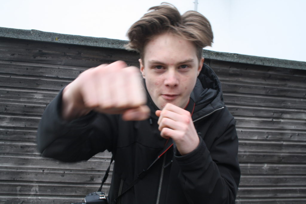
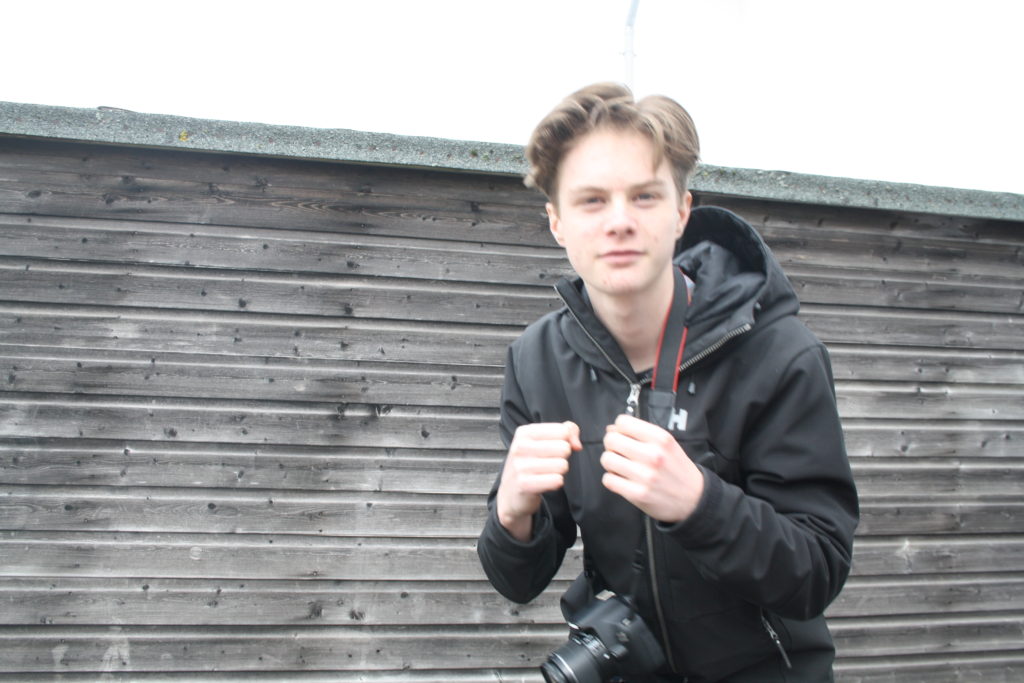
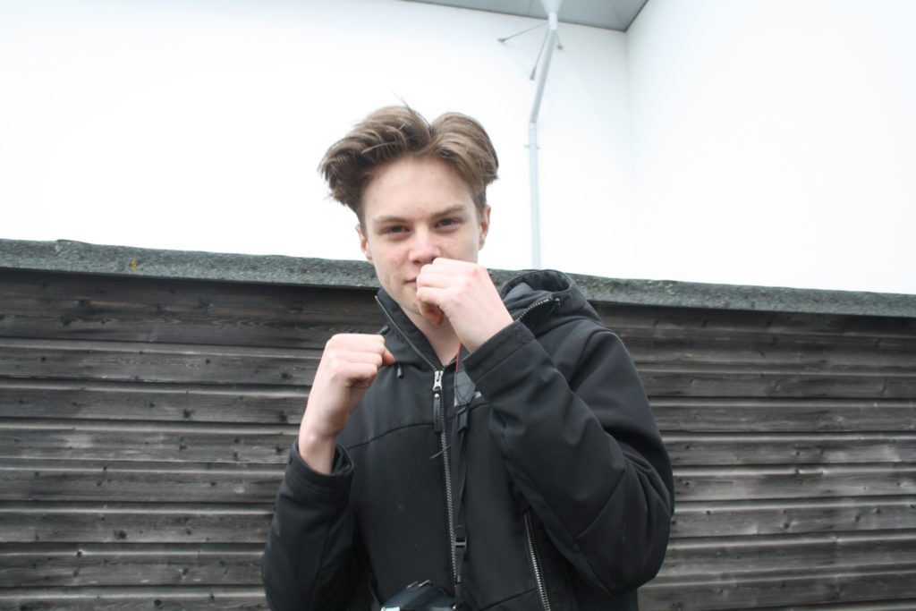
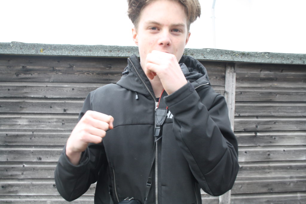
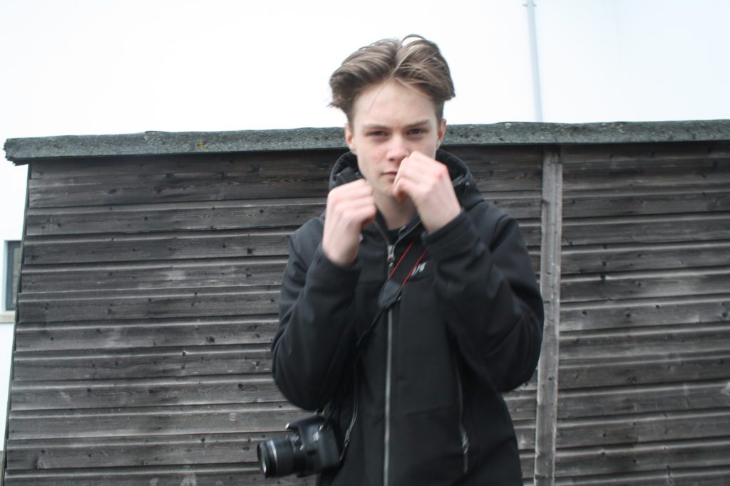
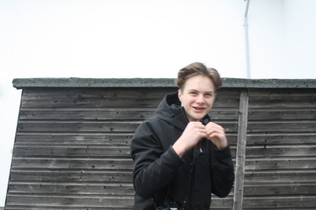
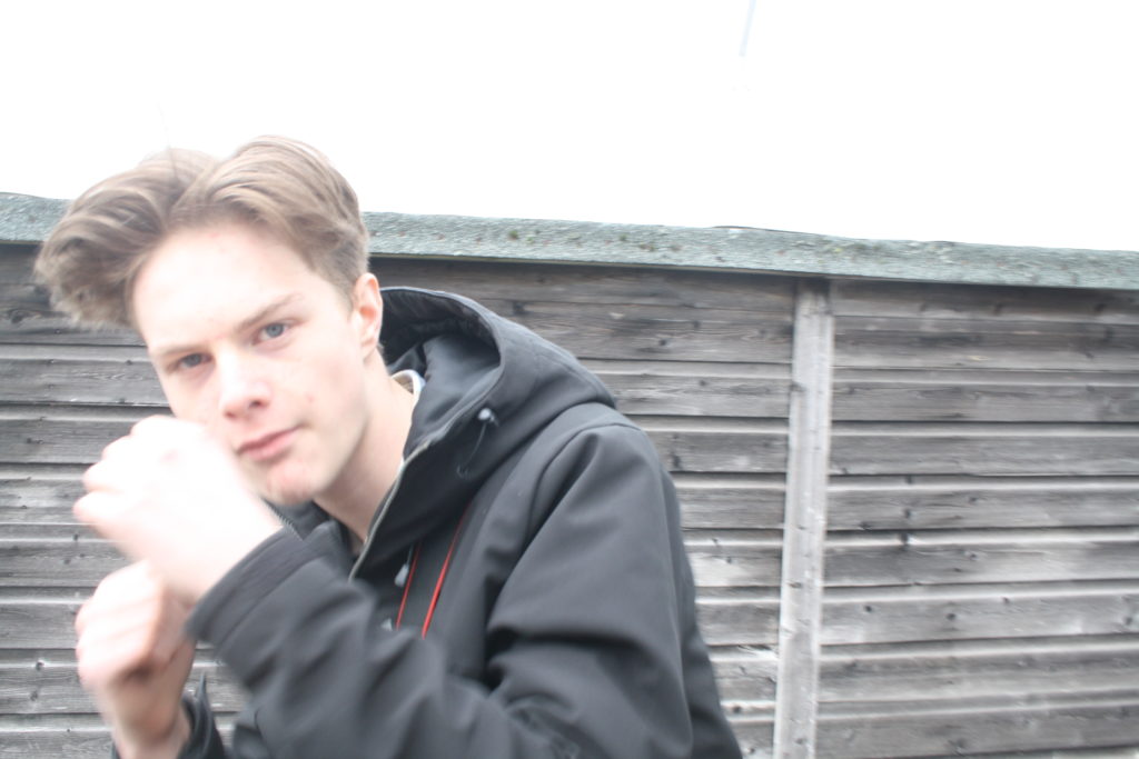
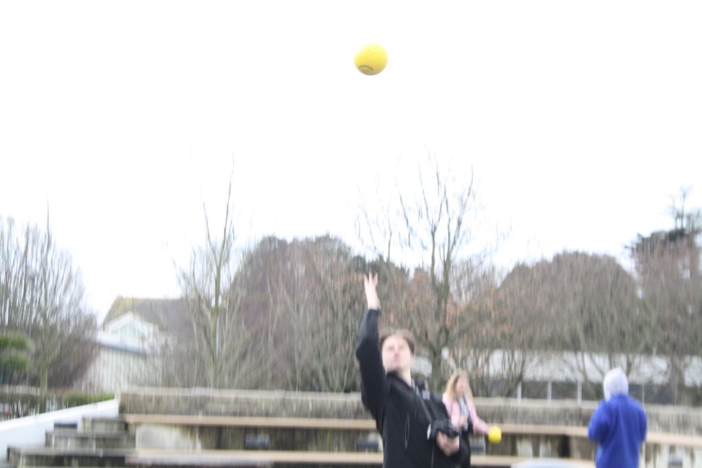
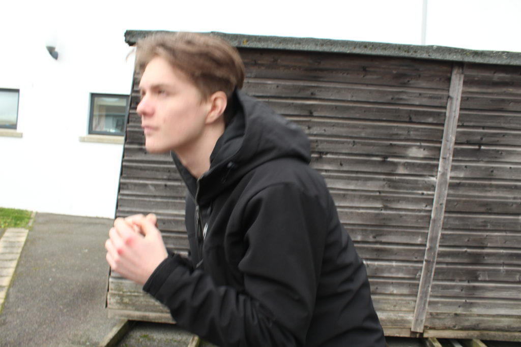
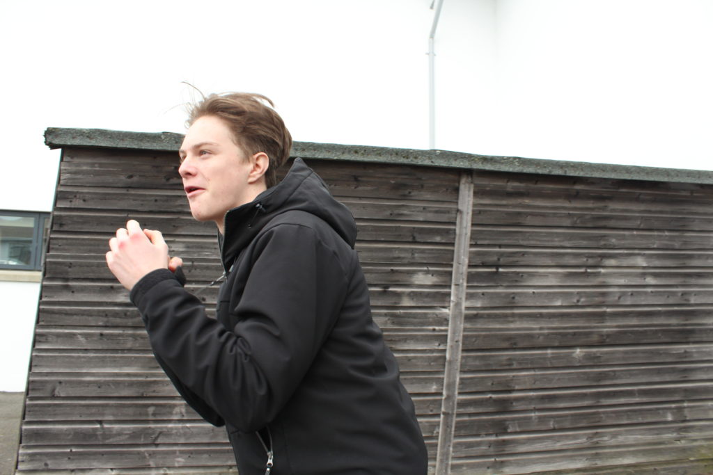
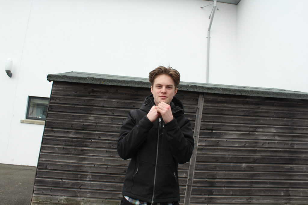
Photoshoot contact sheet
All posts by Kobi Le C
Filters
John Baldessari | Artist Reference
“I will not make any more boring art”

John Anthony Baldessari (born June 17, 1931) is an American conceptual artist known for his work featuring found photography and appropriated images. He lives and works in Santa Monica and Venice, California. Initially a painter, Baldessari began to incorporate texts and photography into his canvases in the mid-1960s. In 1970 he began working in printmaking, film, video, installation, sculpture and photography.

“I guess a lot of it’s just lashing out, because I didn’t know how to be an artist, and all this time spent alone in the dark in these studios and importing my culture and constant questions. I’d say, ‘Well, why is this art? Why isn’t that art?'”
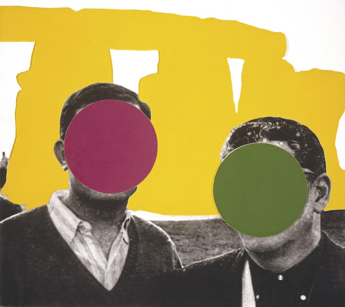
Baldessari first began to move away from gestural painting when he started to work with materials from billboard posters. It prompted him to analyze how these very popular, public means of communication functioned, and it could be argued that his work ever since has done the same. He invariably works with pre-existing images, often arranging them in such a way as to suggest a narrative, yet the various means he employs to distort them – from cropping the images, to collaging them with unrelated images, to blocking out faces and objects with colored dots – all force us to ask how and what the image is communicating.A crucial development in Baldessari’s work was the introduction of text to his paintings. It marked, for him, the realization that images and texts behave in similar ways – both using codes to convey their messages. Text began to disappear from his work in the early 1970s, and since then he has generally relied on collage, but his work has continued to operate with the same understanding of the coded character of images. Typically, he collages together apparently unrelated categories of image or motif, yet the result is to force us to recognize that those images often communicate similar messages.On a visit to the Metropolitan Museum in New York in 1965, Baldessari was struck by the use of unpainted plaster to fill in missing shards of Greek vases. This prompted his interest in how images are effected by having portions removed or blotted out, and he has continued to explore this ever since. Often, the result of his alterations to photographs is to render them generic, suggesting to us that rather than capturing a special moment, or unusual event, photographs often communicate very standardized messages.
Hiroshi Sugimoto | Image Analysis

This image of Sugimoto’s expresses his style. Evidently, the black and white theme continues but he uses animals instead of people or objects as his subject. In the image, Hyenas, Jackals and Vultures appear to be fighting over something, likely a kill. This fighting is a fine line where life meets death, the kill itself is represents the dark side of that spectrum. The weather also plays a vital role in exposing this theme which is only emphasized by the black and white. The horizon marks the border between the light and the dark, the margin that represents the border between life and death.
Despite the image being constructed post shoot, it looks very real and to the viewer, it creates a sense of fear perhaps and an exaggeration of the line between life and death. Visually, the image stands out by being unique and interesting with its wild subjects however the composition of the image itself increases the image’s likability. Being black and white, the image attracts a nice contrast between light and dark, linking to the theme of life and death that we see in the subject matter. Further,more, the sky has little structure and retains a rather smooth texture yet the shading adds a real depth to the image and almost sets the brightness of the entire image and creates an effect making the image appear brighter yet still having a meanness to it.
This image, despite using fake subjects, is quite a fascinating image when it comes to the taking of the image itself. It could appear that Sugimoto put himself in danger being so close to wild predators. He captures a lot of lives in that image and that fact even further expresses how fragile that can be as they fight over a kill. I would think that he used a wide angle lens at quite a close range, maybe only 5-10 meters from the subjects. I would believe he used a faster shutter speed and a medium ISO to capture the birds flying perfectly still but also having the light in the image to light the foreground but not too much to have the background (sky) to be over-exposed.
Hiroshi Sugimoto | Artist Reference
Hiroshi Sugimoto is a Japanese born photographer, who first began taking interest during his time in highschool. Although Sugimoto studied Politics and Sociology at university level in 1970, he decided to ratrain in 1974 and recieved a BFA in Fine Arts at the Arts Centre College of Design.

Sugimoto describes his work as an expression of time exposed photographs which act as a time capsule for a series of events in time.
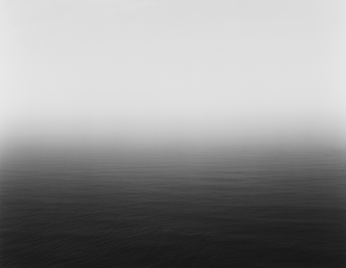
Many of Sugimotos photos lack the physical detail which would allow the photos objects to be distinguished, and instead strongly focuses on the lighting and textures. Sugimotos photos do not follow a certain pattern, and his images do not specify the subjects in which we are looking at,suggesting that he follows the surrealist movement.
Sugimoto produces a vast amount of his images using a large 8×10 format camera on a long exposure, creating the blurred effect that some of his images have.
Michael Wolf | Artist Reference
Michael Wolf was born in 1954 in Munich, Germany and was raised in the United States, Europe, and Canada. He attended the North Toronto Collegiate Institute and the University of California, Berkeley. In 1976 he obtained a degree in visual communication at the University of Essen, Germany.
Wolf began his career in 1994 as a photojournalist, spending eight years working in Hong Kong for the German magazine Stern.
Wolf states that a decline in the magazine industry led to photojournalism assignments becoming “stupid and boring.” In 2003 he decided to work only on fine-art photography projects.
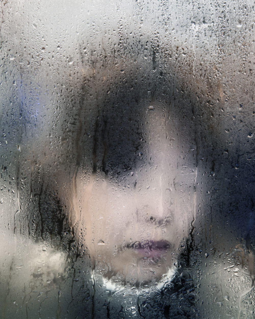
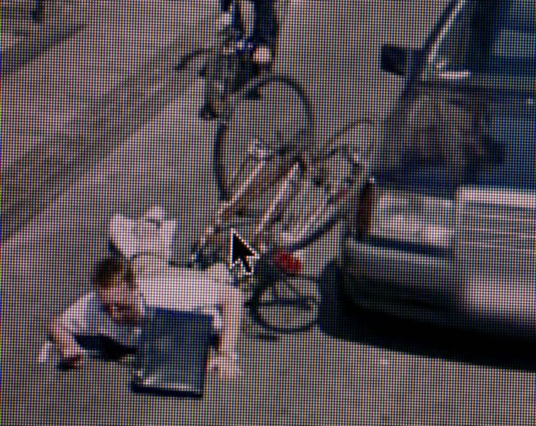
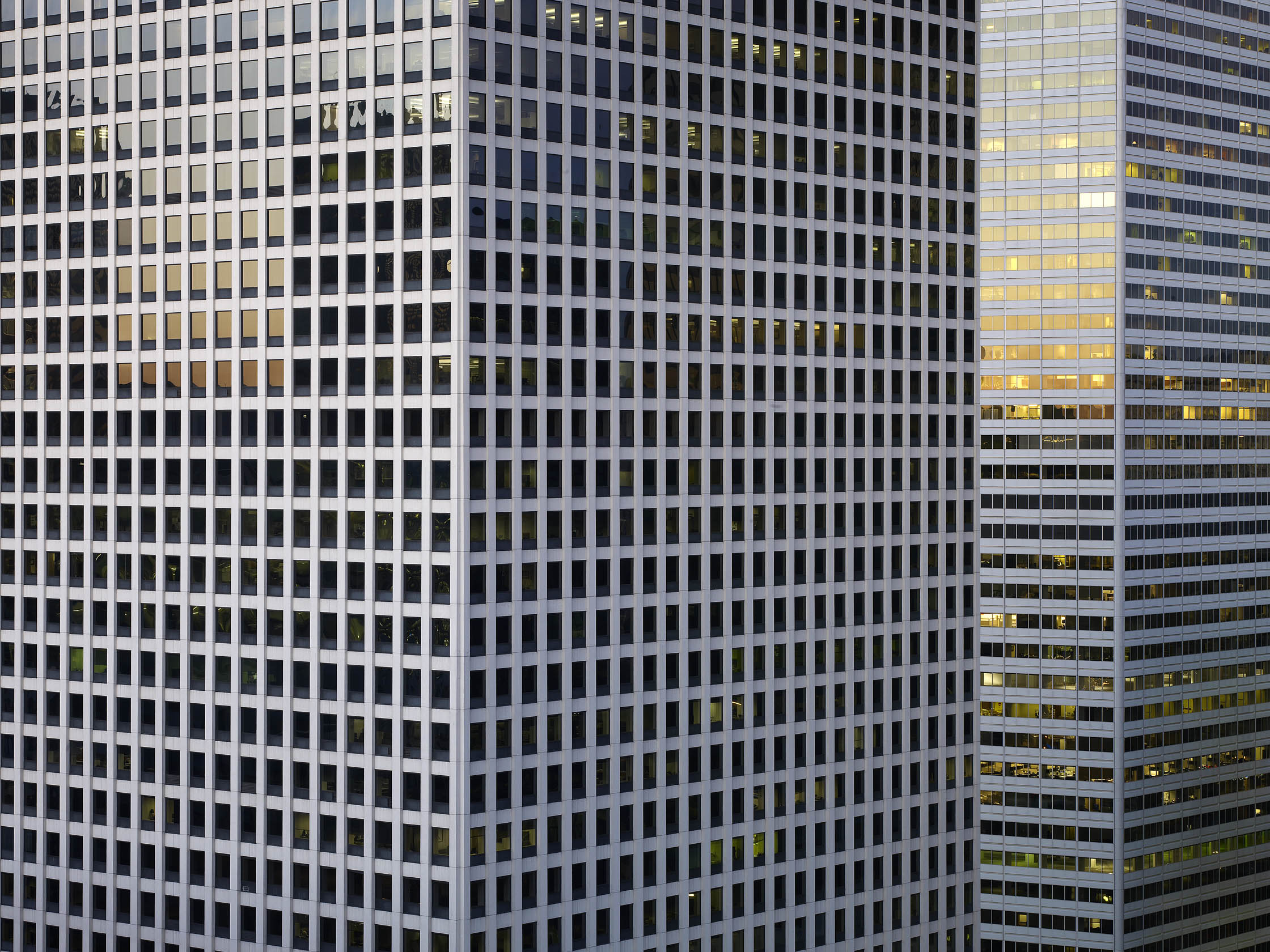
Wolf’s current works are spread between Hong Kong and Paris mainly and
his work focuses on the structure and repetitiveness of daily life in big cities. He has has many notable projects such as ‘100×100’, ‘Bastard Chairs’ and ‘Tokyo Compression’.
Everyday
This short video is something I do everyday, a daily repetition.
David Prentice | Linked to Hiroshi Sugimoto
David Prentice was an English artist and former art teacher. In 1964 he was one of the four founder members of Birmingham’s Ikon Gallery. His work is hard-edged, abstract, close to the Op art of a period when young artists and architects were full of ideas for new beginnings.
For many years, his subject was the Malvern Hills, which he knew intimately from countless walks with sketchpad in hand. The forms of the hills were a constant, the weather constantly changing. He painted with the concern for structure and surface that had characterized his earlier work. The watercolors, often done on the spot, were more specific but the paintings done in the studio were as carefully constructed as ever.
In time his subjects expanded to include dramatic cityscapes of London, especially of the river, and the landscape of Skye, or rather its approaches.


I believe there are direct correlations between the work of David Prentice and Hiroshi Sugimoto. The key similarity is the attention to lighting and textures as appose to detail and displaying a landscape how we would usually see it. Instead, Prentice uses large brush strokes giving a faded/blury look to the landscape with emphasis on accurate depiction of light. Sugimoto focuses on using slow shutter speeds to bring about this faded look like Prentice does. Despite Sugimoto’s images being in black and white I believe there is a main focus on how lighting/weather can transform the similar landscape that he focuses on. Another key similarity in their works is the elimination of any man made features creating a difficulty in identification of a place.
GIF Experimentation
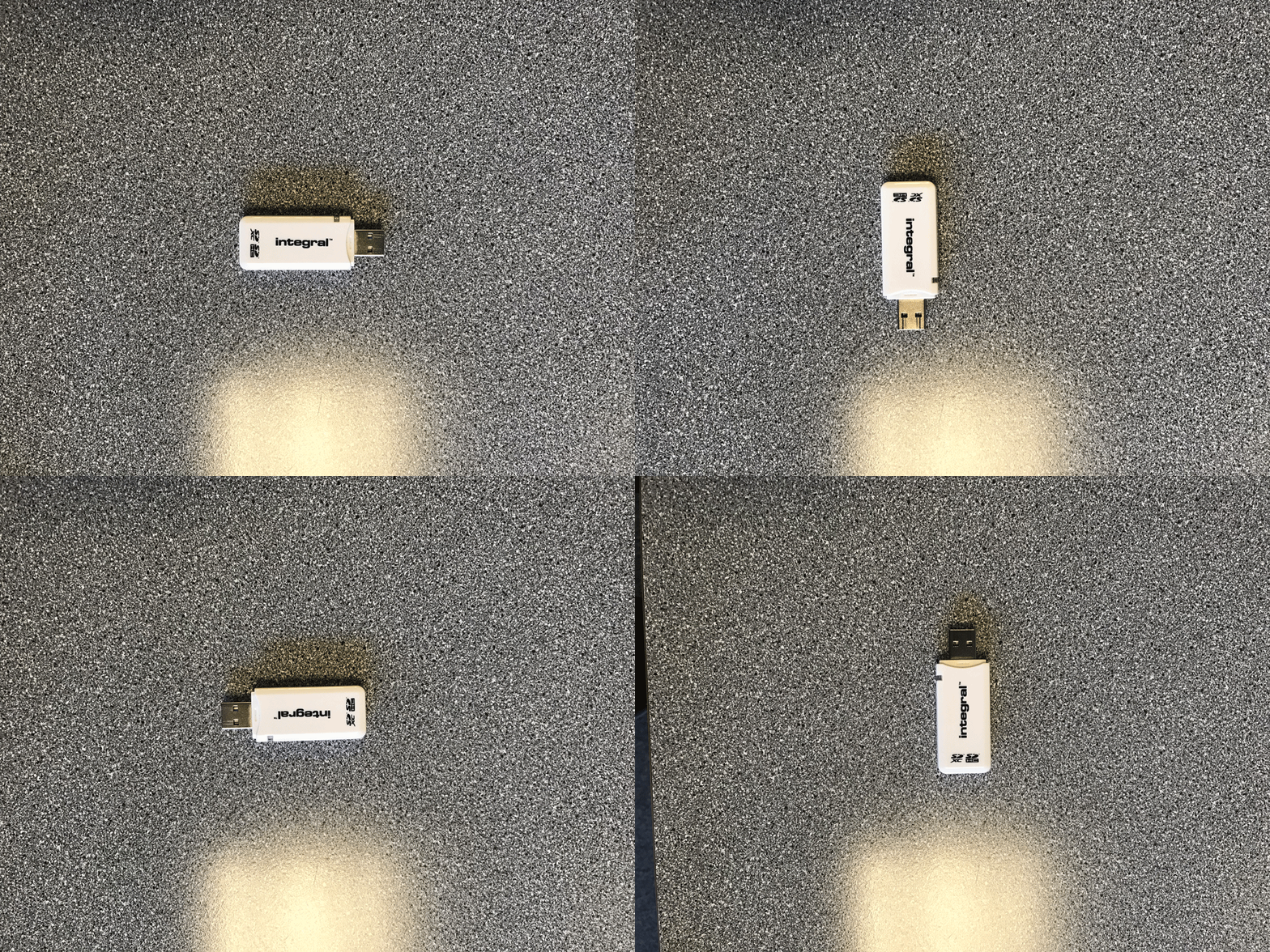
My GIF is very simple and explores the ideas of similarity and difference. This card reader is the same object but turning to face different directions.


