Click HERE to view the preview of my book on Blurb ‘Latitude’
You can click HERE to see the listing on Blurb
You may notice some blank spaces, two images are missing and will be added when the hard copy arrives and added as inserts.

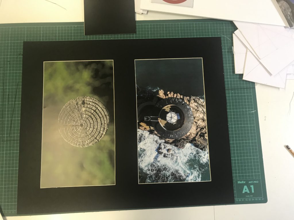


I am happy with this final design and I will send this to be printed. To start with, my title page and back page were designed to be eye catching yet simple and that’s why I chose those images. I used white text as it worked well with the background and a bold sans-serif font for effect. The back page is also simple and the circle contains text that explains the meaning behind the name ‘Latitude’.
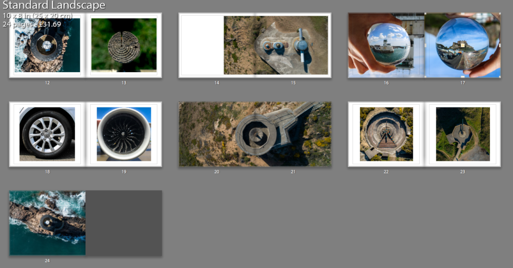
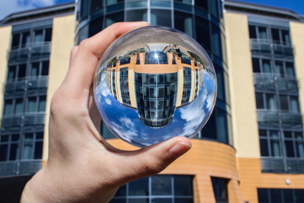
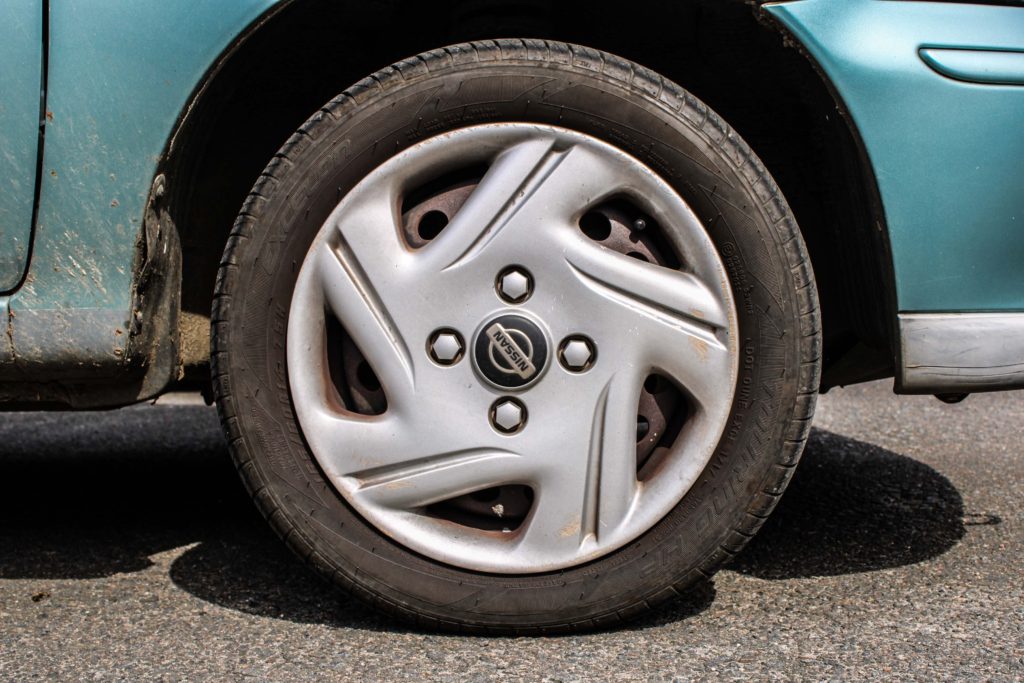
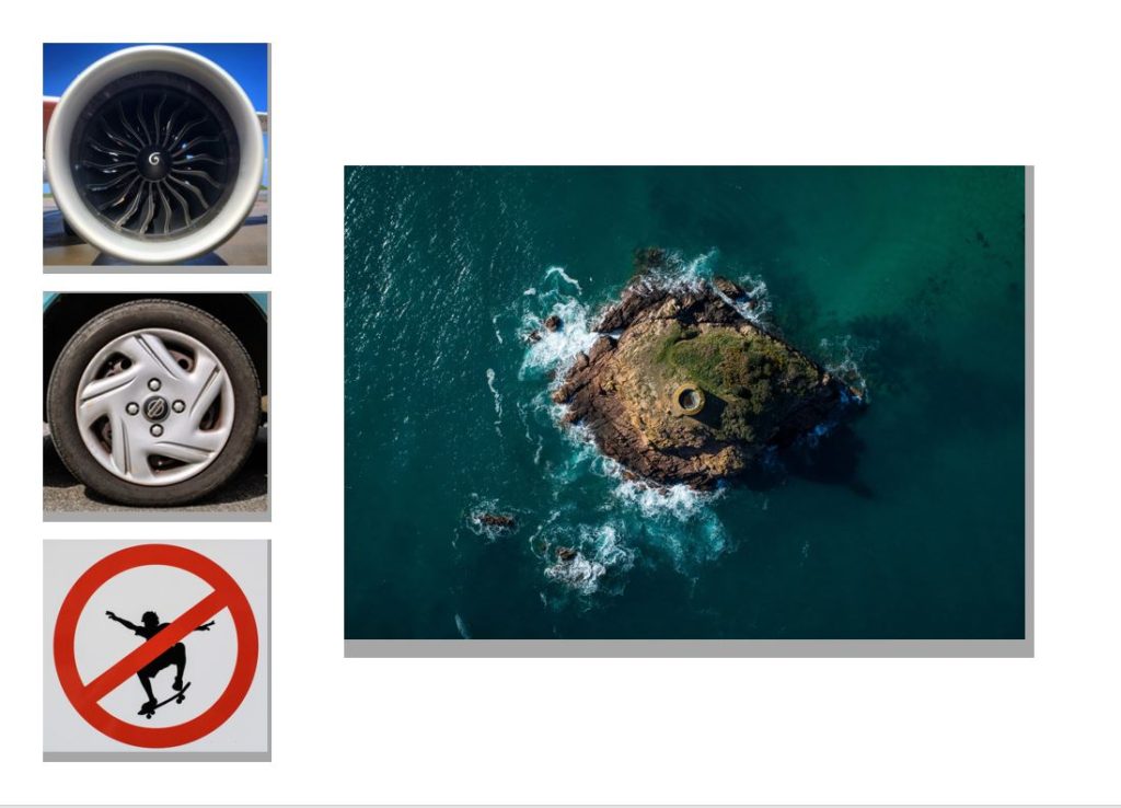
The first image is Liberation Square in town (which happens to be a circle), the second set of pages represents the urban and rural contrast and also the differentiation of technique through the lens ball and tiny planet photography yet maintaining the circle shape, following out theme of Variation and Similarity. The next double page spread is La Hocq, then Noirmont bunkers, Janvrin’s tomb with a zoomed image, Batterie Moltke guns, tower to wood contrast between natural and man made structures. Then Noirmont targeting position, then lens balls of the harbor VTS and Mont Orgueil Castle, wheel and jet engine, Noirmont MP1, guns from Batterie Moltke and Lothringen and finally Noirmont Lighthouse.
I wish I had a larger variety of images however it was not viable due to cost but mainly because the book would seem overcrowded and maybe too jumbled, therefore I stuck to a basic set of images that worked together.

After much umming and ahhing I decided on a name. ‘Latitude’. I discovered this name when looking through a Thesaurus at other names for circles and I rather liked it straight away. I had a couple of other options however for me, this one stood out for many reasons.
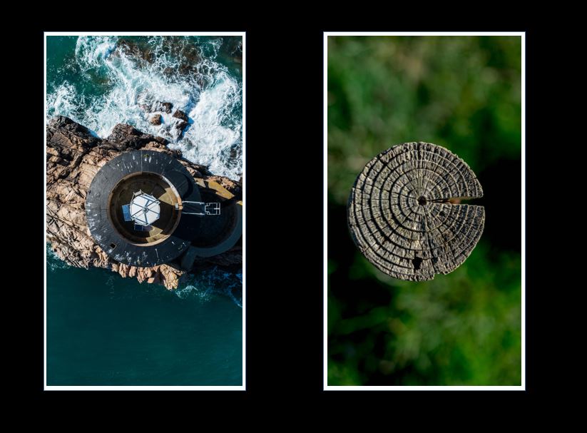
Firstly, it just sounds cool and catchy. Secondly, latitude is a circle on world charts and this links to my images of tiny planets as they are globes like out planet. Lastly, on a map, latitude looks like rings around the earth and this links to my cover image you see above of the wood with the rings representing life.

I attempted merging images together to create one image where the circles are halved. I thought this would work well however this image was the only presentable one. I am glad I experimented and realized that this didn’t work however I do not believe this image would fit in with the rest of my book as it would be too alien in comparison to the other images in the book. As well as the fact both of these images are used in separate pages.
Below are my final outcomes from yesterday’s shoot (Monday);


These final outcomes from one shoot made that day very successful in my opinion, I was very happy with the lens ball images and some of the extra little shots I produced whilst walking around town and Gorey.
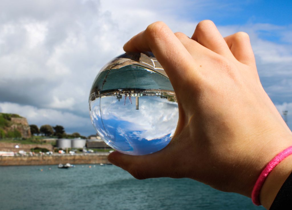
My favorite images, which is labelled above, is of Mont Orgueil Castle above Gorey taken through the lens ball. I simply had the camera on auto as I had to hold the ball in my left hand and shoot with my right so I believe auto would likely be the most sensible approach to taking this image, yet I usually try to use manual settings on all shoots. The lens ball can be difficult to master when shooting objects from afar. You need to play around with the camera and ball at the same time to work out the best angles and distances between the subject, lens ball and camera lens to achieve the best clarity, depth and subject size possible.
The main reason I like this image more than the is because it is more of a close up, it allows for more details to be picked up in the image, furthermore, the ball looks much more 3 Dimensional and may even look like a planet as it picks up the sky very well.
Narrative: What is your story?
Describe in:
Design: Consider the following
My first images to present (below) are contrasts of each other and work very well as a set of two. I have two ideas to start with, one where each image is on white foam board and the other idea is they they are in black window mounts. You can see the two designs below and I have decided to go with the black window mount. When using the diagrams below, I liked both ideas however the black mount make the colors more prolific and allowed for a nice contrast between the white in the water and the black mount.

My next set of images to present are different, I plan to have a set of 3 images in a line sitting next to a larger image. I have two very similar ideas for this one, as you can see below. You see the set of 3 on the left on top of an extra foam board to make them stand out (3D) and the image on the right is not, however on the second idea the image on the right is also on foam board. In the end, I decided to follow the second idea and have the image on the right on foam board as well and the set on the left.

My planned photoshoot for St Helier did not go to plan due to the Jersey Boat Show taking place at the time. This affected my ability to shoot certain places and areas. Therefore I moved to Gorey and shot there as well to get some extra imagery. I spent 3 hours walking around town and also Gorey village looking for circles and exploring them through photography.
Below is the contact sheet of that afternoon;

This shoot was completely ground based, no drone today however I did take the drone up with my dad the day before and I will upload this in a separate post.
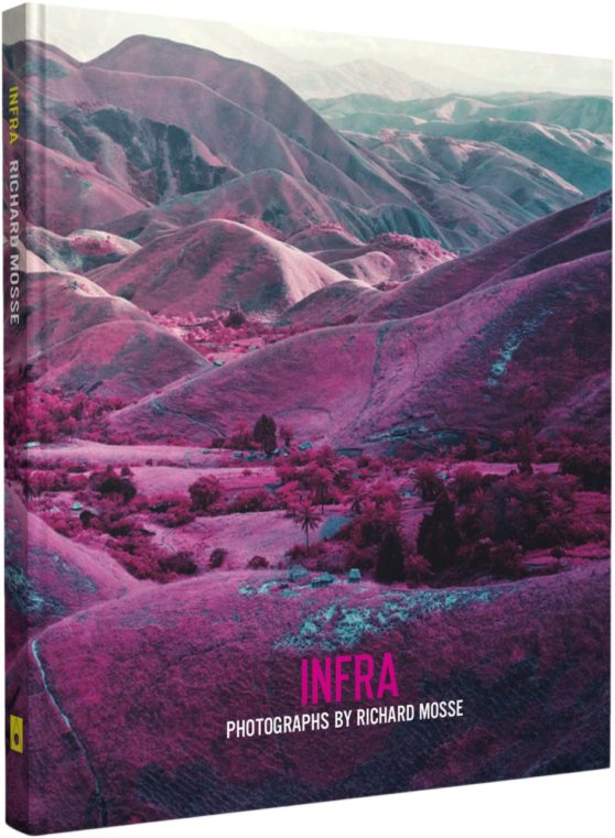
Infra, Richard Mosse’s first book, offers a radical rethinking of how to depict a conflict as complex as the ongoing war in the Democratic Republic of Congo. Mosse depicts the rich topography, inscribed with the traces of conflicting interests, as well as rebel groups at war with the Congolese national army (itself a patchwork of recently integrated warlords and their militias). For centuries, the Congo has repeatedly compelled and defied the Western ideology. Mosse brings to this subject the use of a type of color infrared film called Kodak Aerochrome. Originally developed for military reconnaissance and now discontinued, it registers an invisible spectrum of infrared light, rendering the green landscape in vivid hues of lavender, crimson, and hot pink. The results offer a fevered inflation of traditional reportage, underlining the growing tension between art, fiction, and photojournalism. Mosse’s work highlights the ineffable nature of current events in today’s Congo. Infra’s photographic dialogue begins as an intoxicating meditation on a broken genre, but ends as a haunting elegy for a vividly beautiful land touched by unspeakable tragedy.


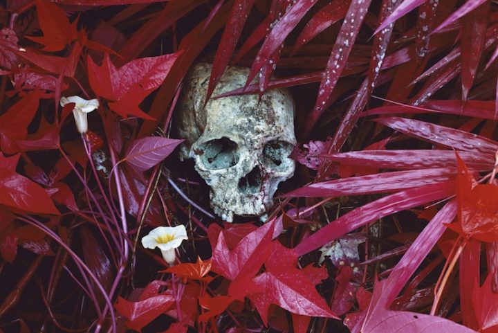
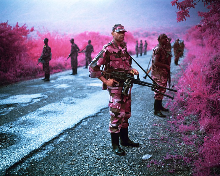
Mosse’s photo-book ‘Infra’ was one I found very eye catching and appealing to me. I became instantly interested in his story and his images were compelling and told the story of his time in the Congo without using a single word. My book however is not following the same approach, my book aims to make people see the world in a different way and maybe be more observant of the world around them and circles are a shape that you can see everywhere, but nobody really takes notice. That is one similarity this book has with my idea, that nobody takes notice of the conflicts etc in countries we find ‘insignificant’ to us.

Richard Mosse (born in Kilkenny, Ireland, 1980) holds an MFA in photography from Yale University School of Art, and additional degrees from Goldsmiths, London; King’s College London, and the London Consortium. His work has been widely exhibited internationally, including at the Palais de Tokyo and the Tate Modern. In 2011, Mosse was awarded a John Simon Guggenheim Memorial Foundation Fellowship, with a supplemental stipend from the Leon Levy Foundation. Mosse is represented by Jack Shainman Gallery.