All posts by Jay Liron

Filters

Author:
Category:

Evaluation of my Final Piece

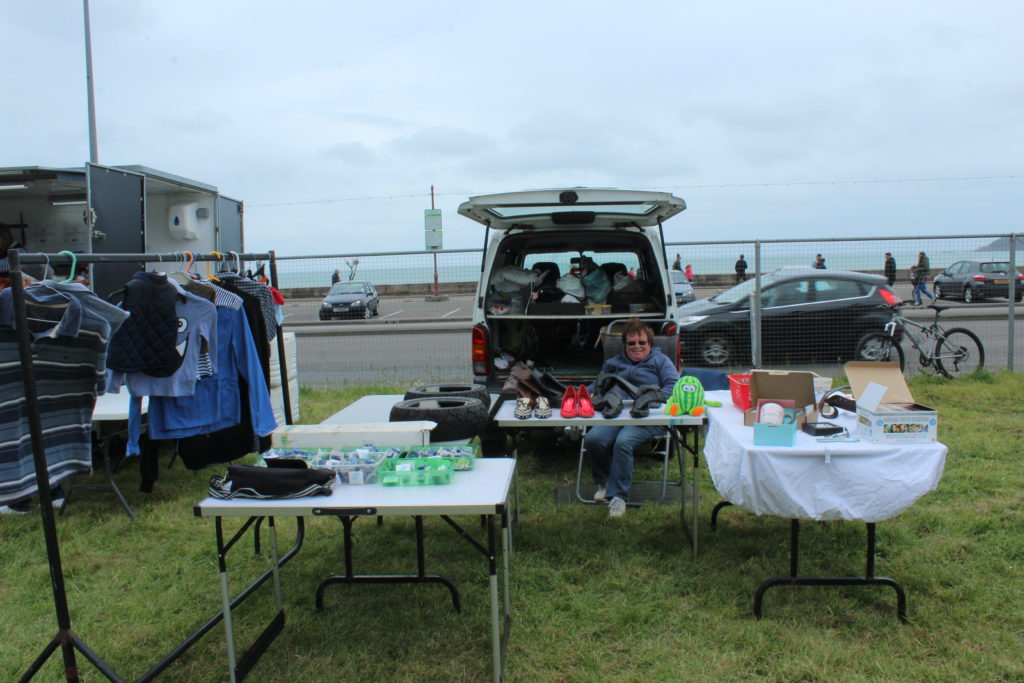
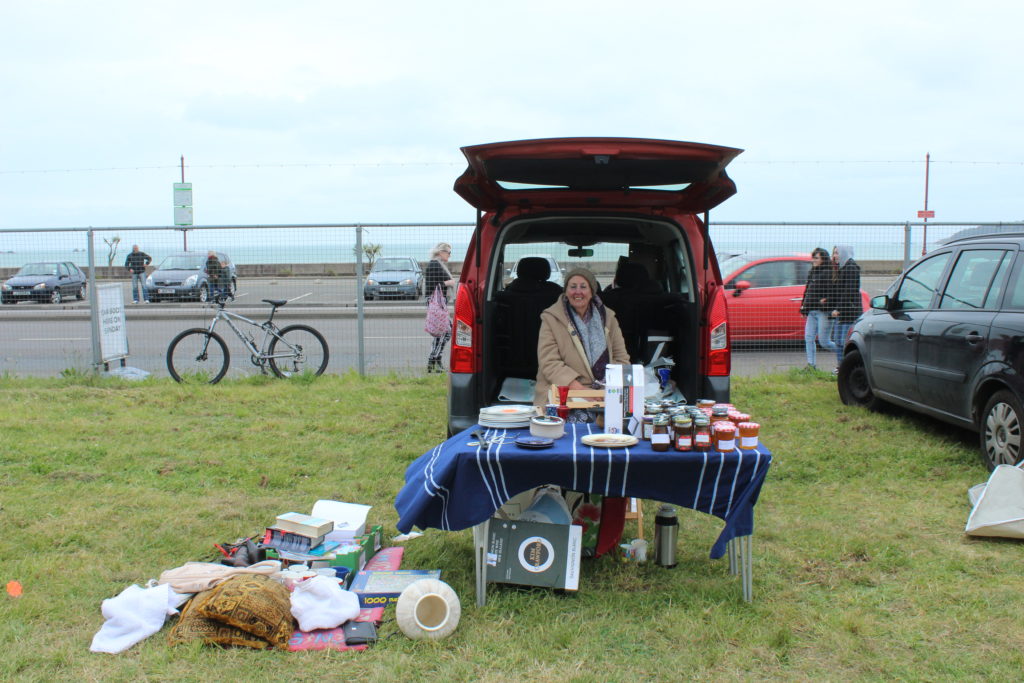
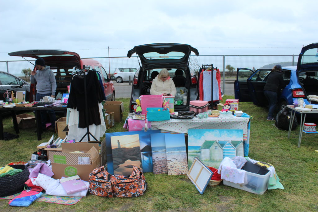
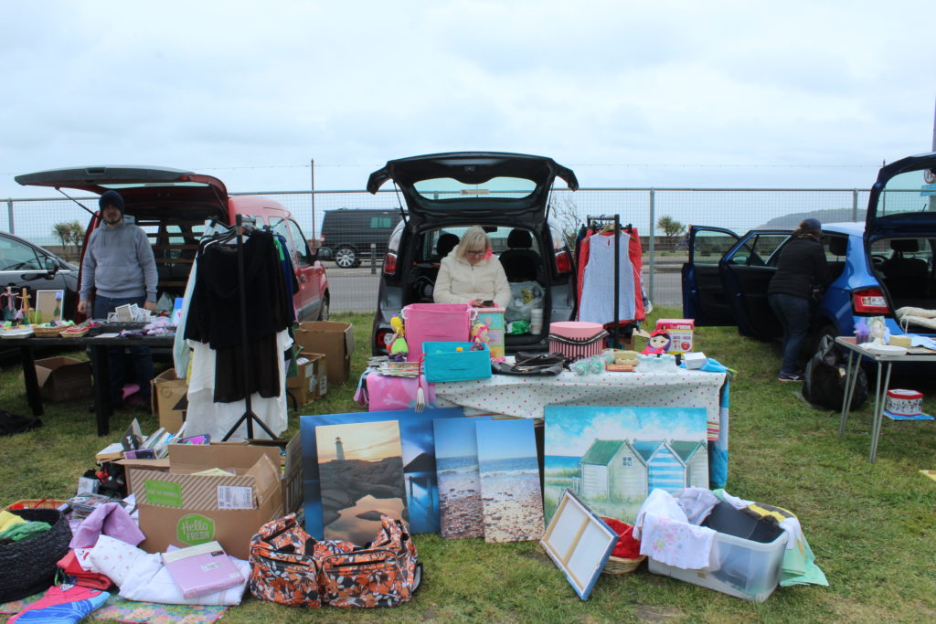
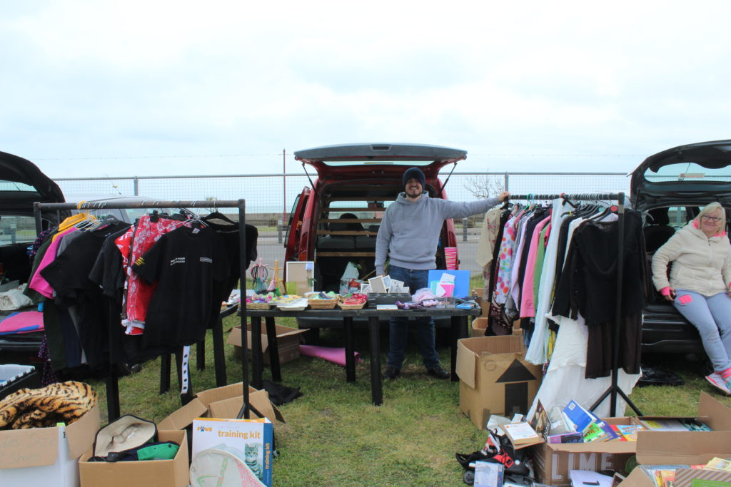
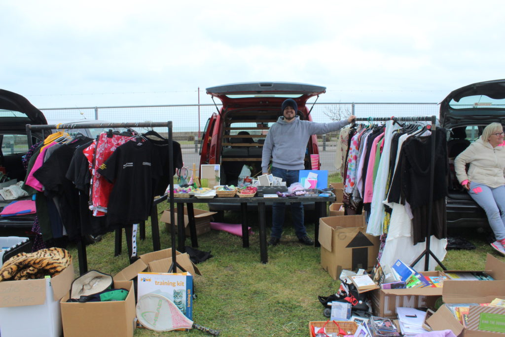
During the ‘variation and similarity’ projects I’ve taken inspiration from many different sources and developed my images over time to create a final piece that I am please with. Originally had looked at photographing front doors however I feel that it was not interesting enough so pursued car boots, taking inspiration form Huang Qingjuns ‘family stuff’.

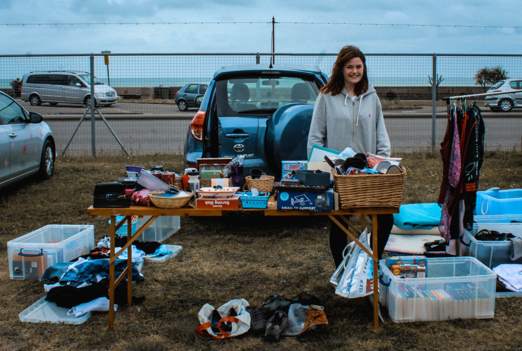
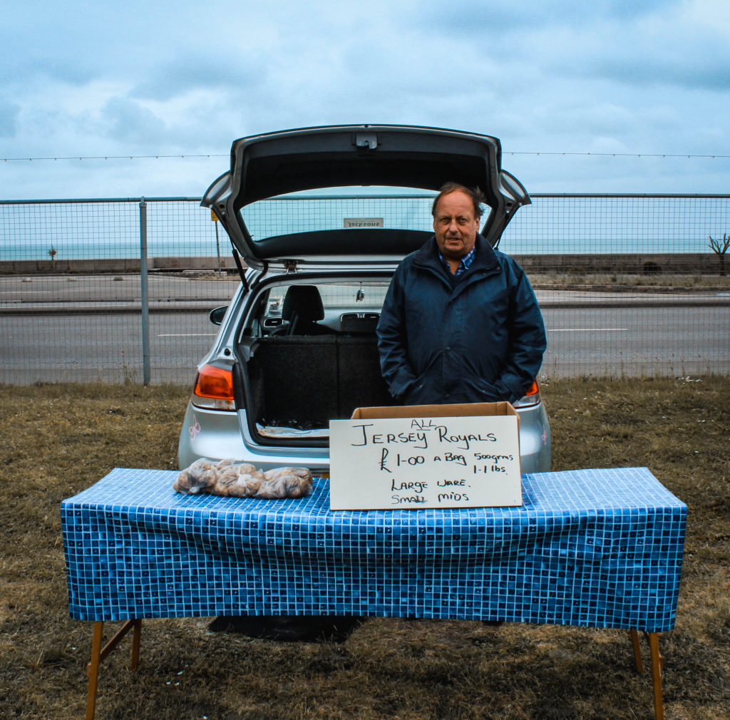
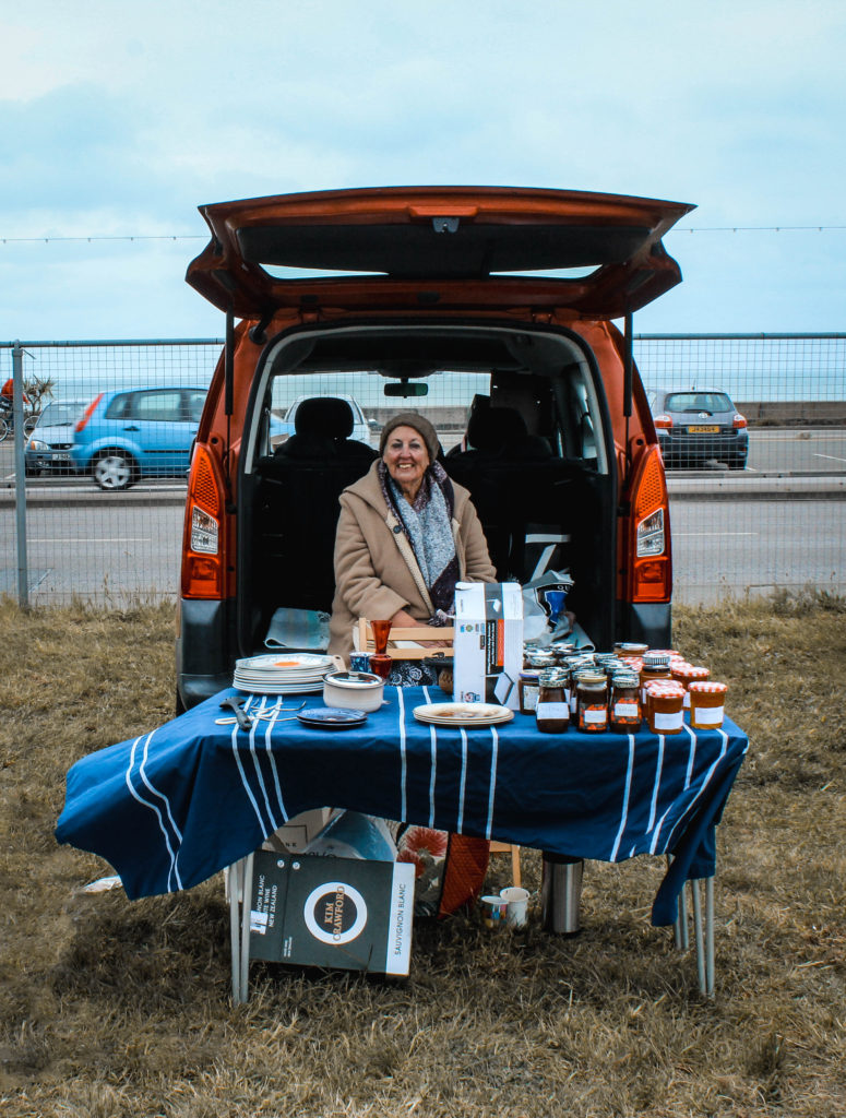
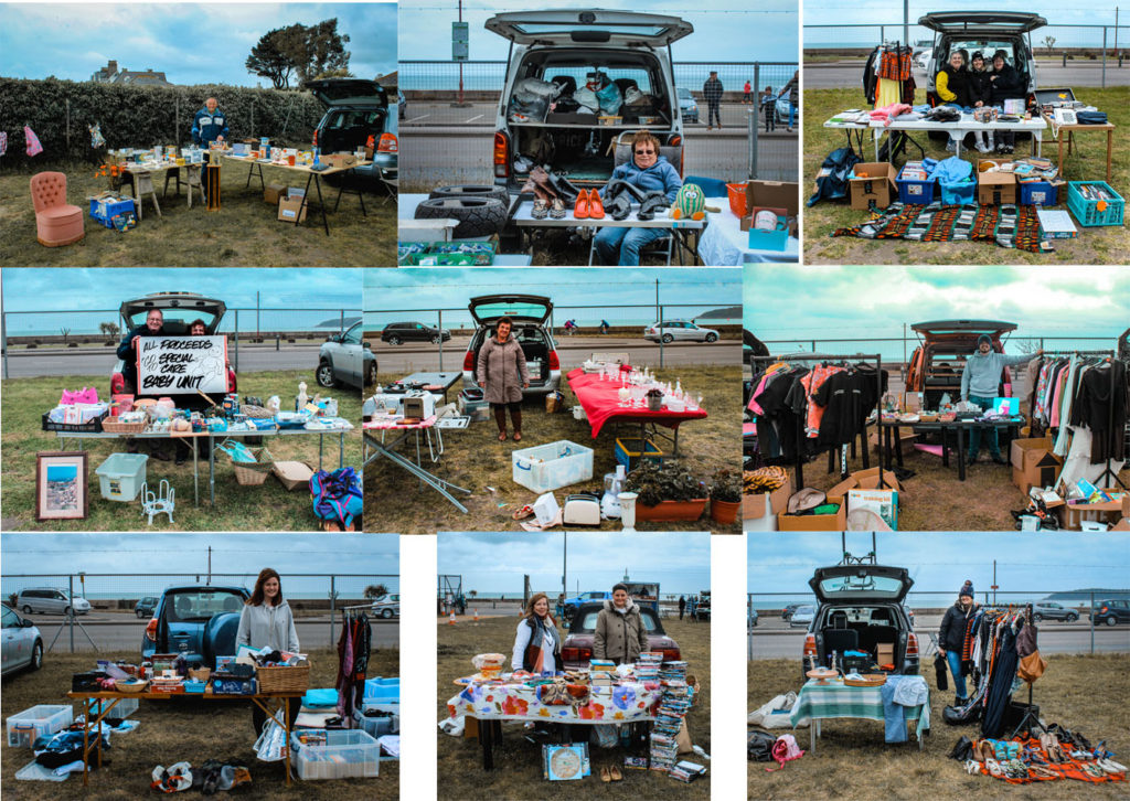
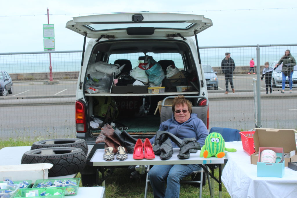
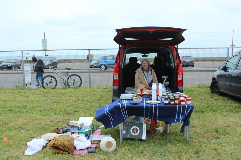
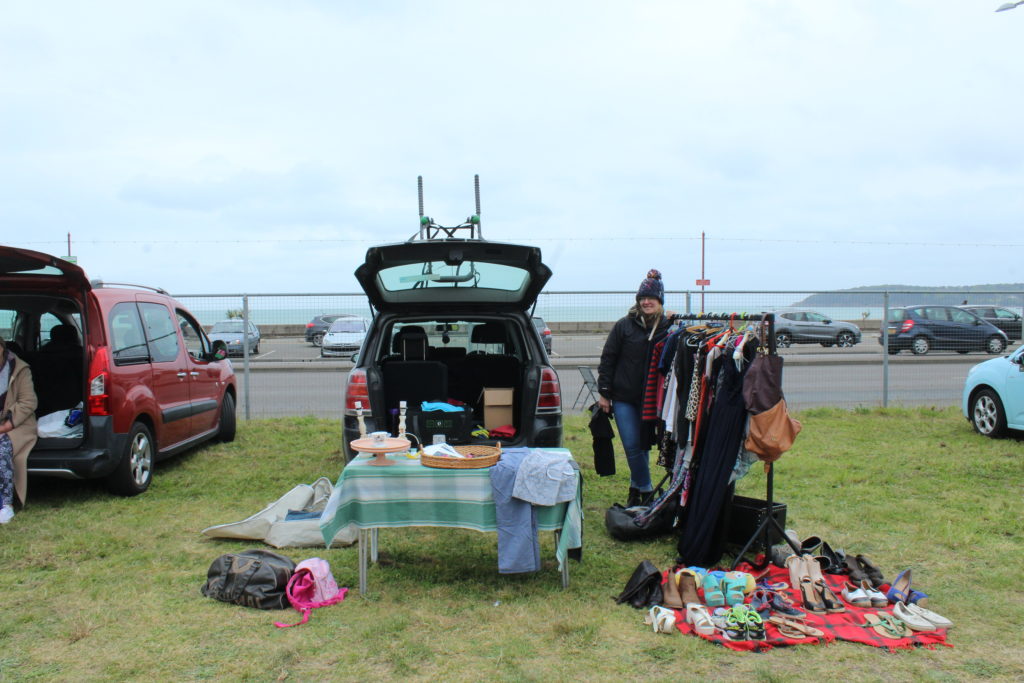
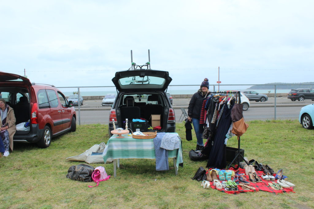
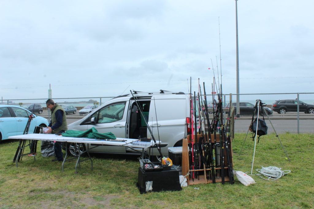
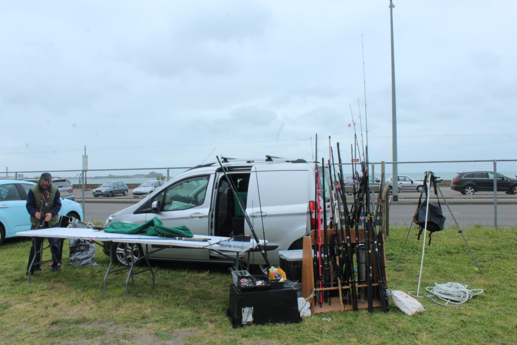
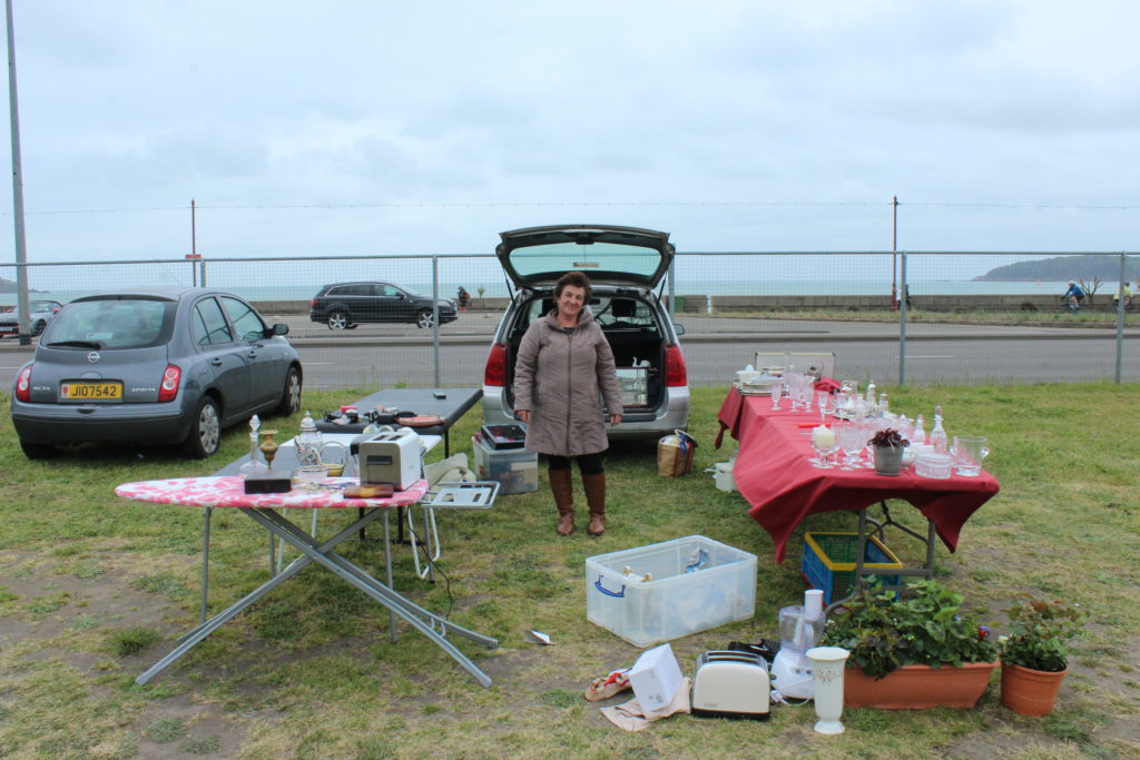
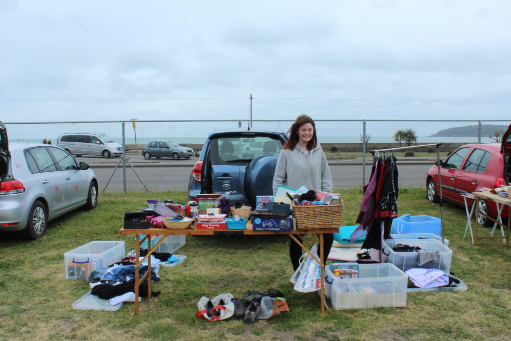
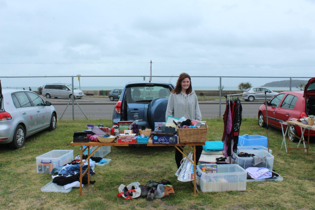
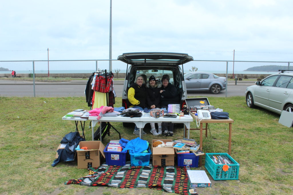
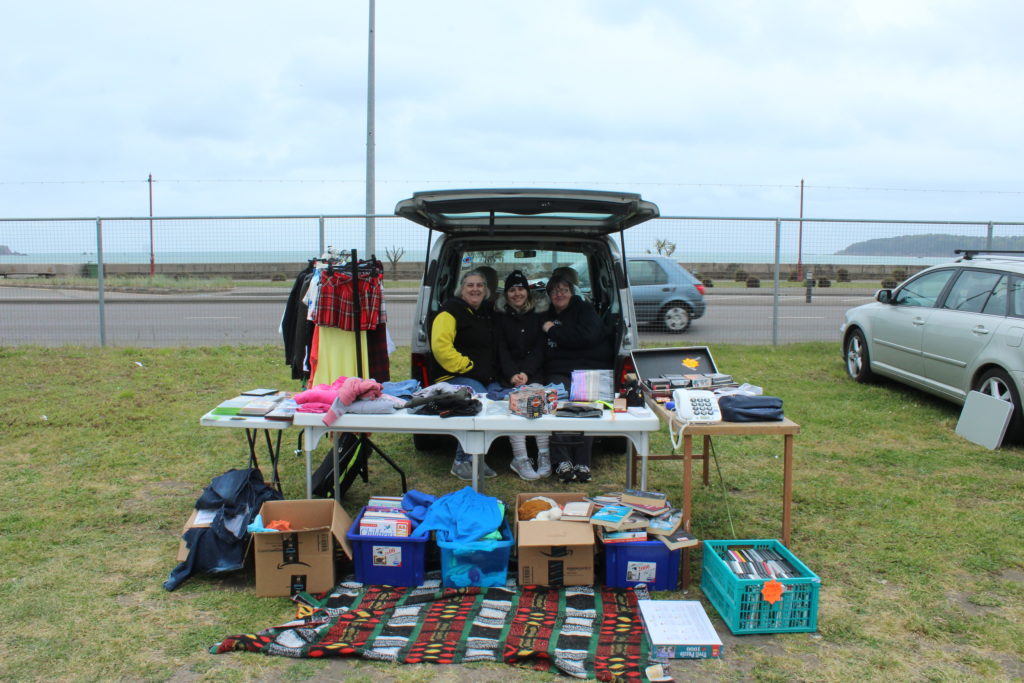
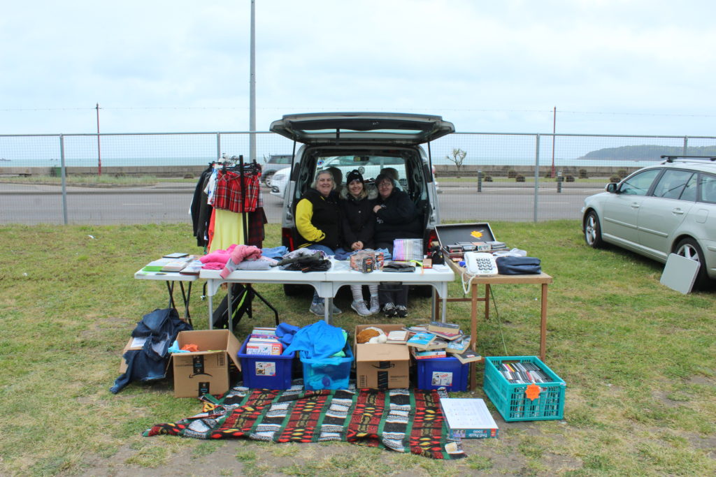
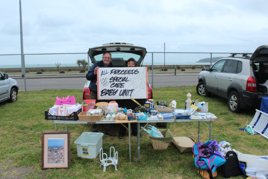
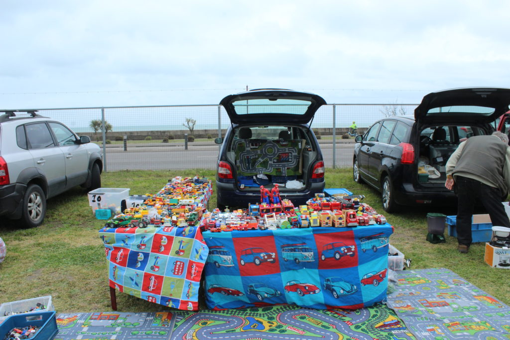
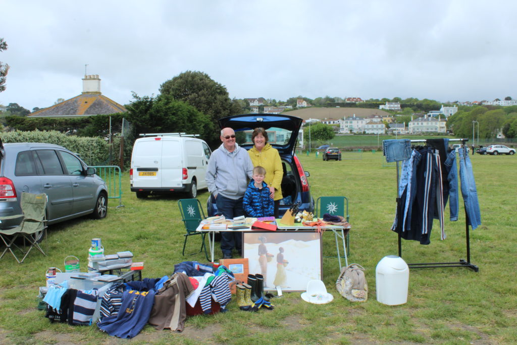
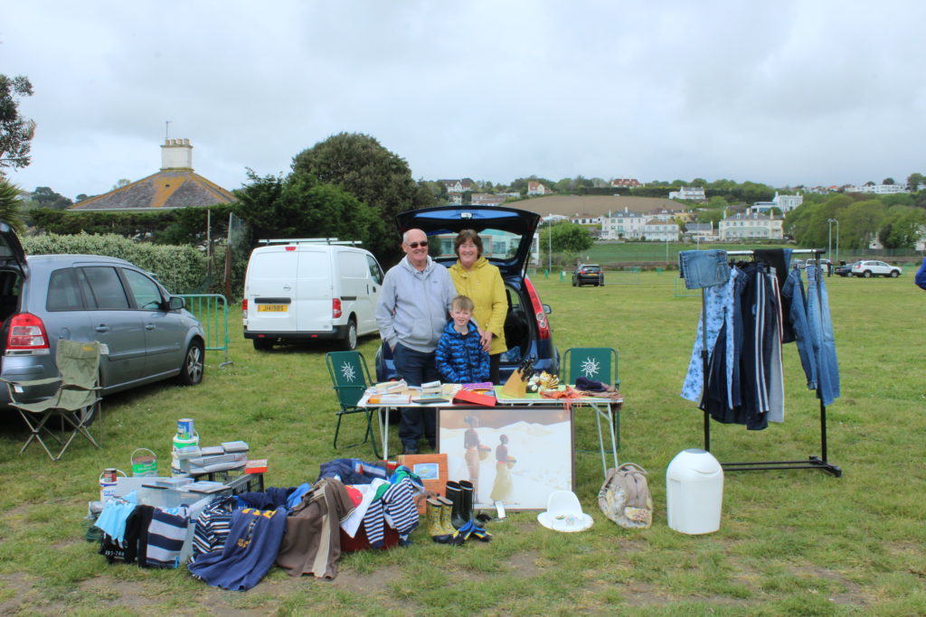
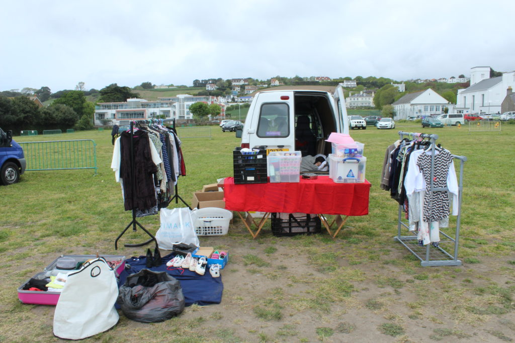
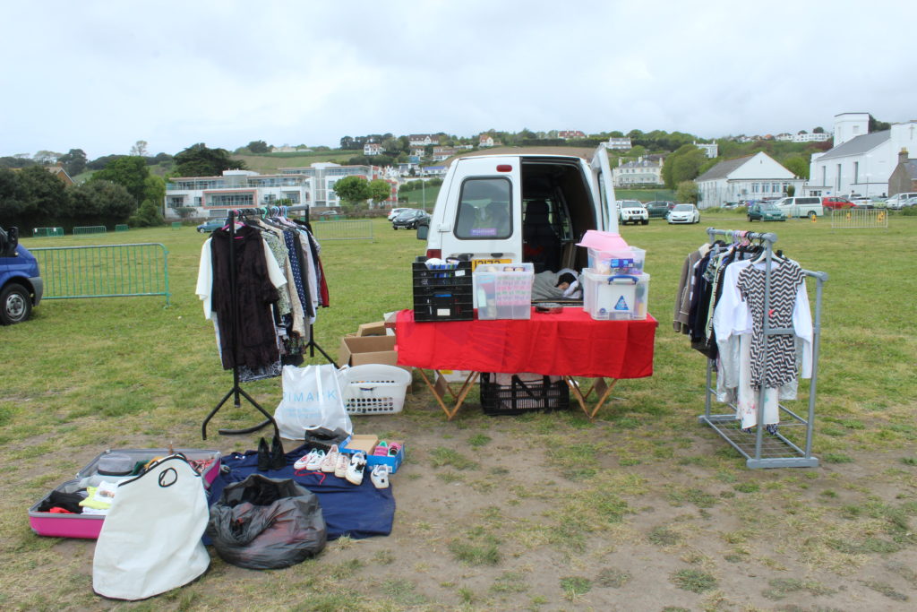
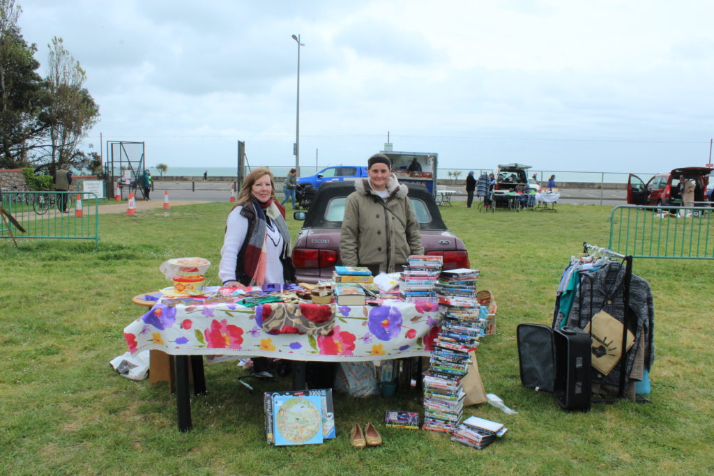
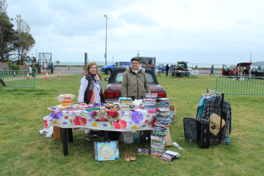
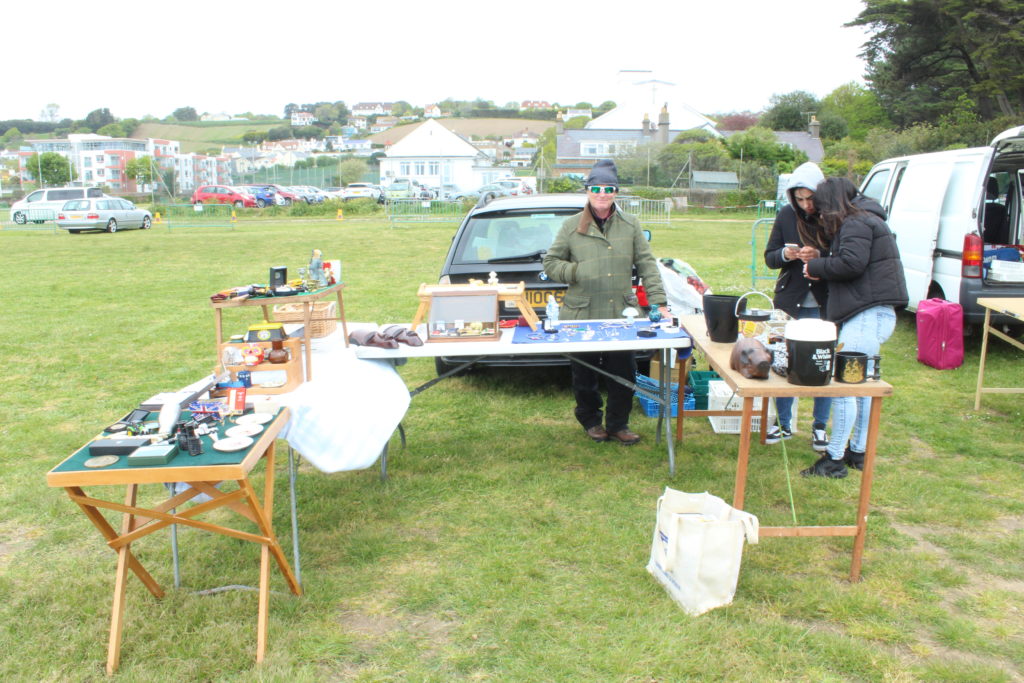
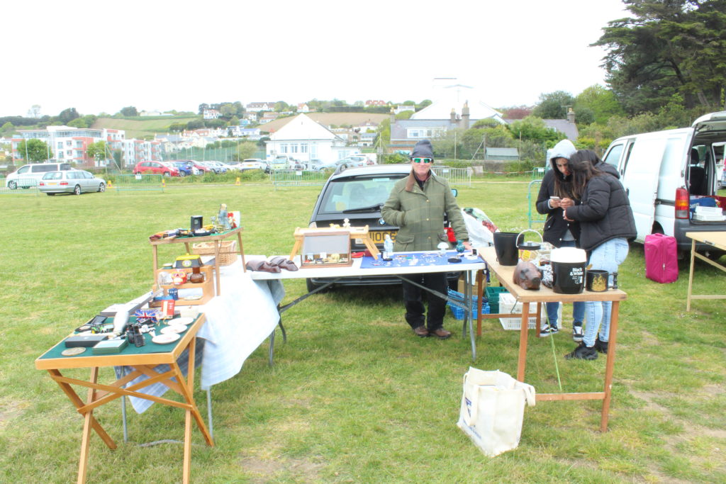
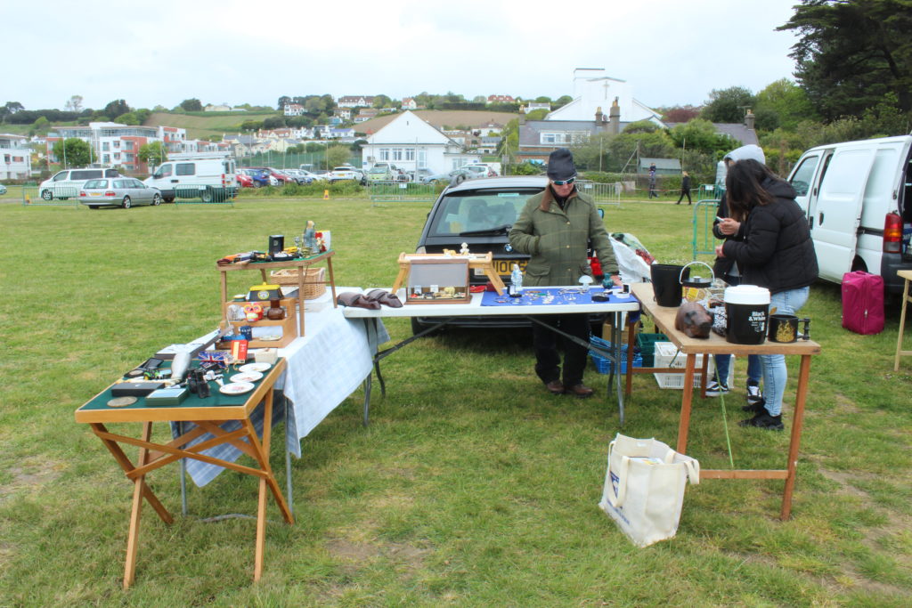
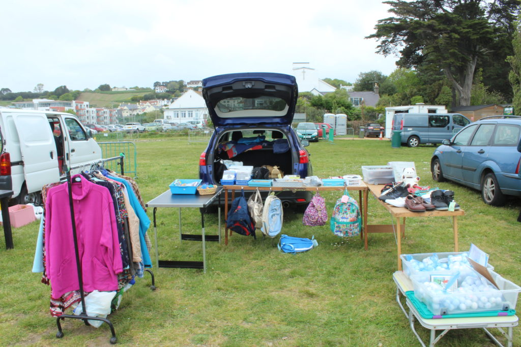
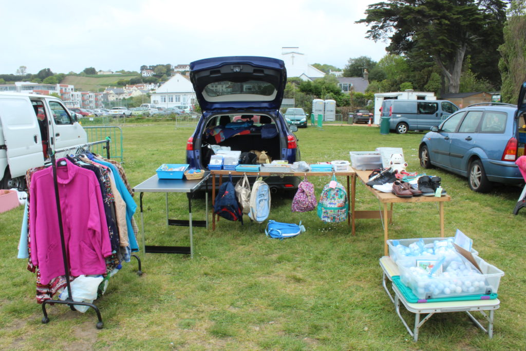
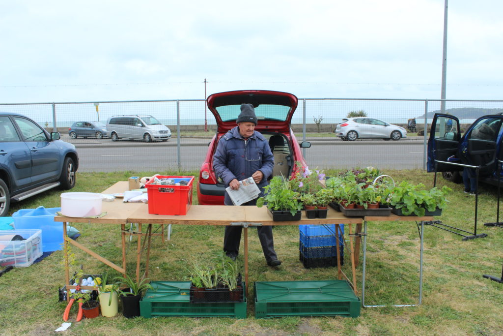
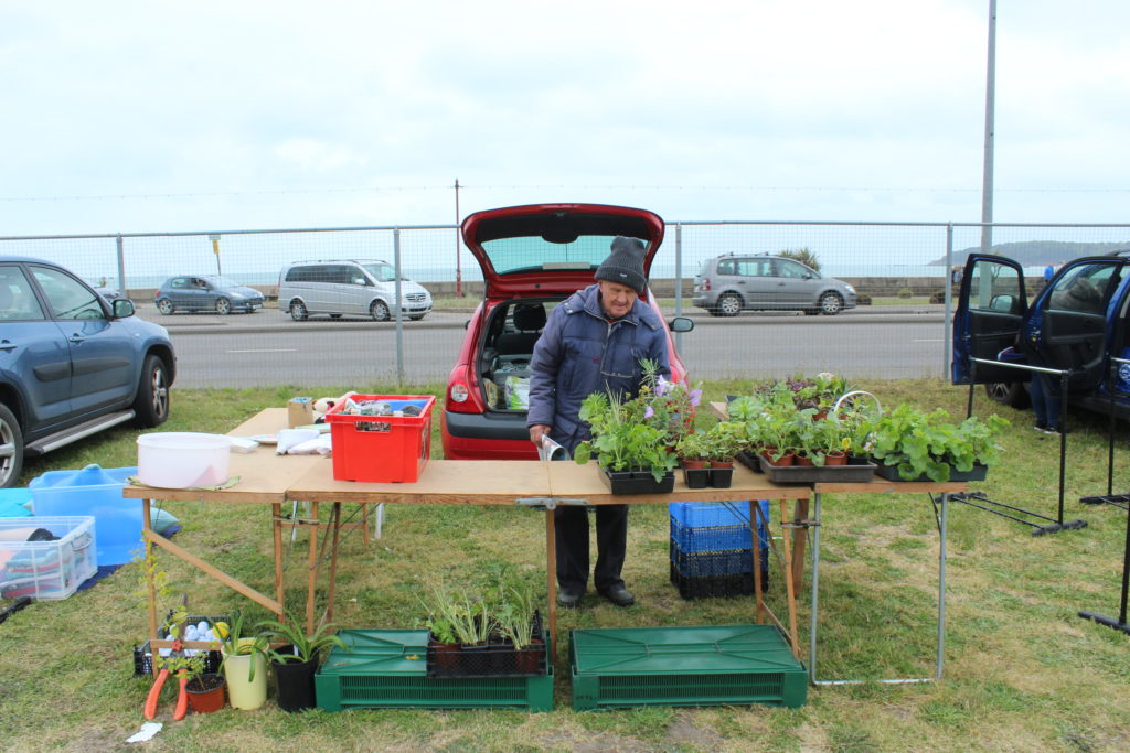
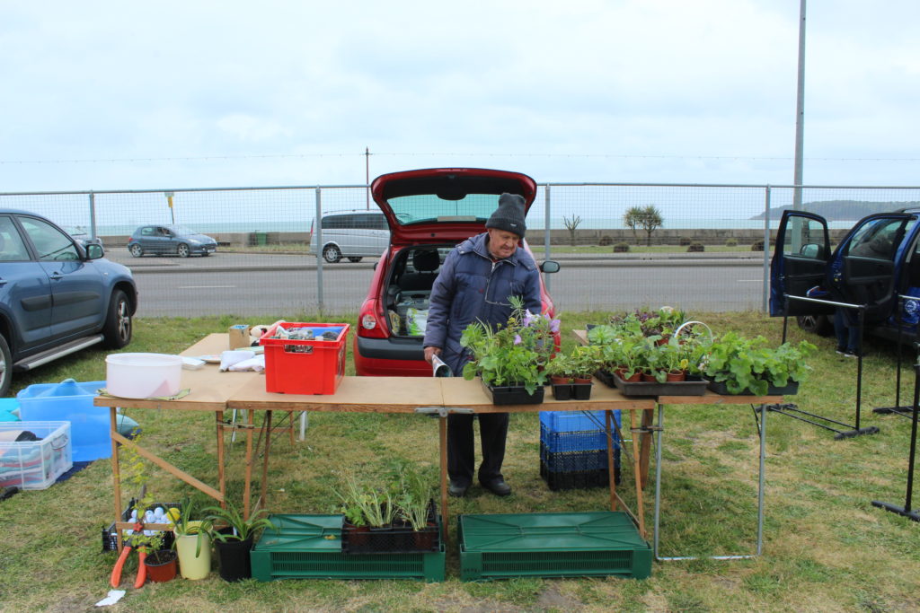
My initial idea was to show just ‘Variation and similarity’ between peoples belongings and create a Typology such as bag belongings of individuals to give an insight to their lives. After experimenting with this I then decided to visit a car boot to take images of peoples belongings, however I decided to take pictures of each person with their stall as it would tell the viewer more and allowed a contrast of who they were to who they are now, by comparing them to their belongings they were hoping to sell. After this I decided to pursue this idea. At the start I was still planing on making a typology but I felt the photos were better suited to individual or a few prints displayed at a time. I took inspiration for this from Haung Qinjun’s ‘family stuff’. My initial response laid down the ground work for my project and my final pieces. I then experimented with GIFs, Typologies and Layering to further develop my work.

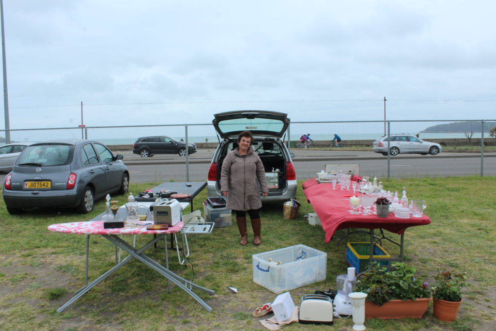
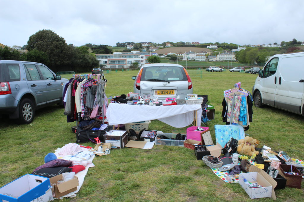
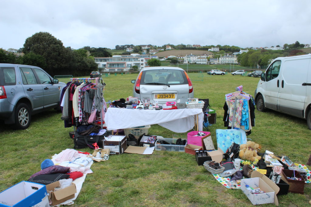
To conclude I believe that I have successfully followed the exam brief and the theme of Variance and Similarity’ which can be seen in my final outcomes. This is shown in the comparison between the photos with the common features of a car and a table. The comparison is aided by framing them together which allows the images to compared by the viewer. Therefore the projects follows the theme.

I feel all of my final out comes are Aesthetically pleasing, which I have created by capturing the images and editing them. All my images were taken outside with natural light, which ensured natural lighting which allowed the natural shadows and contrasts to show in the photographs, as well as a wide tonal range. The contextual idea behind my work was to provide an insight to people how they were compared to now. This shows through well in my work due to the images nature and allows comparison

Experimenting with Layering

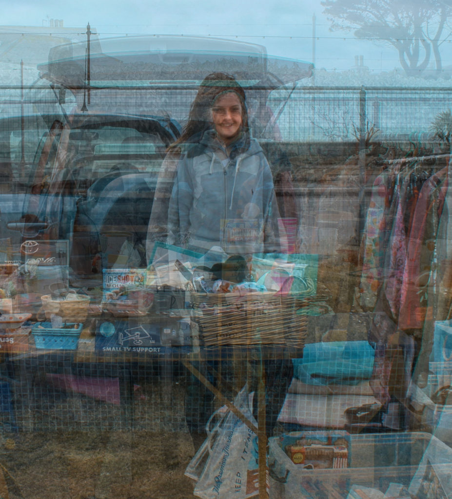
For this I have experimented with layering. To do this I have tried to create a new image by layering other images on to of each other, aligning the face to try and make a new one with the characteristics of the other people. by doing this I feel I have created a new story for a new person.

I found inspiration for this from Lewis Bush’s project in jersey ‘Trading Zones’. which he did for the faces of employees at financial buildings in jersey to see what the average person looked like at each firm. By doing this I believe you can find the average look of a person at the car boots.
Presentation of my Final Work
What it includes?

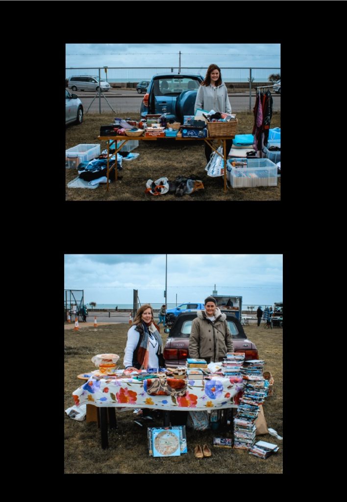
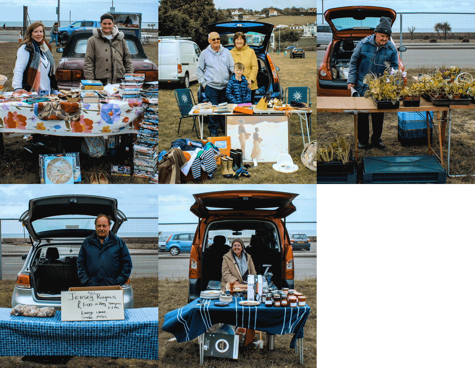
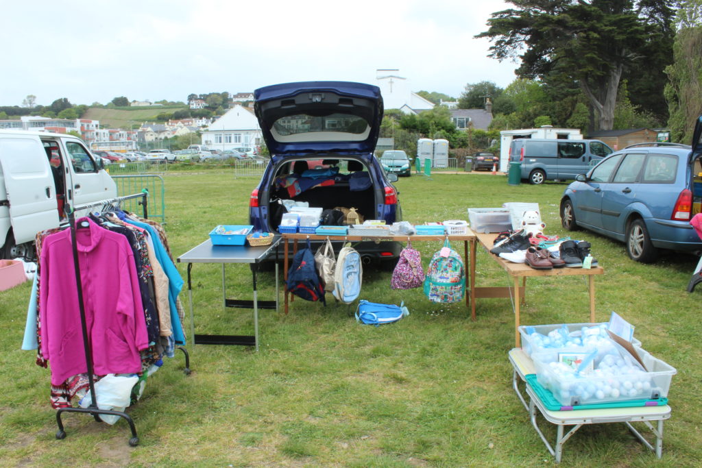
For the presentation of my final photographs in my exam the first frame up I will be presenting will be an A3 and two A4 photos framed together. I believe that this is an effective way to display my photos as it allows the viewer to compare these similar, and busy, stores. I have used similar methods to display my photographs on past projects and think that is a good display. I believe that this represents the ‘Variation and Similarities’ theme well.

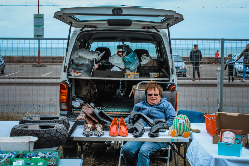
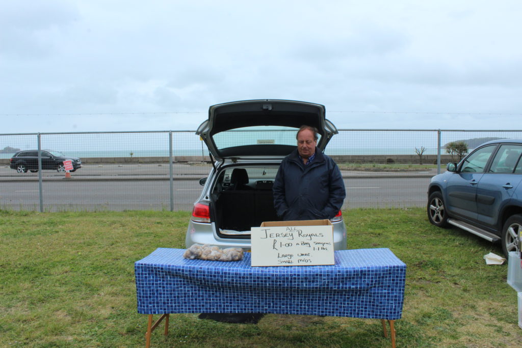
For the second image I have displayed it by its self. I feel that this is a good way to display it as its quite minimalist Photo which tells you a lot about the person who is also quite minimalist, wearing block colour clothing. By putting this image by its self it enhances the minimalist feel which I believe is quite visually pleasing.

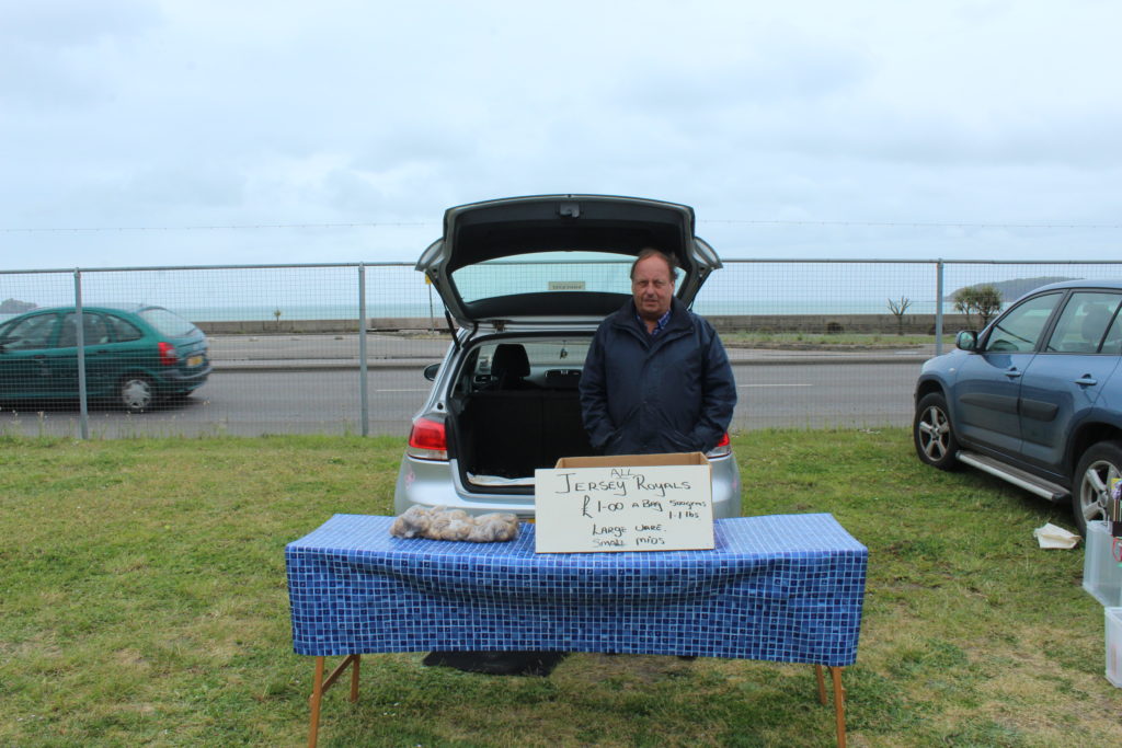
For my final image I have put two images one on top one the other. I believe this allows the viewer to compare the two images on this display such as a difference between what the young own compared older generations. By comparing the images I believe that this follows the ‘Variations and Similarities’ theme.


My Final Selection

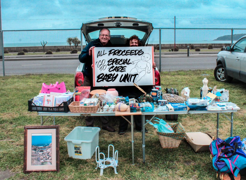
The images below are my final outcomes. I believe that these represent the theme of ‘Variation and Similarities’. I have got four A4 and two A3 images which I feel reflect the standard of work and experimentation have done with these images.

A4 Prints:

A3 Prints:

Micheal Wolf

Wolf was born in 1954 in Munich, Germany, and was raised in the United States, Europe, and Canada. He lived and worked in Hong Kong and Paris. He attended the North Toronto Collegiate Institute and the University of California, Berkeley. In 1976 he obtained a degree in visual communication at the University of Essen, Germany, where he studied with Otto Steinert. Wolf died in April 2019 in Cheung Chau, Hong Kong.


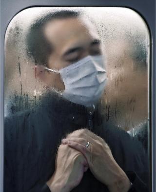
Wolf began his career in 1994 as a photojournalist, spending eight years working in Hong Kong for the German magazine Stern. He said that a decline in the magazine industry led to photojournalism assignments becoming “stupid and boring.” In 2003 he decided to work only on fine-art photography projects. In ‘Tokyo compression’ Wolf photographed people squashed up against windows in the underground trains. Michael Wolf’s Tokyo compression focuses on the craziness of Tokyo’s underground system. For his shots he has chosen a location which relentlessly provides his camera with new pictures minute by minute. Every day thousands and thousands of people enter this subsurface hell for two or more hours, constrained between glass, steel and other people who roll to their place of work and back home beneath the city. In Michael Wolf’s pictures we look into countless human faces, all trying to sustain this evident madness in their own way.

Image result for michael wolf tokyo compression

I like this image the most as it tell you about the subject. From this image I can gather that the Tokyo sub-way is a dirty place and also that the people who live there must wake early to go to work through a crazy rush-hour of people to support family, and that they are probably very tired constantly and grab sleep when they can. This image is also compels you to look at the subject as he is put in the frame due to the trains window he is squashed up against. Many of the other images also show people squashed up against the wet windows, also suggesting it is hot and crowded in there.

This image is quite dark and more of an environmental photo rather than his usual pop-art or abstract photos. The photo would have been taken with a higher ISO to let more light into the lens in the darkly lit scenes of the tube. A fast shutter speed would have been needed if the train was moving, or a low one of roughly 1/60 of a second if it had stopped.

Architecture of Density

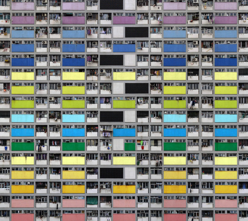
In Wolf’s ‘Architecture of Density’ he has used natural light from the city of Hong Kong to catch the repetitive and colourful high-riser apartment block. Natural lighting has been able to capture the natural tonal ranges of the building which I think depicts the city of Hong Kong well. A deep depth of field would have been used this is because all parts of the photograph are in focus. A shutter speed of 1/60 would have been use as it is the usually one for people and slow moving object an ISO of about 100. this has lead to a visually appealing image.

CCA Gallery / Private Gallery

CCA gallery

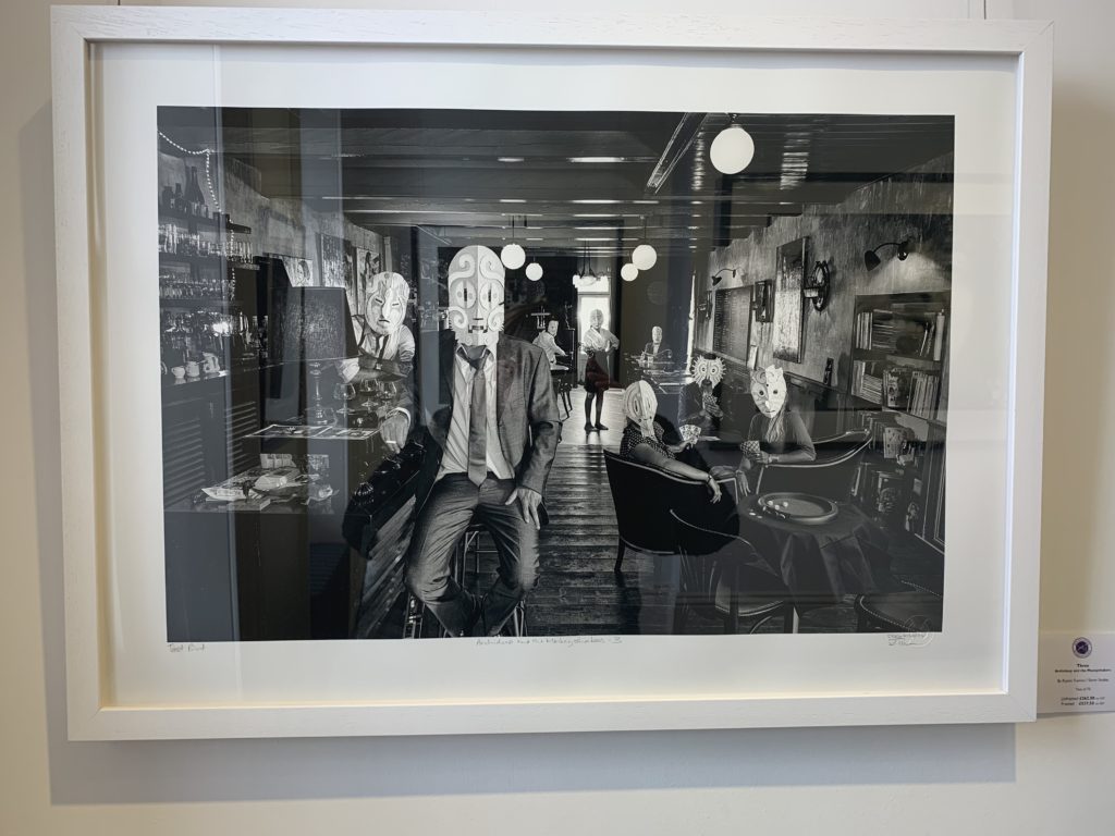
The CCA Gallery was an expedition “showcasing the unseen aspects of photographing celebrities, from behind the lenses of Carinthia West, Rupert Truman (Storm Studios) and Mike McCartney.” The expedition also showed an insight into the lives of other 60’s icons such as Mick Jagger by showing their album covers.

The image that caught my attention however was “three”, an image that was on the front cover of Archideep and the Monkeyshakers’ taken by Rupet Truman. This work appeals to me as I feel it can link in with my work showing that not every one is the same and have different story’s shown by the masks similarly to how the car boot stalls tell my subjects story.

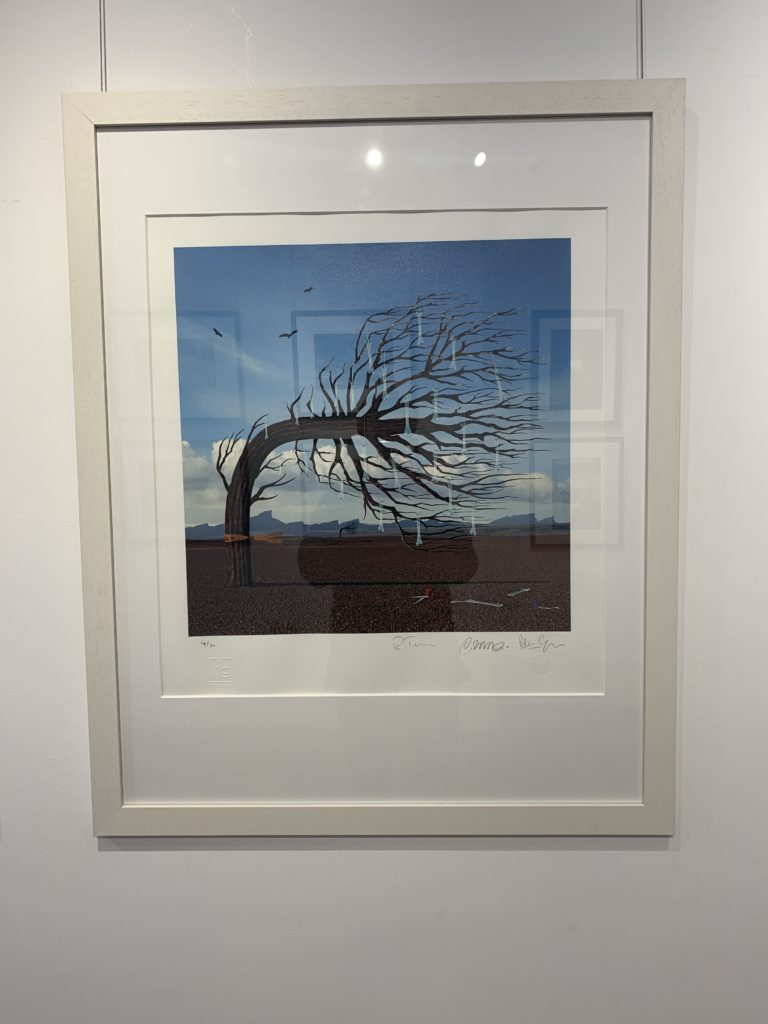
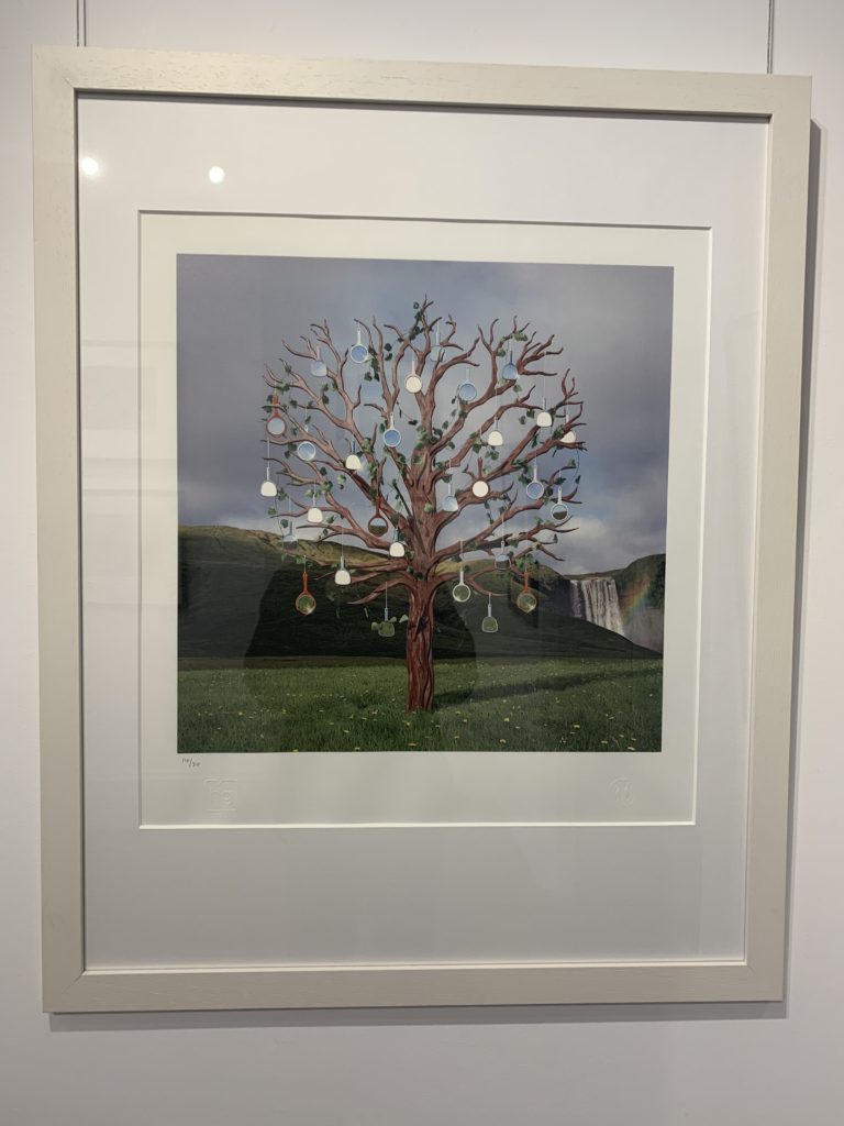
Although I like this image, much of his other work is quite bland and rarely links with my work. This can be shown in this work Bones and Mirrors, which is quite bland as it is just a tree with objects hanging off it.

Private Gallery

The Private Gallery was very different from the CCA Gallery as it contrasted greatly by showing pop art rather than the more abstract work of the CCA Gallery. The Gallery was called ‘Pop icons in the 20th century, Britain and American pop art’, which I believe it showed in the contrasting colours and abstract shapes in the work. The pop art movement was around in the 1950’s and peaked in the 60’s but is still widely recognized and practiced today. The work at this gallery had a very contemporary style to it – a lot of the work was art rather than photography but was still relevant as the themes and styles used can be transferred into photography.

One image that I liked was the ‘black bean soup’ image. this is because is is simplistic which appeals to me visually. This image was taken by Warhol in the early 60’s, the height of Pop art and followed a common theme of painting soup cans and cola bottles. Even though these were paintings rather than photographs they still apply the same rules of variation and similarity which I believe to be important.

Specification

So far, within the ‘Variation and Similarities’ project I have explored
Eadweard Muybridge and Typologies, Hiroshi Sugimoto and the transience of life, and Huang Qingjun and documented the utilitarian lives of millions of ordinary Chinese people. From these people I have drawn inspiration for my project to create Photographs of people and their belongings which when looked at in detail can tell a story. After looking at different artists and their styles I have decided to follow the route of Huang Qingjun in exploring people and their belongings, and the ‘Variations and Similarities’ between them.

I have explored this area by photographing People and their belongings at car boot sales. I have experimented different ways of presenting these images, including GIFs and typologies. The different presentation techniques are all intended to allow the viewer to compare the different images and see the ‘variations and similarities’. To further my project I intend to photograph more car boot stalls and edit them using similar styles

Experimentation

Experimenting With GIF’s


How to Make a GIF

  1. Upload your images to Photoshop.
  2. Open up the Timeline window.
  3. In the Timeline window, click “Create Frame Animation.”
  4. Create a new layer for each new frame.
  5. Open the same menu icon on the right, and choose “Make Frames From Layers.”
  6. Under each frame, select how long it should appear for before switching to the next frame.
  7. At the bottom of the toolbar, select how many times you’d like it to loop.
  8. Preview your GIF by pressing the play icon.
  9. Save and Export Your GIF.

Experimenting With Typologies

How to Make a Typology

  • First select the similar images you want
  • Select an order to put them in
  • Select each image and drag them onto one page
  • Make them the same size and put them into order

Hiroshi Sugimoto

Hiroshi Sugimoto born 23 February 1948 is a Japanese photographer and architect. He leads the Tokyo-based architectural firm New Material Research Laboratory. Sugimoto has spoken of his work as an expression of ‘time exposed’, or photographs serving as a time capsule for a series of events in time. His work also focuses on transience of life, and the conflict between life and death. He is also deeply influenced by the writings and works of Marcel Duchamp, as well as the Dadaist and Surrealist movements as a whole. He has also expressed a great deal of interest in late 20th century modern architecture.

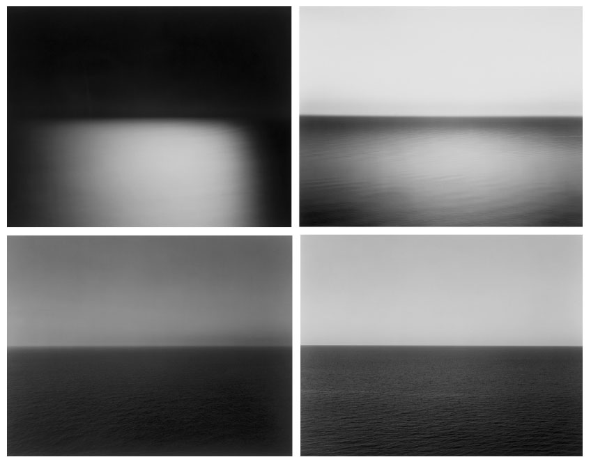
Sugimotos work “seascapes” interests me the most of his projects. In 1980 he began working on an ongoing series of photographs of the sea and its horizon, Seascapes, in locations all over the world, using an old-fashioned large-format camera to make exposures of varying duration (up to three hours). The locations range from the English Channel and the Cliffs of Moher to the Arctic Ocean, from Positano, Italy, to the Tasman Sea and from the Norwegian Sea at Vesterålen to the Black Sea at Ozuluce in Turkey. The black-and-white pictures are all exactly the same size, bifurcated exactly in half by the horizon line. The systematic nature of Sugimoto’s project recalls the work Sunrise and Sunset at Praiano by Sol LeWitt, in which he photographed sunrises and sunsets over the Tyrrhenian Sea off Praiano, Italy, on the Amalfi Coast.


All of Sugimoto’s images are very similar as they are all half sea and half horizon. And they are almost like typologies which is similar to the work of Eadweard Muybridge’s typologies. However where these artists are similar they are also different. Both Muybridge and Qingjun both work in colour primarily whereas Sugimoto works in B/W.

Analysis

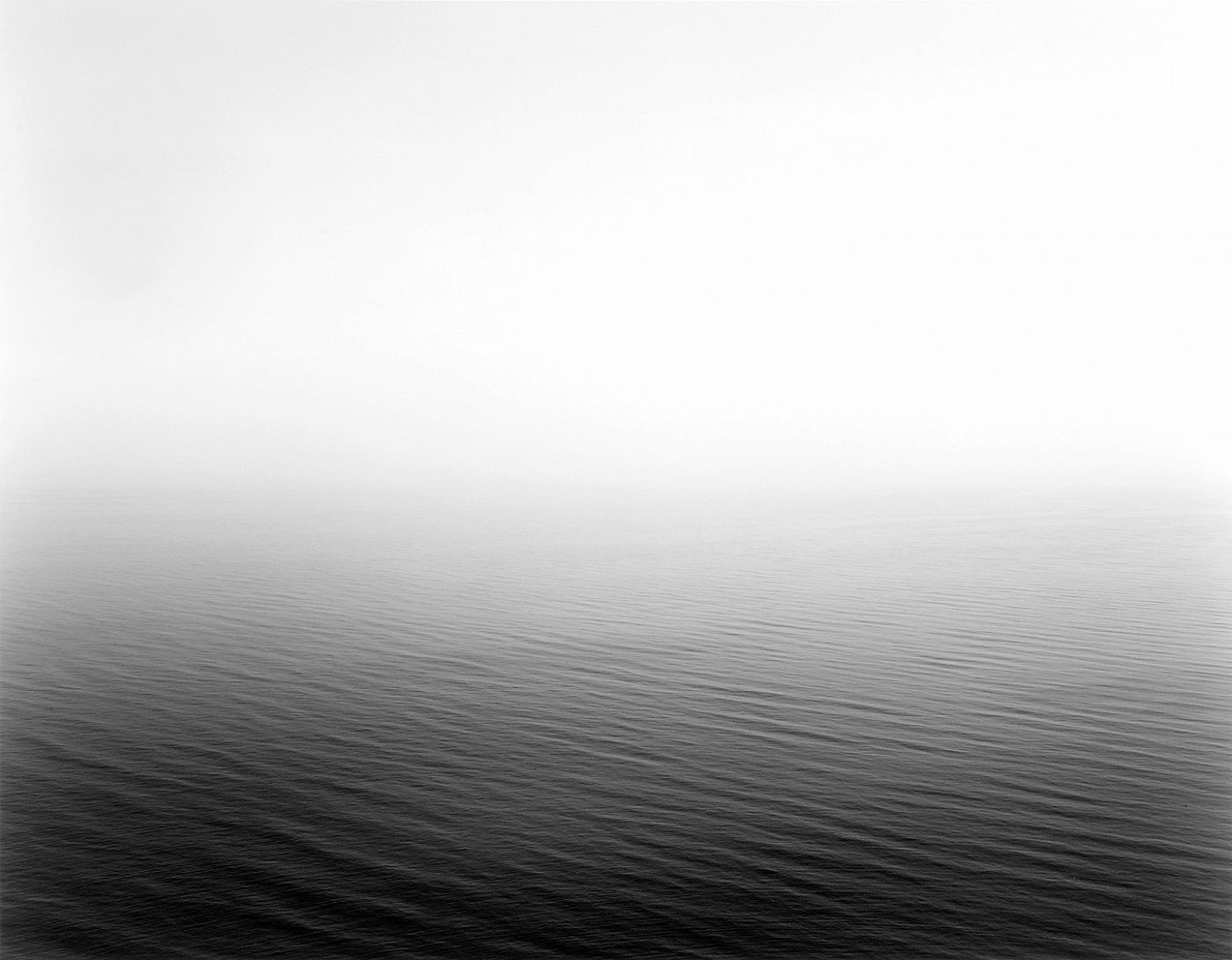
Image result for hiroshi sugimoto seascapes

This image like the others in the “seascapes” projects are a natural black and white image. Also the images are very minimalist which makes it quite aesthetically pleasing. Within this image in particular there is no land or man-made features and unlike the other images this photos splitting line between the sea and the horizon is obscured by the fog and mist. The mist creates a sense of unease and when many people look out to sea we look at the horizon. By having the mist there it forces the eye away from the horizon and toward the sea which is where Sugimoto possibly wants us too look.