All posts by Erin Luis

Filters

Author:
Category:

Evaluation

I think overall, I fulfilled the exam title ‘Variation and Similarity’ successfully as the final theme I chose to follow was ‘Light vs Darkness’. This interpretation of variation and similarity was interesting as I found I could use many factors to photograph; it can be anything you see, (since light and darkness can just be a varied amount of light and dark tones).

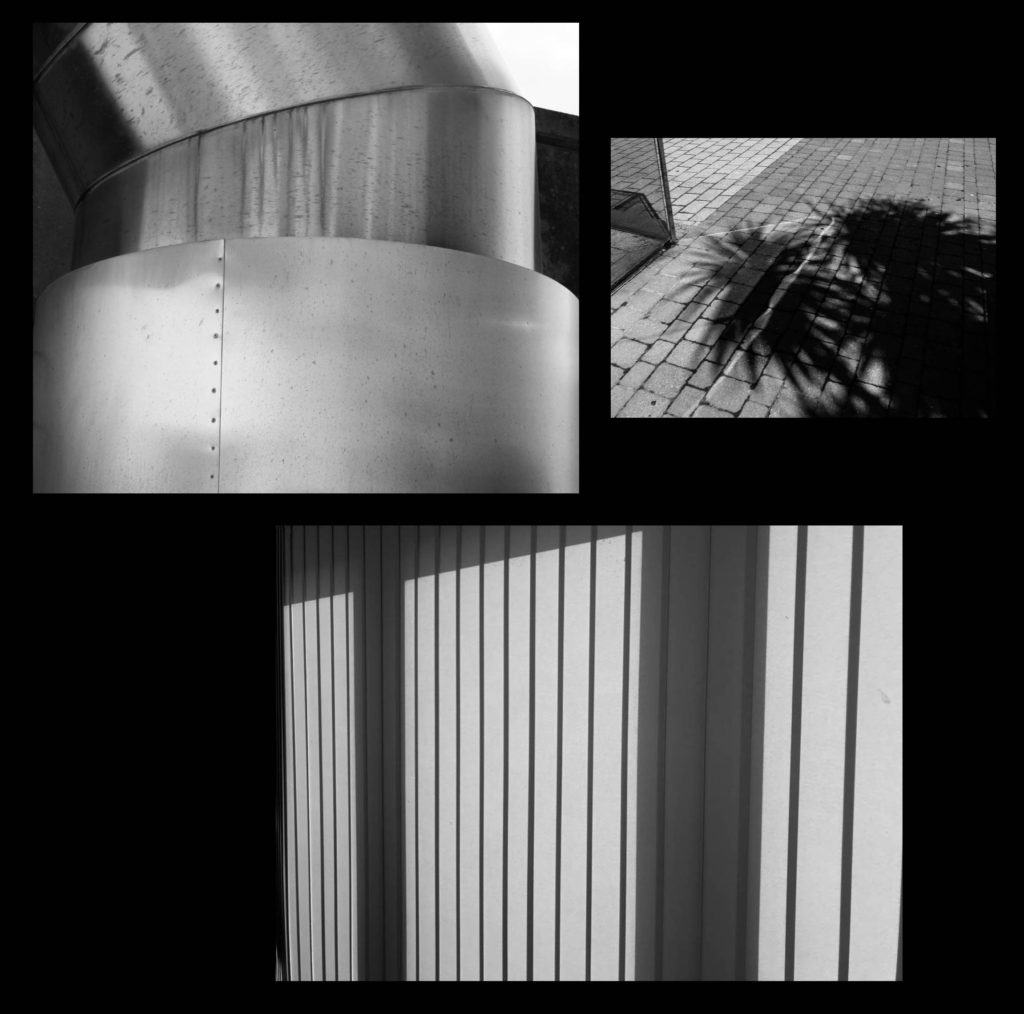
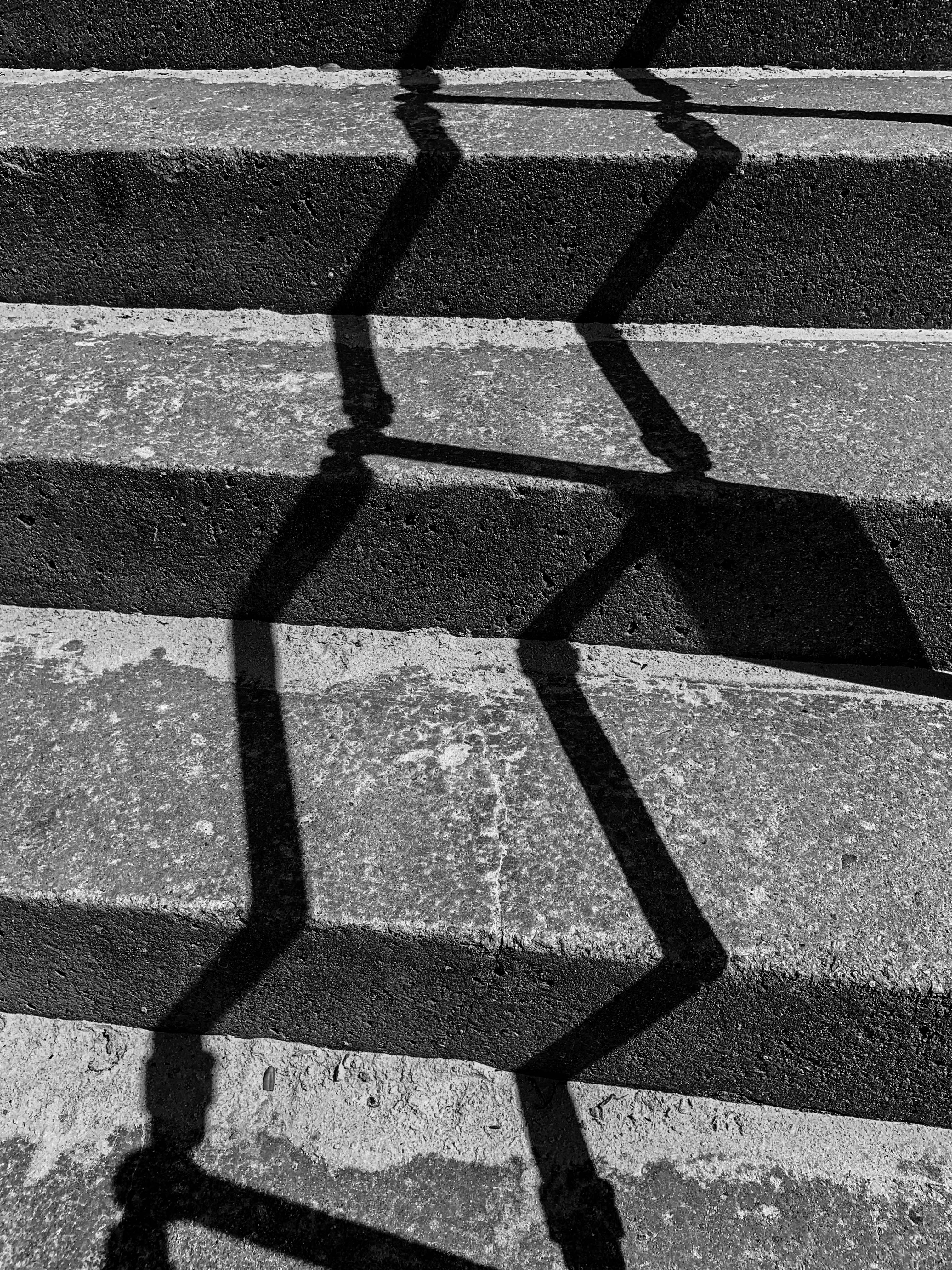
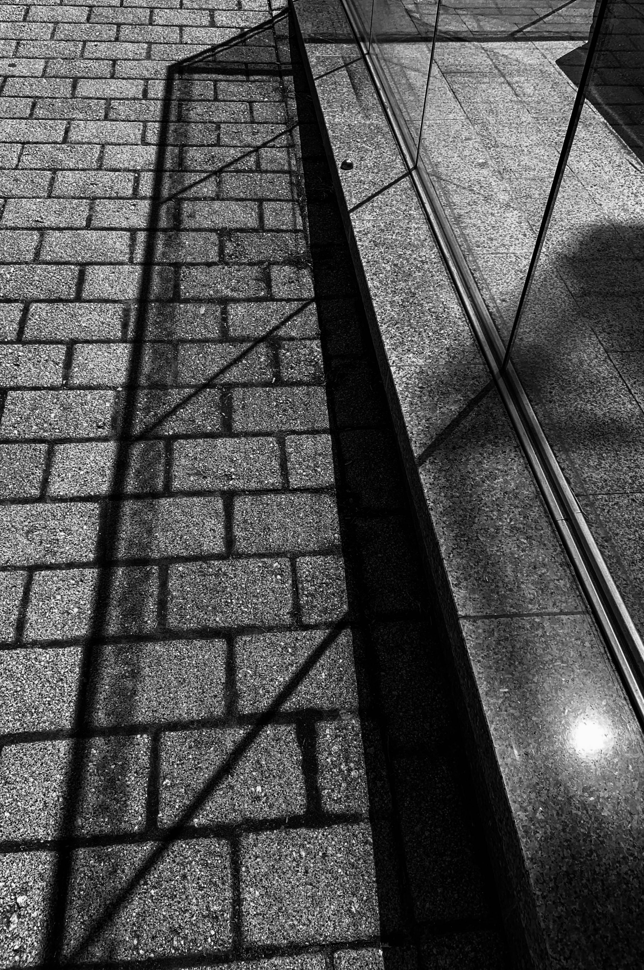
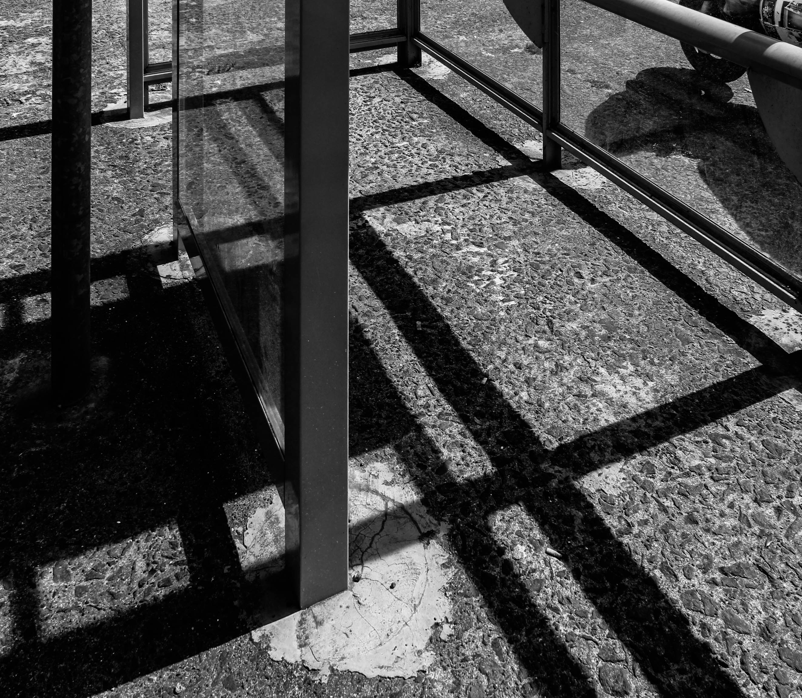
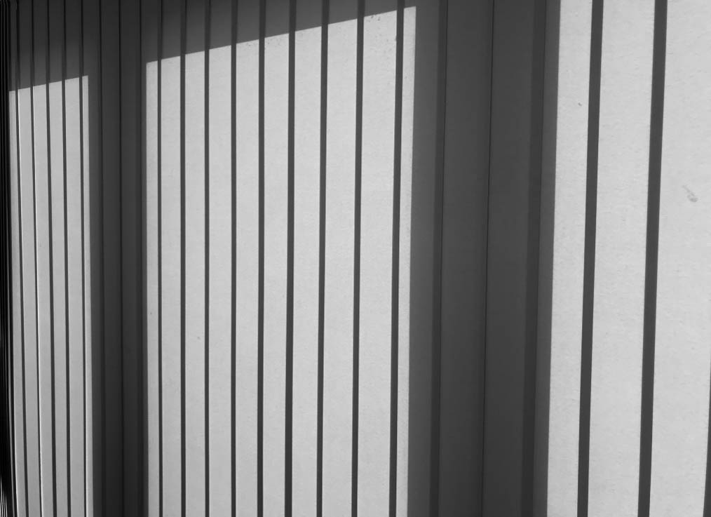
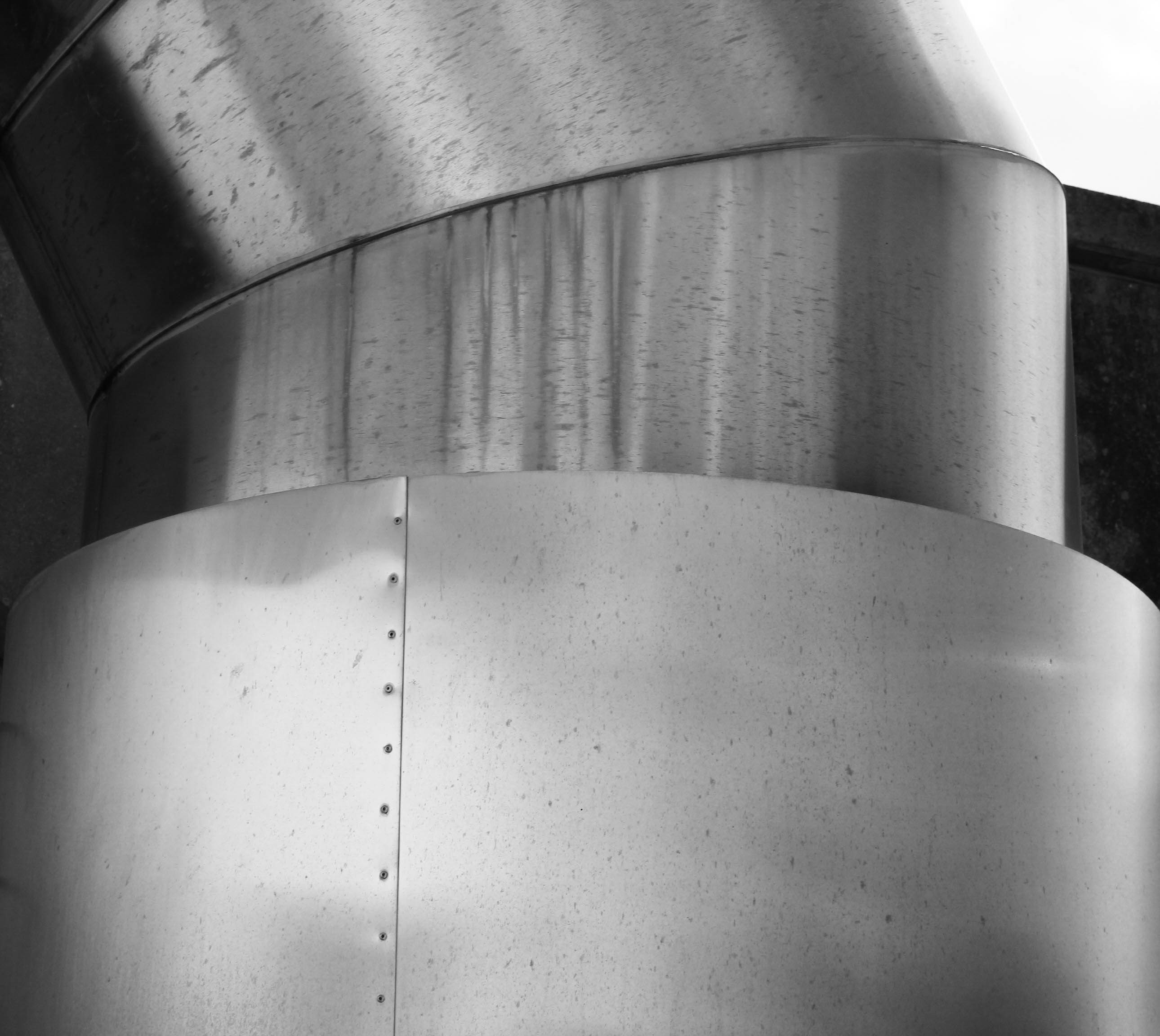
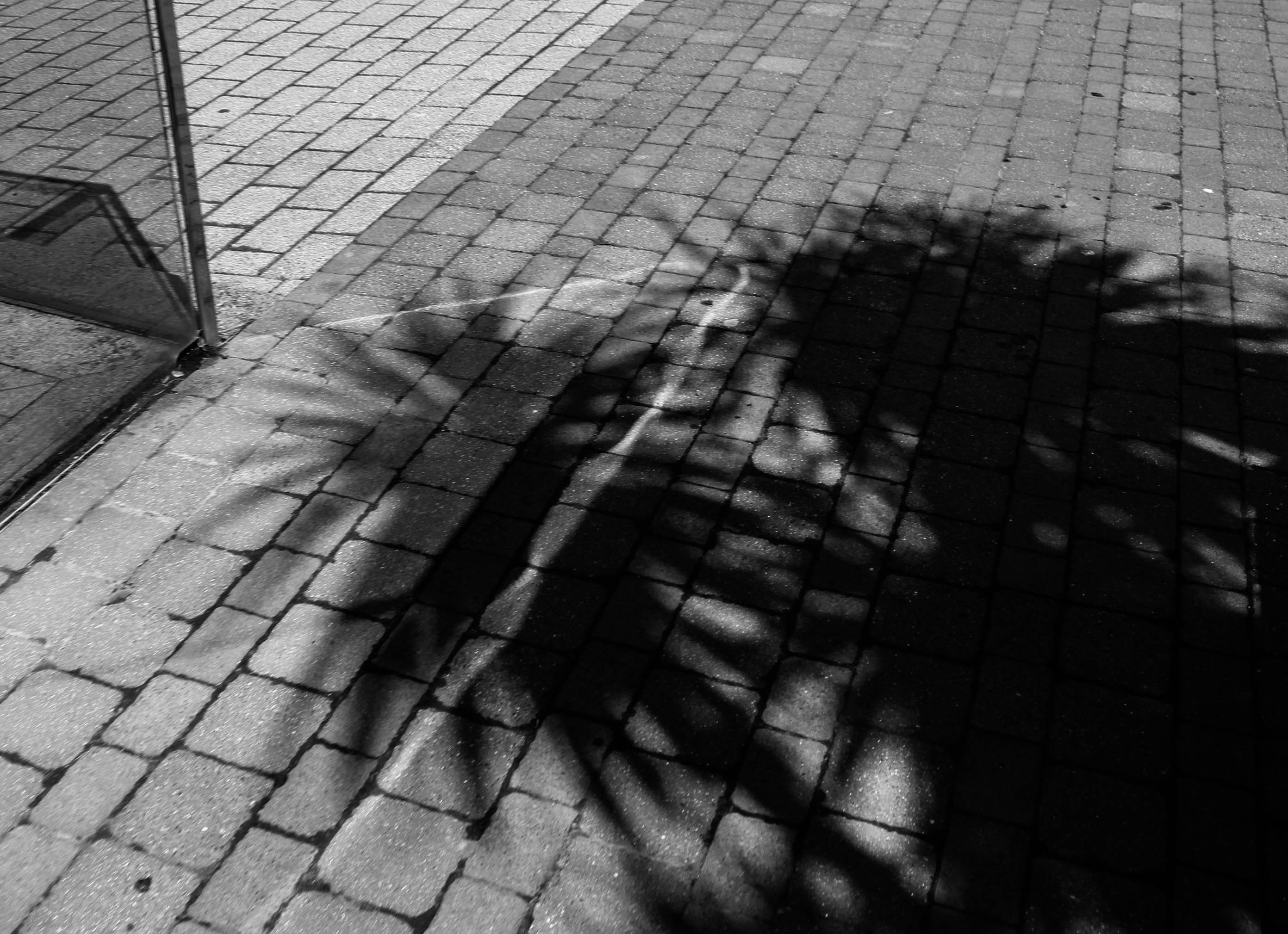
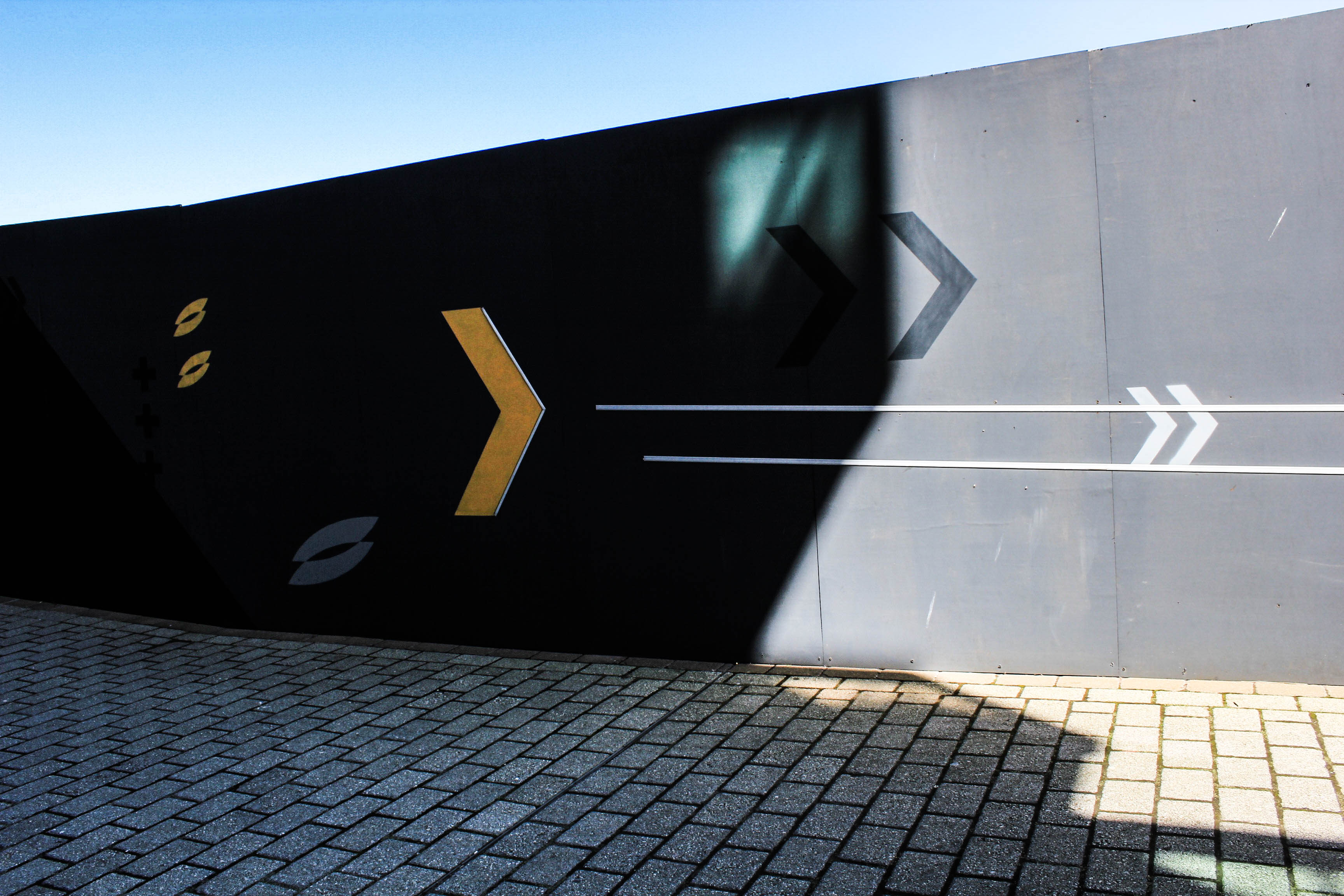
I started off with following the idea of repetition, where I did a mini experimentation shoot of doors and windows to see if I liked this theme. I started to think I could explore repetition further and start to capture other aspects such as shadows and lighting, reflections, architectural structures (like doors and windows,) sunlight, colour, water, nature, landscapes and seascapes. However, I then took the route of photographing light and darkness as I felt this related more to the exam title. This is because, light and darkness are two polar opposites and so this is a variation of tones. However, they are similar because they can create similar effects, such as shadows.

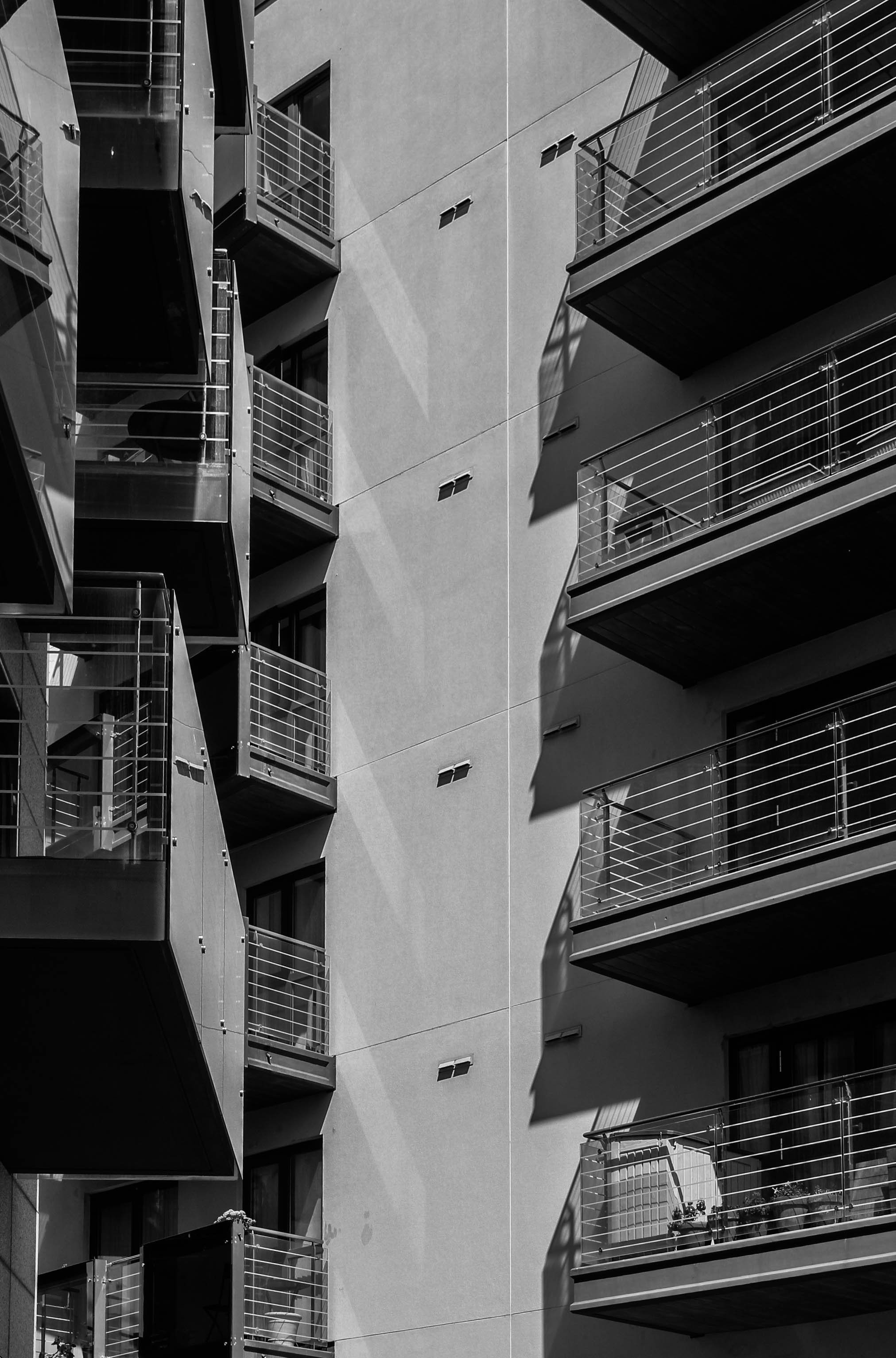
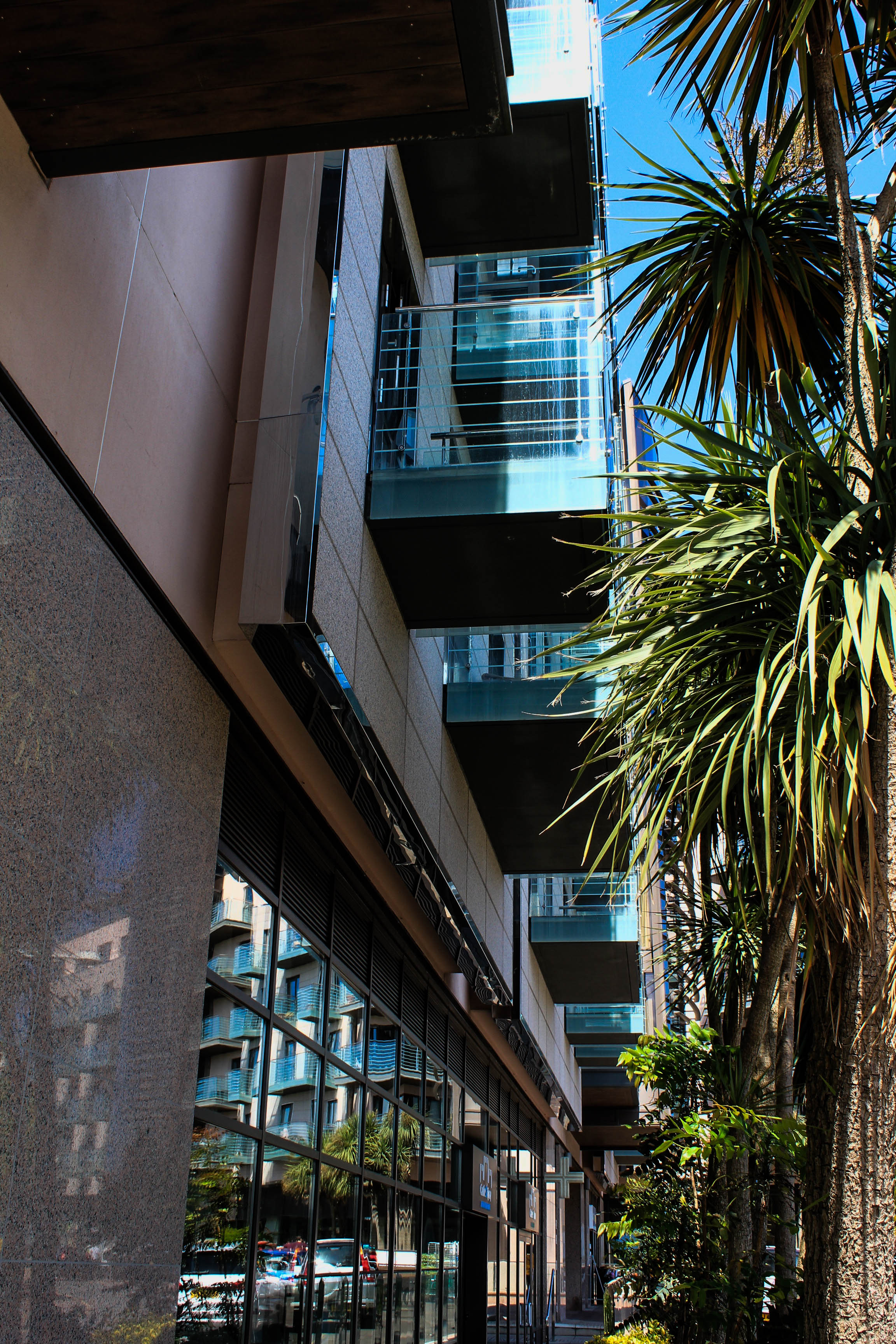
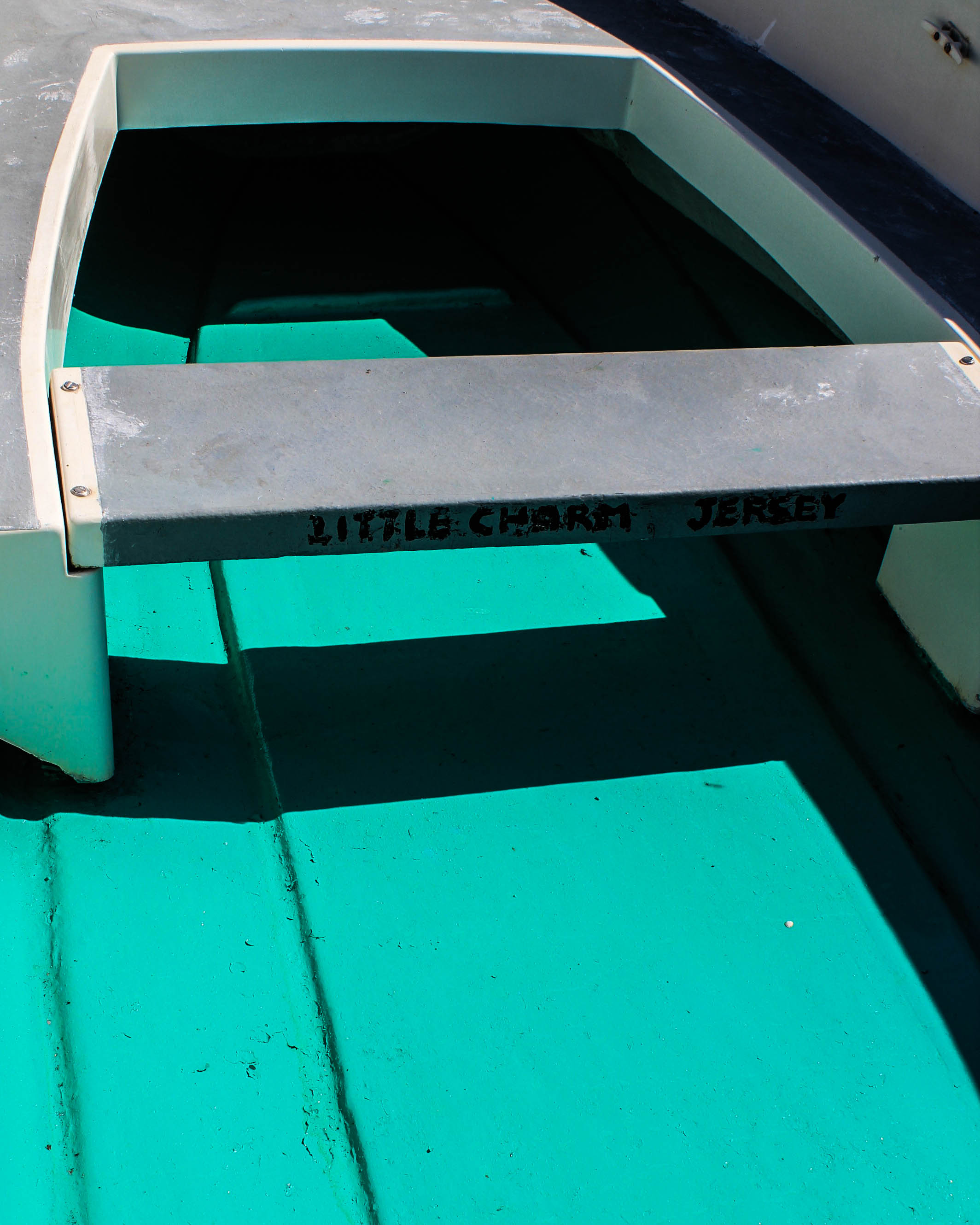
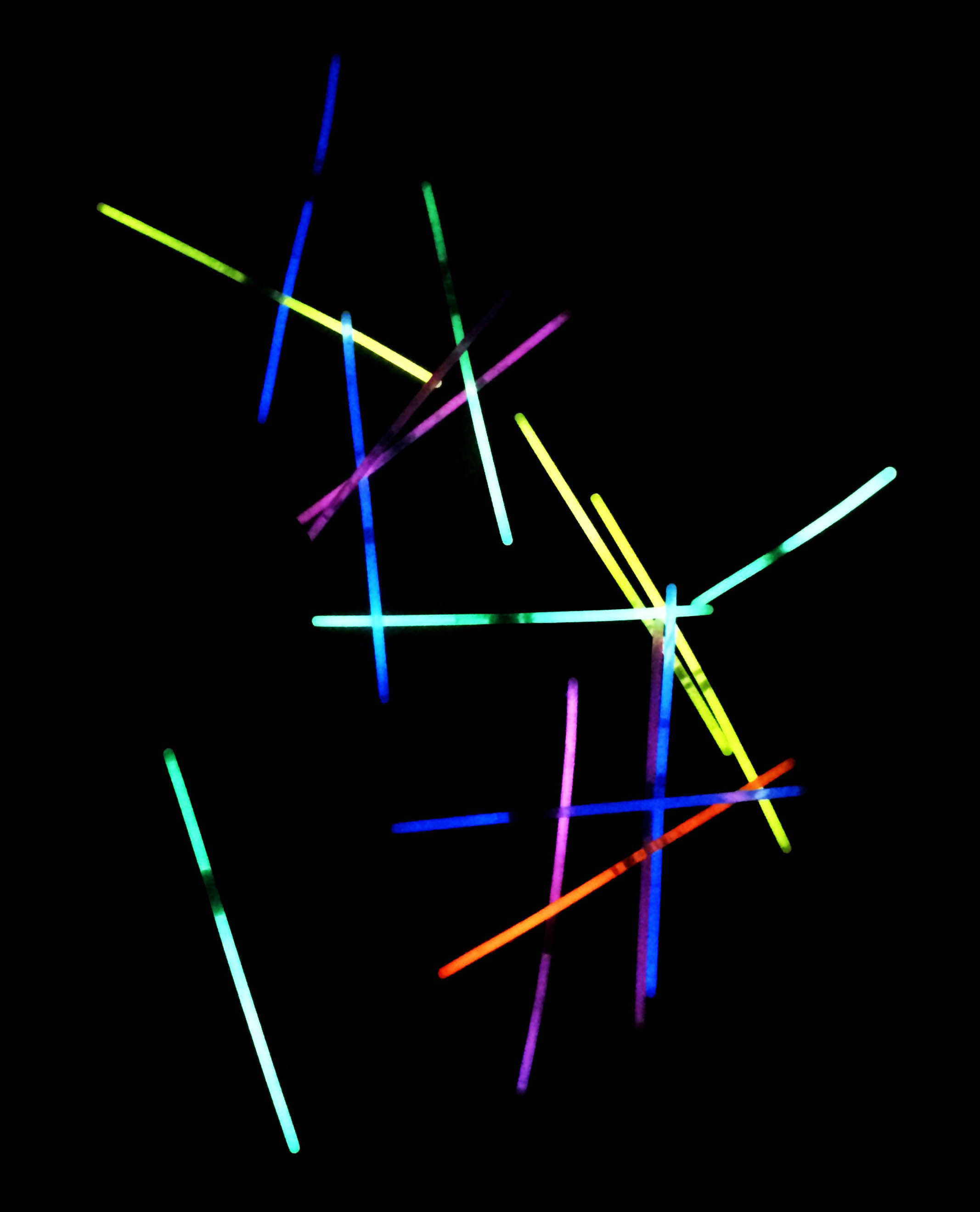
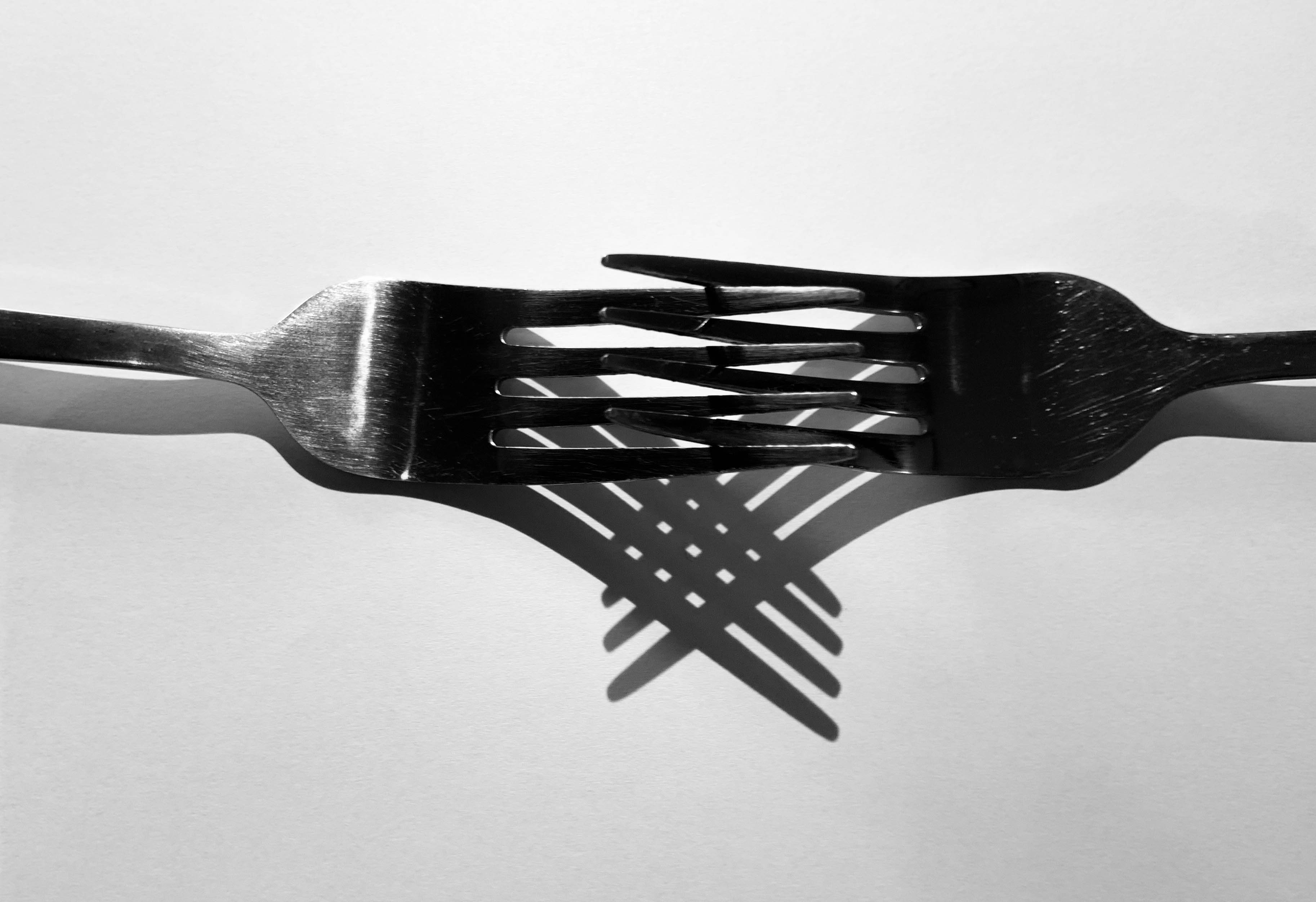
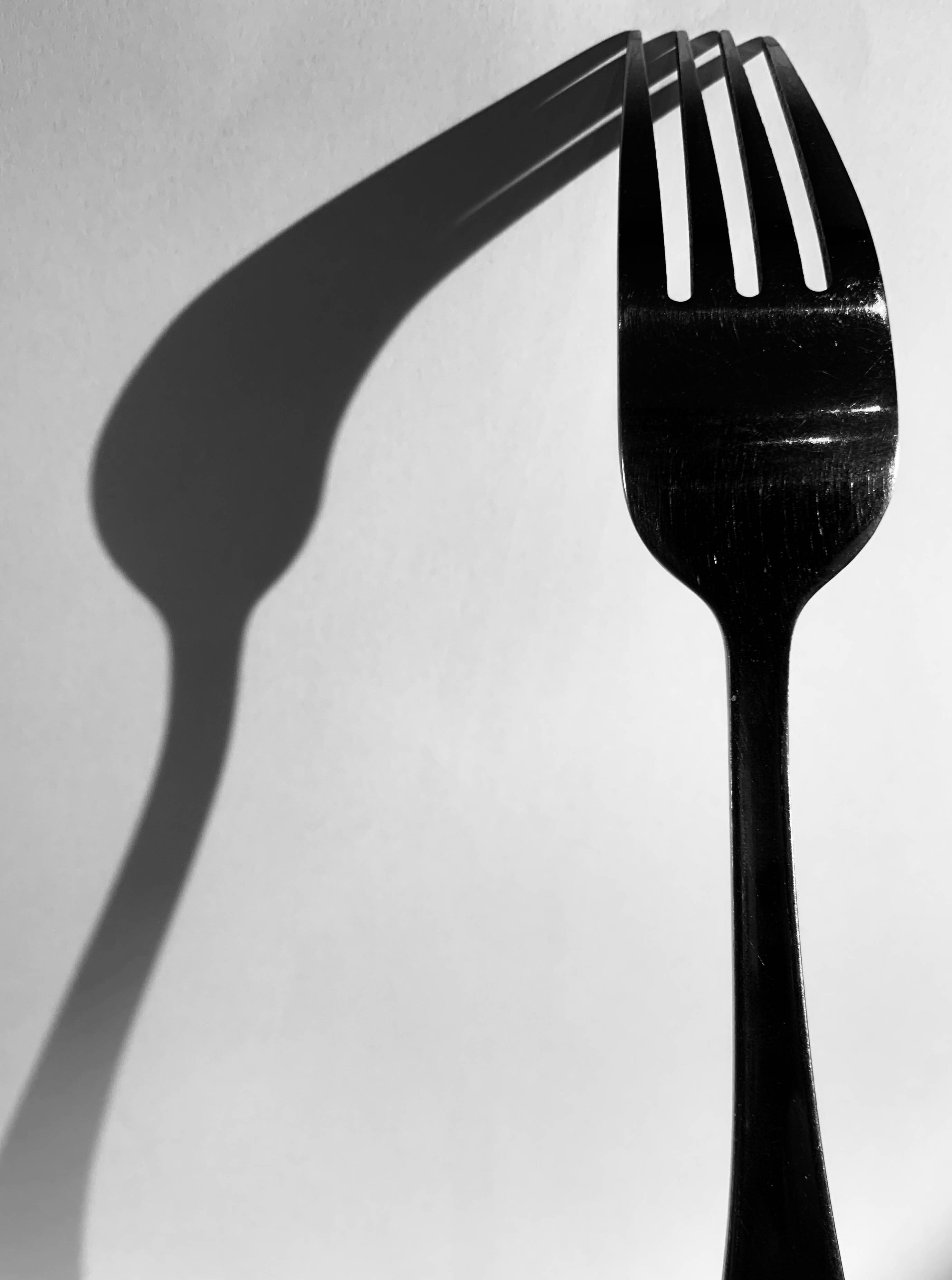
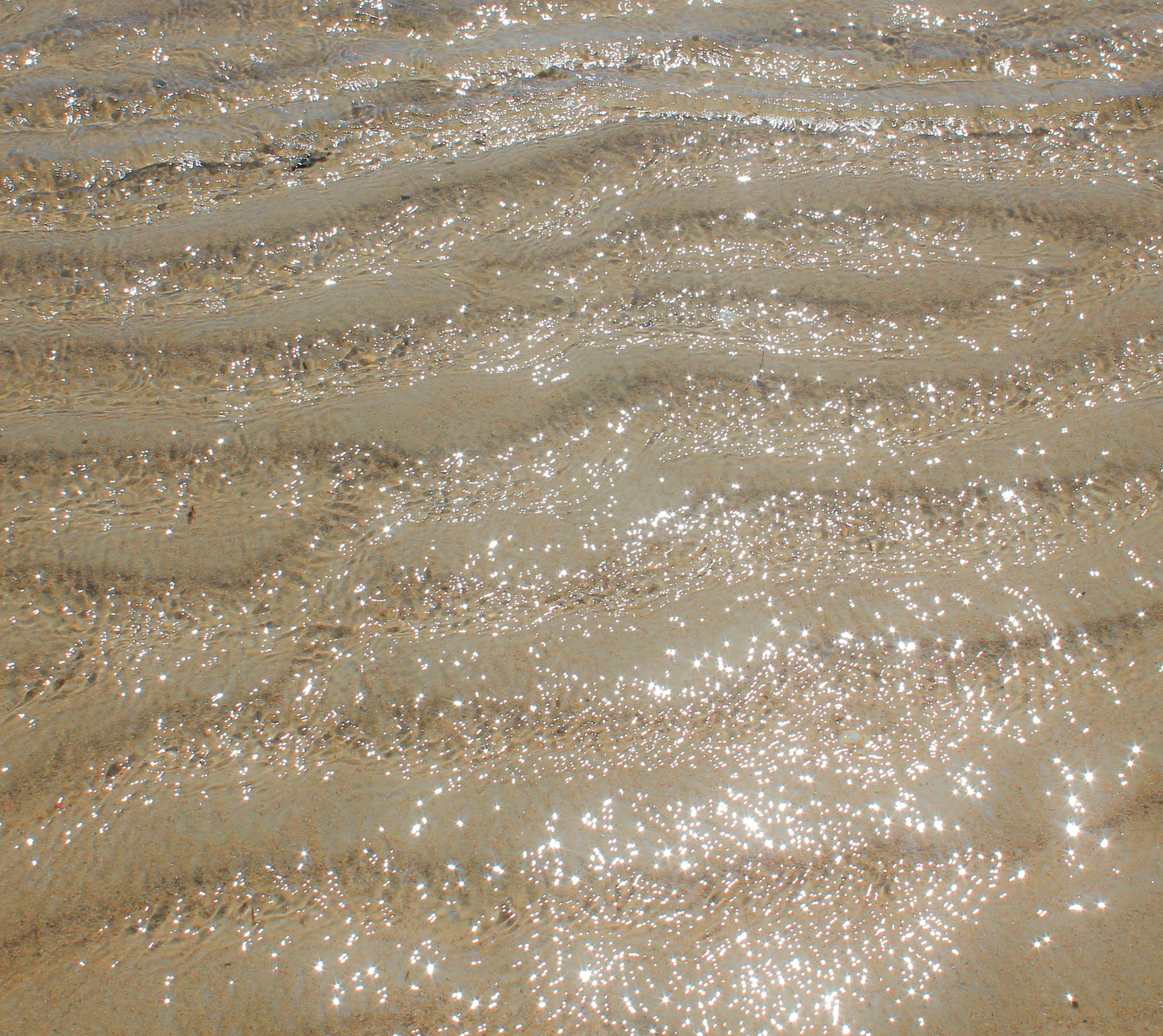
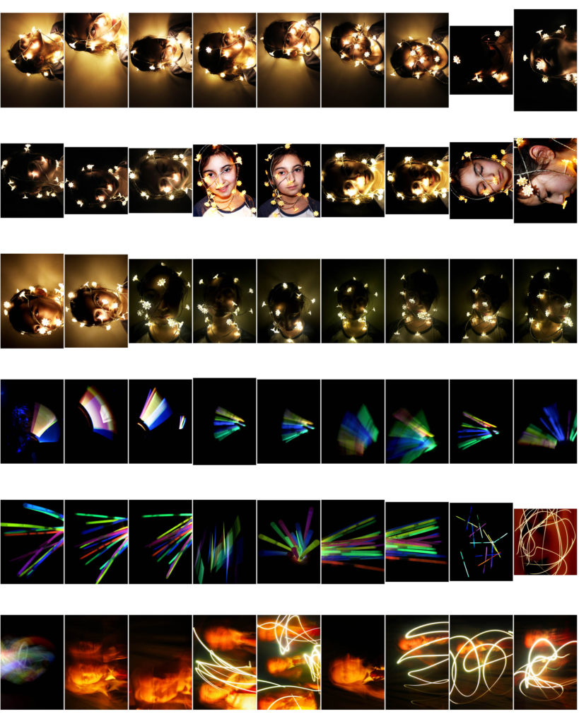
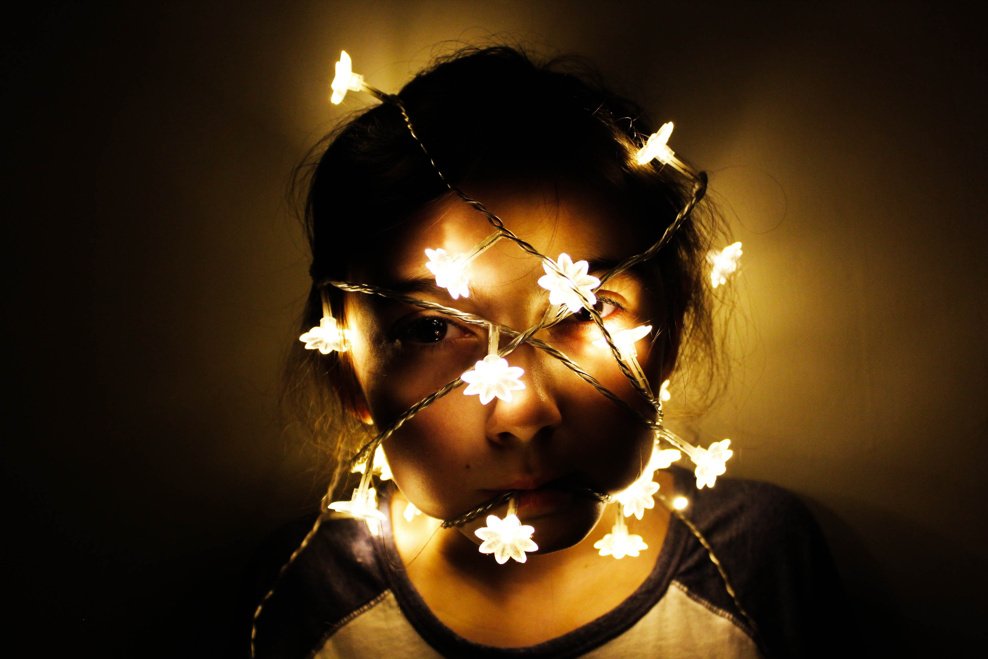
I did 7 main shoots to explore light and darkness, with 1 mini shoot (so overall, 8 different shoots). I think these went successfully as I planned all my shoots beforehand so I knew what I wanted to achieve. I thought about my composition so that each of my images could be taken from various angles and perspectives to see which worked best. I edited all my images from all my shoots, and then made a narrow selection of 10-30 images that I liked the best; I did this on light-room as I found it easier to make selections from. To select my final images I went onto light-room and changed the filter settings to flagged so I could see all my favourite selection of images. Then I narrowed down to a further 50 or so images that I thought would work well to create a final piece from. I had images of people (from my studio shoot with lights,) as well as coloured glow-stick images from a studio shoot, architecture images, beach images and seascapes, as well as a few images from my boat shoot. In the end, I looked at what I thought my most appropriate images were to fit my exam theme of light and darkness and found that these were my images that included shadows in them. A lot of these were black and white images, however there was 1 boat image in colour. I finally selected 11 images to use (which I displayed in my final image choices blog post). These consisted of 2 boat images, 1 studio image, 1 home shoot image, 5 architecture images and 2 beach images. The only image that didn’t match well with the other final images is the studio shoot photo of the glow-sticks; however, I still selected this as one my final prints because I wanted to show how I explored light and darkness in a creative way. I think that because I displayed this glow-stick image on its own final piece, its worked well because it wasn’t juxtaposed with any other shadow images. Maybe I shouldn’t have included this image because of how unrelated it is to my other images but I still think it was a successful choice.

In terms of artist references, I chose 6 artists to analyse. However, only 4 of these artists was based on my interpretation of the exam title (light vs darkness). The other 2 artists was inspiration for when I first started the exam and I was experimenting with different styles of variation and similarity to see what I preferred. I think the 4 artists I chose to use as inspiration for my exam was an appropriate choice as they all used photography as a chance to explore light and darkness. Initially, the artists I wanted to take a big step to follow was Kanghee Kim, as another idea for mms specification was to explore the sun; as she uses the sun to capture images in her photo-book ‘Golden Hour’, I made an artist reference about her. Yet, as I realised that I wanted to go down the route of light and darkness (not just the sun,) I still thought of Kim as a good artists inspiration. Ray K Metzker was another bold inspiration towards a lot of my images as his images of shadows and street photography really outline the variation between light and darkness. I think I could’ve used more artists for references as 4 isn’t a huge amount – although, because these 4 artists were such big influences on my work, I think only having 4 artists was successful as I really concentrated on shoots that reflected their work and their style of photography, (as shown in my images of mine similar to artists blog post).

Images of mine similar to artists

My flower shoot was inspired by artists such as Takashi Suzuki, as she photographs studio images of objects, (like flowers, as well as sweets). Rinko Kawauchi was another artist; her illuminance book consists of images where my flower shoot created similar styles.

Takashi Suzuki’s style of photography:

Takashi Suzuki’s image

Images of mine similar to Suzuki’s:

Rinko Kawauchi’s style of photography:

Mood-board of Kim’s photography

Images of mine similar to Kim’s:

My architecture shoot was inspired by artists such as Ray K Metzker, Takashi Suzuki and Kanghee Kim.

Ray K Metzker style of photography:

Mood-board of Metzker’s photography

Images of mine that are similar to Metzker:

Mood-board of my images similar to Ray K Metzker

Takashi Suzuki’s style of photography:

Mood-board of Suzuki’s photography

Images of mine that are similar to Suzuki’s style:

Mood-board of my images similar to Suzuki’s

Kanghee Kim style of photography:

Mood-board of Kim’s photography

Images of mine that are similar to Kim’s style of photography:

Final print layouts

I decided I wanted to print 4 photos in A3, 4 photos in A4 and 3 photos in A5. This is shown below:

My 3 A5 images
My 4 A4 images
My 4 A3 images

I experimented with a few different ways in how I was to present my images. My first instinct was to go with these layouts below:

I liked these 2 together as even though one is in colour and the other is in black and white, they are both related to each other due to the fact they are both from my boat shoot and they have similar shaped objects and structures in those 2 images.

I liked these 2 A4 images and 1 A5 image together because the consistency of the black and white created an effective look. Additionally, I liked how they all are landscape images and how the bottom image has the strongest structure of shadows. I was thinking that I could trim all these images so there is no white borders and spray mount each image onto a piece of foam board. Then, I would’ve got a big piece of black card and stick each image on top of the foam board onto the card so they are assembled together.

I thought these 2 A3 images looked good placed next to each other as they both have strong shadows in each image. I would’ve done a window mount of these images together so that they were included in the same piece of card but in 2 separate frames.

Then, with the remaining 4 image prints, I would’ve put them all onto a piece of foam board and stuck the foam board onto a piece of black card, but maybe a different coloured card for the glow stick print on foam board.

However, I thought that some of the layouts above could’ve looked better, so below is some more experimentations of layouts:

With seeing all the different best possibilities that could work well to present my final images, I decided to use these below:

With these 2 A3 images, I am going to put them both onto a separate piece of foam board and put this on top of some black card.

With these 2 A5 images, I am going to do the same as the idea above – put them onto foam board and then onto black card.

With this 1 A3 image and 2 A4 images, I am going to do the same foam board idea and put them onto black card.

With these 2 A4 images, I am going to put them together in the same window mount, however they will be in separate frames on the same black card.

With this A3 image, I am going to make a window mount of black card.

With this A5 image, I am going to put it onto foam board but I am thinking of keeping the white border around this image so that when I put it onto card, there will be a nice thin white strip to separate the colour of the card and the black background of the photo.

Final image choices

For my final outcomes, I wanted to group together certain images that were following the same photographical theme. 8 of my images link together as I put all 8 of these images into black and white – i felt this was more appropriate because of the style I was photographing in. Additionally, these 8 black and white images are involving shadows, (which is a big factor as to why I put these images into black and white). Therefore, this means they follow my light and darkness theme of the exam title ‘Variation and Similarity’ through my technique of capturing interesting shadows to portray light and darkness. My other 3 images I chose for my final choices were 3 images that I kept in colour. 2 of these 3 images are still involving shadows within their images, whereas the other 1 colour image has no shadows within its image; it is an image of several coloured glow-sticks that I captured in a dark room. I wanted to include some of my other dark room pictures in my final prints but a lot of these dark room shots included a model and I felt that having people in my final prints would take away the theme I was trying to follow as there is no people in any of my final choices of images. Overall, my theme for my final prints shows that I was interested in capturing shadows to show light and darkness in different areas and scenes. I kept my final prints more towards architecture, which included images from my beach shoot, my boat shoot, my architecture shoot of buildings, 1 image from my home shoot and 1 image from my dark room shoot. However, I experimented with different styles of photography to reflect light and darkness, such as seascapes, sand images, studio flower shoots and more dark room shots using long exposure to capture a moving person. After taking all these shoots, I realised my shadow images crated a more formal photographic look and matched my light and darkness title the best; this is why the 11 images I have chosen below have been picked.

I chose this image as one of my final choices for my final prints because it is an image that clearly links to my interpretation of the exam title. I captured this photo from a face on perspective which really helped the image display its light and dark tones. I took it on a sunny day hence the shadows being reflected from the balconies of the building. I like how there is a clear structure to the image as there is a lot of repeated shapes included in this photo. The multiple straight lines and objects creates a sense of repetition which also fits in nicely with how the shadows are repeated at each balcony level. I thought this image looked best in black and white because the tonal range of the photo is varied and so, having a black and white effect made the photo more standard. Again, this links to the repetition aspect of this photo because all the tones in the image are linked together without any bright or out of place colours taking charge.

I chose this image as one of my final prints because the shadows the stair handles made is really structural and organised. I like how the shadows are straight lines but how they also go in a zig zag direction. It also links in well with the first image I chose, due to the way the photo has levels to it; the stairs in this photo have a great amount of texture in them which makes the photo have more light and dark tones to it.

I chose this image for one of my final prints because the architecture of this large boat brought a lot of details and texture to it, due to the rust and various scratches and marks on the steel parts of the boat. Again, there is a few strong parts that have caused shadows onto the boat which really help build this image to become a strong factor into my light and darkness project for this exam.

I chose this photo for one of my final choices because the shadows are really vivid and bold. I like how the you can tell there is a different tone in the shadow on the cobblestoned floor compared to the floor on its own without the shadows because of the glass pane. This fits in well with the first 2 images I have chosen above as there is a clear structure to the architecture as well as the shadows. With the straight lines, this again creates a repetition effect.

I chose this picture for one my final images because there is a bold completion of shadows that portray the structure of the bus stop surrounding it. I like how the floor is tarmac with stones on top. This makes the shadows more obvious as the stones in the floor differentiates itself from the shadows.

I chose this image for one of my final choices as it really shows the variation of light and dark tones. It is an image of the blinds on my garden doors – this is such a simple photo yet the sun from outside creates this interesting, unique effect of how easily light and darkness can be shown onto objects. I like how there is a repetition of the rectangular shapes of the blinds. Additionally, each section of the blind has a thin line of dark toned shadows which outlines how there are strong shadows in this photo. The thicker dark toned shadows almost border the image and give it this bold vibe.

I chose this image for one of my final choices because the object I captured is unique and different to every other object and scene I have photographed. I like how I zoomed in on in the top half of this large steel pipe; this makes my photo more close up and shows how I focused on only one area of this object. I like how you can see the rust marks on the pipe – this creates a fine detail to it, similar to my 3rd image I displayed above from my boat shoot. There is a slight shadow to the far left and far right of the pipe. Yet, because the pipe is silver steel, the reflection of other objects onto it create darker tones on the pipe which means the main shadows didn’t need to be as big as the other shadows I have captured because overall, this image has a varied amount of light and dark tones within it.

I chose this picture as one of my final prints because the shadow of the palm trees creates an intriguing shape on the floor. This image is so simple yet the big shadow with an interesting structure to it makes the photo different. It links in well with my other images I have chosen as it has a big shadow in the image which is the main focus of this particular photo.

I have chosen this picture for one of my final prints because the architecture of this image is really full and clustered together with the palm trees. I chose to keep this image in colour because there was not many bold, strong shadows displayed and so the colourful tones of this photo was the main focus to what makes this image powerful. The reflection of the trees and cars in the windows and on the marble building create a sense of light and darkness within different aspects of the photo.

I chose this image as one of my final prints because it has an interesting focus; the way I captured this photo is so that there is no background around the frame of the image. I have clearly photographed just what is inside this boat – which could make it hard to tell what this object is. I like how there is strong shadows on the floor of the boat. Additionally, the bright blue colour of the boat is such a vivid colour which is why I thought that keeping this image in colour was best for this photo. The shadows were dark and bold enough that keeping the image in colour would still be effective to show this shadow effect, although I did adjust the contrast and shadows slightly to make the shadows stronger.

Finally, I chose this image for one my final choices because the bright colours of the glow sticks portray a strong contrast of the light and darkness of this photo. There is a sharp outline between colour and darkness due to how I used a dark room for this image. I like how the glow sticks are displayed as straight; this gives the image more of a structure to how the repetition of the straight glow sticks appear. I also like how you can see the detail of the dark tones in each glow stick as this gives the photo more balance between light and dark tones.

Shoot 7 – Cutlery shoot

For this shoot, I wanted to capture forks and spoons and experiment with different angles of lighting, different positioning of the cutlery and different backgrounds to see the effect of light on cutlery – which is such a simple everyday object. The variation of shadows is produced as shown below:

Contact sheet

Edits

This shoot was inspired by Michael Luitad from his cutlery work, where I have already made a blog post on him and his work.

Shoot 6 – Boats

For this shoot, I wanted to go and visit boats down on the beach on a sunny day, when the tide was low so I was able to walk around the boats and take my images. I wanted to see how boats can have different effects of light and darkness due to their positioning on the beach, which is where the sun shines onto heavily.

Contact sheet

Edits

Shoot 4 – Darkroom

For this shoot, I wanted to create a series of images that included multi-coloured lights from a bundle of glowsticks, as well as an experimentation of using slow shutter speed and waving an iPhone torch and glow sticks around in a dark room. Additionally, in my darkroom shoot, I used fairy lights around a model to see the effect of light and darkness on the models face.

Contact sheet

Edits

Shoot 3 – Architecture

For this shoot, I wanted to concentrate on capturing light and darkness within architecture. This included taking my images in the day time on a sunny day with strong rays of sun light. Shadows were a bold factor in this shoot which helped me to create a sense of darkness in my images. I was inspired by a few photographers to create this shoot, which I discuss further down in this blog post.

Contact sheet


Edits