Hansen is a street photographer who explored colour, shape and geometry.
This image Shows the subjects coat contrasting against the road markings in the tarmac
Hansen is a street photographer who explored colour, shape and geometry.

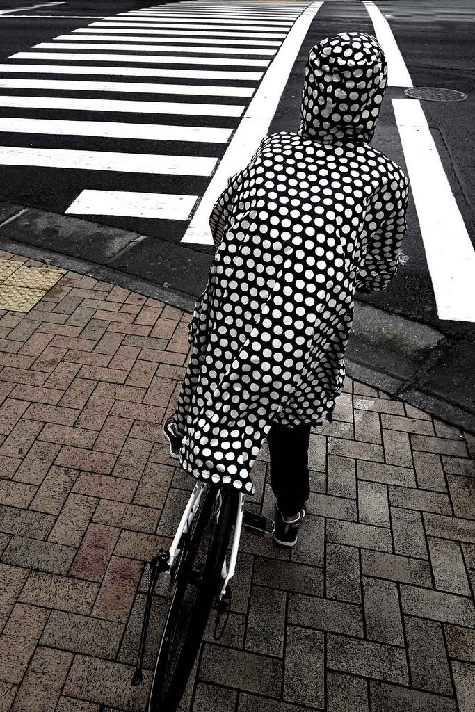
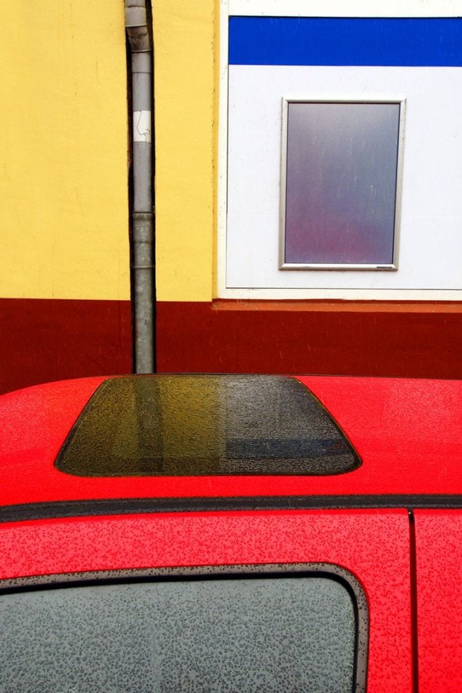
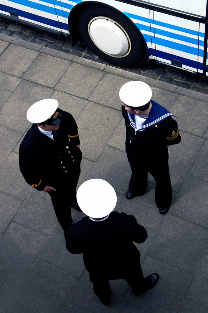
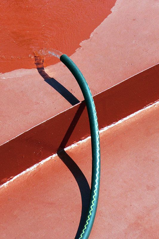
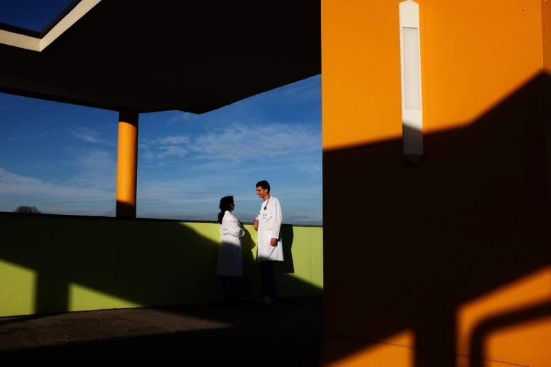
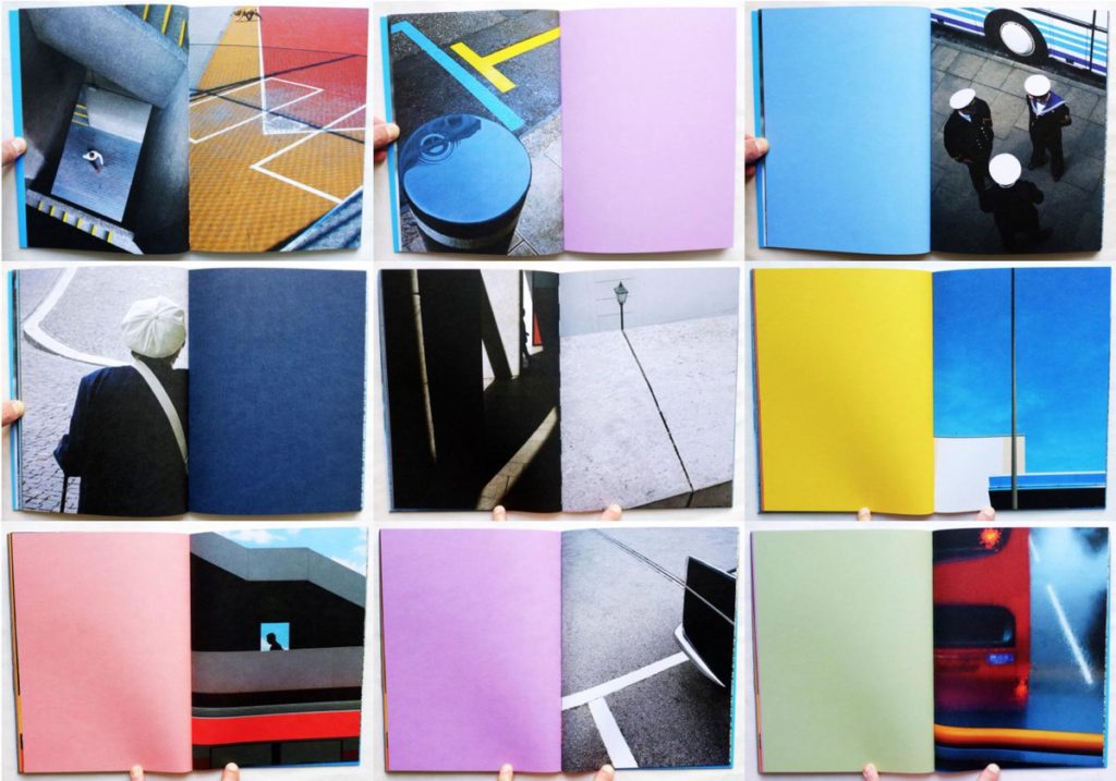

This image Shows the subjects coat contrasting against the road markings in the tarmac
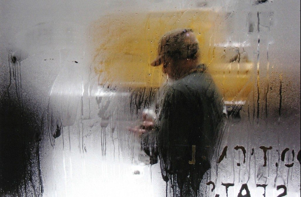


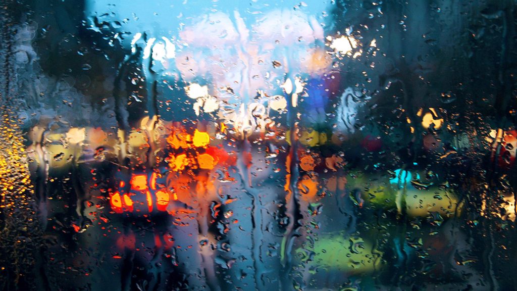


Keld Helmer Peterson was born in 1920 and died in 2013. He was a pioneer of Danish modernist photography and is internationally recompensed for his images of structure, patterns and detail, cities and nature.
His book’122 colour photographs’ was very well know, due to its innovative use of colour in his photographs.
in the 1950s and 1960s, he established himself as an architectural and design photographer. He later shifted into a more abstract form of photography.
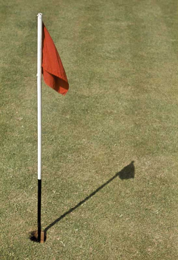
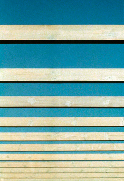
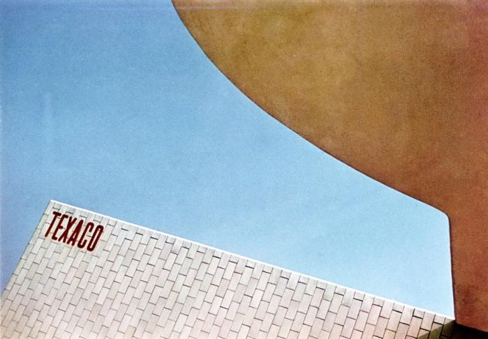
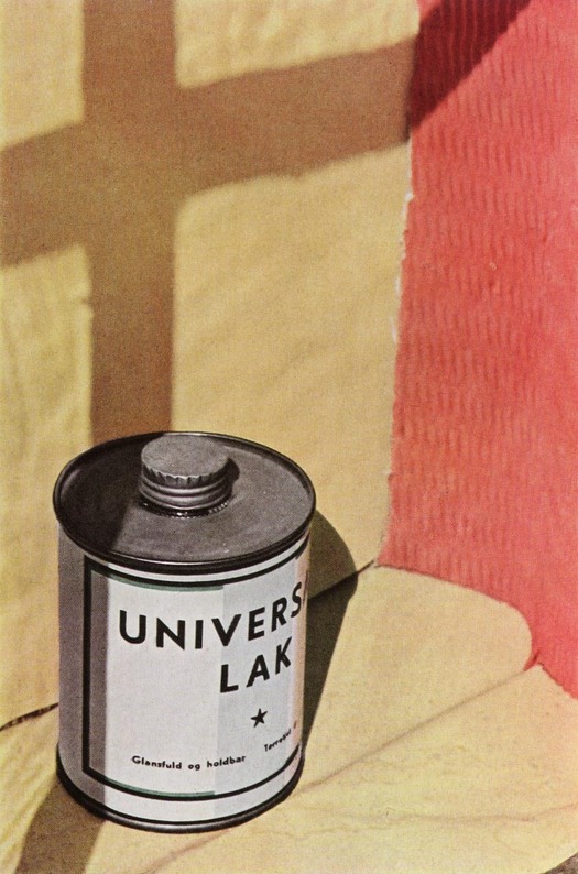

This images was captured by Peterson when he was creating his well known photobook 122 colour photographs. he produced it under natural lighting. The image composition is very interesting as it creates the illusion of depth within the image. This is something i will be considering when creating my own images
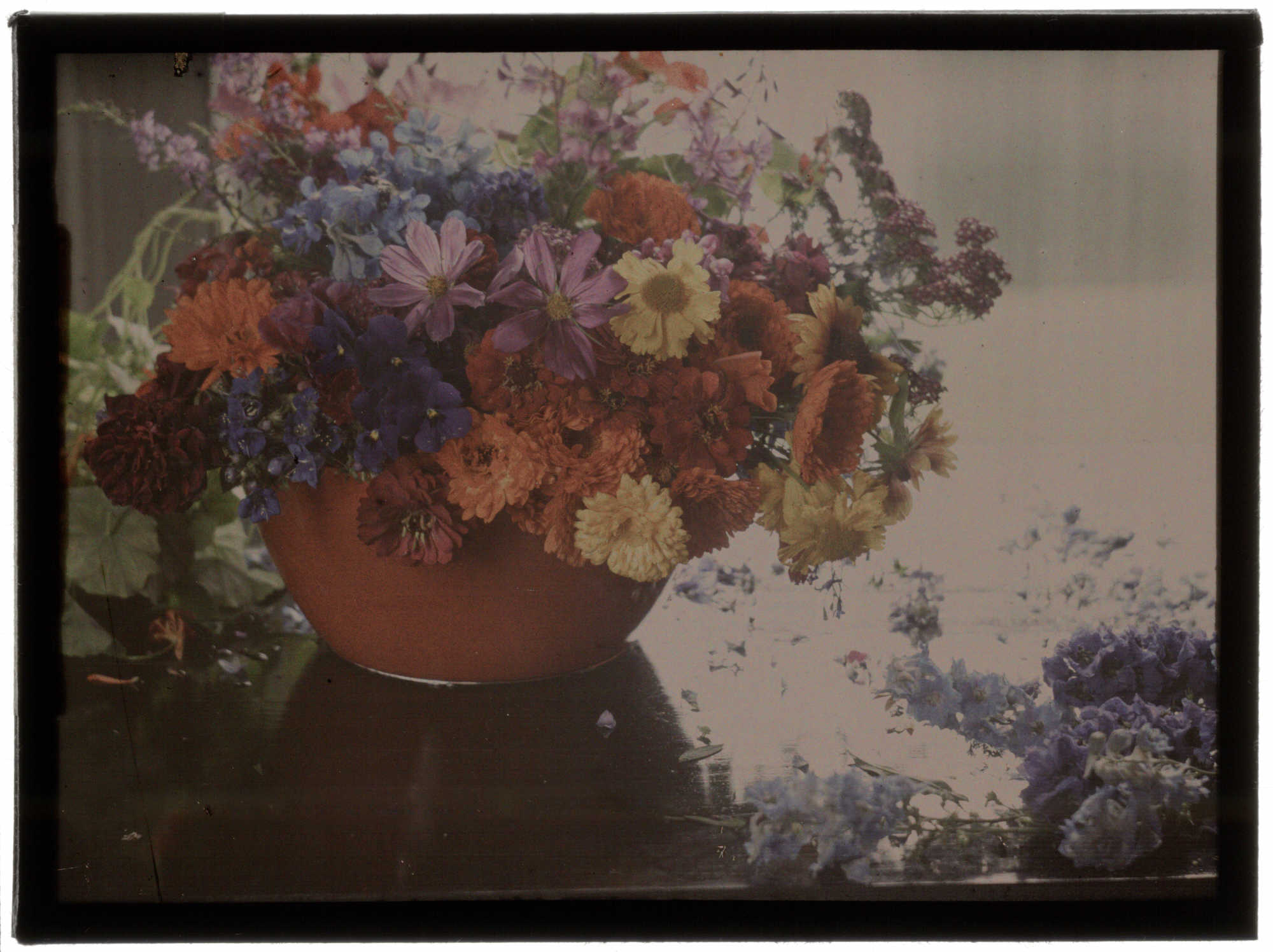
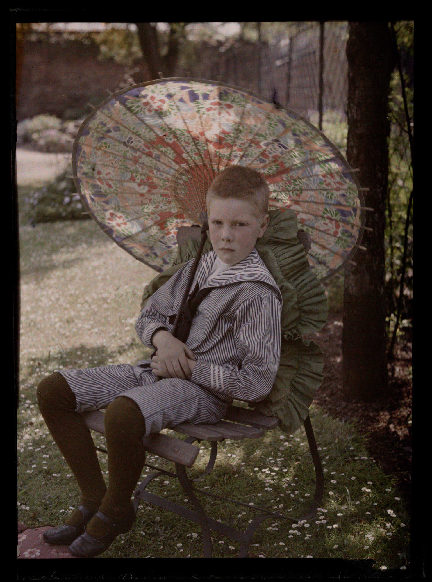
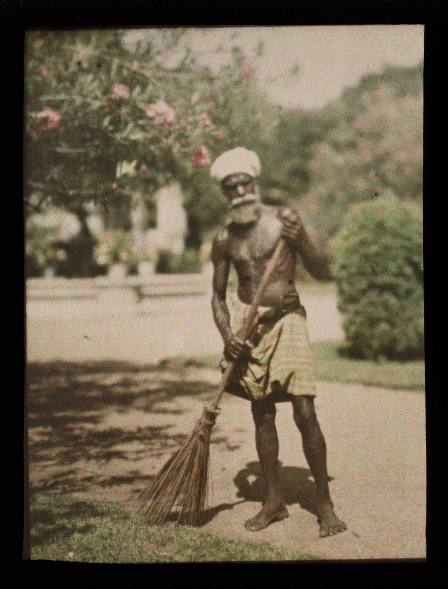
The first colour photograph made by the three colour method suggested by James Clerk Maxwell in 1855, taken in 1861 by Thomas Sutton.
In 1839, when photographs were seen for the first time, they were regarded with a sense of wonder. However, this amazement was soon tempered by disappointment: photographs captured the forms of nature with exquisite detail, yet failed to record its colours.
Attempting to meet consumer demand, photographers began to add colour to monochrome images by hand. Even at its very best, however, hand colouring was not the solution.
In 1861, James Clerk Maxwell conducted an experiment to prove that all colours can be reproduced through mixing red, green and blue light. This principle was known as additive colour synthesis. With the fundamental theory in place, several pioneers did succeed in making colour photographs, but their processes were complex, impractical and not commercially viable.
It was not until the end of the 19th century that the first panchromatic plates, sensitive to all colours, were produced. Now, at last, the way lay clear for the invention of the first practicable method of colour photography: the autochrome process, invented in France by Auguste and Louis Lumiere.
Autochrome plates are made up of red green and blue microscopic potato starch grains, around 4 million per square inch. When a photograph is taken it passes through the colour filters to the photographic emulsion. The plate is processed to produce a positive transparency. As light travels through the strach grains they begin to combine creating a colour image of the original subject.
Mood Board


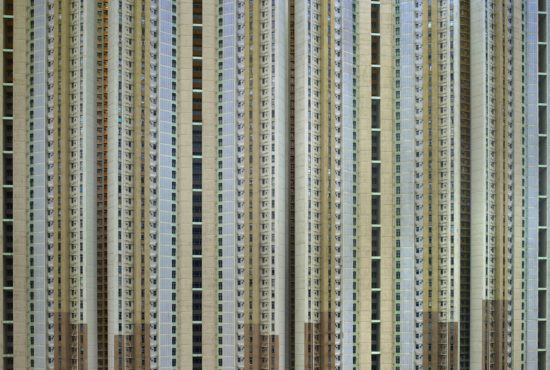


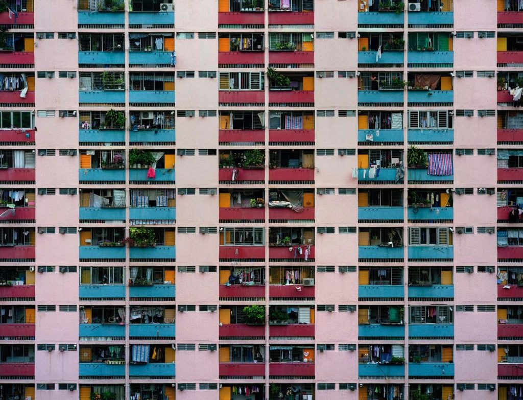


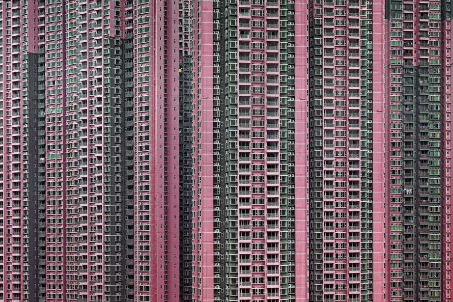

The focus of German photographer Micheal wolfs work is life in mega cities. He explores and documents the archaeology and culture in cities
such as Hong Kong, Tokyo, Chicago, and Paris and address issues such as population concentration, mass consumption, privacy, and voyeurism.

In Michal Wolf’s ‘Architecture of Density’ he has used natural light from the city of Hong Kong to catch the repetitive and colourful high-riser apartment block. A shutter speed of 1/60 would have been use as it is the usually one for people and slow moving object an ISO of about 100. this has lead to a visually appealing image. Natural lighting has been able to capture the natural tonal ranges of the building which I think depicts the city of Hong Kong well. A deep depth of field would have been used this is because all parts of the photograph are in focus.


Stephen Shore was born in 1947 in New York. He was an only child and lived a privileged existence. With annual trips around Europe, exposing him to new cultures and art. At the age of six, his uncle gifted him a darkroom set. He would use this to develop his families snapshots taken on a inexpensive Kodak Brownie. He had little skills with a real camera until the age of nine, when his mother bought him a 35mm camera.

Shore was using a large format camera (8-by-10 camera, that’s on a tripod, and it produces a negative that’s eight inches by ten inches. ) to ensure maximum exposure and detail.
This photograph of an intersection in Oklahoma is among the image sequence known as American Surfaces, taken on Shore’s first drive across the United States. At the center of the image is the point where two roads intersect, marked by a set of traffic lights and a vertical sign marking the Texaco station visible behind two cars on the right side of the image. The image has been taken late in the day and the lights are bright against the faded blue and orange sky, the dark green of the nature strips and the grey of the road and the foreground parking lot in which crumpled newspapers lie discarded. American Surfaces is intended to be seen as a sequence, in which the minor details of life on the road, including food on tables, beds and televisions in motels and gas stations such as this, build to communicate a sense of the North American interior as an anonymous monotony.
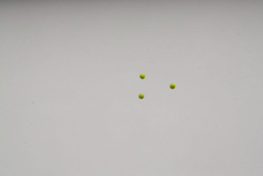
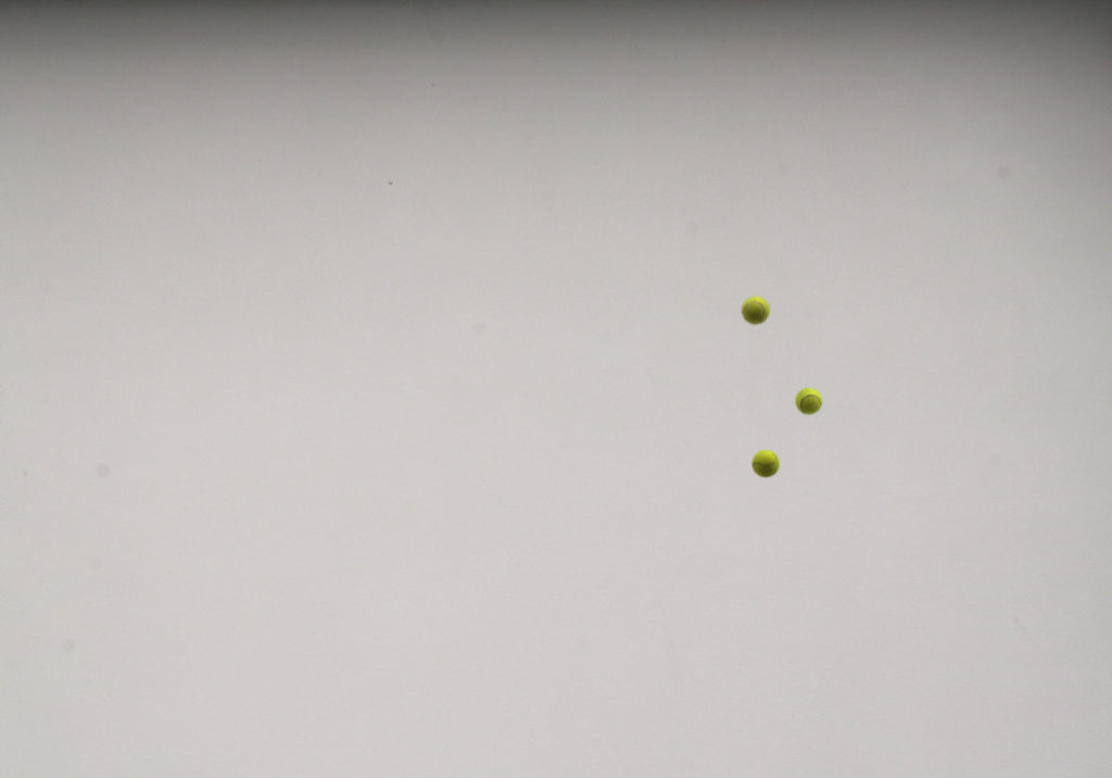
The theme of variation and similarity can be seen throughout many types of work one of which is an experiment by Californian photographer John Baldessari. This experiment was influenced by Baldessari after he did it in 1973. His aim was to get all three balls to line up mid air and take a picture as they do so. it was really challenging to throw them up and get them lined up and take the picture at that exact moment.
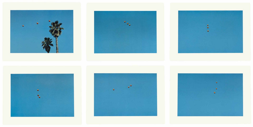
My Attempt:
Idea 1: I was planning on going on a trip to London and during the time in London i am planning on photographing buildings. Exploring the extreme variation between modern and post modern architecture within the city and how it developed and evolved into the city it is today. In addition, i would like to look into future building plans and compare them to recently finished structures and much older structures. When taking the pictures i will take into consideration, the golden ratio (Fibonacci sequence), geometry, symmetry, opposites, dramatic juxtapositions.
Idea 2: For my second idea I looked at size, shape and colour within the streets and natural landscapes. Colour is everywhere in our lives so i wanted to explore the aesthetic. Colours have been assigned to many different signs and and objects over the years; such as, traffic lights, red means stop and green means go. or the blue flashing lights on emergency vehicles, or uniforms. I want to explore the colours we see everyday, artificial and natural, to compare and contrast between them. I will research the origins of colour photography and how it has progressed with modern technologies.
Idea 3: For my third idea i was planning on focusing on similar shapes and sizes of objects and show the variations between them. For this idea i would explore Standardisation. This is when components of parts and or just about everything. It is when things are made so that they can be assembled easily, used with comfort. They take into consideration human orthographic which is the average human dimensions. This shows how everything we have build is designed around the human body so i thought this would be an interesting concept.
To conclude, the idea i would like to use for my variation and similarity project is idea 2. I feel like this will be the most exciting and interesting idea to go ahead with, this is because alot of photographers use black and white. Why take away the natural colours? I want to go in an opposite direction from black and white into vibrant and saturated images that pop with colour.
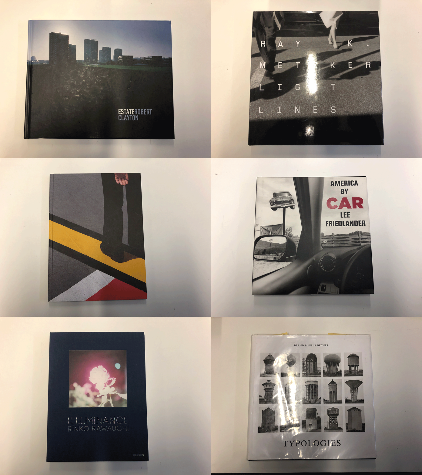
This was an experiment with gifs. I imported images i took of photo books i was interested in.
How to make a Gif in photoshop:
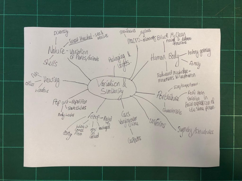
Variation:
Definition: A change or slight difference in condition, amount, or level, typically within certain limits.
“regional variations in house prices”
Similarity:
Definition: The state or fact of being similar.
“the similarity of symptoms makes them hard to diagnose”