All posts by Declan O'Grady

Filters

Author:
Category:

Final Selection

These are the images i am deciding to edit and use as final prints and in my photobook. I carefully selected these images from the 4 shoots i did. I strongly believe that these images best fit my specification and project theme of variation and similarity. They also show influential features from the photographers i studied in order to carry out my photo shoots.

When it comes to displaying my images and how they will be viewed in their final element, i would like them to be collated throughout a photobook, With juxtaposing sequences and layout variation.

Editing Process

I took a relaxed approach when it came to editing and manipulating my images. This was my intention as i did not want to destroy and ruin the images that i thought were ready with minor adjustments. My process for most if not all my images was similar. I would crop the image to my desired size or no crop it at all if i think it will take away from the image. From here i would create an even balance between Dark and light tones with a slightly increased contrast. Then I would increase the vibrance and saturation of the image but not excessively. I would only increase it to give the colour a slight pop so that it stands out among other details of the image as that is my main intention for my project.

Here is the process: The Adjustment units are on the right hand side of the image. All Images Edited in Light Room


Shoot comparison

Shoot 1 – Although i only used one image from this first shoot, i believe that it is the most important images of all as it is what made me want to explore colour photography for my exam unit. It is one of my strongest images that supports the theme and style of variation and similarity. Compare to the other three shoots this one is the least successful due to the lack off images but i got one really strong one out of it.

Shoot 2 – This is my best and most successful shoot for what i was trying to capture and display at the end of the project. I got many of my final images from this shoot which really allowed me to open and explore. This will also help when it come to designing my photobook and experimenting with print layouts. Overall this will allow me to create a narrative sequence within my photobook.

Shoot 3 – Shoot 3 was an experimental, one off shoot. to explore colour in nature and landscape. although i thought this was a good idea i felt that none of the images would work with the images from the other shoots, so i’m deciding to leave them out. In addition, this one off experiment helped with my final shoot as it made me think about shooting under a different lighting influence and exploring colour and experimenting with new contrasts.

Shoot 4 – I believe that my 4th shoot was my second most successful shoot. I captured many of my strongest images for the project during this shoot. This shoot was different when it came to use of lighting as i shot in underexposed areas of coloured lights and objects. Unlike the other shoots, the images had a different feel to them with the new contrasts and tones. This, in my opinion is what made this shoot an overall success.

Shoot 3:

Contact sheet

Edited

I took it under natural light influence at around 2pm. The focal point of this image is the felled tree with the writing on the bottom. The composition of the image even with the root in the middle the grass on the foreground contrasting with the brown trunk the the trees in the mid-ground are the trees which add a natural touch to the image. Then the sky is in the background Creating a contrast between the the sky blue and the green in the trees, This is the most naturalistic colour and tone collation so i thought the stop wars trunk would add great context.

This is my favourite edit and image from my 3rd shoot, It shows a tree that has been cut down in hide park. On the bottom of the felled tree is some writing that stop wars. As soon as i saw this i had to capture it. My concept behind the image is that when you read it you look around you and see how amazing life is that there is no need for wars. Its also in a peaceful environment showing us what the world could look like everywhere if we stoped fighting.

Shoot 2:

Plan: capture images with varied colours, shapes and sizes.

Influential photographer: Siegfried Hansen

Contact sheet:

Edited:

Images analysis:

This images was taken in Barbican, London of an apartment complex, It was taken around midday under a cloudy influence of natural light. The images is very well composed with strong, even and symmetrical lines. This influence came from Siegfried Hansen and his photography using lines within the image. It shows an apartment complex, with barricades, that is yellow and white in colour. The barricades added an interesting pop of colour. I liked the look of the yellow and white together so i aligned the camera up to capture the building in an almost abstract way. Much like my photographer reference.

Shoot 1:

During my first shoot I will try to capture images that explore colour in landscapes and objects.

Image analysis:

This image was taken in liberty warf and it was taken under the influence of artificial lighting from the electric lighting on the roof. I shot diagonally down to the right to capture the feeling of depth in the image, This makes the shapes in the image more interesting and full. In the foreground of the image is a bright red table i shot this as my focal point as it is so loud. Then in the mid ground are the multi colour tables and chairs. This fills the mid range will varied colours and shapes.

This image shows the variation and similarity between the sizes shapes and colours of the chairs because although they look they same each one is unique and important in the image.

Planning of Photo shoots

Shoot 1: My first shoot will be In the style of Keld-Helmer Peterson. I will look for interesting colouful objects around Jersey I will select my strongest images that supports the theme and style of variation and similarity.

Shoot 2: My second shoot will be City based. I will take a variety of images in London during the day. Some being abstract and others not. This is to create a subtle link to a supporting image using the same colour combinations.

Shoot 3: My third shoot will be in Hyde Park in london. The plan for this shoot is to capture the natural elements in Londons Hyde park. I thought it would be very interesting to visit the area as it visualizes what the area around London would have looked like before mans existence. This will be an experimentation shoot. I want to capture the nature

Shoot 4: My final shoot will be during the night. I decided that i should take images of colour under a dark influence to contrast with daytime images of the othershoots. This would give the images a different feel to them with the new contrasts and tones.

Specification

My idea is to photograph colours and shapes in objects and buildings. I am specifically going to be looking for areas, buildings and objects that have multiple colours. I will produce most of my images whilst in London. London is packed with really historical buildings and at the same time is packed with modern structures. I want to explore how colours patterns and shapes have vary and developed as new design themes were popularised. I will capture both abstract, portrait and landscape images. I drew my inspiration from Siegfried Hansen, Saul Leiter and Keld Helmer-Petersen. All pioneers of colour photography.

Review and reflect

How well have ideas developed?

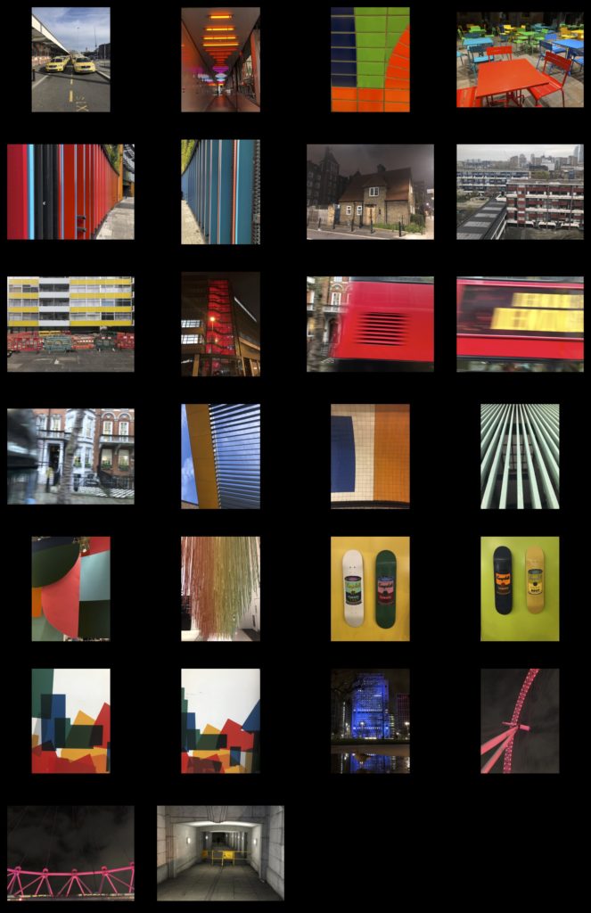
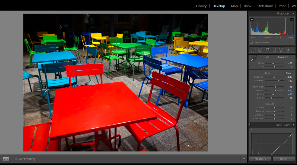
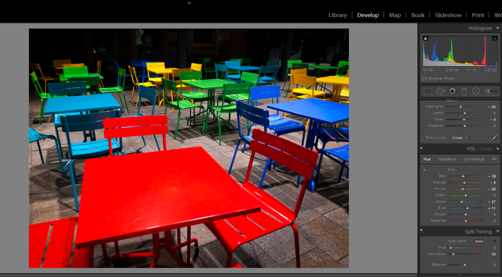
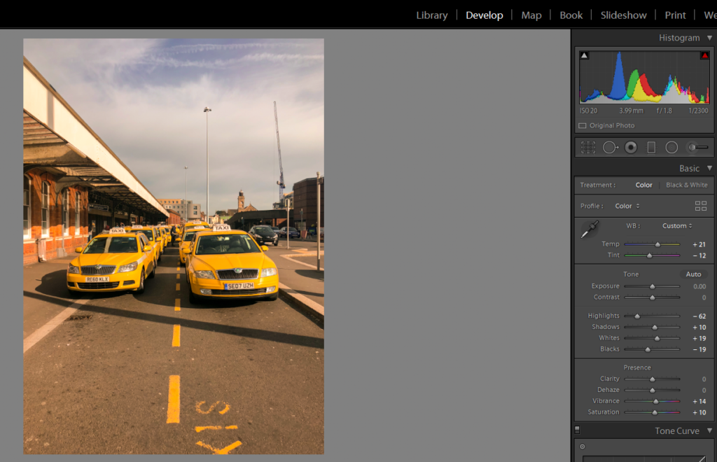
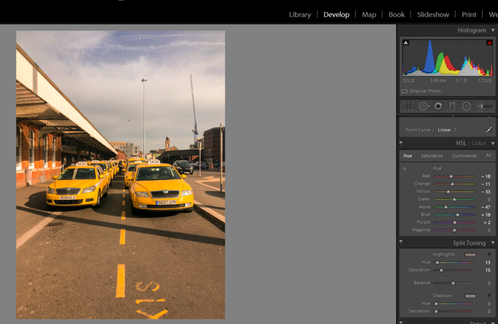
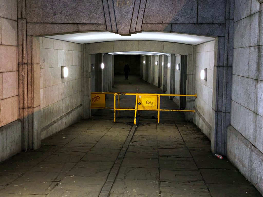
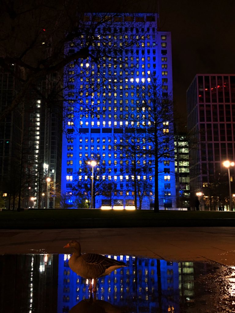
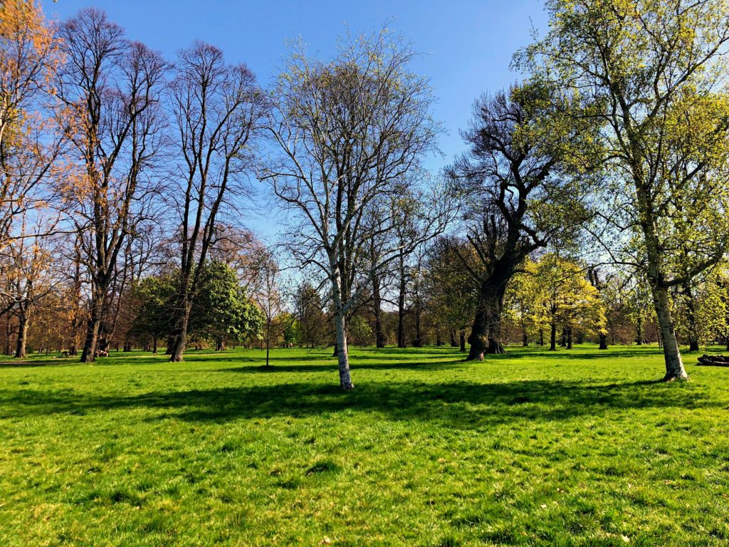
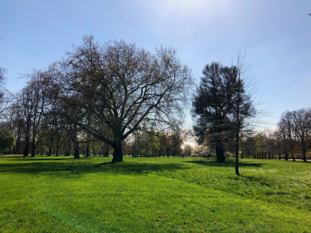
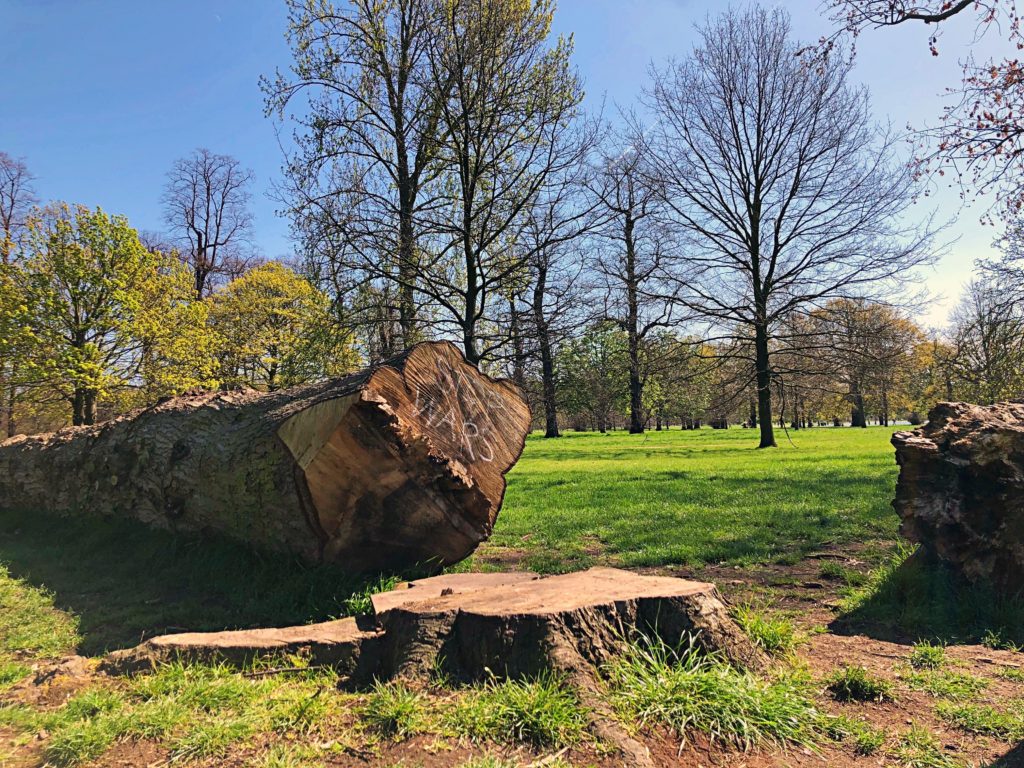
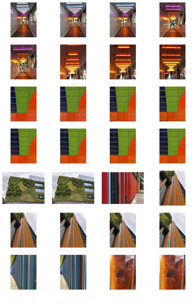
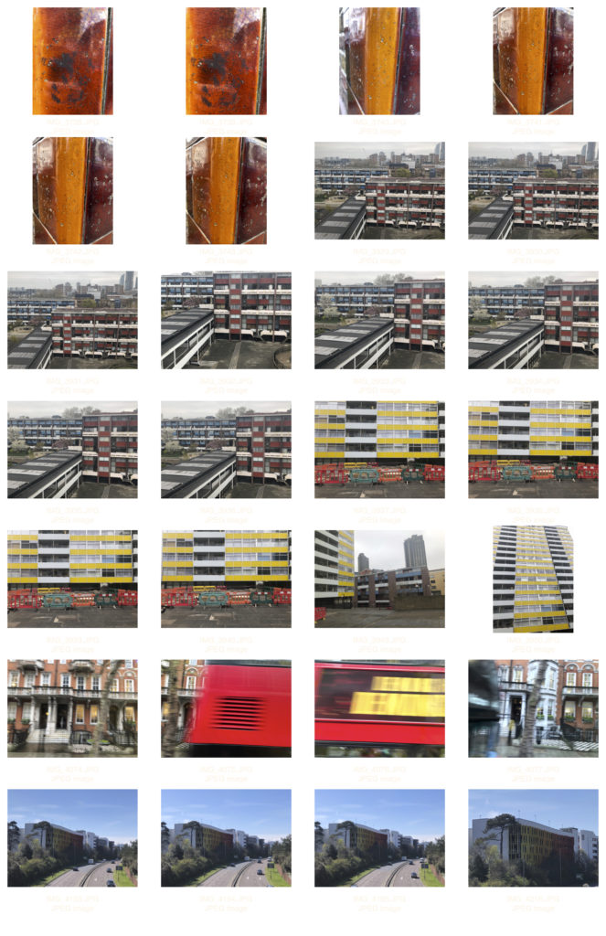
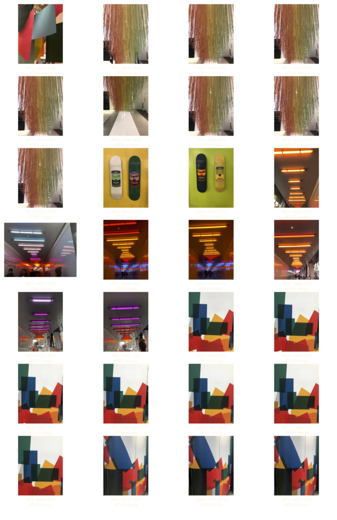
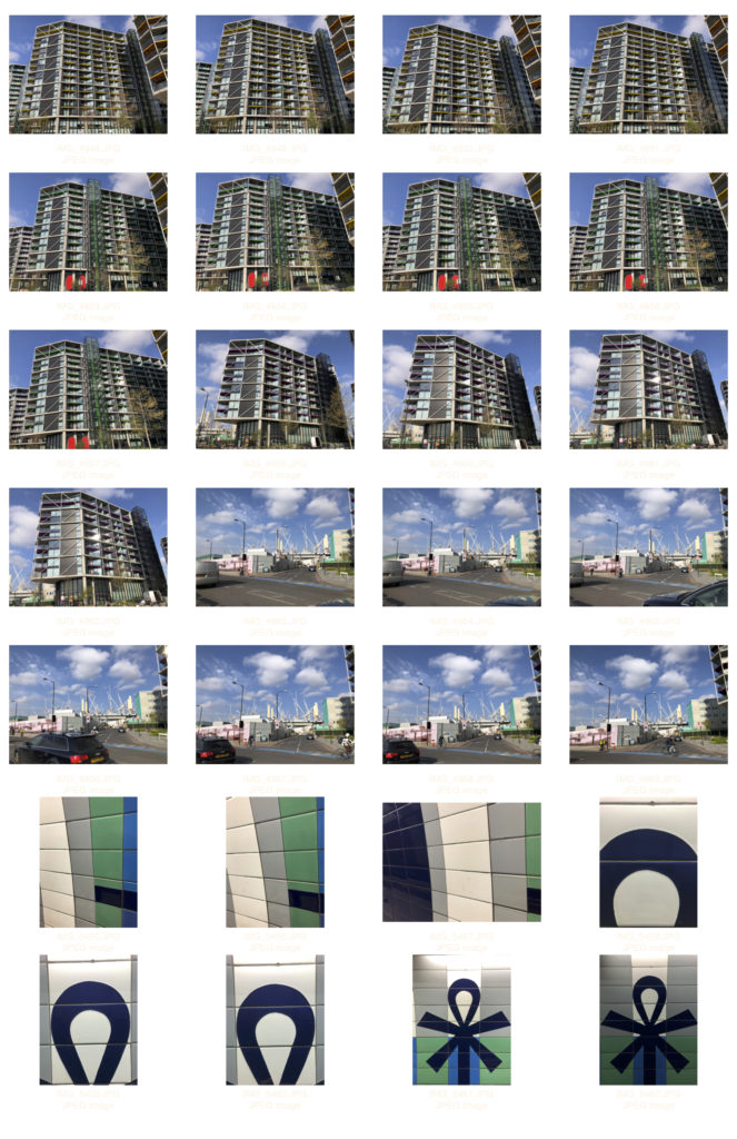
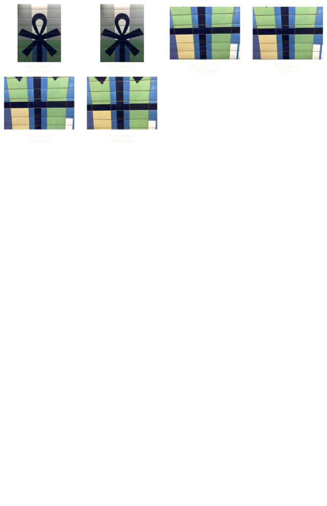
originally i was interested mass density areas and buildings. I wanted to explore the life within a city. whilst looking at Siegfried Hansen I became inspired by colour. From here my idea developed into exploring colours shapes and tones. I am happy with the current status of my project and would like to develop my images further through editing and displaying them in a colourful way.


Are ideas explored and selective appropriate to intentions?

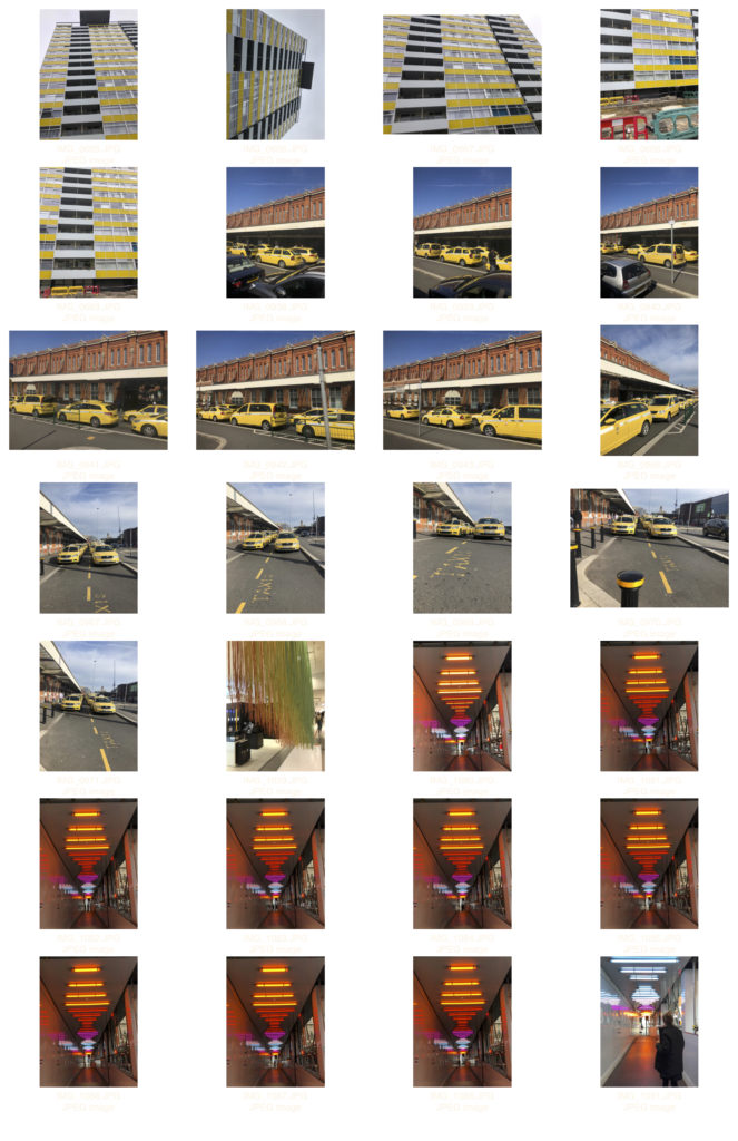
I explored and researched each of my initial ideas until i narrowed it down to my current idea. Through careful selection i chose the theme i felt was most suitable for my project ‘variation and similarity’


How many responses/ shoots?

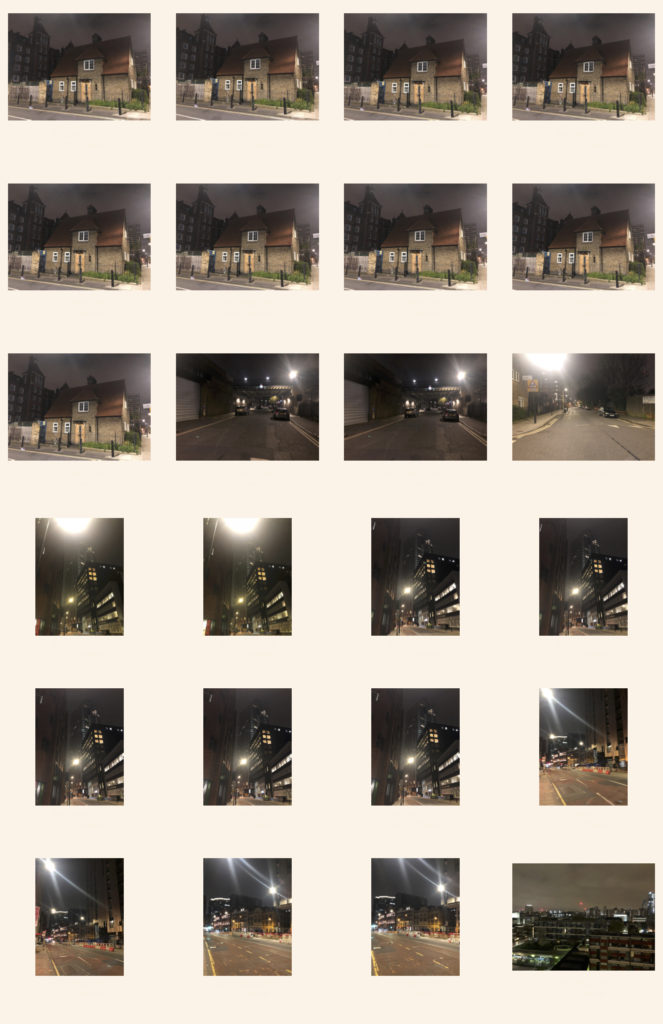
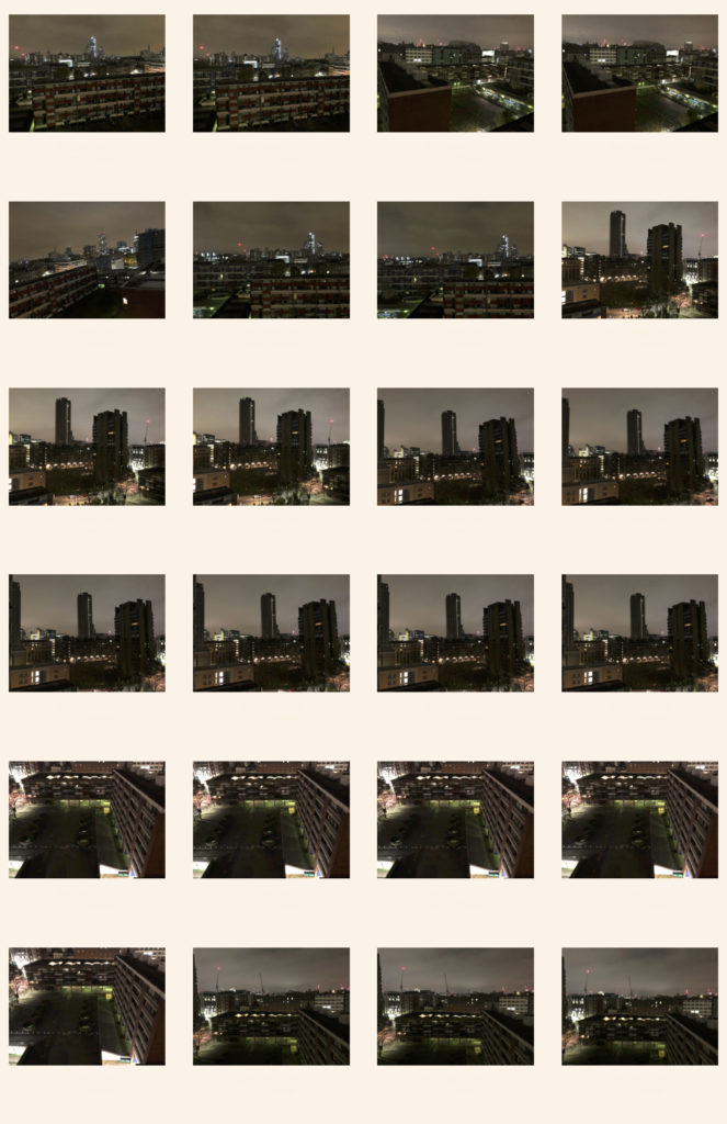
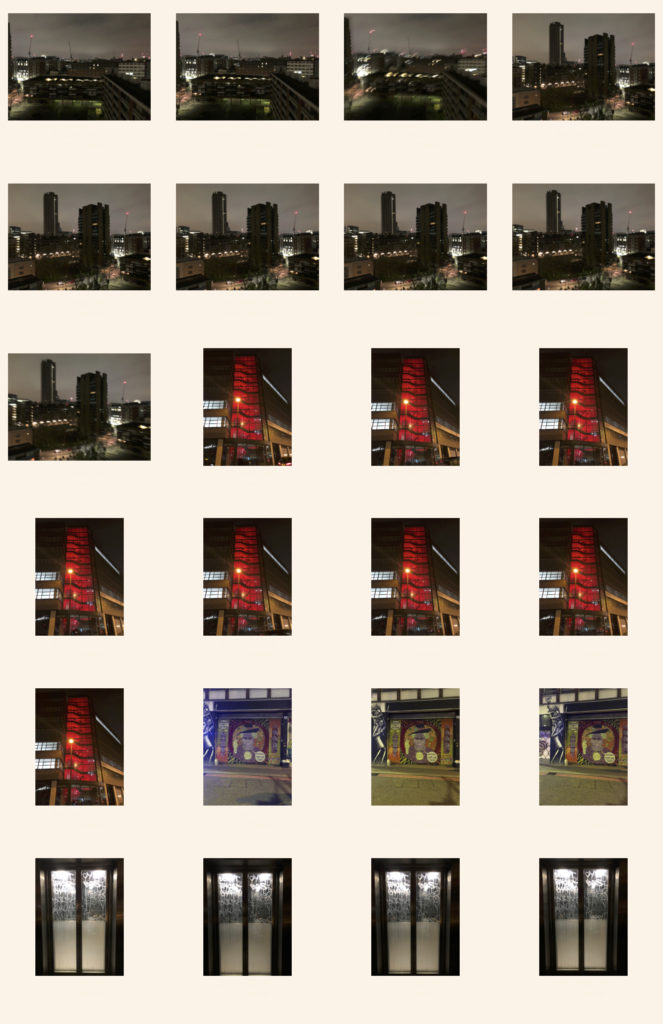
Overall i made 4 shoots in total, all of which i believe to be strong shoots that gave a direct response to my artist references.


How do they relate to artists references?

My images show inspiration from my three artist references as they are all linked in my project through minor and major details varying from image to image. They all relate due to composition, colour, use of shape and patterns.


How do the interpret exam theme?

They interpret the exam theme as It shows the variation of colours we have available to use and explore on this planet. I also explored shapes and size to give the images a bigger illusion and give them depth.