
This is a link to my complete photo book.
All posts by Declan O'Grady
Filters
Evaluation – Final Outcomes
My final pieces are displayed in two forms. In a photo book and mounts. These two forms allow my images to have a sequence to give my photo book a narrative. The narrative for my photo book was pin pointing areas and objects, with vibrant colours, and then capturing those images through carefully thought out shoots throughout London and creating juxtapositions between the images to make the viewer compare the similarities between the two varying images. This is where my project theme comes in. My main influence and inspirations came from three notable photographers; Keld-Helmer Peterson, Saul Leiter and Siegfried Hansen.
From the start of the project ‘variation and similarity’ I was researching the work of photographer Michal Wolf. I was very intrigued by his project ‘Hong Kong Inside Outside’ as it showed the extreme diversity and variation between the locals. His images subjects where of extreme poverty among mass apartment units. he does this in a very formal and symmetrical way. From here i started looking into colour photography and researched the auto chrome, all about the begging of colour photography and how it was first produced. This made me question why so many photographer take images with beautiful colour then go in photoshop and make it black and white. All the hard work and innovation. I wanted to use this as motivation to produce colourful images for the project and show the variations of colours in the objects, buildings and nature. I started by researching the pioneer of colour photography, Stephen shore. This opened me up to a whole new range of colour photographers, such as; Keld-Helmer Peterson, Saul Leiter and Siegfried Hanson. All of these photographers have a noticeable influence in my photo book. This is what kicked my project into action. From here i carefully planned out shoots each inspired by a different reference
Photo Book:
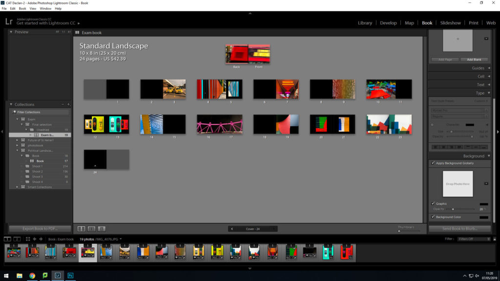
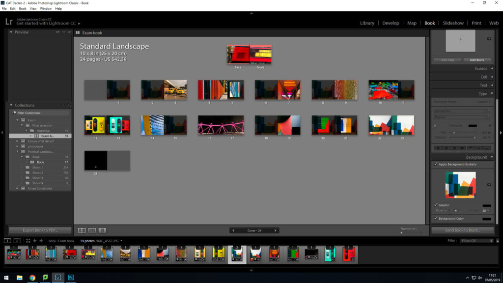
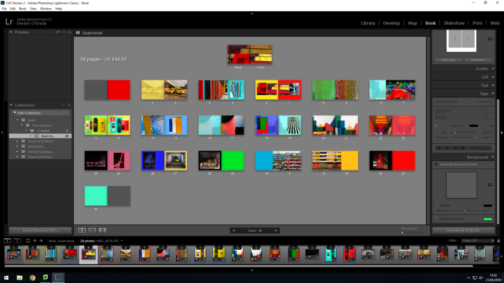
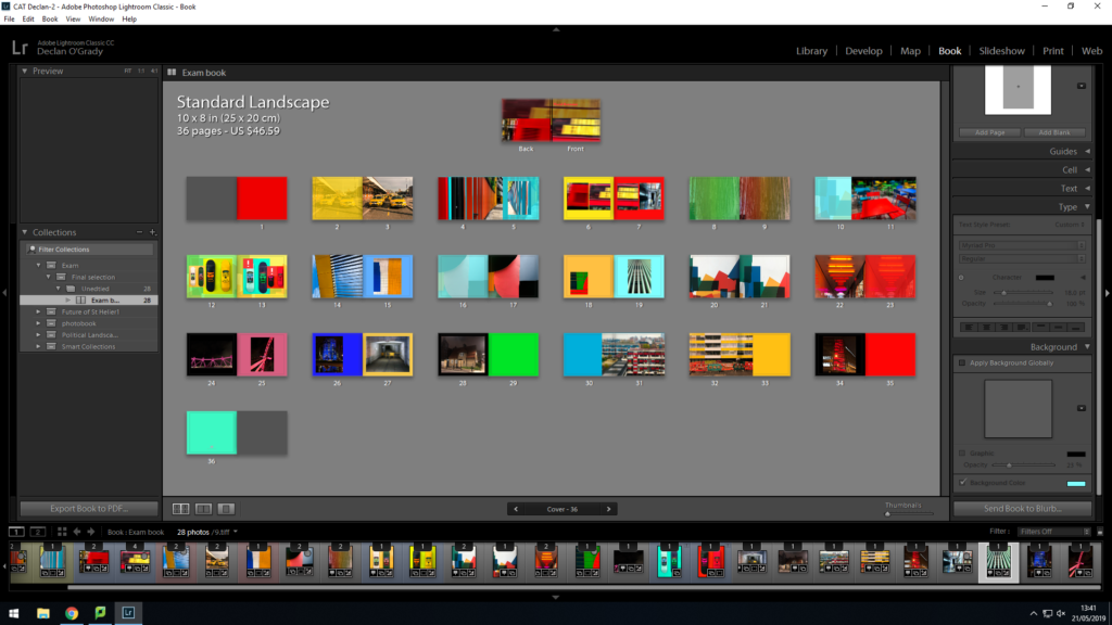
My photo book ‘The Colour And The Shape’. Was an overall success for a final display of my images to collate them a sequence. Throughout the design process, i thought of different colour combinations that would look suitable. I came to the conclusion of using tonal colours. I would colour match the focal colour in the image and i would make that the colour of the page. Although, i did not use this method for all pages. I found other colours that compliment the colours within the images to almost extent my own image. This is what helped me achieve the final result i was initially visualising and now that it is in physical form i couldn’t be any more pleased. To Conclude i am pleased with the final outcome of my final photobook as it meets specification points for the exam and my own specification for the project and the book.
Mounts:
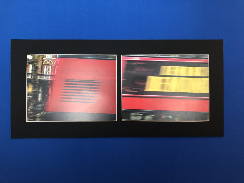

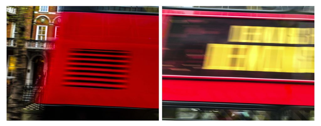
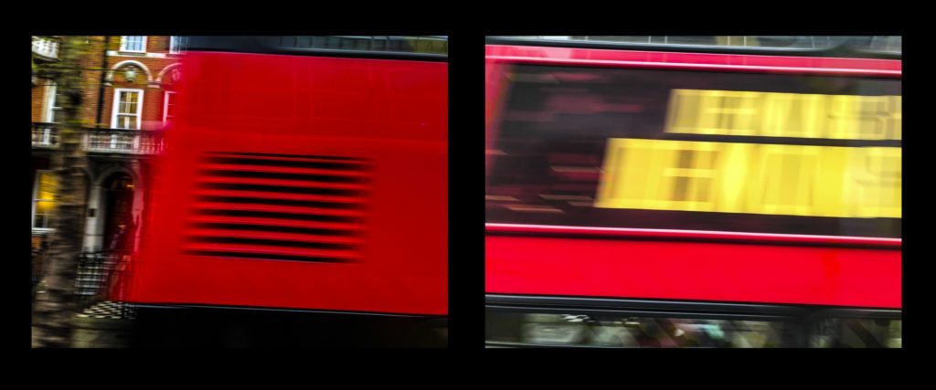
The first set of images on the left are of a London bus that was traveling past. as i took a picture i took a burst to try and capture the full bus so that when it came to editing i could use them to build and image of the moving bus. Overall i am pleased with how this idea turned out in my final outcomes both in this layout and within my photo book.
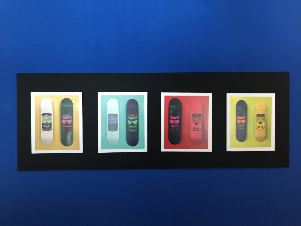
The middle layout is of Skateboards showing the variation of colour mixes in the images and the new mixes when compared to one another.
Finally the last layout is of my strongest images from the overall project. This is why i decided to Lay them all out in a large format to display them. They all share similar colours to each other but are in the form of other dimensions, materials, place and position. so as a result of this i believe this to be my strongest and most successful layout when it comes to consideration for the theme of the project and final execution of the layout.
I am pleased with the final result of my prints. I feel that they were the best ways to present my final outcomes in a larger format.
If I were to do this project again i would, Produce more images and shoots to work with a wider range of images. I would capture images that are focusing on similar subjects and show in almost a typology form the similarities and variations they share. I would also research other artist references that use interesting editing skills to give new meaning to the image. Such as, joiner images.
Final Photo Book
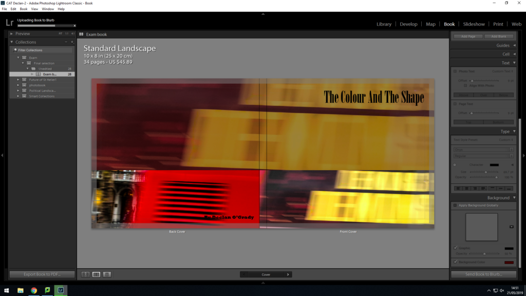


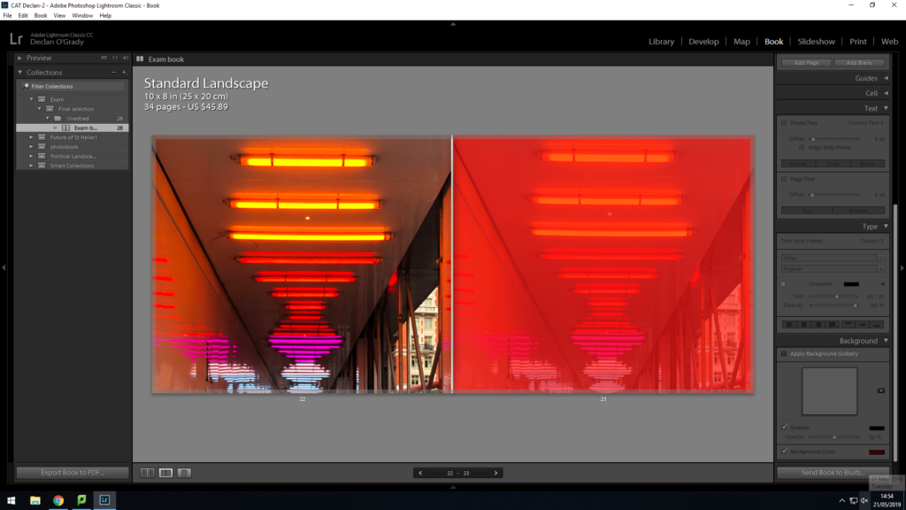

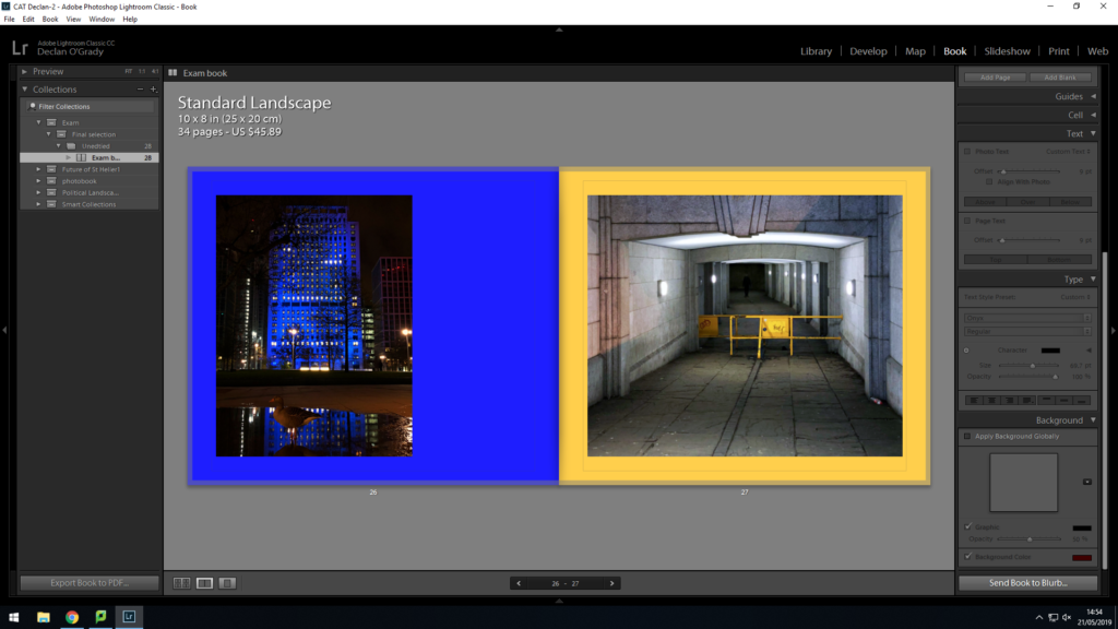


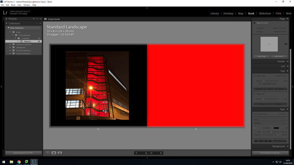
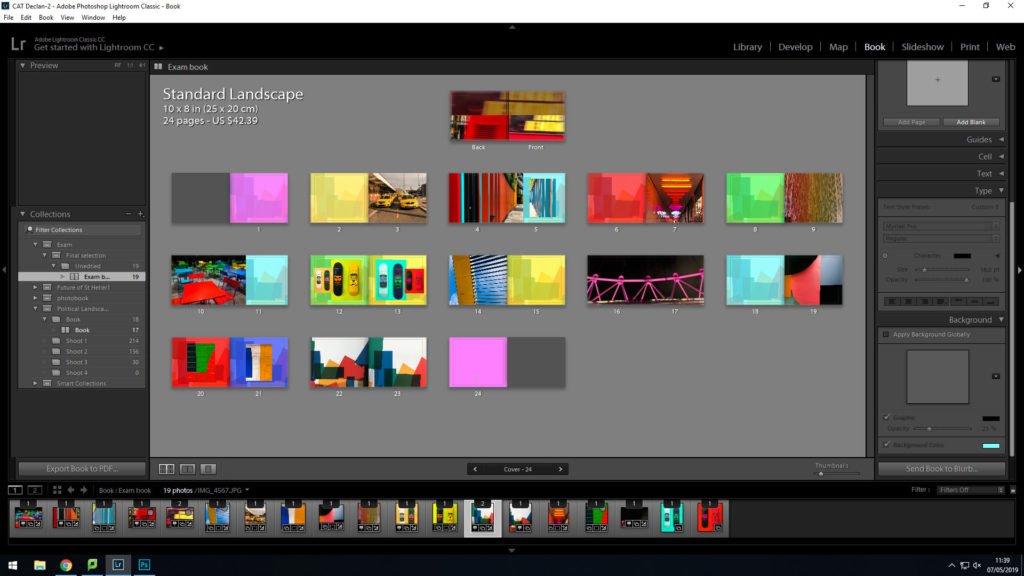
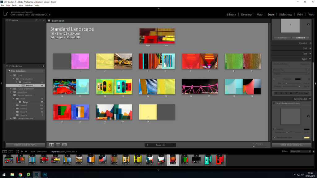
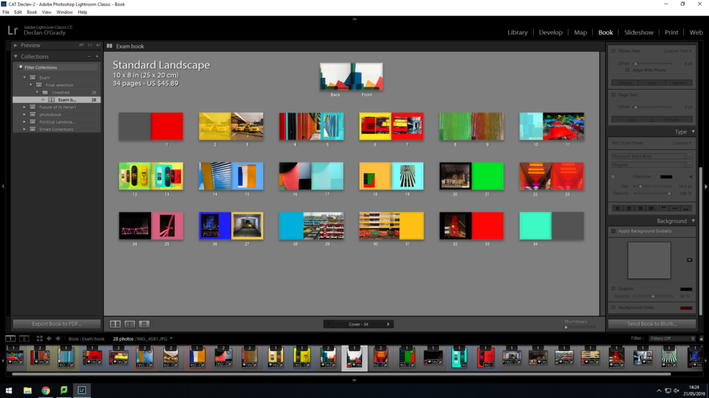
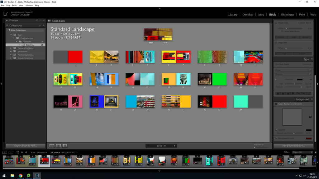
This is my final design for my photo book ‘The Colour And The Shape’. The front cover is something i had been playing with a lot when designing the book. this allowed me to develop the final design seen on my front cover. I used a bottom layer image with 40% opacity through a brown mask layer, this helped darken the image, I then used the same image on the front cover and a supporting image on the back. I used red and yellow because I wanted people to know it was a book full of vibrant colours. I am very pleased with its final sequence. I sequenced my images in a way that flowed predictably and unpredictably. For instance, on page 20 i used an image i thought did not suit my book but i used it as it created a unique contrast between other images displayed. Throughout the design process, i thought of different colour combinations that would look suitable. I came to the conclusion of using tonal colours. I would colour match the focal colour in the image and i would make that the colour of the page. Although, i did not use this method for all pages. I found other colours that compliment the colours within the images to almost extent my own image.
Siegfried Hansen: Comparison

My response:
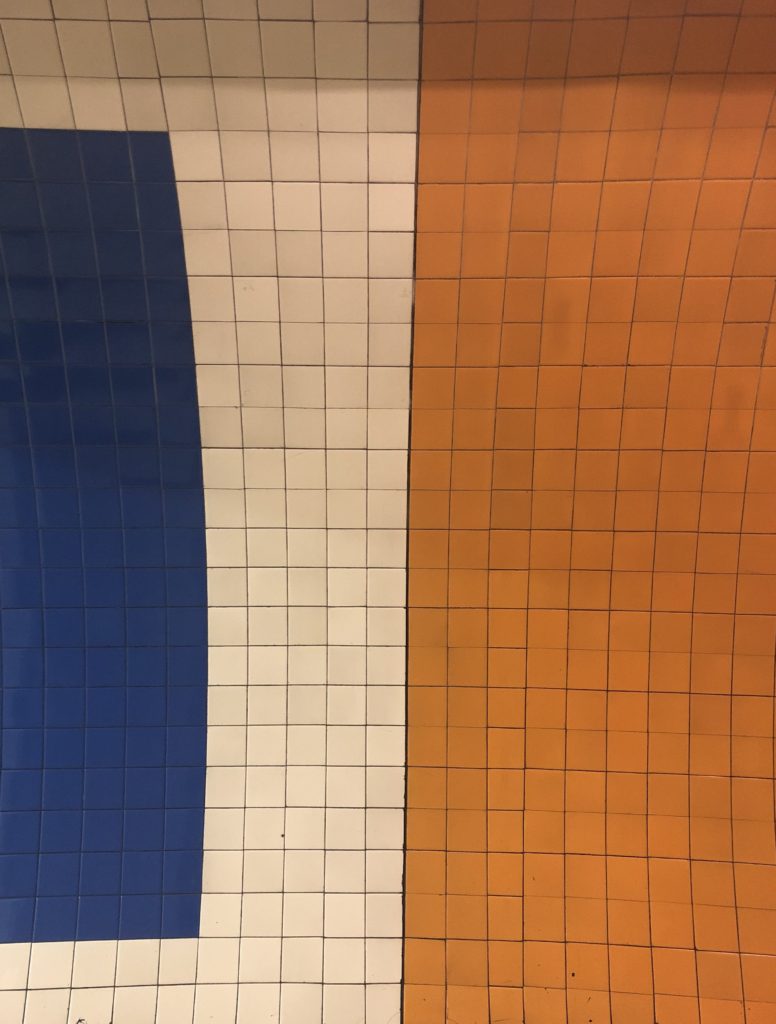
My response was captured during my shoot inspired By Hansen, i enjoyed his minimalism and i thought abstract photography would compliment other images with similar colour. I plan on using this idea when creating my final piece. I feel that this image is successful in capturing Hansen’s aesthetic. His image is very symmetrical and bold with washed out colour. This is what i tried to capture with my subject in my response, I located some tiling in one of the London underground tube stations and i immediately had to capture the tones of the tiling. I took it face on so it would be symmetrical and balanced just like Hansens.
Keld Helmer-Petersen: Comparison

My response

I feel successful in capturing Keld-Helmer Peterson’s aesthetic. Although both images are different, they share some characteristics. For instance, The subject matter is fairly similar, but the thing that sets them apart is the angle it was shot and the colours within the image.
I think was a strong response as it shows clear signs of inspiration yet it meets the specification of my own project. This image also contrast really well with my response to Hansen
Saul Leiter: Comparison

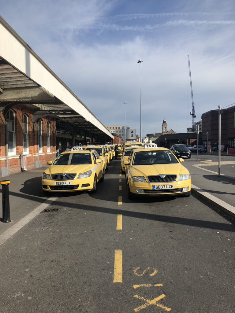
When compared to the work of Saul Leiter, there can be signs of influence in my response. The subject matter of both images is similar just mine is modern and his is from the 50s. This image does a great job at showing development throughout time. Leiters image is slightly darker than mine With much less noise within the image. Mine shows two rows of a variety of yellow coloured taxis. Whereas, Leiters image shows a gentleman and a yellow and green Taxi behind. The main reason i liked this image is because of they way they all have the same exact taxi sign on the roof Yet they are on different variations of cars, This makes them similar yet varied. Lieters image has a high contrast with a slightly lowered brightness, Where as my image is overall fairly light due to the different times they were shit at.
Print layout: Experimentation
Layout 1
2

3

Of these first three layouts my favourite is the 2nd I think the black frame creates a deep contrast and it makes the images Stand out.
Layout 1
2
3

My Favourite of these three layouts is the 2nd as I feel like the black supports the image
Layout 1

2

3

My final decision for the layout of my third print set is Layout 1
To conclude i am pleased with all three of my preferred layouts for my final presentation.
Book Design Experimentation
I have decided to make a photobook using lightroom to present my images as i feel that this is the best way to display and collate the images i have produced, focusing on colour photography. I am focusing on including vibrant, saturated and a contrast between dark and light.
From my artist reference on
This is my final design:
This is my final outcome for my book design. I think this will be the most suitable design as it meets my book specification.
Book Specification
How you want your book to look and feel
I want my book to be eye catching, i will achieve this by using vibrant and bold colours such as red. The front would be finished in matte to give a clean and professional look and feel.
Format, size and orientation
The book will be in landscape with the dimensions of 25x20cm to fit the average standardised photobook.
Design and layout
The design will vary from page to page to keep each page fresh and different. I will use double page spreads, full bleed and different sized images to create a different atmosphere in shape and colour.
Rhythm and sequencing
Images will be carefully selected to support each other with a strong bond. In this case that bond is colour. Each page will be a different colour from the last.
Structure and architecture
image sizing and shape will vary thought the book. To keep every page unique and important.
Narrative
The narrative of my photo book is based around colour and shape by photographing and pin pointing areas and objects, with vibrant colours, and then capturing those images through carefully thought out shoots throughout London and creating juxtapositions between the images to make the viewer compare the similarities between the two varying images.
Title: The Colour And The Shape
Images and text
There will only be text on the outside of the book, this writing will be my title. I want a bold interesting title so i went with The Colour And The Shape after carefully selecting the most suitable title for my photo book. The text will be in black so that it contrasts with the yellow and red.
Colour and B&W (or a mix)
My photo book will include images of colour only. As this is the main aspect of my photography. Although there will be some dark contrasting images and background colours.
Paper and ink
I will use a matte finished paper texture as it feels smooth and professional. Colour ink will be used to fill in blank pages pages with colour to make the book burst with colour.
Keld Helmer-Petersen: 122 colour photographs
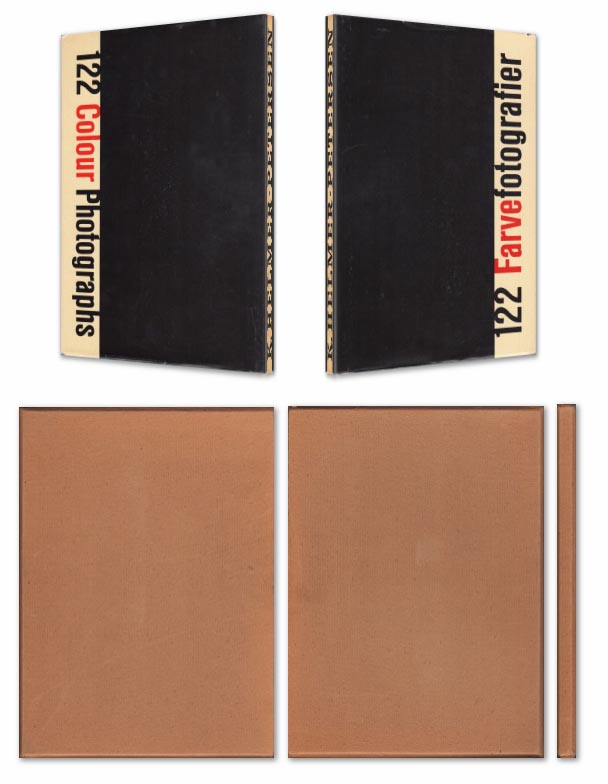
Keld Helmer-Petersen’s 1948 publication of 122 Colour Photographs stands as an extraordinary accomplishment. Inspired by the realism of the Neue Sachlichkeit movement, Helmer-Petersen concentrated on the mundane and the everyday, creating geometric abstractions out of curved doorknobs, crates of tomatoes,
Book in hand: how does it feel? Smell, sniff the paper.
Paper and ink:
The front cover has a hardcover with dust jacket in a publisher cardboard slipcase.
Format, size and orientation: portraiture/ landscape/ square/ A5, A4, A3 / number of pages.
Design and layout: image size on pages/ single page, double-spread/ images/ grid, fold- outs/ inserts.
Rhythm and sequencing: flow of images/ juxtaposition of photographs/ editing process.
Structure and architecture: how design/ repeating motifs/ or specific features develops a concept or construct a narrative.
Narrative: what is the story/ subject-matter
Title: literal or poetic / relevant or intriguing.
Images and text: are they linked/ introduction/ essay/ statement by artists/ use of captions (if any.)