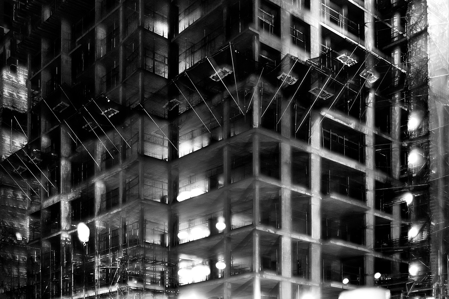
This shoot draws inspiration from Lewis Bush’s ‘Metropole’ as well as Michael Wolf’s ‘Architecture of Density’ and aims to show some of the repetition and symmetry in blocks of flats and offices whilst at the same time showing the difference in designs between buildings. Going into this shoot I had the vision of photoshopping the photographs that result to create compositions that are full of patterns and are illusion-like. Lewis Bush’s ‘Metropole’ came to me as an inspiration because it explores the fact that there are an increasing amount of large buildings for offices or flats taking away from green land and so the landscape in which we live is turning into a repetitive view of similar flats and offices leaving citizens with a feeling of monotony as everything is being redeveloped to serve the same purpose. Bush’s work on ‘Metropole’ shows a lot of emphasis on the repetition between buildings and I have tried to replicate this in this shoot. Wolf’s work has inspired me as he essentially does what I am attempting to do in this shoot but on a much larger scale by photographing the density of high-riser apartments in Hong Kong.
One way in which I could develop on this shoot in the future is by looking at typology, which would involve me researching Bernd and Hilla Bechers, of high rise buildings in Jersey. I could approach this by finding the 14 high rise apartment blocks in Jersey and photographing these in a similar style to this shoot and then creating a typology page of these different buildings.
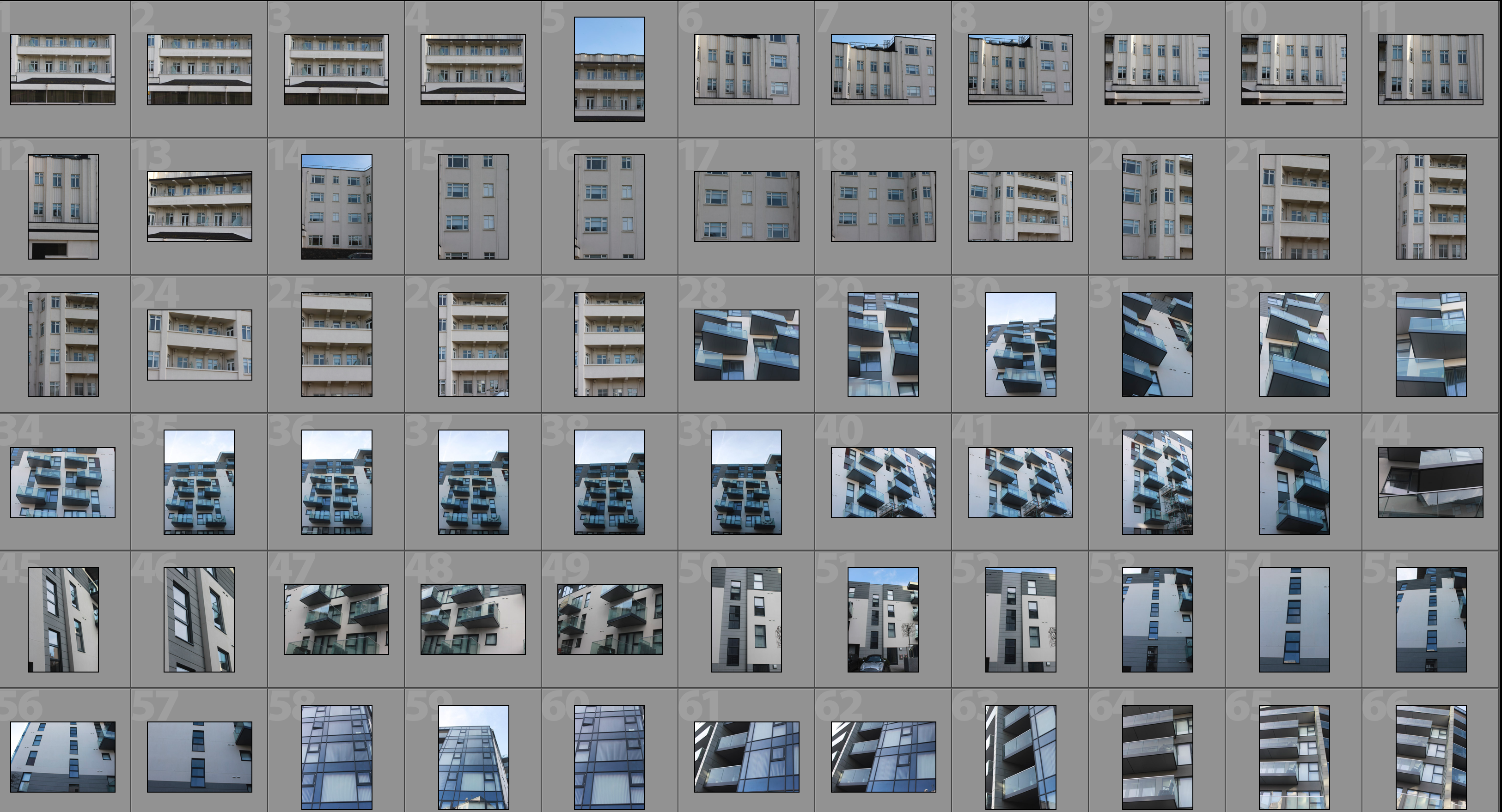
Contact Sheet


Edited Photographs
After going through all of the photographs that I produced on this shoot I selected some of the best that I could edit. I edited these photographs by putting a black and white filter on in order to allow the viewer to focus on the shapes within the photographs rather than the colour. I then used a perspective crop on the majority of the photographs in order to make the photograph completely straight on in order to further emphasise the symmetry and patterns within the photographs. As well as the black and white filter I increased the contrast, used high highlights and whites, used low shadows and blacks and adjusted the exposure accordingly to create a composition that is mostly over exposed but the features such as the windows are emphasised to help the shapes within the buildings to come forward.


Edits
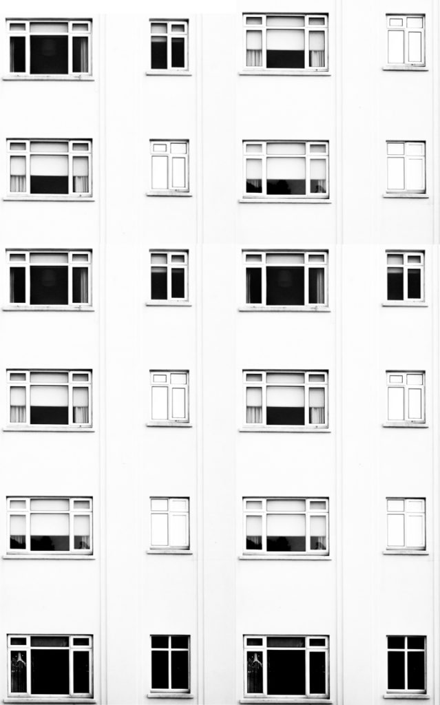
After editing the individual photographs I brought the photographs into a blank photoshop document and duplicated it. After the duplication I then messed around with the layout of the multiple photographs to create illusions that show lots of repetition and some symmetry. The result is montages that emphasise in blocky shapes and use a black and white filter to bring contrast into the photographs.
#1

#2

#3
#4

#5

#6

Analysis

I captured this photograph in a natural lighting in order to bring out the natural shadows and shapes within the building that I was photographing. There is a wide tonal range due to both the nature of the building and my editing to the photograph. The bright whiteness in the walls of the photograph contrasts greatly with the dark black shadows on the balconies. I took this photograph on a bright day where there was plenty of sunlight so only needed to use a low ISO of 100 along with a shutter speed of 1/60 to capture this photograph. The low ISO paired with the quick shutter speed allowed for the photograph to be as high in quality as possible as well as not being overexposed (even though I edited the photograph to increase the exposure. I edited this photograph by using a black and white filter to bring out the shapes in the windows as well as the shadows and then I increased the contrast, highlights and whites whilst reducing blacks and shadows to create a composition that had high contrast between the black and whites. A depth of field of f/16 was used to capture the photograph which can be seen as the whole of the photograph is in focus. The photograph has a slightly cold colour cast to it due the bright whiteness throughout it.
I opted for a black and white filter over a colour photograph as it helped to bring out the details within the buildings, especially the contrasts as well as a wide tonal range to create a more dramatic composition. Due to the deep shadows and edges within the photograph as well as the editing of the photograph the composition has a 3D effect as it appears to have different layers which bring the photograph to life. There is also a lot of patterns and repetition within the photograph, which I aimed to create when setting out on this shoot. I have placed the balconies on the two horizontal lines of the rule of thirds as I feel that they are the most interesting parts of the photograph so placing them along these lines creates a more interesting composition as well as helping with symmetry.
The aim of this shoot was to create a set of photographs that showed the repetition of shapes within blocks of flats and offices and how this repetition can be aesthetically pleasing. The overall results shows how even though there is a lot of repetition within individual buildings, each building has its own unique characteristics and shapes and therefore have variance. The inspiration for this shoot came from photographs of tall tower blocks in cities such as Hong Kong where each floor and flat are almost identical, which is perfectly demonstrated in Michael Wolf’s work as well as inspiration from Lewis Bush’s ‘Metropole’ in which he looks at the development of buildings through a double exposure technique to create a similar outcome to what I have done.
The concept behind this is that there are an increasing amount of these large and repetitive buildings that make way for office buildings or flats due to the ever rising population and urban migration. The photographs resulting from my shoot show just how repetitive these buildings that are taking space from nature really are and reflect the idea that some residents may believe that the landscape of cities including Jersey is becoming repetitive and monotonous as lots of land is being taken to serve the same purpose of housing or offices.

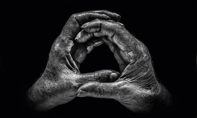
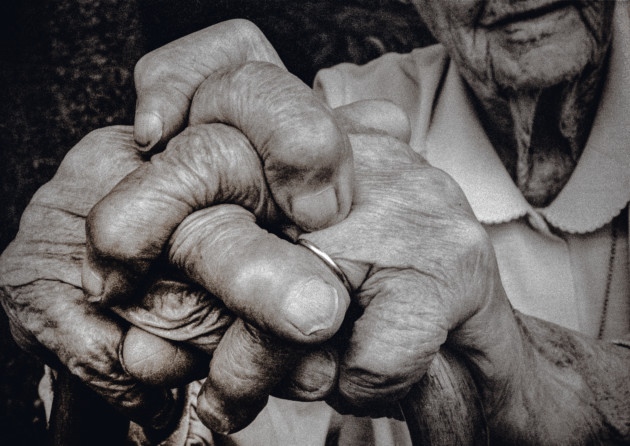 The way they rested on her walking stick showing her wedding ring, so smooth against the rough skin, told a large part of her story”. Booth says that it was his first ‘hands as a portrait’ and inspired him to carry out more hand portraits. Booth decided that throughout the project he would shoot in black and white, in natural light and in half an hour wherever his subject found most convenient – I will also try to go by these standards as I seek to draw inspirations from this project. Booth also says he has “always preferred black and white as a portrait medium. It enables you to focus on all the detail and form, and not be distracted by skin colour, markers, blemishes and veins” which I completely agree with and believe that it will be vital in my response to this. When picking his subjects booth would first think of a profession he wanted to feature and then who would best represent it. In total there are about 115 pairs of hands in the exhibition telling hundreds of stories of people.
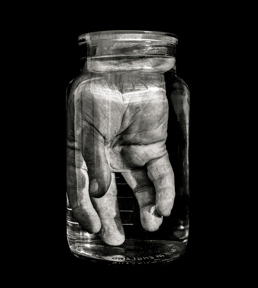
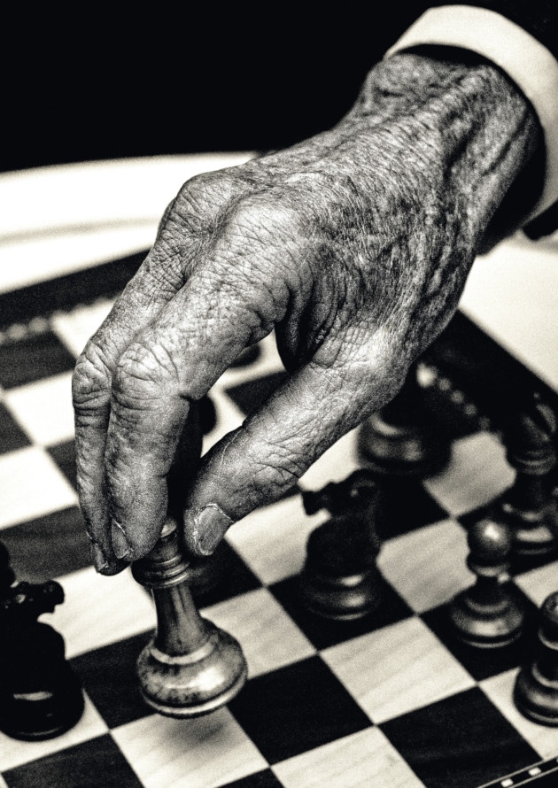
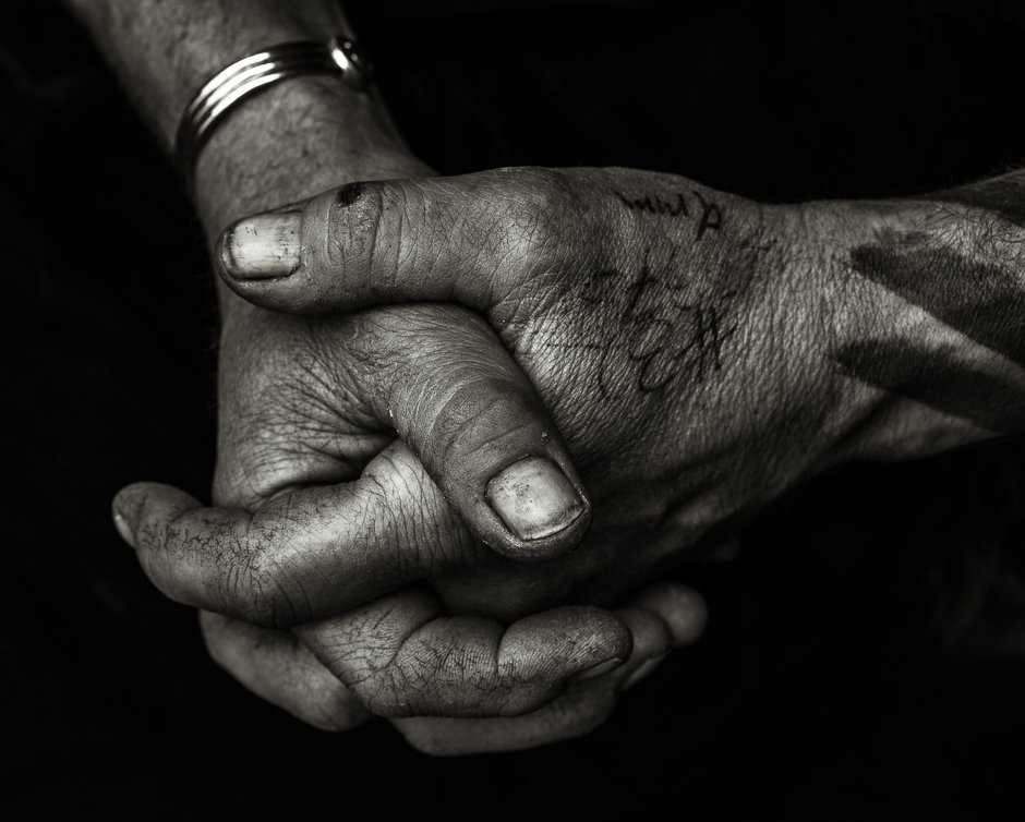 My first idea for a shoot is to photograph the hands of different people. I have chosen to focus on a person’s hands as there are man features on a hand that give indication of the person that they belong to – they can have clear veins running through them, they can have calluses, different skin tones and then everyone is guaranteed to have different lines running throughout their hands due to their genes as well as individual fingerprints. I have taken inspiration for this shoot from photography Tim Booth who did a project titled ‘A Show of Hands’.
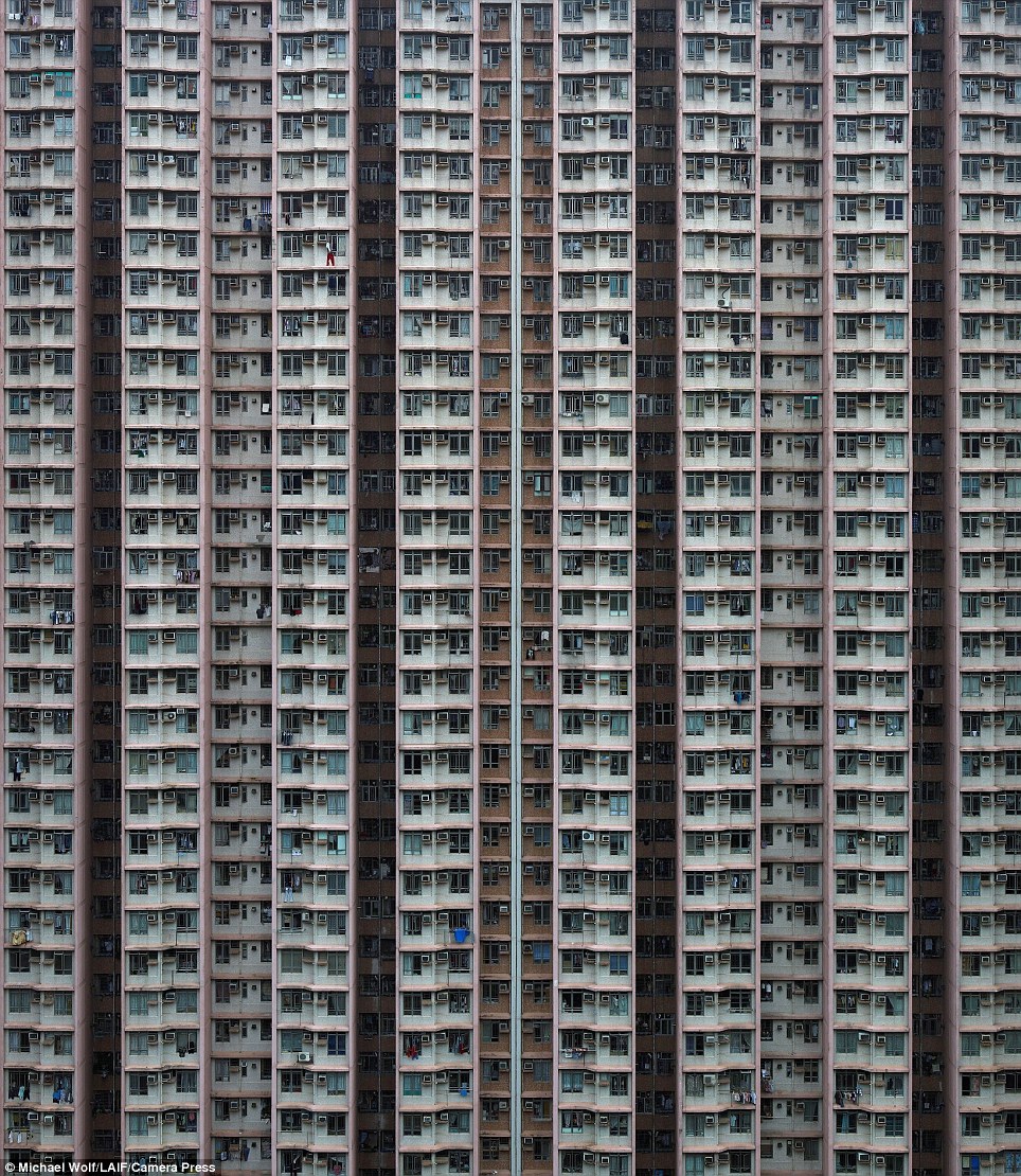 My second shoot idea is to photograph blocks of flats around Jersey and then photoshopping the resulting photographs to create repetition and patterns of the photographs in order to create a sense of monotony within the photographs and to show how repetitive blocks of flats can be. The resulting photographs will be very symmetrical and will almost create illusions. I could also approach this idea by photographing the symmetry and repetition within the blocks of flats and then presenting the photographs alongside each-other multiple times in a typographic style. I have drawn inspiration for this shoot idea from Lewis Bush’s work on ‘Metropole’ as well as the blocks of apartments in cities such as Hong Kong
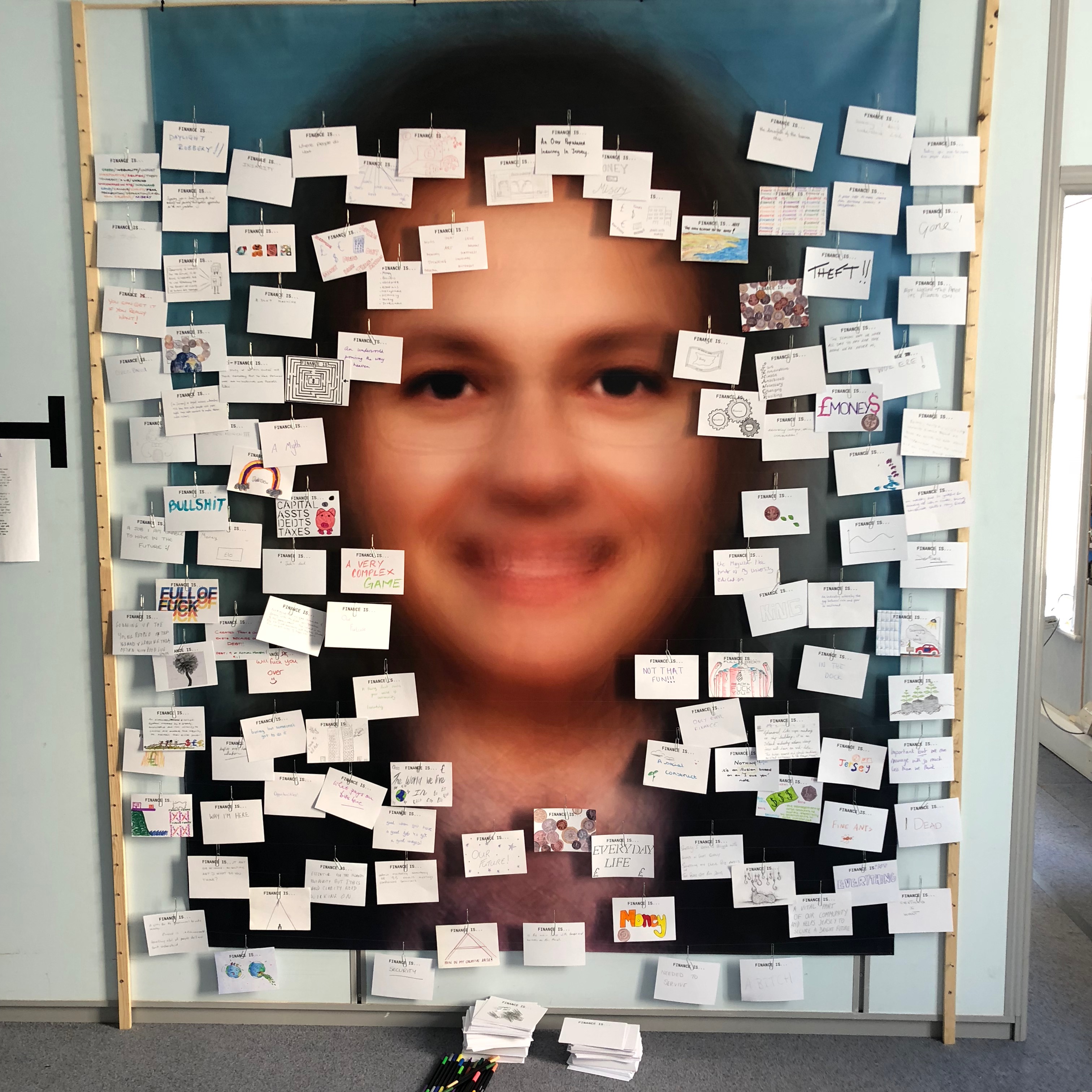 My third photo-shoot idea draws inspiration from Lewis Bush’s work on ‘Trading Zones’ in Jersey. In one segment of the work he showcased cards showing what the public though of finance. From this I believe that I could explore the unique hand-writing style of every individual through asking them to write what ‘Variance and Similarity’ means to them. The result of this will be a range of cards showing a variety of hand-writing styles which may be messy or neat which ultimately will give a slight insight into a personality trait of the person. Hand-writing is unique to everyone as everyone learns from a young age to write in different ways – some write quickly and messily whilst others take pride in ensuring that their hand-writing is neat and almost art-like. The aim of this shoot would be to show the wide variance in people’s styles.
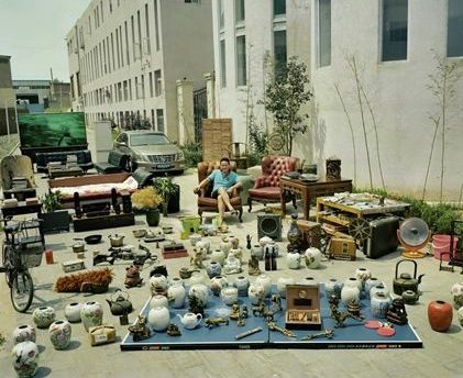
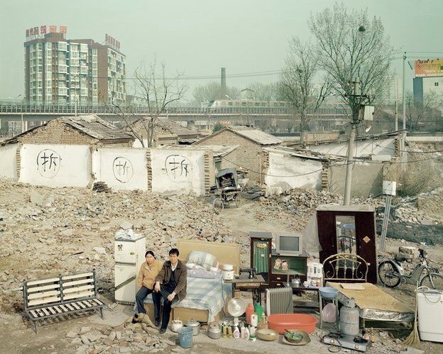
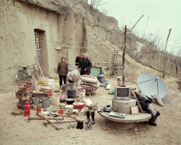
 My fourth shoot idea will focus on the personal belongings of different people. One way in which I could look at the personal belongings of individuals is by photographing the items that people carry around in their school bags on a day-to-day basis. This could be an interesting shoot that will give an insight into the personality traits of the individual as everyone will have different variations of items, some people may have more unnecessary items in their bags whereas some may only carry the minimum. This shoot idea takes inspiration from Huang Qingjun’s work ‘Jiading’ meaning ‘Family Stuff’ in which he photographed families along with their belongings in rural China to show the effect that modernisation is having on the population of the rural areas. I could present this in a typology style way so that the viewer can easily see the similarities and differences between what people carry around with them.
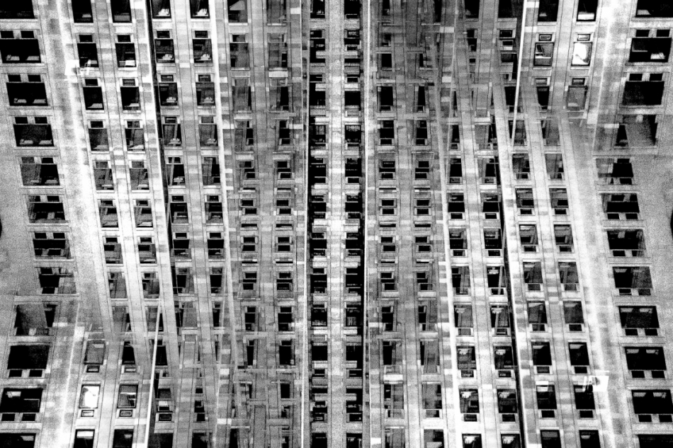 Lewis Bush (born 1988 in London) is a British photographer, writer, curator and educator. Bush studied history at the University of Warwick and gained a master’s degree in documentary photography from London College of Communication, where he lectures on photojournalism and documentary photography. In his work bush seeks to draw attention to forms of invisible power that operate in the world – such as finance. Bush has the standpoint that ‘power is always problematic because it’s natural resting state is arbitrary and untransparent’. Bush’s projects tend to incorporate writing and he has written about photography for a range of national and international print and web titles.
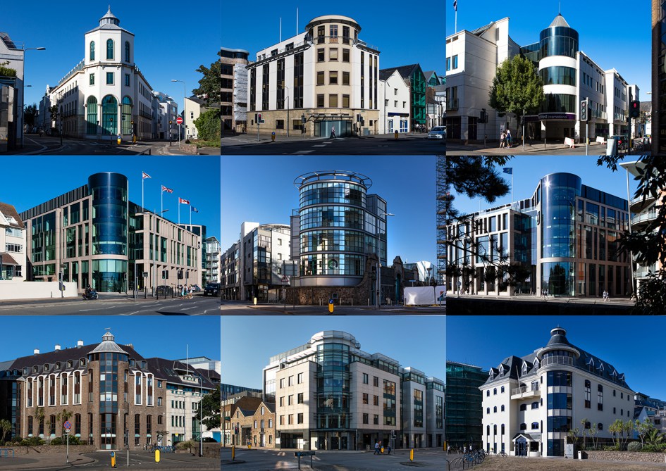
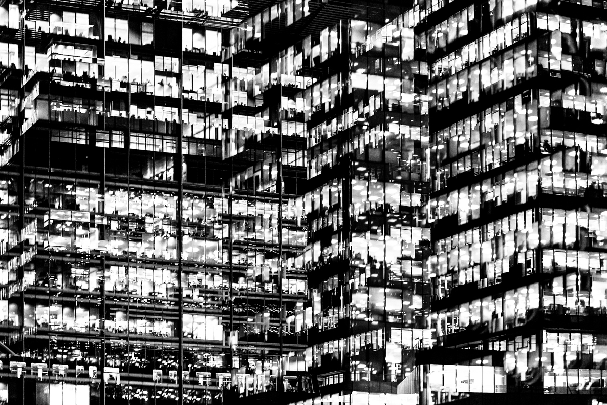 The main project by Bush that interests me is ‘Metropole’ in which he used a technique of double exposure. The project looks at the collapse of the British Empire and how in its place globalised capitalism grew as London has been rebranded as “a city of demolition, cranes, and glittering new high rises”. ‘Metropole’ aims to record the effect of this on London through the form of documentary photography. This appeals to me and links to the theme ‘Variance and Similarity’ because it explores the fact that there are an increasing amount of large buildings for offices or flats taking away from green land and so the landscape in which we live is turning into a repetitive view of similar flats and offices leaving citizens with a feeling of monotony as everything is being redeveloped to serve the same purpose. Bush’s work on ‘Metropole’ shows a lot of emphasis on the repetition between buildings due to his double exposure effect. I intend to respond to this work by capturing blocks of flats or offices, both in day and at night and then altering the photographs in photoshop to replicate the buildings and create a pattern of repetition throughout the edits. These edits will show how buildings can look different individually but a lot of them can be very boring and repetitive.
 Huang Qingjun is a Chinese photographer who has photographed families posing with their possessions amid China’s dash to become rich. He has spent nearly a decade travelling to remote parts of China to persuade people who have never been photographed to carry outside all their household possessions and pose for him. The results of this product are glimpses of the different lives and belongings of different families within China. The pictures have not been widely seen outside of China although some have been shown at exhibitions in Paris and New York.
 Huang was inspired as a teenager by an uncle when the typical hobbies for the Chinese youth were calligraphy and singing. The idea for the series about people’s material good, called ‘Jiadang’ (family stuff). first came in 2003 with some photographs that he took for the magazine Chinese National Geography but the project didn’t start properly until three years later, when Huang started travelling around China looking for suitable people. Huang says that “Most people thought what I was proposing was not normal” but most people understood the point at the end of it. Most of the people in these poor, remote areas did not have many possessions making the project both simpler and more interesting. Some of the projects took a couple of days whereas others took several months. Next year marks the 10th anniversary of the first photograph, and Huang plans to mark it by returning to the places he visited to see how they have changed. Huang also hopes to broaden the project’s range upon revisiting it by including people from a wider range of backgrounds, such as government officials.
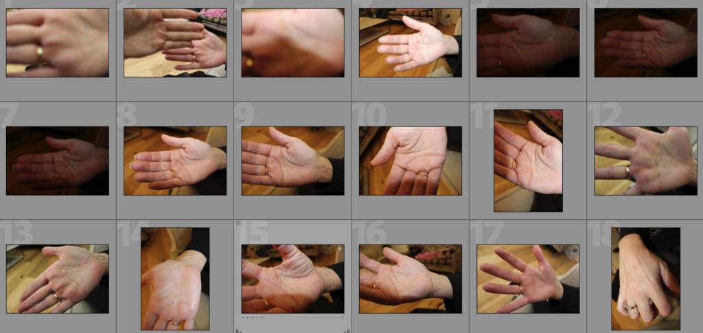

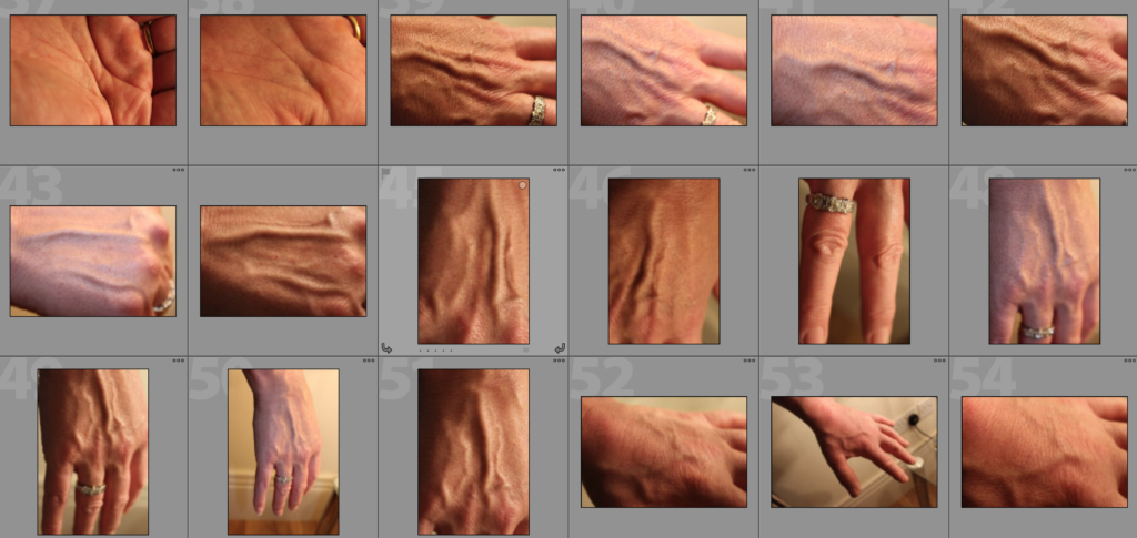
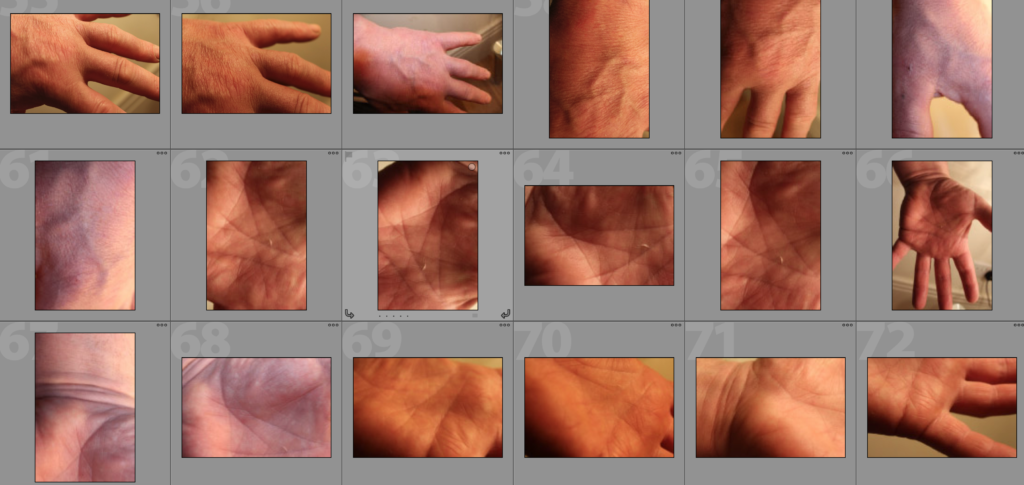

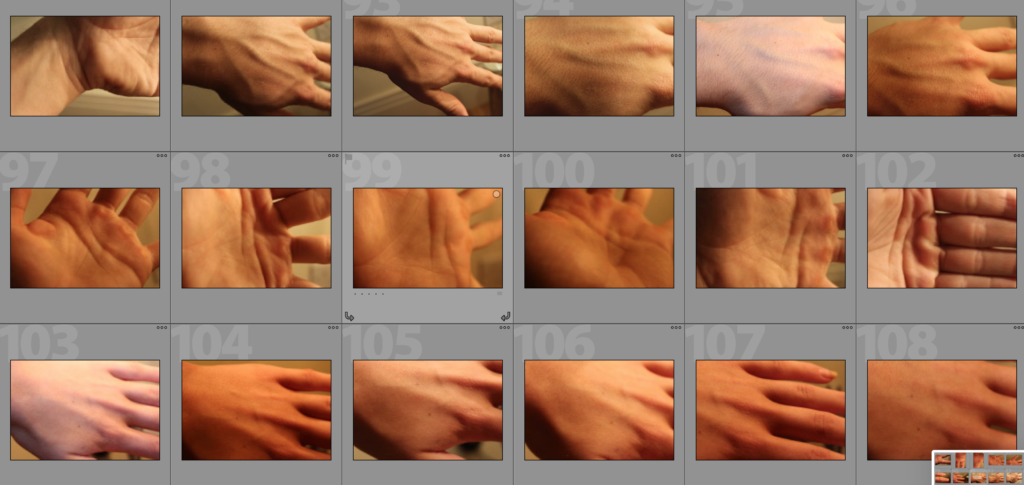

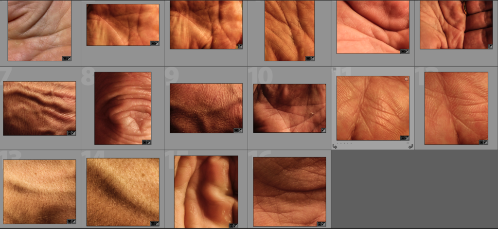
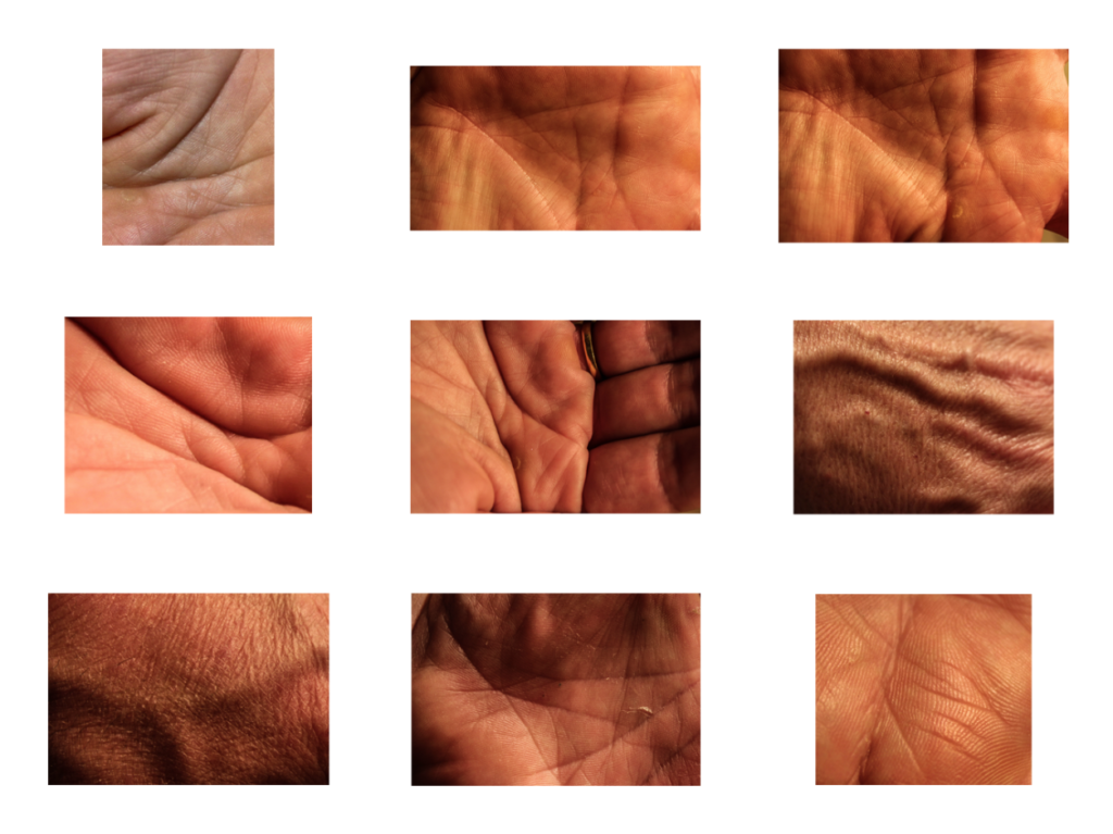
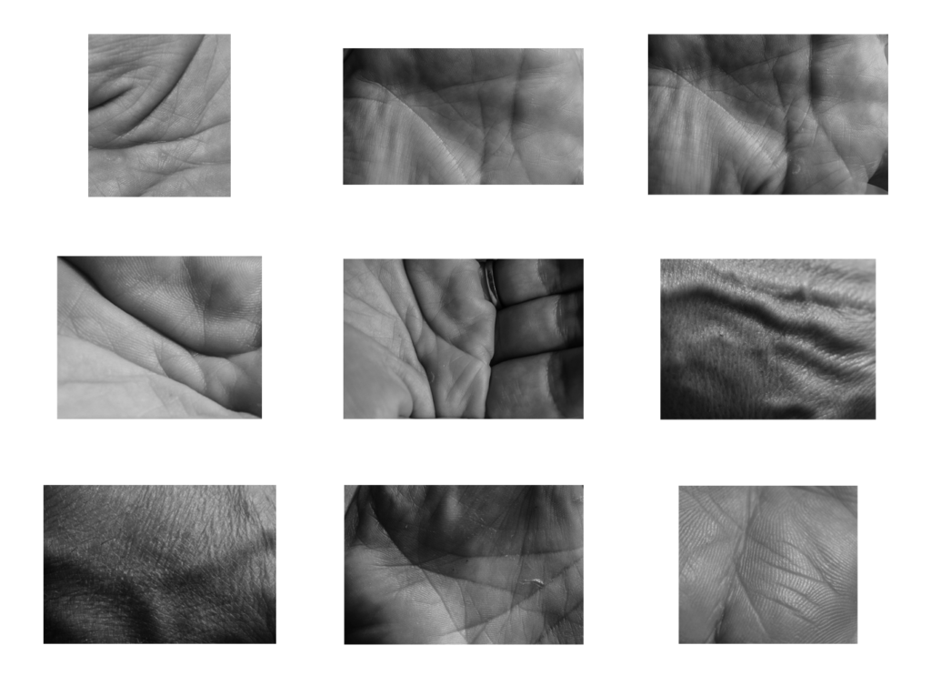
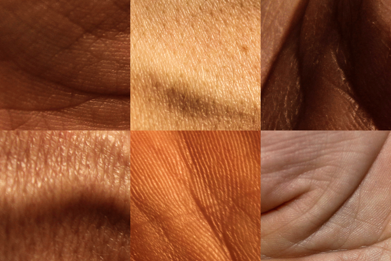
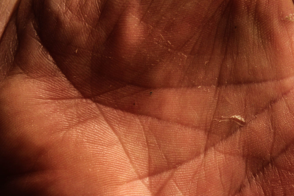
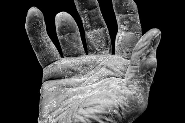 different size and shape of people’s hands and especially the different lines in the palms of hands and possibly fingerprints. This could product some abstract up close photographs or photographs showing the whole hand. I could experiment with colouring the hands with ink in order to emphasise the features of the hands. I could also experiment with printing the photographs then putting materials such as coloured string along the hand lines to emphasise the lines. This could lead me to look at other natural lines on the human body including veins. An artist that I could look at relating to this subject is Tim Booth who did a project titled ‘A Show of Hands’.