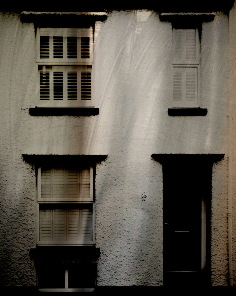
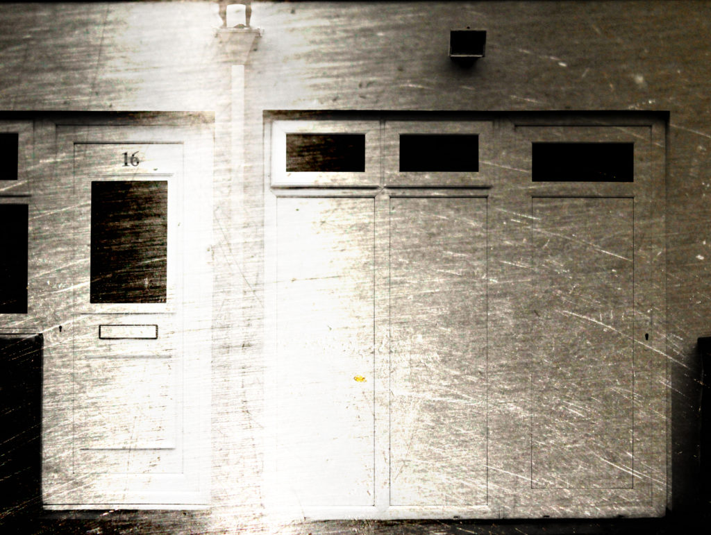
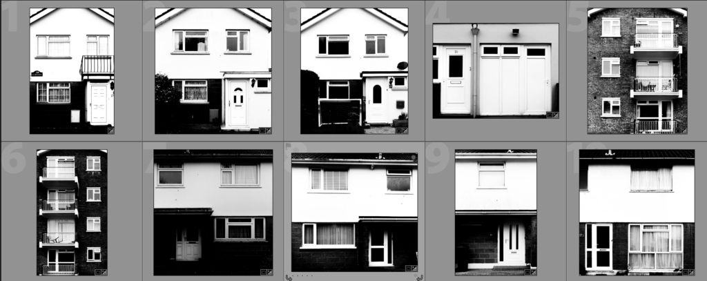
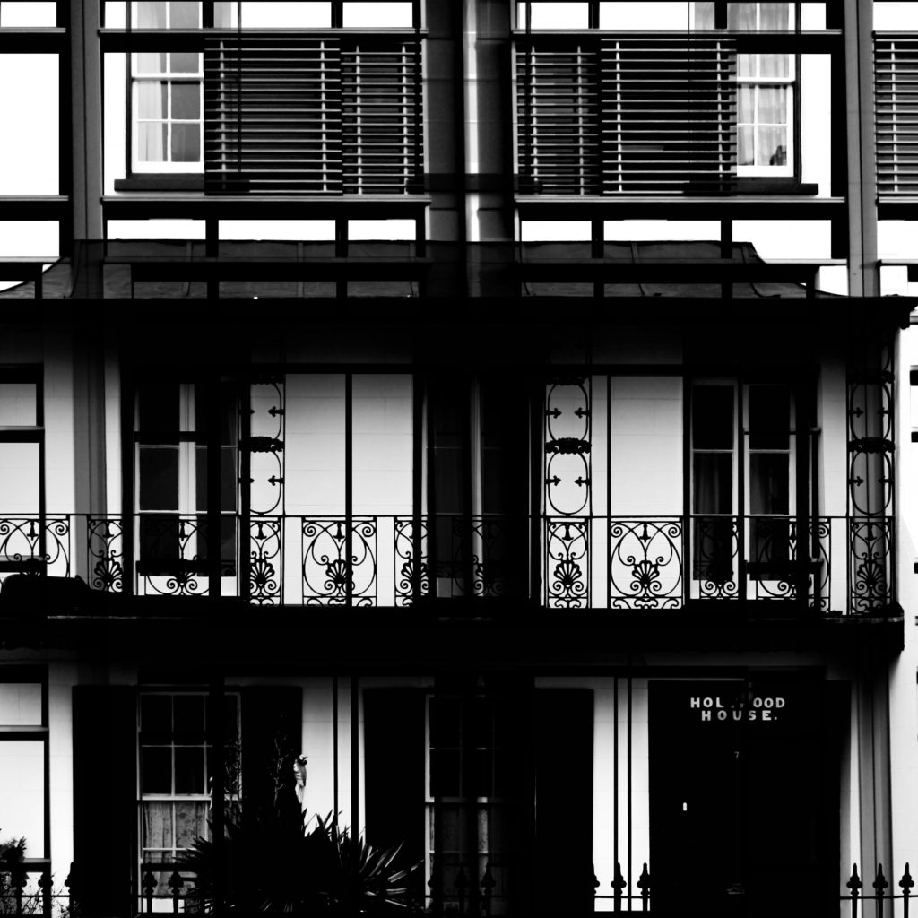
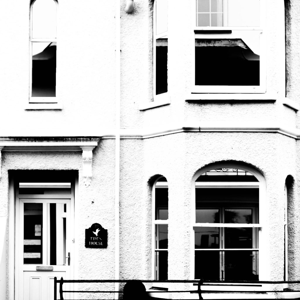
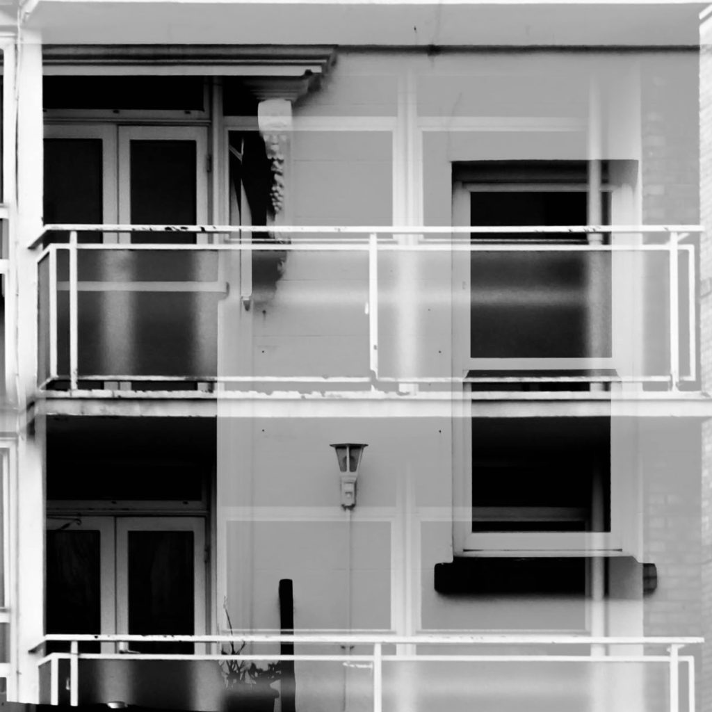
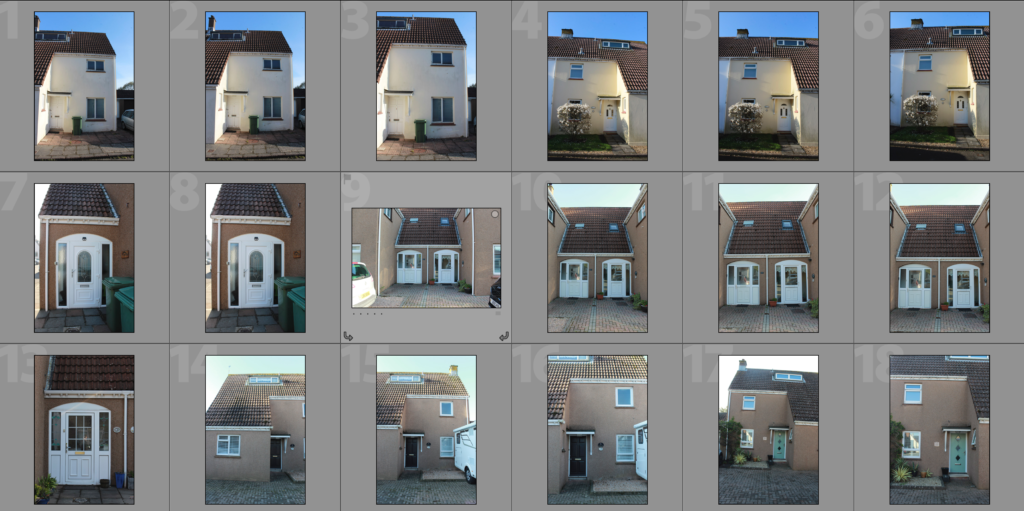
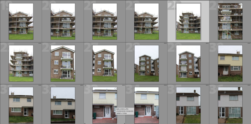
In this shoot I have developed on my previous shoots in which I have looked at the faces of housing blocks, office blocks, houses and other types of commercial buildings within Jersey. In my previous shoots I explored the area of Havre Des Pas, St. Helier and St. Peters and took photographs of houses in the area to demonstrate how the houses can have similar features and materials used due to being in the same geographical area whilst also having these features changed slightly in each house to make each house unique and different. In this shoot I have photographed an estate in St. Johns to show how similar the houses in estates can be – they are often designed in bulk to create a quick and easy building process and so leads to lots of similar houses with the same style and layout. Of course, even when looking at how similar these houses all are, there are lots of features which make the houses individualistic, such as the paint colour or the style of window or the curtains. All of these features go towards emphasising how factors such as personal taste can create something ordinary into an individualistic feature that can make the house stand out from others. The essential idea behind this shoot is to reinforce the idea of variance and similarity in previous shoots and to show how even though something may be produced to be similar, there will always be differences. These photographs will contribute to the material that I have available to me to use in editing with my photographs of steel and granite. I have stayed consistent with using the high-contrast black and white filter with these photographs as I believe that it allows for a strong finish when layered over the photographs of steel and granite.
All posts by Conor H
Filters
Layering Building Faces Over Steel
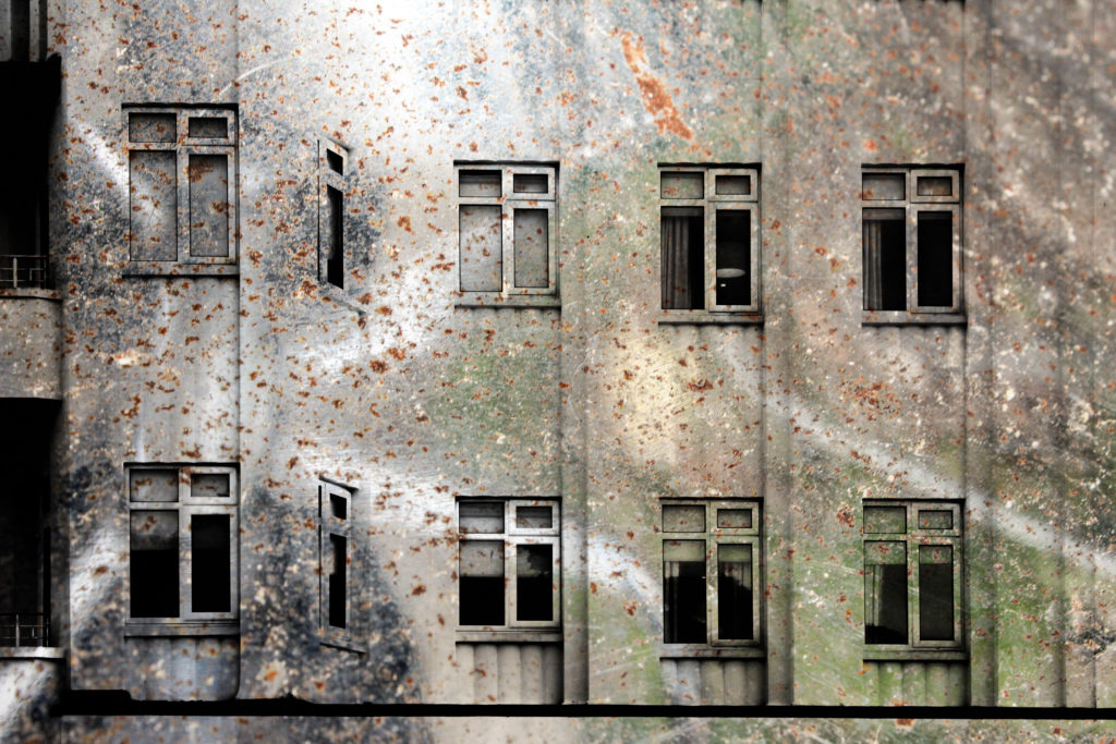
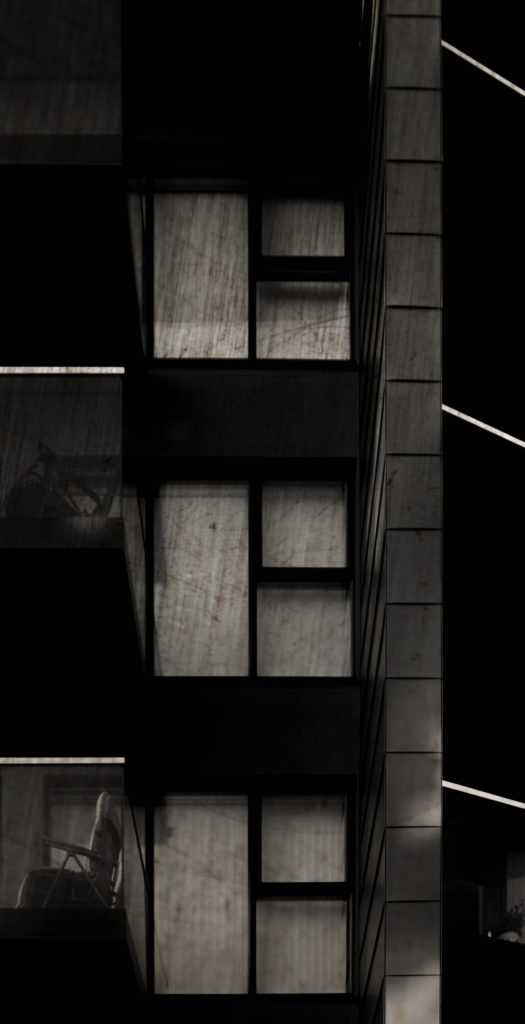
The below edits are the results of my shoot in which I photographed steel as a surface in order to capture its texture. I have layered the building face photographs from previous shoots over the steel photographs as a hint at how buildings such as office blocks are now being developed. In the top three edits I have made the composition by removing the natural frames from the photograph to reveal the scratchy steel texture in the background – I have done this previously to show granite and find that doing this with granite in the background looks much more effective due to the unpredictable shapes and colours within the rock whereas the steel is slightly boring and predictable. In the later edits I focused on creating them through using double exposure methods on photoshop – I edited the blending options to blend the two photographs together resulting in the building structures being clearly shown with the texture of the steel being shown at the same time to allow consistent contrast.
Analysis
When capturing this photograph I used the natural day light to capture the natural elements of the building face. Using natural daylight on the steel rod used for the background allowed for the reflections to be seen in the rod to add further contrast and tones within the photograph. The photograph is slightly overexposed but when layered over the darker steel it creates a composition that is abstract in which the overexposed building face does not look out of place. I used a deep depth of field when capturing the photographs used in this composition to ensure that all of the photograph was sharp and in focus. A shutter speed of 1/60 was used as well because the steel and building face were both still objects which didn’t require very fast shutter speeds – when this is paired with the low ISO of 200 used it allows for the best quality composition possible with the correct amount of light entering the lens from the surrounding area. The rust and reflection in the steel rod creates a slightly warm colour cast and creates on old-fashioned eroded feeling in the composition.
The black and white building face contrasts with the warm rust on the steel in a very complementary way as it creates a damaged dynamic to the photograph and really brings the texture of the steel to the forefront to create an interesting composition. There is a wide tonal range in the composition because of the reflections and scratches in the steel. The building face captured is a very flat one and so the photograph is very flat and two-dimensional – it almost looks like a screenprint. The photograph fits in with the rule of thirds as the building face merges into the steel rod on the top third of the photograph to create an aesthetically pleasing photograph along with the man-made shapes such as the windows.
This photograph is the result of an edit from a shoot focusing on the texture and properties of steel. The composition was made by blending together the face of a building and a close-up photograph of a steel rod. I have looked at contrasting man-made building faces with natural granite rock faces in my previous shoots. This has led to me thinking, as I was focusing on the material of granite, it may be interesting to contrast man-made structures with eachother by focusing on how the materials used to make houses have changed overtime. Traditionally granite has been used in Jersey but as office blocks, such as the international finance centre, have been developed there has been an increase in more ‘modern’ looking materials, such as steel. Therefore I have captured close-up photographs of steel objects to capture its texture, which by itself makes for quite a boring photograph, but I will experiment with layering the building faces over the steel. Steel is an alloy of iron and carbon and because of its high tensile strength and low cost, it is a major component used in buildings, infrastructure, tools, ships, cars and other items. Since it is used so much in the world around us, as granite is, I believe that it is important for me to include the exploration of this material in my project. I plan on presenting these photographs in a typology grid or possibly as GIF’s in the future as well as creating more edits in a similar style.
Steel Shoot
This shoot focuses on steel and its texture. I have looked at contrasting man-made building faces with natural granite rock faces in my previous shoots. This has led to me thinking, as I was focusing on the material of granite, it may be interesting to contrast man-made structures with eachother by focusing on how the materials used to make houses have changed overtime. Traditionally granite has been used in Jersey but as office blocks, such as the international finance centre, have been developed there has been an increase in more ‘modern’ looking materials, such as steel. Therefore I have captured close-up photographs of steel objects to capture its texture, which by itself makes for quite a boring photograph, but I will experiment with layering the building faces over the steel. Steel is an alloy of iron and carbon and because of its high tensile strength and low cost, it is a major component used in buildings, infrastructure, tools, ships, cars and other items. Since it is used so much in the world around us, as granite is, I believe that it is important for me to include the exploration of this material in my project.
The pictures that I have captured in this shoot have focused on the texture of steel and have been captured with the intentions of using it in an abstract approach. The scratches and reflections in the steel create different shades and bring the texture out in the material so I believe that this approach may work well when it comes to using a double exposure approach. Please see my next post ‘Layering Building Faces Over Steel’ for the edits resulting from this shoot and analysis of the work.
Plan For Future Shoots
In order to develop my exploring of ‘Variance and Similarity’ further I have further shoots that I plan on producing so that I can add to the material that I have to work with as well as adding to possible experiments that I can do with my work.
- My first shoot idea is to focus on steel, specifically its texture. In my previous shoots and experiments I have looked at contrasting man-made building faces with natural granite rock faces. This has led to me thinking, as I was focusing on the material of granite, it may be interesting to contrast man-made structures with eachother by focusing on how the materials used to make houses have changed overtime. Traditionally granite has been used in Jersey but as office blocks, such as the international finance centre, have been developed there has been an increase in more ‘modern’ looking materials, such as steel. I will plan on capturing different textures of steel and then using these as a backdrop as I have done with the granite photographs that I have produced.
- My second shoot idea is a follow up to the previous photographs that I have been producing of building faces. Previously I have photographed buildings in the area of St. Peters and in St. Helier, which has resulted in the photographs demonstrating vernacular architecture as the buildings in the geographic areas will have certain styles of architecture to them, especially if they are part of an estate. Next I will visit St. Johns and produce a shoot of a range of houses/buildings in the area in order to increase the range of material that I have to work with.
Layering Building Faces Over Granite
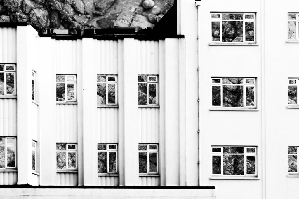
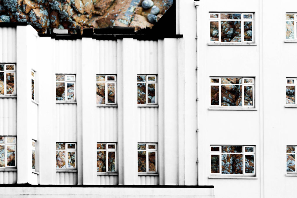
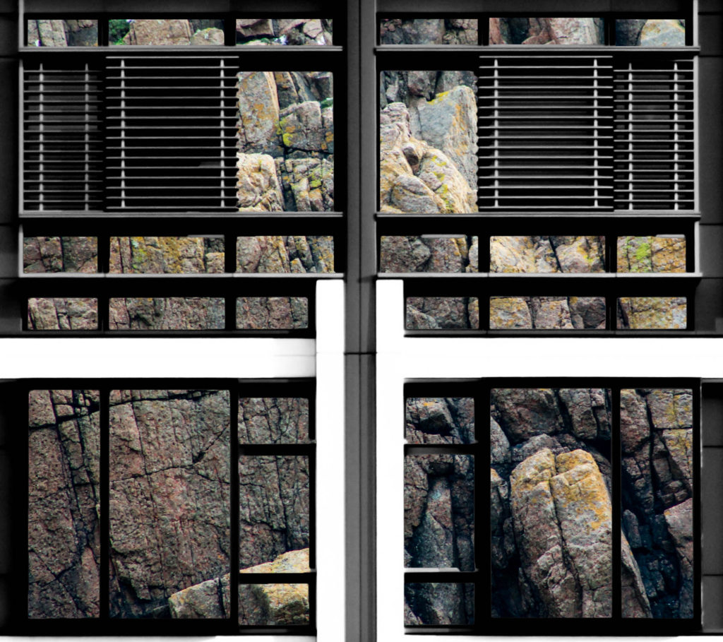
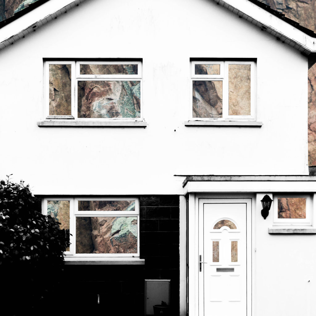
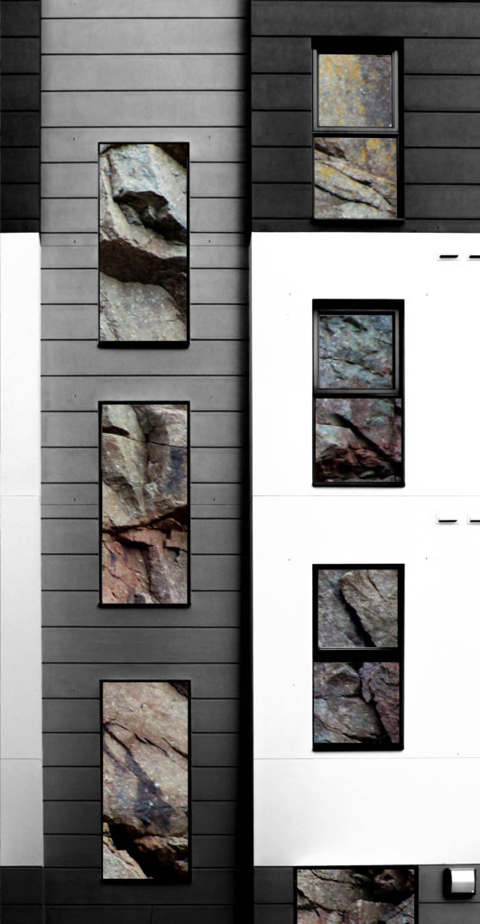
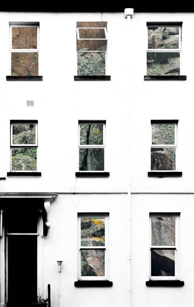
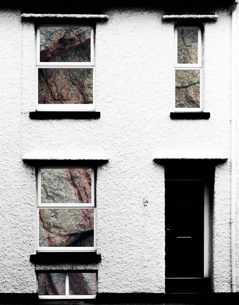
In this post I am showing the outcomes of manipulating both my shoots of building faces and granite faces. Previously I have experimented with removing parts of the building face to reveal other buildings behind it in order to create contrast between the two and to show the similarities and differences between buildings. This experiment draws inspiration from that as I found that it can be quite effective when I remove the natural frames from the photographs to give an insight into the background photograph. I have used this approach when experimenting with integrating the building and granite photographs together – I photoshopped out all windows of the building face in the foreground to reveal the texture and natural colours of the granite in the background. I experimented with presenting the granite photographs in black and white but I found that the outcome was too boring, whereas when the granite photographs were in colour it would bring the photograph to life by contrasting with the high-contrast black and white building face, which would further bring out the colours of the rock. The idea behind these experiments comes from the fact that a lot of houses have granite lying under the decoration and so this represents peeling back the layers of plaster and paint to reveal the base structure.
Analysis
In this composition, natural day lighting was used. Due to the nature of the house face, the natural light only brought out so many shadows and shapes within it meaning that there is only a simple face to it, which contrasts to the rock face in the background which has all sorts of shapes, tones and shadows brought out from the natural lighting. I used a 300mm lens to capture the photograph of the rock to ensure that I could zoom in enough to create the abstract composition as I intended to. I used a deep depth of field as well in order to ensure that everything was sharp and in focus to ensure that the resulting photograph was as of high a quality as possible.
I used an ISO of 800, an aperture of f/8.0 and a shutter speed of 1/500 when taking the rock photographs. The ISO of 800 is fairly high but ensures that the photograph is correctly exposed along with the quick shutter speed of 1/500 that allows the photograph to be sharp and focused when the camera is zoomed in to such an extent. The depth of field ensures that the photograph is fully in focus and is clear. For capturing the building face I only used a shutter speed of 1/100 and an ISO of 100. These camera settings have allowed me to create contrast between the two photographs incorporated into the composition.
The photograph of the house face has been kept in black and white whereas the rock photograph in the background has been kept in colour to create a contrast between the two photographs and to emphasise the natural colours and tones within the rock face. There is also a wide tonal range within the composition due to the editing to create high contrast and to bring out the shadows in both photographs. There is a strong sense of texture within the composition due to the sharp angles and shapes within the rock face, this adds to the aesthetic qualities of the composition. There is also a sense of 3D in the composition for the same reasons – the jagged rock face contrasts with the flat face of the house in the foreground. The unpredictable structure of the rock shapes also contrasts greatly with the house face structure which has been carefully designed and built to meet form and function requirements.
The idea behind these experiments comes from the fact that a lot of houses have granite lying under the decoration and so this represents peeling back the layers of plaster and paint to reveal the base structure. The house face was originally photographed as part of a shoot to show the variance and similarities between houses within a certain geographic area, but I have realised that I can achieve the aim of that shoot whilst being able to add another element of contrast through contrasting the man-made building structures with the natural granite structures.
CCA Gallery / Private Gallery
CCA Gallery
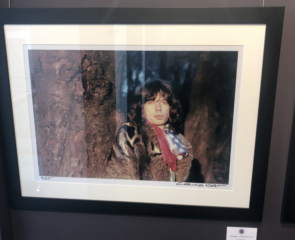
The CCA Gallery was an exhibition by Mike McCartney, Rupert Truman, and Carinthia West. The exhibition showed a range of alternative album covers for artists in the 60’s, such as Pink Floyd, as well as giving an insight into the lives of other 60’s icons, including Mick Jagger. The gallery had a documentative approach in the portrait styles, as seen in the photo of Mick Jagger
One photo which caught my attention was the Mick Jagger ‘double exposure in the tube’ piece by Corinthia West. I think this appeals to me due to the work that I have been experimenting with throughout my ‘Variance and Similarities’ project – I have looked a lot at the use of double exposure and layering photographs over eachother to create a disorientating effect or to add an element of excitement to a typically boring photograph.
Although liking this piece by West, the majority of the west of her work didn’t appeal to me as they were all plain and documentary-style portraits which did not have much to them other than the fact that the subjects were considered icons. As can be seen on the right photograph, her portrait of Mick Jagger is simply him stood next to a tree looking blankly at the camera – there is nothing to catch the eye or add an element of interest to it.
Private Gallery
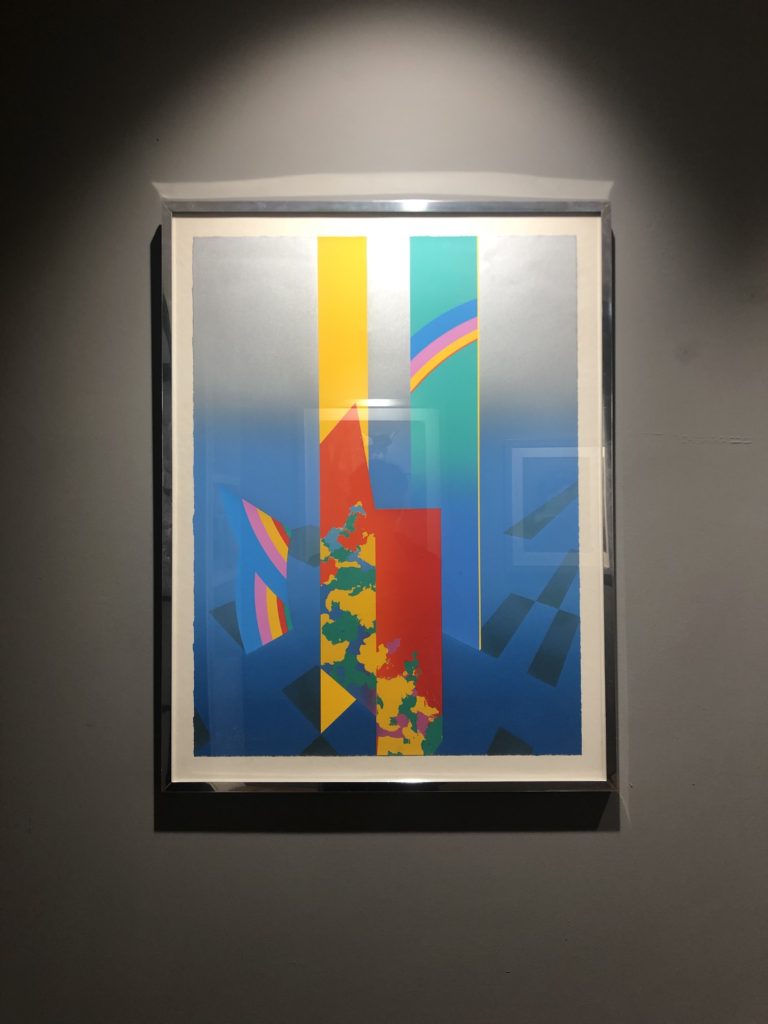
The private gallery contrasted greatly with the CCA gallery – the private gallery focused a lot more on the culture of pop art. The work consisted of lots of bright colours, abstract shapes, and represented the theme of mass customisation as Andy Warhol intended. The gallery was titled ‘Pop icons on the 20th century, Britain and American pop art’. The pop art movement was around in the 1950’s and peaked in the 60’s but is still widely recognised and practiced today. The work at this gallery had a very contemporary style to it – a lot of the work was art rather than photography but was still relevant as the themes and styles used can be transferred into photography.
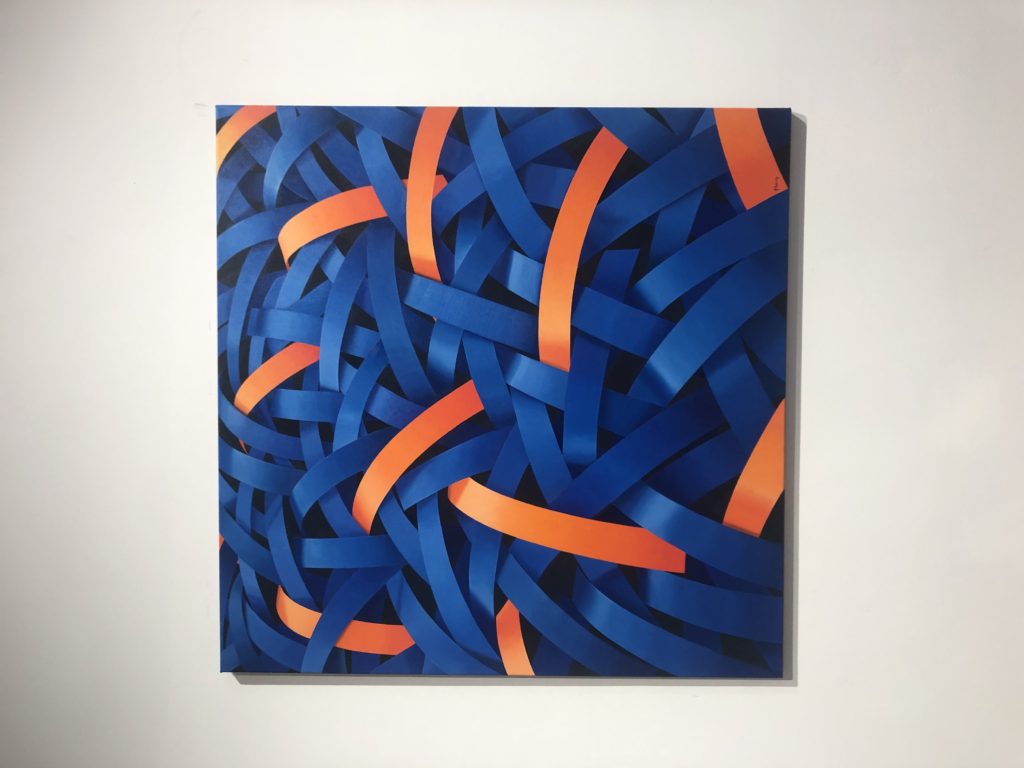
One photograph from the private gallery that I particularly liked was ‘Homard Bleu’ by Nick Parlett. The photograph is an abstract painting of what appears to be shiny metallic pieces of metal all intertwined but the painting stemmed from a quick sketch of long grass by the beach side. The story of how the painting came to be really appealed to me because it shows how you can pull abstraction from anything you want to and turn something into something completely different whilst still keeping elements of it.
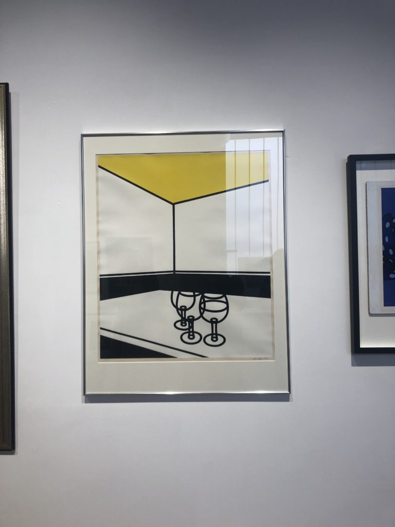
A photograph that didn’t appeal to me was ‘Black & White Cafe’ by Patrick Caulfield. I think this is because the photograph seems so empty and doesn’t have anything to draw attention to it other than it’s simplicity. Of course it would be harder to paint this composition than it seems but it seemed to lack skill and anything of interest – which I suppose was the idea behind it in the first place.
Geology/Granite Shoot
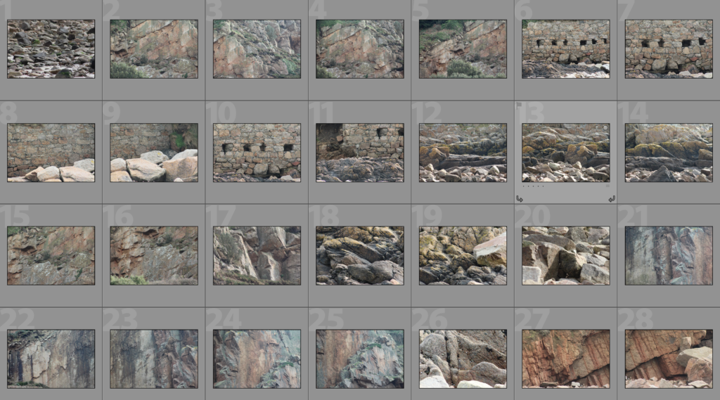
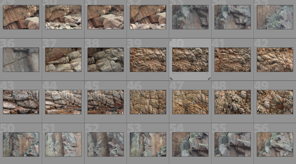
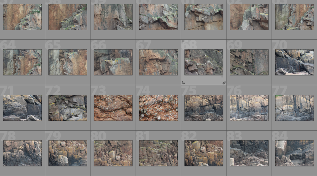
Granite is a resource in Jersey that is available in abundance and plays a key part in the structures in Jersey. Lots of houses are built with the stone but the majority of them have plaster and paint covering the granite, whereas others have the granite exposed. This shoot serves the purpose of collecting photographs of granite rock faces of different shapes and at different angles. The reason I am doing this is so that I can use the material that I produce to create a contrast with the man-made structures that I have been photographing. I am planning on continuing with the style of editing that I have been experimenting, such as double exposure and layering photographs over each other to show this contrast. The photographs of the buildings that I am comparing these rock faces against are in black and white whereas I will be keeping these photographs in colour as I believe that the natural earthy tones of the rock will help to create an effective contrast within the compositions. Ultimately, the edits will show comparisons between how shapes are formed in man-made structure against the shapes formed in natural rocks by the waves over time.
Analysis
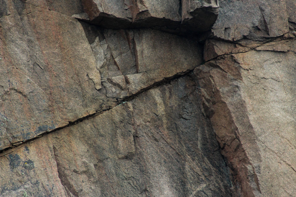
To capture this photograph of a granite rock face I used the natural daylight from Oueisne beach where the shoot took face. This natural daylight allowed for the natural shadows and crevices within the rock face to come to light and created contrast between the different depths of the rock face. I used a 300mm lens to capture the photograph so that I could zoom in and create a close-up abstract photograph of the rock face that focused on the edges and shapes within the rock rather than the surroundings. I used an ISO of 800, an aperture of f/8.0 and a shutter speed of 1/500 when taking the photograph. The ISO of 800 is fairly high but ensures that the photograph is correctly exposed along with the quick shutter speed of 1/500 that allows the photograph to be sharp and focused when the camera is zoomed in to such an extent. The depth of field ensures that the photograph is fully in focus and is clear.
There is wide tonal range in this photographs due to the sharp edges of the rock and the natural formations and cracks. There is also a range of earthy colours throughout the photograph as some parts of the rock face are more weathered than others – this helps to create a texture in the photograph as the edges can clearly be seen as sharp and the weathering can be seen in different areas. There is also a 3D effect due to the different depths of the rock face which emphasises the shapes and shadows within the photograph. There is no repetition in structure in the photograph as there is of my photographs with man-made structures which shows the contrast between a natural structure and an artificial one.
The photo is intended for editing alongside the photographs of building faces that I have produced and will aid me in showing contrast between buildings and natural rock formations. I chose to photograph granite specifically because it is a key natural resource of Jersey and is used in lots of housing. – the idea is that by editing the granite along with the buildings it will give a feeling of peeling back the layers to reveal the building materials supporting the buildings.
Building Faces Shoot 3 – St. Peter
In this shoot I have developed on my previous shoots in which I have looked at the faces of housing blocks, office blocks, houses and other types of commercial buildings within Jersey. In my previous shoot I explored the area of Havre Des Pas and took photographs of houses in the area to demonstrate how the houses can have similar features and materials used due to being in the same geographical area whilst also having these features changed slightly in each house to make each house unique and different. In this shoot I have photographed an estate in St. Peters to show how similar the houses in estates can be – they are often designed in bulk to create a quick and easy building process and so leads to lots of similar houses with the same style and layout. Of course, even when looking at how similar these houses all are, there are lots of features which make the houses individualistic, such as the paint colour or the style of window or the curtains. All of these features go towards emphasising how factors such as personal taste can create something ordinary into an individualistic feature that can make the house stand out from others. The essential idea behind this shoot is to reinforce the idea of variance and similarity in previous shoots and to show how even though something may be produced to be similar, there will always be differences.
Below I have continued to edit these photographs in a sharp black and white in order to emphasise the individual features of the houses and apartments. I originally decided this due to inspiration from Tim Booth who, when photographing portraits through hands, found that the black and white prevented the viewer from just focusing on colour and rather focusing on the deeper features and shadows that are brought out when using a strong black and white. I believe that it is important for me to continue to use this contrasting colour scheme as it makes it effective for when I make edits with these photographs later on, such as with GIF’s or with double exposure edits. With some of these edits I am going to experiment cutting out natural frames and layering it over photographs of natural rock faces as I begin to study geology and granite in Jersey.
Geology and Vernacular Architecture
Geology (coming from the greek gē, meaning ‘earth’, and -logia meaning ‘study of’) is an earth science which is concerned with the solid aspects of the Earth, the rocks which make up the Earth, and the processes of how they change over time. Geology is not specific to the Earth – it can be applied to any planet or moon. The evidence for processes such as plate tectonics, past climates and evolutionary history come through geology. There are three main types of rock – igneous, sedimentary, and metamorphic.
The word ‘vernacular’ in terms of architecture means the structures and buildings that are built in a functional way that is unique to that geographic area and which suits the area by using the main abundant natural resources available. Vernacular architecture can reveal the culture of the society slightly through showing the patterns, materials and elements that are unique to the area. The origins of vernacular architecture came from the design skills and tradition of local builders, who were to use the particular materials indigenous to the region and would use the local traditions and cultural practices that they are used to.
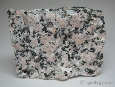
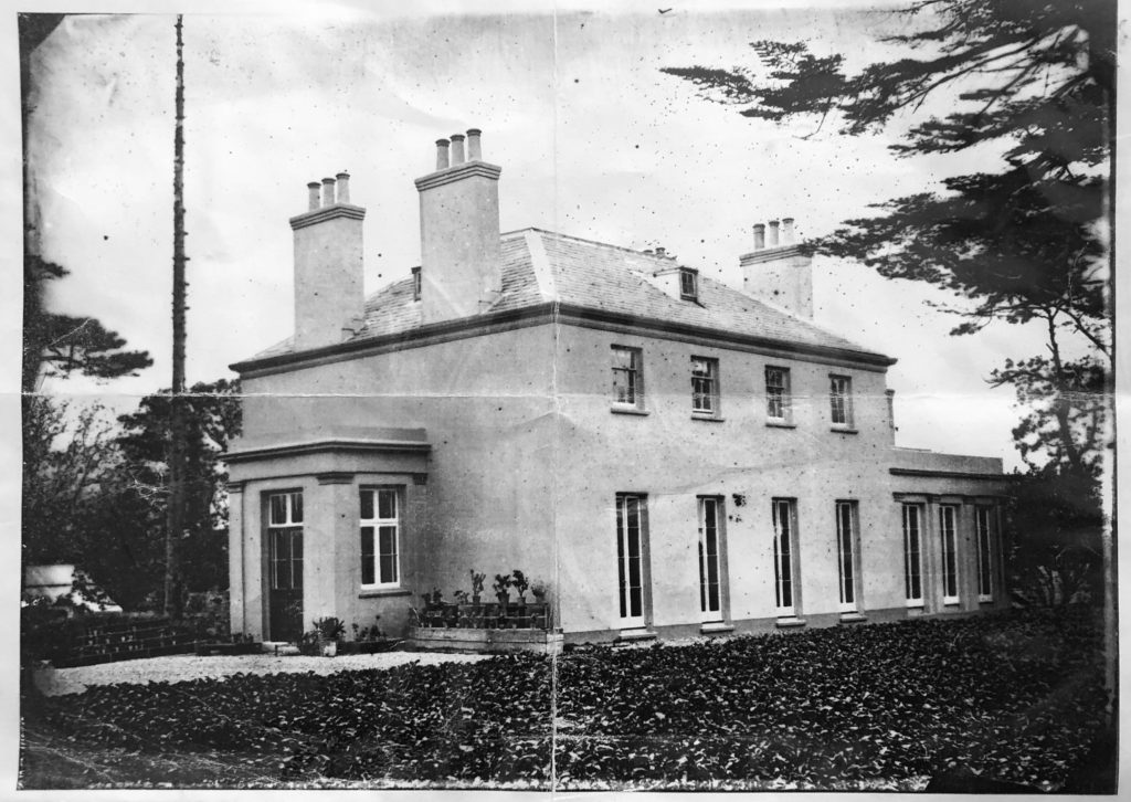
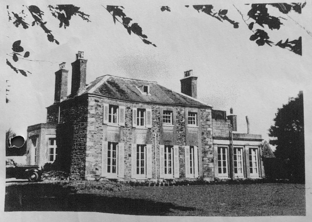
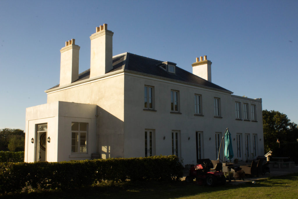
Granite is a key part of Jersey’s vernacular architecture. It is completely abundant in the island and is a common type of feslic intrusive igneous rock that is granular and phaneritic in texture. The fact that it is igneous means that it is formed through the cooling and solidification of magma or lava, also because the granite is rich in elements that form feldspar and quartz it is described as ‘felsic’. The word ‘granite’ comes from the Latin granum. Granite is used as a base structure for the majority of houses in Jersey but is covered by plaster and paint in most cases. The exposure of granite in houses comes and goes as fashion changes – an example of this is my own house. Below is a set of photographs of my house over a period of time. The first photograph shows my house in 1862, the second one in the 1950’s and the third one taken this year. As you can see in the first photograph the house is plastered and painted as doing this was seen as a sign of wealth, but in the second photograph the granite has been exposed due to it being a trend at the time. In the third photograph the plaster and paint has been reinstated leading to the house looking more like the original photograph than the second photograph because the trend of using plaster and paint has come round again but the whole time the granite had been present.
I want to explore granite in Jersey by photographing the large formations of it in our beaches all around the island as it is such an abundant and important resource to the island. I will be planning on photographing the rock to fill the lens to create a slightly abstract composition that focuses on the shapes and formations within the granite rock. I will then explore exposing the variance and similarity within this rock by comparing them side by side or along with the building faces that I have been photographing.
Experimentation of editing photographs together
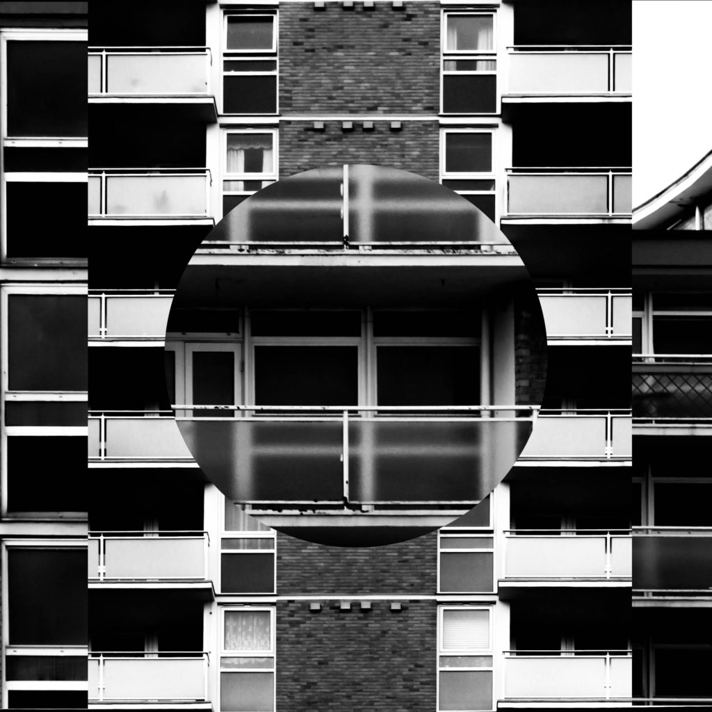
In this post I have done some further experimentation on ways to compare and merge the photographs that I have taken. The main idea behind this editing is to take away parts of a photograph layered on top of another photograph to reveal a photograph in the background – this will allow the differences and similarities between the faces of the two buildings to be shown clearly. The idea for introducing shapes into the photograph to show contrast came from John Baldessari’s work with brightly coloured dots in which he covered the face of his subjects with dots that contrasted with the background; I felt that the introduction of more shapes brought another element to the photograph. Below is my first example of experimentation with cutting shapes into a photograph then layering; I cut around a coin with a stanley knife to reveal the features of the photograph below and show to create abstract effects within the composition.
In the first set of edits below I have used both circles and oblongs to create a range of contrasts within the photograph. I believe that this method may appear too confusing and removes the aesthetically pleasing aspects from the photographs but it does show contrast between structures.
In the below set of edited photographs I have used photoshop to remove the windows from the photograph on the top layer and so opening up a viewing into the background layer. This method could be used well with a double exposure method potentially, as I have done with the photograph on the left. This method helps to show similarities as even though parts of the composition have been completely removed it does not look completely abnormal.
In the below left edit I had first cut out the shapes within the windows and felt that this did not create a strong enough composition so then I continued to alter the opacity of the photograph to create more of a double exposure effect in which you can see both photographs when you look at it in a different perspective. In the photograph on the right I have cropped out circles within the photograph similarly to my first experiment with cutting out shapes. I feel that the circles do not sit well against the blocky natural shapes of a building face and so creates an abstract but not an aesthetically pleasing compositon.