
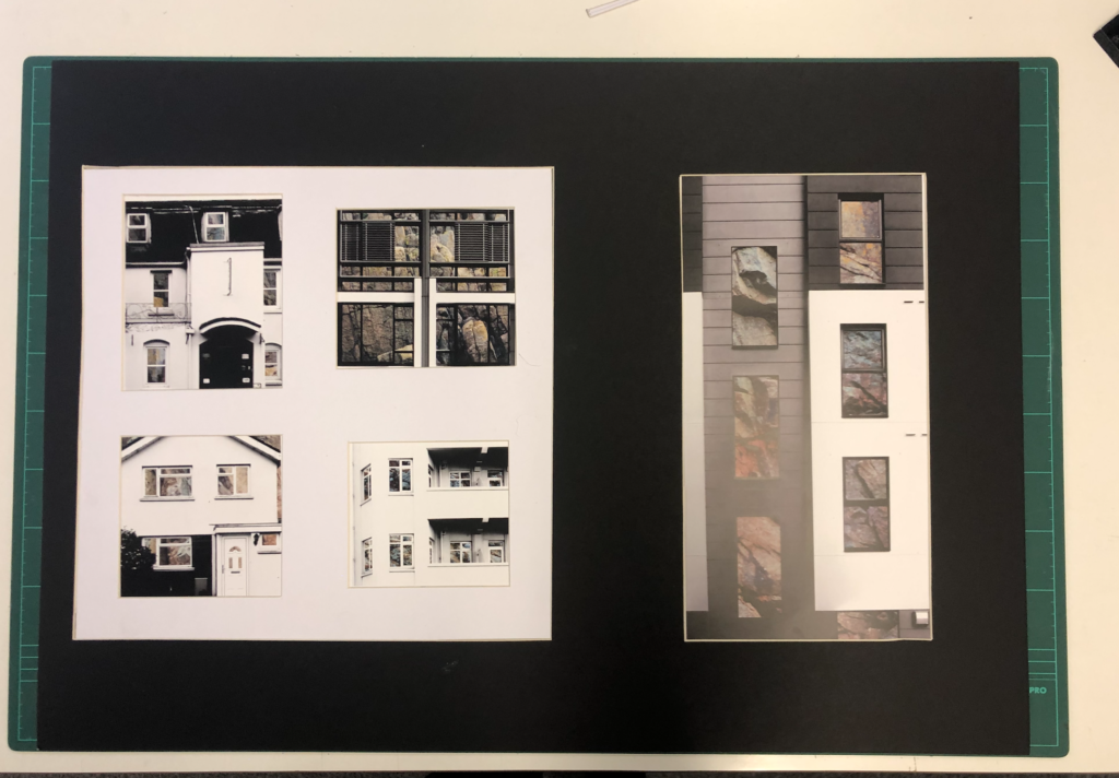
Pictures of My Final Piece

Throughout my work on the topic ‘Variance and Similarity’ I took lots of inspiration from a variety of sources and my experiments and plans developed over time to give a final piece that is the result of trial and error. On first thoughts when approaching ‘Variance and Similarity’ I decided that my approach would be based on the comparison of similar subjects and characteristics.
My initial ideas were to show the difference between people through the individual hand creases bespoke to each person, to create a typology of different styles of buildings and to photograph the personal belongings of individuals to give an insight into personalities. After experimenting with photographing hands close up whilst taking inspiration from Tim Booth and John Coplans I decided that this approach was too limited and did not allow me to expand what I was photographing, and I found the same when photographing the personal belongings of individuals whilst taking inspiration from Huang Qingjun’s ‘Family Stuff’.


Therefore I started exploring the patterns within buildings and the similarities between them – this took inspiration from Lewis Bush’s work on Metropole and Michael Wolf’s work. My initial response to these photographers layed the foundations for my final pieces as these photographs would be the base layers for the double exposure photographs that I would create later with photographs of textured steel. After researching the Becher’s I began to experiment with ways in which I could effectively display and compare photographs – I created both GIF’s and typology grids, and the grids became a key part of my project as I came to believe that they are a simple and effective way to compare photographs.

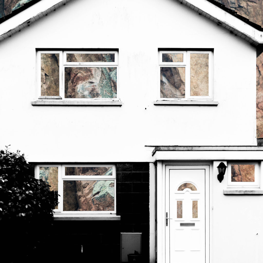


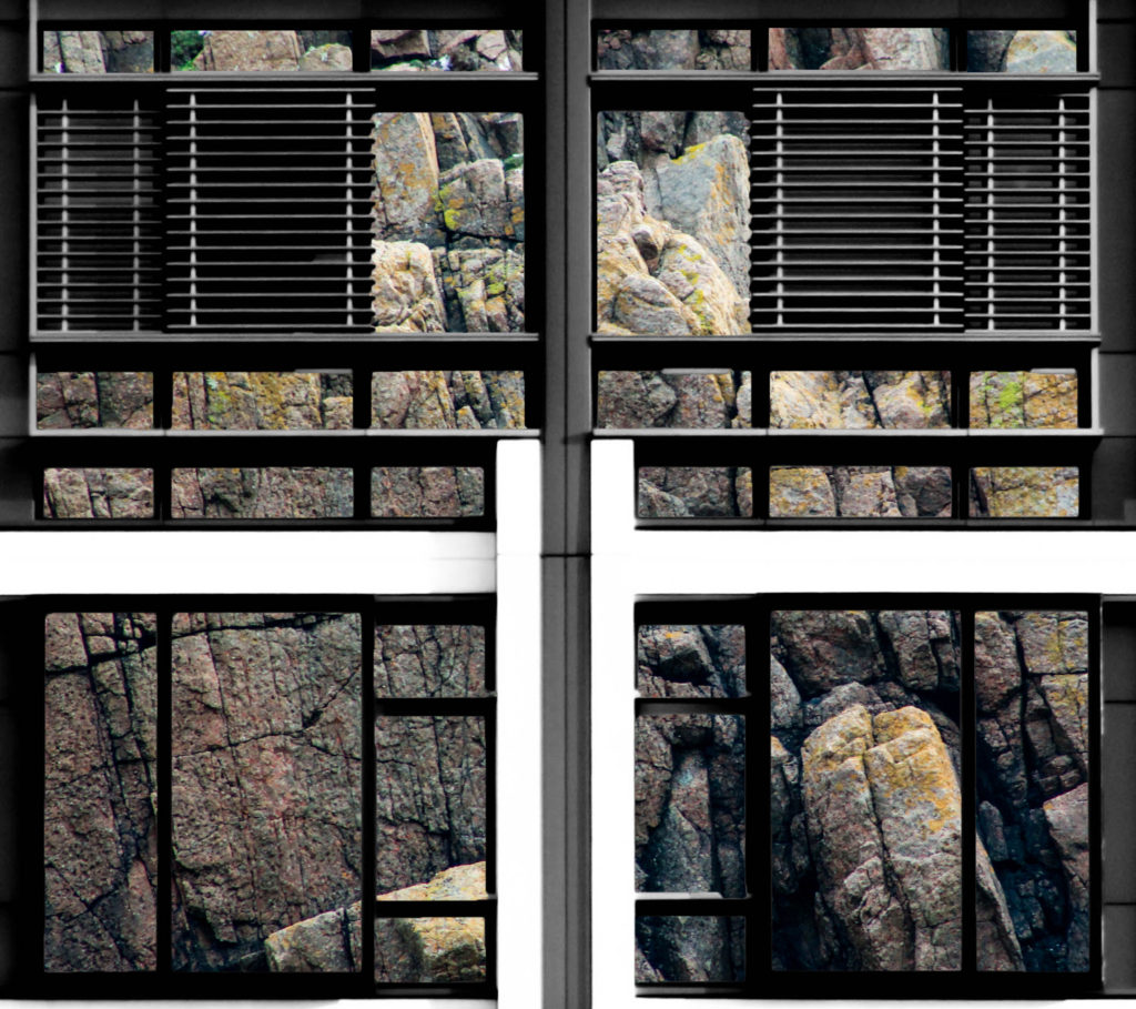
After beginning to pave a way for the route that my project would be taking, I researched John Baldessari and took inspiration from him in the sense of creating unusual abstract photographs, and his idea of putting coloured dots over faces led me to experiment with cutting out shapes in the building faces that I was photographing in order to reveal something else. At the same time I was experimenting with double exposure with inspiration from Lewis Bush’s ‘Metropole’. I decided to take a deeper search into the context of houses and buildings and so began to explore granite, due to it being an abundant resource in Jersey for building houses. This resulted in me experimenting with layering photographs of houses over photographs of granite and cutting out shapes of the natural frames to show the granite that is the base of the house. I found that this method was not as effective when working with photographs of steel so proceeded to create double exposure edits with the photographs of the steel and found that this created an abstract approach to show how buildings and materials change over time, whilst also incorporating steel due to the fact that more buildings are being built using it now more than ever. This double layering led to my final piece in which I incorporate typology grids inspired by the Bechers’ after I improved on the photographs of steel that I had photographed.


To conclude, I believe that I successfully fulfilled the exam brief and theme of ‘Variance and Similarity’ as my final outcome successfully shows the differences between different building faces whilst drawing comparisons between them, such as the common features including doors and windows. This comparison is aided by the use of a typology grid to show that the photographs are linked but individual. Therefore the photographs and presentation successfully show the variance and similarities between different building faces whilst drawing inspiration from a variety of photographs, but primarily from Lewis Bush, the Bechers’ and other New Typologists.
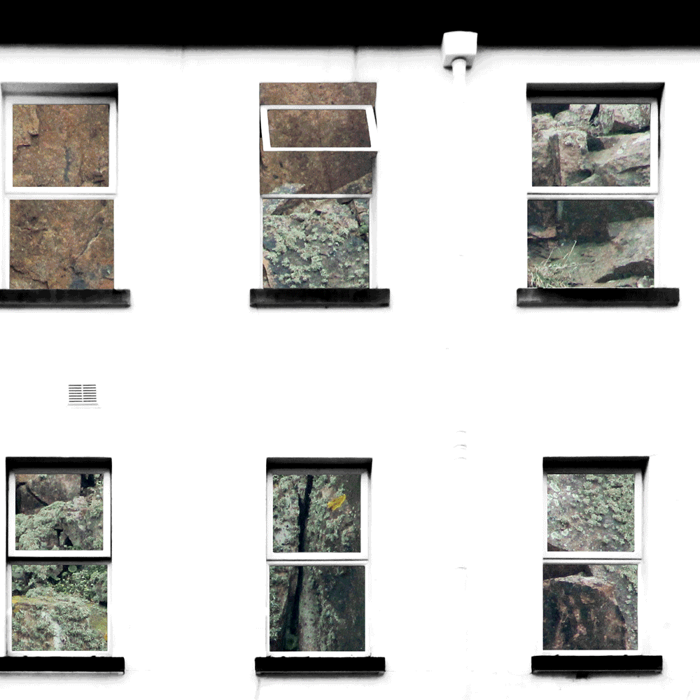
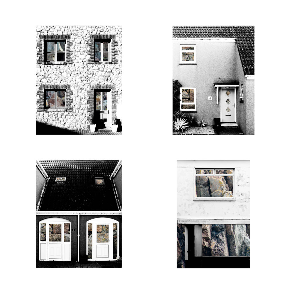
The final photographs produced have all been edited and captured in a way that ensures that they are technically accurate and aesthetically appealing. They were all captured with a natural lighting in order to ensure that all the natural shadows and contrasts were present in the photographs, as well as ensuring that a sufficient tonal range was present to create more contrast within the photographs. For the photographs in the typology grid there is a warm colour cast due to the rust of the steel – this contrasts with the composition on the left side which has a cold colour cast because of the cold nature of the steel layered over it. There is not a huge presence of colour in the final piece as the original photographs are in black and white but the steel layered over it is providing colours through the rust and textures within it. The final compositions are fairly two-dimensional as planned because I want to show the buildings as faces rather than as a whole structure. There is a strong sense of pattern and shapes throughout the composition due to the natural structure of houses – the windows and frames provide this sense of shaping which allows for the photographs to be contrasted. The context and idea behind this piece is that it gives an insight into changing trends. This is shown in the photographs as some of the building faces present are older and more of a traditional design, whereas others are newer estate houses. This typology grid allows the photographs included to be compared for what they are and they give an insight into how the design of buildings change, but also how the key components and shapes stay constant. The steel used also represents the changes occurring over time because previously houses in Jersey have been manufactured with granite being the base material, such as in cod houses. However, more recently with the occurrence of the high investment in the financial investment and a modern wave of house designs, steel is being used more often in houses and buildings, therefore the steel represents a variance in design and the rust represents the natural change in trends. For the composition including the granite edits the idea and context is very similar and is built from the same base (being the variance and similarities in buildings), however the granite represents an insight into what the structures of buildings are traditionally built with, compared to the steel that is more commonly being used. Together these two presentations show the variance and similarity of how buildings are built in both form and function and enable contrast to be drawn between buildings.

In 1975 there was an exhibition of New Topographic inspired work – it was titled “New Topographics: Photographs of a Man-Altered Landscape” and was considered a point of turning in photography by many historians. The exhibitions consisted of the Bechers, Robert Adams, Lewis Baltz, Joe Deal, Frank Gohlke, Nicholas Nixon, John Schott, Stephen Shore, and Henry Wessel. The photographs revolved around typical typology themes such as abandoned buildings. What was appealing about this exhibition was how unusual they were compared to the traditional approach of photographing landscapes. The new topographic photographers were less concerned with displaying nature as an ideal haven and they prioritised showing how many has changed the landscape, possibly for the worse. The exhibition also brought around a change in the teachings of photography because all of the photographers involved were associated with academia as either students or professors, which was strange at the time as photography was not widely taught in schools. Stephen Shore’s photographs in the exhibition also showed a shift from the old belief that fine art and photography should be in black and white. Ultimately, the exhibition helped the idea of photography as fine art to gain traction. The exhibition was originally held in the George Eastman House but in 2010 was re-staged at the University of Arizona in which they chose over 100 photos from the original exhibition to include. The influence left behind from the photographers involved on photographers can be clearly seen in the photographs. Each photographer in the New Topographics exhibition was represented by 10 prints, all of which was in black and white except for Stephen Shore’s work. When introducing the exhibition, Jenkins (the curator) defined the common denominator of the show as “a problem of style: stylistic anonymity”, meaning an absence of style. The idea was that all of the photographs were stripped of artistic frills. For more detailed look at what the work of the New Topographic’s consisted of, please see my post on the Bechers.


The work of the New Topographic’s appeals to me because the work that I have been doing on ‘Variance and Similarity’ involves me photographing building faces in a documentary style similar to the work of Topographics, such as the Bechers. I believe that the strong and bold photographs that they have produced in an attempt to show how there is beauty in the ugly have a strong influence over the work that I have produced as I have been photographing buildings which are not conventionally attractive, as well as photographs of steel covered in rust, which is another typically ugly subject. The resulting photographs are abstract compositions that reflect the documentative and cold-cut style of the New Topographic work. I am also presenting some of my final pieces as a typology grid, which is a feature strongly associated with the Becher’s. The typology grid appeals to me because it provides a great way to compare and contrast between photographs as well as showing trends between them in a way that is simplistic but effective.


For the presentation of my final photographs in my exam I will be presenting the photographs in a typology grid. I believe that this method of presentation is very effective and appropriate because I have experimented with it throughout my project and have studied the likes of the Bechers’, who pioneered the use of typology grids. Originally, when planning on how to present my final work I had the below four photographs planned as my final four, as I was experimenting with the different layouts I found that it looked slightly off – I eventually decided that the photograph in the top left did not fit in well with the other photographs as it depicted a more brushed steel texture as opposed to the rusted texture in the other compositions. Saying this, I still thought that this photograph was very effective and aesthetically pleasing so I decided that I would include it by presenting it by itself as a side piece to the typology and replacing it in the typology with a more fitting composition. The resulting piece is a set of photographs in a typology grid that portrays how a standard house face can be so similar in features but at the same time can be completely different due to their own individual features. This idea is added to by the rusted steel layered over the building face as the steel represents how the materials used in house construction has changed over time from granite towards steel modern structures. The photographs will be printed as four A5 photographs and one A3 photograph.


I plan to present the typology grid made from four photographs and the individual photograph on a foam board. One way in which I could present the photographs is by using a window mount method – in order to mount the typology grid I would first stick the photographs to a piece of white card and then tape it to the mount like an ordinary picture. I could also present the photographs on white card as shown below. After experimenting with both options on photoshop I believe that the most effective layout of the photographs would be to use window mounts and black card because the slight white border contrasts well will the black mount board, which also brings out the colours and shaped within the photograph. This contrasts with if I was to set it out on a white background as the contrast in colours and shades does not exist in this option, making it the weaker option. I have also experimented with which side to place the individual photograph and have come to the conclusion that I will place it on the right as I want the viewers attention to first come to the typology grid.

The second part of my presentation will follow the same guidelines as the above presentation but will be made up of my compositions in which I layered building faces over granite. It will include four A5 photographs made into a typology grid along with a single A3 photograph all on one black window mount. The idea behind this presentation is the exact same as in part 1, except that the granite is replacing the steel by giving an insight into the internal structure of the houses to show what material they are based upon.
I will present these granite compositions in the same style as the steel compositions in order to ensure consistency in my work – I will window mount all the typology photographs onto white card and then window mount that card and the A3 photograph onto a larger black card.

The below photographs are the ones that I intend to present as my final piece. I have included four photographs that will be grouped together, of which are compositions of double exposures with textured steel layered over building faces. Please see my next post to see how I will be presenting these photographs in my exam and explanation on as to why they are presented in that way. I have chosen these photographs because I feel that they effectively reflect the standard of work and the theme that I have been exploring throughout ‘Variance and Similarity’ and I believe that they are effective at showing the variance and similarity between buildings, as I will explain further in my coming work.


In this shoot I have created more photographs of steel surfaces for me to work with in my edits. My previous photographs of steel surfaces were mostly of brushed steel and therefore there was not a lot of texture to add interesting features to the photographs. I have photographed more worn and rusted steel to provide character and more emphasis to the steel exposed over the building faces. This rust also hints at the age of both the steel and some of the houses, and links back to political landscapes due to showing how something can be changed over time through wear and tear.


The below edits are edited in the same style as my previous double exposure edits. I did this through photoshop – I layered the photographs of the steel over the photographs of the building faces and used the ‘darken’ blending option in order to bring the rusted and ruined textures to the forefront resulting in double exposure edits that are more characterized and interesting than my previous edits due to more colour and layers.

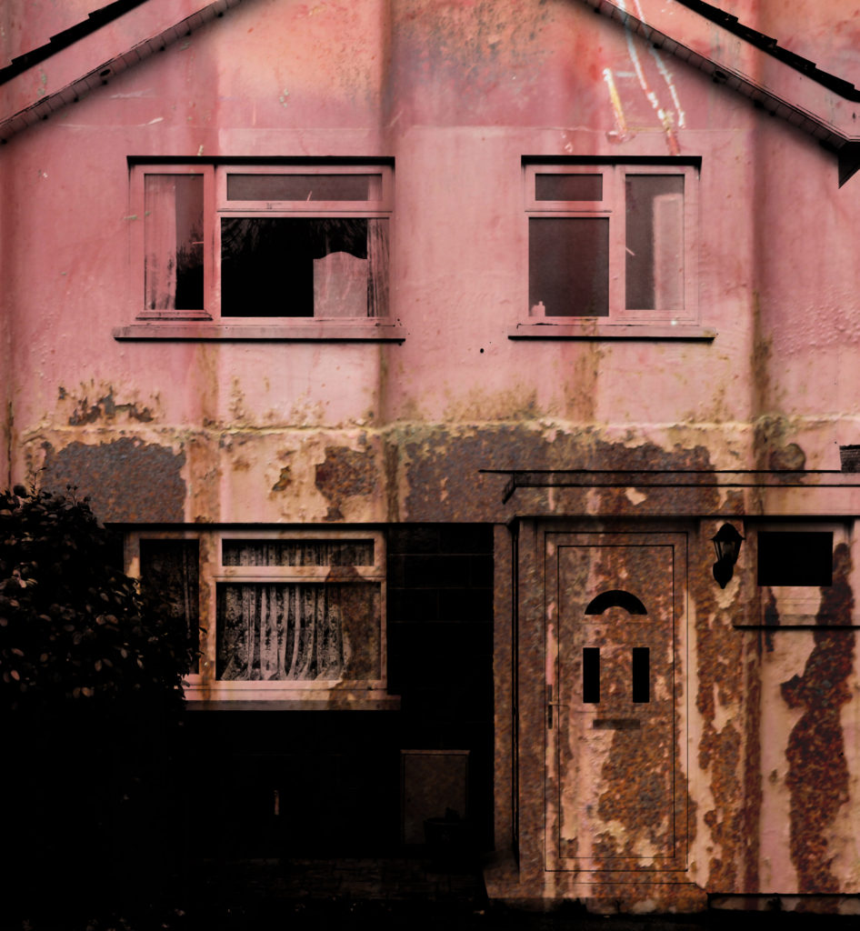


When capturing this photograph of a house face I used the natural lighting from the area, as I did when capturing all the other similar photographs of building faces in the shoot. This use of natural lighting allowed for the shadows and contrast to be displayed naturally within the image, which was helped by using a deep depth of field, shutter speed of 1/60 and an ISO of 200. These settings ensured that there was enough time to allow light to enter the lens but not so much time that the photograph became overexposed. There is a slightly cold colour cast in this photograph which matches to the metal structure layered over it (which have connotations to cold).
The photograph is in black and white it appears due to the natural silver of the metal face layered over the building face. This lack of saturation allows the shadows and contrasts to be brought forward in the photograph which leads to a wider tonal range and a more dramatic and effective photograph. The texture of the metal can also be seen throughout the composition as the metal bolts go up the side of the photograph whilst the lower half shows the texture of the brushed steel and brings the photograph to life. The photograph is set up so that the door is set along the lines of the rule of thirds which makes the photograph more aesthetically pleasing for the audience.
This photograph is from a set of compositions that I have made in which I have layered photographs of steel over photographs of building faces resulting in abstract compositions with texture. The idea behind this is that houses and office buildings are increasingly being built with steel structures in Jersey rather than the traditional granite base used. This steel gives a forecast into the future of housing and shows what will potentially be the base of houses as buildings develop and change. When this photograph is seen as part of a set it shows how buildings are all unique and different even when they are designed as batches.
Andreas Gursky (born 1955) is a German photographer and professor and the Kinstakademie Dusseldorf, Germany which is the academy at which the Bechers’ taught him and influenced lots of art in the Minimalism movement. Gursky is known for large format architecture and landscape colour photographs (similar to the style in which Lewis Bush photographs in his Metropole project. Gursky studied at the Universitat Gesamthochschule Essen in visual communication, with classes led by photographers Otto Steinert and Michael Schmidt. Between 1981 and 1987 he attended the Dusseldorf Art Academy where he received training from Hilla and Bernd Becher which led to a similar methodical approach in his photography.

Gursky would not digitally manipulate his images before the 1990s however has begun to rely on computers to enhance his photographs. A lot of Gursky’s photographs are taken from a high vantage point which gives an unusual but effective perspective. He tends to focus on large man-made spaces such as offices and high rise buildings. The photographs are printed to create huge panoramic colour prints which can be up to six feet high by ten feet long. Critic Calvin Tomkins described the experience of confronting one of his works in person as having “the presence, the formal power, and in several cases the majestic aura of nineteenth-century landscape paintings, without losing any of their meticulously detailed immediacy as photographs”.
Gursky’s photograph 99 Cent taken in 1999 was taken at a 99 Cents Only store in Los Angeles and shows the interior of the store as a wide composition of parallel shelves with a few white columns to separate up the photograph. The photograph represents all of the individual products as one wave of colour and blocky shapes rather than the brands and products on offer. The photograph supposedly depicts a stretch of the river Rhine outside Dusseldorf.
Andreas Gursky appeals to me because, similar to Bernd and Hila Bechers and Lewis Bush, he focuses on buildings and the patterns throughout them in order to create abstract and intriguing compositions. The photographs produced by Gursky often show the contrast and similarity between products and buildings through a typology approach without using a typology grid, for example in his photograph ‘99 Cents Gursky shows the contrasts and similarities between each of the products in the 99 Cents store. This is shown as the individual shapes of each product can be seen if you look closely but when looking at the photograph as a whole all of the products seem to be the same apart from the colour – the branding that the manufacturers pride themselves on are no longer important as all of the products blend together.

Previously I have experimented with GIF’s, but that experiment only included photographs of a limited number of building faces. In the below GIF I have included 12 fully edited photographs in which the building faces have been layered over rock faces. This use of GIF’s is extremely relevant to the topic ‘Variation and Similarities’ as it is an easily displayable way to demonstrate both variation and similarities between subjects. The 0.2 second time that each photograph is shown for, along with the cropping, creates a very abstract and unique method of presentation as the viewer is not sure what they are looking at until the GIF has been played multiple times. By using the GIF format the photographs are constantly being compared to eachother as the individualistic features of each building are being focused on and then replaced with another feature of another building, therefore it is demonstrating the variance and similarity between the buildings.
In this post I have experimented with presenting my compositions in which I layered photographs of building faces over photographs of granite rock faces. I believe that since I am looking at subjects that are easily comparable to eachother a typology grid is suitable – I have explored typology in the past through the works of Bernd and Hila Bechers and think it is a very effective was of drawing attention to the similarities and differences between the buildings. The use of rock faces in these compositions is great for creating similarities and differences between the photographs because not one rock face is the same as another; there is always individual angles and shapes that are unique to the rock. In typical use of typologies, all of the photographs are cropped to the same size – I had looked at doing this when putting the typologies together but found that it would take away from the composition of some of the photographs so it was best to leave them in their full shape. These typologies are made of my shortlist of best edits so I may change the photographs to all be cropped in the same way when I narrow the photographs down to about four.


In this post I have experimented with presenting my compositions in which I layered photographs of building faces over photographs that show the texture of steel. I believe that since I am looking at subjects that are easily comparable to eachother a typology grid is suitable – I have explored typology in the past through the works of Bernd and Hila Bechers and think it is a very effective was of drawing attention to the similarities and differences between the buildings. I have tried to use a wide variety of steel textures to create as much variety between the photographs as possible. In typical use of typologies, all of the photographs are cropped to the same size – I had looked at doing this when putting the typologies together but found that it would take away from the composition of some of the photographs so it was best to leave them in their full shape. These typologies are made of my shortlist of best edits so I may change the photographs to all be cropped in the same way when I narrow the photographs down to about four.


