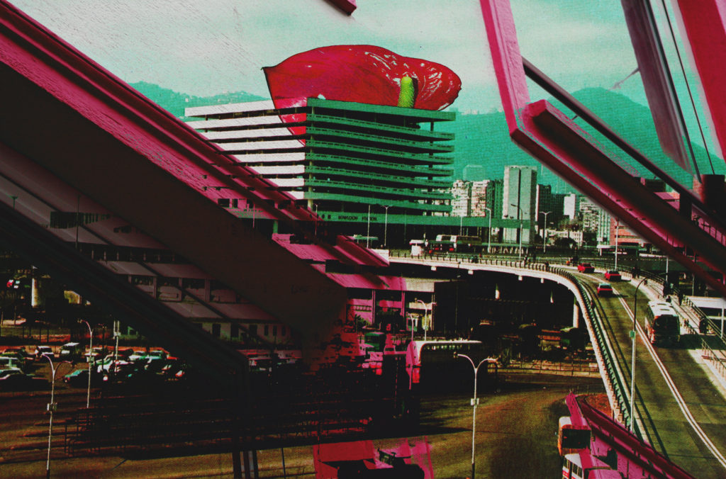
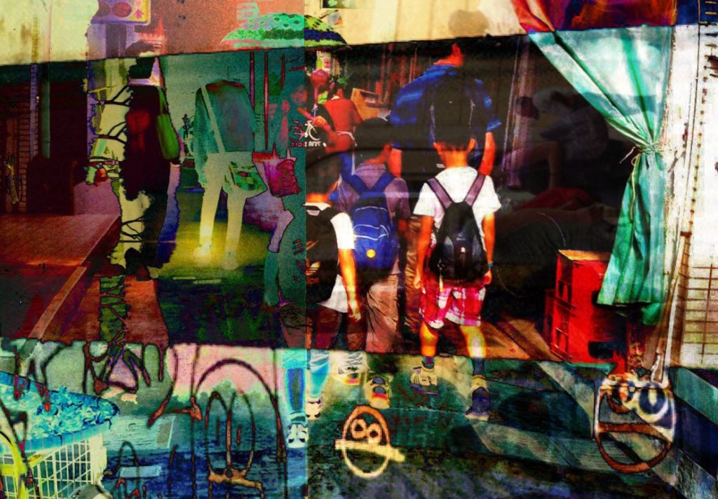
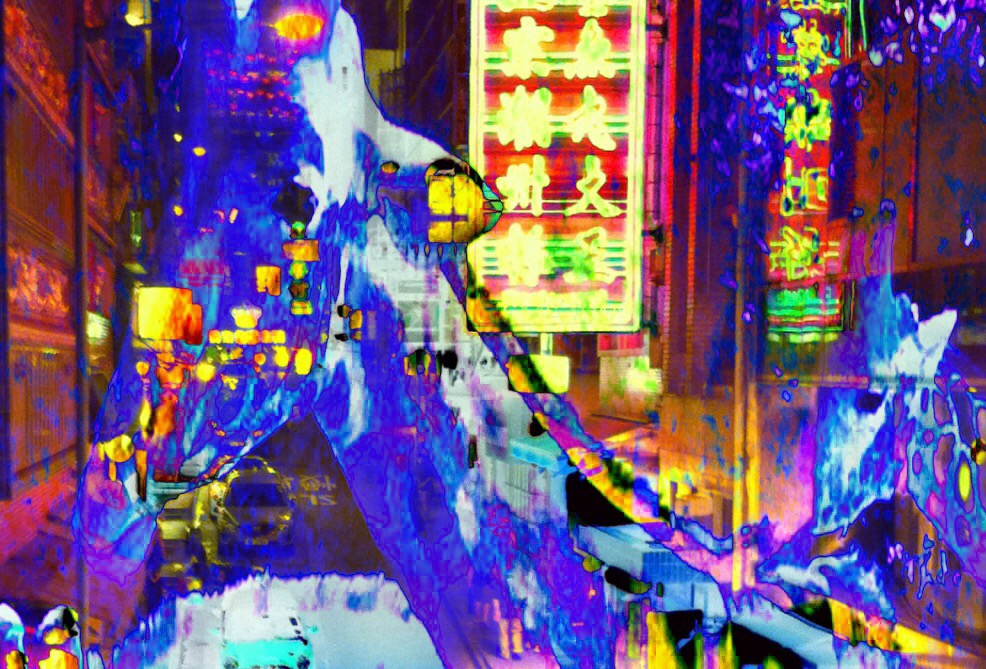
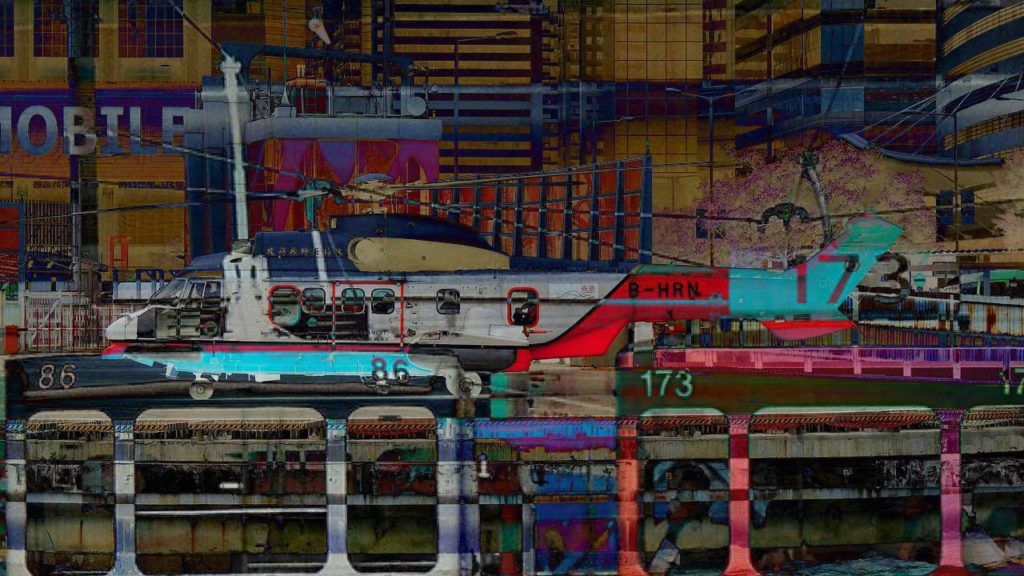
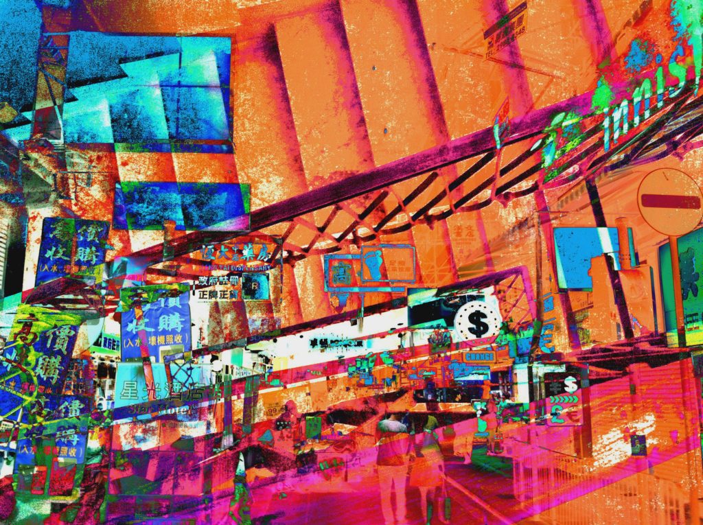
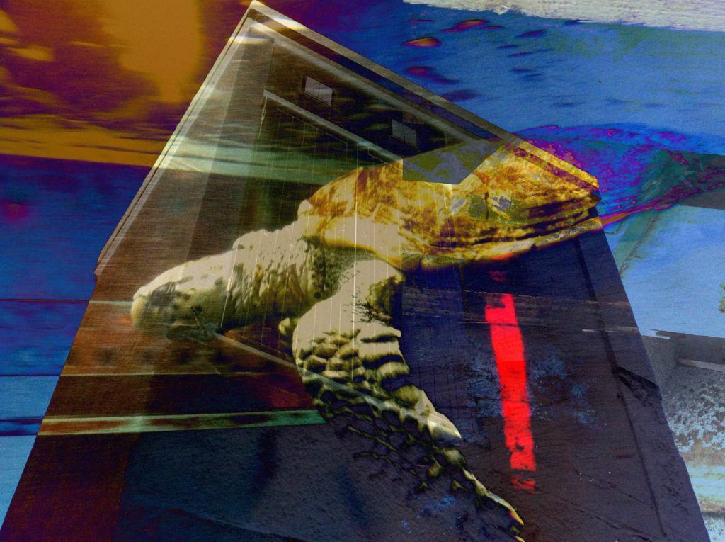
Since reflecting on my initial work, I have continued with the photo-montage process whilst gathering further visual material and taking more photographs to use. I believe that following a similar process to that in my two editing process posts has helped me to consistently produce successful outcomes which I am very satisfied with. This post is simply a display of the work I have produced since reflecting, I will go on to describe and explain my outcomes in further posts where I begin to select those which are most successful. So here just some of the outcomes which I have since made…
All posts by Charlie Craig
Filters
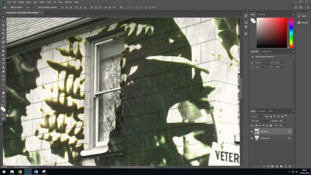
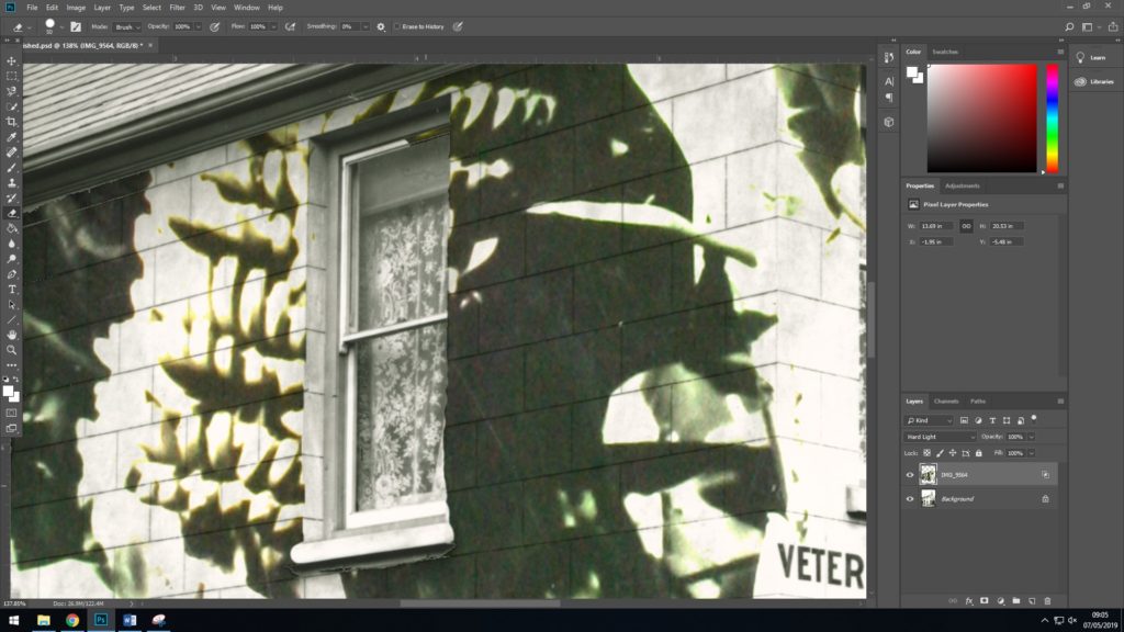
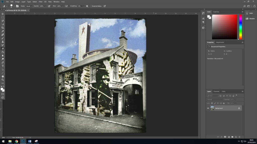
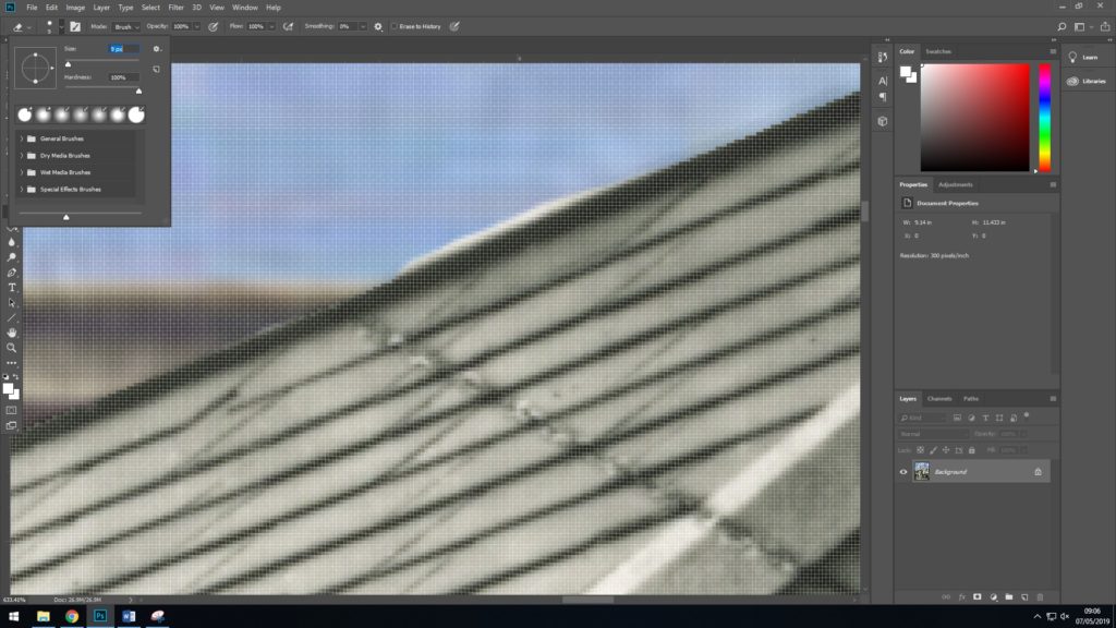
Editing Process 2
Structure & Form Photo-shoot
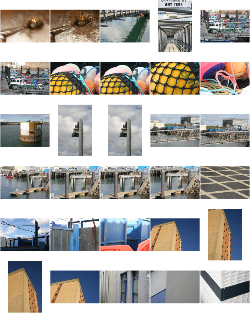
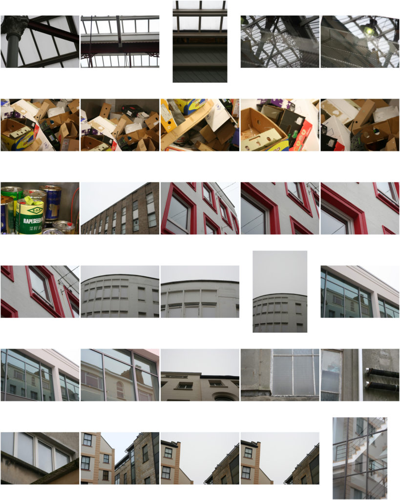
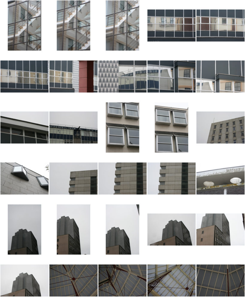
As I stated in my previous post I planned a photo-shoot in which I would focus on structure and form, I stated that in order to balance out the aesthetic of my photo montages, I believed that it would be a good idea for me to produce some images which focus on structure and form in a minimal manner. Producing minimal images with this simple focus would also give me a way of including conceptual and contextual elements to my work as I can photograph subjects which relate to trade and industries in Jersey which link us with the rest of the world. So after planning this photo-shoot I closely followed my plan and overall I believe that the shoot was very successful as I managed to make photographs which will definitely come in use in my photo-montages. I did this photo-shoot over the space of two days as visiting each location in my plan in a single day may lead to me rushing too much which could have a negative effect on the quality of the photographs which I come out with. I managed to focus on the subjects which I intended on capturing. And as I wanted to come out with the photographs certainly relate to trade and industries in Jersey which link us with the rest of the world.

Structure and Form Photographer research/Photo-shoot Plan
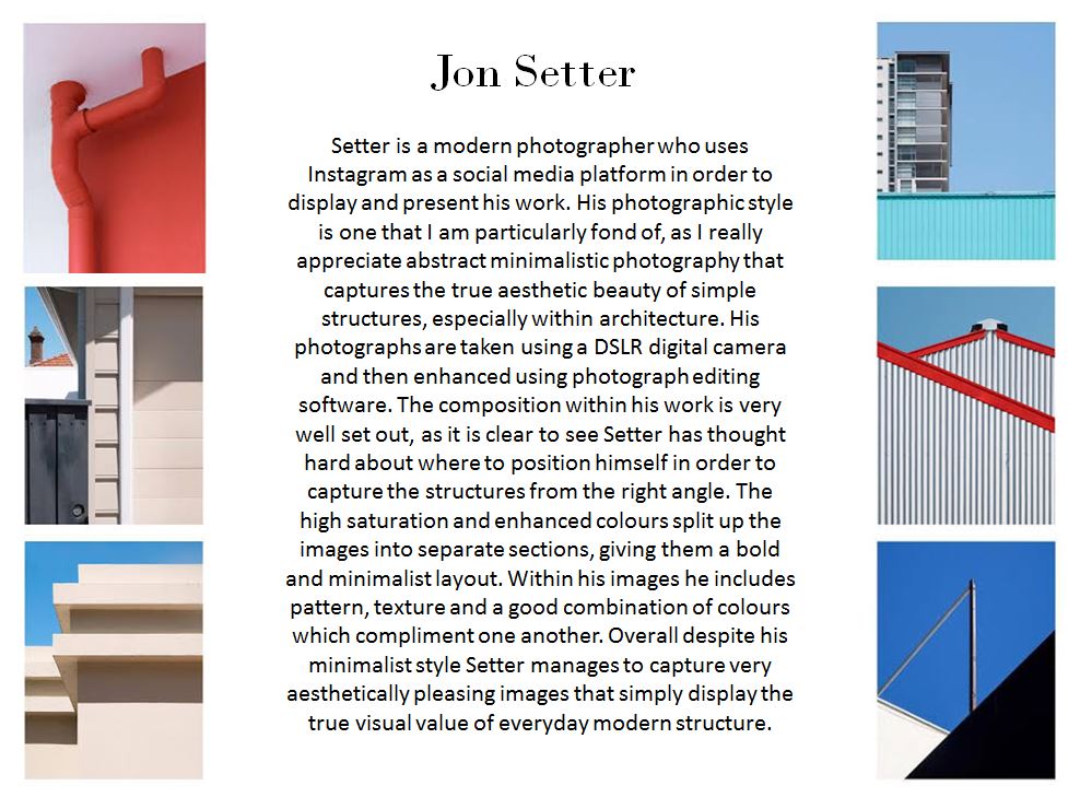
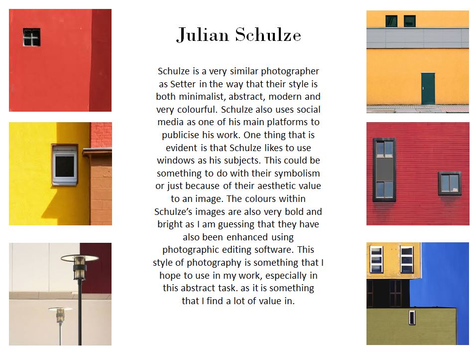
In order to balance out the aesthetic of my photo montages, I believe that it would be a good idea for me to produce some images which focus on structure and form in a minimal manner. Producing minimal images with this simple focus will also give me a way of including conceptual and contextual elements to my work as I can photograph subjects which relate to trade and industries in Jersey which link us with the rest of the world. I feel like it would be appropriate for me to do some brief research on a couple of abstract photographers who’s photographs focus on form and structure as well as other elements, so here are two short pieces of research on two relevant photographers.
Based on this here is a simple plan for a photo shoot which I will do…
Brief: Produce photography which focus of structure and form in a minimal and abstract manner
Subjects: Buildings, Windows, Machinery, Industrial Structures, Boxes, Signs etc…
Location: Town (St. Helier), Harbour, La Collette, Rue De Pres trading estate
Light source: Natural outdoor day light
Lens: 18-55mm
Jersey Archival Trade Photographs
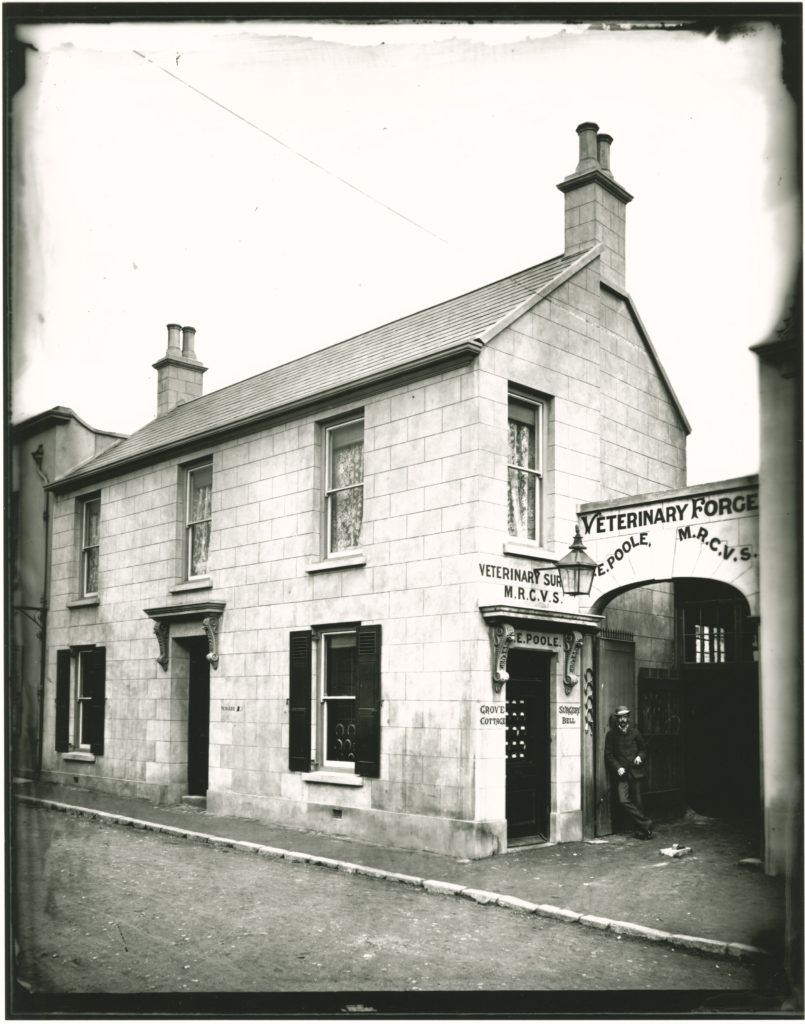
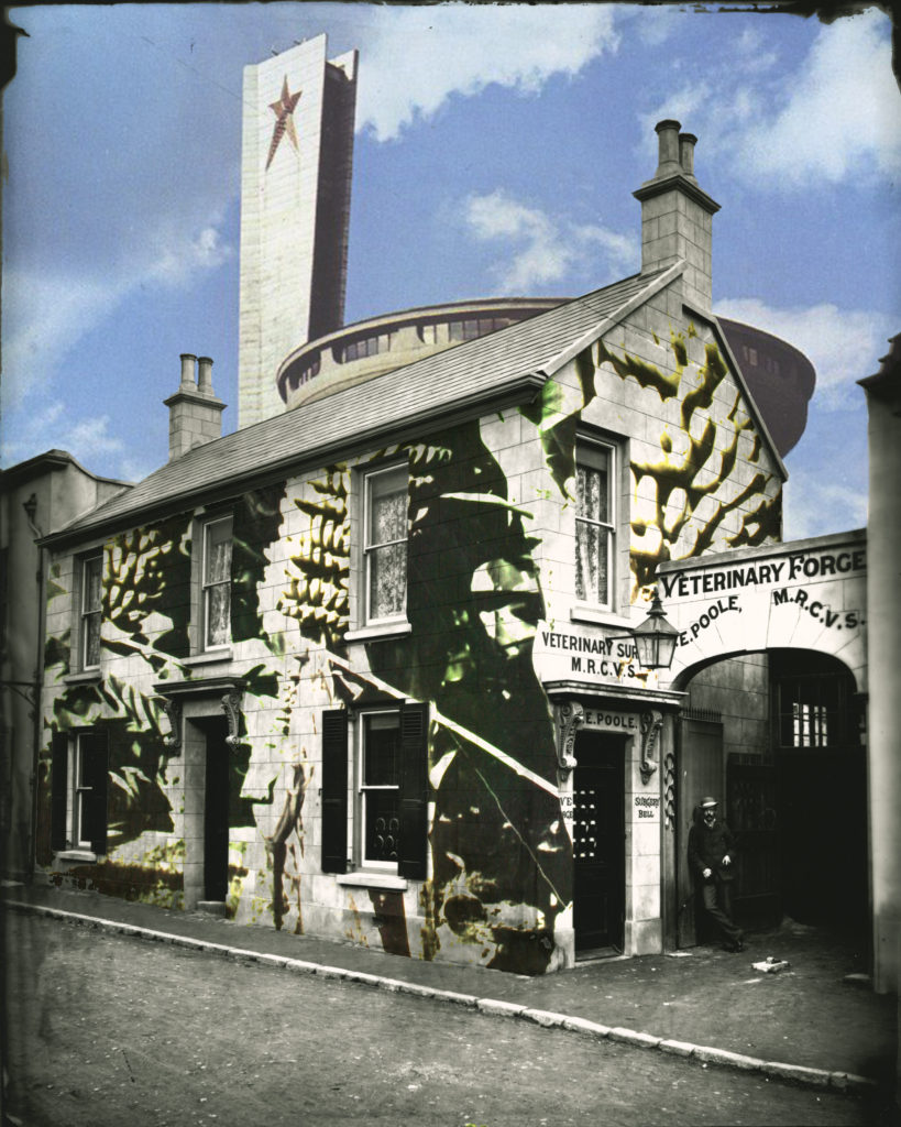
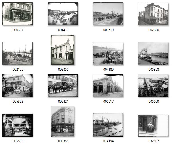
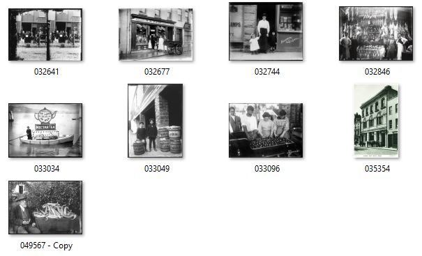
As I stated in my project specification I intended to explore how Jersey’s trade has developed over time from past to present and then looking into future projections. As part of this I have gathered a selection of Archival Imagery from the Societe Jersaise Photo Archives that show forms of trade on the island from the past, which I am going to use in photo montages as a way of looking at the past of Jersey’s Trade with other places. These photographs were taken by four Jersey based archival photographers: Ernest Baudoux, Francis Foot, Percival Dunham and Albert Smith. These photographers documented the people, the buildings, events and just the general goings-on of the island in the late 19th and early 20th century. Percival Dunham was Jersey’s first ever photojournalist. In 1913 and 14 Dunham worked for Jersey Illustrated Weekly and then the Morning News, which was the main competitor for many years for the Evening Post which is now the Jersey Evening Post (JEP) which has now been Jersey’s only daily newspaper for several years. Ernest Baudoux was originally from France and worked in Jersey from 1869 as a portraitist, taking pictures of important islanders’ houses, he also took a large number of pictures documenting the outdoors of Jersey. Francis Foot had an interest in photography in the early 20th century after being born in 1885, his family were known as those who owned the HMV franchise for Jersey selling gramophones and records, notorious for its F.Foot HMV sign which has recently been restored in 2018. Some of Foot’s photographs were published as postcards around this time. But eventually the gramophone and record side of his business became more important and took over the larger shop in Pitt Street, where Francis was still selling records in the 1950s and 60s. The fact that this was the story behind Francis Foot is something which I believe nicely fits into this project as I have been looking at trade on the island.
Researching Data & Statistics (Employment, Trade & Population)
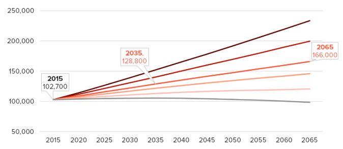
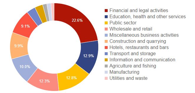
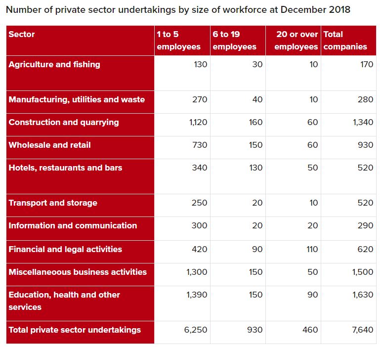
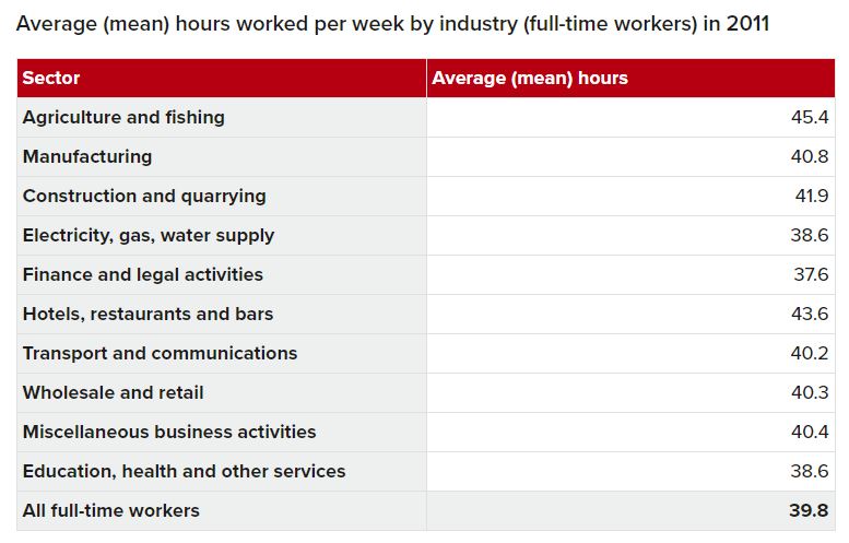
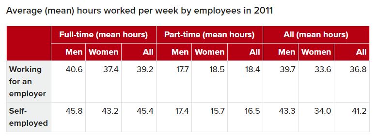
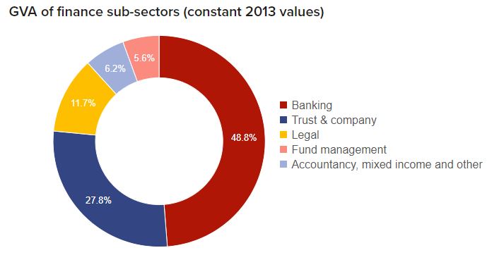
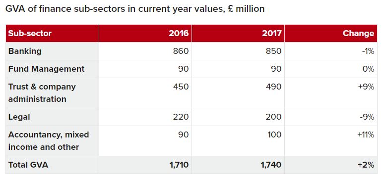
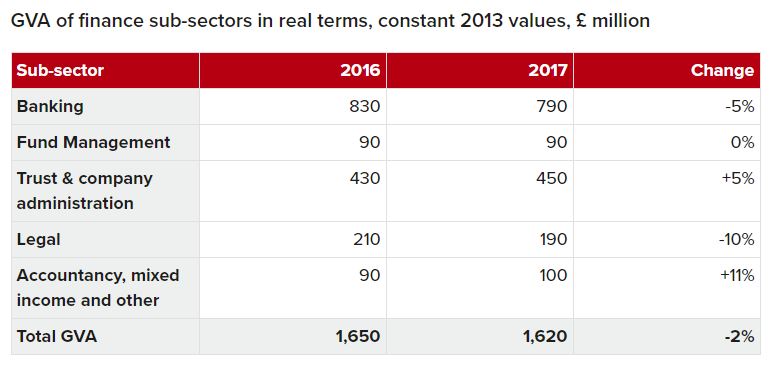
In order to get a much better understanding of how Jersey stands in terms of its statistical goings-on, I decided that it would be a great idea to look into the statistical data provided by Jerseys government in terms of social factors such as employment, trade, housing and population. Having the knowledge of these factors within the local society will give me more ideas on how to approach this project and on how Jersey is linked with the rest of the world through various aspects. Overall allowing me to back up my initial concepts on how to approach the project as a whole. Here are just some visual sets of data such as graphs/tables that I came across and looked into when doing this research…
What I can quite simply conclude from the data which I have looked at is that 1. population in Jersey is rapidly increasing and is projected to continue in this way 2. Jersey is becoming more and more of a diverse and multicultural society as time goes on (connecting it even more with the world than ever) 3. Over time Jersey’s leading sectors/industries of trade have changed, but currently Jersey’s most predominant sector is the financial and legal sector which takes up 22.6% of Jersey’s economy and employment. I believe that is would also be interesting if in some of my photo-montages I could incorporate figures and statistics from these sets of data in order to give subtle meanings within some of the pieces which I produce.
Photo-montage Process
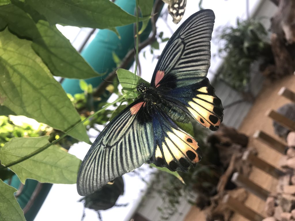
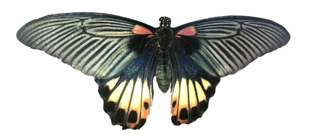
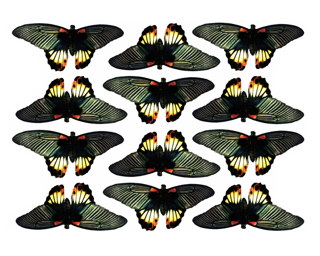
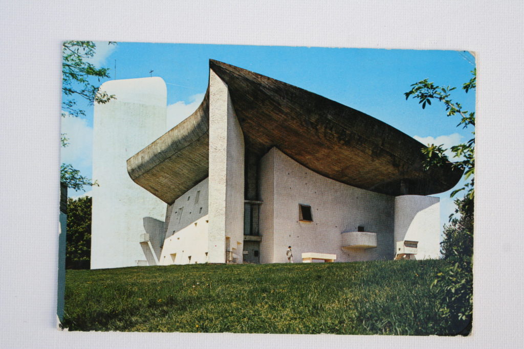
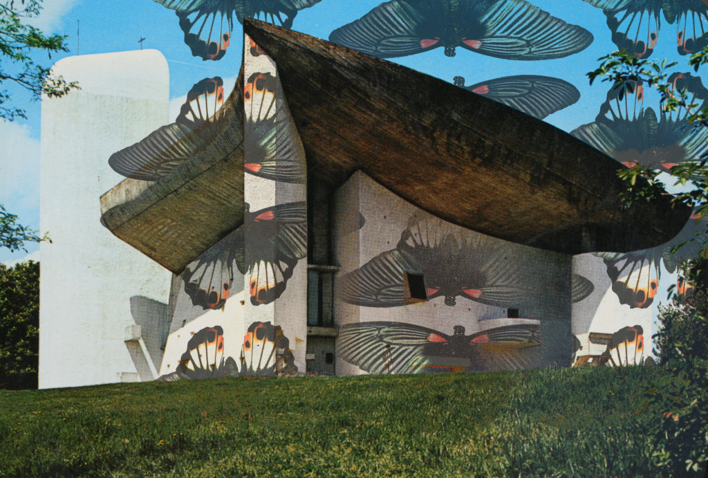
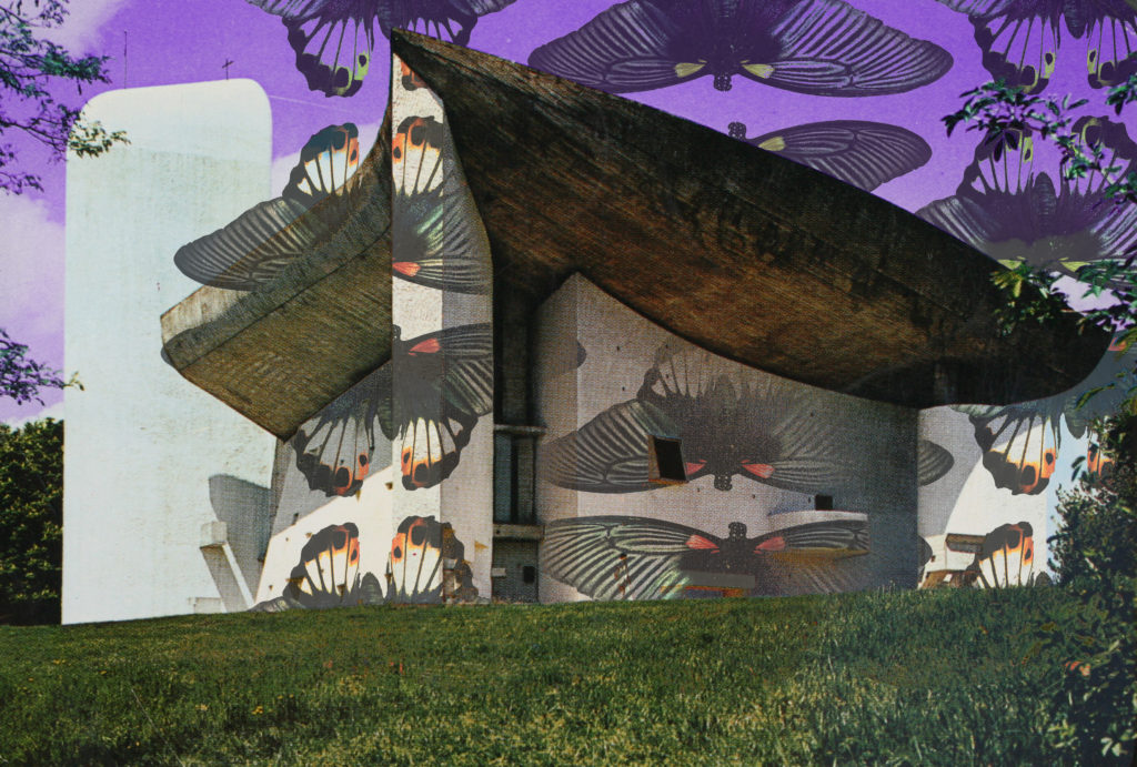
Photo-montages, Reviewing My Work So Far
So far I am following my project specification very closely are taking inspiration from the artists, photographers and movements which I have researched. I have stuck to my aesthetic plan of a chaotic look, and this is something which I believe is particularly working very well. Although I am taking inspiration from my research as I said, I don’t feel like this is to the point where the pieces I am producing so far aren’t original, since I personally feel like the aesthetic of the work is something which I have come up with myself. Aside of the 15 responses to the work of Dexter Navy which I made…
…I have also begun to use my initial two shoots to begin creating some photo-montages, here is what else I have made so far…


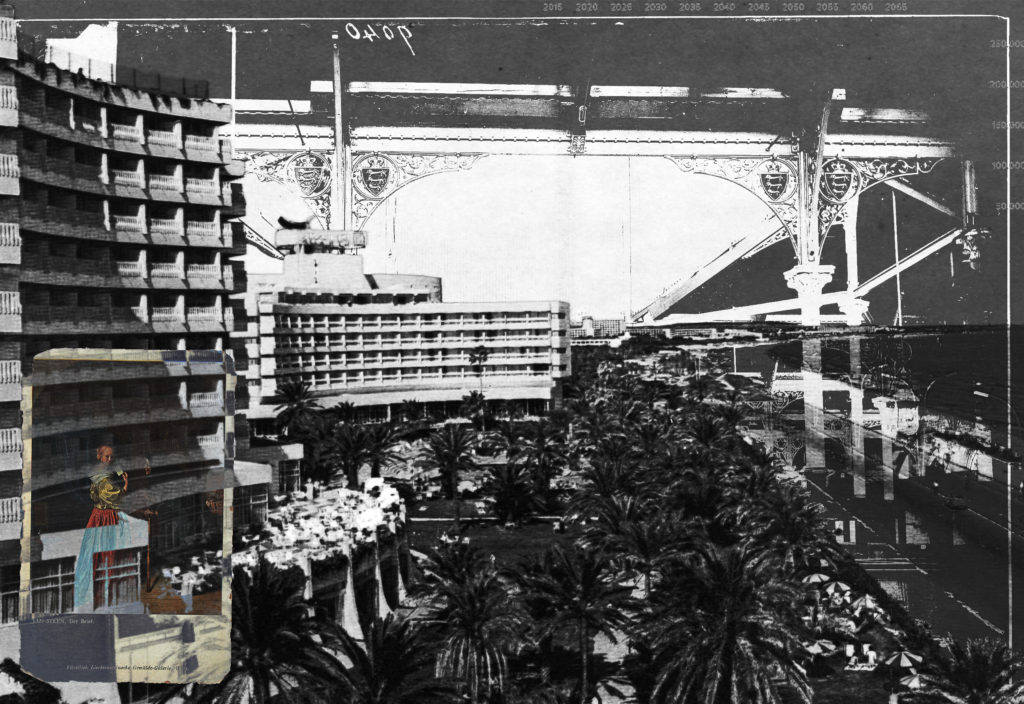

I am so far satisfied with how my techniques of photo-montage are working, using cutting out and double exposures to combine images with subtle links. From these further 4 montages above my favorite is the fourth, this is because of the carefully considered colour palette and the open spaced elements of the piece. Whereas with the other three although I think they are successful maybe they are overly chaotic and don’t actually look controlled. Therefore I plan to make a post on my editing process of the fourth photo-montage so that I am able to follow the process and hopefully continue to produce successful pieces.
What is Photo-montage, Dadaism and Surrealism?
PHOTOMONTAGE?
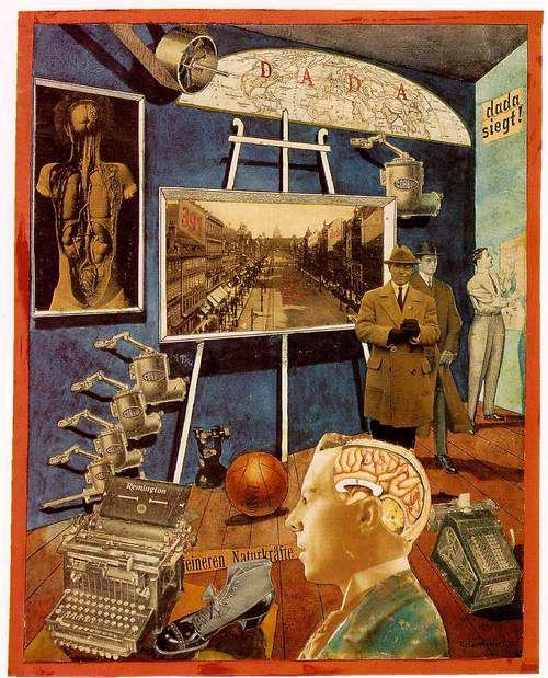
Photo-montage its self is a medium in which another composite photograph is made up by combining, gluing, overlapping, rearranging two or more photographs in one way or another. This can either be done digitally or physically, and even sometimes photo-montage is produced in a video format. The medium of photo-montage tends to be either used in a way that challenges political affairs, or challenges issues that we face in society as a whole. Photo-montage seems to have first been used around 1915 by the Dadaists (a movement I will explain shortly). The medium then began to be used by the Surrealism movement who began to combine images with no seeming connection or association, this was with the intention of ”releasing the creative potential of the unconscious mind.” Soon after, In 1923 the Russian constructivist Aleksander Rodchenko who was part of the Russian avant-garde movement (linked my post looking into this movement) began experimenting with photomontage as a way of creating politically fuelled challenging imagery concerned with the placement and movement of objects within a given space. Below are some modern examples of photo-montage techniques being used, and it is clear to see that this is an aesthetic which has remained prominent within art since its origin…
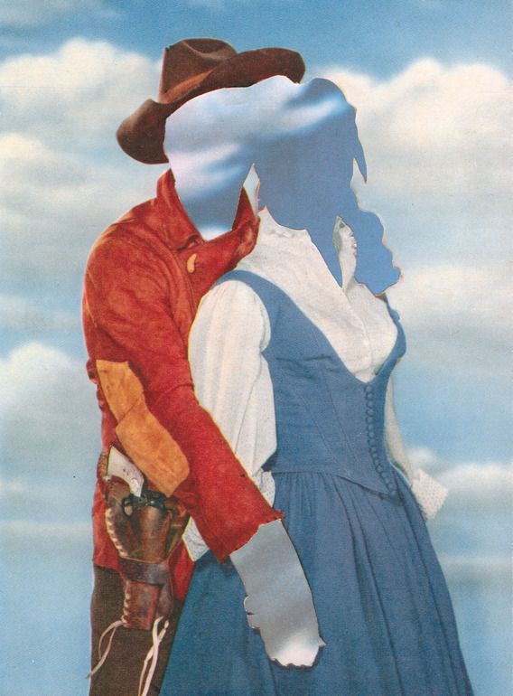
Joe Webb – 2012, Assemblage / Collage “Daydream III”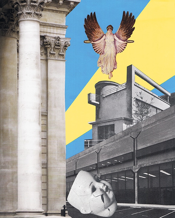
Broken Photo-montage 2017 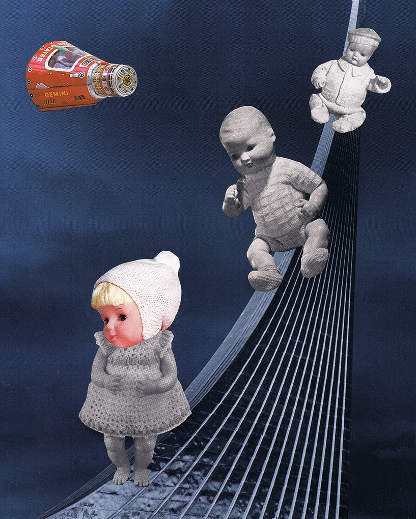
Special Delivery Photo-montage 2017
DADAISM?
Dadaism was an creative avant-garde movement in modern art which began during the First World War. It was a reaction to the negativity and horror that was occurring during the war, and a focus on going against the standards of society. It was done in a somewhat dark humorous way as it was ridiculing the modern world. It originated in Zurich, Switzerland and quickly spread to New York in 1915 and to Paris soon after 1920. Pioneers of the Dadaism movement included artists such as: Marcel Duchamp, Raoul Hausmann and Max Ernst among many others. Here are some examples of work from these three artists.
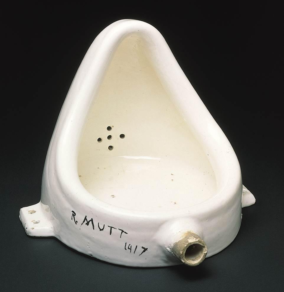
Marcel Duchamp – Fountain 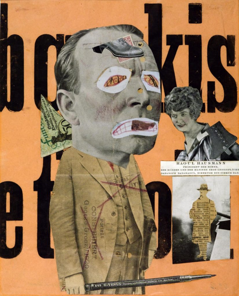
Raoul Hausmann – The Art Critic 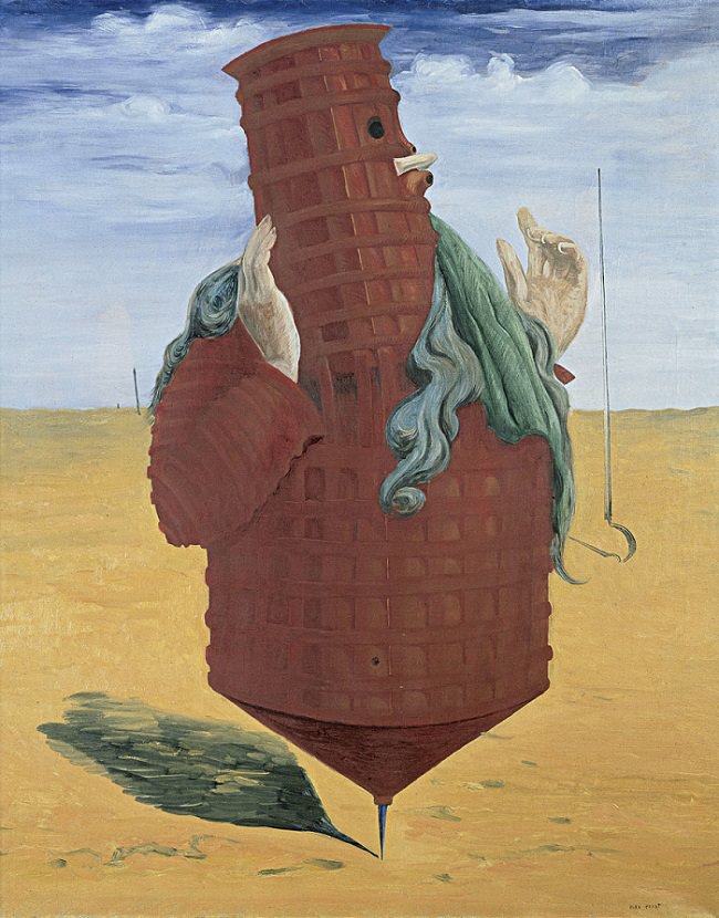
Max Ernst – Ubu Imperator
SURREALISM?
Surrealism is an abstract artistic movement which also began in the early 20th century inspired by dadaism and abstractism. The purpose of surrealism was to challenge the unconscious mind and the creativity within all human mind. It ”aimed to revolutionise human experience, rejecting a rational vision of life in favour of one that asserted the value of the unconscious and dreams. The movement’s poets and artists found magic and strange beauty in the unexpected and the uncanny, the disregarded and the unconventional.” So to put it simply this art movement was basically a way of trying to activate the creativity within the unconscious human mind, by means of unconventional techniques and aesthetics. Surreal as a word its self suggests something beyond reality which is exactly what this art entails; a lot of the time showing a form of dream or imaginary worlds etc… This is evident written as ”Many surrealist artists used automatic drawing or writing to unlock ideas and images from their unconscious minds, and others sought to depict dream worlds or hidden psychological tensions.” Some of the worlds most famous modern artists such as Salvador Dali, Pablo Picasso and Frida Kahlo belong to the Surrealist movement. Below again are some examples of work from these three artists that contributed to surrealism.
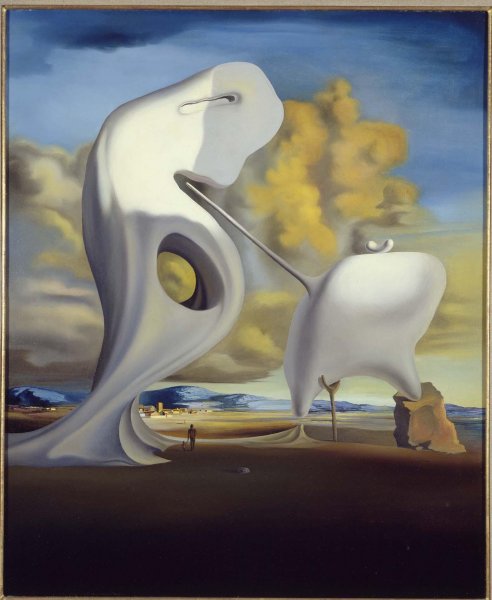
Salvador Dali – Figueras (1933) 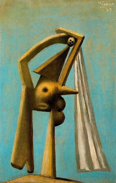
Pablo Picasso – Bather (1929) 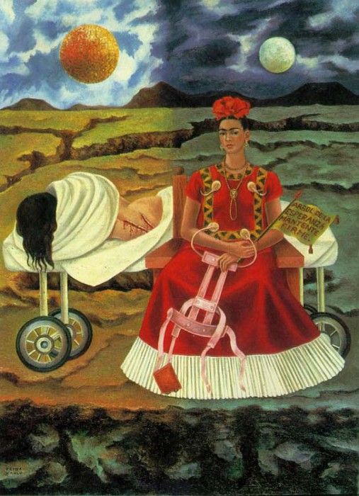
Fride Kahlo – Tree of hope (1946)
Russian Avant Garde (Context & Analysis Study)
WHAT IS RUSSIAN AVANT-GARDE?
Russian avant-garde was a very influential movement in the world of avant-garde art, that was at its height in Russia, from around 1890 to 1930 however it is said that its beginning could be as early as 1850 and its end could be as late as 1960. However personally I believe this may be due to the influences continuing from the movement which I will talk about, and the beginning is debatable as there were many things that inspired the movement in the first place. The Russian avant-garde movement includes many separate but closely related art movements that were prominent at the time of the movement as a whole. These closely related movements included movements such as: Suprematism, Constructivism, Russian Futurism, Cubo-Futurism, Zaum and Neo-primitivism. The movement reached its most publicly popular height in the period of the Russian Revolution between 1917 and 1932, at which point the ideas and concepts of the avant-garde clashed with the newly emerged state-sponsored direction of Socialist realism. Socialist realism was the complete opposite of what Russian avant-garde was about, it was a style of realistic and state approved art which, it emerged at the end of the Russian Revolution where it was first used in 1932. I believe what most solidifies the fact that it was pretty much completely influenced by the soviet state was that the term was settled upon in meetings that included politicians of the highest level, including Stalin himself.
In order to gain a better understanding of the Russian avant-garde movement, these two videos made by the museum of modern art (MoMA) help a lot.
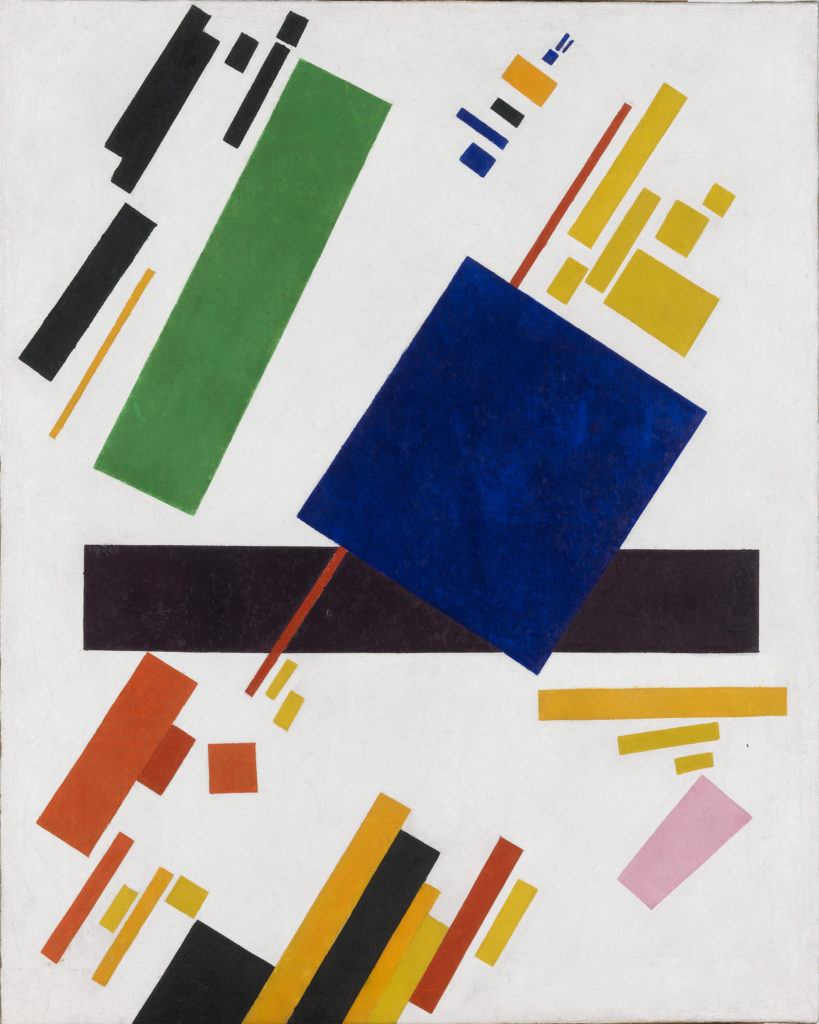
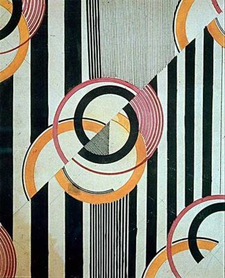
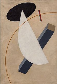
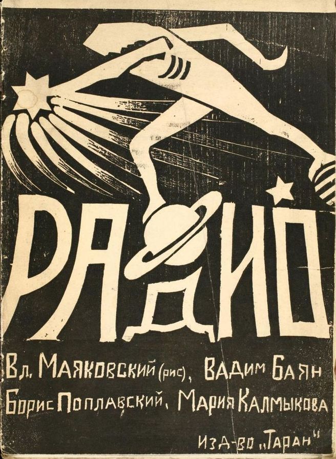
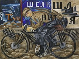
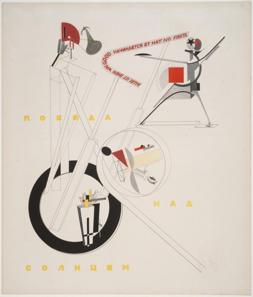
3 examples of work from the Russian avant-garde movement which I am particularly fond of…
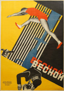
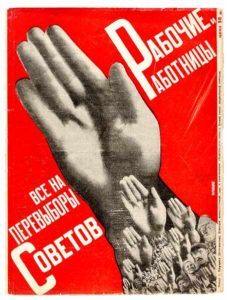
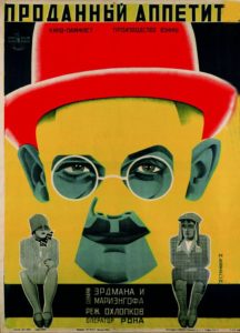
SUB-MOVEMENTS OF RUSSIAN AVANT-GARDE…
As I mentioned, within Russian avant-garde there were many closely related styles/sub-movements of art. In order to give myself a better understanding of the whole movement I then began to look into each sub-movement and what was included in each, here is some insight on a few of these sub-movements…
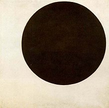
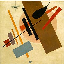
SUPREMATISM: this was an art movement which focused on basic geometric forms found in everyday life, such as circles, squares, lines, and rectangles, which were painted in a limited range of colours. The main artist involved in this movement was Kazimir Malevich who was believed to have founded the movement in 1913, which he then officially announced at one of his exhibitions in 1915. The actual term of supematism itself is a reference to the form of art that was based upon “the supremacy of pure artistic feeling.” This was instead of a realistic depiction of subjects. Said about constructivism by Malevich was that ”Under Suprematism I understand the primacy of pure feeling in creative art. To the Suprematist, the visual phenomena of the objective world are, in themselves, meaningless; the significant thing is feeling, as such, quite apart from the environment in which it is called forth.” Below are some examples of the art which came from the movement, all 3 from Malevich.
CONSTRUCTIVISM: This was a movement of ”architectural” art which the same as suprematism began in 1913. It began at this time, founded by artist Vladimir Tatlin. The constuctivism movement was actually very influential on the art world as a whole, causing major effects upon sculpture, graphic design, industrial design, architecture, theatre, film, dance and fashion. Below are some examples of the artworks which came from the constructivism movements. As you can see however, there were a lot of visual overlaps and similarities between constuctivism and suprematism.
RUSSIAN FUTURISM: This was another movement within the overall Russian avant-garde movement. It was a style and philosophy of work which was adopted by Russian artists who were influenced by the principles of Fillippo Marinetti’s ‘Manifesto of futurism.’ This manifesto expresses an overall concept called futurism that referred to a rejection of the past and a celebration of speed, machinery, violence, youth and industry. The Russian futurism movement is said to have begun in 1912 (a year earlier than the other two sub-movements which I have looked into) However instead of being influenced by an individual artist, this time the movement was influenced by a group of artists called Hylaea who were based in Moscow. It is only fair that I list the artists who equally made up this group, it included: David Burlyuk, Vasily Kamensky, Velimir Khlebnikov, Aleksey Kruchenykh, Vladimir Mayakovsky, Mikhail Larionov, Natalia Goncharova, Kazimir Malevich and Olga Rozanova. When looking at works of art from this movement it quickly became evident to me that a frequently used piece of symbolism within the art was the depiction of wheels and physical speed. The presumptions which I make from this is that the wheels and speed represent moving into the future. Below again are some examples of artwork from the movement which I have just spoken about.
INFLUENCES ON MODERN CULTURE AND FASHION FROM RUSSIAN AVANT-GARDE…
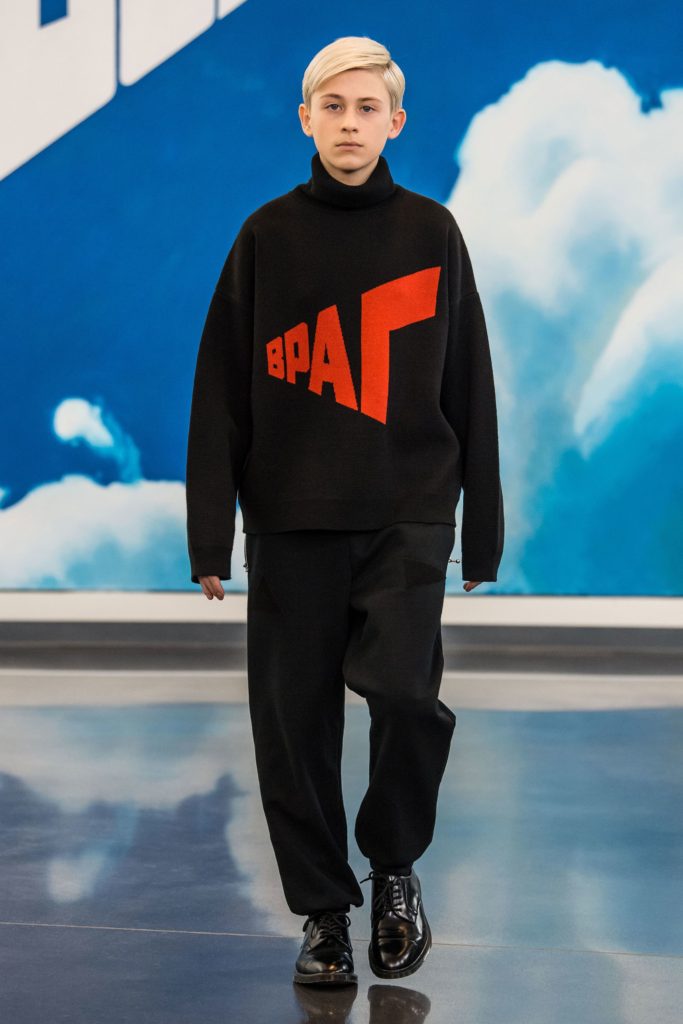
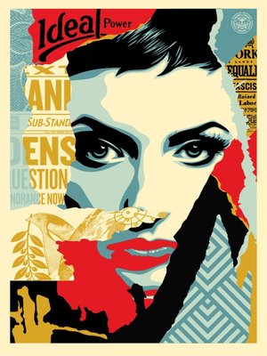
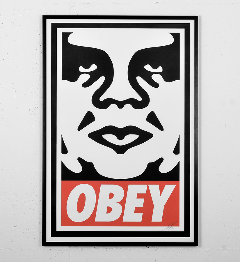
As I began to explain before, the Russian avant-garde art movement has continued to influence many forms of creativity since its hay day. In terms of how it is still influencing creativity today, there are two creators that stand out to me as being particularly influenced by the movement, and they are fashion designer/photographer Gosha Rubchinskiy and graphic artist/obey clothing brand owner Shepard Fairey. These two artists show clear visual influence within their work from Russian avant-garde. This is particularly through the use of colour, shape, form and elements of text.
Gosha Rubchinskiy (Гоша Рубчинский), a Russian himself, shows a significant amount of influence from Russian avant-garde when it comes to the design of the garments which he designs for his self-named ”Gosha Rubchinskiy” brand. A brand which is very well known in the street high-fashion industry, who have collaborated with worldwide fashion brands such as Adidas, Levi’s, Burberry and Dr. Martens. The main way in which I believe the designs which Gosha produces reflect the movement is in terms of its political statements/rebellion and the use of bold graphic text. Below you can see examples of his work which I believe give a better understanding of my suggestions.
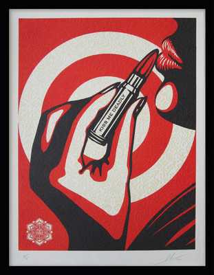
Shepard Fairey who as I said also takes inspiration from the Russian avant-garde. He emerged as a street artist from the skate scene and is best known for his ‘OBEY’ branding and the notorious Andre The Giant logo which he began his brand with as a sticker campaign. Similarly to Rubchinskiy, Fairey also reflects the movement is in terms of its political statements/rebellion and the use of bold graphic text. He is influenced by the Russian graphic rebel propaganda used at the time of the movement and also by the constructivism sub-movement which I explained earlier. His work seems to intend on using the similar effective aesthetic values of the Russian movement in order to get across messages about the political and social issues which we face within our modern society today. Below are some examples of Fairey’s graphic art which I have spoken about.
Visual analysis of a work by Shepard Fairey…
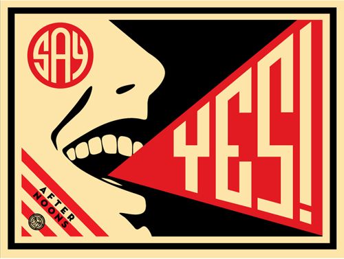
Here we have a piece of work titled Say Yes by Shepard Fairey, a screen printed graphic which was published in 2008 by Fairey. My first thought on this image were that there was a clear political message being put across by Fairey with the ‘say yes’ slogan which I initially believed to have been a link with the OBEY branding surrounding Fairey’s career, and that maybe ‘say yes’ was a message about conforming to society and political changes which is what the OBEY brand entails. Come to find out however that this piece is not intending on conveying any sort of political message, and however is actually a poster created for one of Fairey’s friends Steven Scott who is a part of the ‘afternoons’ band, the artwork is for a song called ‘say yes’ and from there the poster was printed 150 times as part of the project. This is better described by Fairey himself saying ”My friend Steven Scott who works at my favorite LA breakfast spot, The Mustard Seed Cafe, gave me a copy of his band’s demo CD. The band is called AFTERNOONS and their music is very symphonic, uplifting, indie rock in the vein of the Polyphonic Spree or newer Flaming Lips. The standout track is called “Say Yes” and I was so inspired by it that I decided to make a poster for the band to put up on the street, and a few to sell to recoup printing costs. The edition is only 150.” I then begun to become aware of the feeling that I had seen something very similar to this piece and quickly realised that in fact when researching the constructivism sub-movement of Russian avant-garde, I came across a poster by Aleksandr Rodchenko from 1924 which depicts a woman screaming a slogan however in Russian with blatant visual reflections to Fairey’s ‘say yes’ poster. Here is the Rodchenko poster which I believe to have somewhat inspired Fairey.
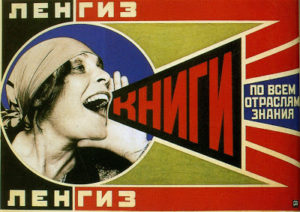
As well as many other clear aesthetic similarities, the joyful expression of the mouth in both Fairey and Rodchenko’s artwork clearly shows a great similarity. And although I am actually unable to find any hard evidence as to whether Fairey was directly inspired by Rodchenko’s piece, I am quite confident to say that I would be nearly certain that Fairey’s piece is a refence to this and that if not it would be a considerable coincidence which I have come across. Overall I believe that Fairey’s ‘say yes’ piece is a very successful work. The composition of the piece is great as it is full yet remains graphic and not over-complicated, also Fairey’s choice to only use 3 colours (most likely due to the screen-printing technique) is easy on the eye and reflects the style of Russian propaganda in which they tended to also limit the amount of colours used.


