To conclude, I am extremely satisfied with the outcomes of the ‘Variation & Similarity’ project, in relation with my initial project specification I am confident to say that it reflects throughout my project and is clear in my final pieces. My initial action plan when approaching this project was ”I will produce photographs surrounding the theme of chaotic imagery. I plan to do this by creating photo-montages, collages and edits in response to the artists and photographers which I have and will research. I am going to relate this work to the issues of overpopulation and capitalism which have and still continue to play a big part in the overpowered development of the world. I will photograph all kinds of things relating to this theme as rather than limiting myself to one specific subject matter this will not allow me to produce pieces with chaos as the main part. These issues of overpopulation and capitalism are something which closely links Jersey with the rest of the world, through trade, immigration, politics and culture. I plan to explore this link and how it has developed over time, looking at the past and how it has become the present. And then how the future may look in terms of these issues. This will be executed by the use of archival and found imagery mixed with my own purposed photographs through means of collage and montage.” Which I can say with full confidence is something which I have more than met. Although my creative thought process and ideas have developed consistently throughout the project, I can safely say that the aesthetic which I was intending on producing from my initial thoughts is exactly what I have managed. My photo-shoots and gathering of visual material were a vital part of executing this project and again I can safely say that I followed my plans for these and it payed off as I managed to gather more than enough to work with than what was needed, which was massively ideal since I required a broad selection of textures, colours, shapes, forms, scenes, objects etc… The research I have done has clearly inspired the work which I have produced. Looking into the work of a total of 18 creative individuals has given me a good understanding of the style of work which I was aiming to produce, and this is definitely something which shows. Also learning about art movements which I was previously unaware of has allowed me to have a much better understanding of the creativity which I was working towards. Artists/Photographers Dexter Navy, Alice Wielinga, Peter Blake, Salvador Dali and Raoul Hausmann were definitely the most influential artists on my work which personally I believe is blatant within my work, as there are visual similarities within at least one of my final outcomes to each of these individuals. In terms of my two final displays they went completely to plan and I believe perfectly reflect my plans and mock-ups, and are overall a complete success. They are interesting and unusual outcomes and I believe that it was definitely worth spending my time on something slightly more complex than just a window mount or framing that wouldn’t show my images in a very eye catching way. They show my work in a way which can be individually interpreted by viewers as there are subtle meanings and messages within the work which can be noticed on closer inspection. So to say the least, I am overall extremely satisfied and confident in the way which this whole project has come together and worked.
All posts by Charlie Craig
Filters
Final Postcard Display (Final Piece 1)
This post covers my first and main final outcome of the ‘Variation and Similarity’ exam project.

As I intended to do I have produced my 38 inch x 48 inch postcard display which overall I am very satisfied with, I am happy with the fact that following my plan for this display, I have managed to produce exactly what I was planning to. Although I thought I may have to rearrange some of the prints from how they were composed on my plan, once I had set it up I found that actually it looked great as it was and so I left them in the same order as I had in my plan. The display successfully shows my outcomes in an unusual way and overall it is much more interesting than if I had just mounted or framed these prints up, as it really does show that I was going for a classic postcard aesthetic with a twist of my own. The way in which I have spaced apart different prints such as landscape/portrait, black and white/colour or front/back is very successful as although they appear to be randomly spaced this is what i was intending and was in fact harder to make the order look random as I had to think carefully about things vertically and horizontally when spacing everything apart. In my original project specification I stated that I would produce photographs surrounding the theme of chaotic imagery. I planned to do this by creating photo-montages, collages and edits in response to the artists and photographers and movements that I have researched. I said I would relate the work to the issues of overpopulation and capitalism which have and still continue to play a big part in the overpowered development of the world. And that I would photograph all kinds of things relating to this theme as rather than limiting myself to one specific subject matter this will not allow me to produce pieces with chaos as the main part. I also went on to state that these issues of overpopulation and capitalism are something which closely links Jersey with the rest of the world, through trade, immigration, politics and culture, planning to explore this link and how it has developed over time, looking at the past and how it has become the present. And then how the future may look in terms of these issues. This would be executed by the use of archival and found imagery mixed with my own purposed photographs through means of collage and montage. And overall in terms of how I believe this final display has come out I would say that I am confident in the fact that I’ve closely followed my specification and plans in order to produce something which reflects this to a full extent, along with my A3 print display.

Final Postcard Display Planning
As I decided in my previous post I am intending on displaying 24 postcard prints strung up in either 6 rows of 4 or 4 rows of 6 on a wooden board of some form. I personally believe that a light tone of wood will look best as it will make the prints stand out whereas a darker wood may be too overpowering. Below is the sort of wood tone which I think will work best.

I need to make a choice as to whether 6×4 or 4×6 in terms or the print rows will make for a more successful outcome. and therefore I have created these very simple mock ups of how the compositions will both appear.
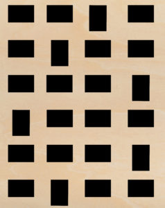
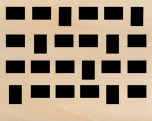
After composing these layouts in order to see what would work best I have decided the the second option (4 rows of 6) would work best. I’ve made this decision as looking at both layouts the second looks much better due to the fact that the majority of the postcard prints will be landscape. And therefore a landscape board of wood would be most appropriate visually. I will also buy brown string and some wooden pegs of the same tone so that everything displaying the postcards matches. Here is the kind of string and small pegs I will try to buy somewhere.


Then after making all of these decisions I thought it would only be right that I make a mock-up draft on Photoshop of what the display will probably look like. So I did this in three steps: one with just the postcards, one with the string and one with both the string and the pegs (As you can see below.)
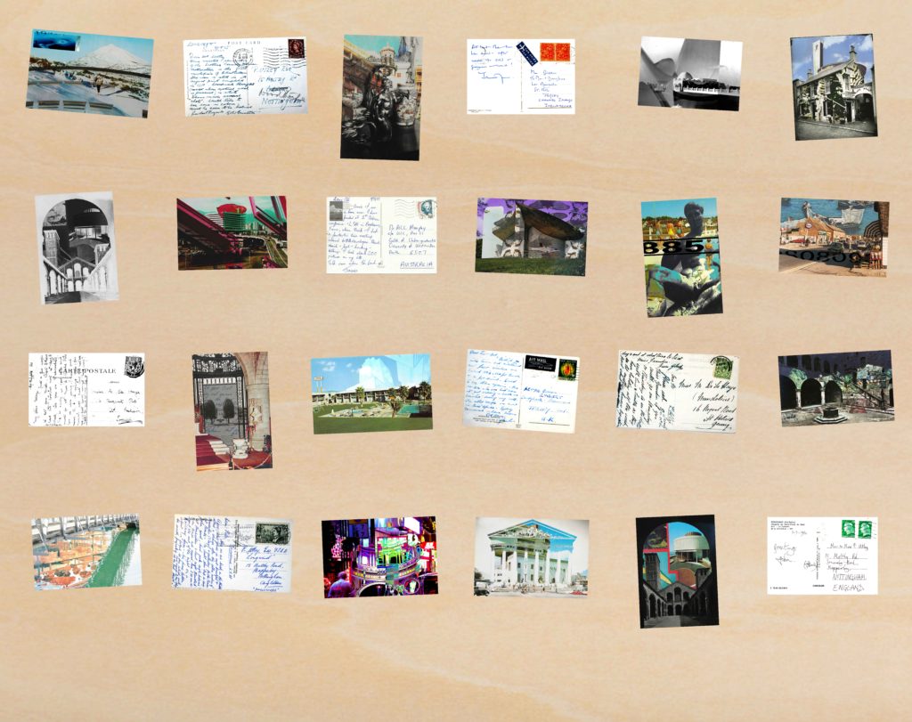


Overall with that as a mock up I am extremely happy as I believe it works really well, the composition of each postcard print is carefully considered as although it looks very random that was the point as I wanted to space out the prints depending on whether they were landscape/portrait, colour/monochrome, fronts/backs etc… Also doing this layout mock up has been useful in terms of working out what dimensions I will need to use for a wooden board, and I have come to the conclusion that I will need to use a 38 inch by 48 inch board. I intend to staple each string at both ends into the back of the board in order to tightly secure them so that the postcards can hang off them using the pegs.
Final Postcard Display Initial Ideas
For my final display I somehow want to display 24 of my final images as postcard sized prints, displayed somewhat how postcards would be by either a retailer or in a home. The reason I want to do this is because of how I’ve used postcards, archival and my own visual material in order to create my final pieces. And therefore I wanted to turn these back into new postcards that look at the idea of links between Jersey and the rest of the world through trade links, corporate activities, consumerism, tourism and employment; whilst executing this with a chaotic aesthetic as I intended from the beginning of this project. When searching for ways in which postcards are displayed I came across three different ways of doing this.
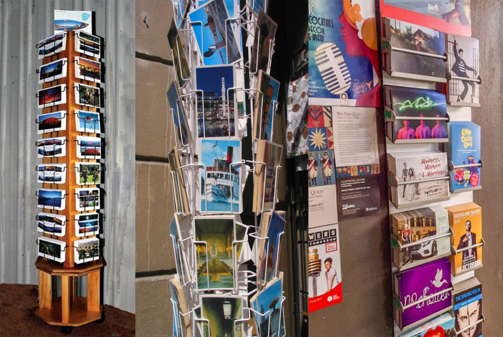
One being a metal postcard stand which you tend to find in souvenir retailers all over the world, these can either be strung up to a wall or on a rotating attachment. I think that these are a great way to display postcards, however the downside of this is that some postcard cover up those behind them, meaning that some may not be seen. Also with these stands they are very expensive and or would be very hard to get my hands on or make myself, so this may not be the best option for my final display, although it was good to consider.
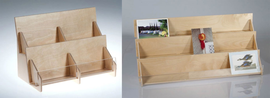
The second method of displaying postcards is a more accessible way of me being able to arrange my postcard sized prints. It is something which I could construct fairly easily with small pieces of thin plywood. I think that also having rows and columns of the prints works for a successful composition/layout of images, it means that I could arrange the postcards in order to create contrast and clashes between certain prints. However the issues with this method of display are firstly that the stand its-self, to fit all of my 24 prints, would have to be quite bulky and would also be a problem where portrait prints may slightly cover landscape ones.
The third (and most fitting) option of display is some form of stringing up the postcards with pegs. This could be done nicely with a board of wood which is big enough to fit all of the postcard prints (most likely in rows/columns) of 6×4 or vice versa. This would be the most ideal way of displaying my final 24 postcard prints as it will ensure that I can space out each print without any issues of overlapping or covering up. It will also show a good narrative of my work and tell a story of how connected Jersey is with the rest of the world through trade connections which is the concept behind my whole project.
So after looking at all of these display options, it is clear to me that the most appropriate option for this would be the third, by stringing up each of the postcard prints in rows.
Final Postcard Prints Selection
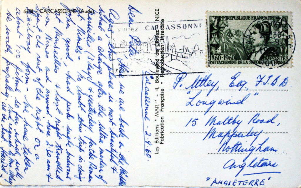
Aside from the 8 postcard backs which I have chosen to print (in my previous post) I will also be printing the following 16 photo-montages in postcard format. Through this project I have created nearly 50 variations of photo-montages which successfully meet my intention of symbolising and displaying the connections between Jersey and the rest of the world through trade, tourism, and actually visual surroundings within societies around the globe. Posts will follow this looking at how I will display these 24 postcard prints. Here are the 16 photo-montage prints which I have chosen, followed by an evaluation of why I chose these specifically.

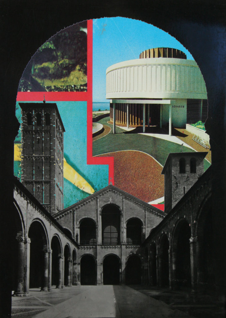
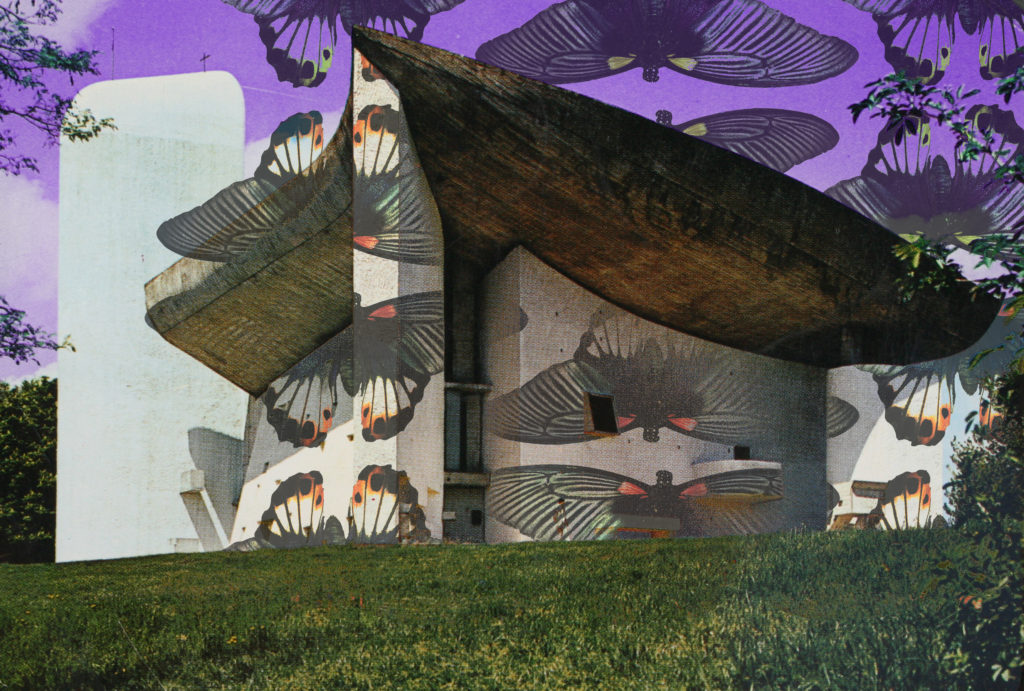


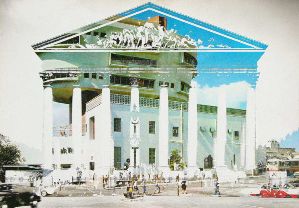


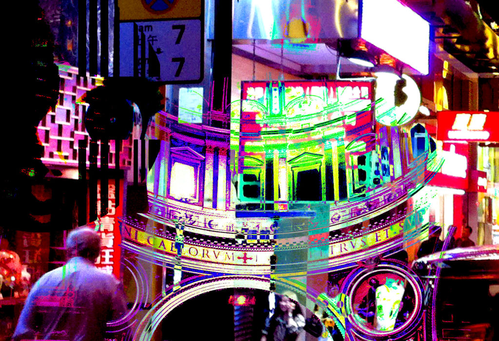
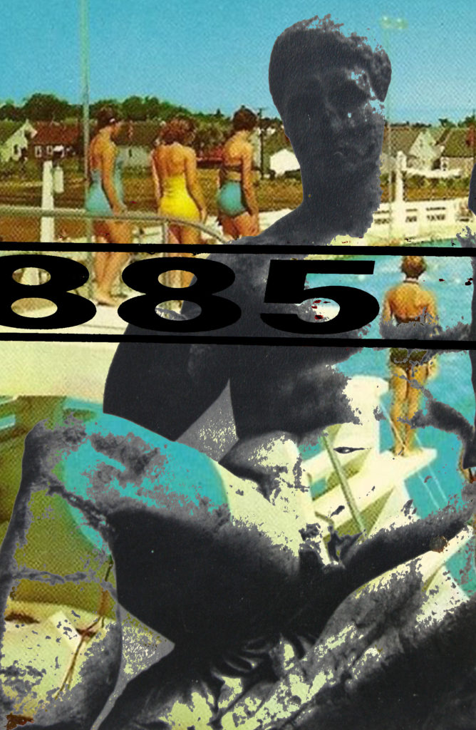
Out of all the photo-montages which I have produced throughout this ‘Variation and Similarity’ project I have chosen these 16 above for a combination of reasons. First of all I believe that considering my initial specification which stated ”I will produce photographs surrounding the theme of chaotic imagery. I plan to do this by creating photo-montages, collages and edits in response to the artists and photographers which I have and will research. I am going to relate this work to the issues of overpopulation and capitalism which have and still continue to play a big part in the overpowered development of the world. I will photograph all kinds of things relating to this theme as rather than limiting myself to one specific subject matter this will not allow me to produce pieces with chaos as the main part. These issues of overpopulation and capitalism are something which closely links Jersey with the rest of the world, through trade, immigration, politics and culture. I plan to explore this link and how it has developed over time, looking at the past and how it has become the present. And then how the future may look in terms of these issues. This will be executed by the use of archival and found imagery mixed with my own purposed photographs through means of collage and montage.” That these 16 photo-montages most reflect the initial aim of my project along with showing inspiration from the artists, photographers and movements which I have researched throughout the project. Secondly I believe that they are a good combination of images as there are a range of different formats within them such as some monotone and some colour as well as some being portrait and some landscape. This will mean that the final display doesn’t look too uniformed and will in fact look like a collection of actual postcards which is the look I am going for. Third and finally the most basic reason for why I chose most of these as postcard prints was simply due to the fact that I thought these 16 outcomes were the most aesthetically pleasing and balanced.
Postcard Backs For Final Display
As part of my final display I plan on printing some photographs of the back of the postcards which I have. I have edited the tones within the images to ensure that once they are printed onto matte card and trimmed down to replicate the postcard backs, that the white would show clearly.
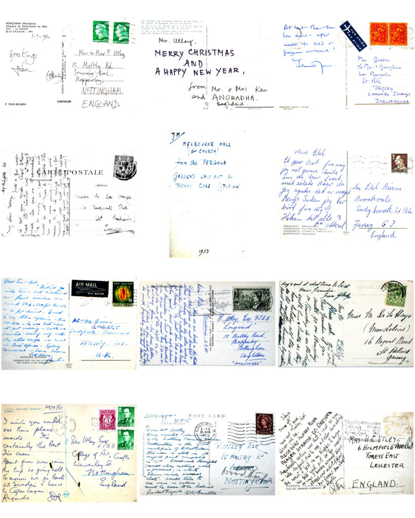
Among the 24 postcard prints which will make up my final postcard display, 8 of these prints will be the backs of the postcards. Here are the 8 final postcard backs which I have decided to use…


Overall I believe that these images of postcard backs are very successful and will help to ensure the classic postcard aesthetic in my final display. They also represent the connection between Jersey and the rest of the world which I have been exploring throughout this project.
Final A3 Print Display (Final Piece 2)
This post covers my second final outcome of the ‘Variation and Similarity’ exam project.

As I intended to do I have produced my A3 print display display which overall I am very satisfied with, I am happy with the fact that following my plan for this display, I have managed to produce exactly what I was planning to. The layout which I planned to use worked really nicely once put upon the foam board, and allowing for a slight overhang of 2 prints which is a nice visual touch. As I said when selecting which photo-montages to use for these prints, it would be a good idea to choose those which contain intricate details since when they are enlarged they will become more visible; something which has effectively worked and went to plan. In my original project specification I stated that I would produce photographs surrounding the theme of chaotic imagery. I planned to do this by creating photo-montages, collages and edits in response to the artists and photographers and movements that I have researched. I said I would relate the work to the issues of overpopulation and capitalism which have and still continue to play a big part in the overpowered development of the world. And that I would photograph all kinds of things relating to this theme as rather than limiting myself to one specific subject matter this will not allow me to produce pieces with chaos as the main part. I also went on to state that these issues of overpopulation and capitalism are something which closely links Jersey with the rest of the world, through trade, immigration, politics and culture, planning to explore this link and how it has developed over time, looking at the past and how it has become the present. And then how the future may look in terms of these issues. This would be executed by the use of archival and found imagery mixed with my own purposed photographs through means of collage and montage. And overall in terms of how I believe this final display has come out I would say that I am confident in the fact that I’ve closely followed my specification and plans in order to produce something which reflects this to a full extent, along with my postcard display.
Final A3 Print Display Plan
As I made evident and described in my previous post I have decided that I will compose 6 A3 prints of my Photo-montages. This post will be a plan of how I intend to display these prints. So firstly I needed to lay out some simple compositions of the images which I intend to have printed to scale. Here are the 5 options which I have come up with…


After laying out these compositions on Photoshop, I decided that simply based on what I believed to be most aesthetically pleasing that I would pursue option 4. However I have various options as to how I could display these prints such as many ways of: Framing, mounting and foam board. However after ruling out framing as an option due to the fact that it would over-complicate the display, from mounting or foam board I have decided that I will create a layered foam board display.

I intend to have each print on its own piece of foam board to the right dimensions, and then proceed to use double sided tape in order to attach the 6 prints to 2 full sized boards of foam. These two boards will be held together using support pieces of foam taped across the back of the two boards.
Final A3 Prints Selection
As well as my postcard display I have decided that I would also like to make an outcome of some larger A3 sized prints. My idea behind this is that it will show some of the finer details within my photo-montages which may be harder to see in the postcard format. 6 of these prints would be a good idea as I believe threes work nicely in a layout so as a multiple of 3 I think 6 prints will be will be overall aesthetically pleasing. Therefore I also want to have 3 portrait prints and 3 landscape prints as this will balance out the composition of the display. The 6 photo-montages which I have chosen to print in the A3 format are ones which have a lot of intricate detail which I feel like will look great once scaled up. Here are the 6 which I have chosen…
In a following post I intend on planning how I will display these prints as a final outcome.
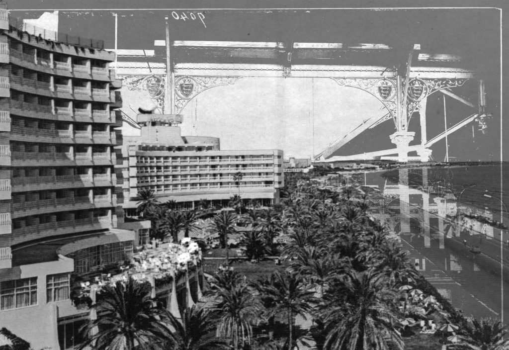
Black and White Experimentation / Image Analysis
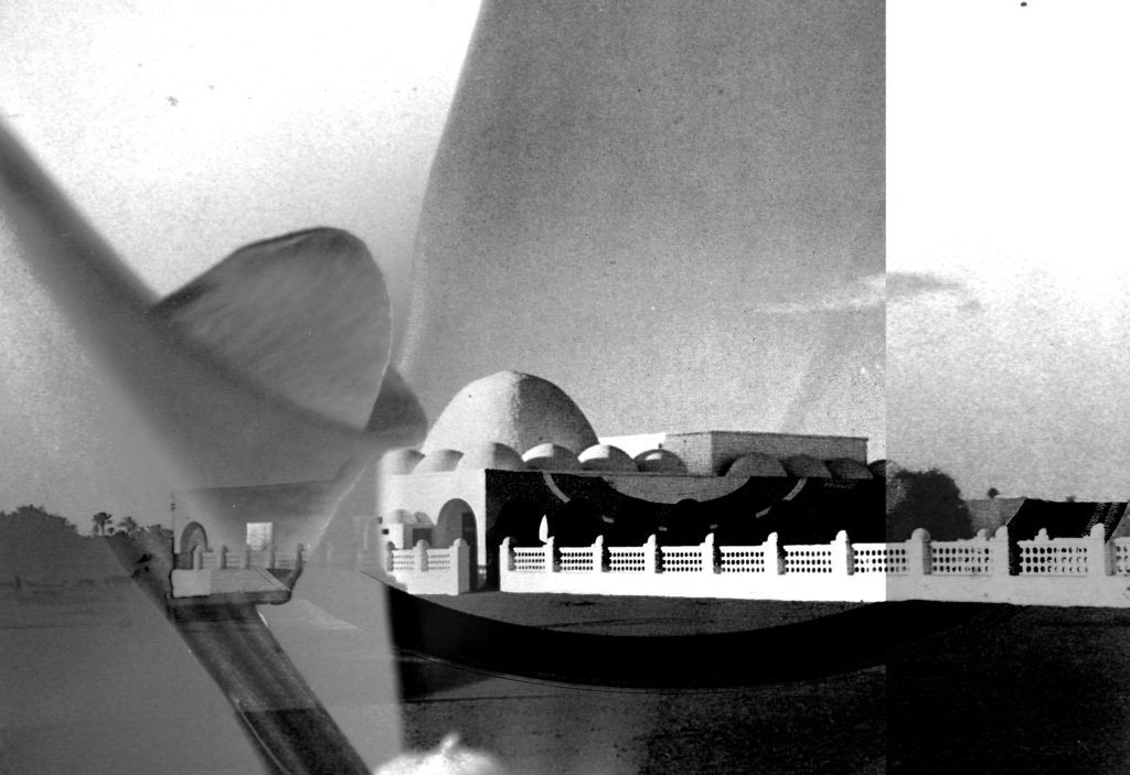
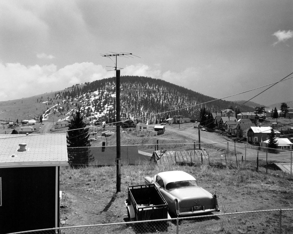
After continuously producing photo montages that are coloured I decided to do some monochromatic experiments, some completely new and some modifying montages which I have already made. I personally believe that these experiments are great in terms of how they show shape and form, as removing the element of colour allows for more focus on the simple elements of each piece. I also believe that with reference to romanticism and the new topographics, with photographers such as Ansel Adams and Robert Adams; that these pieces which I have produced give a great sense of depth and drama. Here are some examples of Romanticism/New Topographics which I am refering to…


I also feel like due to the chaotic photo-montage aesthetic, that once in black and white these pieces have a sense of mystery and the unknown. Here are all of the black and white experimentation which I have done, a few of my favourite experiments are followed by a description as to why I believe they are successful…