Overall, I feel my project has been an interesting and alternative insight into the diversity of the natural world and how zooming in on nature up-close can reveal it’s intricate sublime beauty. ‘Nature’ is a broad spectrum but I wanted to capture as big a variety of photos I could. My four categories of ‘trees’ , ‘natural forms’ , ‘cloudscapes’ and ‘water’ helped me establish a plan of what I would photograph on my shoots. Below, are my final prints framed up. The materials I used to help me frame my final pieces include: stanley knife, bevel cutter, black card and memory foam. For my images of high contrast and clarity, I felt the black card background mounted the photographs well, and the solid black put emphasis on the areas of light in my pictures. For my primary source images that were brighter and less heavy, I felt the white memory foam was a good backdrop as the white contrasts with the shadows and tonal differences in my pictures. The memory foam also gives my photographs a three – dimensional feel in comparison with the thinner, flat card.
I have decided on 4 final photographs for my project. Each one of shoots were different in subject focus i.e. light, water, green, trees, and were inspired by a varied host of artists and photographers. My final outcomes and edited photographs from each shoot vary distinctively from one another, but are all still interconnected by nature. My project aim was to look at the variation and similarity within nature, so I categorized my shoots into nature topics that I felt would allow me to look at nature from multiple viewpoints . I focused on capturing texture, line, shadow and tone in my capture points. I looked at multiple artists and photographers for each category of nature, allowing me to have a spectrum of photographs inspired by a collection of different photographers.
Final photograph 1:
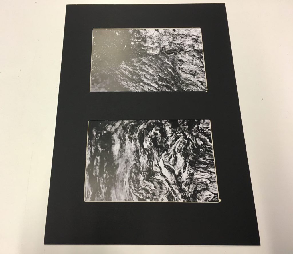
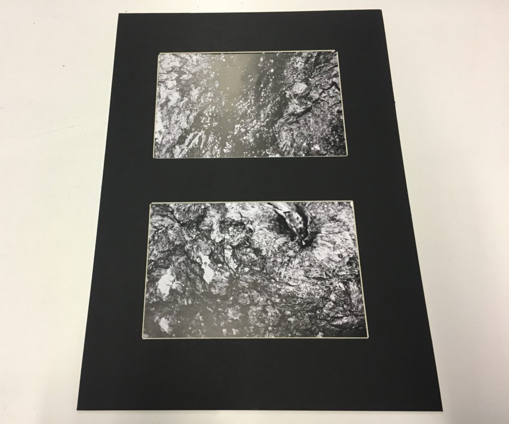
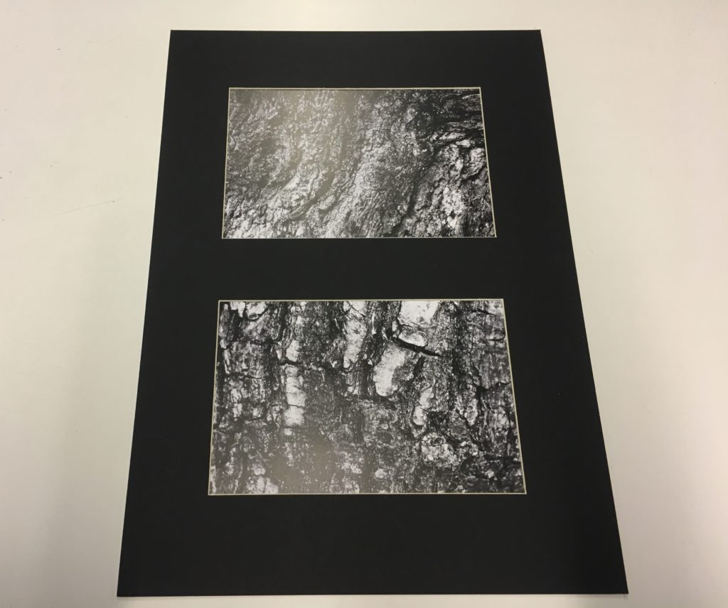
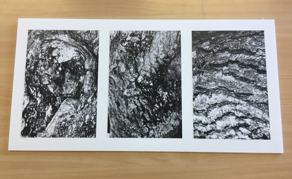
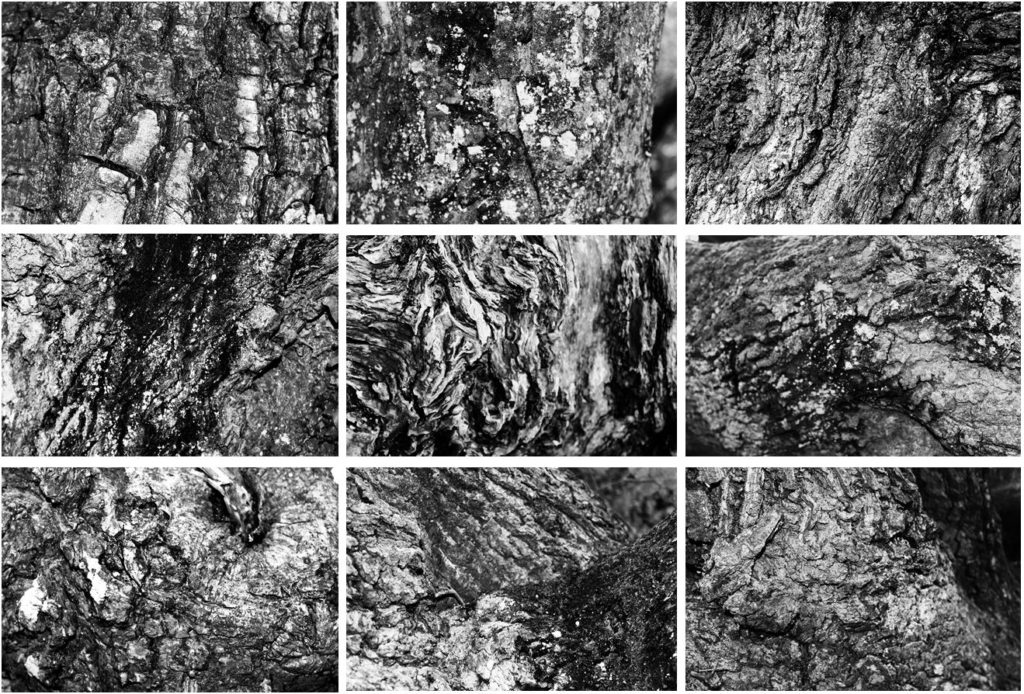
My first final photograph is from shoot 2, focused around ‘trees’. I aimed to look at trees from afar and very up close to capture the intricate detail and patterns of the tree bark. Final photograph 1 is a capture of 9 images arranged in a grid format, all of different angles and captures of numerous trees up close. I chose to arrange my photographs in this format as inspiration of Bernd and Hilla Becher who specialized in typologies and presenting multiple images of similar nature. All photographs from this shoot were edited into black and white individually as I felt the strong contrast of white and black, with shades of grey intertwined really emphasizes the tonal contrasts and shadows of my photographs effectively. My camera allowed me to present the complex detail of each curve, piece of moss, shape, bump and indent in the tree. I felt this linked back well to the idea of variation in nature as although each tree may look similar from afar, from up-close, it is evident that the detail differs greatly.
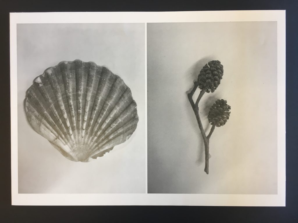
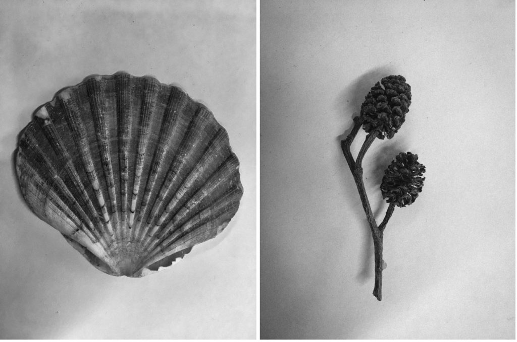
Final photograph 2:
My second final photograph is from my second photographic shoot: natural forms. This photograph was taken in the style of botanical photographer Karl Blossfeldt. I photographed alternative natural forms as shown below rather than just flowers as I felt it was something different. I edited my images into monochrome and added ‘clarity’ and ‘sharpness’ to my images to emphasize the detail and tonal differences of the forms.
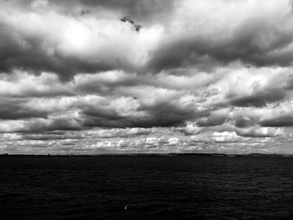
Final photograph 3:
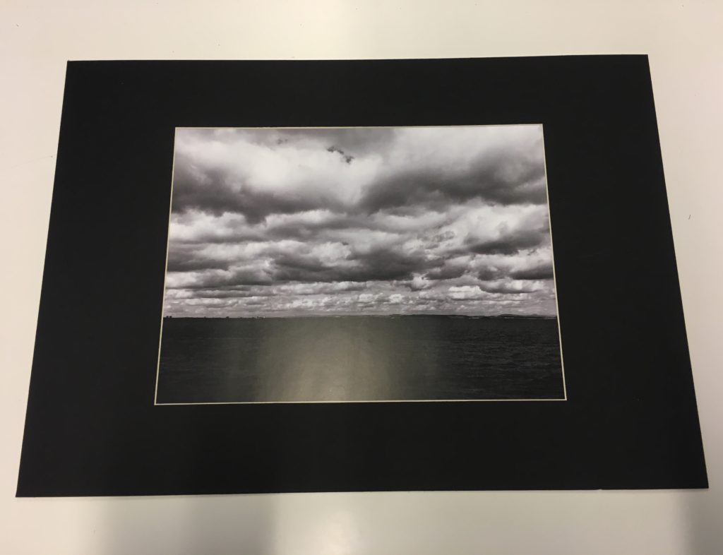
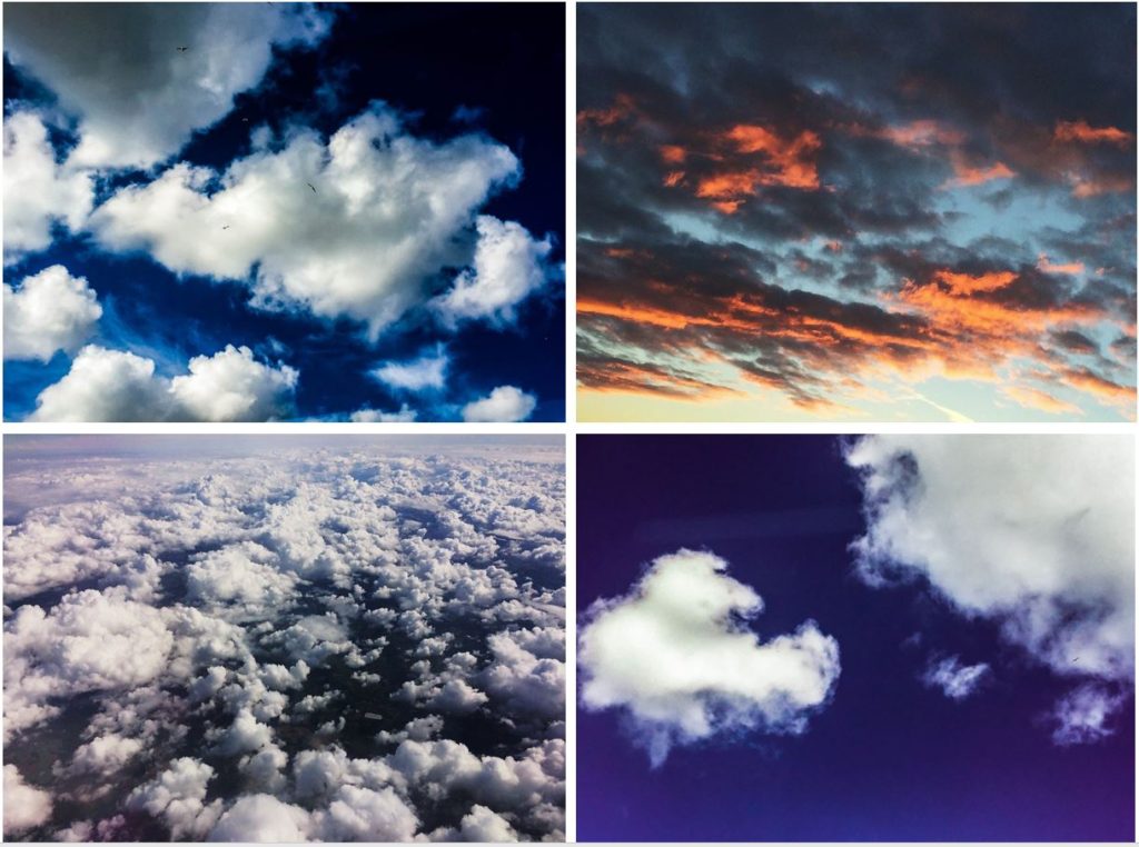
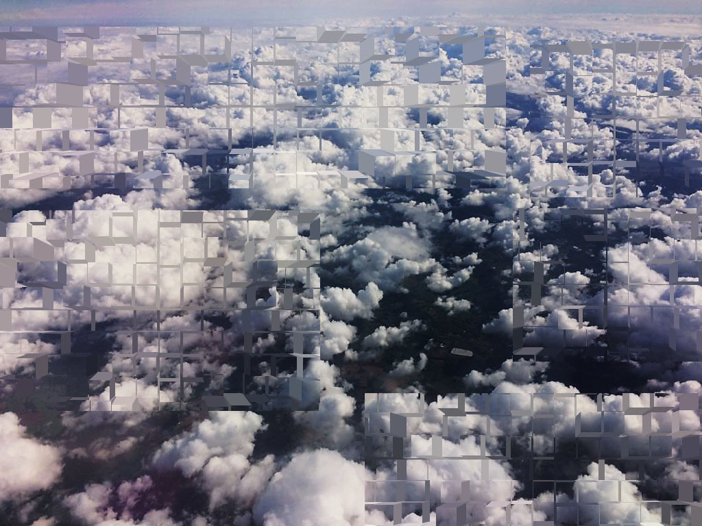
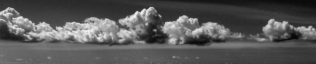
My final photograph 3 was taken in shoot 3, in response to cloudscapes. In this shoot, I took photographs in response to Alfred Stieglitz and John Day, two photographers with a very different visual style. This particular photograph was taken and edited by inspiration from Alfred Stieglitz’s Equivelents.Equivalents looks at dramatic black and white cloudscapes, an alternative viewpoint to many other photographers who photograph the sky in heavily saturated colour. In order to respond effectively, I edited this photograph in Lightroom CC, turning it into black and white then increasing the ‘contrast’, ‘clarity’ and ‘shadows’ to how I saw fit. This worked well and presented the billowing clouds as heavy and the image as very dynamic and bold. Cloudscapes can be looked at in many ways, exploring the serene and calm aspect of nature, or opposingly nature’s stormy and tempestuous character.
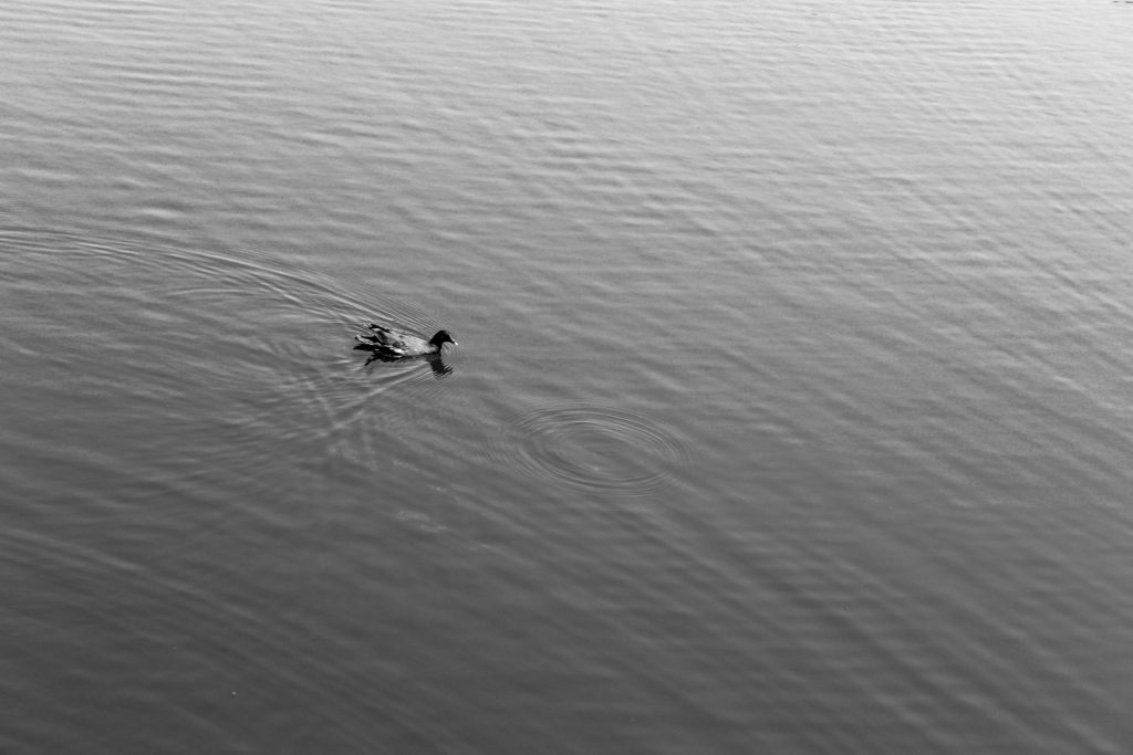
Final photograph 4:
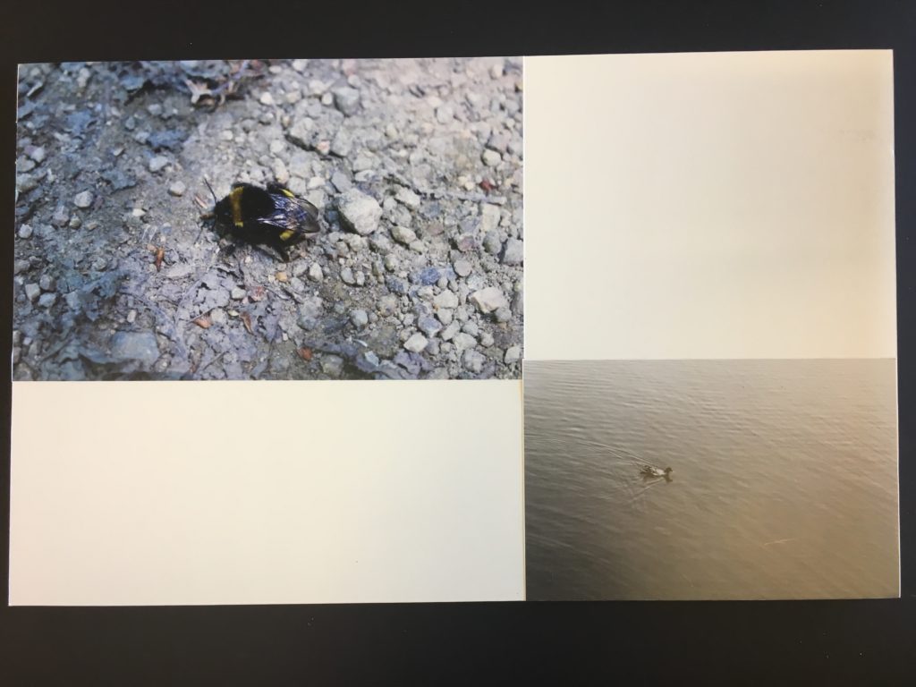
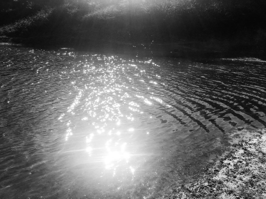
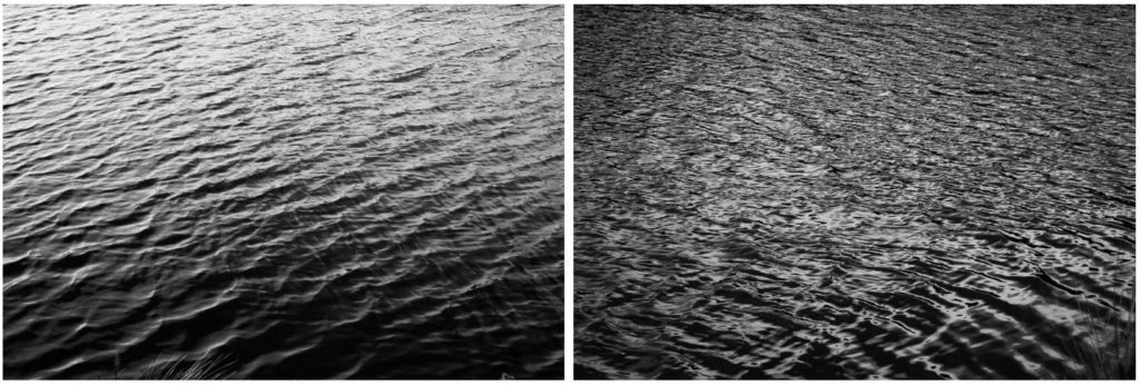
My 3rd final photograph comes from shoot 4, focused on the subject of water. I looked at Hiroshi Sugimoto’s work before this shoot, inspiring my style of response. This photograph looks at nature in an alternative way to my other photographs. This image is very simplistic and strips nature down to it’s most basic form, exploring the serenity and tranquility of how wildlife and the landscape come together to produce basic yet beautiful sights. There is little movement displayed in the water, only one single circular ripple where a raindrop has hit the water.
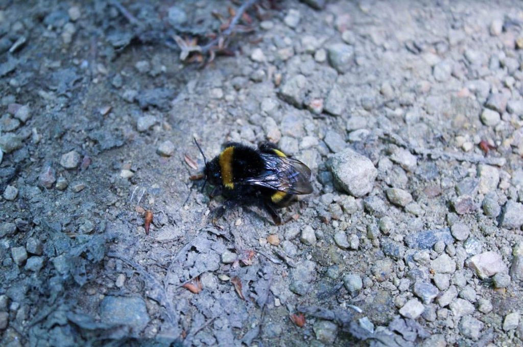
Final photograph 5:
My second final photograph is from shoot 5, responding to Rinko Kawauchi. I got up-close to a bee to capture a very zoomed in look at nature’s produce. I aimed to capture the bee in detail, from it’s vibrant yellow colour, to the detail in it’s wings. The bee is the obvious main focal point of this photograph, situated centrally in the image; it contrasts well with the simplistic background of small rocks and stones.
Coming towards the end of my project, I have started to think about final presentation ideas. I have come up with the idea of full-size prints, grid format, photo collection and photobook. I will definitely present at least one of my final prints alone and full-size. Full-size prints are a good presentation method for strong composition and visually interesting image. Pictured below are two photographs I feel I could present alone, however this is not certain as I am still to finalize my favourite prints. I may mount my photographs onto card or use spraymount to stick them down and present them.
1.
2.
Grid format:
I like the idea of using grid format to present multiple of my images at once. Grid format is a good idea for images that aren’t very visually strong presented alone. I have exprimented with this grid format before my final exam to test the idea, presented below. I think the grid format works well as I am able to show 4 of my images in one collection, images that are interconnected and are all brought back to the idea of nature.
3.
4.
5.
6.
7.
Photo collection:
Photo collection is similar to the grid format, but I am able to place more or less than 4 of my photographs together and in a different style i.e. side by side or one below another. Again, I have experimented before the exam with numerous primary source photos below. I am happy with my edits and think my individual images work well together.
6.
7.
8.
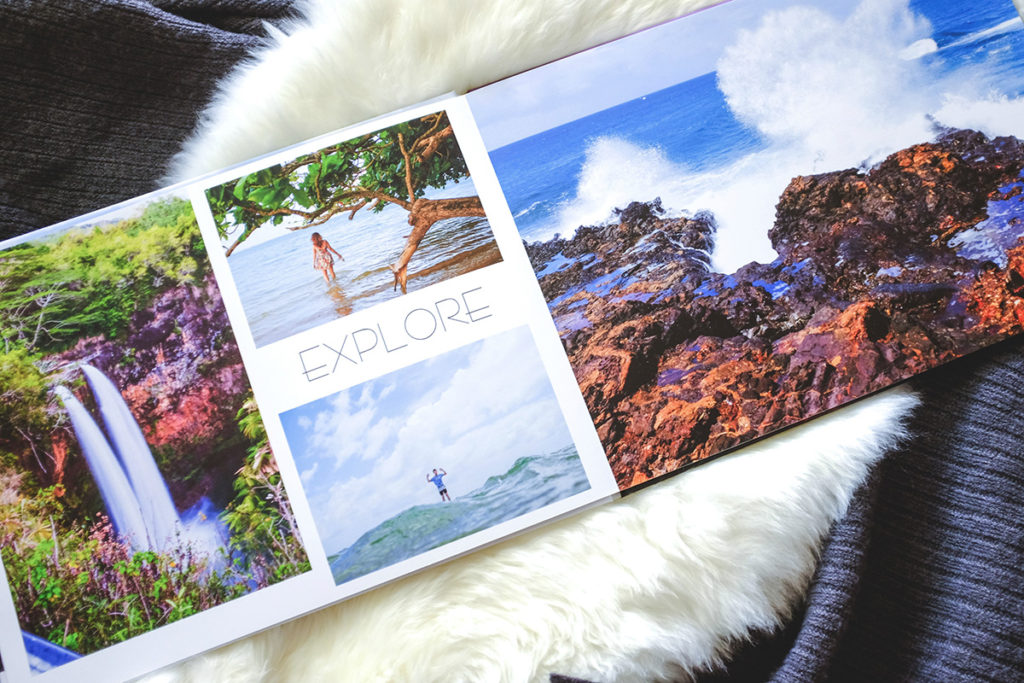
Photobook:
A possibility for presenting my final prints is by photo-book. This is a relatively lengthy process however the final product would be a successful way of presenting the different categories of nature and my wide variety of photos. If I am to create a photobook I would create it using Blurb and Adobe Lightroom CC.
Letha Wilson is a mixed media artist who was born in Honolulu, Hawaii, raised in Colorado, and currently lives in Brooklyn, New York. Letha Wilson is known for combining photography with industrial materials like concrete and steel. Wilson cuts, tears and shapes her photographs, pushing and pulling the prints into place and then encases portions of the composition in cement. Using architecture and three-dimensionality as both frame and armature, Wilson reclaims the photographic image, exploring the medium’s inability to encompass the site it represents.
“MY ARTWORK INVESTIGATES RELATIONSHIPS BETWEEN ARCHITECTURE AND THE NATURAL LANDSCAPE, AND THE NAVIGATION OF BOTH URBAN AND WILDERNESS SPACES.”
Felicity Hammond is an emerging artist who works across photography and installation. Fascinated by political contradictions within the urban landscape her work explores construction sites and obsolete built environments. In specific works Hammond photographs digitally manipulated images from property developers’ billboards and brochures and prints them directly onto acrylic sheets which are then manipulated into unique sculptural objects.
“THE WORK DOESN’T JUST COME OUT OF MY IMAGINATION. IF I AM GATHERING ALL THESE IMAGES AND RETURNING TO THESE LANDSCAPES AGAIN AND AGAIN, I’M ENGINEERING THE OUTCOME THAT BECOMES HYPER-REAL. MY WORK DEFINITELY COMES FROM MY MEMORY, AND THE SIGNS AND SYMBOLS I CREATE; A SPACE FOR MOURNING, TRAGEDY AND MORE.”
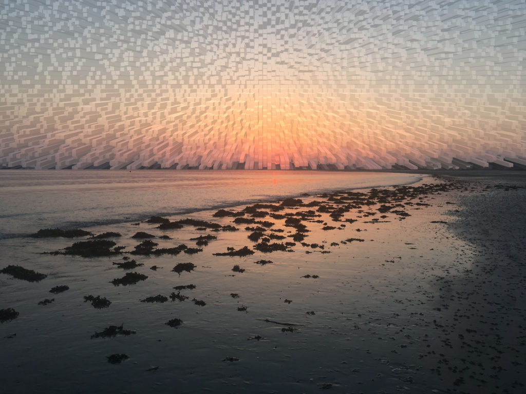
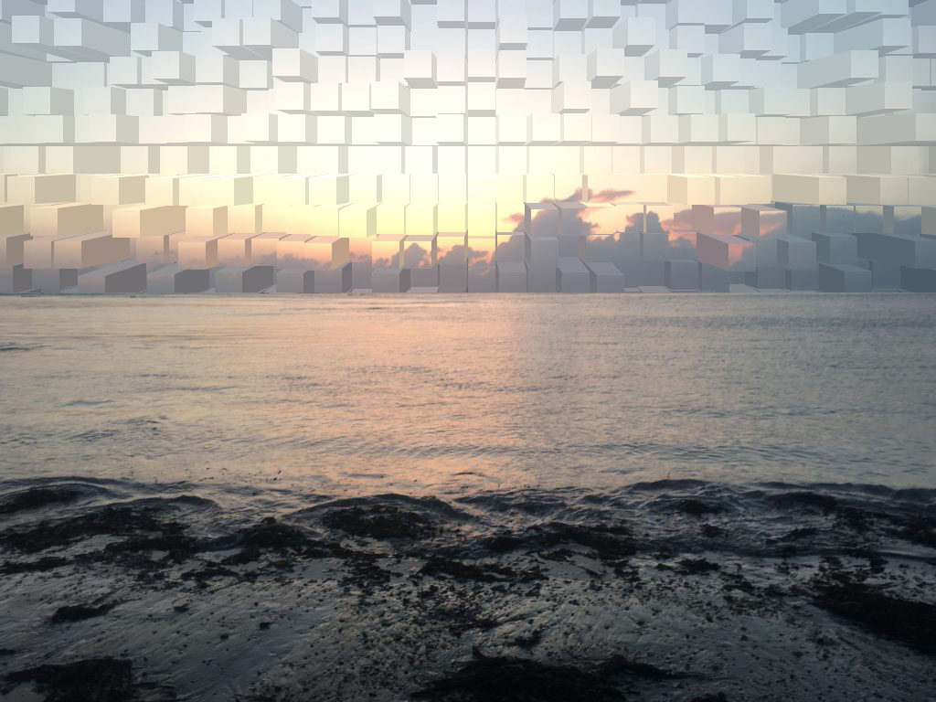
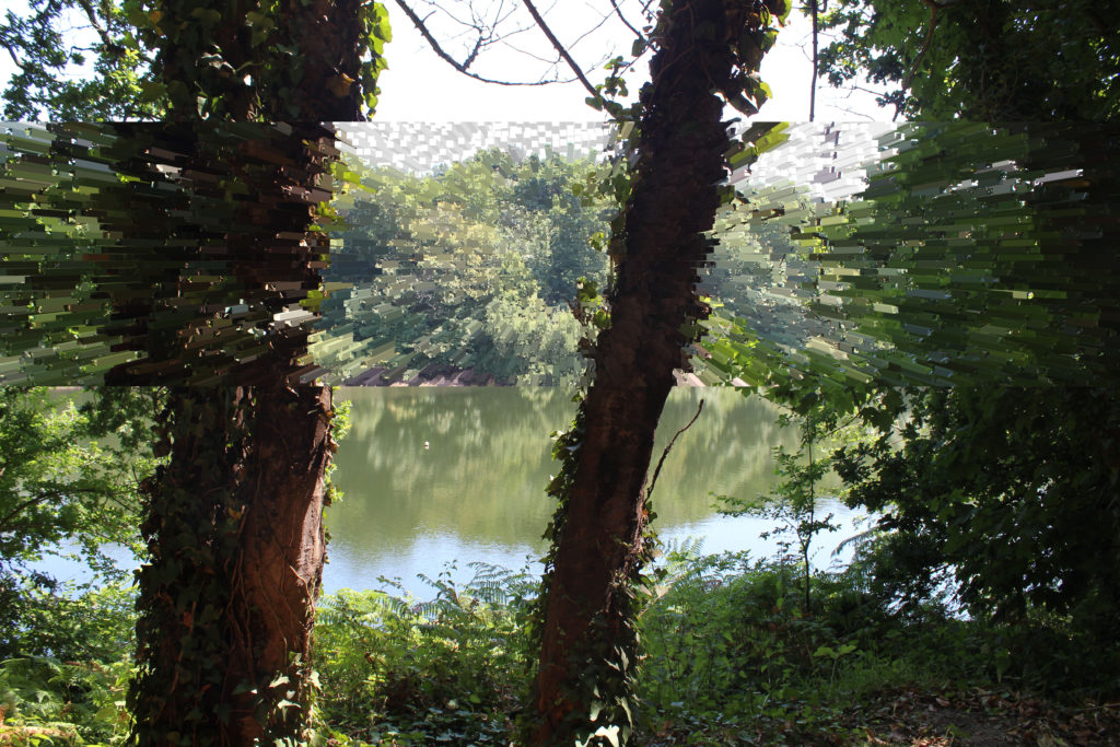
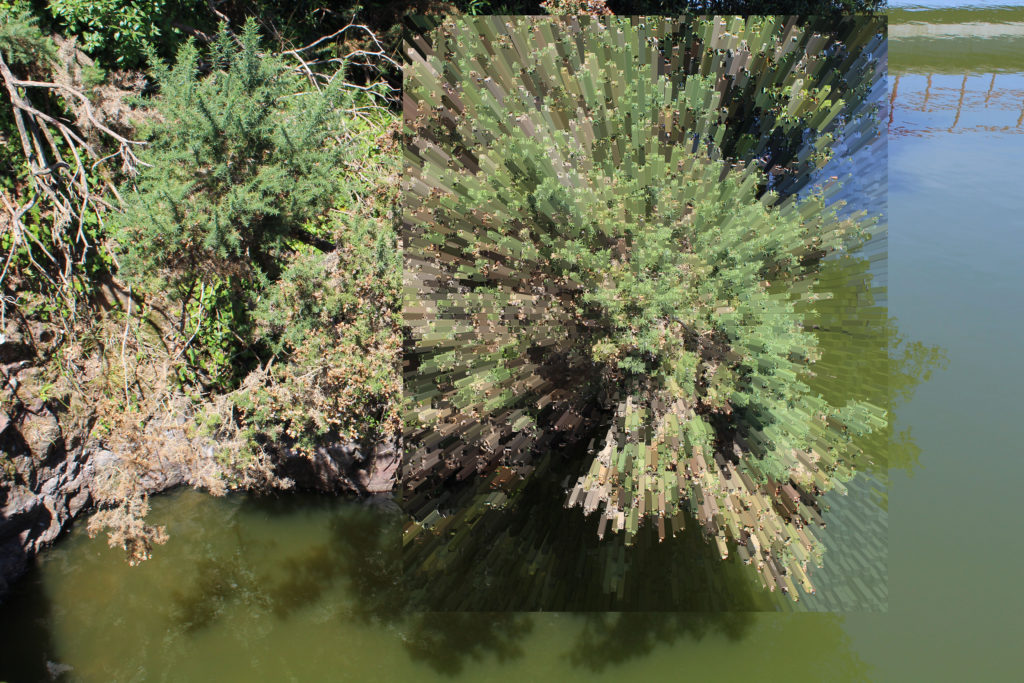
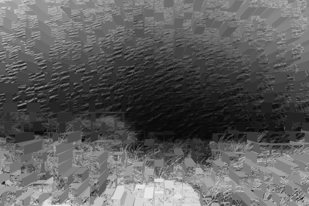
As part of my experimentation stage, I have taken a number of my own images and experimented with editing them in Adobe Photoshop. I have used the ‘extrude’ tool, which has split my photographs into geometric shapes. I found this to be interesting as it portrays every pixel of colour in my photographs individually in shape form. This tool also gives my images a sense of movement and dynamism which isn’t achieved in a usual still photograph.
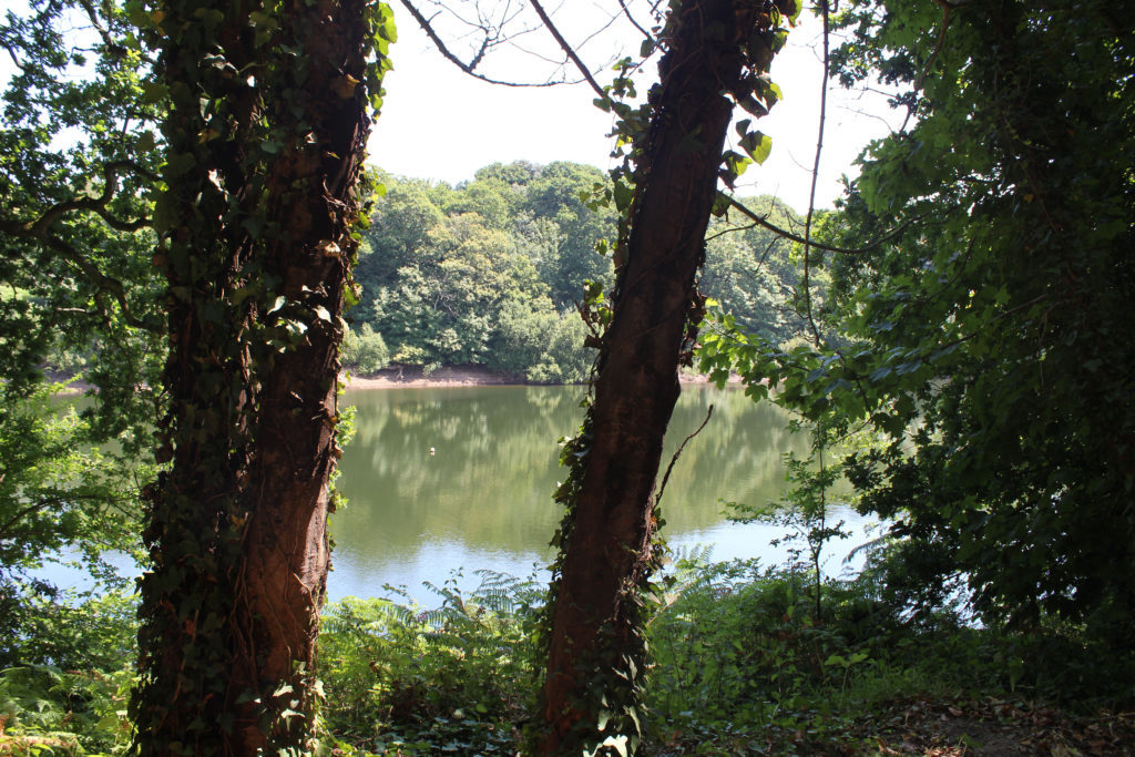
I really like my image below, taken in Shoot 7. There is a lot going on in this image, split up by the tree structures in the foreground. From subtle, pale shades of green to darker, prominent shades, my image captures the wide spectrum of colour contrasts in nature and how this presents the most sublime landscapes. Due to high camera quality and prime time of light exposure, I was able to photograph the intricate detail of the landscape; from the reflection in the water to the outline of each individual tree in the background and leaf in the foreground. This image was taken at Queen’s Valley Reservoir. The reservoir has a natural wealth of flora and fauna and is home to many species of birds and wildlife.
Image 2:
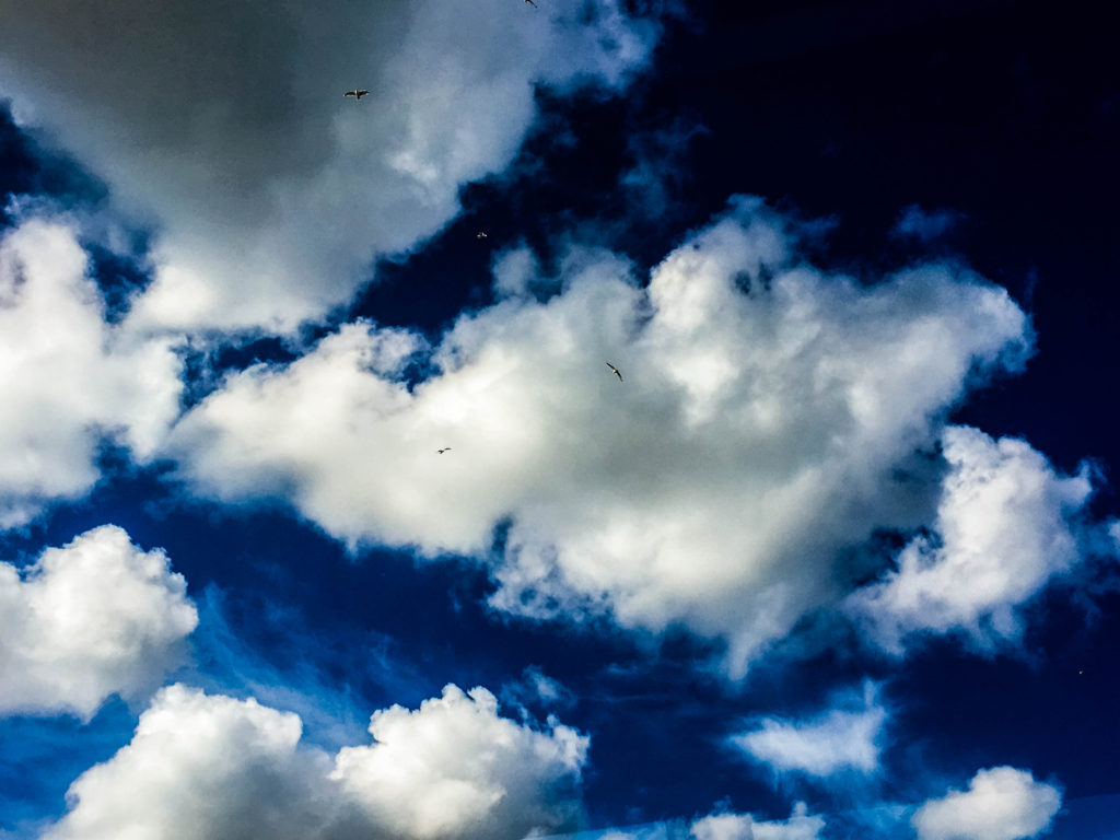
This image was taken in Shoot 3, based around cloudscapes. This particular photograph was edited in response to the photographer John Day. Day heavily edits his photographs of cloudscapes to emphasize the cloud outlines and bold colours of the sky behind. In order to respond effectively, I edited my photograph in Lightroom, increasing the clarity, contrast and vibrance to get an unusual capture of the sky above. The small-scale seagulls scattered in the photograph emphasize the immense size of the clouds.
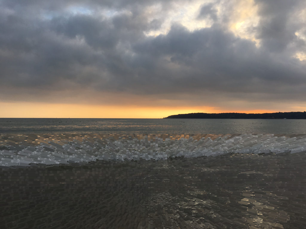
Image 3:
The composition of this image differs from my other large-scale format photographs. I thought a panoramic picture would be an interesting response to cloudscapes. This image was edited in response to Alfred Stieglitz, a photographer who created a famous series of cloudscapes called Equivalents. I firstly edited it into black and white but thought this wasn’t enough to portray the stormy sky visual I was hoping for. I consequently increased the clarity and shadows of the photograph, which created a more distinct horizon line and contrast within the separate clouds.
Image 4:
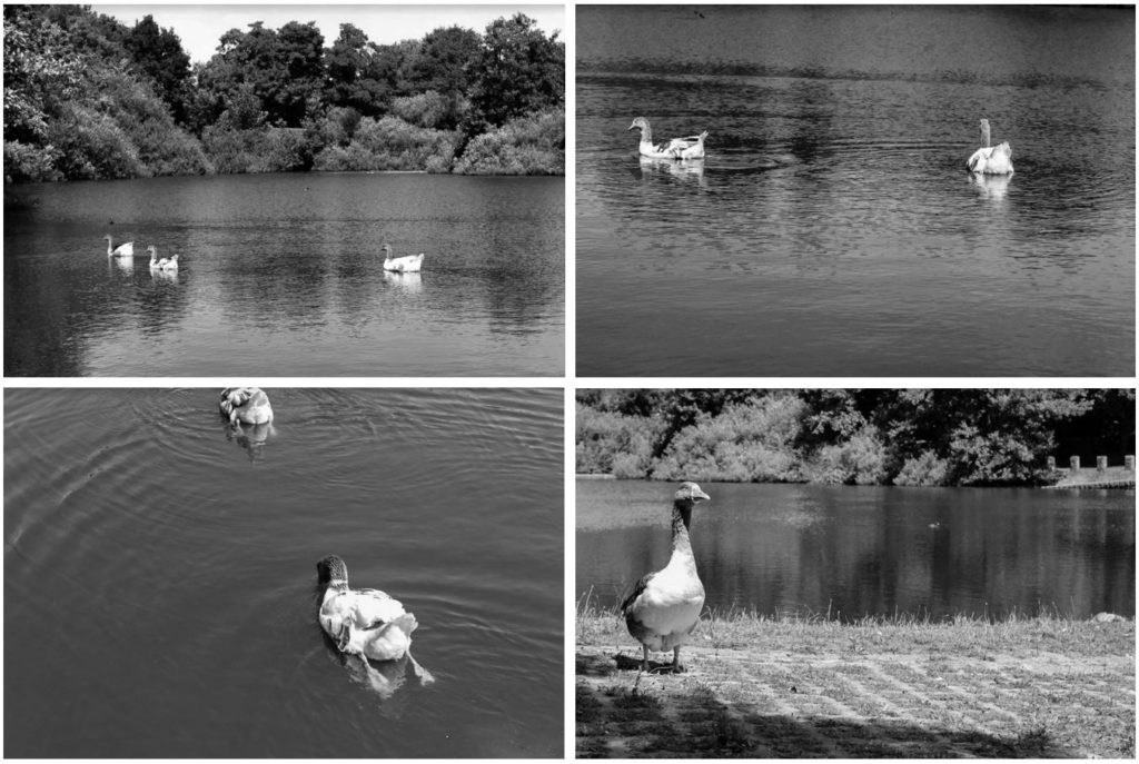
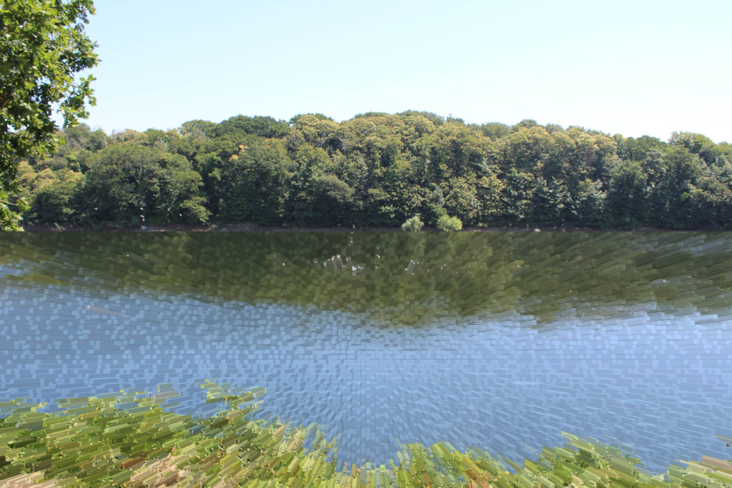
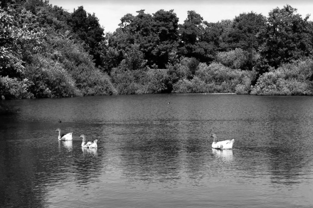
Another black and white edit taken at Queen’s Valley Reservoir, I have captured the water and 3 geese int the foreground, and vegetation in the background. The black and white edit has created clear tonal contrasts of white, black and grey, following Ansel Adam’s zone system. The water is calm, with little visual movement and almost looks like a dry surface with the geese on the surface. This image is much more tranquil and serene compared to image 3, an element of nature I wanted to capture.
In order to further develop my photographic investigation into diverse nature, I have decided to analyze 5 of my primary source images. I have chosen one image from shoot 8, one from shoot 7, one from shoot 5 and another two from shoot 6.
Image 1:
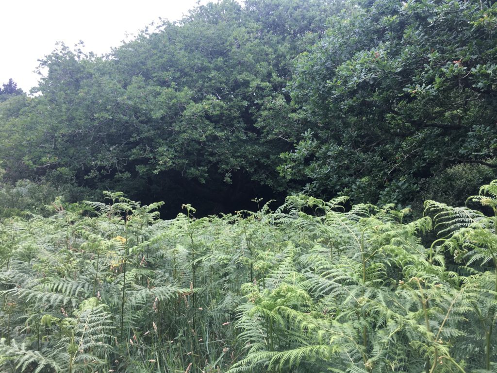
This image was taken in my response to the colour ‘green’, shoot 7. Although it incorporates clear evidence of vibrant shades of green, it also exhibits a range of other colours and tonal contrasts. As this project I am focusing in on the beauty of nature and zooming in on how nature can produce such unique and wonderful structures and forms, I thought this was a perfect capture. This product of nature represents how zooming in on seemingly simple and everyday things can be surprisingly interesting. Each leaf of this plant is different, from pattern and shape, to size and colour. The striking pinks, greens, yellows and reds all come together to portray a energetic and dynamic picture of nature close-up.
Image 2:
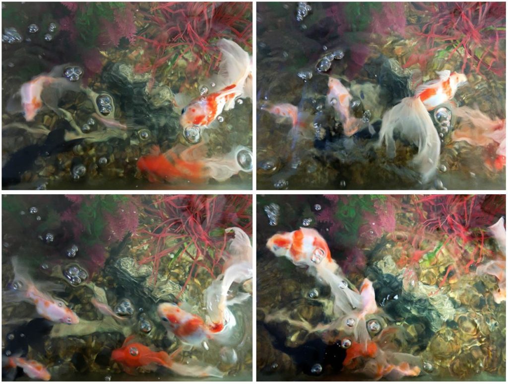
I like this image as it is fairly abstract and unique to my other primary source. I took this from a birds-view point at the top of a fish bowl, for a different perspective. The combination of the water and movement of the fish, has created a blurred effect. This photograph is unedited and original, despite it looking altered. The flamboyant orange colour of the fish contrasts with the paler background, and the three-dimensional bubbles above, on the surface of the water.
Image 3:
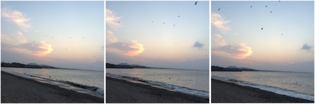
This photograph was taken in shoot 5, responding to the works of Rinko Kawauchi, a sublime photographer who uses light to her advantage to capture the basic beauty of the world, au naturel. I really enjoyed this shoot as I came out with a large collection of successful images resembling hers. This particular photograph was captured at St Ouen’s Bay, towards the end of the sunsetting. It is a relatively basic image, but has clear composition and a split horizon. The top of the horizon has a subtle orange glow, fading into the blue of the sky and ocean below. At the bottom of the horizon, the waves fan out into the sand in opposing directions. Due to the time of capture, this image is fairly underexposed, giving the photograph an alternative feel than nature’s usual colourful and bright visual.
Image 4:
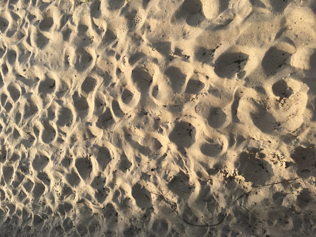
Taken in response to natural patterns, this photograph is clearly evident of natural texture and shape as a result of natural processes. Taken along a coastline, my image shows the layering of rock and the interesting form it has created. The sand has been eroded through wind, waves and erosional processes like abrasion, furthermore allowing me to witness the end product of nature’s ways. The sand fades into the dark, murky water, becoming less intricate and distinguishable towards the top of the photograph. The light was prime at the time I captured this, the sunlight giving me full exposure of the detail of the sand and rock, displaying each individual line and curve in all its beauty.
Image 5:
In this image from shoot 8, I have focused in on the element of light and how it interacts with nature. I’ve captured the sunlight hitting the water, creating a beam of light on the sea surface. The pale yellow light glows on the dull water, radiating the waves and movement of the water.
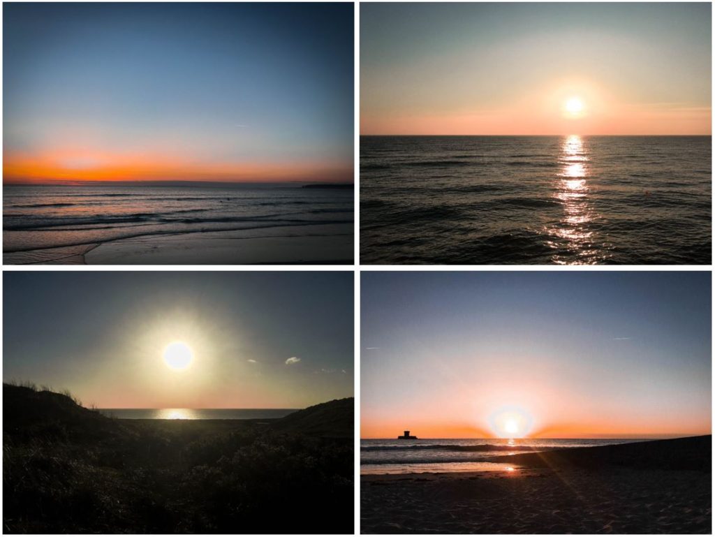
My 8th photographic shoot is based around ‘light’, an element of nature. I have captured the sunrise, the sunset, golden hour and full exposure light in this shoot to capture light during different periods of time.
Golden hour: In photography, the golden hour is the period of daytime shortly after sunrise or before sunset, during which daylight is redder and softer than when the Sun is higher in the sky. The opposite period during twilight is blue hour, just before sunrise or after sunset, when indirect sunlight is evenly diffused.
Green is often associated with nature. I thought it would be an interesting angle to complete a photo shoot based around solely the colour green. Photographing in the field, I have looked at a range of sceneries, all linking back to my theme of diverse nature. In order to capture a variety of images, I had to complete my photo shoot over the space of multiple days and a number of locations. I have increased the contrast and saturation slightly on the majority of my photographs, in order to emphasize the vibrant colours and shades of green. I am very happy with my outcomes of shoot 7 as I have a variety of photographs that differ in terms of subject focus and visuals but are interconnected by the colour green.