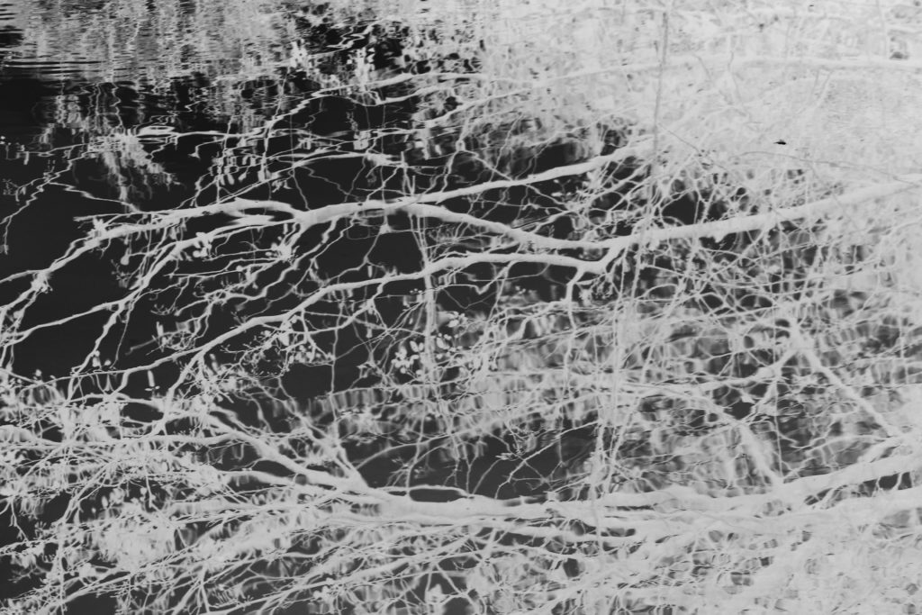
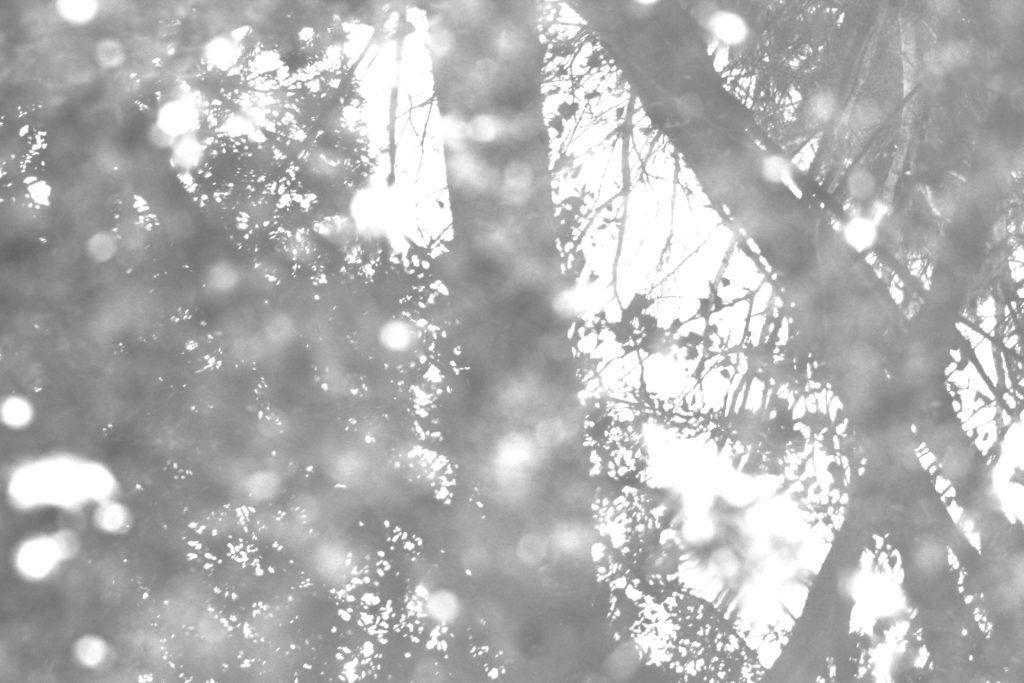
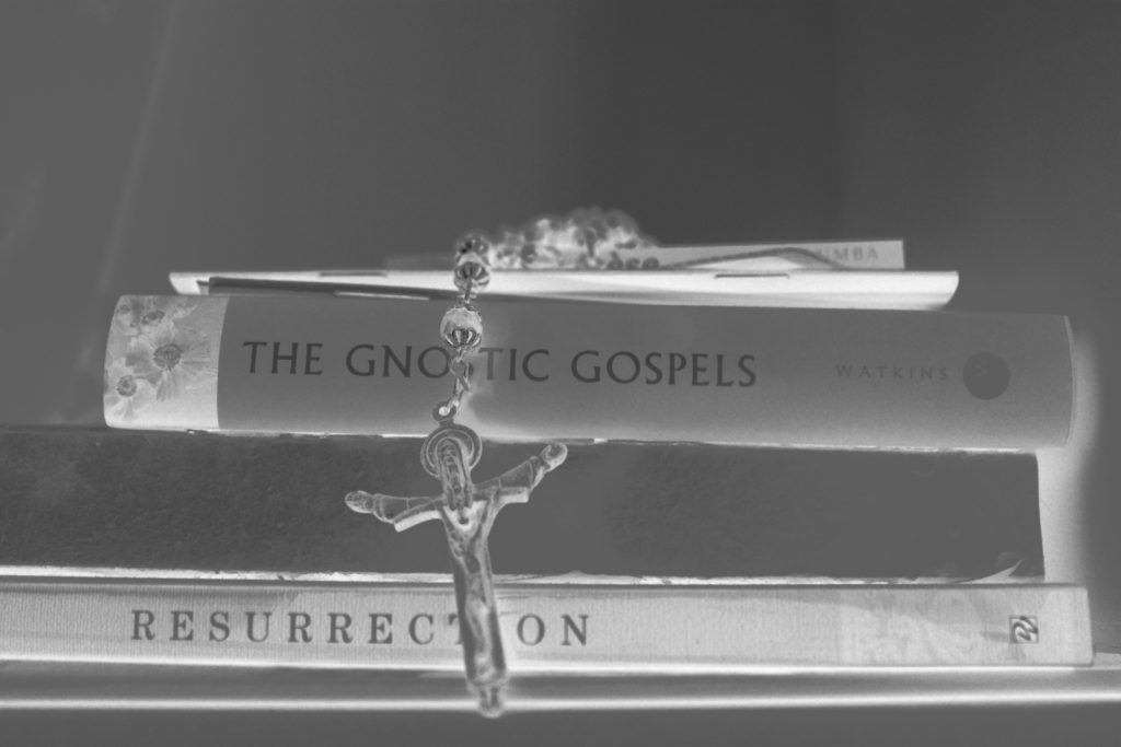
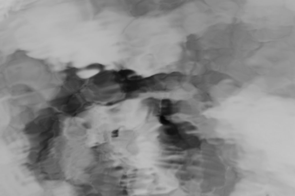
I chose these images as my final prints as I belive they have a narrative effect and also allow a aspect of tranquility within the contrast of the lights and darker tonal colours.

This is one of my favourite images for a few reasons. Conceptually the images clear religious connotations, there is an element of foregrounding and background, highlighting some areas such as the door, creating an indexical symbol to invite and enter the image itself, also demonstrating entering the after life. The clear invert of colours also shows nature having a prominent life, as well as the entry to the life of god. The contrasting texture throughout the image are too very interesting.

I chose this image due to the composition, I like the circular motion of the water mimicked throughout the image, and the central contrast of the lightness of the duck. It to also shows an element of life within the creation of god. The elements of the delicacy of the branches too shows a sense of heavenly beauty. I also chose this image as it is veery similar to one of my theorists images found within Astres Noirs, And I believe this is just an exciting image which clearly conveys the life of nature.

I wanted to use this image, as I believe there is a sense of illuminance and a real concentration of light, differing a very eye catching comparison to the others. To my mind the shapes and dimension too within the piece are very interesting and allow a much more successful literal glow to live, a symbol for prosperity.

This image has a fluidity of movement, and an identity within escapism yet a loss of personal identity. From terms of isolation this is a successful exposure of how you are able to see a figure yet have no personal judgments on the person. It is a significant gesture for that of how we might perceive god and the holy Trinity, the richness of the whites shows too a safety within the figure and an element of reliability. The long extension to the back of the piece shows a possible connection of narrative and character to the rest of the people and so on.

This is my favourite image and will also be the front cover. It reminds me of my previous experimentation within looking at the haiku and beauty within the everyday. I believe the lines and watery mirrored lines, re-creates something quite beautiful. The lines are dainty yet show a strength, there is an essence of purity and life within the image itself. I believe too, though much of the image is white, every aspects you are able to see all the details from within. With this image you would not be able to conceive how this is an element near where you live as it is, something so beautifully composed yet we take for granted. This comes under the creation story and the fact everything is created for a purpose, of unity of life. Due to the lines and heavenly colours I believe the title of ‘ascension’ is applicable as it shows the life of the branch raising above the water and as it connotes to the representation of life and death.

I decide due to my book being loud with large images with volumes of tonal integrity and inspiration of life and chaos, I want an interesting expressive and large way to which I can present my images themselves. My book is going to be a very large square with an image on every page, so I believe the huge effect of this book, needs to be mirrored with an innovative presentation. After looking at the artist Batia Suter, she prints off many of her images and sticks them across walls for her final presentation, without a frame to keep the feel to her work. I belive this too could be an interesting presentation for my work, However, Due to my not having available gallery space, their is no where that would be readily available for me to stick my work all over the wall. A similar theme I could use, Is printing off many large prints, and sticking on another to large A1 boards and creating a . large abstract narrative story telling piece. My second idea, is to print off every single image I have and create a window frame boarded with small pints showing the same narrative construct of my book itself, although this doesn’t have the huge size per image, it does have the effect of amount of imagery used.

Above is the type of presentation of my images I want, I believe I will print off 9 sets of three images each for my final all on A3, I will then apply foam board to the back of the images to make them come off of the wall slightly. I will see if there is a way I could get a large space to present my wrk here in school, if not I will find a space closer to home and create the presentation from there. I believe it is important that I do this as it goes with the narrative of my book, the size is the best way to see these images, and it shows an element of innovation to my project. I cold also expand this presentation idea to painting on a very large surface ad diving just one image up to around 6 parts, and do this multiple times for a more abstract feel. Below I am going to show the three rows of three an demonstrate which images I could have placed next to each-other.


