I first started off the development of my book with the inspiration of three artists who all used silver and black ink and focused on a abstract and vivid interpretation of the world. I believed all of their books had an essence of life and a narrative journey within them. I started off my shoots for the book by concentrating on the beauty and birth of life itself in a religious manner. I took around 5 shoots inspired by the beauty found within nature, and placed these images at the beginning of the book as this will be the start of my narrative journey. I wanted to place the images next to another which had a contrasting and oppositional colour inversion, so a light and a dark tonal image next to each other, I believed this attracts the same attention to each image and creates a nice flowing narrative to the book itself.
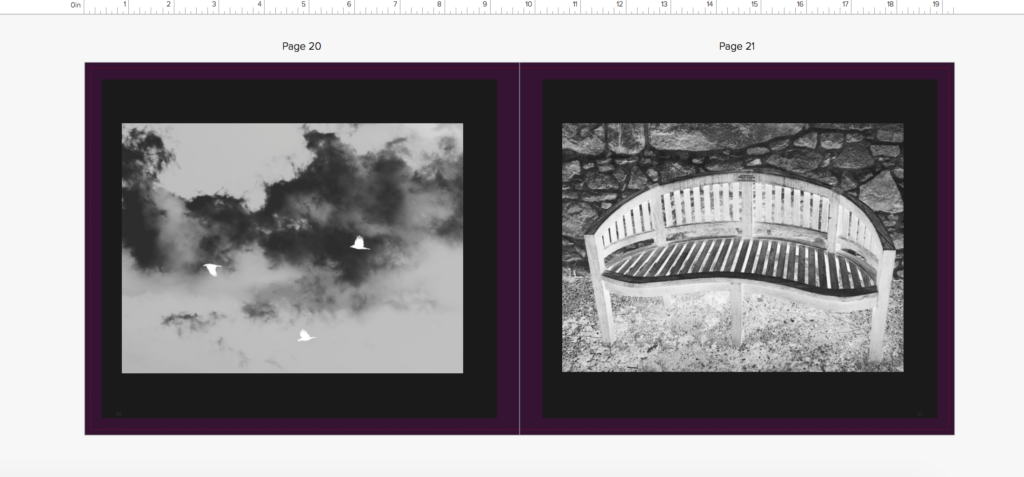
I had soon filled the first part of the book with images of life, I then wanted to show more abstract elements of religion that god was said to create, so showing direct imagery from underwater, animals, and light itself in a more creative manner. I not only wanted to show the world, But too wanted elements of myself to show the human chaos and soon destruction of the world, and the self growth and deterioration throughout the book. As the narrative is about the journey of life of people created and given by god. I decided to add objects which symbolised a life cycle and journey, such as houses, benches and mugs of tea, doing this also constitues a narrative of isolation and loneliness, and presents a sense of abandonment and getting towards the end of life itself. I soon added images from outside and in a church to not only symbolise the end of life, but an evolution of combining the end of life with the original creator itself, reflecting in both the individuals journey of life and religion itself. I also edited the images so they get darker throughout the church imagery towards the end, showing the tonal navigation of light to dark throughout symbolises a pathetic fallacy of death and foreshadowing the gradual end and decay of the book itself,.
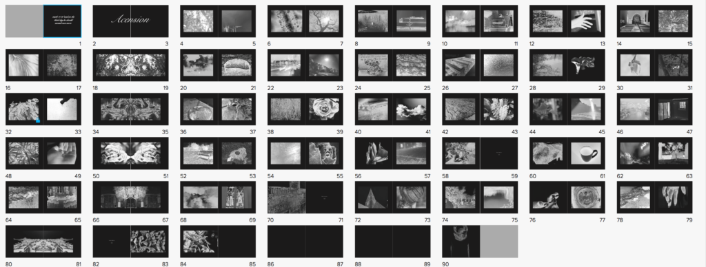
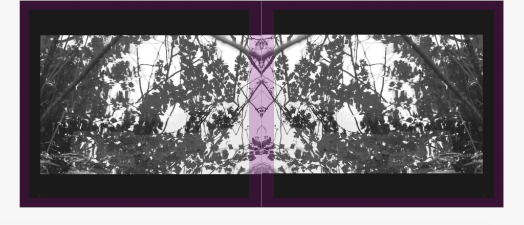
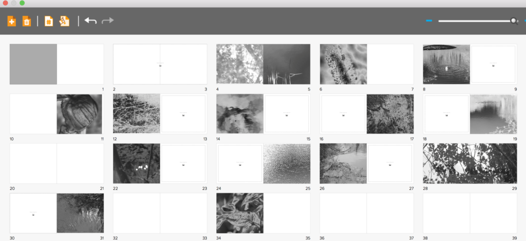
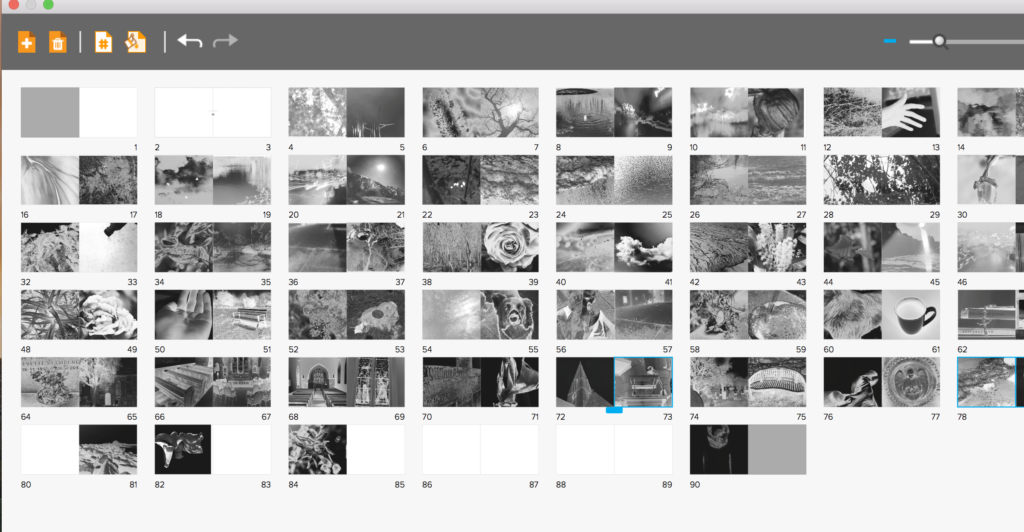
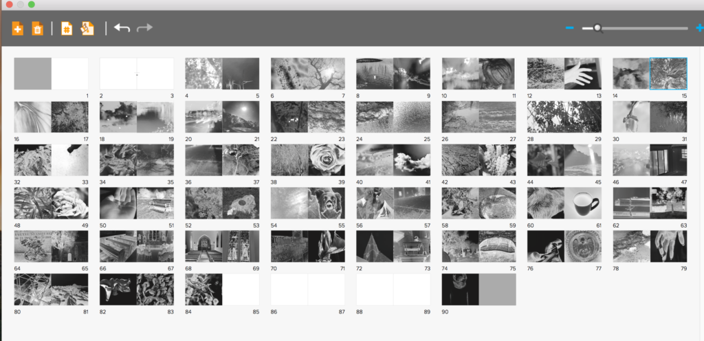
I had soon Finished applying all of the images to the book itself, having both people, nature, objects and a clear narrative both emotional, and chronological. However, after discussing with teachers, we decided to have the book this segregated wasn’t the most successful way in order to show the images, So I re arranged the narrative to show contrasting images, so rarely two nature images are together. I decided I wanted my book to be long in order to have such a strong effect, I also wanted this effect to be heightened by the image on every page always being the same proportion. I believe if you are going to do a book with such a strong concept colour-wise and story wise you need to carry on this strength and not stop the narrative at any-point. However, I thought it would be successful if like two of my artists I showed a continuous black border, which not only exaggerates the colour in the images themselves, but shows a clear narrative colour scheme throughout the book, and doesn’t make the images over-bleed continually on each page. The book itself has the layout of more of lexicon of life, and a clear chaotic feel, as life is not a simple route to the end. I the wanted to show a separating indexical icon throughout, so repeated one image across two pages every 8 pages, to segregate and keep attention throughout the length of the book itself.