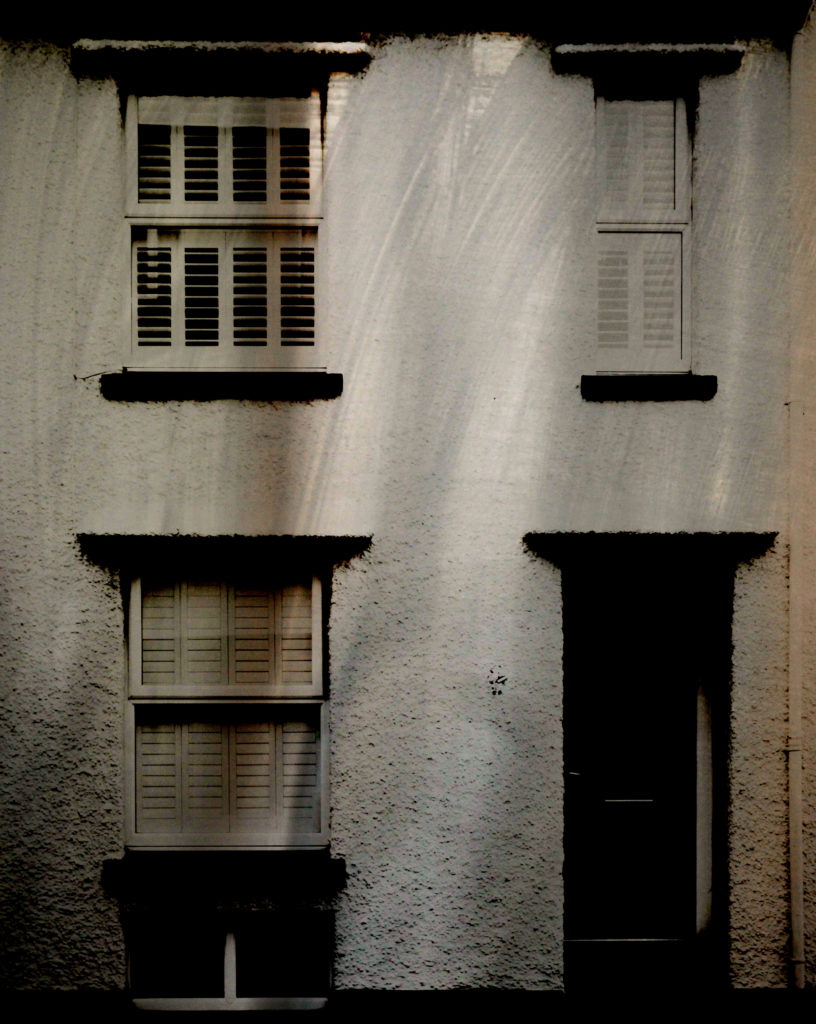
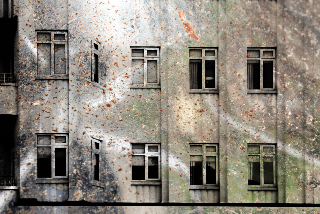
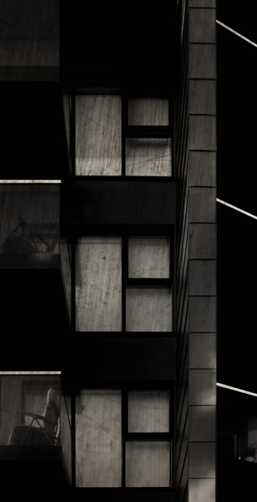
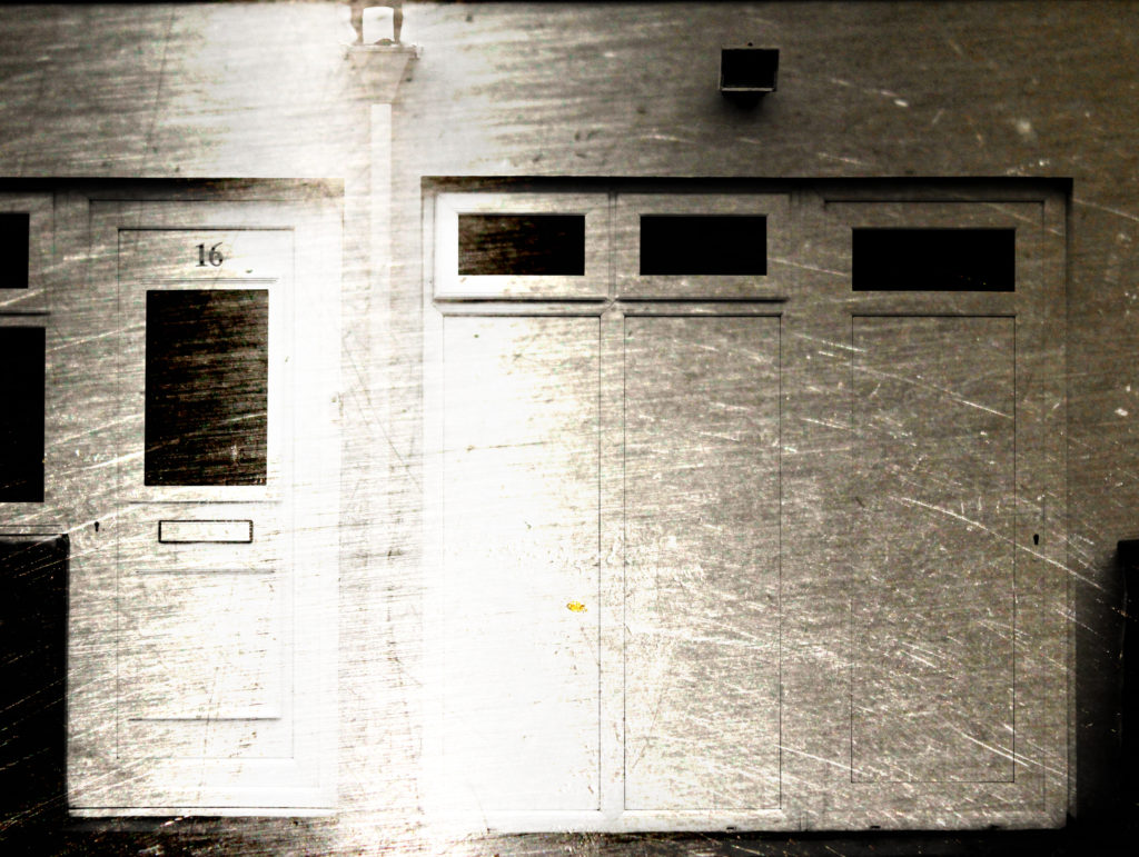
The below edits are the results of my shoot in which I photographed steel as a surface in order to capture its texture. I have layered the building face photographs from previous shoots over the steel photographs as a hint at how buildings such as office blocks are now being developed. In the top three edits I have made the composition by removing the natural frames from the photograph to reveal the scratchy steel texture in the background – I have done this previously to show granite and find that doing this with granite in the background looks much more effective due to the unpredictable shapes and colours within the rock whereas the steel is slightly boring and predictable. In the later edits I focused on creating them through using double exposure methods on photoshop – I edited the blending options to blend the two photographs together resulting in the building structures being clearly shown with the texture of the steel being shown at the same time to allow consistent contrast.


Analysis

When capturing this photograph I used the natural day light to capture the natural elements of the building face. Using natural daylight on the steel rod used for the background allowed for the reflections to be seen in the rod to add further contrast and tones within the photograph. The photograph is slightly overexposed but when layered over the darker steel it creates a composition that is abstract in which the overexposed building face does not look out of place. I used a deep depth of field when capturing the photographs used in this composition to ensure that all of the photograph was sharp and in focus. A shutter speed of 1/60 was used as well because the steel and building face were both still objects which didn’t require very fast shutter speeds – when this is paired with the low ISO of 200 used it allows for the best quality composition possible with the correct amount of light entering the lens from the surrounding area. The rust and reflection in the steel rod creates a slightly warm colour cast and creates on old-fashioned eroded feeling in the composition.
The black and white building face contrasts with the warm rust on the steel in a very complementary way as it creates a damaged dynamic to the photograph and really brings the texture of the steel to the forefront to create an interesting composition. There is a wide tonal range in the composition because of the reflections and scratches in the steel. The building face captured is a very flat one and so the photograph is very flat and two-dimensional – it almost looks like a screenprint. The photograph fits in with the rule of thirds as the building face merges into the steel rod on the top third of the photograph to create an aesthetically pleasing photograph along with the man-made shapes such as the windows.
This photograph is the result of an edit from a shoot focusing on the texture and properties of steel. The composition was made by blending together the face of a building and a close-up photograph of a steel rod. I have looked at contrasting man-made building faces with natural granite rock faces in my previous shoots. This has led to me thinking, as I was focusing on the material of granite, it may be interesting to contrast man-made structures with eachother by focusing on how the materials used to make houses have changed overtime. Traditionally granite has been used in Jersey but as office blocks, such as the international finance centre, have been developed there has been an increase in more ‘modern’ looking materials, such as steel. Therefore I have captured close-up photographs of steel objects to capture its texture, which by itself makes for quite a boring photograph, but I will experiment with layering the building faces over the steel. Steel is an alloy of iron and carbon and because of its high tensile strength and low cost, it is a major component used in buildings, infrastructure, tools, ships, cars and other items. Since it is used so much in the world around us, as granite is, I believe that it is important for me to include the exploration of this material in my project. I plan on presenting these photographs in a typology grid or possibly as GIF’s in the future as well as creating more edits in a similar style.
