Behind the Lens
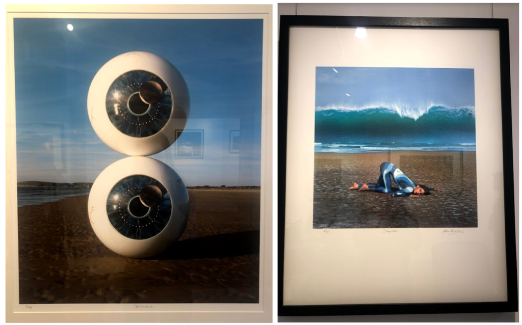
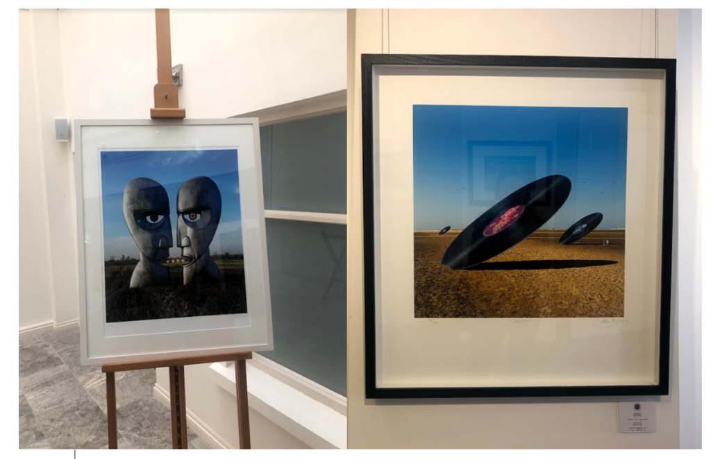
I visited the CCA gallery which had an exhibition called ‘Behind the Lens’ by
Mike McCartney, Carinthia West and Rupert Trueman looking at Britain in 1960s-70s, pop/counter culture, sexual revolution, rock documentary.

This image stood out to me in this exhibition as the mirrors had been physically put into the landscape rather than being digitally manipulated in. I liked this as it shows nature in a different way to other images I’ve seen. I like how the landscape looks artificial, but still shows the natural waterfall and grass in the background and foreground of the image. I also like the simplicity of the image, and how the tree is the main aspect of the image, with the shadow along the floor.


Pop Icons
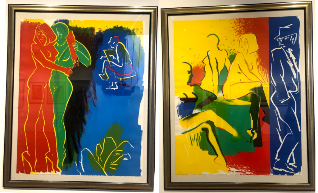
The second Private gallery I visited looked was called ‘Pop Icons’ and looked at Pop-art, reflecting on mass consumerism, advertising, celebrity culture, iconography. Artworks by Andy Warhol, Roy Lichtenstein, David Hockney, Peter Blake and other artists were displayed.

1950’s in Britain and late 1950’s in America, Pop Art reached its peak in the 1960’s and went on to become the most recognisable art form of the 20th century. It began as a revolt against the dominant approaches to art and culture and traditional views on what art should be. I particularly liked these two pieces above by the same artist because of their use of primary colours and the sections in which they’re divided into. I think i have slightly explored this in my project where i focused on block colours when editing the original images. Adjusting the colours in these images make them link to the work in pop art, although they are not a bold colours, this is something I could explore in my project further. I also like the use if cured lines and shapes representing the figures i the images as I think they relate to shapes and lines that you fins in natures and plants, linking to my projects.

Gallery Director Chris Clifford said, “Pop Art often takes imagery that is currently in use in advertising. Product labeling and logos figure prominently in the imagery chosen by pop artists, seen in the labels of Campbell’s Soup Cans, by Andy Warhol who is one of the artists featured in this exhibition. I also liked this image I displayed above as the repetition of the curved lines and colours, links to the theme of variation and similarity. I also liked how the patterns in the 2D images looked 3D like they wee coming off the image. In his image I thought that the blue colours linked to colours in nature and water, and the bright orange also links to my experimentation where I have included colour which arena normally found in nature within my images to make them stand out.

Being Human –
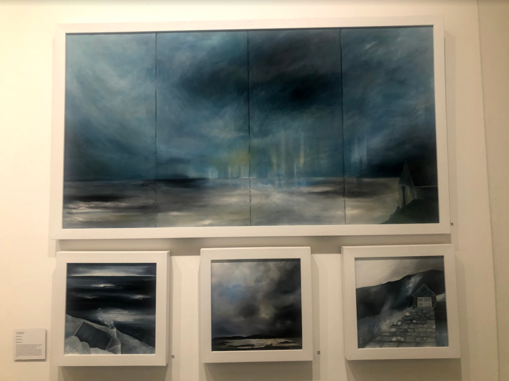
Feminism, representation of women artists in the art world, alternative voices etc.

I think the this exhibition related well to this project as a lot of the work focused on nature, emphasising the representation of woman artists. This relates to my work as one aspect i am exploring is femininity in nature, looking at soft shapes that follow a stereotypical view of woman. I particularly liked these pieces above as I think that they represent ideologies of sublime, with the storm and dark clouds above the landscape, creating movement. The tones in the image are cool and emphasis the shadows, looking at the vastness in the scene. This relates to the work I am doing now as I have explored the ideologies behind sublime and beautiful, this type of image being something I could explore more in my project where I look at the other dangerous side to nature, rather than the fragility that i have focused on so far. So far i have explored warm, soft tones and colours in my images, this contrasts to these pieces where predominately cold dark colours are used, and is another aspect that i could look at in my work, contrasting cool and warm tones.
