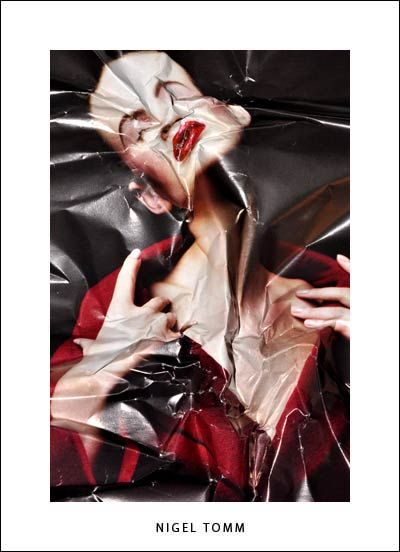
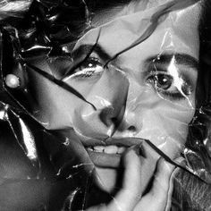
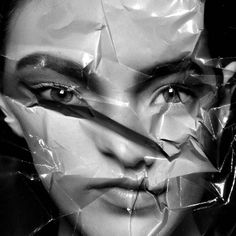
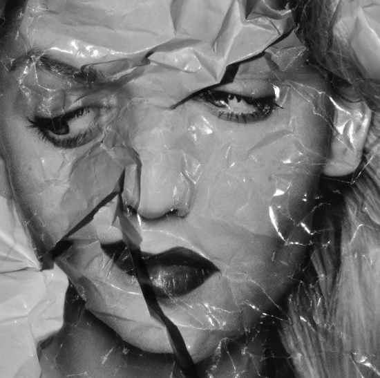
Nigel Tomm is a modern artist whose work has great parallels with cubist art. He is most knows for his manipulation, distraction and recreation of existing image. Working with pre-existing photographs from magazine he tackles the issue of perfection in the media displayed by celebrities and models. The magazine images he choices are often from editorial, beauty or glamour shoots, they show a glimpse of the beauty standards which are pushed to audiences every day. He manipulated them by crumpling the glossy images, randomly folding sections over and distorting to original. He then partially flattens the images back out an re captured them either using a camera in a studio with bright lights making reflections or a scanner which gives clean crisp look. These final images are then either turned to black and white or left in colour creating abstract pieces. His work subverts the conventions of beauty and critiques the these editorial publications which portray ‘perfect’ people. His work mixes the idea of beauty and ugliness two polar opposites which people have very fixed ideologies. In a way his work brings the ‘beautiful’ models and celebrities in the original photos down to a realistic level of beauty. He works with the idea that consumers are no longer looking to attain perfection but rather to be real instead, letting imperfections shine through showing a more modern surrealist approach.

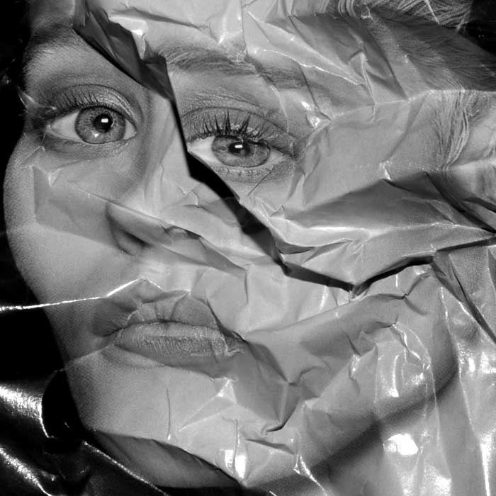
This photo is a hand manipulation of an existing image in a beauty an fashion magazine. the original image would have been taken in a studio with bright lighting helping the evenly illuminate the models face. When the magazine page was distorted and re captured bright studio lights would have been used again, this helps to show off the glossy pages which we link with editorial images. These lights also create shadows which highlight the texture in the page and give it a more warped effect. The photo has a very high contrast because of the lights used and the shadows and highlights created on the paper. The magazine photo would have also had a high contrast because this is often a a technique used to help make editorials images stand out and look larger than life helping to exaggerate models features. This photo is in black and white which helps to simplify it and helps the viewer focus on the interesting shapes and distorted features. The form of the image has been reconstructed by the random crinkles inn the paper, although the photographer has considered the placing of the the folds he did not have complete control over it making the image more spontaneous. We can still tell the image was originally of a beautiful model however this idea had been challenged, the once smooth skin is now covered in lines from the creased paper and the proportions have been disfigured.

