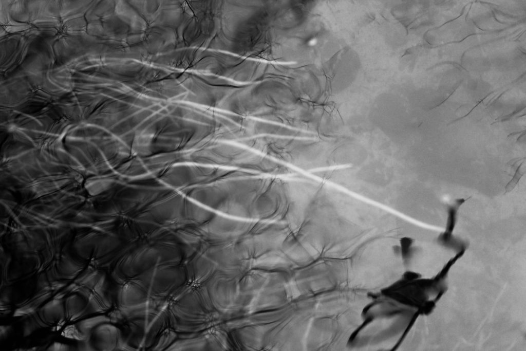
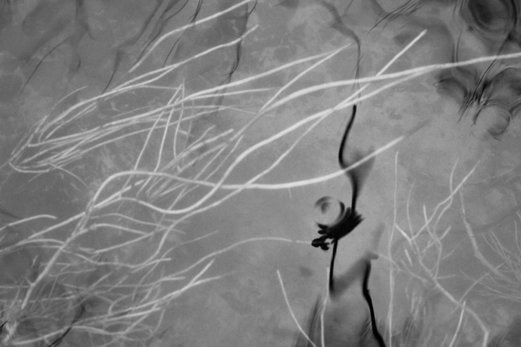
I first started experimenting with the images from my first shoot by editing them black and white. Doing this emphasises the reflections on the water and highlights the shadows under the water, creating more depth in the image. I also think it emphasises the white on the plants under water making them contrast more against the shadow which is the main focus of the image. I like the range of tones created in the image, the darkest point being the plant closest to the water and the most noticeable reflection, the ground underneath the water is the mid tines, and the lightest point is the plants underwater, growing in the direction the water is going. I think that the black and white edit creates a different effect than the image in colour as it removes the warm/pink tones. This makes the image look less inspired by Rinko Kawauchi as it doesn’t emphasise the light on the water. I think that this images reflect more abstract ideas, providing responses to my research into abstract artists and photographers. I also think that it links to my research into the romantic era, looking at ideologies like beauty which i think is emphasised by the soft, round shapes in this image.
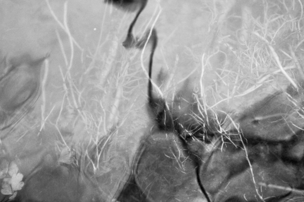
This image is one of my favourite black and white edits from this shoot as I think it reflects the abstract research I have done previously in my project. I particularly like the lines created by the movement of the water and the geometric shapes that all different tones, portraying juxtaposing colours. I think this reflects ideas of abstraction as at first glance it is difficult to identify what the image is of. I like how the plants underneath the water are shown in the light areas and less in the darker areas as it makes them stand out more.
This image in particular i think looks at the beauty of nature effectively as it emphasises the delicate aspects of water and plants through the soft tones and lines. I also like how the different tones in the water create texture showing the different shapes of the waves. One photographer in particular that this image remind me of it Andrew S. Gray who creates intricate work from shaking his camera. He produces abstract landscapes inspired by the paintings of the old English masters of pictorialism.
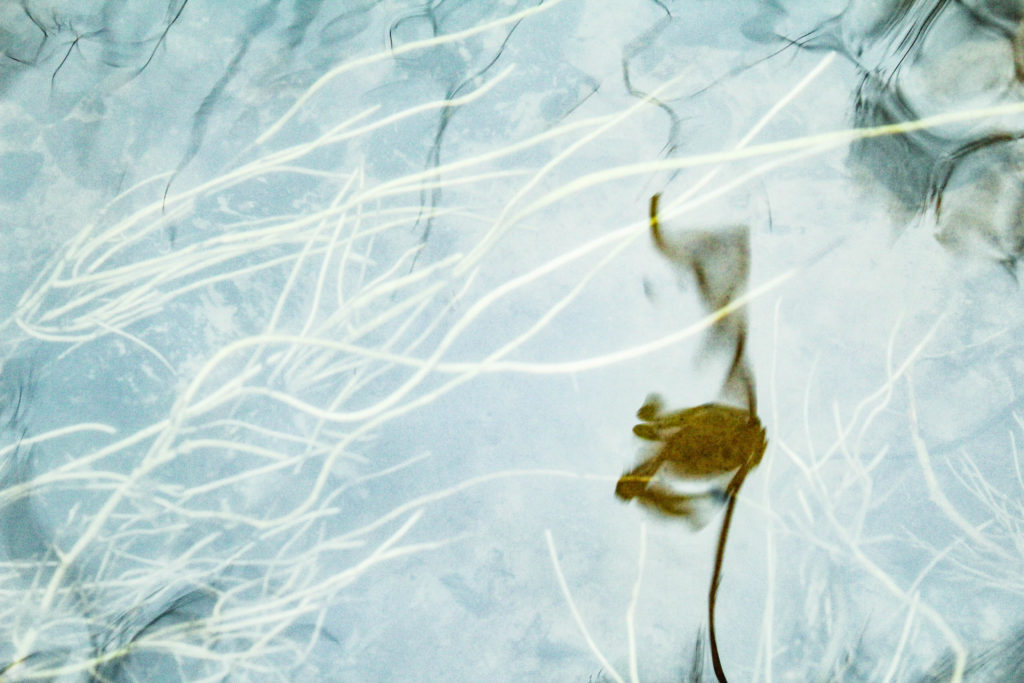
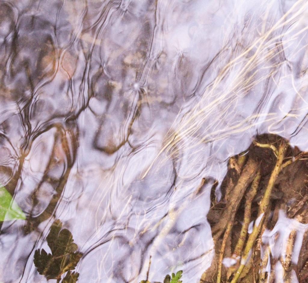
Colour Edits
I then went on to edit the images in colour on photo shop and tried to emphasise the different shapes portrayed in the images. I did this in various ways like adjusting the hues of the images to create different variations of the same image. I think by experimenting with different colours it creates interesting images that are exploring beauty and fragility in nature, bringing inspiration from other art movements.
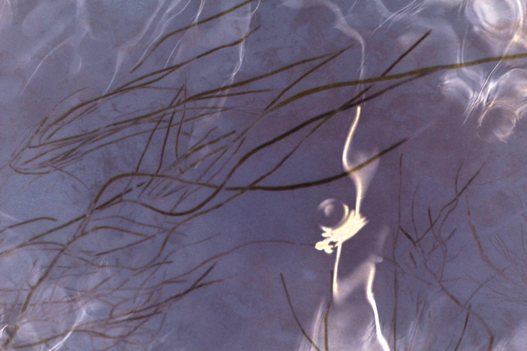
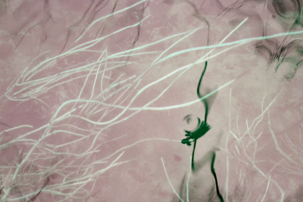
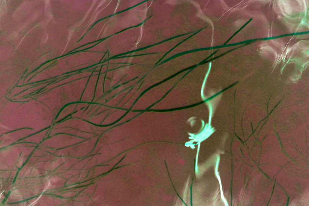
I chose to display these images as I like how they work in a series, contrasting from one another , each one one portraying a different atmosphere. The first two images use pink and purple, experimenting with the idea of what stereo typically considered feminine. I think these two images reflect ideologies of romanticism and beauty from the the soft, pastel colours that I edited them in. The first image uses a darker purple, which is emphasised by the even darker brown lines of the plants underneath the water. This all contrasts to the plant in the foreground of the image which is white. I also like how some of the waves on the water have turned white as well which complements the plant in the foreground and creates a more aesthetically pleasing image.
In the second image I edited a light pink to be in most of the image which contrasts to the plants underneath which are white in this image. To me, this work is more inspired by the photographer Rinko Kawauchi, through the use of pale pink and white in the image. The green of the plant in the foreground looks at traditional colours in nature, which contrasts to the pale pink. For the third image I chose to experiment by editing a bright red into the image and contrast it with the green, which are complementary colours. I think that this image is more bold and powerful as red isn’t a colour which is normally associated with nature and beauty. I think that displaying these images together is effective as each image makes you notice something new, through the different colours of the same aspects.
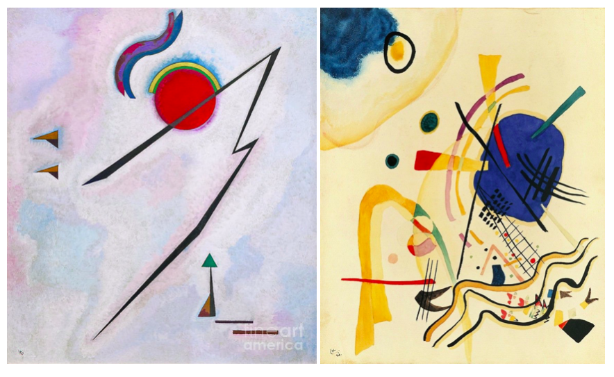
I took inspiration from Wassily Kandinsky in these images who was a pioneer in abstract art. He first began to use expressive color masses separating them from forms and lines. Soon after that, he started to merge geometry with abstraction. I think that this relates to the images I have edited as I have tried to emphasise the different shaped lines which are curved or straight against the background colour of the image. I also tried to use colours that arenet traditionally associated with nature. For many of his painting he uses lines which are round and curved which is an aspect that links are work together. In my images the rounded shapes of the plants underneath the water going in different direction reflect this. Also the plant in the foreground is an interesting shape which has a solid block colour, reflecting ideologies of abstraction.
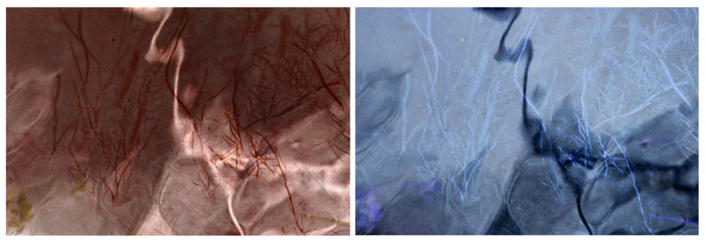
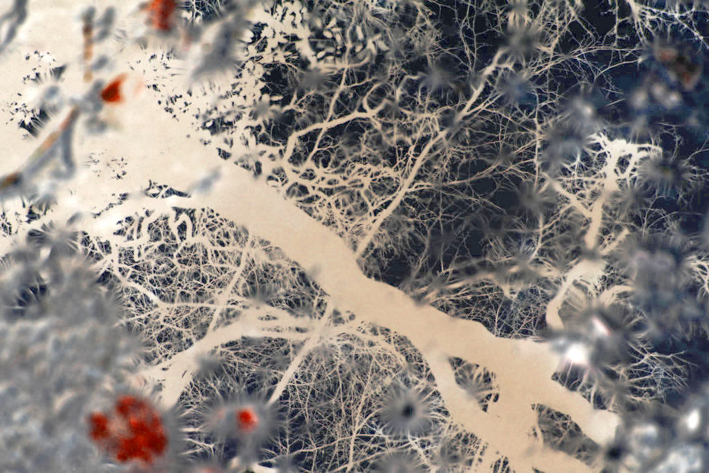
I then started experimenting by inverting the images I took in my first shoot. I chose this edit to display as I think that the inverted effect emphasises the natural shapes and fragility of nature that weren’t as obvious before. This makes the overall image have a different atmosphere, through the dark blue colours that weren’t there before contrasting with the bright white. The edit also makes it harder to tell what the image is of. Even in the original image, the way the image way taken through a puddle wasn’t too obvious, with this edit it makes it even harder, also reflecting ideologies of abstraction. One particularly aspect I like in this image is the red shapes on the left side of the image as I think they contrast effectively to the navy blue and white colours in the rest of the image, making it more interesting.
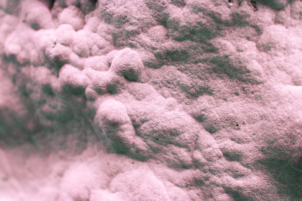

To experiment with this image I decided to play with the idea of pastel colours to emphasise the beauty and femininity . I like this image as it is an aspect of nature that isn’t normally related with beauty. By taking the photo close up to fill the frame and emphasisng warm pink tones I think it effectively reflects my ideas of fragility in nature, through the soft rounded shapes. I experimented by adjusting the colour balance and tones in the image, making some versions colder colour, and some warmed colours to see which was the most effective, I think that the warmer colours are most effective as they play on the ideas of traditional beauty through something that isn’t considered beautiful.
I also experimented by inverted the image to see what effect it would have. I found that it created an image where the shadowed parts are much darker than the original and the lighter white/ pink areas were brighter, almost looking as if they were glowing. Although I thought that this edit made an interesting image, I think that for my project where I slightly emphasise and manipulate the colour to change the overall appearance of the image works better. This is because the the slightly edited version still reflect the nature that was there when I took the image originally. With the over edited images I think that the nature that was there orginally is less obvious in the final version, taking away from the ideologies of beauty and fragility I have been looking at in my project so far.
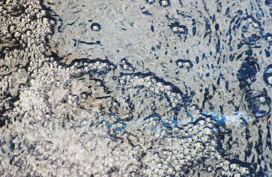
I think that this image goes well with the previous edited image as the blue and pink tones and the rounded shapes complement each other. I edited this image to have more cooler blue tones which I could contrast to my warmer toned images. I think that this is effective in giving me a variation of images that were taken in the same place. I think that this image takes more inspiration from Rinko Kawauchi as I think it follows how she takes photos depicting the ordinary moments in life and ‘the mindful awareness of what is special in simple things’ like in her images I displayed above. . Patterns created by falling and moving water is an ordinary moment and may not be something that many people notice in their day to day life which is why I think my work relates to Kawauchi’s. I also like this image as I think that the reflection of the sky on the water is emphasised by my editing. I also like how the bubbles in the bottom left corner are slightly blurred further emphasising the effect of moving water.


I think these images are beautiful and have a spiritual quality to them.
Did you read chapter on Art and Spiritualism by Kandinsky?