With this shoot I will develop the outcomes in two manners. The first being creating surreal pieces, editing the close-ups to have people and changing the perspective to the landscapes themselves, creating character. To do so I will probably over lap the images, and also edit the images themselves, into being black and white, to capture the tonal differences, from the light and more tonal shades. The second way in which I will develop this shoot, is from printing out some of the more clear landscape images, and pouring them in paint and liquids, in order to change the composition and the colouring of the art piece itself. This second composition idea, has a much more clear influence from the fine art outlook, and I believe it will be very different from the outcomes below, and less predictable. edits- to create a more fine art creative influence:
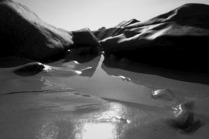
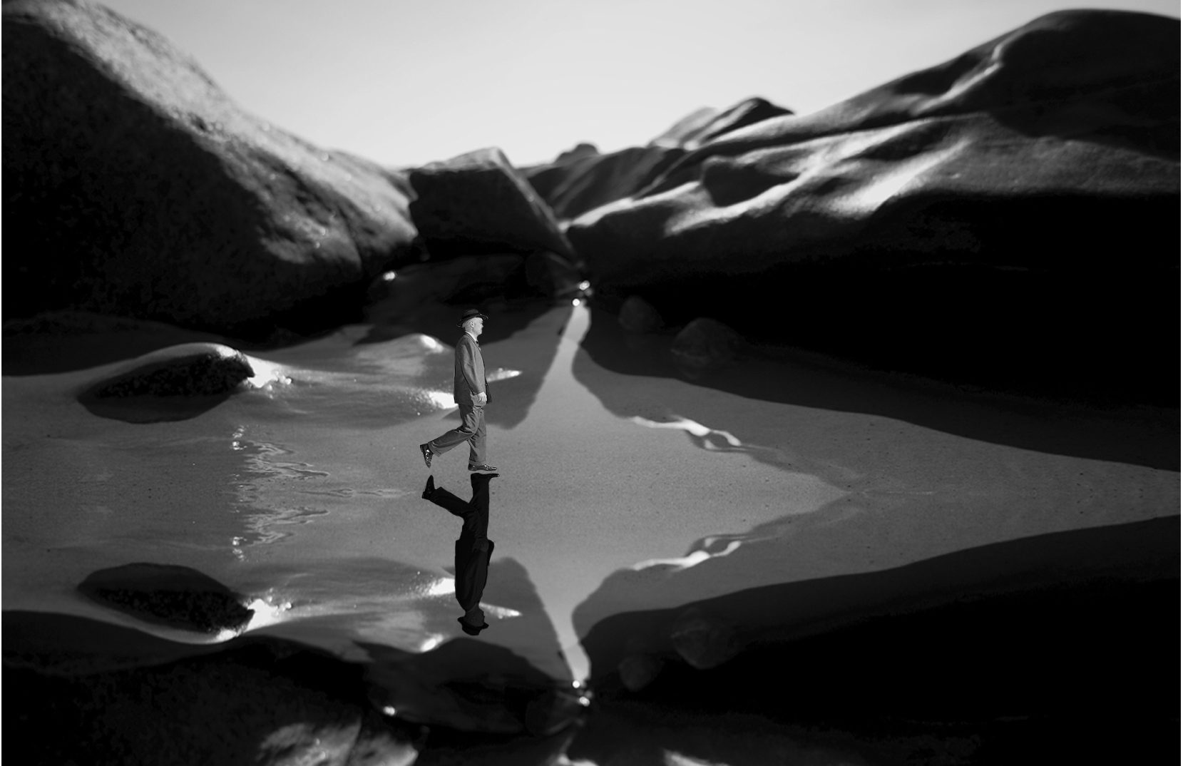
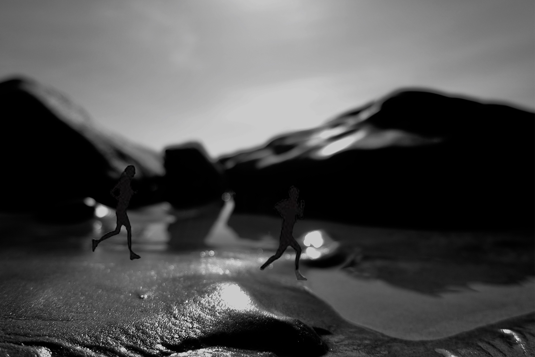
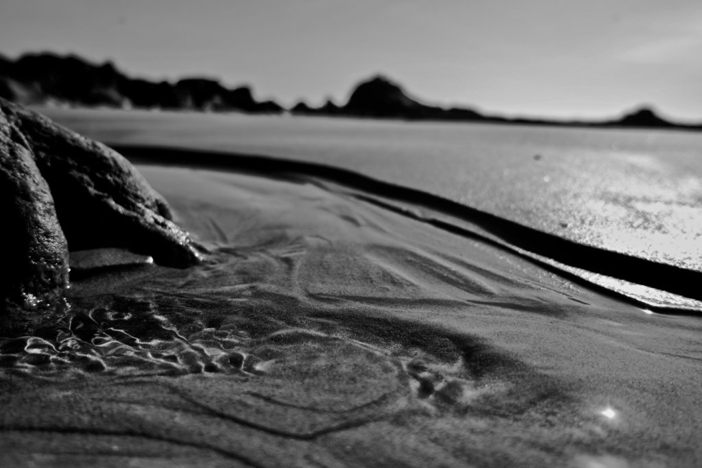
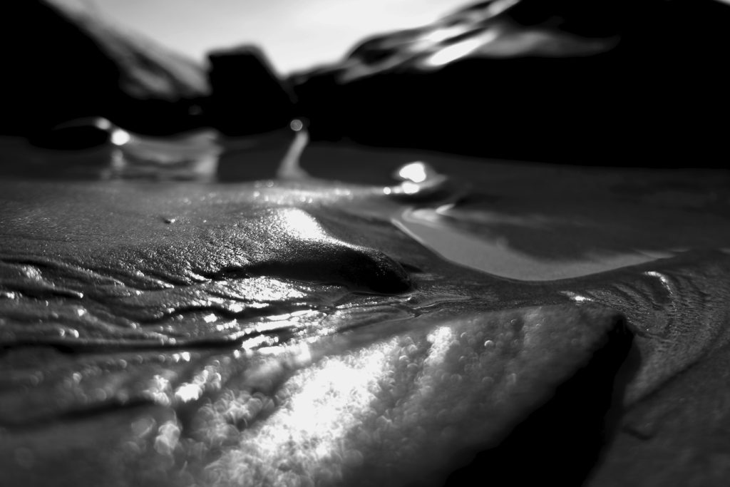
analysis: For this shoot and small edits, I wanted to show landscapes which could be further edited in order to show surreal elemnts. My main aim for these images, was to capture an element of fluidity, and softness of structure to the images. I wanted to get the reflection and the detail within the sand, and use this in order to change perspective and make it look as though the image is not close up but expands across a large-scale. When looking closer at the reflections and movement of the sand, I discovered that it looked as though it was a path, or something which was guiding a route for someone. Because of this, I thought to create a surreal image I would repeat the images, and make it appear as a wet pathway, and put someone and a reflection within the water. I chose A politician as then this both connects my theme of media into my work. It additionally creates a uncomfortability within the image. He looks out-of-place in his suite and with his surrounding, it creates contradictions within the image however, at the same time, still forming connections to surrealism. I added the shadow in order to give the piece an elements of realism. The second image, I too thought had elements which paved out a path. I decided to add more artistic looking fine art figurative people, running along the beach. However, I do not belive this is as successful as the previous, due to the composition and light.
