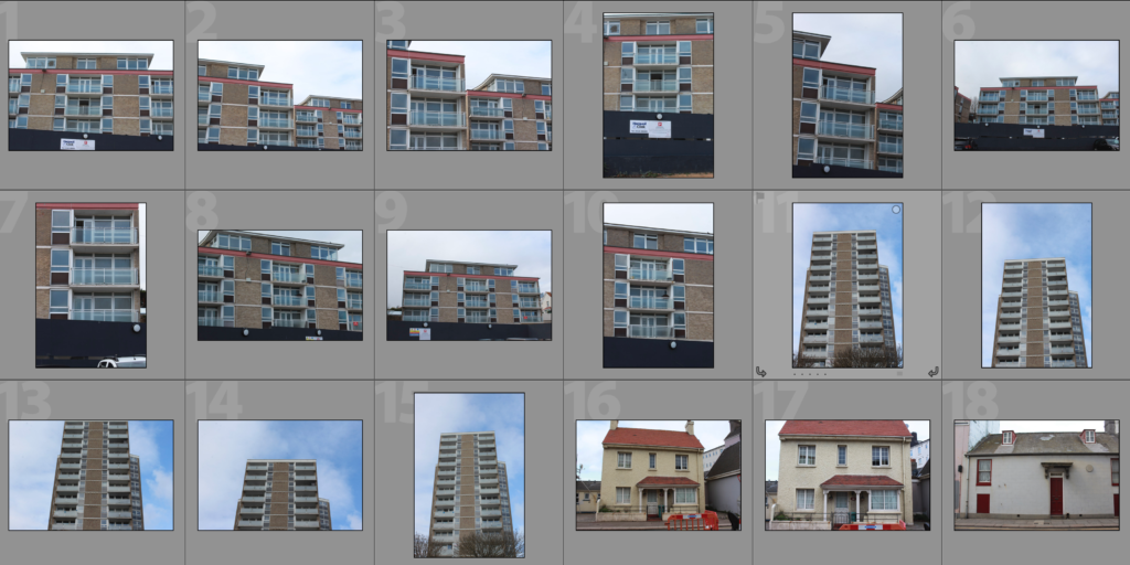
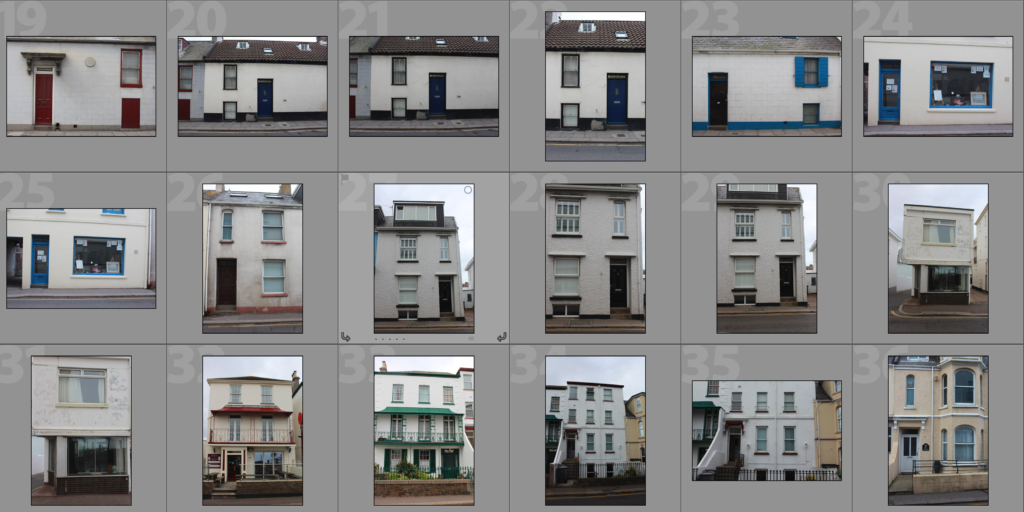
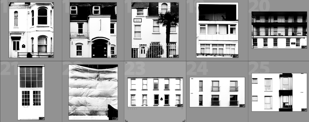
This shoot is a development on my original shoot which drew inspiration from photographers Lewis Bush and Michael Wolf. My previous shoot focused more on the faces and structures of housing and office blocks but I have decided to expand beyond this in this shoot by also photographing other types of buildings such as hotels, shops and individual houses. Through expanding beyond housing and office blocks it allows me to further demonstrate how different the housing situations within Jersey can be, as well as showing how similar the styles of housing can be in a certain area as the shoot took part near Havre De Pas where a lot of the houses are terraced and quite old-fashioned. I plan on editing photographs from this shoot, future shoots and previous shoots by experimenting with styles such as GIF’s, typologys and layering through double exposure as Lewis Bush did on ‘Metropole’. My intentions in experimenting in these ways is to explore which method is possibly the best at demonstrating how similar but different the houses/flats in jersey can be as well as emphasising the shapes and patterns within the buildings. I feel that it is important for me to focus on different types of buildings within Jersey rather than focusing on only high-riser buildings as that would limit the extent to which I explore buildings in Jersey as well as limiting the extent to which I show variance and similarity within the buildings
Contact Sheet
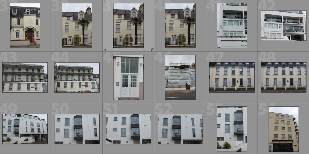

Edits
After going through all of the photographs that I produced on this shoot I selected some of the best that I could edit. I edited these photographs by putting a black and white filter on in order to allow the viewer to focus on the shapes within the photographs rather than the colour. I then used a perspective crop on the majority of the photographs in order to make the photograph completely straight on in order to further emphasise the symmetry and patterns within the photographs. As well as the black and white filter I increased the contrast, used high highlights and whites, used low shadows and blacks and adjusted the exposure accordingly to create a composition that is mostly over exposed but the features such as the windows are emphasised to help the shapes within the buildings to come forward.
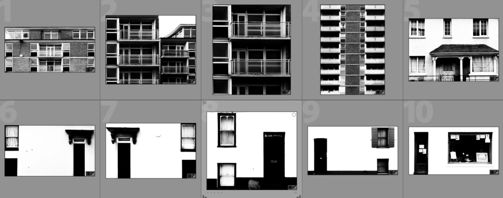

Analysis
I captured this photograph in a natural lighting in order to bring out the natural shadows and shapes within the building that I was photographing. There is a wide tonal range due to both the nature of the building and my editing to the photograph. The bright whiteness in the walls of the photograph contrasts greatly with the dark black shadows on the balconies. I took this photograph on a bright day where there was plenty of sunlight so only needed to use a low ISO of 100 along with a shutter speed of 1/60 to capture this photograph. The low ISO paired with the quick shutter speed allowed for the photograph to be as high in quality as possible as well as not being overexposed (even though I edited the photograph to increase the exposure. I edited this photograph by using a black and white filter to bring out the shapes in the windows as well as the shadows and then I increased the contrast, highlights and whites whilst reducing blacks and shadows to create a composition that had high contrast between the black and whites. A depth of field of f/16 was used to capture the photograph which can be seen as the whole of the photograph is in focus. The photograph has a slightly cold colour cast to it due the bright whiteness throughout it.
I opted for a black and white filter over a colour photograph as it helped to bring out the details within the buildings, especially the contrasts as well as a wide tonal range to create a more dramatic composition. Due to the deep shadows and edges within the photograph as well as the editing of the photograph the composition has a 3D effect as it appears to have different layers which bring the photograph to life.
The aim of this shoot was to create a set of photographs that showed the repetition of shapes within not only blocks of flats and offices, but also within houses, shops and other styles of buildings within Jersey. The overall results shows how even though there is a lot of repetition within individual buildings, each building has its own unique characteristics and shapes and therefore have variance. The inspiration for this shoot came from photographs of tall tower blocks in cities such as Hong Kong where each floor and flat are almost identical, which is perfectly demonstrated in Michael Wolf’s work as well as inspiration from Lewis Bush’s ‘Metropole’ in which he looks at the development of buildings through a double exposure technique to create a similar outcome to what I have done – I plan on further developing this shoot to photograph more buildings in a different area of Jersey to further demonstrate variance between the houses. I will also be experimenting with different ways of presenting the photographs.
The concept behind the previous shoot is that there are an increasing amount of these large and repetitive buildings that make way for office buildings or flats due to the ever rising population and urban migration but this shoot focuses as well on the housing of the population away from these tower blocks. The photographs resulting from my shoot show just how repetitive these buildings that are taking space from nature really are, especially ones in within close proximity to eachother, and reflect the idea that some residents may believe that the landscape of cities including Jersey is becoming repetitive and monotonous as lots of land is being taken to serve the same purpose of housing or offices.


