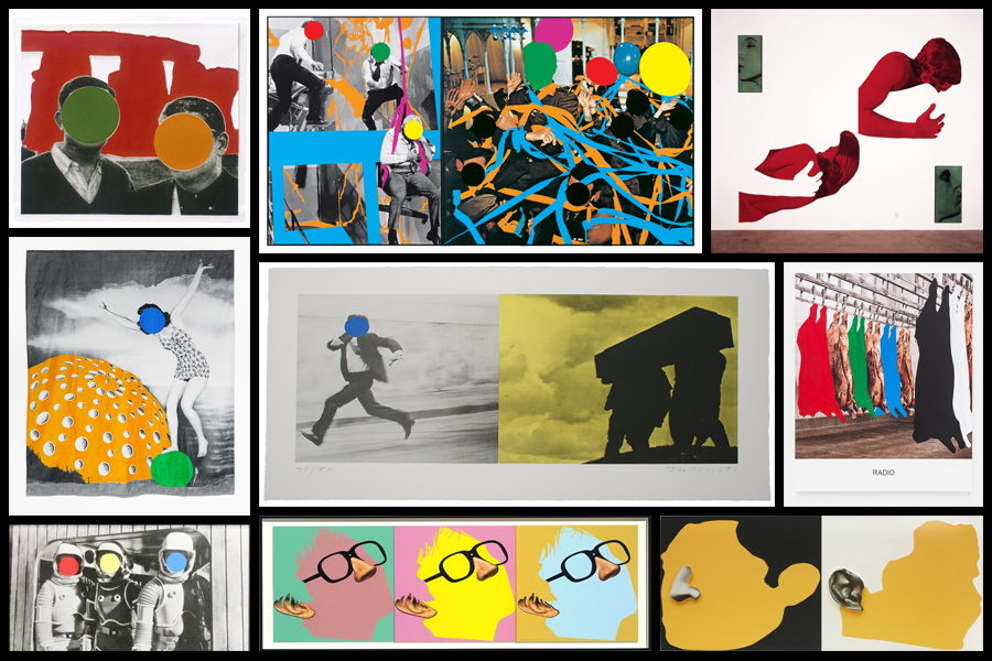
After looking over the works of John Baldessari I became inspired to create my own response regarding the colours used within his graphics used. I really liked his used of block colouring to create abstract effects within pre-taken images of people and landscapes, blocking out faces and aspects of the environment as a means of censorship. As a result of this it produces collages of different materials which contrast one another allowing for a aesthetically pleasing result. To create the intended results I would have to use software such as Adobe Photoshop to cut and paste in colour in the areas wanted, the photos I will be using are images I have previously taken in shoots regarding the topic of variation and similarity. Here are some examples of Baldessari’s work which I will be drawing inspiration from:
Once I had chosen some of the works which I would be using as a reference to create off I decided to go ahead and proceed to cut areas out which I thought would look more effective with varying ranges of colour. Using Adobe Photoshop I used the snipping tool to cut out and replace the different areas of each image with block colouring, looking back at Baldessari’s work as a reference to my structure of creating related works. Here is the process of me creating each image:
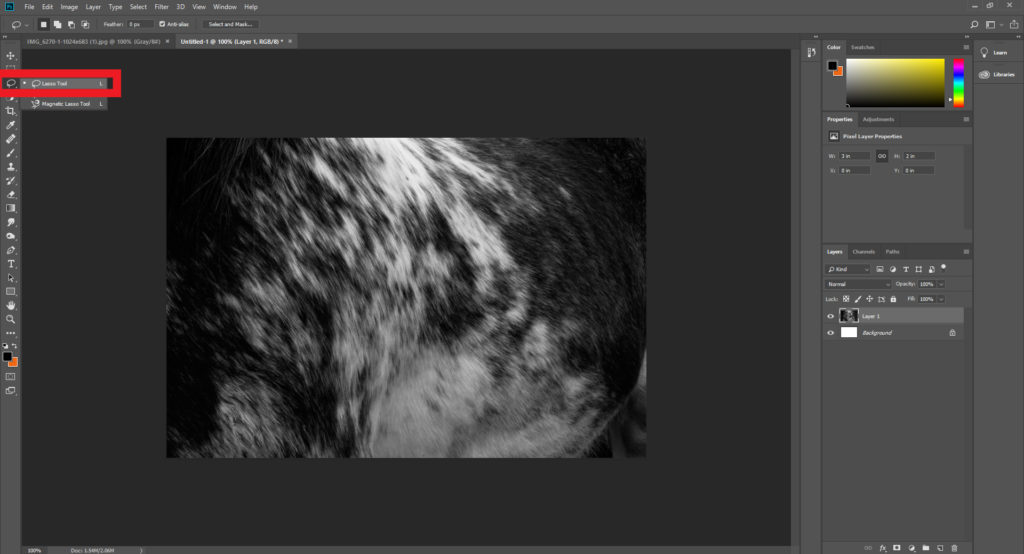
Step 1: Select the lasso tool located on the top left hand side of the tool bar and make sure the freehand option is chosen.
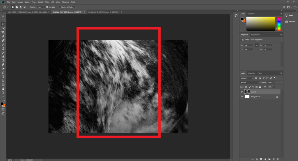
Step 2: Once you have selected the lasso tool draw out the desired shape of the area you intend to make a block colour out of, when doing it make sure to connect the end and the start point so that it does not ruin the layout.
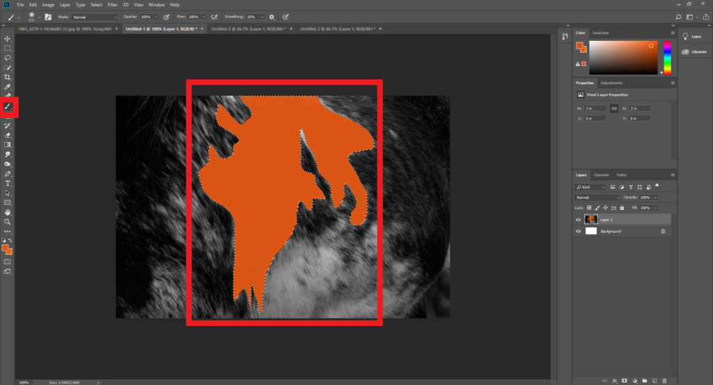
Step 3: After highlighting the wanted area make sure to go on to chose the paintbrush tool next, located just under the lasso tool. Using the colour boxes select a colour that contrasts the piece well and paint it within the lassoed area, making sure to deselect the highlighted are once completed.
When I finished experiment with various designs I then chose four images that I best reflected the intended outcome of the process and inspiration towards John Baldessari’s work. These are the images I selected as the best outcomes of the experimentation:
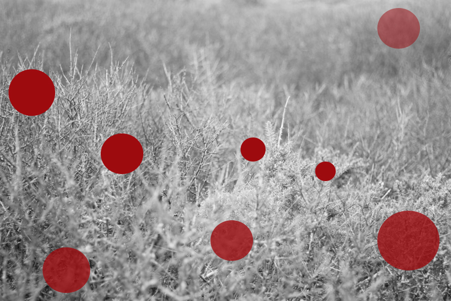
For this image I used red circles each with a varying opacity, by doing this it would create the impression of different depths of fields, with the more out of focused being the more faded shapes. When creating it I wanted to make sure there was still a natural feel to the piece, so limited the amount of shapes depending on the focus of the area so that they would not overpower and fill the entire piece.
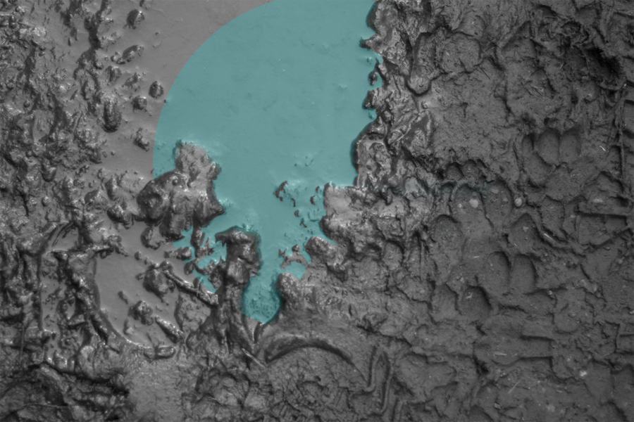
Here I wanted to capture a reflection of a shape within a muddy puddle. To do this I had to crop out the parts of the shape which touched the mud, this seemed a bit to complicated for a Baldessari’s work, however I liked the final outcome of how the lighter blue completely contrasted that of the surrounding black mud of the image.
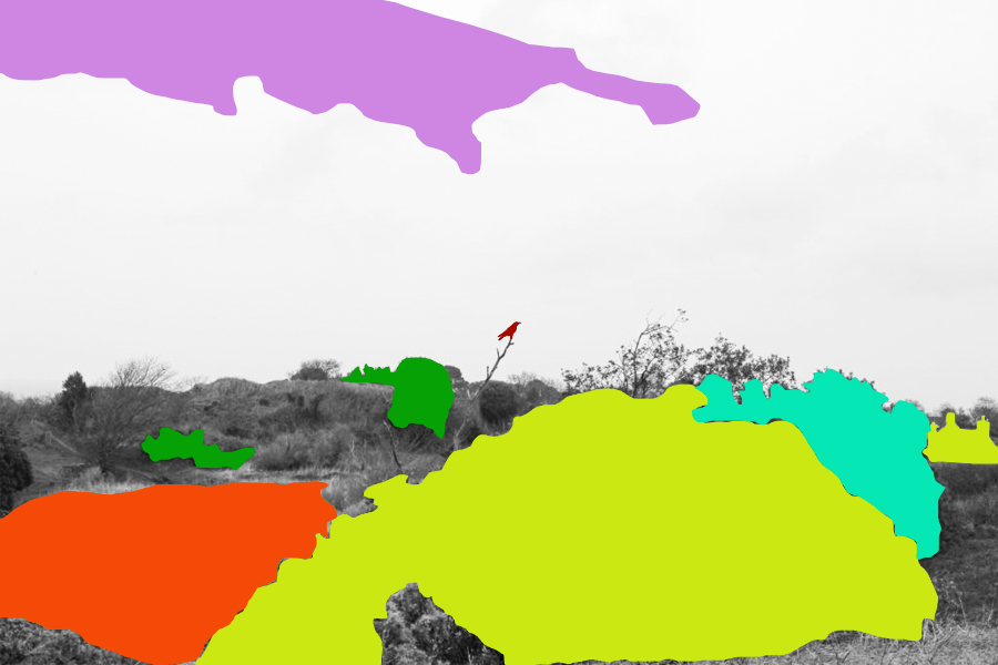
When editing this piece I tried to block colour only the bushes and trees that were the most outstanding to the environment, allowing me to roughly cut out the area and replace it all with colour that contrasted but complimented each other so that it would not become eye sore. When placing the block colours I made sure not to have them grouped together so much as by clustering them together it would reduce the effect of the simplicity I wanted to put across, instead abstracting the photo too much.
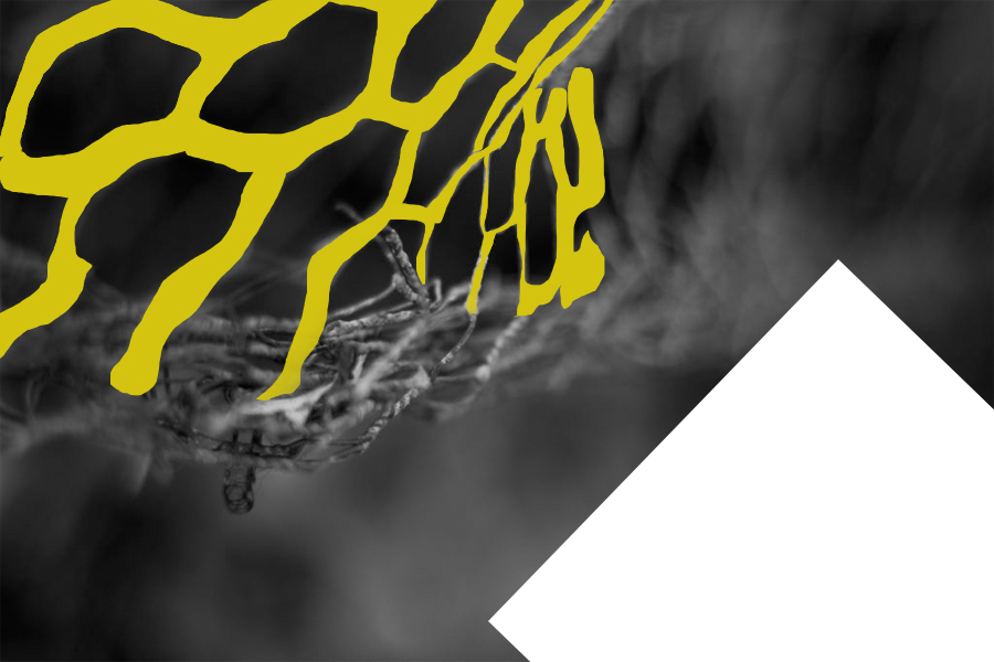
Finally I selected this image because I like the roughly cut out mesh wire which it replaced with a contrasted yellow which compliments the black which makes up the majority of the photo. By also adding the white rectangle I found that it brakes the piece up and instead stops the yellow from becoming too minimal and the black becoming too overpowering.

