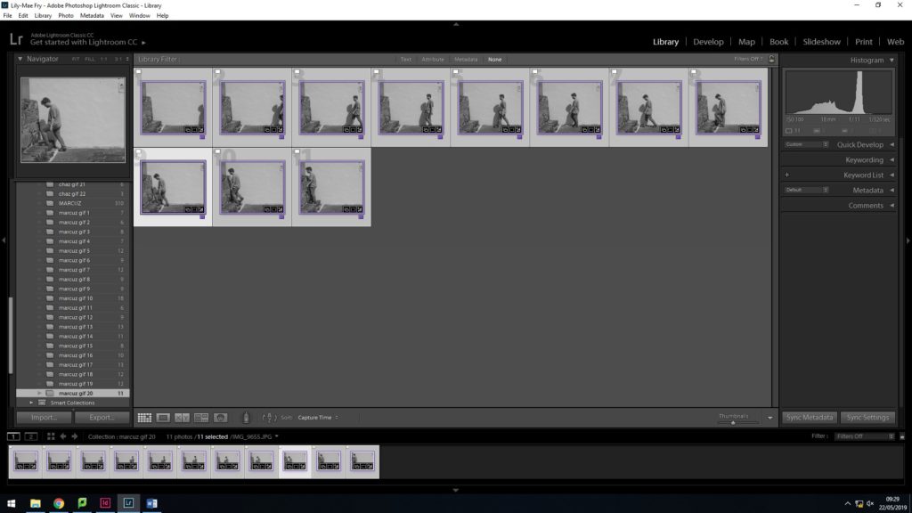
To begin editing I needed to organize all my material to make it easier to edit my photos into gifs. I used Adobe Lightroom because it has more editing features that best fit the way I need to edit. My plan is to make gifs from my photoshoot of each movement my subjects made while talking, so I have to edit photos in groups according to what movement they belong to. I grouped all pictures of one movement into one folder after sorting through my usable and non-usable material. After putting my gifs/movements into separate folders, I would highlight all the pictures from one folder so my editing would be synced. This meant every change I would make to a photo would be applied to all. This allows the final gifs to flow, especially when using the the cropping tool, with every frame matching the same editing style.
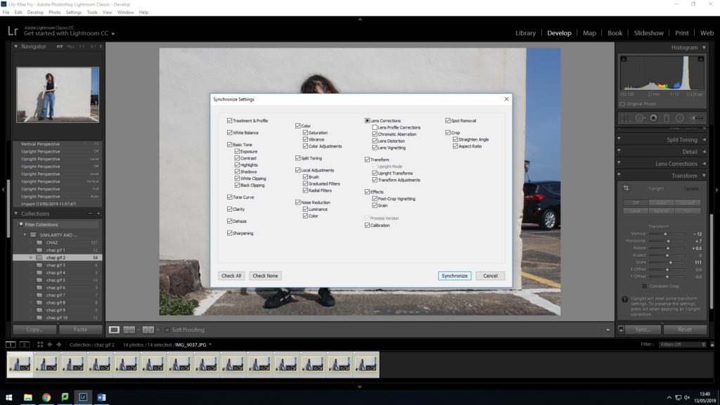
First I cropped the photos. I used the rule of thirds grid to adjust the position and focus of my subject in the photographs. I want the viewer’s eyes to adjust to my point of focus straight away when they look at my work. I decided on each point of focus for each set of photos by picking out the most interesting movement of my subject, no matter how subtle it is – the point of my project is pointing out the smallest or most interesting characteristics of animation in individuals that would otherwise go unnoticed during one’s everyday interaction with other people. The picture below is an example of hand movement. I made sure the point of interest was where the intersection of the horizontal and vertical lines were.
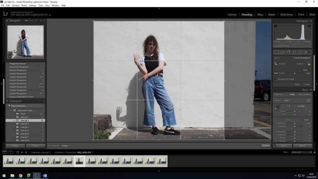
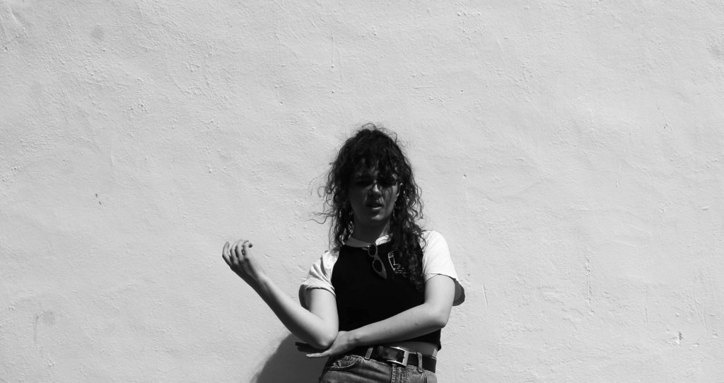
I originally edited my photos by draining some of the colour out of the picture, by reducing the saturation then warming up the image with yellow tint. I then decided that the image needed to be sharper in tones and contrast to make my points of interest stand out more so I decided to edit my images black and white. This references artists I have looked at like Edweard Muybridge but also, creates more definition in my photo. I think the photos need that definition and contrast in tones because the elements of a person’s being that I am trying to capture are already subtle. This means that my whole subject will stand out from their background rather than blend in and for example, in this photo, her hands are more prominent and forward from the background.
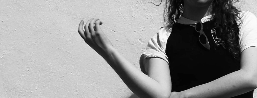
I also experimented with more extreme cropping to see how effectively I could draw attention to her hands, always keeping her hands within the intersections of the rule of thirds cropping guidelines. I quite like the contrast of extreme crops and close ups and the full picture, as if its showing the analysis of her movement and gestures that otherwise becomes elusive in the whole picture.
GIFS
After I had finished editing each of my pictures from Adobe Lightroom ready to create into gifs, I moved to Adobe Photoshop, because it provides the feature of creating ‘Frame Animations’. To create a gif in Photoshop, I first imported one group of photos from my photoshoot into a stack. This means I can upload multiple photos into one document in layers. To create a gif from a selection of photos, they need to be in one document in the form of layers. After clicking ‘create frame animation’, you have to make frames from layers like a filmstrip. In order to keep my animations in a full loop, I copied the frames I already had and pasted them after the original frames so there were two sets. While the second set of frames were still highlighted I reversed the frames so instead of my gifs cutting at the end and restarting from the beginning, making it seem as though the animation is jumping from the finish back to the start, it instead reverses the movement, then goes back to the start.

uploading files into stack 
frame animation 

make frames from layers 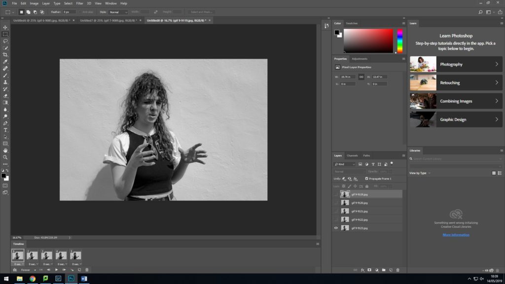

copy and paste
LAYERING PHOTOS
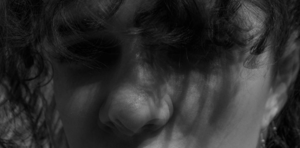
I wanted to experiment editing my photos like Etienne-Jules Marey. Marey edits his photos in layers, so one movement made up of many different images is shown in one still image.
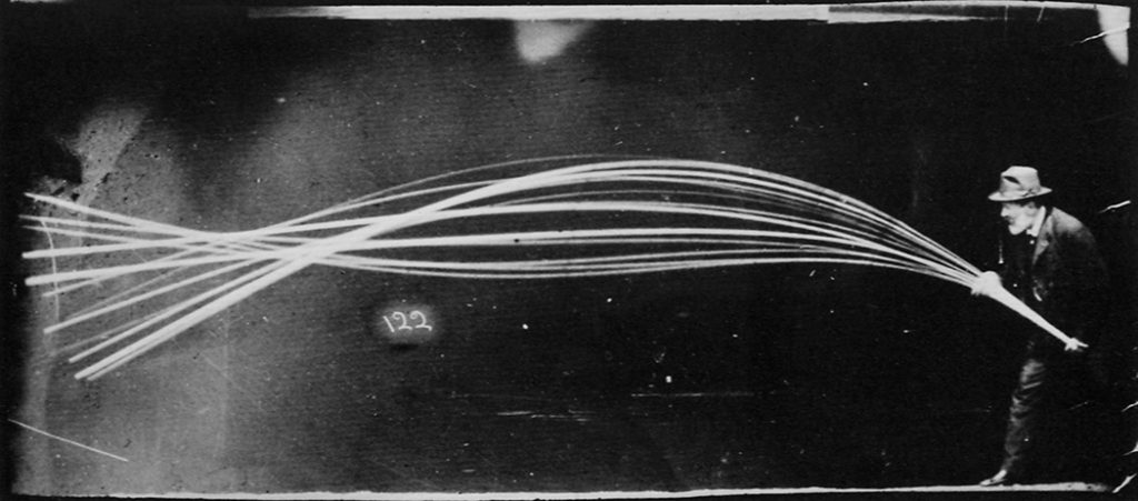
I Layered images by simply changing the opacity every layer in my document to 50 percent. I then decided to hide some of the layers because there were so many, you couldn’t see the other layered images underneath. I could also select layers that had more of a drastic change in movement and changed the opacity again of the remaining layers. Opacity ranged from 90% to 10% so some of the images wouldn’t be lost behind multiple layers. The picture below is an example of subtle movement; you can only noticed multiple nostrils.

adjusting opacity 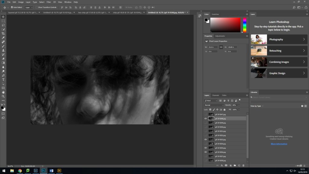
selecting hidden layers
STRIP SETS
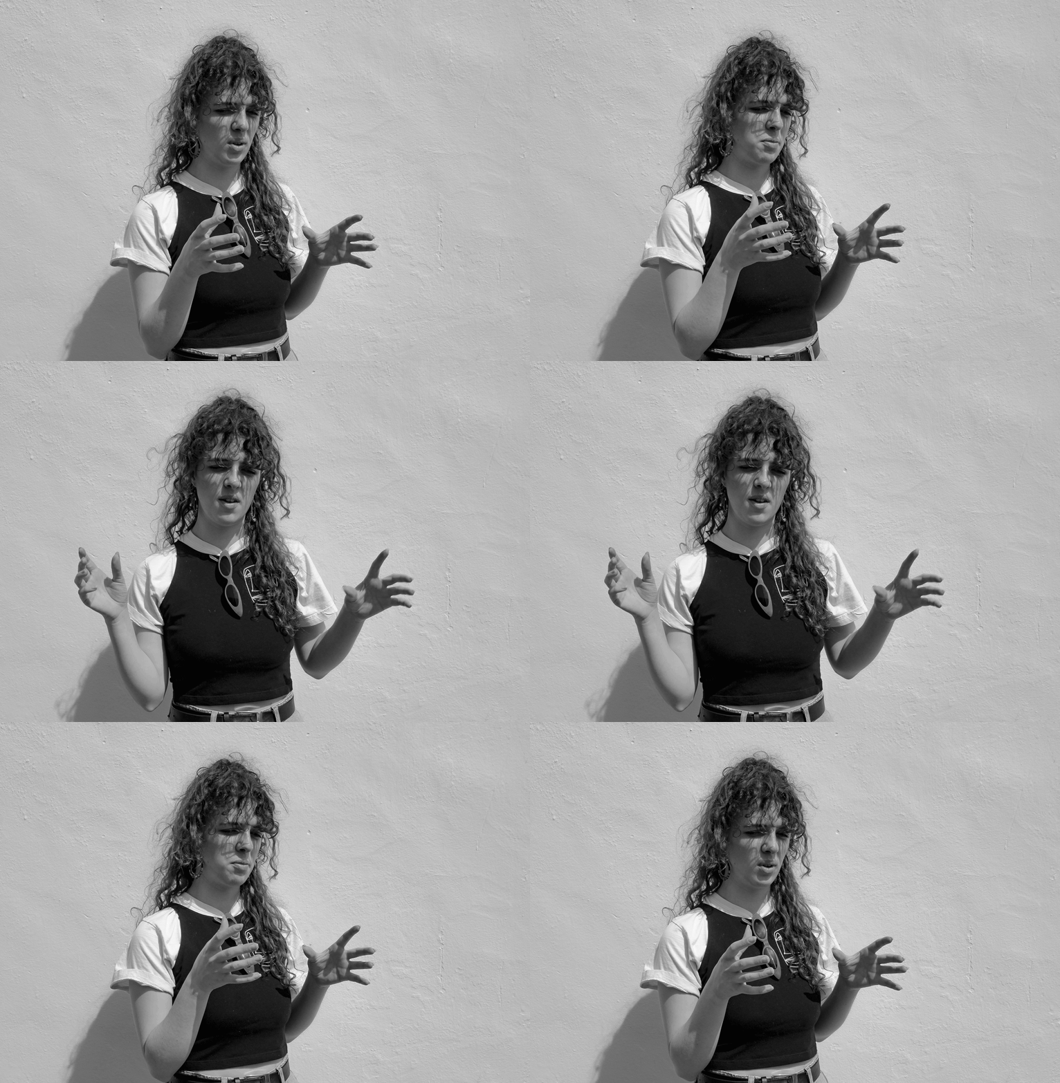
My last technique in editing was arranging a set of photos into a strip, imitating a film strip. This layout of images make it clearer to see movement and displays each picture in one as a still, allowing the viewer to take in each change of movement. I created this by expanding my canvas size. Doubling height and extending the width.


