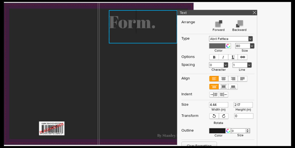
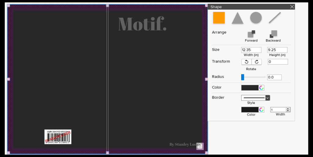
Once I had looked at the compositions of the fonts and colour of the covers I came to a conclusion of the designs I wanted and proceeded to use them on all three books. Like the compositions I made sure to leave the overall theme of design the same throughout each of the covers as I wanted to enforce the idea of them containing a different style of photography with the same overall theme. Here are the results of the designs and my thought process behind them:

For the fonts on the covers I decided with Abril FatFace, this is because it created a formal font which contrasted well against the grey backdrop and produced an outcome that I had seen present in most of the minimalist abstract covers. Colour wise I went with a lighter grey to the grey used on the cover due to me wanted to blend them together to some degree and prevent the text from becoming too overpowering. This led to my choice of using font size 80 due to how it didn’t take up a huge amount of space in comparison to the rest of the page, but how it also made use of the negative space surrounding it which it used to its effect.

For the font for the authors name I once again went with the same font as the title being Abril FatFace. This is because I wanted consistency throughout the cover and matching all text to the same font was crucial to this. Regarding the font size I went with a size 18, this is because unlike the title I wanted to leave the authors name more or less unnoticed due to how it didn’t provide any relevant information on the subject within each book.

Finally for the backdrop I had created I’d used an enlarged grey square which stretched across the cover. To accompany this I experimented with a variety of colours such as blues and browns present in the books to discover what would work well against the title and fonts used. My outcome was a dark grey that was borderline black, I selected this because of how I found it to be relatively neutral in disclosing what would be inside the book with only the title giving it away, which as a result allowed for the books to work together as a trilogy, stopping designs clashing which could occur when putting them into sleeves.
