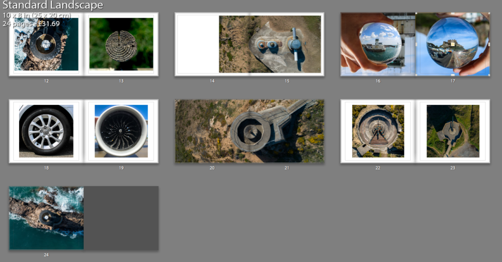

I am happy with this final design and I will send this to be printed. To start with, my title page and back page were designed to be eye catching yet simple and that’s why I chose those images. I used white text as it worked well with the background and a bold sans-serif font for effect. The back page is also simple and the circle contains text that explains the meaning behind the name ‘Latitude’.
The first image is Liberation Square in town (which happens to be a circle), the second set of pages represents the urban and rural contrast and also the differentiation of technique through the lens ball and tiny planet photography yet maintaining the circle shape, following out theme of Variation and Similarity. The next double page spread is La Hocq, then Noirmont bunkers, Janvrin’s tomb with a zoomed image, Batterie Moltke guns, tower to wood contrast between natural and man made structures. Then Noirmont targeting position, then lens balls of the harbor VTS and Mont Orgueil Castle, wheel and jet engine, Noirmont MP1, guns from Batterie Moltke and Lothringen and finally Noirmont Lighthouse.
I wish I had a larger variety of images however it was not viable due to cost but mainly because the book would seem overcrowded and maybe too jumbled, therefore I stuck to a basic set of images that worked together.
