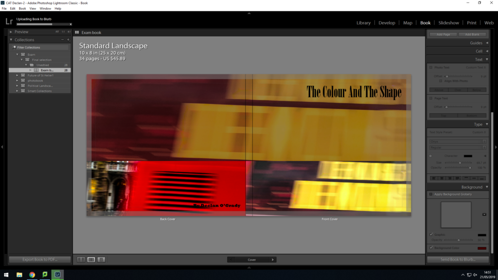

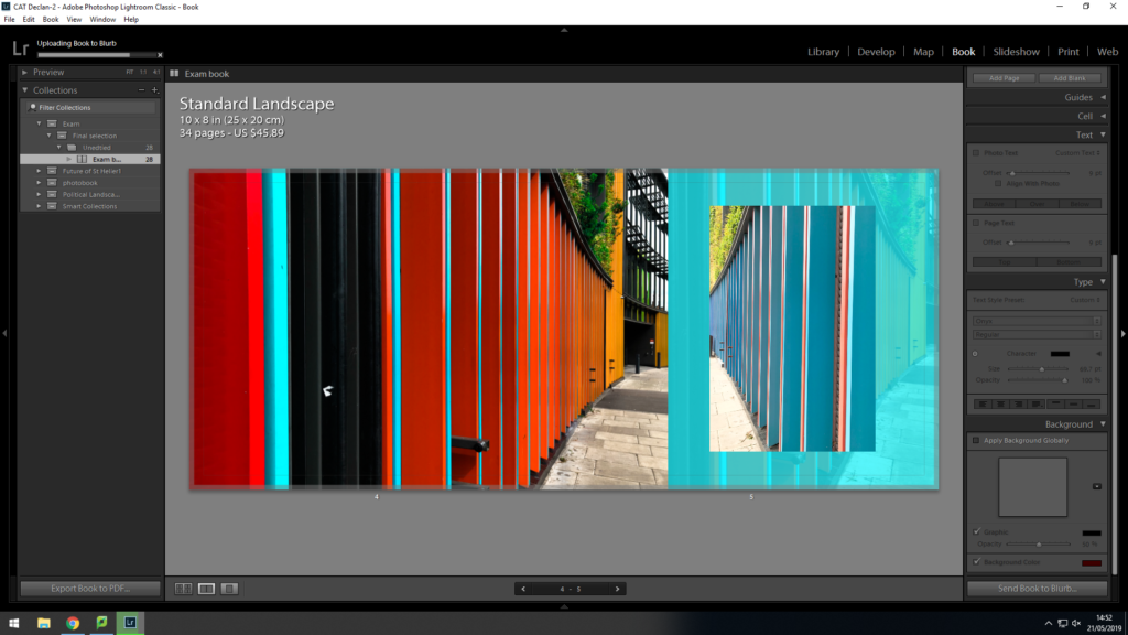


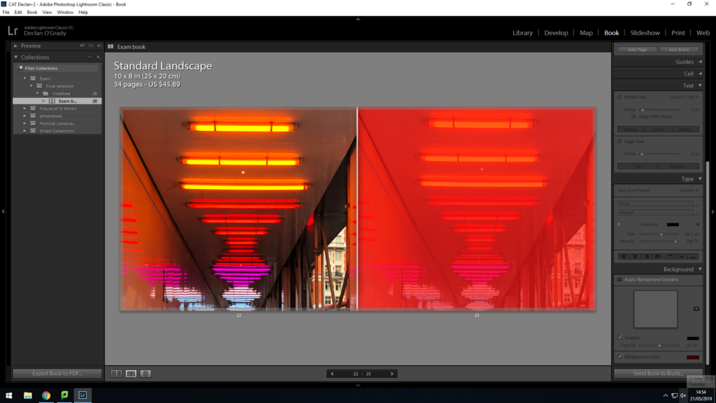

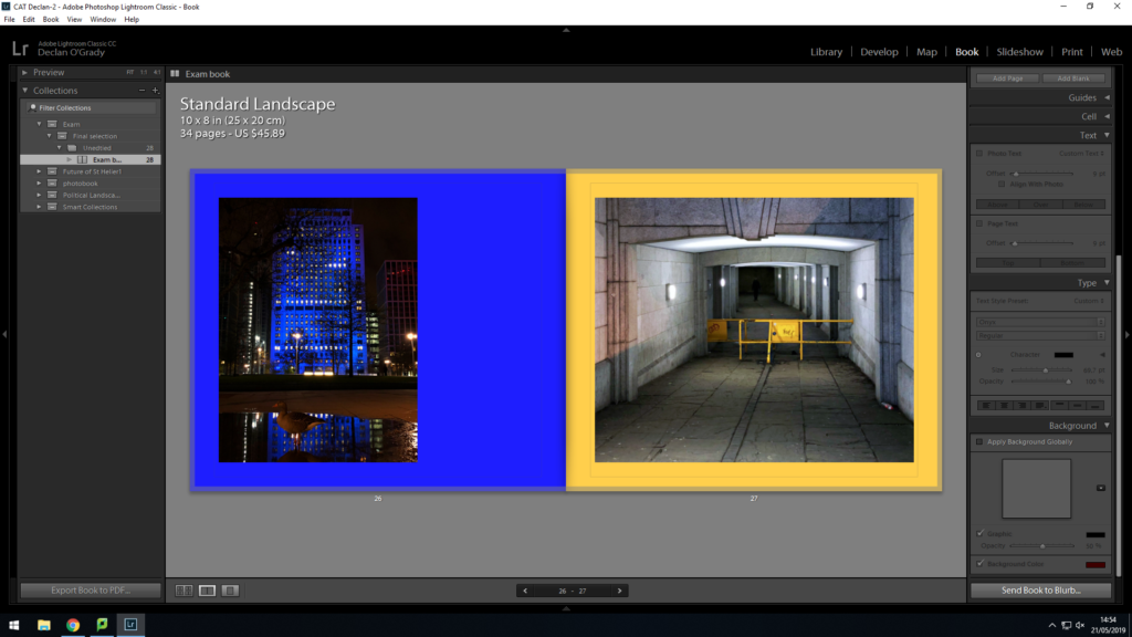


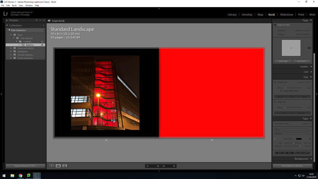
This is my final design for my photo book ‘The Colour And The Shape’. The front cover is something i had been playing with a lot when designing the book. this allowed me to develop the final design seen on my front cover. I used a bottom layer image with 40% opacity through a brown mask layer, this helped darken the image, I then used the same image on the front cover and a supporting image on the back. I used red and yellow because I wanted people to know it was a book full of vibrant colours. I am very pleased with its final sequence. I sequenced my images in a way that flowed predictably and unpredictably. For instance, on page 20 i used an image i thought did not suit my book but i used it as it created a unique contrast between other images displayed. Throughout the design process, i thought of different colour combinations that would look suitable. I came to the conclusion of using tonal colours. I would colour match the focal colour in the image and i would make that the colour of the page. Although, i did not use this method for all pages. I found other colours that compliment the colours within the images to almost extent my own image.
