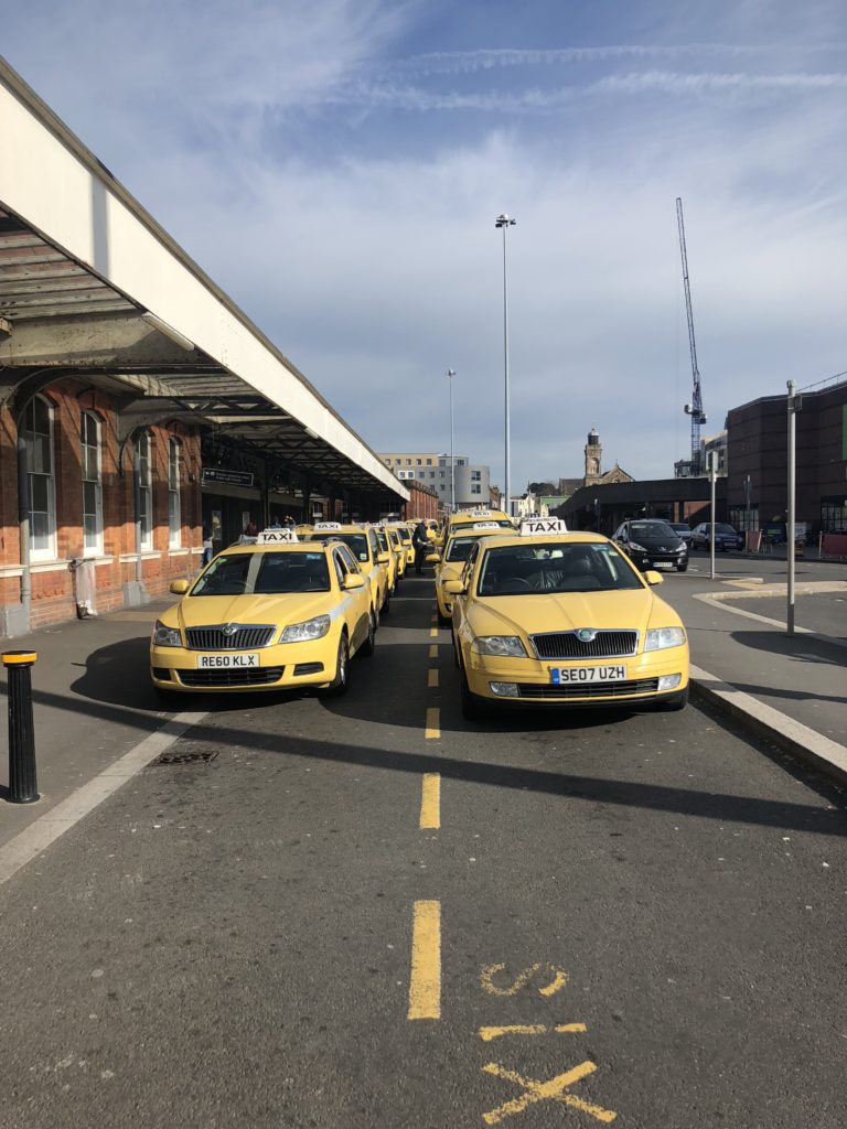

When compared to the work of Saul Leiter, there can be signs of influence in my response. The subject matter of both images is similar just mine is modern and his is from the 50s. This image does a great job at showing development throughout time. Leiters image is slightly darker than mine With much less noise within the image. Mine shows two rows of a variety of yellow coloured taxis. Whereas, Leiters image shows a gentleman and a yellow and green Taxi behind. The main reason i liked this image is because of they way they all have the same exact taxi sign on the roof Yet they are on different variations of cars, This makes them similar yet varied. Lieters image has a high contrast with a slightly lowered brightness, Where as my image is overall fairly light due to the different times they were shit at.
