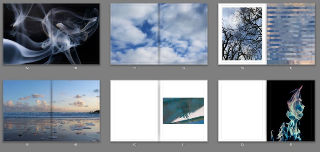
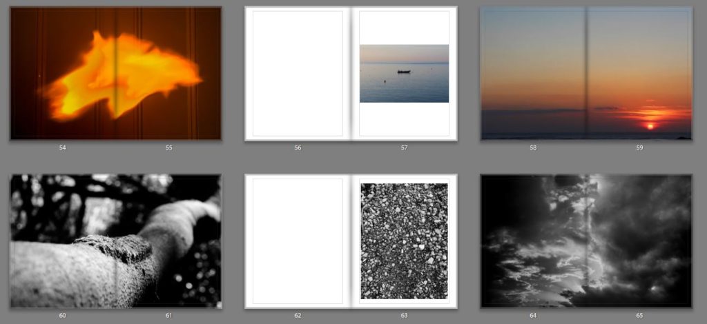
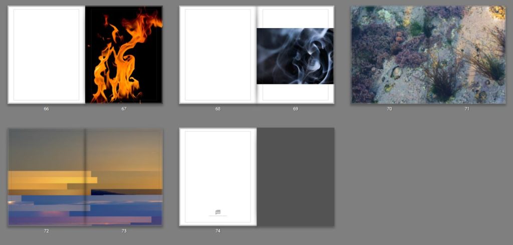
I feel that it was necessary to create a book as a final outcome because I think as the topic that I chose is quite abstract in its nature, it needs to have some depth and quality to the images when looking at them as a whole to understand the project. But also by creating a book I feel that it helps the viewer to engage more with the images, as they are able to take their time looking at each image and take on its meaning, rather to when they are displayed on a wall, I feel that the images become very felt and don’t have much depth in comparison to a photobook.
I really wanted the book to convey a sense of simplicity but at the same time the images to be really powerful and to make the viewer stop and really take in what they are looking at. And make them stop in their everyday life to see the beauty that is around them if they take the change to stop and look.
My main inspiration for the style and genre of my book was Rinko Kawauchi’s book Illuminance which has been the inspiration of the whole of the project. Her book is very simplistic in its nature and each images flows really well into the next one which really helps to make the project link together, due to the atheistic of each image and the colour texture and composition of the image.
Which is something that I wanted to be able to work into my book. Which is why I didn’t separate the book by element as that would get very boring. The narrative within my book is individuality, beauty and simplicity of each element and how different each one is but yet how each one is connected and dependent on the other to survive.
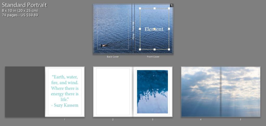
For the the front cover I wanted a image that would draw the view into the book, but wasn’t too busy so it would ruin the aesthetic of the rest of the book. I really like the cover that I chose, I think as the cool tones of the blue is calming and links my idea of the taking the image to stop and look at the tiny details, as the viewer has to stop and turn over the back to see the duck swimming across the page to see where the ripples in the water are coming from. I chose to have a big white title in the middle of the page as I think that this juxtaposes the blue and makes a bright and bold front cover which is calming at the same times as being able to draw in the viewer.
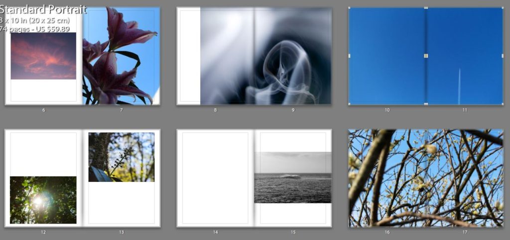
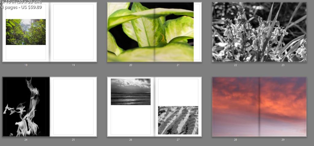
Most of my images are very colourful and the book as a whole is very contrasting in its colours, I wanted the viewer to be drawn in by the use of pastel colours. But I also wanted some images to juxtapose each other which why some but not many of the images are in black and white I also felt that is changed the sequence and flow of the book to help the viewer look at the images in a different light. I also felt that but some of the images in black and white helped to bring out the detail of them.
In the book there are different sections for each element but I wanted to make sure that each image had a connection to the image before and after it as this was a notable feature in Rinko’s work that I really liked also because I felt that it would help the viewer to understand the project more, and also create a sense of rhythm and structure for the book. However I didn’t want all of the image to be grouped together but element as I thought that this would become very boring and repetitive for the viewer.
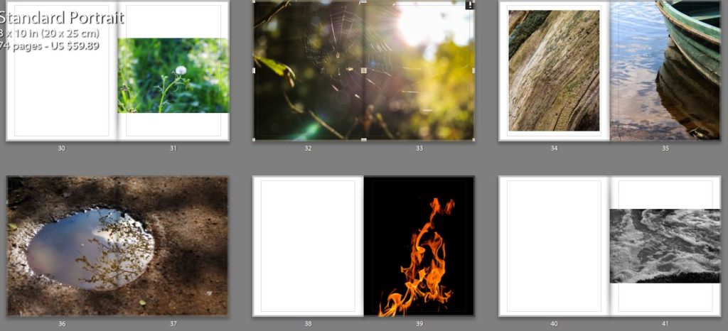
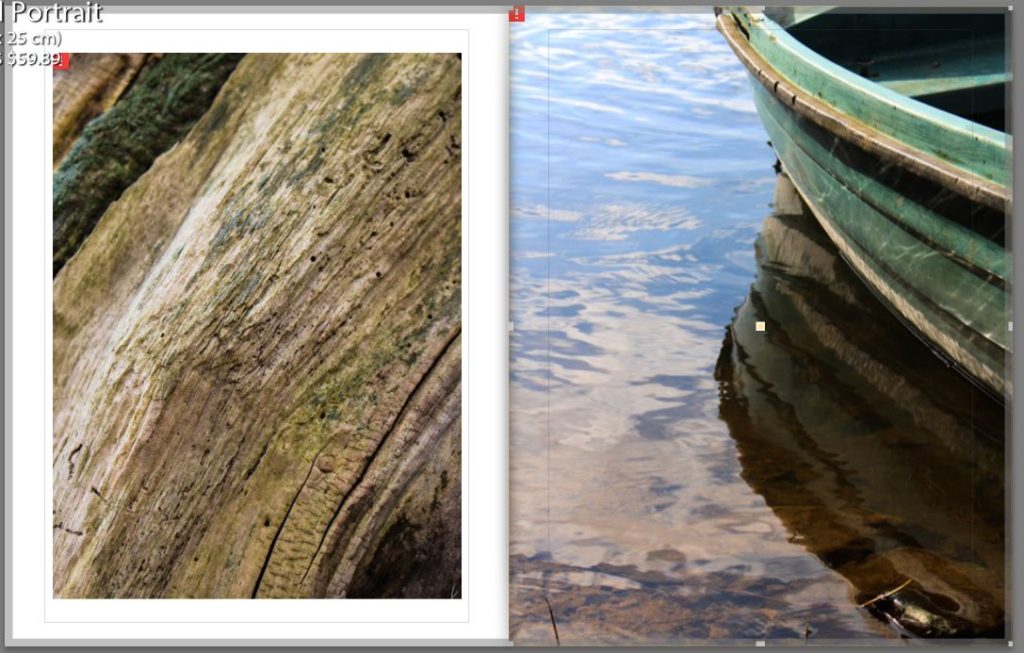
Below is an example of connections that I made between the images. One is an image is an unusual perspective of the bark of a tree, I but this image in the book as I feel that it is a visual representative of the idea that I wanted to get across of the beauty in everyday things. The other image is a close up of the side of a boast with the light reflection off the water onto the side of the boat. I decided put these two images together due to the texture and colours in the images and the lines in the boat and the lines in the bark.
Overall I think that this project has gone very as I have created a book that makes the viewer reflect on the way that they view the world and will hopefully make them some and look at the beauty that is around them which they are missing in their everyday lives. But I have also created a book that takes an in-depth look not only into the physical elements but the spiritual parts of the elements and the feelings that they convey.
