I decided I wanted to print 4 photos in A3, 4 photos in A4 and 3 photos in A5. This is shown below:


I experimented with a few different ways in how I was to present my images. My first instinct was to go with these layouts below:

I liked these 2 together as even though one is in colour and the other is in black and white, they are both related to each other due to the fact they are both from my boat shoot and they have similar shaped objects and structures in those 2 images.

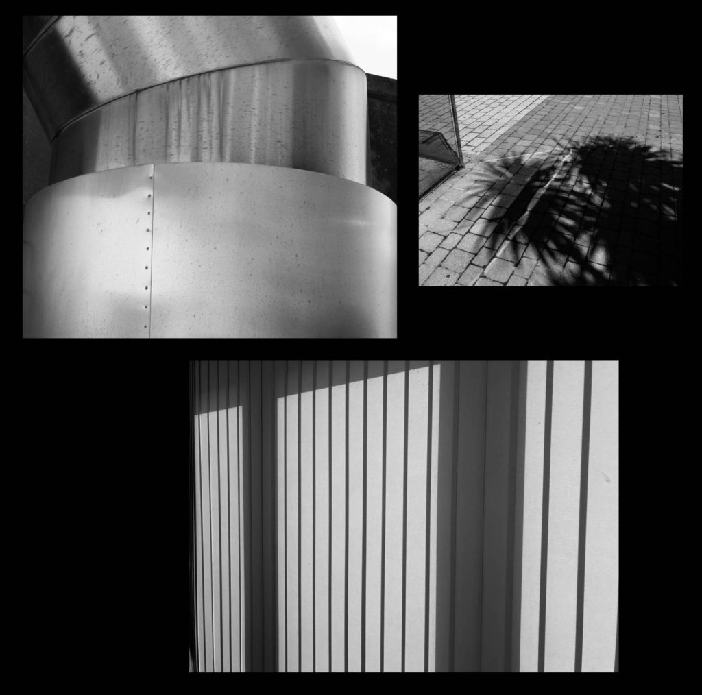
I liked these 2 A4 images and 1 A5 image together because the consistency of the black and white created an effective look. Additionally, I liked how they all are landscape images and how the bottom image has the strongest structure of shadows. I was thinking that I could trim all these images so there is no white borders and spray mount each image onto a piece of foam board. Then, I would’ve got a big piece of black card and stick each image on top of the foam board onto the card so they are assembled together.

I thought these 2 A3 images looked good placed next to each other as they both have strong shadows in each image. I would’ve done a window mount of these images together so that they were included in the same piece of card but in 2 separate frames.


Then, with the remaining 4 image prints, I would’ve put them all onto a piece of foam board and stuck the foam board onto a piece of black card, but maybe a different coloured card for the glow stick print on foam board.
However, I thought that some of the layouts above could’ve looked better, so below is some more experimentations of layouts:


With seeing all the different best possibilities that could work well to present my final images, I decided to use these below:

With these 2 A3 images, I am going to put them both onto a separate piece of foam board and put this on top of some black card.

With these 2 A5 images, I am going to do the same as the idea above – put them onto foam board and then onto black card.

With this 1 A3 image and 2 A4 images, I am going to do the same foam board idea and put them onto black card.

With these 2 A4 images, I am going to put them together in the same window mount, however they will be in separate frames on the same black card.

With this A3 image, I am going to make a window mount of black card.

With this A5 image, I am going to put it onto foam board but I am thinking of keeping the white border around this image so that when I put it onto card, there will be a nice thin white strip to separate the colour of the card and the black background of the photo.
