Image 1:
This image is a typology grid format of trees from my first shoot. I edited it in response to Bernd and Hilla Becher, who specialize in typologies. This black and white composition shows the varying patterns and markings on the trees I looked at. Editing it into black and white meant I could emphasize the tonal contrasts and shadows on each individual photograph, making them more interesting and compostionally strong. As I am looking at variation and similarity within nature, this image explores that well as it portrays the very different markings, but portrays similarity through the typology format of trees.

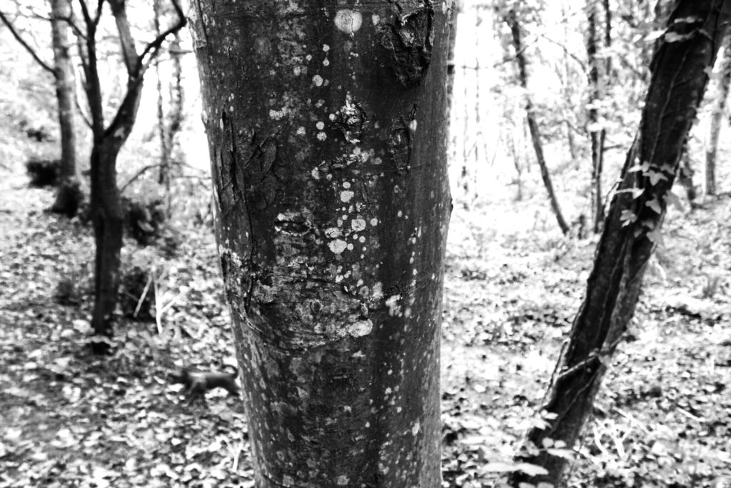
Image 2:
This photograph is also from shoot 1, but in a single-image format. I like this image as although it is a simple capture of woodland, the background is underexposed so contrasts well with the tree in the foreground. The high exposure highlights the moss and markings on the tree, and the leaves in the background.

Image 3:
My 3rd image from shoot 2: natural forms, is a composition of two similar photographs of a segment of rock. I positioned the rock against the white surface background to create a subtle contrast between the pale colours of the rock and the paper. My inspiration for this image is was Bernd and Hilla Becher for the composition and Karl Blossfeldt for the visual style.

