Black and White Experimentation / Image Analysis

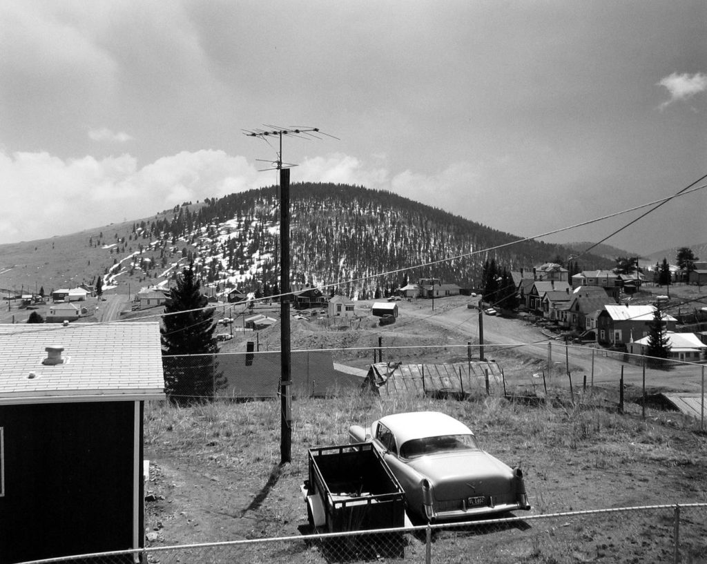
After continuously producing photo montages that are coloured I decided to do some monochromatic experiments, some completely new and some modifying montages which I have already made. I personally believe that these experiments are great in terms of how they show shape and form, as removing the element of colour allows for more focus on the simple elements of each piece. I also believe that with reference to romanticism and the new topographics, with photographers such as Ansel Adams and Robert Adams; that these pieces which I have produced give a great sense of depth and drama. Here are some examples of Romanticism/New Topographics which I am refering to…

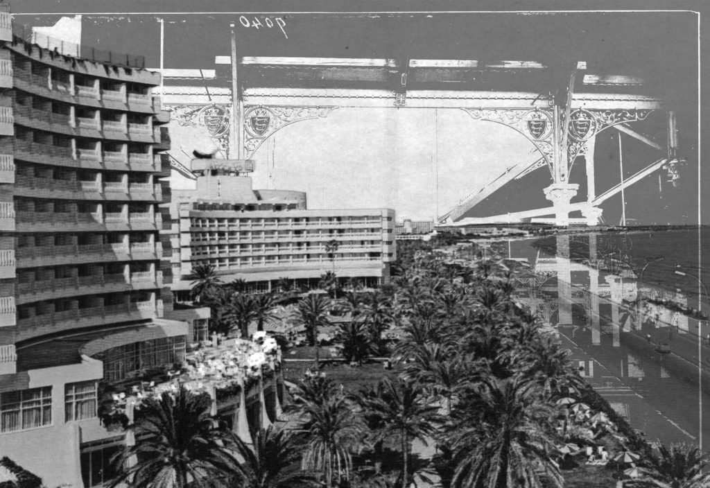
I also feel like due to the chaotic photo-montage aesthetic, that once in black and white these pieces have a sense of mystery and the unknown. Here are all of the black and white experimentation which I have done, a few of my favourite experiments are followed by a description as to why I believe they are successful…

This experiment is one of my favourites from those which I have done. This is because i believe that the shapes and forms within the image are really enhanced by the dark elements in contrast with the bright inverted sections. The shape and form within this piece its self is something which I believe works very nicely as the smooth curves of the archways balance out the sharp corners and lines of the roofs and the sectioned elements above.
This piece above is also one of my favourite outcomes from this black and white experimentation. Again I absolutely love the contrast between the dark tones at the bottom of the image and the light at the top. Another thing which stands out to me in this image is how well the empty smooth sky element of the image balances out the detailed and full section of the image lower down. The grain which i have also added to the image is something which I believe definitely benefits the overall aesthetic of the image as it gives an aged/dated visual characteristic.
Finally, this is also one of my favourite outcomes from this series of experimentation. With this image I brightened the overlaying element of the image and darkened the background, on top of this I inverted the whole piece. My intention of doing these two things was to give a ghostly and mysterious aesthetic to the figure and its surrounding objects upon a simple dark background. This worked great and my intentions were met as I believe that the visual quality i was aiming for was met once editing this image.

Leave a Reply

Your email address will not be published. Required fields are marked *