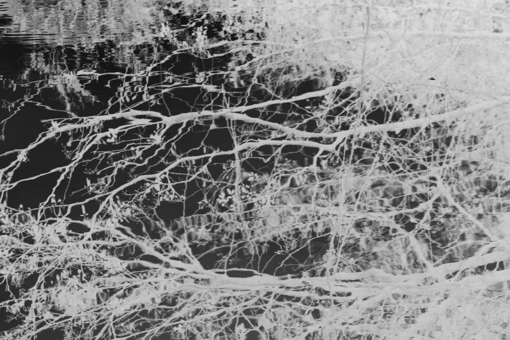
The final prints that I chose are an array of different shoots focusing on body texture, nature and the objectivity of religion.

Doing this experimentation, has allowed me to visually see which is the best ordering and composition. I wanted to develop three Ways which I could show my images, in rows, columns and also possibly in a straight composition of many different levels and sizes.

I believe in a gallery space this piece would be the most effective, this is because It would enable me to experiment with even more prints, and also would allow strong lights to further emphasis the colour of the deep silver and black images already achieved.


My favourite presentation, and in my mind, the presentation I feel to be the most successful, is the first presentation, with two long rows, with the differing images of tonal qualities juxtaposing each-other. I wanted to show all different angles to see which perspectives best compliment the images and also access this narrative relevancy throughout. The choice of having eight also works better than my previous thought of 9 because it allows a sense of equality and evenness to the different stages throughout life and doesn’t give an abrupt ending to life and the book as a whole.
Development:
I have already printed, sprayed and placed my images onto card, and then cropping and trimming the images. After doing this basic development I need to discuss and develop the rest of my presentations. Due to all of the images being A1 I did not know whether I should Put them on a wall due to their sheer size. I want to use some type of developmental composition in order to see what in reality the huge impact it would be seeing physical side of the shoot.
Final display:

I believe seeing it as a reality is a very important aspect of the presentation itself. I wanted this large impact of black to juxtapose from the white wall and I believe this really is evident of the effectiveness within this presentation. It is not the same as what has been done before and the true largeness and amount of images portrays an ideology of an evolution, relating to that of my whole project, within its finality. I chose this order as I believe the variation is almost chronological with starting at a church scenario, and then exploring more to a naturalistic theme, then coming into the essence of people and lastly showing strong contrasting images of a movement of colour in order to connote the aspect of death. All of the images have such a different independent composition and this is why the presentation as a whole becomes interesting and meaningful, as there is not one image on its own holding up every other image.

Evaluation: Overall I definitely feel that these were the best images to choose, not only do they show a variation of many of my different shoots, but there is a clear connotation of the evolution of life and death throughout, and I think the details throughout each piece allow a clear connection throughout. The contrasting very light tonal prints to the ,much darker tonal colours creating a successful print. I decided in the end the best composition that would physically work and fit was The line of two rows. It allows this extended narrative of a line, but more clarity and visibility as it is narrowed down to one area. The two lines also allow the images above and to have a contrast or similar theme to have further connections within each other. Overall I believe this large scale presentations taking up a whole wall was definitely the best possible outcome for my design and really accentuates the true power this piece contains.


