PART 1
What is included?
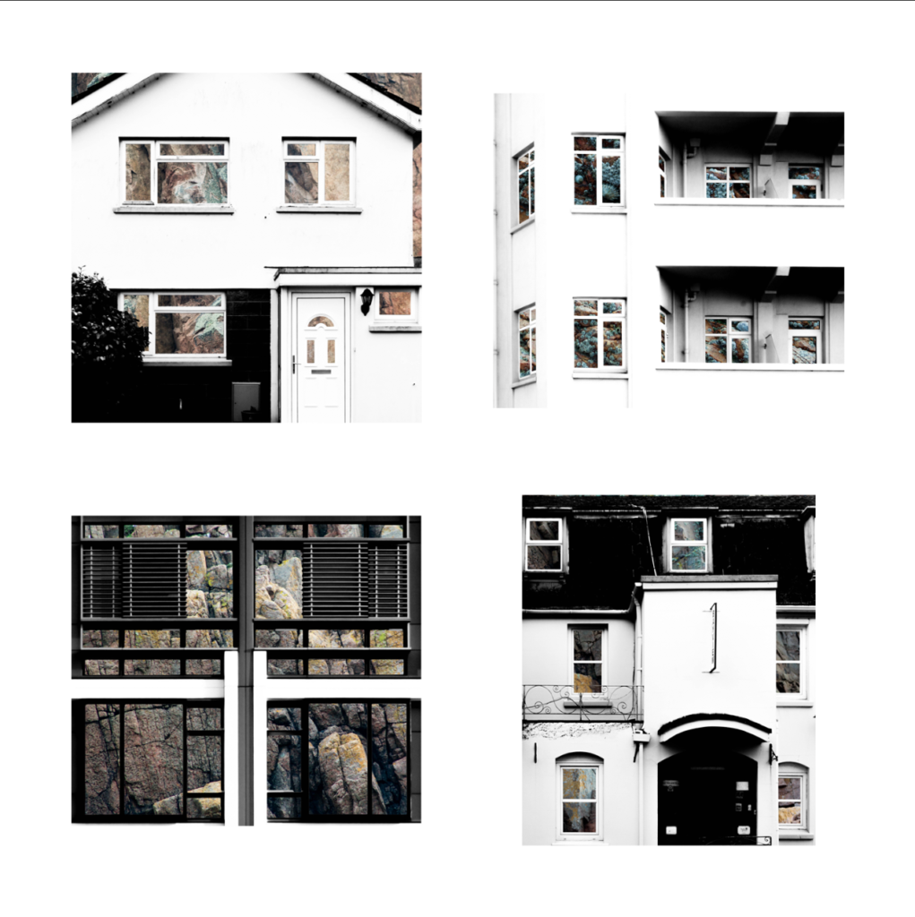
For the presentation of my final photographs in my exam I will be presenting the photographs in a typology grid. I believe that this method of presentation is very effective and appropriate because I have experimented with it throughout my project and have studied the likes of the Bechers’, who pioneered the use of typology grids. Originally, when planning on how to present my final work I had the below four photographs planned as my final four, as I was experimenting with the different layouts I found that it looked slightly off – I eventually decided that the photograph in the top left did not fit in well with the other photographs as it depicted a more brushed steel texture as opposed to the rusted texture in the other compositions. Saying this, I still thought that this photograph was very effective and aesthetically pleasing so I decided that I would include it by presenting it by itself as a side piece to the typology and replacing it in the typology with a more fitting composition. The resulting piece is a set of photographs in a typology grid that portrays how a standard house face can be so similar in features but at the same time can be completely different due to their own individual features. This idea is added to by the rusted steel layered over the building face as the steel represents how the materials used in house construction has changed over time from granite towards steel modern structures. The photographs will be printed as four A5 photographs and one A3 photograph.

Layout 1 
Layout 2


How will the photographs be laid out?
I plan to present the typology grid made from four photographs and the individual photograph on a foam board. One way in which I could present the photographs is by using a window mount method – in order to mount the typology grid I would first stick the photographs to a piece of white card and then tape it to the mount like an ordinary picture. I could also present the photographs on white card as shown below. After experimenting with both options on photoshop I believe that the most effective layout of the photographs would be to use window mounts and black card because the slight white border contrasts well will the black mount board, which also brings out the colours and shaped within the photograph. This contrasts with if I was to set it out on a white background as the contrast in colours and shades does not exist in this option, making it the weaker option. I have also experimented with which side to place the individual photograph and have come to the conclusion that I will place it on the right as I want the viewers attention to first come to the typology grid.

Experimenting with a white background 
Experimenting with a black background and the single photograph on the left

PART 2
The second part of my presentation will follow the same guidelines as the above presentation but will be made up of my compositions in which I layered building faces over granite. It will include four A5 photographs made into a typology grid along with a single A3 photograph all on one black window mount. The idea behind this presentation is the exact same as in part 1, except that the granite is replacing the steel by giving an insight into the internal structure of the houses to show what material they are based upon.

Layout 1 
Layout 2

How will the photographs be laid out?
I will present these granite compositions in the same style as the steel compositions in order to ensure consistency in my work – I will window mount all the typology photographs onto white card and then window mount that card and the A3 photograph onto a larger black card.

