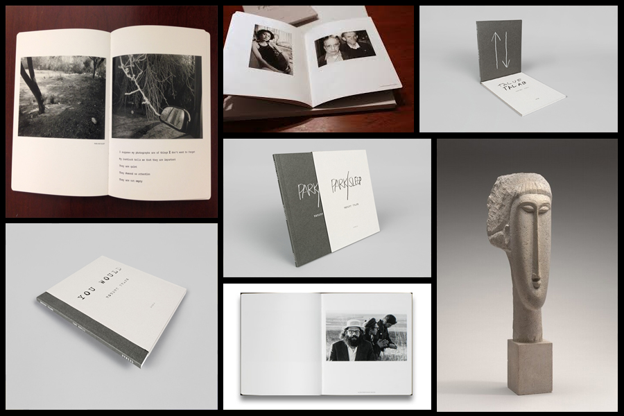
Before going a head and creating my three photo-books I decided to look at a photographer who had produced work in a style that was vaguely similar to the outcomes I desired. The books I found to be particularly inspirational were ‘You Would’, ‘Tal Of Tal AB’ and ‘Park Sleep’, what drew me to the designs in particular where how each was encased inside a brown cardboard folder which fitted the dimensions of each book perfectly. For me this was an idea I wanted to explore as I previously had aimed to produce the three books and store them in a hand-made sleeve so that could be viewed collectively but viewed individually. When looking over the books I found what drew me to them was their minimalist covers which only contained the title and authors name against a predominantly plain backdrop of textured grey card, this was very effective in regards to the book cover being a darker version of the grey which compliments the actual cover which as a result produces the impression of the binding of the sleeve being different. Some pictures of the books can be seen below:

Who is he?
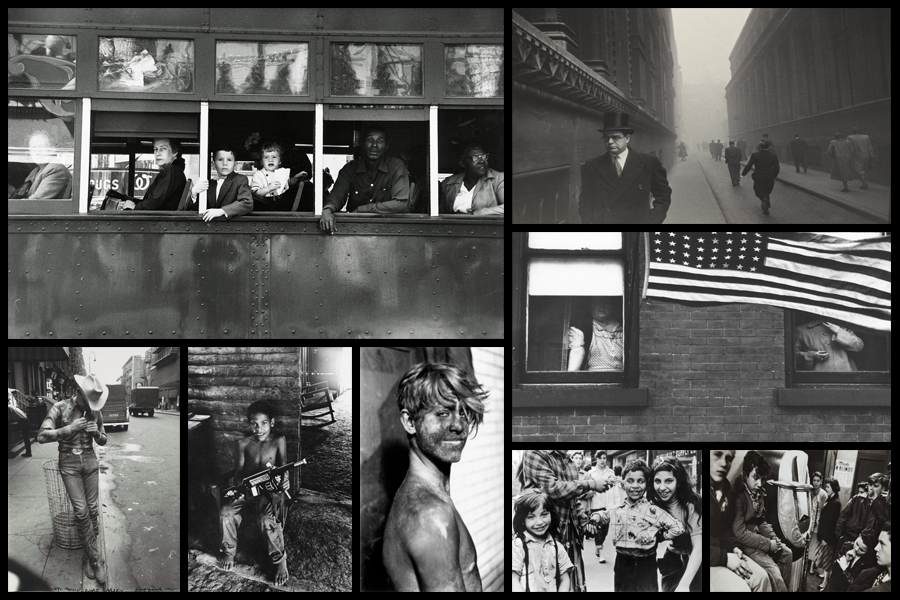
Robert Frank, born November 9, 1924, Zurich, Switzerland, Swiss American photographer and director who was one of the most influential photographers of the mid-20th century, noted for his ironic renderings of American life. Frank became a professional industrial photographer at the age of 22 and in the 1940s became a successful fashion photographer for Harper’s Bazaar magazine in Paris. He felt, however, that the scope of the work was too limited. He abandoned fashion photography about 1948 and went to the United States and then to Peru to explore the expressive possibilities of the 35-mm camera. After photographing in Europe in 1950 and 1953, Frank returned to the United States. Between 1955 and 1956 he drove across the country, taking a number of photographs. Of those, 83 were ultimately published as The Americans, 1959, a French-language version, Les Américains, had first appeared in 1958. Photographs such as Chicago, 1956 in The Americans revealed Frank’s mature style, which was characterized by bold compositions and ironic, sometimes bitter, social commentary. Their publication established Frank as a major creative photographer, and the book was widely hailed as a classic. Examples of his photography can be seen below:

When making my books I would like to explore the use of composition carried about by using singular images over a two page spread which add to the overall effect of any image you want to exaggerate or over-emphasize. For me personally I would like to incorporate mono-printing to produce the cover of my sleeves, this is because of how it would create a newspaper effect where the font thickness and size would be inconsistent and slightly faded, which as a result produces an ink collage effect.
Before ordering and making the book I would need to consider the colour of both the sleeve and books front, this is because of how I want them to be colour coordinated so that they both compliment and contrast each other which creates a more aesthetic result.
