Final Evaluation

‘Variation and Similarity’

After consideration for the exam brief I decided the most effective and interesting way for me to demonstrate the theme ‘variation and similarity’ was through nature and aspects of it. I made this decision due to the vast range of green spaces and easy access to aspects of nature, such as, shells and rocks from the beach, or a variety of flowers from fields and lanes. My exam project focused on three main points within nature, Flowers, Objects found at the beach; rocks and shells, and natural landscapes, to adhere to the theme variation and similarity while using these objects I made sure to collect a variety of different types of the same object; flowers, rocks. I feel abiding by these specific rules I set myself allowed me to successfully fulfill the exam brief, for example I photographed twelve different types of rocks and shells and ten different types of flowers, but while all falling under the same category of photo shoot 1 or 2, demonstrating a range of similar objects; flowers or rocks, but being completely different in appearance, being the aspects of variation. I also photographed natural landscapes, the variable of similarity being the model that appears within the photographs and the fact that the landscape is natural; beach, woods etc, but the variation also being that the natural landscape is different in appearance, the woods differing from the beach greatly in appearance but still falling under the same category of natural landscape and fitting into photo shoot 3.

I drew inspiration from and researched a variety of artists throughout my exam project, for example; John Baldessari, Luigi Ghirri and Etienne-Jules Marey are a few that I was directly inspired by and their techniques and styles are visible thought out my project and final pieces. I incorporated John Baldessaris ‘dots’ into five of my final piece photographs, this being a simple but effective effect within my final pieces. Luigi Ghirri was another artist that I took inspiration from, I used aspects of his style of presentation and composition within photographs, being another simple effect but effective in the overall outcome of the presentation of my final pieces. Etienne-Jules Marey was an artist that I also took direct inspiration from and his style of sequencing and repetition is visible within my final pieces, four of my final piece photographs go into a single sequence. My final pieces link with the exam theme of ‘variation and similarity’ for example the majority of my final pieces have a variety of different photographs in one piece, two of my eight final pieces consist of four different photographs that link in a way, two consist of three separate photographs that link, two consist of pairs of photographs that link and I have included two singular photographs that where successful photographs by themselves and have direct links to artist john Baldessari, one of the artist that I researched throughout the exam project.

The majority of my photographs within the exam project ‘variation and similarity’ where taken in natural daylight, this added a warm, bright feeling thought out the body of photographs and also made the colours within the photographs pop. The meaning behind the photographs are very literal and solely represent what you see in the photograph. I thought specifically about the composition of my photographs throughout the project and made sure to photographed a variety of different angles, distances, to have a variety of option to choose from when making decisions about the most successful outcomes and what photographs would be good enough for final pieces.

In conclusion I feel that my decision to photograph Nature and aspects of it, in response to ‘Variation and similarity’ was successful and my project and final pieces are a good indication of the development of my ideas and work.

Images of mine similar to artists

My flower shoot was inspired by artists such as Takashi Suzuki, as she photographs studio images of objects, (like flowers, as well as sweets). Rinko Kawauchi was another artist; her illuminance book consists of images where my flower shoot created similar styles.

Takashi Suzuki’s style of photography:

Takashi Suzuki’s image

Images of mine similar to Suzuki’s:

Rinko Kawauchi’s style of photography:

Mood-board of Kim’s photography

Images of mine similar to Kim’s:

My architecture shoot was inspired by artists such as Ray K Metzker, Takashi Suzuki and Kanghee Kim.

Ray K Metzker style of photography:

Mood-board of Metzker’s photography

Images of mine that are similar to Metzker:

Mood-board of my images similar to Ray K Metzker

Takashi Suzuki’s style of photography:

Mood-board of Suzuki’s photography

Images of mine that are similar to Suzuki’s style:

Mood-board of my images similar to Suzuki’s

Kanghee Kim style of photography:

Mood-board of Kim’s photography

Images of mine that are similar to Kim’s style of photography:

Phtotobook | Title Page

After much umming and ahhing I decided on a name. ‘Latitude’. I discovered this name when looking through a Thesaurus at other names for circles and I rather liked it straight away. I had a couple of other options however for me, this one stood out for many reasons.

Firstly, it just sounds cool and catchy. Secondly, latitude is a circle on world charts and this links to my images of tiny planets as they are globes like out planet. Lastly, on a map, latitude looks like rings around the earth and this links to my cover image you see above of the wood with the rings representing life.

Merge Experimenting

I attempted merging images together to create one image where the circles are halved. I thought this would work well however this image was the only presentable one. I am glad I experimented and realized that this didn’t work however I do not believe this image would fit in with the rest of my book as it would be too alien in comparison to the other images in the book. As well as the fact both of these images are used in separate pages.

FINAL BOOK LAYOUT

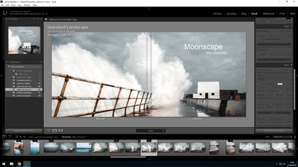
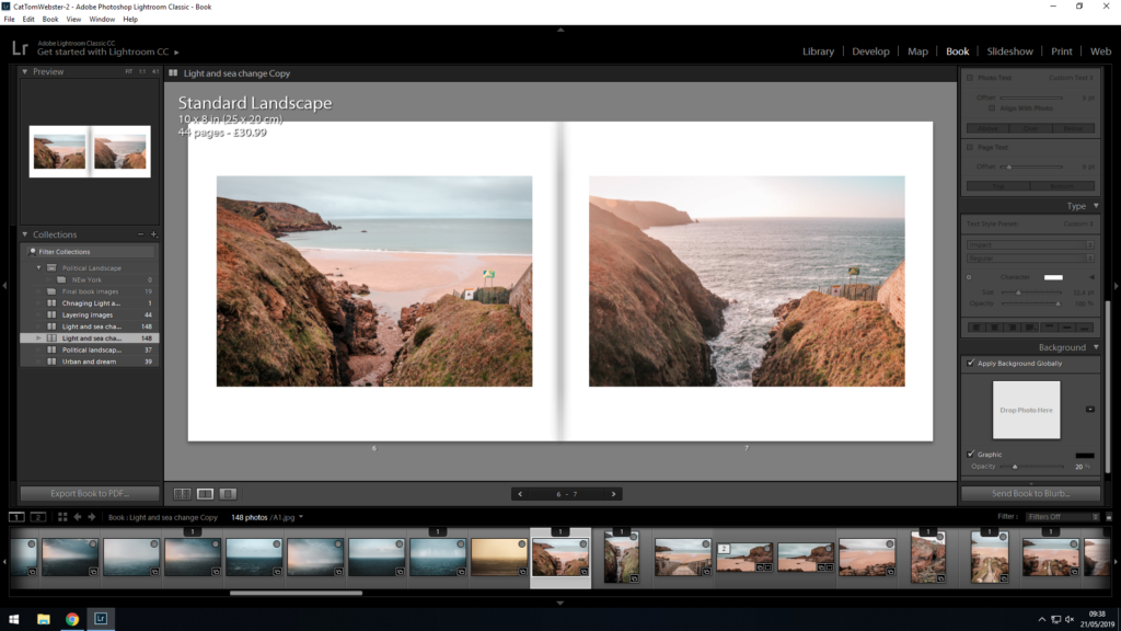
To introduce my book I wanted to make it clear to the audience this sense of change which is the ongoing theme within my book. This set of images on the opening page show these ideas of variation through the difference in water level, one being at low tide and the other at high tide. Another main focus within my book is the variation of lighting within the same location which is evident in this spread as one image was taken at midday and one at sunset.

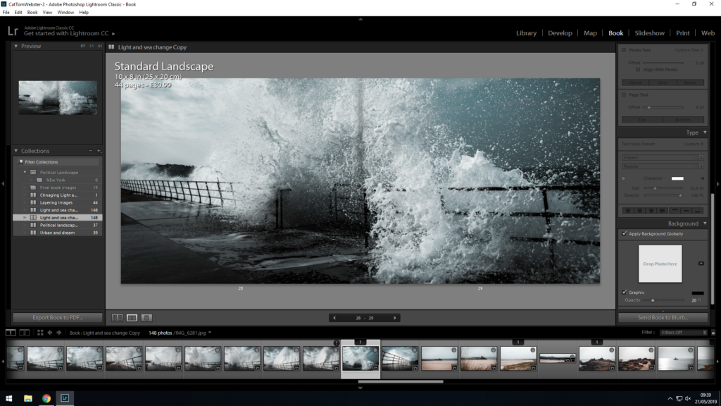
I chose to opt for a double page spread for this image due to the fear of the unknown it creates. The thick clouds and fog obscure the horizon creating a sense of isolation in the way that the clouds appear to be closing in on us. Also it represents an expression of time exposed which act as a time capsule for a series of events in time. This is effective at the start of my book in showing how the whole book is about the events within a day of changing weather, lighting and sea.

I felt as if the above image is very strong in aesthetics and therefore believed it would work best as a double page spread. I ensured there was no boarder to emphasize the sense of isolation and really engage the viewer, making them feel as if they are there. It feels moodier and slower than in reality which i deliberately constructed to show the power of nature and emotions it can evoke.

I think that this method of presenting my work, implies the passage of time and timelessness, echoing the oceans perpetual cycle of change and renewal. By using this triptych method, it allows the viewer to see beauty in each individual part of the landscape as appose to when it is as one photograph.

I thought that this image worked really well within my photo book, mainly to give the viewer a break from the main structure of the book. It allows the viewer to really engage with the beauty of the ocean. The depth within this image has signification of a journey, representing the cycle that the ocean undergoes everyday and also mimicking the journey that the viewer is on within my book.

I like how the above two pages lack the physical detail with an absence of a main focal point, any land mass and objects. Instead strongly focuses on the lighting and textures which are often not appreciated within the landscape. This was inspired by my studies on metaphysics. Through these two pages there are underlying messages about what exists past our reality for example underneath the sea. Also connections to what we may not be able to see in our reality such as the changing light as it happens which is portrayed through the typology.

The diptych above was specifically chosen as a result of the similar patterns within the plants and the ocean froth. I think this similarity in textures and shapes is really interesting, especially due to them both being natural yet different things. This evokes a relationship between these two elements of nature which stimulates a sense of beauty. Also the juxtaposition between the golden light on the left image and dull moody tones in the right image compliment each other.

This is one of my favorite photos within the photo book, hence why I chose to give it a double page spread. I was really pleased with the composition of this photograph, highlighting elements of beauty (the flowers) contrasted with feelings of intimidation and threat (the clouds). I like how the flowers lead the viewer to the to the cloud formations whilst also mimicking the shapes of clouds with the textures they contain themselves.

Gaining inspiration from the constant and seamless cycle of matter, from air to water to cloud and vapor, and back again i captured this photo that represents this with the intense cloud formations.

I specifically chose these images to end my photo-book with as it represents the end of the journey that the weather, lighting and ocean has undertaken throughout my time photographing it for this project. The photograph on the right is the view that is seen when you reach the bottom of the stairs that can be seen on the left. I think that a sunset image works well due to the fact it portrays the end of the day, highlighting that it is the end of my book. The image of the stairs symbolize a sense of movement and time that occurs to result in the changing weather conditions and sea change.

Micheal Wolf

Wolf was born in 1954 in Munich, Germany, and was raised in the United States, Europe, and Canada. He lived and worked in Hong Kong and Paris. He attended the North Toronto Collegiate Institute and the University of California, Berkeley. In 1976 he obtained a degree in visual communication at the University of Essen, Germany, where he studied with Otto Steinert. Wolf died in April 2019 in Cheung Chau, Hong Kong.


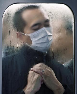
Wolf began his career in 1994 as a photojournalist, spending eight years working in Hong Kong for the German magazine Stern. He said that a decline in the magazine industry led to photojournalism assignments becoming “stupid and boring.” In 2003 he decided to work only on fine-art photography projects. In ‘Tokyo compression’ Wolf photographed people squashed up against windows in the underground trains. Michael Wolf’s Tokyo compression focuses on the craziness of Tokyo’s underground system. For his shots he has chosen a location which relentlessly provides his camera with new pictures minute by minute. Every day thousands and thousands of people enter this subsurface hell for two or more hours, constrained between glass, steel and other people who roll to their place of work and back home beneath the city. In Michael Wolf’s pictures we look into countless human faces, all trying to sustain this evident madness in their own way.

Image result for michael wolf tokyo compression

I like this image the most as it tell you about the subject. From this image I can gather that the Tokyo sub-way is a dirty place and also that the people who live there must wake early to go to work through a crazy rush-hour of people to support family, and that they are probably very tired constantly and grab sleep when they can. This image is also compels you to look at the subject as he is put in the frame due to the trains window he is squashed up against. Many of the other images also show people squashed up against the wet windows, also suggesting it is hot and crowded in there.

This image is quite dark and more of an environmental photo rather than his usual pop-art or abstract photos. The photo would have been taken with a higher ISO to let more light into the lens in the darkly lit scenes of the tube. A fast shutter speed would have been needed if the train was moving, or a low one of roughly 1/60 of a second if it had stopped.

Architecture of Density

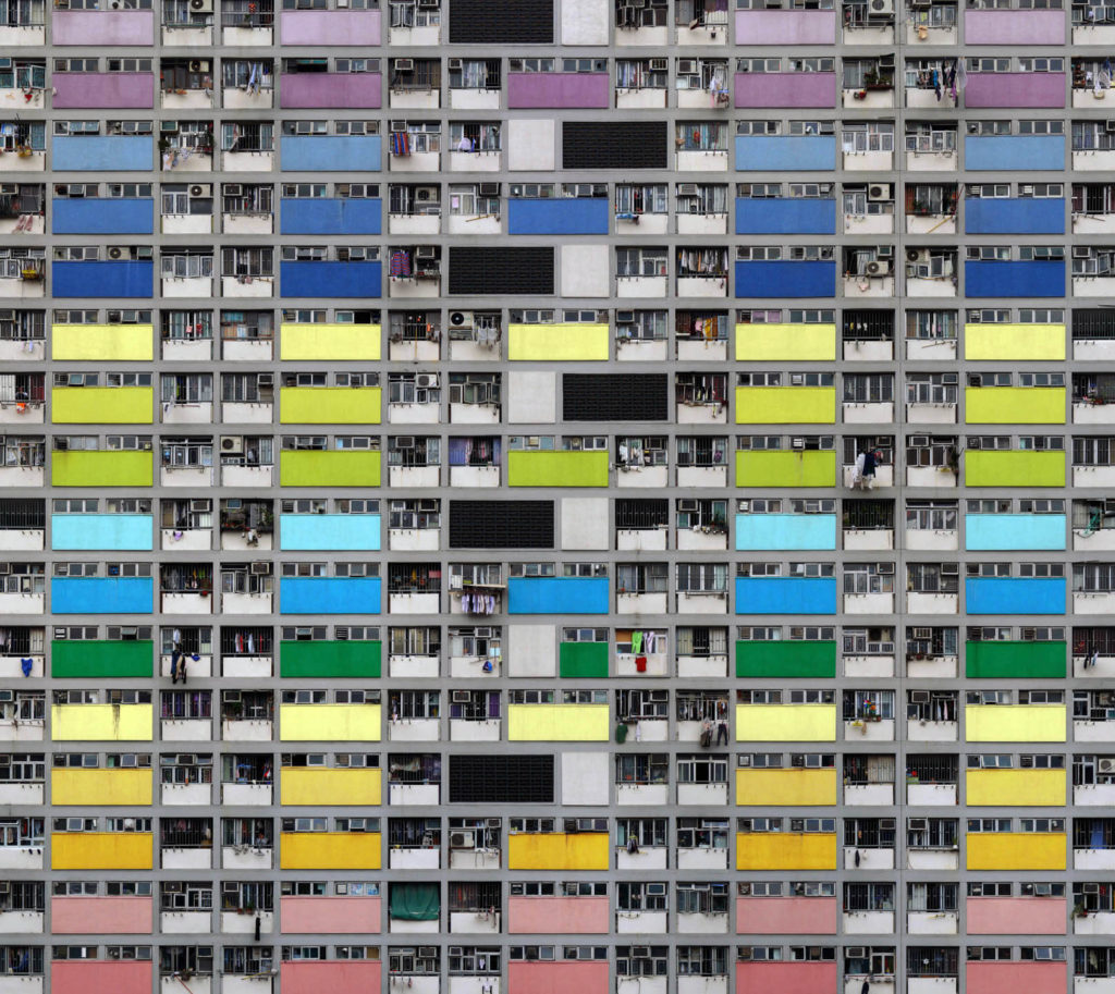
In Wolf’s ‘Architecture of Density’ he has used natural light from the city of Hong Kong to catch the repetitive and colourful high-riser apartment block. Natural lighting has been able to capture the natural tonal ranges of the building which I think depicts the city of Hong Kong well. A deep depth of field would have been used this is because all parts of the photograph are in focus. A shutter speed of 1/60 would have been use as it is the usually one for people and slow moving object an ISO of about 100. this has lead to a visually appealing image.

ESA // Overall Project Evaluation

I felt that the exam title ‘Variations and Similarities’ fitted my style of photography well because it meant I was able to explore landscape photography and produced a wide range of images that looks at the movement of the sea. I found that this project was very successful because it allowed me to explore the beauty of nature, and also explore the science behind tidal movements and what forces have an impact on the sea. For my final presentation, I have decided to present eight (four sets of two) of my images in window mounts, size A4. I have used a black mount board because I felt that this framed my images without taking anything away from the photographs. I have also decided to create a photo book which I plan to capture the feeling of movement throughout.

The key link between my project and the exam theme ‘Variation and Similarity’, was the contrasting images and the differences between high and low tides. The photographers that inspired me throughout this project were Hiroshi Sugimoto because of his simplistic ocean landscape photographs, and Michael Marten‘s contrasting images of landscapes and different times and tidal levels.

If I was to do this exam unit again I would keep to the same concept because enjoyed being able to explore tidal movements as a whole as well as landscape and movement photography. However, I would want to extend my photo shoots so that I could produce a wider variety of contrasting sets of images for my final presentation. Having a wider variety of images would allow me to create a final presentation and photo book at a higher quality. Also, I would include some of the research I found and this would allow me to develop the text elements in my photobook.

CCA Gallery / Private Gallery

CCA gallery

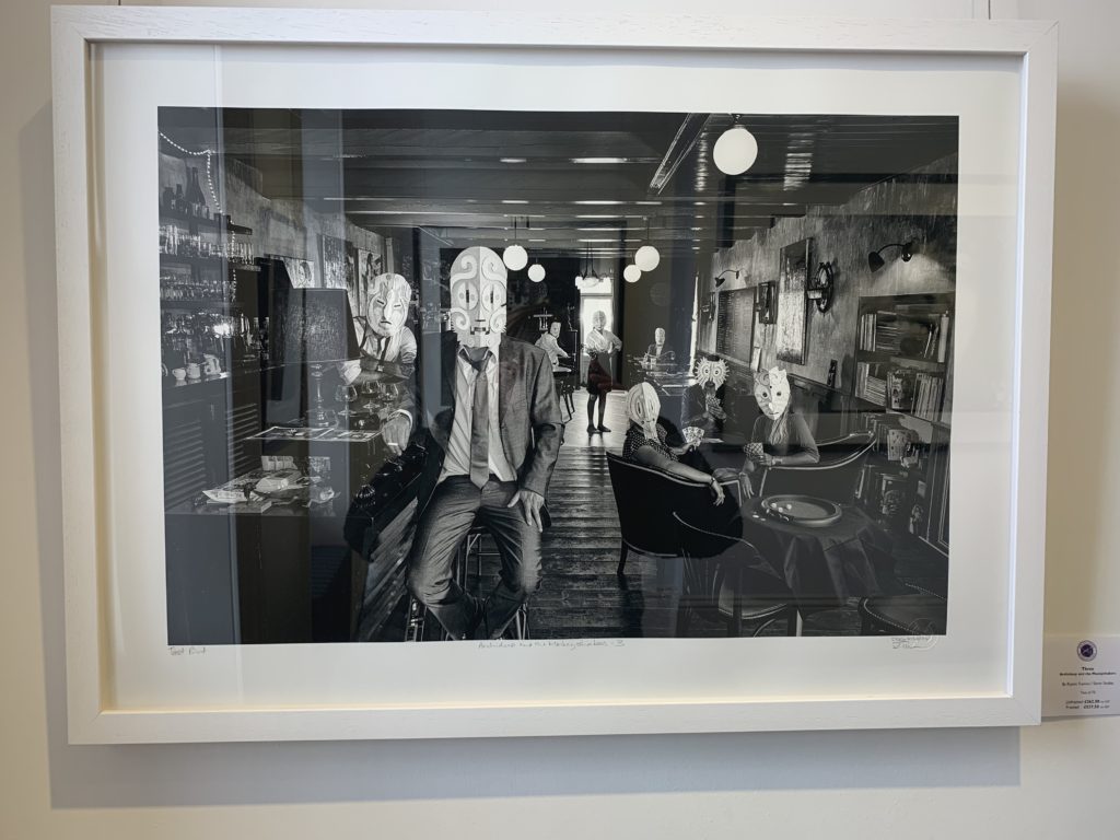
The CCA Gallery was an expedition “showcasing the unseen aspects of photographing celebrities, from behind the lenses of Carinthia West, Rupert Truman (Storm Studios) and Mike McCartney.” The expedition also showed an insight into the lives of other 60’s icons such as Mick Jagger by showing their album covers.

The image that caught my attention however was “three”, an image that was on the front cover of Archideep and the Monkeyshakers’ taken by Rupet Truman. This work appeals to me as I feel it can link in with my work showing that not every one is the same and have different story’s shown by the masks similarly to how the car boot stalls tell my subjects story.

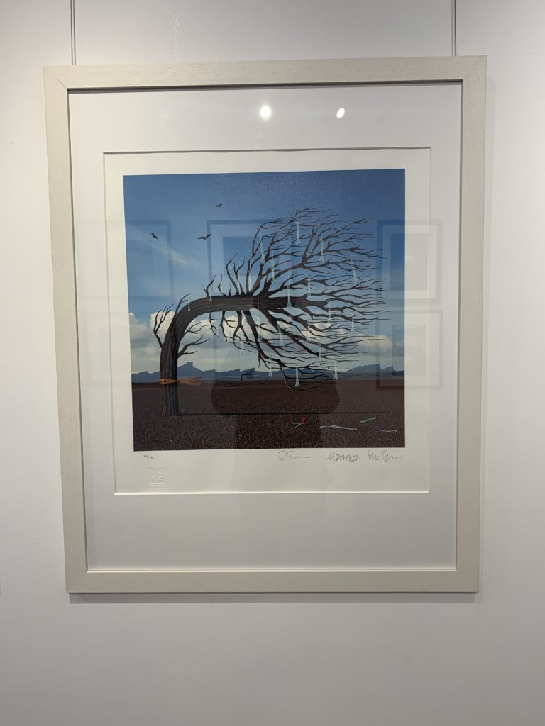
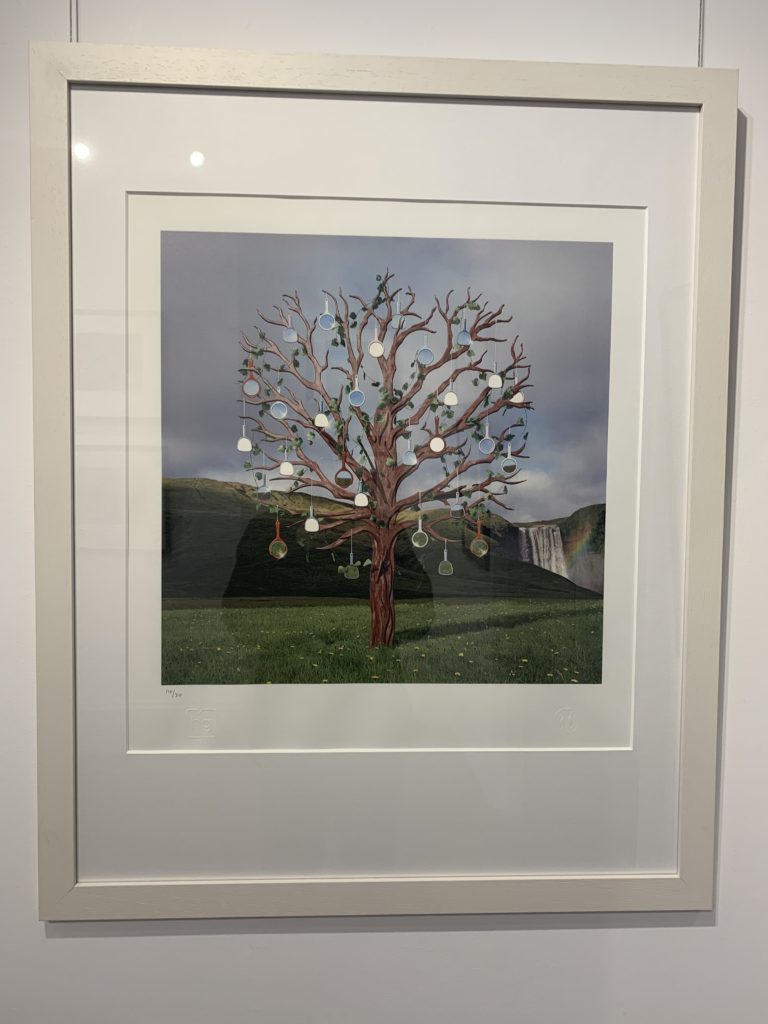
Although I like this image, much of his other work is quite bland and rarely links with my work. This can be shown in this work Bones and Mirrors, which is quite bland as it is just a tree with objects hanging off it.

Private Gallery

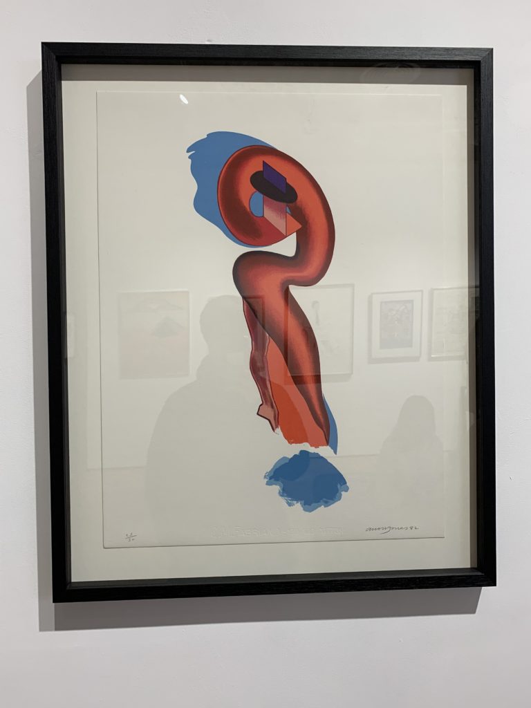
The Private Gallery was very different from the CCA Gallery as it contrasted greatly by showing pop art rather than the more abstract work of the CCA Gallery. The Gallery was called ‘Pop icons in the 20th century, Britain and American pop art’, which I believe it showed in the contrasting colours and abstract shapes in the work. The pop art movement was around in the 1950’s and peaked in the 60’s but is still widely recognized and practiced today. The work at this gallery had a very contemporary style to it – a lot of the work was art rather than photography but was still relevant as the themes and styles used can be transferred into photography.
One image that I liked was the ‘black bean soup’ image. this is because is is simplistic which appeals to me visually. This image was taken by Warhol in the early 60’s, the height of Pop art and followed a common theme of painting soup cans and cola bottles. Even though these were paintings rather than photographs they still apply the same rules of variation and similarity which I believe to be important.

St Helier \ Gorey Photoshoot | Final Outcomes

Below are my final outcomes from yesterday’s shoot (Monday);

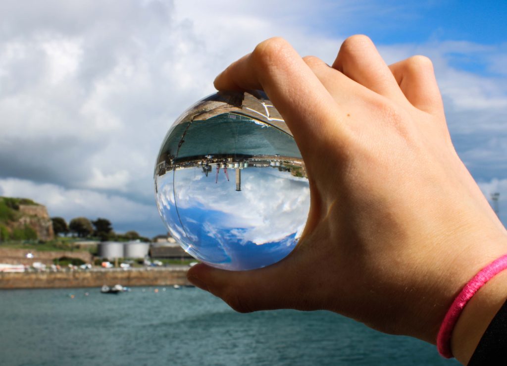
These final outcomes from one shoot made that day very successful in my opinion, I was very happy with the lens ball images and some of the extra little shots I produced whilst walking around town and Gorey.

My favorite images, which is labelled above, is of Mont Orgueil Castle above Gorey taken through the lens ball. I simply had the camera on auto as I had to hold the ball in my left hand and shoot with my right so I believe auto would likely be the most sensible approach to taking this image, yet I usually try to use manual settings on all shoots. The lens ball can be difficult to master when shooting objects from afar. You need to play around with the camera and ball at the same time to work out the best angles and distances between the subject, lens ball and camera lens to achieve the best clarity, depth and subject size possible.

The main reason I like this image more than the is because it is more of a close up, it allows for more details to be picked up in the image, furthermore, the ball looks much more 3 Dimensional and may even look like a planet as it picks up the sky very well.

Final Postcard Display (Final Piece 1)

This post covers my first and main final outcome of the ‘Variation and Similarity’ exam project.

As I intended to do I have produced my 38 inch x 48 inch postcard display which overall I am very satisfied with, I am happy with the fact that following my plan for this display, I have managed to produce exactly what I was planning to. Although I thought I may have to rearrange some of the prints from how they were composed on my plan, once I had set it up I found that actually it looked great as it was and so I left them in the same order as I had in my plan. The display successfully shows my outcomes in an unusual way and overall it is much more interesting than if I had just mounted or framed these prints up, as it really does show that I was going for a classic postcard aesthetic with a twist of my own. The way in which I have spaced apart different prints such as landscape/portrait, black and white/colour or front/back is very successful as although they appear to be randomly spaced this is what i was intending and was in fact harder to make the order look random as I had to think carefully about things vertically and horizontally when spacing everything apart. In my original project specification I stated that I would produce photographs surrounding the theme of chaotic imagery. I planned to do this by creating photo-montages, collages and edits in response to the artists and photographers and movements that I have researched. I said I would relate the work to the issues of overpopulation and capitalism which have and still continue to play a big part in the overpowered development of the world. And that I would photograph all kinds of things relating to this theme as rather than limiting myself to one specific subject matter this will not allow me to produce pieces with chaos as the main part. I also went on to state that these issues of overpopulation and capitalism are something which closely links Jersey with the rest of the world, through trade, immigration, politics and culture, planning to explore this link and how it has developed over time, looking at the past and how it has become the present. And then how the future may look in terms of these issues. This would be executed by the use of archival and found imagery mixed with my own purposed photographs through means of collage and montage. And overall in terms of how I believe this final display has come out I would say that I am confident in the fact that I’ve closely followed my specification and plans in order to produce something which reflects this to a full extent, along with my A3 print display.