Book Specification

Write a book specification and describe in detail what your book will be about in terms of narrative, concept and design.  Produce a mood-board of design ideas and consider the following:

Narrative: What is your story?
Describe:

A sentence

Spirituality and personal connections in nature.

A paragraph

My photo book is looking at personal connections and spirituality in nature, focusing on warm and cold colours, textures, and concepts of abstraction to express how the natural world had it’s own energy and can provoke emotions in humans. I also want to bring a scientific aspect into my photobook, looking at photograms and camera-less images in a spiritual and delicate way.

Title options:

Visceral:

-‘Relating to deep inward feelings rather than to the intellect.’

-‘Being or arising from impulse or sudden emotion rather than from thought or deliberation’

•Ethereal

-‘Extremely delicate and light in a way that seems not to be of this world.’

Transcendant

-‘Beyond or above the range of normal or physical human experience.’

Structure and architecture, Design and layout, Editing and sequencing, Images and text:

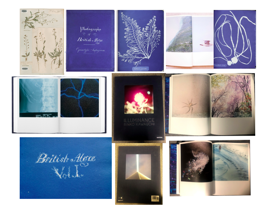
On some of the pages in my photo book I want to contrast the images where I’ve emphasised the warm colours, with images where I’ve looked at cold colours. I think this will be effective in making the images stand out and be more powerful. On other pages I want to use two images that have a link between them, whether than be through a shape or colour that are in both the images. Doing this links to Rinko Kauwauchi’s book Illuminance where on each of her double page spreads the two images are connected in someway. I think that this will create a more interesting photo book and will make it easy to look through, rather than having images that are not connected at all. I also want to physically include some of the photo grams that I created in my 6th photo shoot within my book. I want to do this by having them inside small envelopes on a few pages in the book. Because there won’t be many in the book, it will create a mystery for the reader to see what it is. This will make the reader have to physically open and take out the photogram to look at, creating a interactive quality. This is taking inspiration from Anna Atkins photo book ‘Photographs of British Algae: Cyanotype Impressions’ which is said to be the first photo book made. I think this will give my book more of a scientific appearance, looking at nature in a more objective way, that I can then contrast with my more personal and spiritual images. I want my photo book to be portrait and relatively small so it’s easy top pickup ad open. This means that the photograms inside the book will have to be small, which I think is effective as it will make them seem rare and precious, creating a more authentic and special appearance for them. I want the layout of my image to be simple as most of the natural images I’ve taken are quite detailed and patterned, but displaying them simply it would allow the reader to look at them without being distracted by other images if there were too many on a double page spread.
Final A3 Print Display Plan

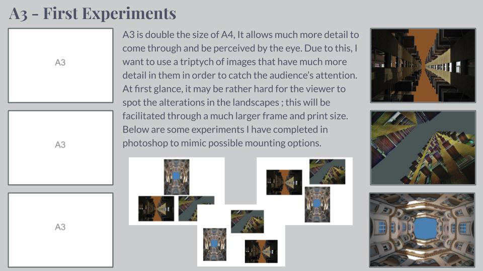
As I made evident and described in my previous post I have decided that I will compose 6 A3 prints of my Photo-montages. This post will be a plan of how I intend to display these prints. So firstly I needed to lay out some simple compositions of the images which I intend to have printed to scale. Here are the 5 options which I have come up with…

1
2
3
4
5

After laying out these compositions on Photoshop, I decided that simply based on what I believed to be most aesthetically pleasing that I would pursue option 4. However I have various options as to how I could display these prints such as many ways of: Framing, mounting and foam board. However after ruling out framing as an option due to the fact that it would over-complicate the display, from mounting or foam board I have decided that I will create a layered foam board display.

I intend to have each print on its own piece of foam board to the right dimensions, and then proceed to use double sided tape in order to attach the 6 prints to 2 full sized boards of foam. These two boards will be held together using support pieces of foam taped across the back of the two boards.

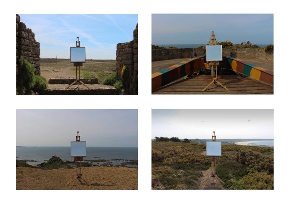
Using an easel (Photo shoot 5) – Editing

These are the images I edited from my Photo Shoot 5.

I firstly edited all the photos to make the easel and mirror be symmetrically in the middle in all the images. I also altered the lighting and contrast of the images to get them all to a consistent level.

I then experimented with laying the images out in a typology style in different formats to show how their appearance could change. I also changed the images into black and white to see how their look changed. I preferred the images in black and white as I think it adds to the old feel of the images as they do not contain any modern objects.

This image has an empty alt attribute; its file name is IMG_0711-2-1024x683.jpg

To take this image I went to my desired location of the rural cliff-paths and found a area with a backdrop that I liked. Once in this area I located the easel in a flat place where it was stable and horizontal to the horizon. Once I was happy with this, I locked the mirror in place so it couldn’t fall out or be blown over by the wind. I chose to take this set of images without a tripod as it would be easier to position and angle the camera like this. If I had to categorise this style of it would be a conceptual landscape as it is not oblivious as first the meaning of the image.

Experimentation/colour: Photoshoot 3

I have chosen a select amount of photographs from photoshoot 3, landscapes/model, to experiment on using different processes and methods in Photoshop.

Original Photographs:

Edit 1:


To create this effect I used gradient map, an effect in Photoshop, I edited each photographs so that they matched as a complete uniform set, using this eye-catching, vibrant filter.

Best outcome: I have chosen this as the best outcome because of the frame effect created by the way I edited this photograph, the greens have turned purple and the rest of the photograph is basically completely red with small details of yellow, the fact that each section is almost one colour, creates a massive divide and the trees surround the model and the outer section of the photograph creating a border around the model.

Edit 2:

To create this effect I used ‘threshold’ in Photoshop, I edited them all so the intensity of the black to white, etc was as equal in each photograph.

Best outcome: I have chosen this as the best outcome of the set, because I like the way the black and white effect, breaks the photograph into sections, the sky is broken into a black and white section due to the blue being two different tones in the original photograph and the sea and sand contrasting and lastly the model features being a bright white but the rest of the hair and clothing block black, created further contrast and allowing the model to be the focal point of the photograph contrasted directly against a massive sections of white. Also the fact it completely changes the entire feel of the photograph, for example this photograph was taken at the beach, in natural daylight, on a bright sunny day, but this effect creates a dark cold feeling.

Original Photographs:

Edit 1:

To create this effect I used Photoshop, and used the gradient map to chose the most interesting filter, editing the levels until I was happy with the outcome.

Best outcome: I have chosen this as the best outcome because I like the fact that the photograph has more going on at the top and that the hill and all the bushes and shrubs create an interesting backdrop for the model, also I like the fact that there are a lot of different factors in the photograph and that it is broken into sections, with the model stood in the middle, on the path that runs directly down the middle, for example there is the water on one side of the path, the other side is a drop, and top/backdrop is bushes and above that is a patch of sky. I also think the orange and purple filter works well in creating an interesting contrast within the photograph while being very simple at the same time.

Edit 2:

This edit is directly inspired by John Baldessari and his ‘dots’, I covered the face in each of these photographs, choosing different colours depending on the colours in the photographs and how they would work and contrast within the photograph. For example for the photograph that includes a small amount of pink flowers among the green, I included a pink dot over the face to highlight the pink flowers.

Best outcome: I have chosen this as my best outcome because I like the simplicity of the photograph, but how it also includes a wide range of colours and the dot ties in well with the colours. The sunlight on the green bushes caused the bush to appear with a yellow colour compared to the darker greens in the photograph, therefore I chose a yellow dot to link with the vibrant yellow. I consider this as the best outcome because of the composition, I instructed the model to stand directly in front of the camera, I feel like this creates an interesting effect because the sand path also creates a divide down the middle, having the path lead to the model and having the model in the middle of the photograph allows them to be the focal point of the photograph, regardless of being far away and a small piece of the photograph.

Photoshoot 3

For this shoot I have chosen to photograph landscapes and also incorporate a model into the photographs as a way to demonstrate ‘variation and similarity’ because I thought it would be interesting to stay on theme with the style of nature but for my third shoot have it on a larger scale and also use a model due to inspiration from other artists and also to add an interesting factor into my photographs. I have photographed a variety of landscapes, woods, beaches, etc and included my model in all the photographs in similar positions within the photographs.

Most successful photographs:

I have chosen this as one of my most successful photographs because of the bright colours and the eye-catching factors, like the white flowers on the tree that stand out from the variations of green that surround it and create an interesting contrast, also another instance of contrast is created by the model and the vibrant purple jumper they wear, this contrast against the white flowers and the greens, all three variations of colour work well together while contrasting and creating an eye-catching colourful photograph. I took this photograph in natural sunlight, on a sunny day, the fact the trees hand over creates a striking pattern on the floor. I also chose this photograph because in this photograph the model is in an engaging pose, rather then stood still, arms by their side.

I consider this photograph as one of my most successful because of the interesting composition, I instructed the model to stand between the trees, creating a kind of frame for the model to be inside, I think this worked successfully and allowed the model to be the focal point of the photograph even though they are the smallest factor in the photograph, oppose to the trees and greenery. The variations of dark and bright greens creates striking effect and the brown tree trunks and muddy ground contrast against each other, creating a clear division, the brown muddy ground also contrast with the shadows created, that turn the ground a black colour, this is created due to the fact I took this photograph in natural, sunlight in a shaded area where the trees created shelter and are overgrown.

ESA // Low Tide Photoshoot – Corbiere

These are the tidal times, and the times of first and last light, sunrise and sunset for the day that I am planning to take photographs.

What I would change/improve on for my next photoshoot.

I think that for my next photoshoot I will be taking images with a less busy a chaotic foreground and try to take images that focus solely on the tide around the lighthouse. I also feel like some of the images didn’t show clearly that the tide was low, which was my primary aim.

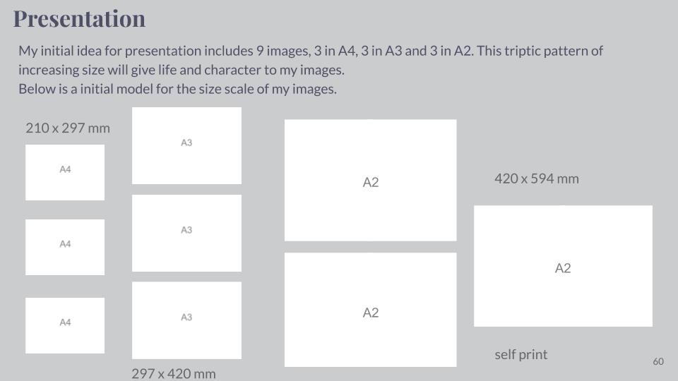
Presentation of my Final Work

PART 1

What is included?

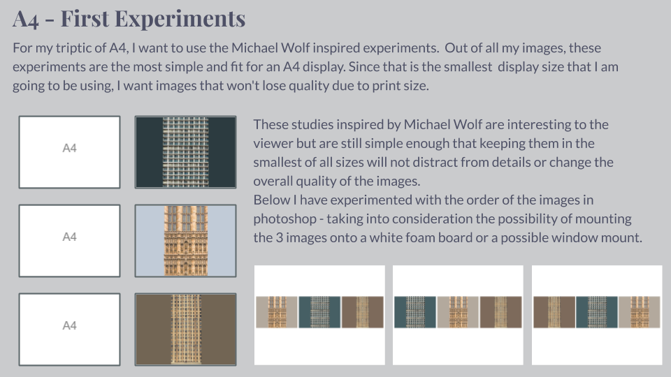
For the presentation of my final photographs in my exam I will be presenting the photographs in a typology grid. I believe that this method of presentation is very effective and appropriate because I have experimented with it throughout my project and have studied the likes of the Bechers’, who pioneered the use of typology grids. Originally, when planning on how to present my final work I had the below four photographs planned as my final four, as I was experimenting with the different layouts I found that it looked slightly off – I eventually decided that the photograph in the top left did not fit in well with the other photographs as it depicted a more brushed steel texture as opposed to the rusted texture in the other compositions. Saying this, I still thought that this photograph was very effective and aesthetically pleasing so I decided that I would include it by presenting it by itself as a side piece to the typology and replacing it in the typology with a more fitting composition. The resulting piece is a set of photographs in a typology grid that portrays how a standard house face can be so similar in features but at the same time can be completely different due to their own individual features. This idea is added to by the rusted steel layered over the building face as the steel represents how the materials used in house construction has changed over time from granite towards steel modern structures. The photographs will be printed as four A5 photographs and one A3 photograph.

My final typology layout
My final photograph

How will the photographs be laid out?

I plan to present the typology grid made from four photographs and the individual photograph on a foam board. One way in which I could present the photographs is by using a window mount method – in order to mount the typology grid I would first stick the photographs to a piece of white card and then tape it to the mount like an ordinary picture. I could also present the photographs on white card as shown below. After experimenting with both options on photoshop I believe that the most effective layout of the photographs would be to use window mounts and black card because the slight white border contrasts well will the black mount board, which also brings out the colours and shaped within the photograph. This contrasts with if I was to set it out on a white background as the contrast in colours and shades does not exist in this option, making it the weaker option. I have also experimented with which side to place the individual photograph and have come to the conclusion that I will place it on the right as I want the viewers attention to first come to the typology grid.

My decided final presentation

PART 2

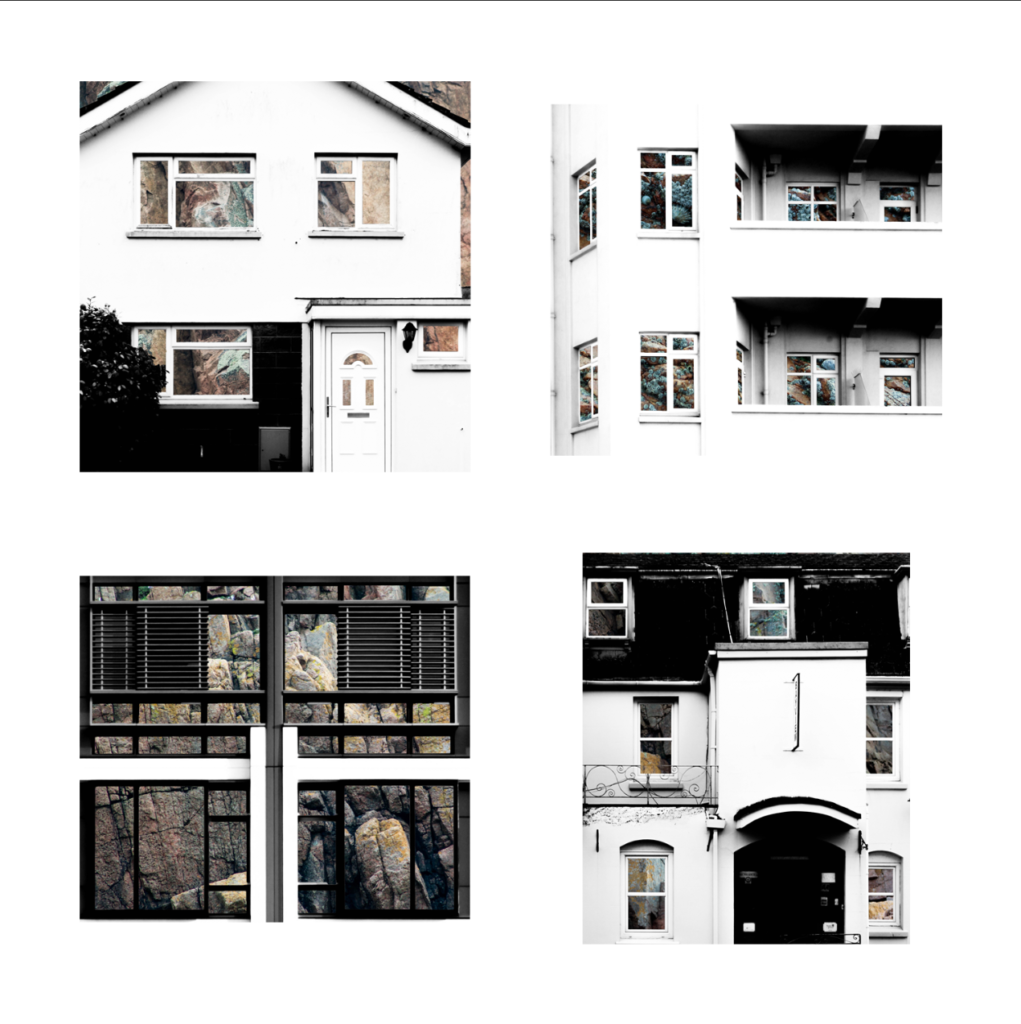
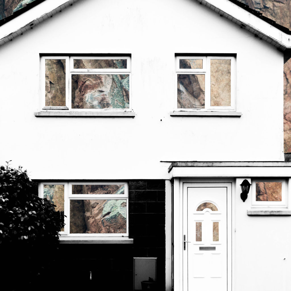
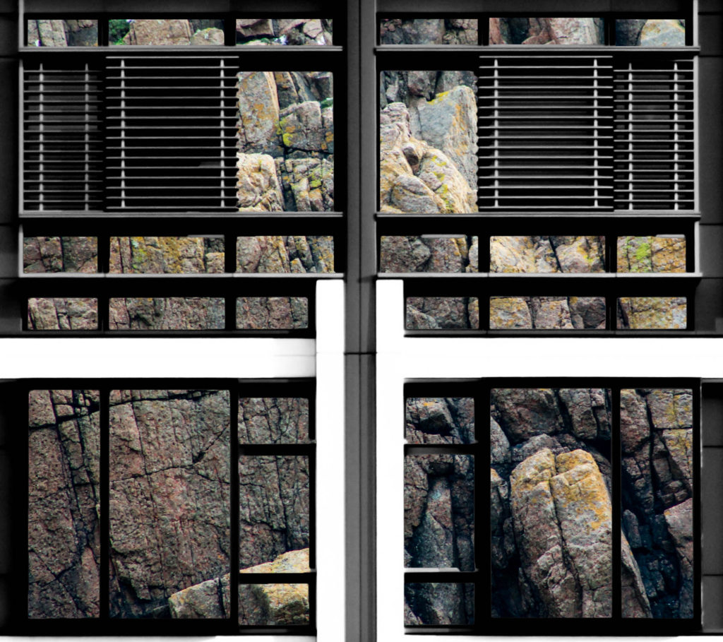
The second part of my presentation will follow the same guidelines as the above presentation but will be made up of my compositions in which I layered building faces over granite. It will include four A5 photographs made into a typology grid along with a single A3 photograph all on one black window mount. The idea behind this presentation is the exact same as in part 1, except that the granite is replacing the steel by giving an insight into the internal structure of the houses to show what material they are based upon.

My Final Typology Layout

How will the photographs be laid out?

I will present these granite compositions in the same style as the steel compositions in order to ensure consistency in my work – I will window mount all the typology photographs onto white card and then window mount that card and the A3 photograph onto a larger black card.

My Final Selection

The below photographs are the ones that I intend to present as my final piece. I have included four photographs that will be grouped together, of which are compositions of double exposures with textured steel layered over building faces. Please see my next post to see how I will be presenting these photographs in my exam and explanation on as to why they are presented in that way. I have chosen these photographs because I feel that they effectively reflect the standard of work and the theme that I have been exploring throughout ‘Variance and Similarity’ and I believe that they are effective at showing the variance and similarity between buildings, as I will explain further in my coming work.