Edits:
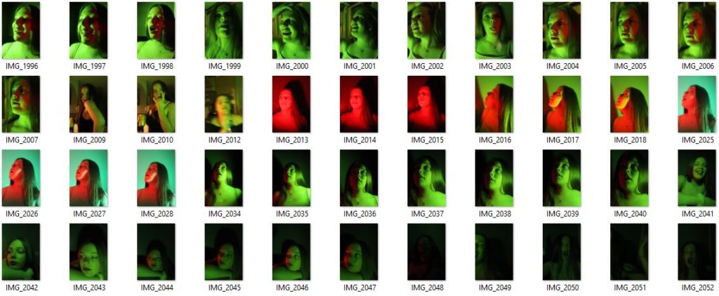
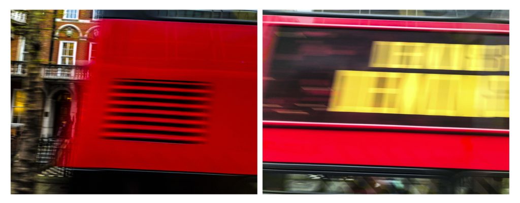
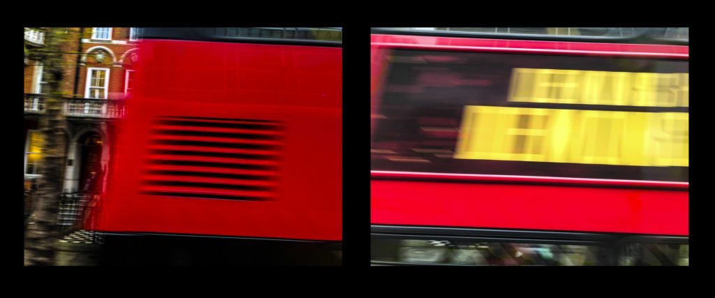
All images were taken with an aperture of around f/4.0 and a shutter speed of around 1/50 sec. One image I decided to change the colour hue to red as I felt it would make the image more dramatic.

Edits:


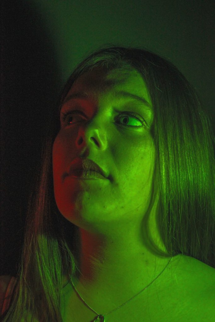


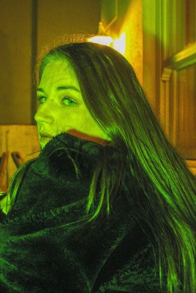

All images were taken with an aperture of around f/4.0 and a shutter speed of around 1/50 sec. One image I decided to change the colour hue to red as I felt it would make the image more dramatic.
Layout 1
2

3

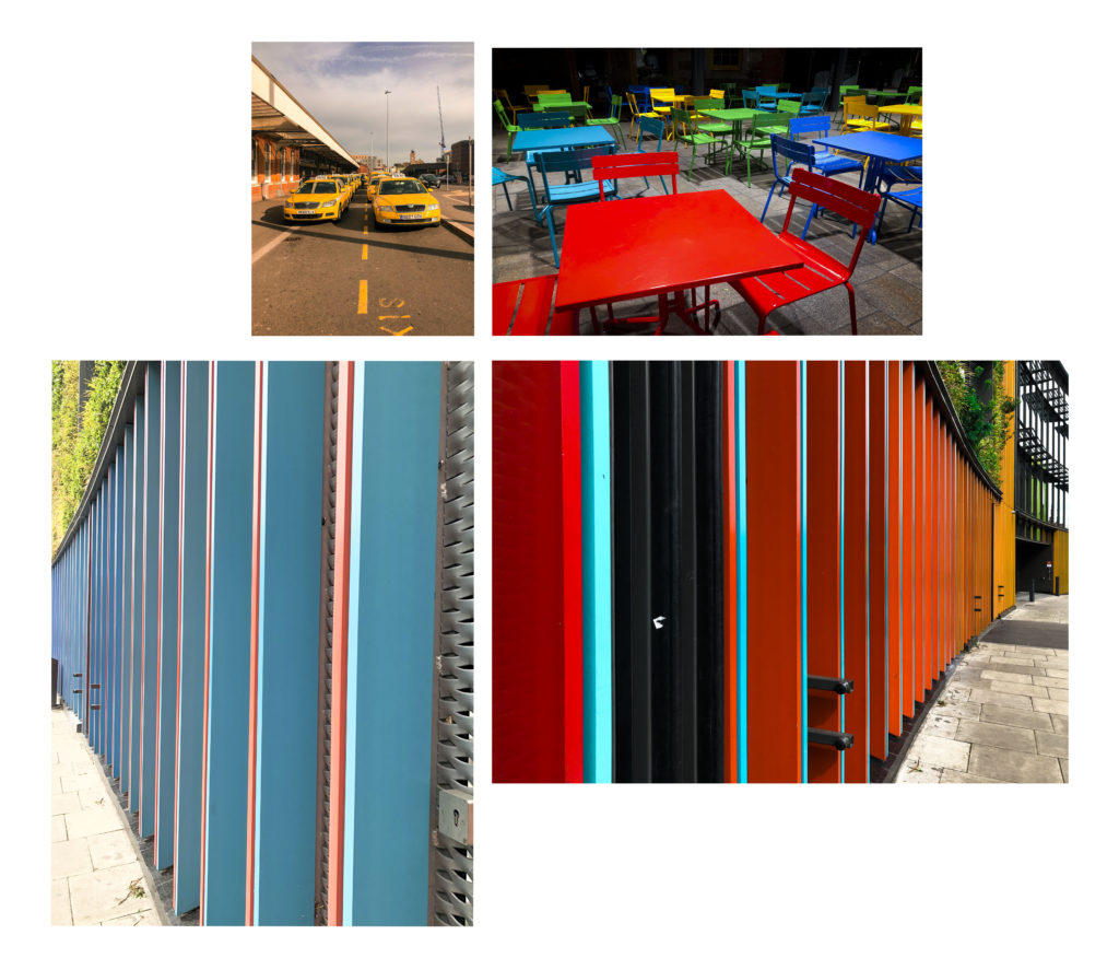
Of these first three layouts my favourite is the 2nd I think the black frame creates a deep contrast and it makes the images Stand out.
Layout 1
2
3

My Favourite of these three layouts is the 2nd as I feel like the black supports the image
Layout 1

2

3

My final decision for the layout of my third print set is Layout 1
To conclude i am pleased with all three of my preferred layouts for my final presentation.
Hiroshi Sugimoto born 23 February 1948) is a Japanese photographer and architect. He leads the Tokyo-based architectural firm New Material Research Laboratory.
Hiroshi Sugimoto was born and raised in Tokyo, Japan. He reportedly took his earliest photographs in high school, photographing film footage of Audrey Hepburn as it played in a movie theater. In 1970, Sugimoto studied politics and sociology at Rikkyō University in Tokyo. In 1974, he retrained as an artist and received his BFA in Fine Arts at the Art Center College of Design, Pasadena, California. Afterwards, Sugimoto settled in New York City. He soon started working as a dealer of Japanese antiquities in Soho.

This photo has been taken using natural lighting while being carefully positioned in order so that the horizon in the middle of the photograph. This taken rule of thirds seems to have been considered in terms of the shading differences in the background and foreground. There is a large tonal range of grey, where there is a gradual shade change, from the darkest point along the bottom of the image and the lightest being at the top. There is a very short depth of field considering that the photo is mostly blurred from the fog. However the foreground of the image is the only part to be in focus and where textures can be seen from the small ripples in the sea, although it is very still. The dark, grey/blue tones bring a cold temperature to the photograph along with the low light sensitivity where we can just about see the horizon in the middle of the image. Although the image is blurred and obscure there are no rounded or curved shapes. Everything is very straight but there are no outlines.
Sugimoto’s image brings a sense of romanticism in their evocation of landscape, related to Ansel Adam’s approaches to photography. This image shows how he sees nature. Sugimoto has said: ‘When I look at nature I see the artificiality behind it. Even though the seascape is the least changed part of nature, population and the resulting pollution have made nature into something artificial’.
David Prentice was born in Solihull, England in 1936 and died 2014. Prentice lived and worked in Malvern, Worcestershire, married to the quilt artist, Dinah Prentice. He was an English artist and former art teacher. In 1964, he was one of the four founders of Birmingham Ikon Gallery. Prentice taught at the Faculty of Birmingham Polytechnic between 1971 and 1986, initially in charge the experimental workshop, and has been a visiting artist at Trent Polytechnic, the University of Nottingham, the Ruskin School and the Birmingham Institute of Art and Design. Prentice held solo exhibitions at the Royal Birmingham Society of Artistsin 1961 and 1963, and in the same year as the second featured in the Four Letter Art exhibition organised by Trevor Denning. Prentice has since held over 40 solo exhibitions.
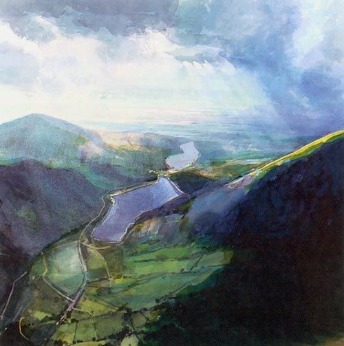
The image of David Prentice “Above Llanberis Lake” uses a variety of blue and green shades. His work shows strong tone to create the shape of the lake and the valley that surrounds the area, this is supported by his use of shadows and light in his work. His uses the valley to tunnel the viewer’s eye to the horizon of the painting, this is where the main change in colour (from green to the blue, foreground to background) and the change in lighting is the strongest and most noticeable. The viewer’s eye is most drawn towards where the light emerges from the clouds as this is the lightest area of the painting which is followed through the sun rays.
My photographs in comparison to the artists that inspired my photo shoots and editing process.
John Baldessari:


Luigi Ghirri:


Etienne-Jules Marey:


Concept: To create an interpretation of Rorschach’s original inkblots, used to examine a person’s personality characteristics and emotional functioning.


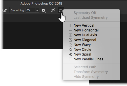
Procedure: Starting with a blank landscape page, I will change the background colour to beige to resemble that of the original prints. I will use ink brushes found online to create the same watery effect. In symmetry mode, I will choose the vertical option, which will create a line down the center of the page. Anything I draw on one side of the line will be replicated exactly on the other. Like Rorschach, I will also experiment with various colours in order to create different shapes for people to perceive. Once completed, I will ask a selection of my peers to tell me what they see in each image. This sample will also include the people I have chosen to photograph.
The Rorschach test is a psychological test in which subjects’ perceptions of inkblots are recorded and then analysed using psychological interpretation, complex algorithms, or both. Some psychologists use this test to examine a person’s personality characteristics and emotional functioning. It has been employed to detect underlying thought disorder, especially in cases where patients are reluctant to describe their thinking processes openly. The test is named after its creator, Swiss psychologist Hermann Rorschach. In the 1960s, the Rorschach was the most widely used projective test.
Using interpretation of “ambiguous designs” to assess an individual’s personality is an idea that goes back to Leonardo da Vinci and Botticelli. Interpretation of inkblots was central to a game, Gobolinks, from the late 19th century. Rorschach’s, however, was the first systematic approach of this kind. The ink blots were hand drawn by Rorschach.[
It has been suggested that Rorschach’s use of inkblots may have been inspired by German doctor Justinus Kerner who, in 1857, had published a popular book of poems, each of which was inspired by an accidental inkblot. Kerner pioneered Klecksography, the art of making images from inkblots. French psychologist Alfred Binet had also experimented with inkblots as a creativity test, and, after the turn of the century, psychological experiments where inkblots were utilized multiplied, with aims such as studying imagination and consciousness.
After studying 300 mental patients and 100 control subjects, in 1921 Rorschach wrote his book Psychodiagnostik, which was to form the basis of the inkblot test (after experimenting with several hundred inkblots, he selected a set of ten for their diagnostic value).


Popular Responses as according to various authors:
Inkblot 1: Beck: two humans (grey), Piotrowski: human figures (72%, grey), Dana (France): human (76%, grey)
Inkblot 2: Beck: bat, butterfly, moth, Piotrowski: bat (53%), butterfly (29%), Dana (France): butterfly (39%)
Inkblot 3: Beck: two humans, Piotrowski: four-legged animal (34%, grey parts), Dana (France): animal: dog, elephant, bear (50%, grey)
Inkblot 4: Beck: animal hide, skin, rug, Piotrowski: animal skin, skin rug (41%), Dana (France): animal skin (46%)
Inkblot 5: Beck: bat, butterfly, moth, Piotrowski: butterfly (48%), bat (40%), Dana (France): butterfly (48%), bat (46%)
Inkblot 6: Beck: animal hide, skin, rug, Piotrowski: animal skin, skin rug (41%), Dana (France): animal skin (46%)
Inkblot 7: Beck: human (orange), Piotrowski: none, Dana (France): none
Inkblot 8: Beck: crab, lobster, spider (blue), Piotrowski: crab, spider (37%, blue), rabbit head (31%, light green), caterpillars, worms, snakes (28%, deep green), Dana (France): none
Inkblot 9: Beck: animal: not cat or dog (pink), Piotrowski: four-legged animal (94%, pink), Dana (France): four-legged animal (93%, pink)
Inkblot 10: Beck: human heads or faces (top), Piotrowski: heads of women or children (27%, top), Dana (France): human head (46%, top)


Rorschach never intended the inkblots to be used as a general personality test, but developed them as a tool for the diagnosis of schizophrenia. It was not until 1939 that the test was used as a projective test of personality, a use of which Rorschach had always been skeptical. Interviewed in 2012 for a BBC Radio 4 documentary, Rita Signer, curator of the Rorschach Archives in Bern, Switzerland, suggested that far from being random or chance designs, each of the blots selected by Rorschach for his test had been meticulously designed to be as ambiguous and “conflicted” as possible.
The interpretation of the Rorschach test is not based primarily on the contents of the response, i.e., what the individual sees in the inkblot. In fact, the contents of the response are only a comparatively small portion of a broader cluster of variables that are used to interpret the Rorschach data. Other significant information can be gained from the time taken before providing a response for a card (taking a long time can indicate “shock” on the card) as well as by any comments the subject may make in addition to providing a direct response.
Determinants and location are often considered more important than content, although there is contrasting evidence. Determinants are the factors that contribute to establishing the similarity between the inkblot and the subject’s content response about it. They can also represent certain basic experiential-perceptual attitudes, showing aspects of the way a subject perceives the world. Form is the most common determinant, and is related to intellectual processes. Colour responses often provide direct insight into one’s emotional life. Movement and shading have been considered more ambiguously, both in definition and interpretation. Rorschach considered movement only as the experiencing of actual motion, while others have widened the scope of this determinant, taking it to mean that the subject sees something “going on”. More than one determinant can contribute to the formation of the subject’s perception. Fusion of two determinants is taken into account, while also assessing which of the two constituted the primary contributor. For example, “form–color” implies a more refined control of impulse than “color–form“. It is, indeed, from the relation and balance among determinants that personality can be most readily inferred.
Location refers to how much of the inkblot was used to answer the question. Administrators score the response “W” if the whole inkblot was used to answer the question, “D” if a commonly described part of the blot was used, “Dd” if an uncommonly described or unusual detail was used, or “S” if the white space in the background was used. A score of W is typically associated with the subject’s motivation to interact with his or her surrounding environment. D is interpreted as one having efficient or adequate functioning. A high frequency of responses coded Dd indicate some maladjustment within the individual. Responses coded S indicate an oppositional or uncooperative test subject.
“Popularity” and “originality” of responses can also be considered as basic dimensions in the analysis.The goal in coding content of the Rorschach is to categorize the objects that the subject describes in response to the inkblot.
Subject’s responses are categorised into one of 27 established codes. The codes include terms such as “human”, “nature”, “animal”, “abstract”, “clothing”, “fire”, and “x-ray”, to name a few. Content described that does not have a code already established should be coded using the code “idiographic contents” with the shorthand code being “Idio”.

These are the tidal times, and the times of first and last light, sunrise and sunset for the day that I am planning to take photographs.


What I would change/improve on for my next photoshoot.
I feel this photoshoot worked well, because it does clearly show the high tide surrounding the lighthouse and covering the rocks. However, I didn’t focus the image aorund the subject enough. There are too many objects within the foreground, and so for my next photoshoot I need to ensure that there is less cliff edge in the foreground and instead just focus on the tide.
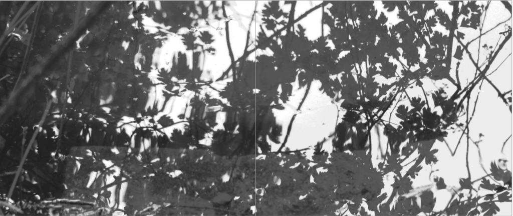
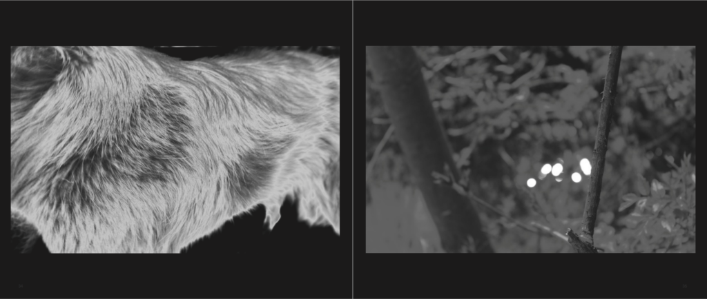
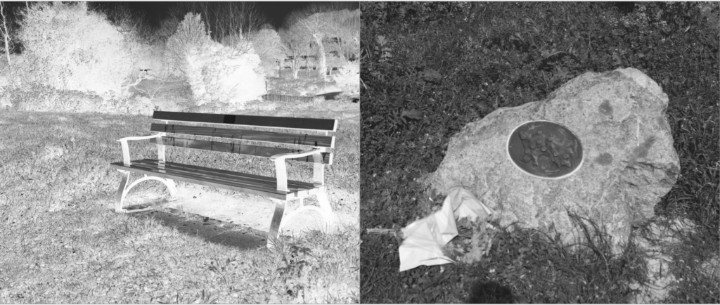
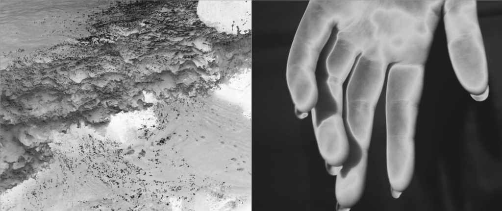
When developing my final book I wanted to have something unique, something I have never done before, and originality that meant my final presentations will be unlike any others. To do so I started off with developing the book. I Knew for my book I wanted to create a black and white tonal book. This soon transpired to having silver and black ink inverted to create glowing images. I also knew that for my narrative of life from birth to death, told through the story of creation, That I would need a long narrative. To do so I first off assigned myself 100 pages, then narrowing down only the best images to around 87 pages in total. Furthermore, to go in hand with his over exaggeration of visual overload due to the volume, I decided to have an image on every single page, so to go hand in hand with this large effect. In the end I was left with an array of different displays, differing from two full bleeds, to some with black boards to full double page spreads. The distorted array not being continually mimicked was very effective and something which Made the narrative of my book, perhaps, more enjoyable, as you are able to take your time when looking through each of the images. As spoken about previously the finality of my book was found within previous books such as Astres Noirs.
My final book layout:
The paper used will be matte, I have chosen this as I have very deep blacks, it would be definitely better for the exposure and use of my colour tones. I then Decided on the front cover that I wanted an image wrap of one of my final prints, of white branches intertwining, This to my mind both perfectly combines that of tranquility and creation of heavenly light, with the fragility of life itself. The title of my book is called: Ascension. I chose this as it is a word which not only has clear indexical connotes to that of the story of creation, Adam and eve being created and ascending into earth, but too links in with the each part at the end of my narrative, and so forming a relation of going into heaven, or being carried up. The wrap around on the cover will not be fabric, as it is a more post-modern book focusing on themes such as religious sentimentality in the 21st century, I want this slick new feel to be evident within my cover, as this is what is to be found inside my book. A pivotal of My book is the primary source of my presentation, it has the majority of my images, and too combines a clear narrative experience throughout: My final layout:








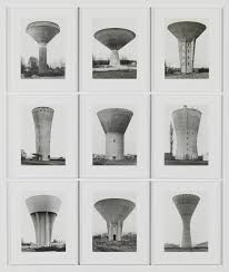
Repetition is the action of repeating something which has already been done or the recurrence of an action or event. In photography terms, repetition is closely linked with typologies. I was inspired by Bernd and Hilla Becher who looked at different but similar buildings in order to produce a repeated style of images and present them in the same way.
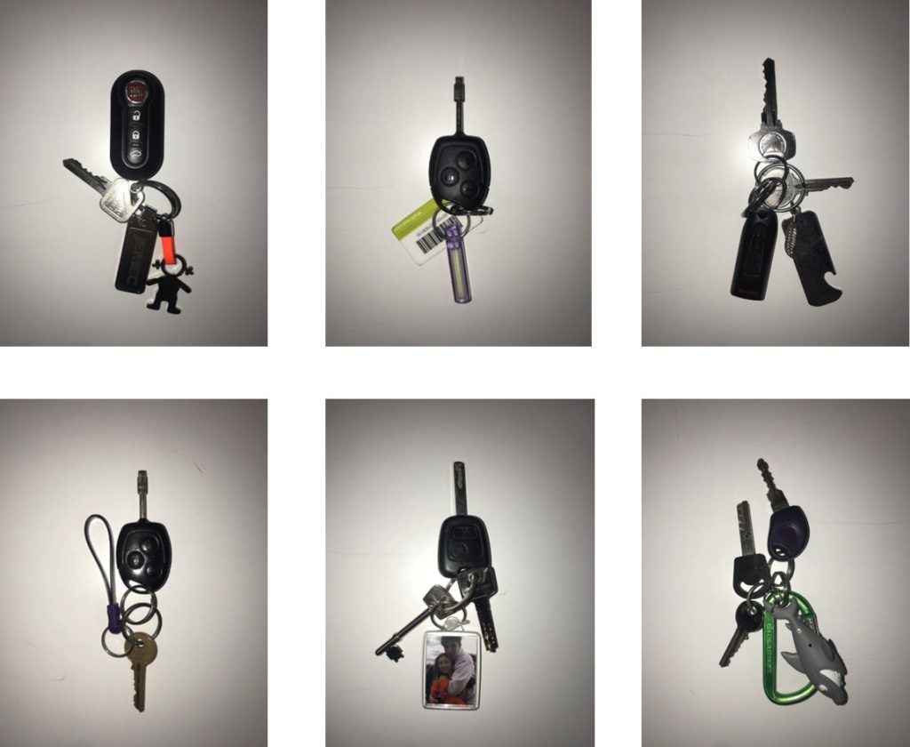
My inspiration for these photographs sprung when looking at Bernd and Hilla Bercher. My idea was to take photos of something simple and used on a daily basis that most people carry around. This experiment became more interesting than what I anticipated as I noticed that each key almost showed each owners personality.
I captured these simple images of keys on a white background of every student in my class to show the similarities (uniqueness) and variations of colours and styles.
After experimenting with different ways of presenting, I decided to produce a GIF of all the images to show the sequence of images and how similar each one is, however, different in terms of style and personality.
Below are the images that I used to construct a GIF. These images are laid out in a typology form as a response to the artist above.
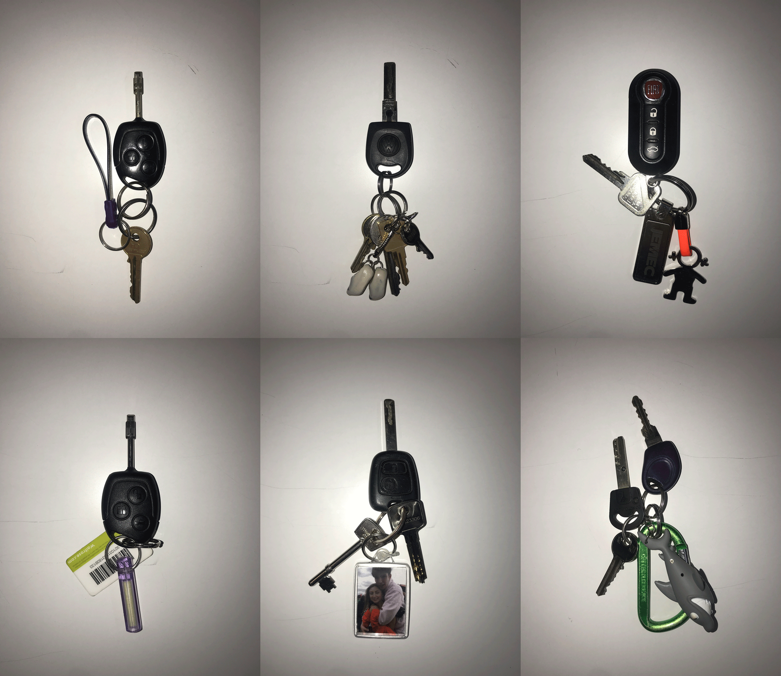
I used Adobe Photoshop to convert these series of images into the GIF shown above. Below is a quick step to step tutorial on how I created this GIF.
