Book Specification

How you want your book to look and feel:

I want the book to be simplistic in its nature but yet convey a powerful message about the elements. I am processing the book through Blurb so it will be to a high quality and look very professional

Format, size and orientation:

  • 74 pages
  • The book will be a
    standard portrait size , 7.75×9.75 in, 20×25 cm

Rhythm and sequencing:

There will be separate sections for each element in the book but images from different elements will be placed in these sections to make sure that the book flows and connects together. The aspect of the image that I have used to connect the images are the colour , shape, composition, depth of focus and shape. I want to make sure that with each image the image before and after it flow together as without this I think that the book will lack in it rhythm.

Structure and architecture:

Throughout the book there is a range of full bleed, single portraits, 3/4 pages, single landscape images of a double page spread to keep the book visually stimulating. ttrt

Narrative:

The book will look at the individuality, beauty and simplicity of each element and how different each one is but yet how each one is connected and dependent on the other to survive.

Title:

The book will not be given a title, as like Rorschach’s ink blot tests, in which there is no text, it is down to interpretation. I want the viewer to create their own relationship between the ink blots and the portraits partnered with them rather than be hinted at with the use of a title. The title of the book is Element, as the book is looking at the element, but I wanted the viewer to make their own connection

Images and text:

There is one quote at the begging of the book to give the viewer and insight of how I felt when creating the book, but mostly I have left it up to the viewer to create their own connection to the images and their own interpretation. ‘ Earth, water, fire and wind. Where there is energy there is life’ – Suzy Kassem

Colour and B&W (or a mix):

Most of the images are in colour only a view selected images are in black and white.

Paper and ink:

I have selected matte paper for the book as it will help to blend the flow of the images.

Shoot 7 – Cutlery shoot

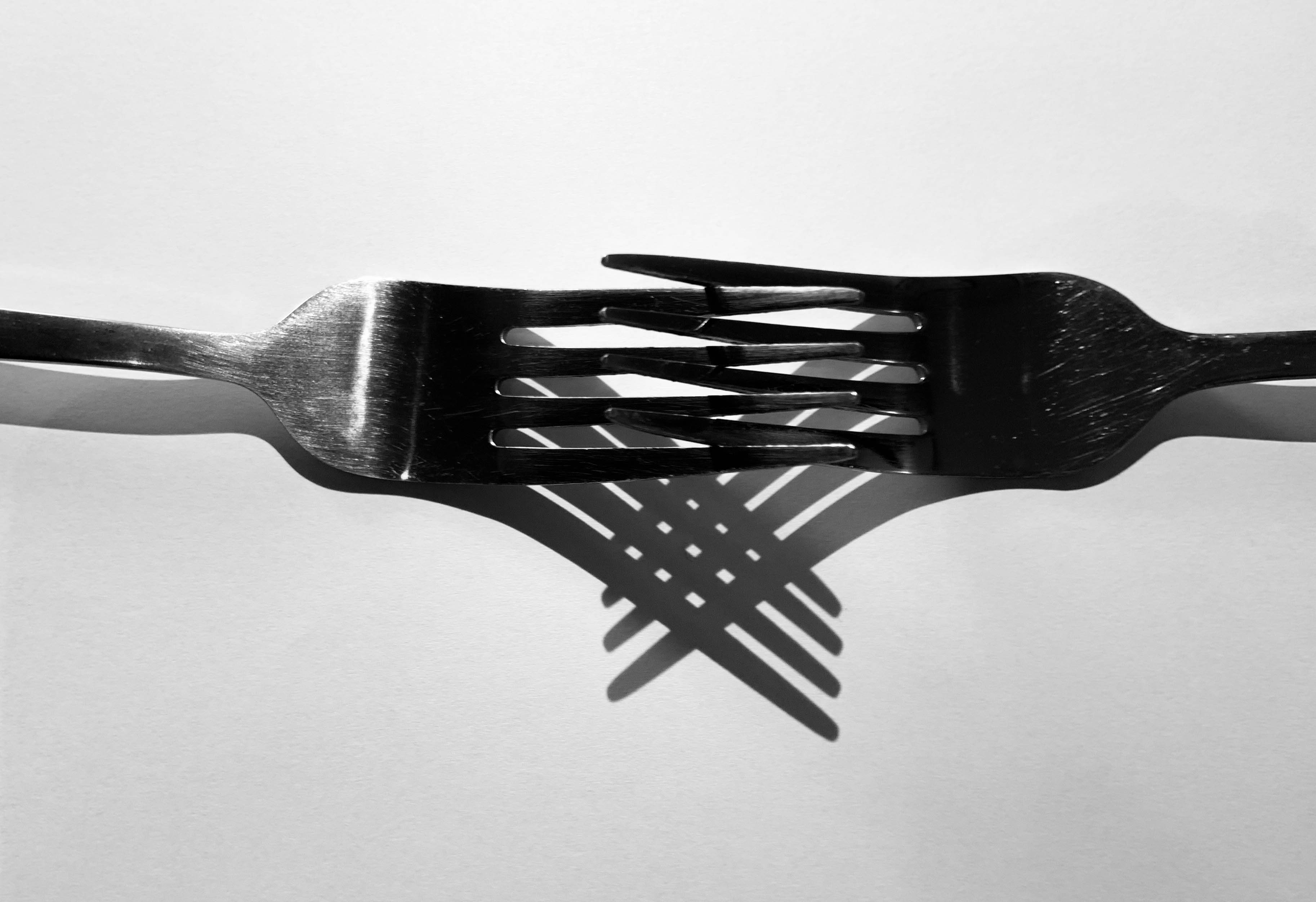
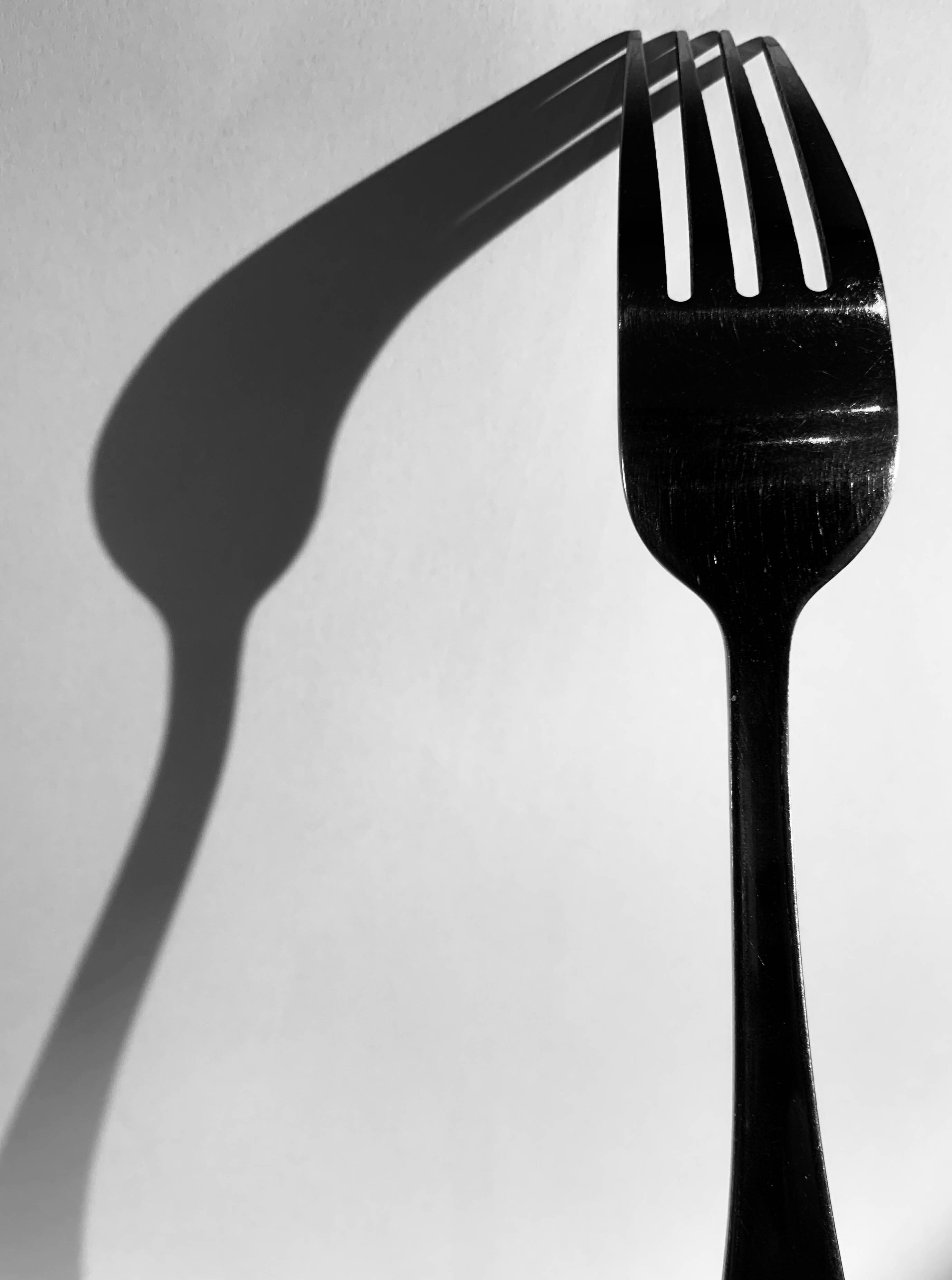
For this shoot, I wanted to capture forks and spoons and experiment with different angles of lighting, different positioning of the cutlery and different backgrounds to see the effect of light on cutlery – which is such a simple everyday object. The variation of shadows is produced as shown below:

Contact sheet

Edits

This shoot was inspired by Michael Luitad from his cutlery work, where I have already made a blog post on him and his work.

Book Specifications

My topic in 3 words: Styles of abstraction

Topic described in a sentence: I will be exploring how three different categories of abstraction, colour, texture and pattern compliment and contrast each other when put together.

My Topic described in a paragraph: I will be looking at the topic of abstraction regarding three of the more dominant areas of it. I will firstly look at colour and the use of heavily saturated photography to isolate the subject from its surrounding environment. Texture is another theme I wish to explore through the almost unseen world present when looked at closer inspection and how natures pattern often are aesthetic and in huge variety. Lastly I will be looking at pattern and the idea of isolating once again a subject from its surrounding environment so that it becomes up to the viewers to interpret what it could be in regards to surface and look.

Design:

  • Look and feel: I would like a matte cover which would produce a photographic but card like feel which would really compliment the material being used for my overall design and theme.
  • Paper and ink: For the sleeve I would probably use printing ink to produce the title and author name, but within the book I would use glossy paper due to it producing a more detailed outcome.
  • Format, size and orientation: The format would be three portrait books due to me wanting them to be able to fit into sleeves, I would probably make the size of them relatively small just below the size of A4 paper.
  • Binding and cover: The cover would be the title of that topic of abstraction within the book such as saturated.
  • Title: Each book will have a different title regarding the contents which can be found inside.
  • Structure and architecture: The page layouts will mainly be one or two images to a spread with the occasional three images if I want to create the impression of a triptych.
  • Design and layout: Once again the pages will mainly have one to two images per spread with the occasional three or four
  • Editing and sequencing: I will be ordering the images into each book regarding which title they best fit into, saturation, texture or pattern. Each book will have the photos ordered into a way in which each compliment each other or have a greater overall theme.
  • Images and text: I would like to keep the book very minimalist and so possibly would just have the location or word saturation with its number such as #1 or #2

Photo book research

A photo book is a book in which photographs make a significant contribution to the overall content. A photo book is related to and also often used as a coffee table book.

Reymond Meeks – Halfstory Halflife

Halfstory Halflife is a book by Raymond Meeks an American photographer who is best known for his focus on memory and place, and captures daily life with his family and also the local youth. Meeks was documenting the local youth who adventure to the Catkill Mountain region in New York during summer breaks. Halfstory Halflife is a distillation of the photographs made in the shadows of these waterfalls, marked each summer by the exposure of young adults sat at a cliff both in space and in their lives.

The technical aspects to the very minimalistic layout consists of images embedded traditionally in the centre of each page with an opposing image on the next page both being A4 portrait orientation with a slight boarder round each image. For the most part, the images take up the whole A4 page however, there are some images which are A5 which are set to the right hand side of the page. I believe by having a variation of layouts throughout keeps the book interesting as it grandly becomes easier on the eye as your not consistently looking at the same layout all the way throughout the book.

As the book has a strong monochrome pallet throughout it creates strong contrasts and shadows within each images however due to the use of natural lighting, soft glares are seen on multiple images. These two factors create a strong juxtaposition due to the fact that it shows the darkness of the area and maybe their youth however the soft glare could contribute to the happiness in their lives and this location could be a spot for which allows them to proceed in being happy.

As the images are in black and white it allows for a more unrealistic interpretation of the images. I think this helps the viewer interpret these images in a different way and to connect with the pictures differently as we don’t view the world in black and white so it can be seen in an usual way. All the pages in the book are consistent, using the same style of white paper which juxtaposes with the images which alter each page with contrasting environments and a lack of colours. There are a total of 144 pages including the unused pages and a total of 78 images which is supported by a soft cover with a fold out jacket. To me, this photo book is essentially a narrative that projects the lack of youths happiness when exploring the environment, landscape today is bound up with a sense of the loss of natural space.

Final Print Analysis

I chose these two photographs as final pieces because these flowers are some of the more interesting and successful photographs from photo shoot 1. I decided to present these two photographs as a diptych because this creates variation due to there being multiple photographs and similarity because the photographs are of the same object, I feel like this was successful and using a window mount added a more professional finish. This final piece differs from my plan, I chose to have a larger border around the photographs, because this fit better due to using a window mount.

I chose these four photographs as final pieces because of the interesting and eye-catching effect created by the sequence, to aid the effect of the sequence I have presented the four photographs in a simple straight line on black card, to allow the photographs and the sequence to be the focal point of the presentation, I feel like this was successful in creating the effect I was aiming for.

I chose these two photographs as final pieces because these flowers are some of the more detailed and successful photographs from photoshoot 1. I decided to present these two photographs as a diptych because this creates variation due to there being multiple photographs and similarity because the photographs are of the same object, I feel like this was successful and presenting on black card allowed a simple but effective sleek finish.

I chose these three photographs as final pieces because the cartoon edit creates a striking effect. I chose a triptych because the three photographs together create the effect of variation in an interesting way. To create variation throughout my final pieces I chose to use foam board and black card to present these three photographs. I think this was successful in creating variation and achieving what I was aiming for within the overall presentation of my final pieces. This final piece differs from my plan, I chose to add a larger border around each image, I feel this worked well and better than a slimmer border, for this trio of photographs.

I chose these four photographs as final pieces because because of the bold and eye-catching colours, I have chosen this layout because it gives off pop art vibes which I think is an interesting bonus and the colours contrast nicely with one and other. I chose to present these four photographs on black card because I didn’t want a window mount or foam board to detract attention away from the photographs. I feel like my choice of presentation, black card, successfully showcases what I was aiming for in my presentation of these photographs.

I chose to this photograph as a final piece because I like the simplicity of the photograph but also how interesting it is, for example the model, the flowers, all the different colours. I chose to present this photograph like this because I wanted a simple presentation to not detract away from the photograph its self.

I chose to this photograph as a final piece for the same reason as the photograph above, they both give me a similar vibe in the way that I like the simplicity of the photograph but also how interesting it is, for example the model, the sand, all the different colours and the vibrant yellow dot. I chose to present this photograph like this because I wanted a simple presentation to not detract away from the photograph its self.

I chosen to present these photographs in a triangular formation because I feel like its something different and I wanted to have a variety of different layouts throughout my final pieces. I chose these photographs because they are all very similar but the change in position and distance creates variety within the trio. I also presented it as a sequence, for example, the top is the closest, the second on the left is further away and the third photograph on the right is the furthest away.

Editing: Final Layout/Presentation

I have chosen a variation of photographs, presenting them in a variety of different colours, styles and sizes.

I plan on presenting these four photographs like this, this layout allows the photographs to be directly compared due to the close formation, this also creates a high contrast. I have chosen this layout because the purple and pink contrast with the yellow and orange directly and then both with each other diagonally, creating a balance of colour and therefore more appealing and creates an eye-catching effect. I will present these photographs as A5 prints, this allows all four prints to almost create the effect on one A4 piece, while still being layed out, rather then printed as one. I will present on black foam board, creating a contrast between the colourful photographs and black card.

I have chosen to lay these photographs out in this order, because in this order a sequence of smallest to largest is created. Secondly I plan on presenting the photographs this way because the colours, orange, cream with pink and yellow tones and yellow work again almost as a sequence, darkest to brightest, allowing the layout to be balanced. These photographs will be presented as A5 prints, I have chosen A5 due to the colours and fact that there are three prints, I feel any bigger than A5 would to overwhelming and take away from the effect of the edit and photograph. When presenting these photographs I will use, black foam board, creating a contrast between the colourful photographs and black backdrop.

I have chosen to present these prints, four in a row, to allow the sequence continued in each photograph to be visible within the layout, this creates an interesting effect, leading to what becomes the focal point of the images, the hole in the shell. To successfully allow the photographs to stand out in the layout I will present them on black foam board, this will contrast against the light white shell. These photographs will be presented as A5 prints, I have chosen to present them as A5 prints due to there being four photographs, I feel if the photographs where any bigger, the size would distract from the layout and sequence.

For this layout I have chosen a simple double photograph layout, I have chosen to present these photographs side by side, because I feel this way it demonstrates variation and similarity successfully, for example, the similarity being they are of the same object, being similar, but the photographs are not completely the same, this being the variation within aspects of the photographs. I will present these photographs as A4 prints, I have chosen A4 due to there only being two photographs and I want the details to be visible due to the fact the photographs are so simple, the details are what make them appealing. I will present the two photographs on a black window mount, I feel like this will add an interesting aspect and add to the simple photographs.

This layout will be the same as the previous one, due to the photographs being similar and I want to create the same effect using similar but different photographs.

I have chosen this layout because I wanted to do something different and interesting and I wanted to add a variation of different layouts for my final pieces.

I have chosen this simple layout because this is one of my most successful photographs, so I want to present this as an A4, with a simple black border, to not detract from the photograph its self.

I have chosen to do a basic layout because this is one of my strongest photographs, I want to present this as an A4, with a simple black border, to not detract from the photograph its self.

Shoot 6 – Boats

For this shoot, I wanted to go and visit boats down on the beach on a sunny day, when the tide was low so I was able to walk around the boats and take my images. I wanted to see how boats can have different effects of light and darkness due to their positioning on the beach, which is where the sun shines onto heavily.

Contact sheet

Edits

Shoot 4 – Darkroom

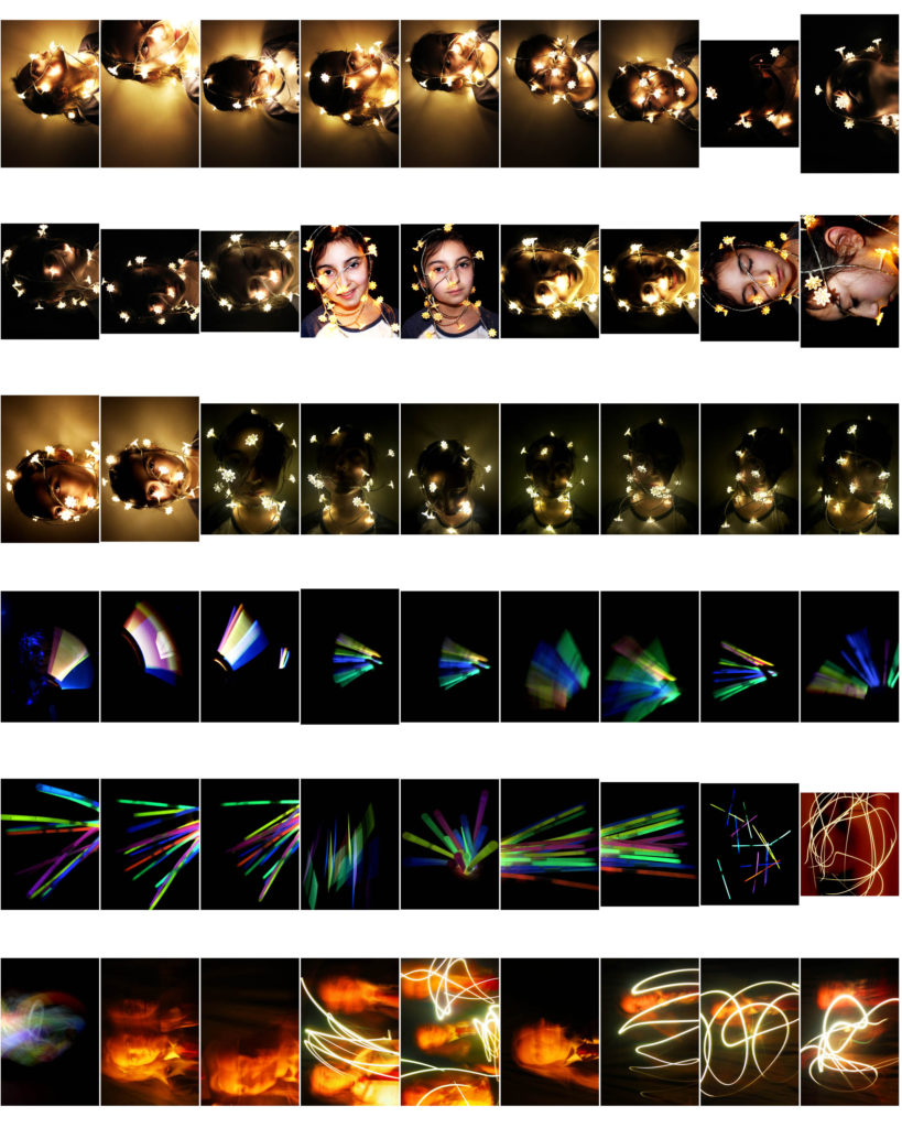
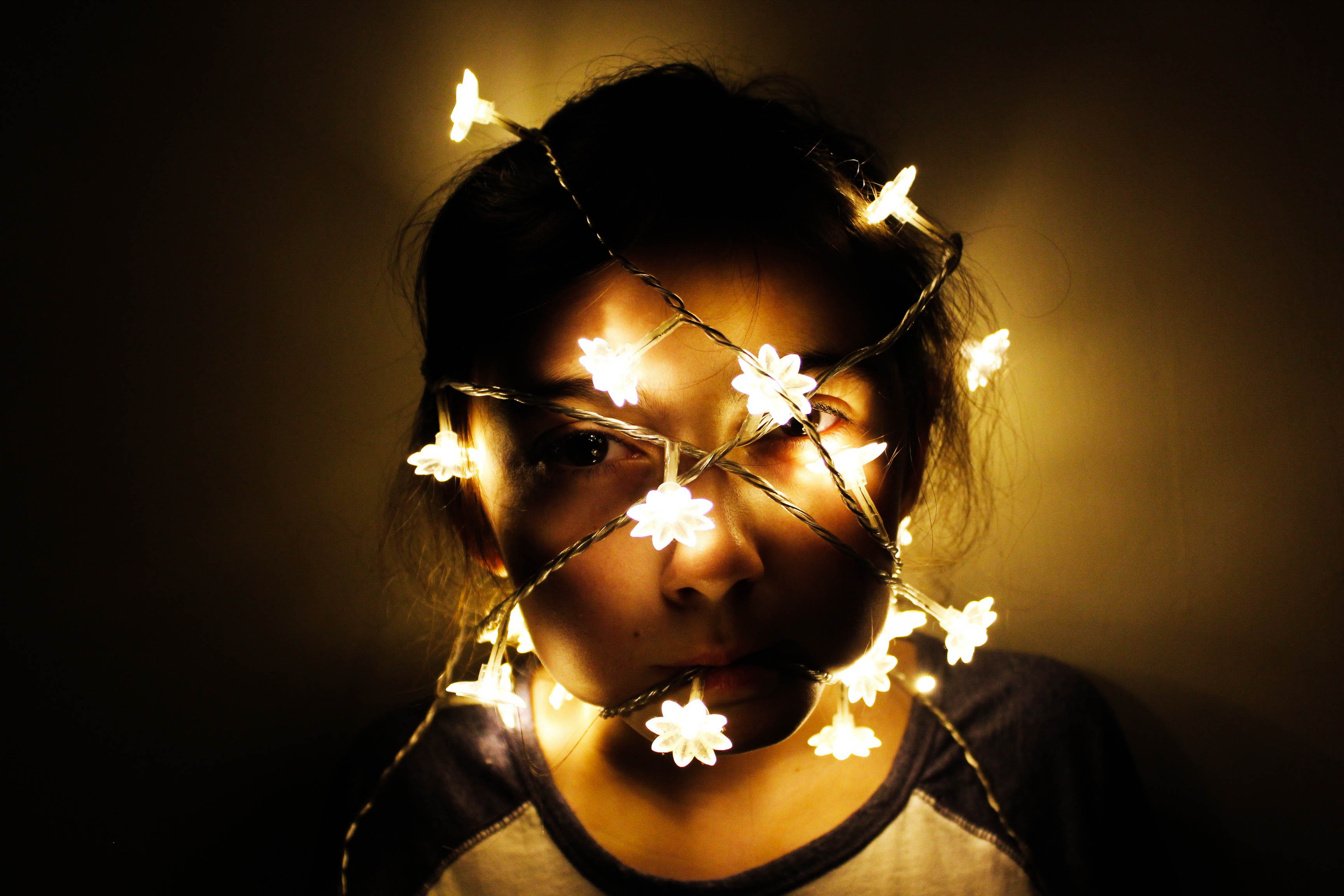
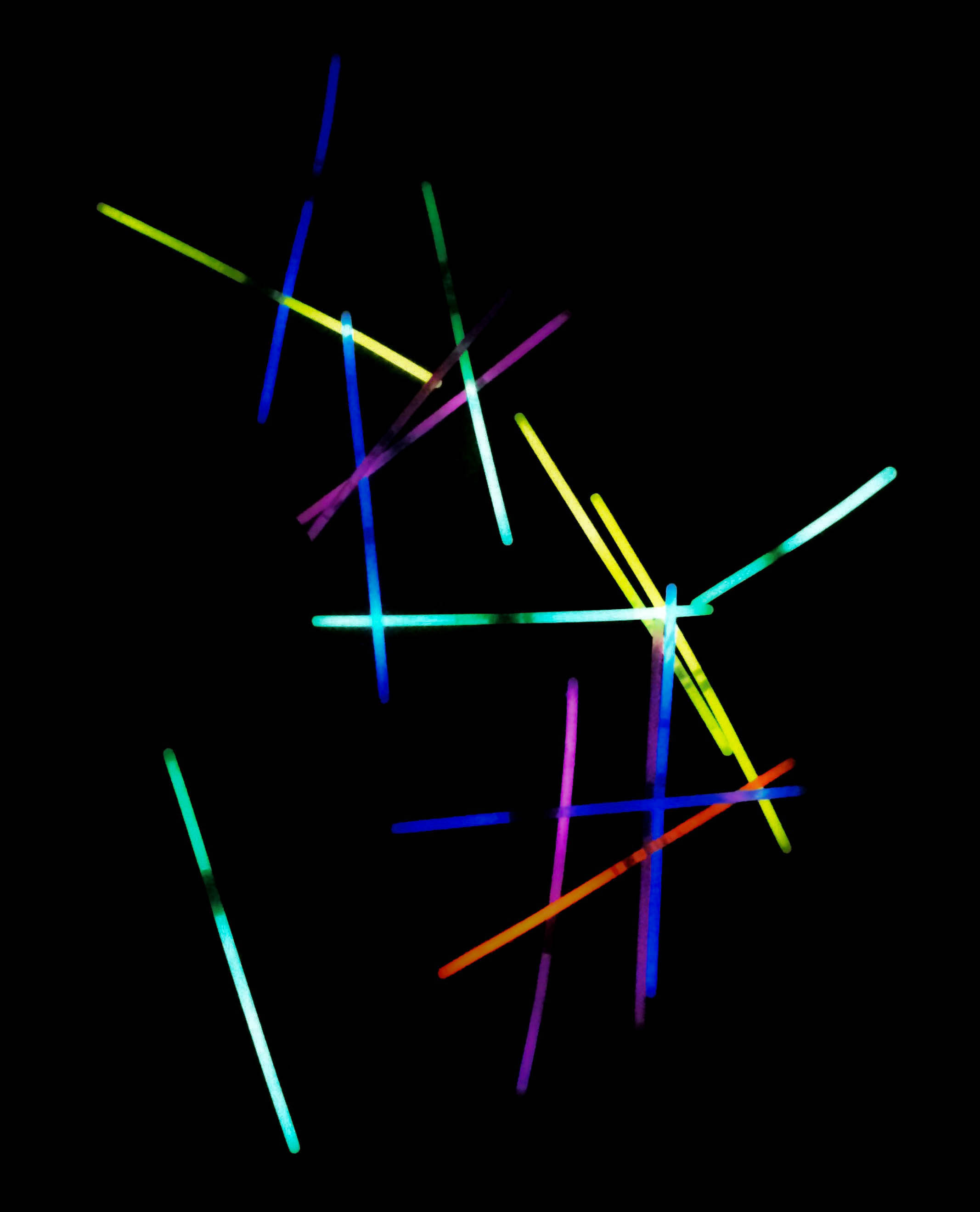
For this shoot, I wanted to create a series of images that included multi-coloured lights from a bundle of glowsticks, as well as an experimentation of using slow shutter speed and waving an iPhone torch and glow sticks around in a dark room. Additionally, in my darkroom shoot, I used fairy lights around a model to see the effect of light and darkness on the models face.

Contact sheet

Edits

Incorporating typologies

I wanted to use typologies within my book as I thought it would create a sense of similarity within each experiment however, it also consisted of variation as the images are in someway different to each other even tho they are capturing the same subject. furthermore, displaying my images as a typology in a way creates a contact sheet and further allows me to display my images in a creative way. As I had taken some of my images on film I was left with the negatives which I believe in a way is a different type of contact sheet. I also wanted to incorporate the negatives within the book. However, the images on the negatives where very small and hard to see which gave me the idea of making my own negatives but as a contact sheet. These where my outcomes.

I decided on incorporating one of the contact sheet as the front cover as it creates a very documentary style feel to it which I wanted to heavily focus on when producing and displaying my images. By having this as the front cover it doesn’t give away too much about what the book is about allowing for an element of surprise when opening it and looking at it for the first time. Furthermore, I didn’t believe that any of the images from the first contact sheet were strong enough to have single images within the book which is why I incorporated this contact sheet as I believe that focusing on the sport itself was also important and I feel will create a sense of variation throughout the book.