Book Specification

How you want your book to look and feel:

I want my book to be simplistic yet still powerful. The professionalism will come from printing full scale images with good ink. I will hold all the images together using purple and red ribbons, similar to the way Satoshi Fujiwara uses an elastic band to hold his book together.

Format, size and orientation:

  • 40 pages including acetate
  • The cover will be printed A3 size (297 x 420mm)
  • Other pages included inside will be printed Square (296 x 300mm), A4 (210 x 297mm), Rectangle (250 x 420mm) and Small Rectangle (180 x 420mm)
  • Acetate will be printed A4 size

Rhythm and sequencing:

I will pair images together based on the shapes in each image. For example, pairing close-up head shots with further away shots for contrast.

Structure and architecture:

Some images will be cropped to fit the scale of the paper, this will prevent the viewer from seeing certain features of a portrait. Other images will be flipped upside down.

Narrative:

The book will look at the individuality between males and females as well as the differences between human beings and their psychological processes.

Title:

The book will not be given a title, as like Rorschach’s ink blot tests, in which there is no text, it is down to interpretation. I want the viewer to create their own relationship between the ink blots and the portraits partnered with them rather than be hinted at with the use of a title.

Images and text:

No text included

Colour and B&W (or a mix):

All images are different colours including red, green and blue. As the pages are different sizes, when the pages are folded, it will become layers of different colours.

Paper and ink:

Unlike Satoshi Fujiwara, I will only use matte paper to produce my book. For two reasons; 1 being that it is what is available for the printer that I will be using and 2 in that it will help blend all the images together into one big ‘book of colour’. The Rorschach ink blots that I have produced will be included as acetate pieces so that the images can be seen through them.


This is a mock up version that I created so that I could establish which images to pair together and the order in which they went. I wanted the colours to balance out within the book so tried to order them red, green, blue

Code Unknown – Satoshi Fujiwara

In Michael Haneke’s 2000 film Code Unknown, there is a scene in which the protagonist’s lover, a photographer, secretly snaps pictures of passengers sitting across from him on the train.

Inspired by the film, Satoshi Fujiwara used the same approach to shoot people on Berlin trains. In contemporary society, it is not acceptable to publicly display pictures of people’s faces that were taken without their permission. Thus, Fujiwara shot and edited his pictures in a way that makes it impossible to identify the individual people who served as “models, using the shadows created by the direct sunlight pouring in through the windows, various compositional approaches, and digital processing to keep their identities anonymous.

Satoshi Fujiwara is ultimately a street photographer; he carries a camera with him in his day-to-day life and shoots people and events that catch his eye. The pictures were taken over a period of several months and show people from a diverse range of ethnic backgrounds, German, English, and other European languages, but also many languages from the Middle East and Asia.

The artist describes being inspired by the unfamiliar, chaotic qualities of European visual culture in relation to the homogeneity of his native Japan. He has brought aspects of this fascination with the West back to Japan.

Award, Shortlists

2018     Foam Paul Huf Award, shortlist

2017     Prix Pictet Japan Award, shortlist

2015     Outset | UNSEEN EXHIBITION FUND, shortlist

2014     Japan Photo Award

https://vimeo.com/183273417

Published in 2015 by Amana/IMA Photobooks

Deconstruction of the physical and narrative features of the book:

Format, size and orientation: 58 pages (multiple sizes), The cover is 27 x 37 cm

Images and text: Includes an essay by the artist on a loose sheet, explaining the inspirations behind the project.

Book in hand: The book is loosebound and comes with an elastic band to hold all the images together. The Soft cover has a glossy finish.

Paper and ink: 56 colour and black and white reproductions on several paper stocks (matte, glossy, white bordered, thin/thick etc.). The use of different paper stocks and/or of different page sizes can be a very simple way to organize information in a tactile and/or visual sense. An attentive reader will realise that there is a difference in meaning behind two images if they consist of different materials.

Structure and architecture: The unconventional construction of the photobook created by a folded layering effect presents a twisting collage of mixed body parts. His portraits are oriented in all directions. Some spreads feature a cropped face on one side and on the other, an extreme close-up detail from that same face, but rotated ninety degrees.

Rhythm and sequencing: The narrative is provided by the book’s dynamic design which highlights a distinct sense of immersive motion. Faces swirl and overlap, building on one another (sometimes on the same page), becoming an interwoven mixture of disconnected features, just like the swim of passing faces on a crowded train. This is a case where the packed density of the photobook form is likely the fullest manifestation of Fujiwara’s vision. While certain individual faces stand out and will make striking large scale prints, it is the pleasingly jumbled public/private experience found in the book that thrums with visual and conceptual richness.

Title: The title “Code Unknown” is taken from Michael Haneke’s film of the same name. It also links to the unfamiliar qualities of European culture, being that Satoshi is native to Japan. Code Unknown signifies an outsider looking in, noticing detail that make us all the same and removing all social convention.

Book Specification – Rinko Kawauchi

Image result for illuminance rinko

Deconstruction of the physical and narrative features of ‘illuminate by Rinko Kawauchi :

Illumaiance is one of the book from a three part series called the ‘Utatane’ series, in which Rinko describes it as
‘Utatane re-creates a fragmentary and fleeting world in which every detail relates to notions of birth, life, death and the passage of time’. It focuses on the tiny elements of life that we would miss out on in out normal everyday life. The book has a female touch which is evident though the pastel and soft colours which is a running theme throughout the book. The book was published in 2011 and is £40. The book is very heavy to hold as it contains hundreds of pages of photos. Each of the pages are think in its quality which has helped to give the book and very professional feel to it.

Format, size and orientation:

The book is 11 x 8 1/2 inches, 163 pages, 144 four-color images. The book has been made as a cloth bounding a using Japansee binding to hold it together, due to this it gives the book a rough texture to the hands when it is held.

Rhythm and sequencing

The book focus of the book is a sublime and spiritual aesthetic that runs throughout the whole of the book. The book links together as a whole as each image links to the next one. Each image has a unique style which contains a spiritual element which Rinko is able to create easily. In the book there is the constant pattern flowing throughout the book of circles and the sense of moving, nearly on every page there is some form of circle weather it be tiny or small or the center focus of the image or just out of the frame. I think is meant to be a metaphor for the circle of life as Rinko said that the book is meant to ‘inescapable life and death and everything in between’. However some of the images that are presented next to each other are contrasting, its the contrast within them that works well together, such as the light and shadow and the line compared the circular shape.

Image result for illuminance rinko

Structure and architecture:

Her work is very much inspired by the religion of Shinto that all things on earth have a spirit, hence no subject is too small or mundane, which is evident in this book. I feel as if her book is a reflection of her view of the world, she is able to see more than the physical object such as a tree she sees the re marke able beauty in it. What inspired me most about her work, is how beautiful her images of everyday landscapes she has photographed in way that they appear beautiful. She is able to photograph the beauty in everyday life. Her images range from landscapes to portraits to abstract scenes, in her work she applies a soft touch to all of the images, so they look very relaxing and visually pleasing on the eye. Her work is very similar to the style of Laua El Tanaway, both of their work has a dream like feel to it, are very very bright and the colours in the images are very desaturated.

She brings a very contemporary and fresh feel to her work, she is breaking the conventional rules with her photography and shows her perspective of the world. The framing of her images are not always typical photography angles and would be sometimes consider incorrect but the way that she frames it and uses symmetry and patterns adds much more depth too her images, looking at her work as a viewer I am able to see Rinkos mindset and look on the world and I can tell that she views each work personality and emotion into each image and each image has a meaning and nothing is placed by accident, Which I hope that I have transferred into my work and a viewer of my work would be able to pick out these qualities in my book.

All of the images are 6x6squares that have been positioned on the top section of the page, this is consistence throughout the book

Narrative:

There is no narrative to the book in regards to telling a story, but there is this sense of flowing and everything come full circle. As the images are of everyday things and situations I think that these images must have been taken over a long period of time and then have been carefully selected to get this sense of connection between them.

Title:

The book is titled ‘Illuminance’,which is visually reflected in the images as all of the images are very light and look like they have been over exposed but Rinko had done it in a way which has given a nice aesthetic to the images which has become a trade mark style of hers.
Colour and B&W (or a mix):

All of the images are in colour but are very light and the tint of the colours to give them a certain look to them, almost as if they had been taken on a film camera but they had not.

Image result for illuminance rinko

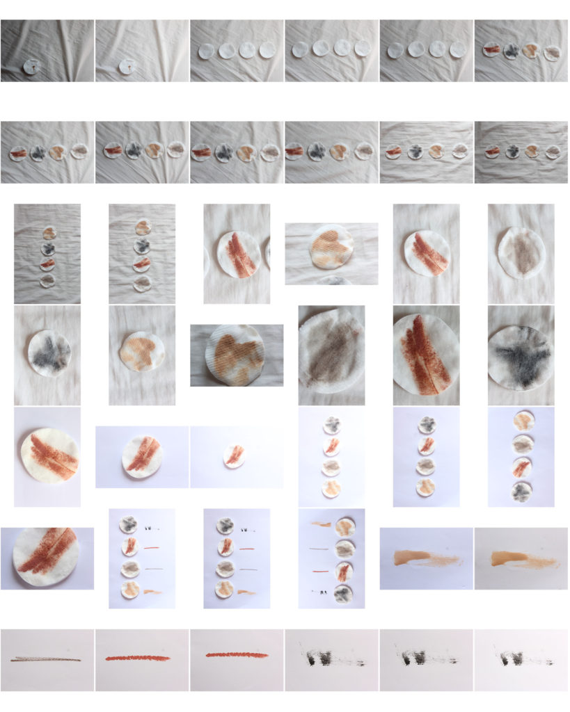
makeup photoshoot

I conducted an extra photoshoot to fill pages in the magazine and compliment my portrait images. I wanted to capture the idea of how people use makeup to correct their faces and make them look a certain way. These images have similar colour pallets of pastels and skin tones to the portrait images I have taken meaning they will fit the theme well

I decided to edit these by duplicating them and turning them into pattern backgrounds to created breaks from portraits in the magazine pages.

Chen Po I – Photo shoot (Photo Shoot 6)

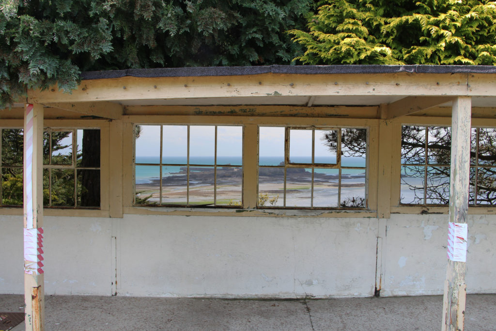
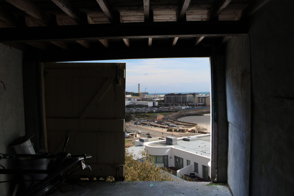
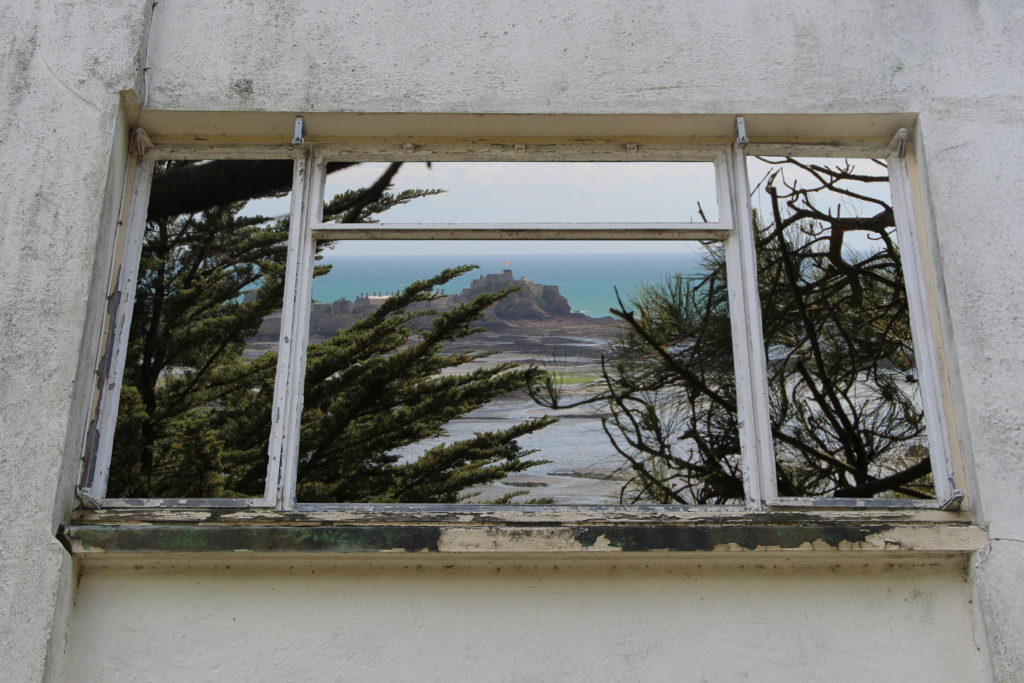
To complete this photo shoot I went to an abandoned location which I knew had a variety of windows, doors and openings which could be used as frames. I photographed these openings with the plan of removing the inside of them and replacing it with a different image. This is to follow in the style of Chen Po I who does a similar thing, the idea of this is to show the a different view of what would have normally be seen though the window.

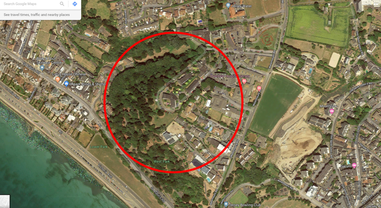
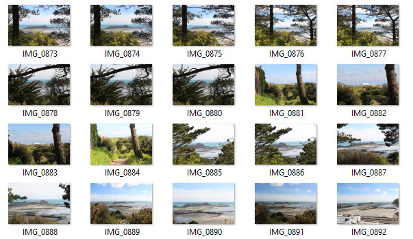
The building I chose to explore was an disused care home overlooking the town. The view from the home has been obstructed by the grow of a woods. I photographed past and through the woods to simulate what the view would have been like before the home fell into disrepair.

Photos of the potential frames I could use.
Photos of the view.
This image has an empty alt attribute; its file name is image-9-1024x576.png

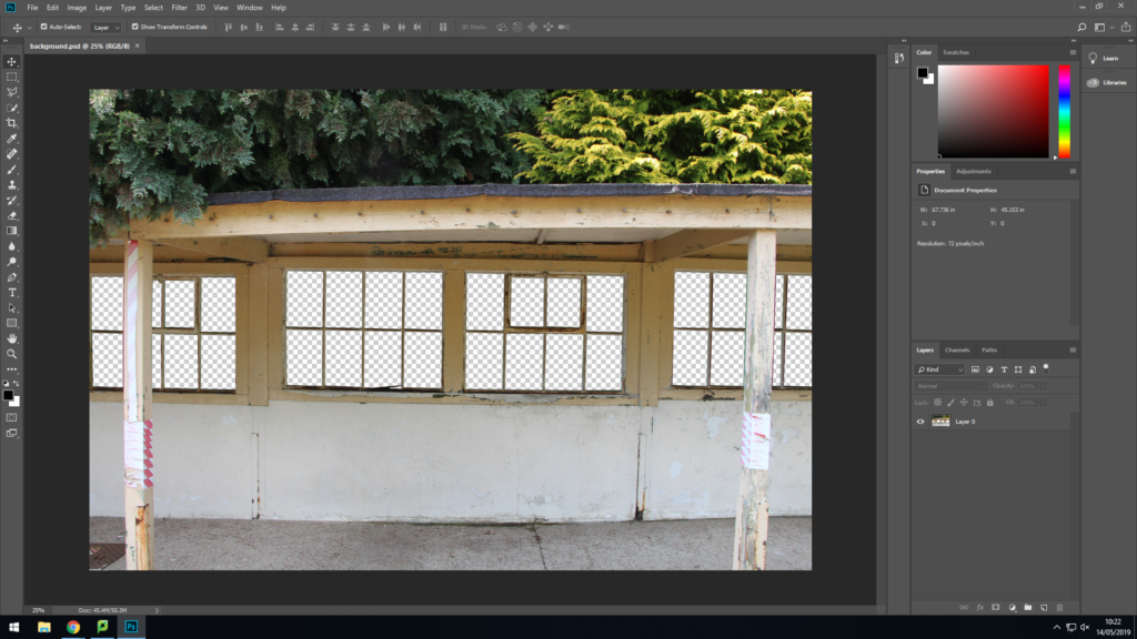
To manipulate the photos I used the lasso tool to cut out the middle of the window frames. I made sure to not just to use straight lines when cutting and instead used lots of little cuts to make sure it makes the damaged frames.

This image has an empty alt attribute; its file name is edit-1-1024x683.jpg

Once I was happy with the cutting I placed the background image behind the first image to create the effect that that is the real view from the frames.

This image has an empty alt attribute; its file name is edit-2-1024x683.jpg
This image has an empty alt attribute; its file name is edit-3-1024x683.jpg

Final Outcomes

The final prints I chose I think display the best images that I took over a array of different shoots all displaying water, earth, fire and air in a different but similar way. I have decided to present the A3 and a4 images together on a card to represent a summary of the project.

A3

Each of these image represent a different element Earth, Fire and Air as I fell as these images are the backbones of the project holding it up and I want to show the detail within the image clearly, however I have not chosen an image from fire as I feel as if its present in the project is not as important as some of the other work.

A4

A5


ESA // Presentation Ideas

Window mounts:

I am wanting to present my images on a black background and in window mounts. I have looked at different layouts that I could present my images, including; each set of images being in their own window mounts, each image being in seperate window mounts, if I have four images to one board or if I join two boards together and have all eight images presented together.

I have decided to present my images on two boards

Final Postcard Prints Selection

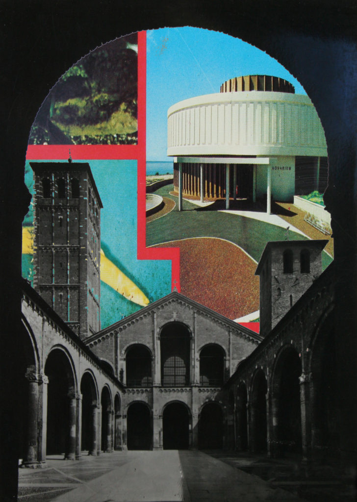
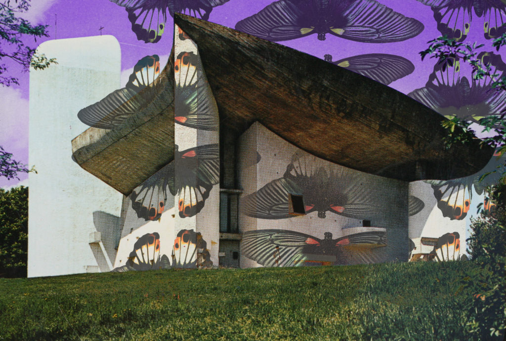
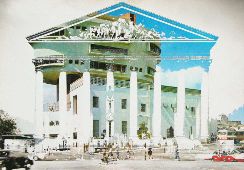
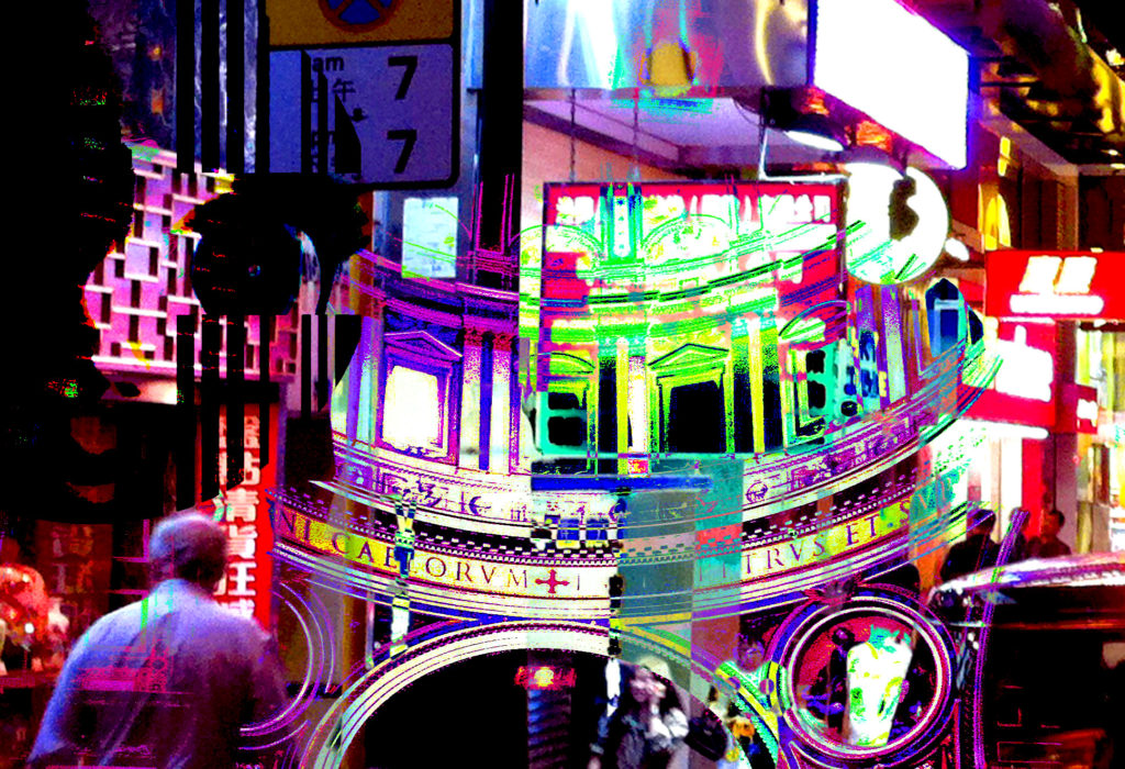
Aside from the 8 postcard backs which I have chosen to print (in my previous post) I will also be printing the following 16 photo-montages in postcard format. Through this project I have created nearly 50 variations of photo-montages which successfully meet my intention of symbolising and displaying the connections between Jersey and the rest of the world through trade, tourism, and actually visual surroundings within societies around the globe. Posts will follow this looking at how I will display these 24 postcard prints. Here are the 16 photo-montage prints which I have chosen, followed by an evaluation of why I chose these specifically.

Out of all the photo-montages which I have produced throughout this ‘Variation and Similarity’ project I have chosen these 16 above for a combination of reasons. First of all I believe that considering my initial specification which stated ”I will produce photographs surrounding the theme of chaotic imagery. I plan to do this by creating photo-montages, collages and edits in response to the artists and photographers which I have and will research. I am going to relate this work to the issues of overpopulation and capitalism which have and still continue to play a big part in the overpowered development of the world. I will photograph all kinds of things relating to this theme as rather than limiting myself to one specific subject matter this will not allow me to produce pieces with chaos as the main part. These issues of overpopulation and capitalism are something which closely links Jersey with the rest of the world, through trade, immigration, politics and culture. I plan to explore this link and how it has developed over time, looking at the past and how it has become the present. And then how the future may look in terms of these issues. This will be executed by the use of archival and found imagery mixed with my own purposed photographs through means of collage and montage.” That these 16 photo-montages most reflect the initial aim of my project along with showing inspiration from the artists, photographers and movements which I have researched throughout the project. Secondly I believe that they are a good combination of images as there are a range of different formats within them such as some monotone and some colour as well as some being portrait and some landscape. This will mean that the final display doesn’t look too uniformed and will in fact look like a collection of actual postcards which is the look I am going for. Third and finally the most basic reason for why I chose most of these as postcard prints was simply due to the fact that I thought these 16 outcomes were the most aesthetically pleasing and balanced.

Final Photo Book

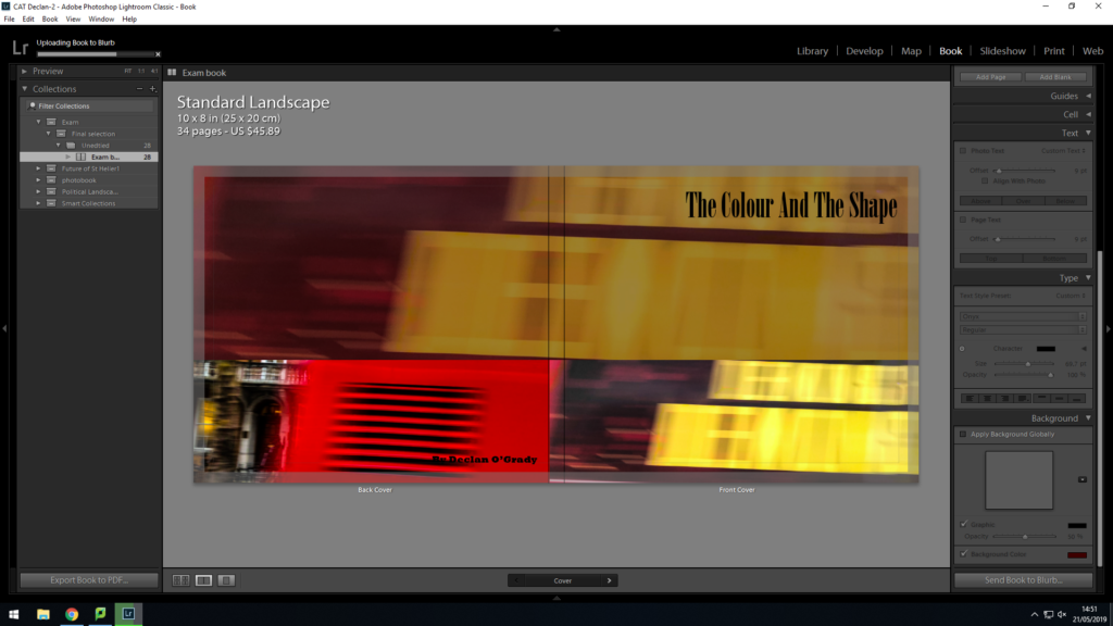
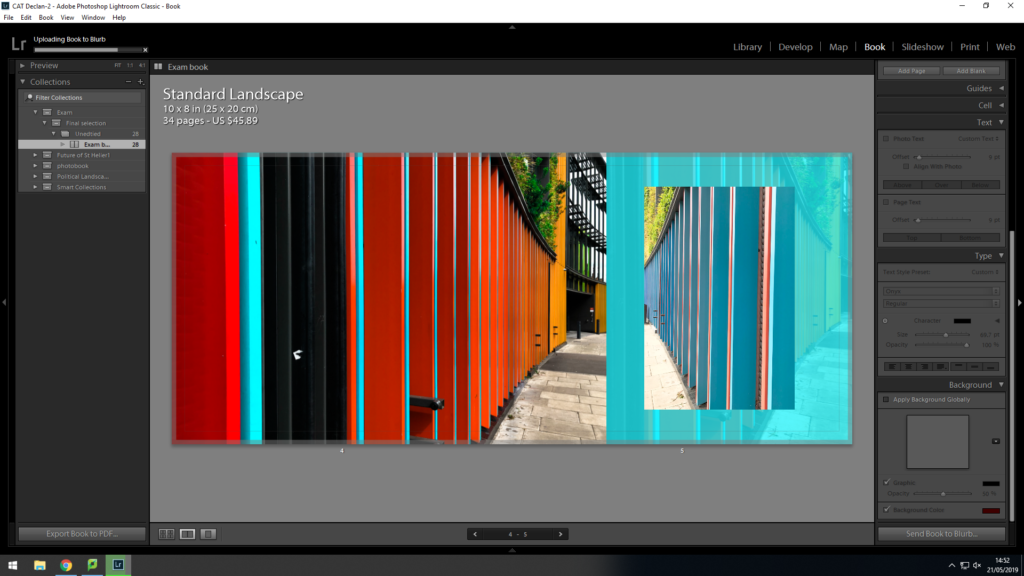
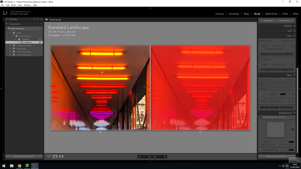
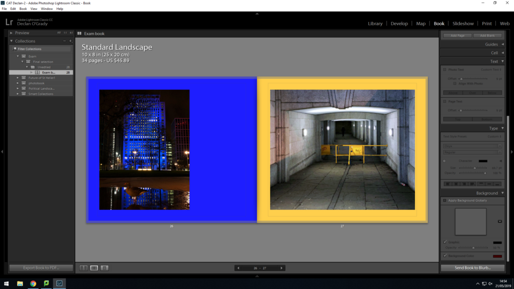
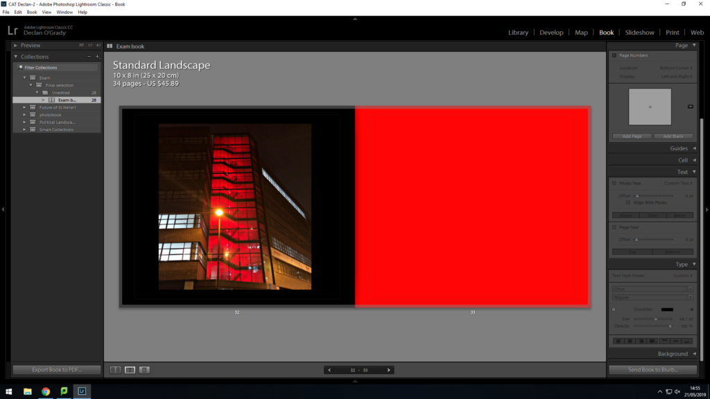
This is my final design for my photo book ‘The Colour And The Shape’. The front cover is something i had been playing with a lot when designing the book. this allowed me to develop the final design seen on my front cover. I used a bottom layer image with 40% opacity through a brown mask layer, this helped darken the image, I then used the same image on the front cover and a supporting image on the back. I used red and yellow because I wanted people to know it was a book full of vibrant colours. I am very pleased with its final sequence. I sequenced my images in a way that flowed predictably and unpredictably. For instance, on page 20 i used an image i thought did not suit my book but i used it as it created a unique contrast between other images displayed. Throughout the design process, i thought of different colour combinations that would look suitable. I came to the conclusion of using tonal colours. I would colour match the focal colour in the image and i would make that the colour of the page. Although, i did not use this method for all pages. I found other colours that compliment the colours within the images to almost extent my own image.