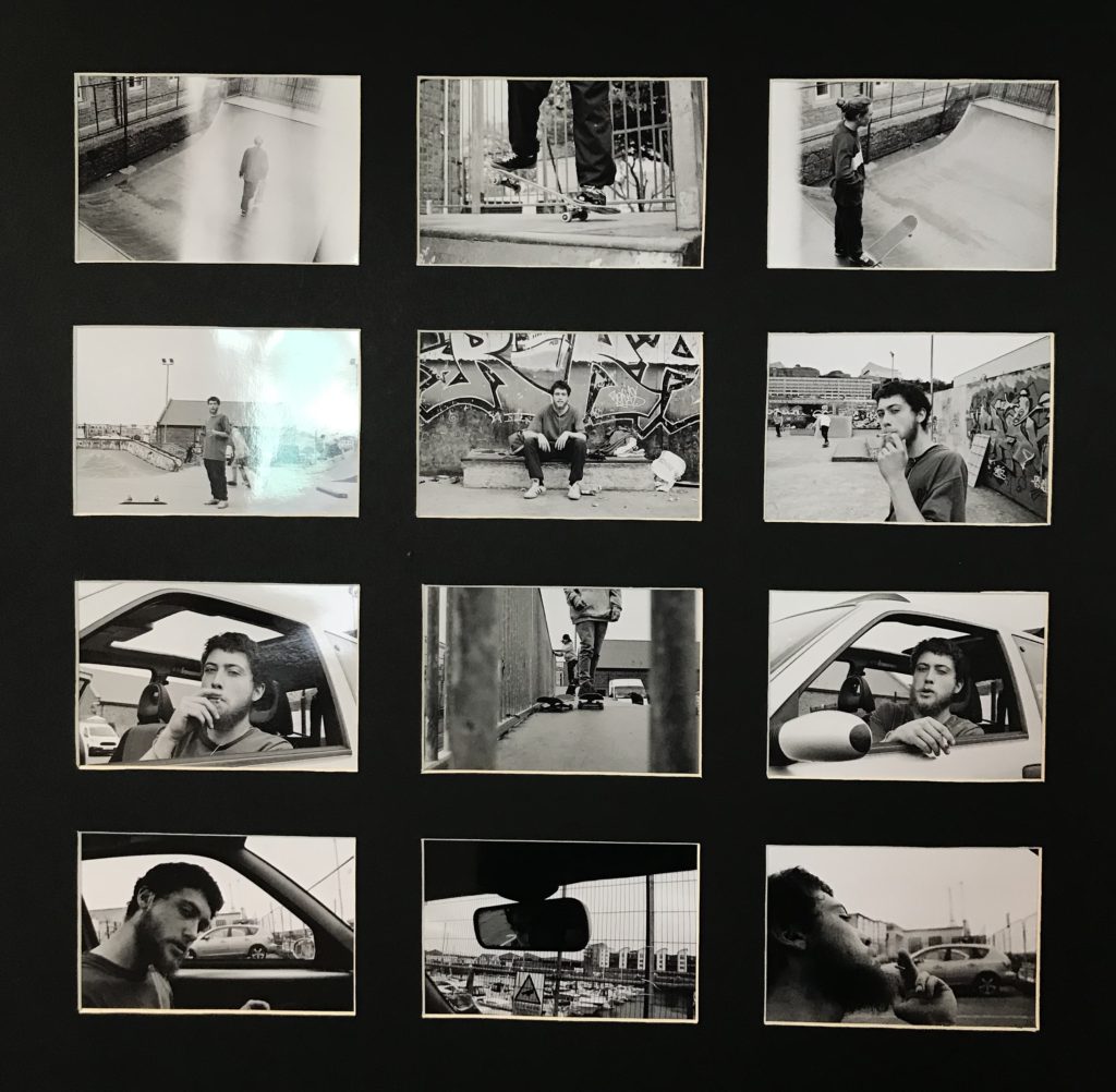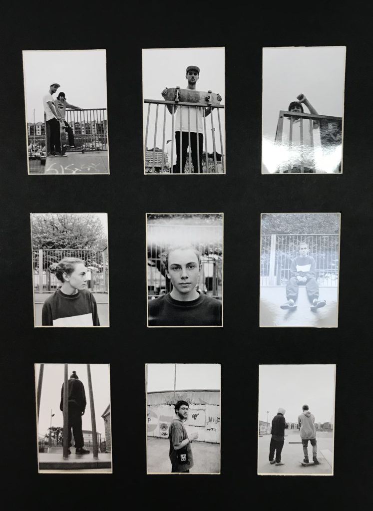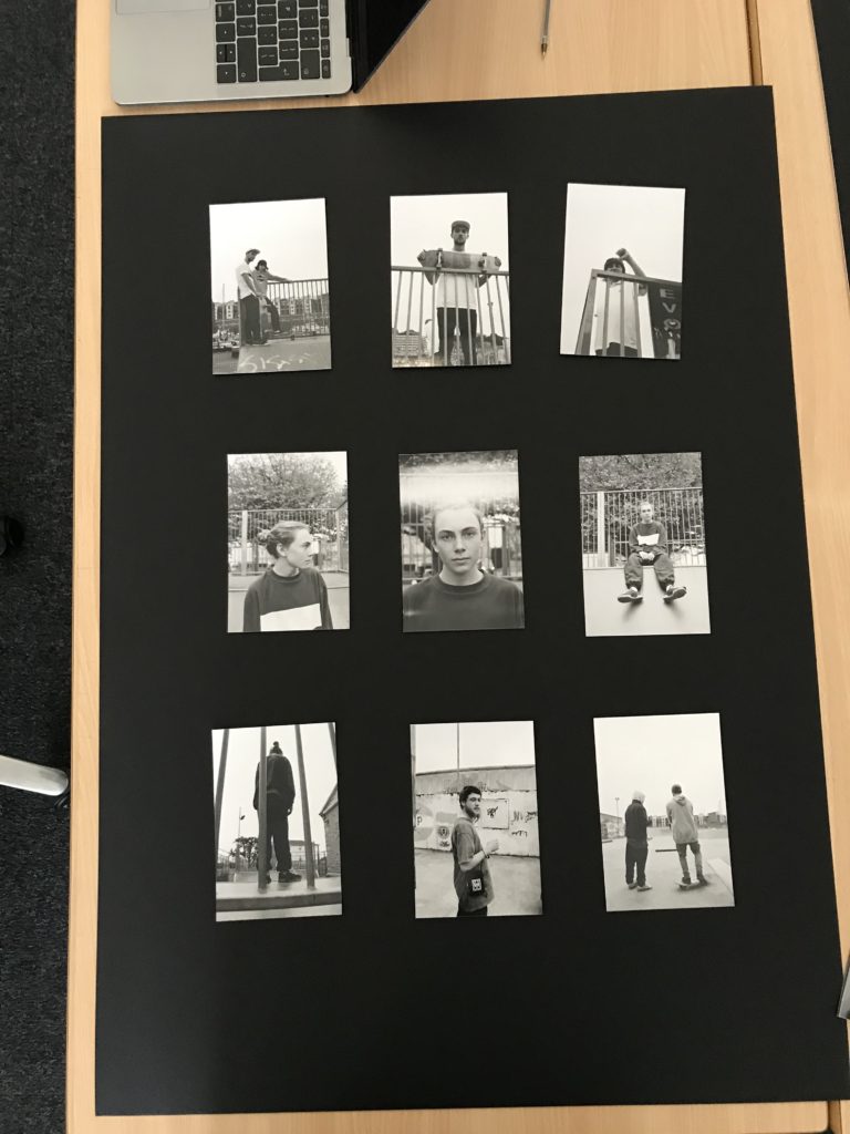
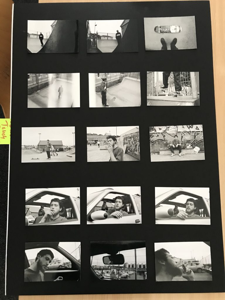
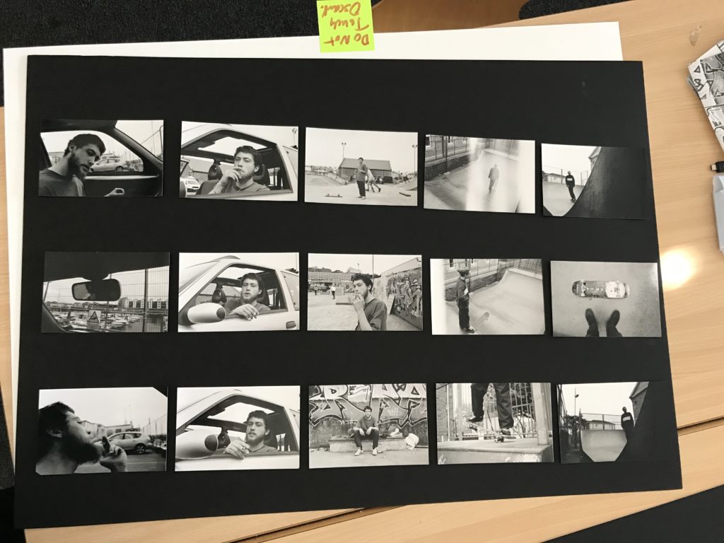
I wanted to incorporate the typologies theme throughout my final prints as I felt this theme conveyed a contact sheet style which I thought would have an interesting outcome for my final images. I wasn’t sure how to display my images, so I came up with multiple different layouts however the three layouts above where the ones I decided on and thought where the strongest layouts and had the strongest images in throughout. However, when looking at a traditional typology or contact sheet they were all portrait which allowed me to narrow down my decision and resulting in me using the two portrait orientation layouts for my final decision. Furthermore, when displaying my images I wanted to create window mounts for my display as I believe my images would be suited better with a little white boarder round the outside of each image and allowed for a stronger effect then if I had just stuck them onto the black mounting card. I decided on using these images as I believed that each individual one had some sort of relation to each other and found they complemented each other strongly within the set. When laying out the images I found I wanted to relate to the theme of the project ‘Variation and Similarity’. I was able to use this theme when laying out and selecting my images as I wanted to include images as part of a set however I also wanted to create a bit of variation within the layout by having a juxtaposing image run through the middle of the the two similar ones. I found by doing this changed up the layout of my images including an obvious variation between the layout and the images. I believe this created a strong effect on the layout which I believe allowed for it to be a more interesting final outcome.
These where my final outcomes.