


Above, I have made a short video made up of screen shots from my editing process for the image below. I did not edit my images drastically as my goal was to make sure that I kept the images as real and natural as possible. Although it can be seen in my Photographic Response post that I have manipulated colours and experimented to see how I could keep the photo looking natural but giving it meaning through colour.

I found the exam unit very successful in the sense that I feel my project topic fulfilled the brief in a way that fits my personal style. The title of variation and similarity allowed me to explore portrait photography around beauty ideals in the modern world. I developed my ideas by first looking at the work of Erwin Blumenfeld one of the early fashion photographers who set the expectations of beauty in the industry. I then looked into some of his work involving mirrors and the idea of reality and fantasy within the world of the mirror, linking reflections with the idea of narcissism. Next I looked at the work of Nigel Tomm and the distortion of the perfect image portrayed within magazines and the media, I was inspired by this to experiment crumpling folding and re scanning existing images from magazines. I then went on to produce my own portrait images in a simple style which I could print and edit in different ways. I wanted these portraits to show variation in beauty rather than being of models who all look the same. After printing out these images in degraded quality I gave them back to the people I took photos of so they could destroy, adapt and and correct their insecurities. I also used these images for other styles of editing including some where I added an overlay to the perfect face structure used by modelling agencies and warped it to fit the real shapes of my models. This was meant to suggest that not everyone can conform to these expectations to be the same, we are all individuals who do not all appear ‘perfect’. I also took close up photos of peoples skin inspired by Peter Devito’s work on changing perception on skin conditions , these images were intimate and display people insecurities in a artistic way rather than the negative way they are often displayed in the media. I compiled all of these edits together into a magazine layout reminiscent of a clastic fashion a beauty magazine which would promote the ideal of perfection. Together they show an broad representation of beauty and question modern ideals and pressures that we all face.
The main links between the exam theme ‘variation and similarity’ and my final piece is in the sense that their should not be one view of beauty and perfection and everyone looking the same, instead a variation is good an natural for humans and should be embraced by modern media to help problems with negative self image and mental health.
The final prints I produced display key elements from the magazine I think the way I presented them compliments the photos and helps their individual details stand out and not become over complicated. The composition of the close up images layered on foam board was hard to get accurate because I could not draw on the background image however I think how I lined them up with the parallel edges looks neat and organised. The composition of the other images was simple I arranged to of the images with the same face structure overlay together, they were both taken from different angles which I think helps show their individual identity. improvements
If I were to do this exam unit again I would keep the same concept because I enjoyed developing these ideas and producing the final outcome however I would probably extend the photoshoots and produce a larger range of edits to extend the length of the magazine and make it a more quality product. I would probably also develop the text elements further creating articles or pieces of literature to accompany the images and narrative them in a a way. I would also extent the magazine by adding images in the style of product adverts which would normally be seen in modern media promoting beauty product which claim to solve people problems with appearance. These would ben in a sarcastic and humorous tone maybe including images opposing the general and expected idea of these advert styles. I could have then used these adverts as my final prints and printed them as posters or on product packaging. However for the time given I think my response to the exam title shows my ability and development of ideas and concepts to produce a final outcome.
When comparing my image with Sank’s, I noticed that the biggest difference was the colours. I believe that colours are a huge part of the story for every photograph. It is obvious that both couples are of different cultures. When comparing my photo to Michelle Sank’s image, we can see that we chosen different environments. I think that our garden tells a big story and so I thought that each detail in both photographs are all very important and strong as there are objects which are treasured and have a lot of meaning.
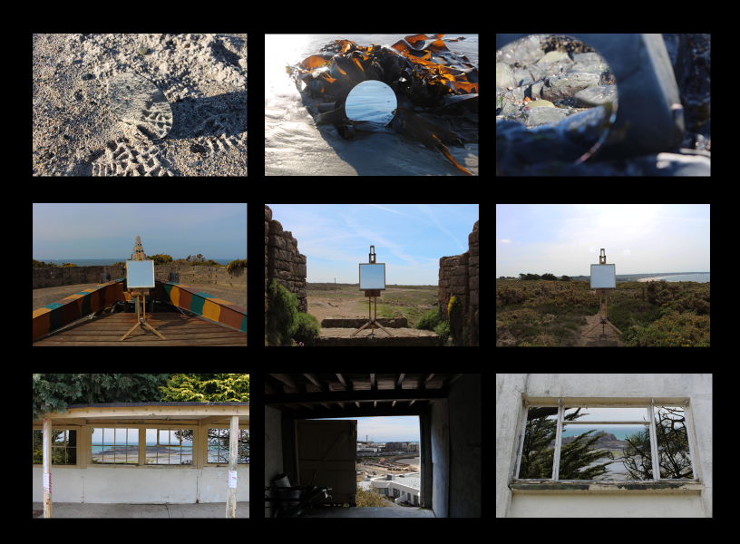
For my final piece I deiced to use three frames of different sizes to frame up 6 prints. I got the frames from a gallery because they were no use to them due to having no backing or glass but they were perfect for me. I measured the mount-board and my photos to achieve a central finish with even boarders. I also measured the mount-board to fit inside the frames to act as the new backing. The theme of the exam was Variation vs Similarity. I explored this idea by using mirrors and frames to play off the idea of how we variate the images we take by alterating them by using the viewfinder. My inspiration for using frames for my final work was the Salon of Art Exhibitions which used lots of small frames to cover the walls of galleries. This fitted in with my project because my final images all used frames to frame something (E.g. Window frames).


For this frame I chose to use 3 landscape A5 images as I thought they would be stronger in a collection of three. For the shoot in which I took these images, I used a easel which I borrowed to hold the mirror, my mirror from home and I decided against using a tripod as I thought it would be easier to position the mirror in the center of the image without having to move and adjust the tripod. The were taken on the cliff paths of Jersey near or on site effected by war. This shoot was in response Guillaume Amat’s work which focused on used mirrors as a way to reflect a view which added to context to the image. For example the image below which shows a prison with the reflection of a tree with a clear background, which in opinion is a sign of hope for the people in the prison that one day they will be free.

For this frame used two pieces of work that were inspired by Chen Po I. He creates work similar to that of Guillaume Amat in the sense that he uses frames to send a political message. Instead of using mirrors he uses window and door frames to frame backgrounds. I chose to put these to images together as they both contain more natural backgrounds and have similar compositions.

I thought this was strongest image, so I decided to give its own frame to stand alone. This image was also inspired by Chen Po I but I chose to use a slightly different frame from what he normally uses (the open door). I like how the light inside the shed looks like it is coming from the light source outside which adds to the overall look of the image.


This are my final images I have chosen which I believe are the strongest I have created. I may use all of or I may chose a slightly smaller collection to frame up and present. On this post I going to show different variations of the images using Photo shop.


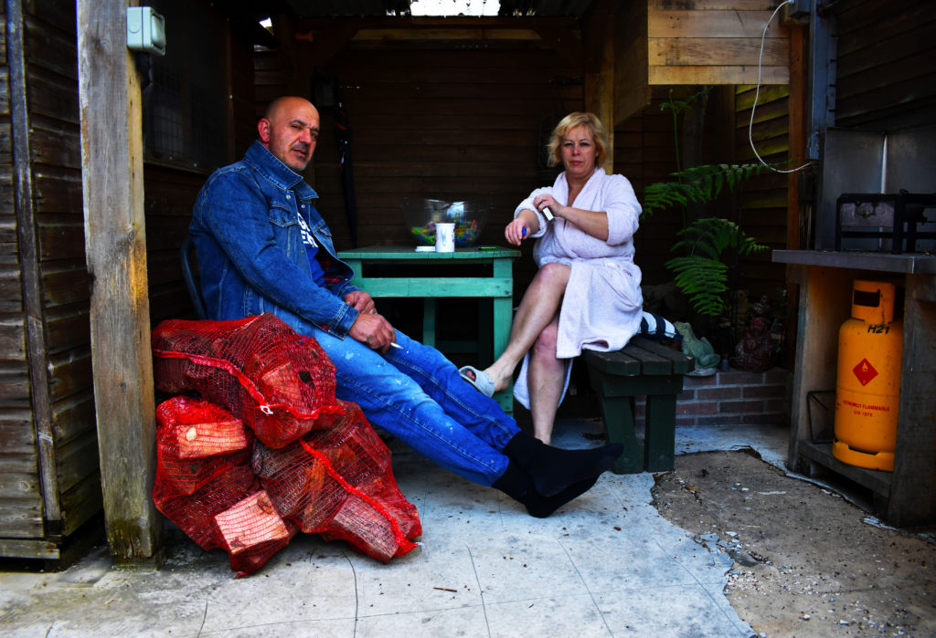
I took this photograph in response to Michelle Sank’s image of the two elderly figures. I decided that I was going to photograph my parents in a similar way, however, in a different area. An area where they both spend most of their time together. The garden was handmade, from the benches to the tables, the cooker, shelter, planting area and floor. This is another element that I really like about this image and I think that it is very powerful because it shows how things have become damaged and used. The wear and tear over the years has never been fixed and rarely nothing has refurnished. This is very important to me as it is the home that I grew up in, one which my father practically built.
The image was taken spontaneously and in my opinion, I think that it has made the image more powerful. I was arriving home with my camera as they were chatting away, they both stopped what they were doing and became distracted by the camera for a split second. The image was taken with a faster shutter speed and so it is all in clear focus. I wanted to make sure the photograph was all in focus as everything in the garden has it’s own story and builds up to my childhood. The red bags in the front of the image have wood inside them. I had just brought these bags home for my father to make us food on the grill outside while my mum used the cooker. This image made me realise that my father could potentially have built all these old fashioned styled things in order to bring our culture back into our home.

The colours in this image are very saturated and I did this to show the colour in our lives and the festive feeling of the portuguese culture. I also did this because I love the idea manipulating the colours in an image to give them a meaning. In this case, the brightst colours are red, green, blue, yellow, and white. All of these colours are in the Portuguese flag and therefore I though it would be a good idea to bring these colours out as much as possible.
I also noticed a similar pattern in Mahtab Hussain’s images and therefore wanted to ideas of my chosen photographers into one photograph.

I chose this image because it was brought to my attention that Michelle Sank mainly photographs younger people in their bedrooms. Bedrooms full of posters and alternative colours, non of which are the same. The images were of more messy rooms and typically unique for every individual. I used this photograph as a visual inspiration because it was different from all the other images produced by Michelle Sank, I think it is a very powerful image with a lot of meaning behind it, from the colours, to the positioning of the subjects.
It shows an old couple sat the end of their bed in a very clean and tidy bedroom. They are also well dressed which may hint that they belong to the upper-middle class. There is a lot of daylight coming through the window behind and to the left of the camera creating a shadow on the other side of the bed. Overall, there are not too many shadows and the photograph is very bright with high exposures, as shown on the corner of the bed where only white can be seen.
Followed by a light tonal range and there is a lot of repetition in the colour range; beige, yellow and whites. This makes the photo very warm which could potentially reflect on the personality of these two elderly figures, expressing love and warmth. The image is unsaturated and consists of low contrasts. However, it still remains sharp, clear, and all small textures (i.e. the carpet) are enhanced. The photo also seems very empty, other than the very limiter furniture seen and the fluffy toy on the bed, there is not much story to the image. Of what is seen, we can say that this old couple live on their own and the emptiness in their room can also indicate sadness. Both figures are making subtle physical contact where they are both resting their hands on each other, showing affection and unity.
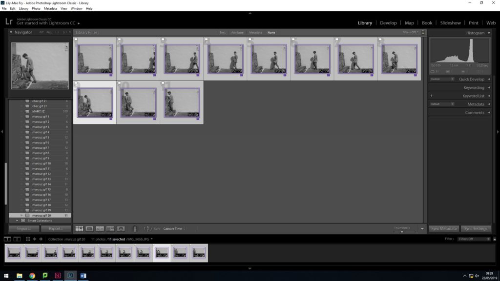
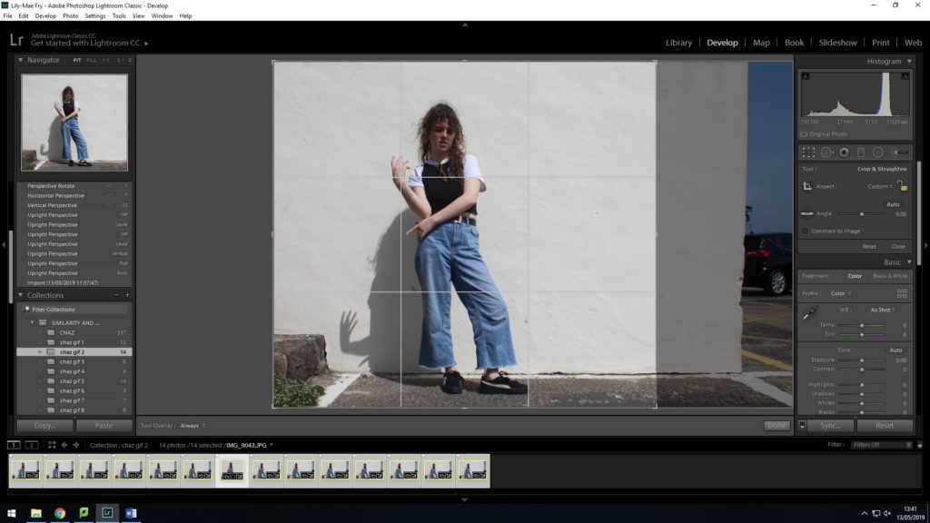
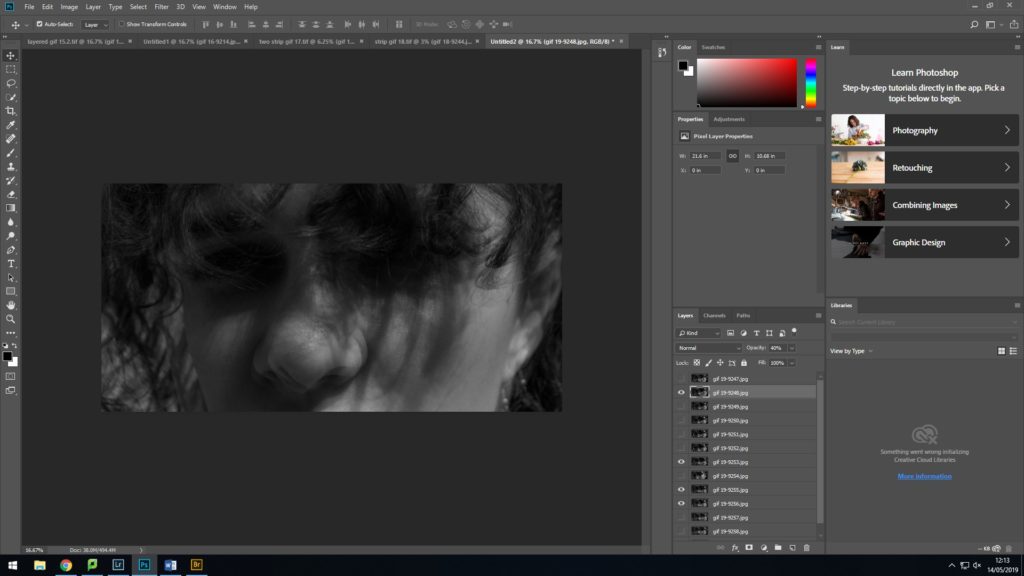
To begin editing I needed to organize all my material to make it easier to edit my photos into gifs. I used Adobe Lightroom because it has more editing features that best fit the way I need to edit. My plan is to make gifs from my photoshoot of each movement my subjects made while talking, so I have to edit photos in groups according to what movement they belong to. I grouped all pictures of one movement into one folder after sorting through my usable and non-usable material. After putting my gifs/movements into separate folders, I would highlight all the pictures from one folder so my editing would be synced. This meant every change I would make to a photo would be applied to all. This allows the final gifs to flow, especially when using the the cropping tool, with every frame matching the same editing style.
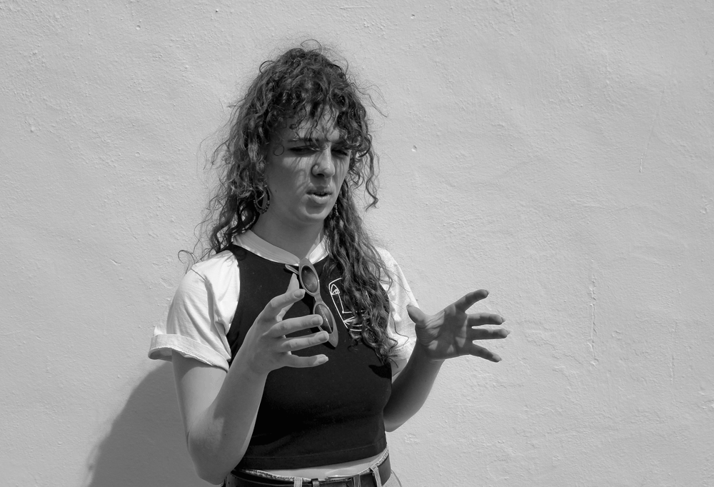
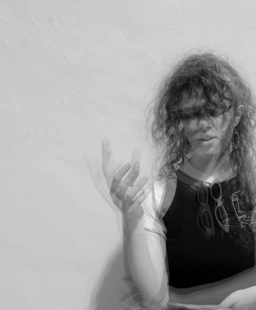
First I cropped the photos. I used the rule of thirds grid to adjust the position and focus of my subject in the photographs. I want the viewer’s eyes to adjust to my point of focus straight away when they look at my work. I decided on each point of focus for each set of photos by picking out the most interesting movement of my subject, no matter how subtle it is – the point of my project is pointing out the smallest or most interesting characteristics of animation in individuals that would otherwise go unnoticed during one’s everyday interaction with other people. The picture below is an example of hand movement. I made sure the point of interest was where the intersection of the horizontal and vertical lines were.
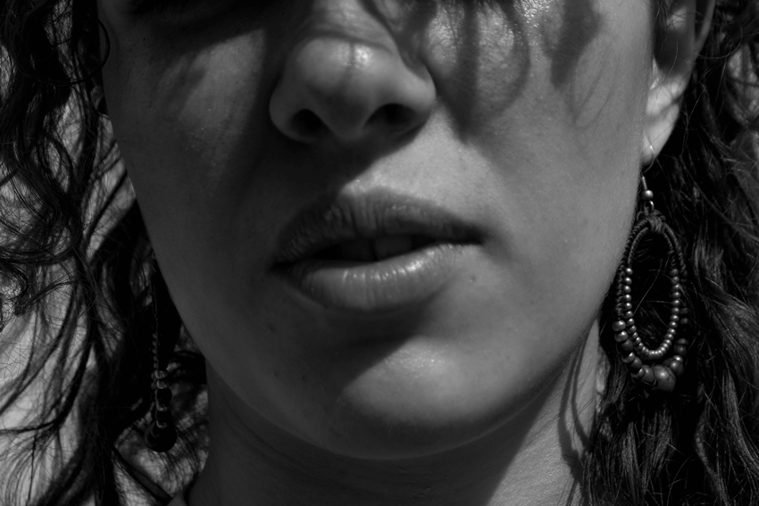
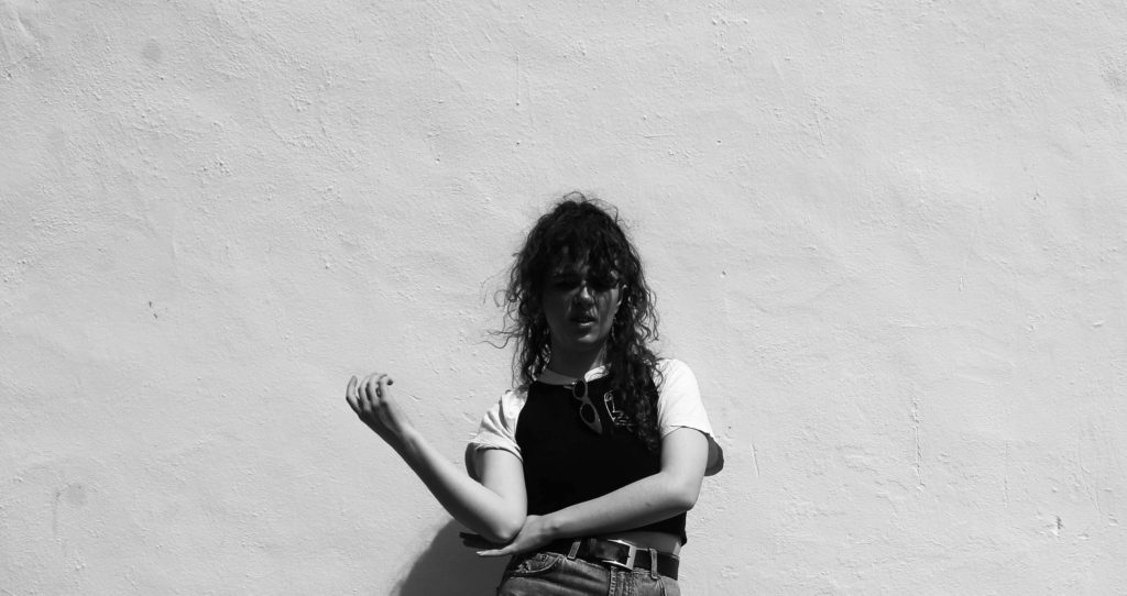
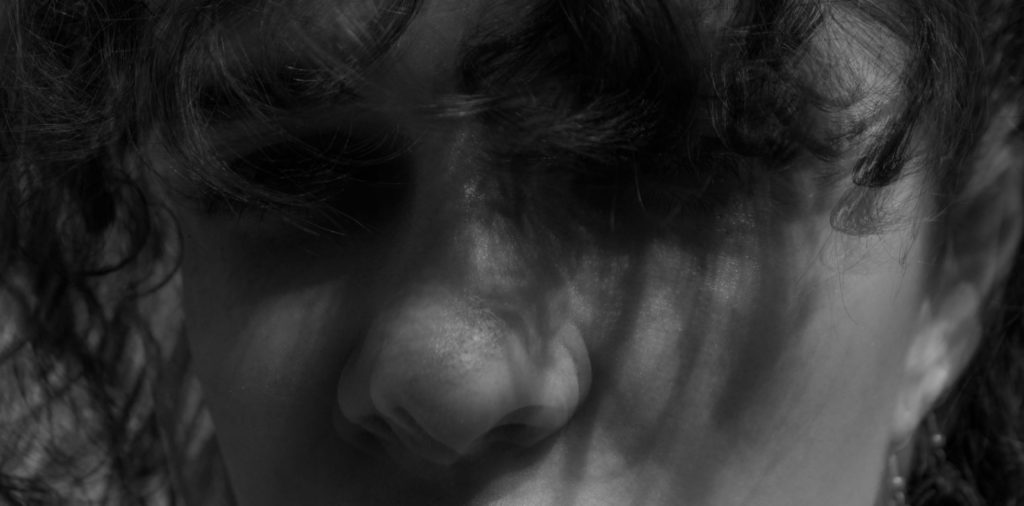
I originally edited my photos by draining some of the colour out of the picture, by reducing the saturation then warming up the image with yellow tint. I then decided that the image needed to be sharper in tones and contrast to make my points of interest stand out more so I decided to edit my images black and white. This references artists I have looked at like Edweard Muybridge but also, creates more definition in my photo. I think the photos need that definition and contrast in tones because the elements of a person’s being that I am trying to capture are already subtle. This means that my whole subject will stand out from their background rather than blend in and for example, in this photo, her hands are more prominent and forward from the background.


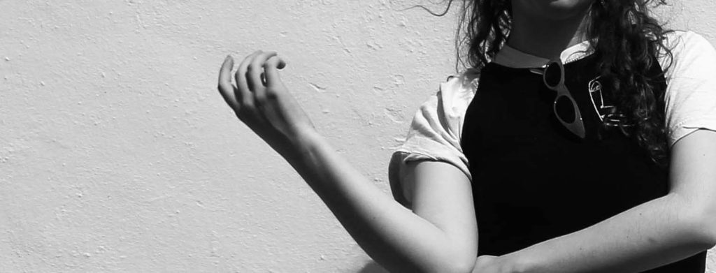
I also experimented with more extreme cropping to see how effectively I could draw attention to her hands, always keeping her hands within the intersections of the rule of thirds cropping guidelines. I quite like the contrast of extreme crops and close ups and the full picture, as if its showing the analysis of her movement and gestures that otherwise becomes elusive in the whole picture.


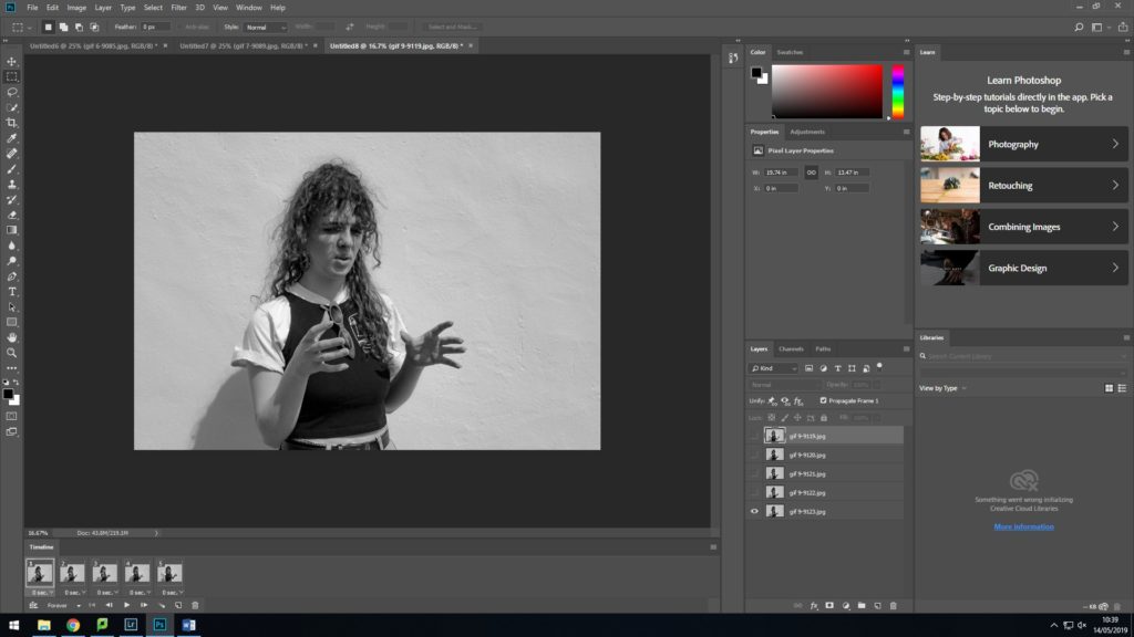
After I had finished editing each of my pictures from Adobe Lightroom ready to create into gifs, I moved to Adobe Photoshop, because it provides the feature of creating ‘Frame Animations’. To create a gif in Photoshop, I first imported one group of photos from my photoshoot into a stack. This means I can upload multiple photos into one document in layers. To create a gif from a selection of photos, they need to be in one document in the form of layers. After clicking ‘create frame animation’, you have to make frames from layers like a filmstrip. In order to keep my animations in a full loop, I copied the frames I already had and pasted them after the original frames so there were two sets. While the second set of frames were still highlighted I reversed the frames so instead of my gifs cutting at the end and restarting from the beginning, making it seem as though the animation is jumping from the finish back to the start, it instead reverses the movement, then goes back to the start.


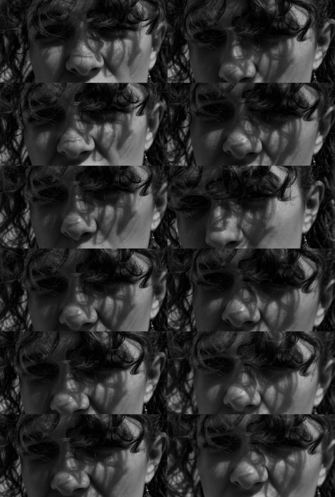
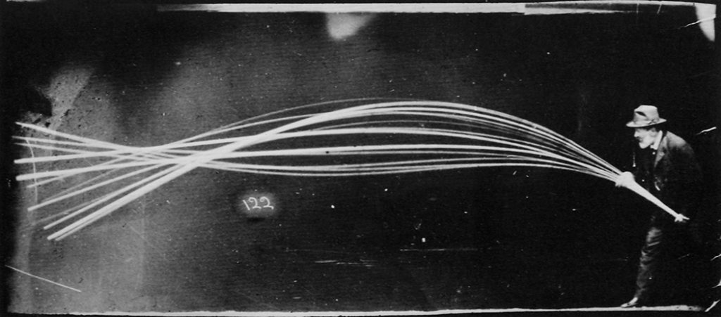
I wanted to experiment editing my photos like Etienne-Jules Marey. Marey edits his photos in layers, so one movement made up of many different images is shown in one still image.
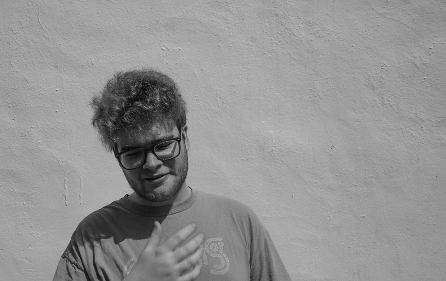
I Layered images by simply changing the opacity every layer in my document to 50 percent. I then decided to hide some of the layers because there were so many, you couldn’t see the other layered images underneath. I could also select layers that had more of a drastic change in movement and changed the opacity again of the remaining layers. Opacity ranged from 90% to 10% so some of the images wouldn’t be lost behind multiple layers. The picture below is an example of subtle movement; you can only noticed multiple nostrils.

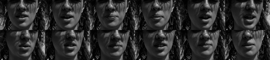
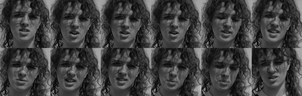
My last technique in editing was arranging a set of photos into a strip, imitating a film strip. This layout of images make it clearer to see movement and displays each picture in one as a still, allowing the viewer to take in each change of movement. I created this by expanding my canvas size. Doubling height and extending the width.


Here is a link to my book ‘ Element’.
https://www.blurb.co.uk/bookstore/invited/8164132/dbcee53ba068b5cdd5db496ec33d2f1a5193d6d0