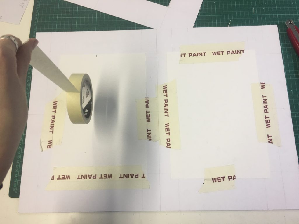
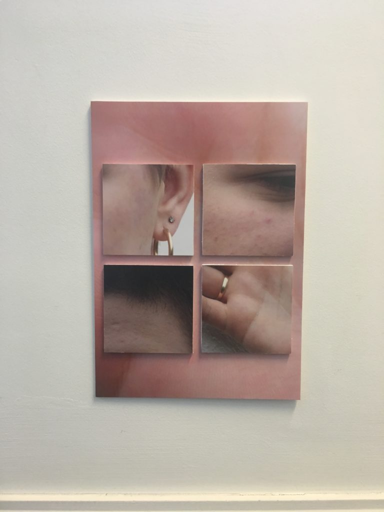
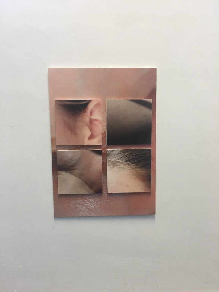
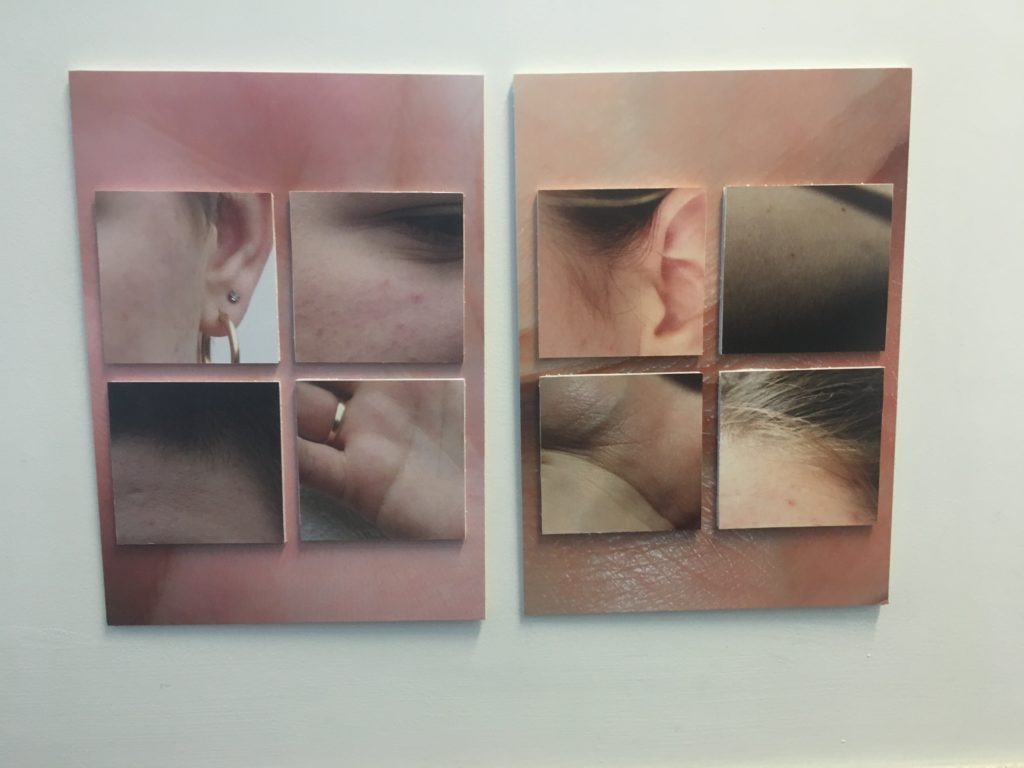
I got a selection of images from the magazine printed to show an alternative outcome. I started by cropping the printed images so there was only 1cm of white around them, this meant I wasted less foam board. I then used spray mount on the back of the all the close up photos and stuck them to a white foam board sheet before cutting the excess white areas off. I then layered the small square images on top of the large image, the foams board helped the stand out from the background and gave it a modern and clean look.
These two sets of images could be displayed individually however i think they create a greater impact when placed together helping to highlight the difference in details and tones. This set up could be with images of different people helping to display a broad range of ‘ real beauty’

For the other images I printed I decided to display them in simple black window mounts, they were already detailed images so I wanted to keep it simple and help to bring out the darker contrasting colours from the pastel images using thick dark frames.

I chose to put these two images together in a window mount because they have a corresponding themes of the white line face structure. The wide black frame again helps to pull out the dark areas in the image from the bright background.

For the final two images I decided to frame them separately due to them having different dimensions which would have stood out in a window mount. These images show are both re constructed images which have already been printed adapted and re scanned. Their quality is slightly distorted but this helps with the theme of questioning our need for perfection as humans.


