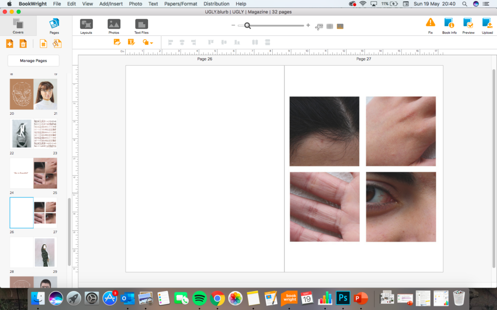
How do you want your book to look and feel? I want my book to look and feel like a common fashion, beauty and lifestyle magazine, with glossy pages and masthead on the cover.
Format, size and orientation: portraiture/ landscape/ square/ A5, A4, A3 / number of pages. I will have the format as a portrait Just smaller that A4 size with around 25-40 pages
Binding: soft/hard cover. Image wrap/dust jacket. Saddle stitch/swiss binding/ Japanese stab-binding/ leperello. It will have a soft gloss cover to fit the conventions of a popular magazine
Cover: linen/ card. graphic/ printed image. embossed/ debossed. letterpress/ silkscreen/hot-stamping. The cover will have a printed portrait images which is distorted similar to the other portraits inside. It will also have a masthead of “UGLY” which is a controversial word which is used as a label for people not seen to conform to beauty ideals. It will also have a cover line to introduce it and add context to the title.Title: literal or poetic / relevant or intriguing.
Structure and architecture: how design/ repeating motifs/ or specific features develops a concept or construct a narrative. I will repeat similar page structures throughout the magazine to give it momentum whilst looking through it. This will reduce the chances of it being repetitive.
Images and text: are they linked? Introduction/ statement / use of captions (if any.) I am creating text to overlay over some of my close up images, this text will have various meanings and will link ti the idea of perfection and beauty.


I have chosen this font for the repetitive text because it reminds me of computer code that is used to control and power phones and electronic devices. I have done this to comment on the idea that modern technologies have made pressures on beauty much worse for example social media enforcing ideas of on the ideal body image through influencers and celebrities.


