
Over the ‘Variation and Similarity’ Project I have explored photographers, artists and movements that have inspired me when creating my photography and led me to create a final pieces that represent my theme and have had a successful outcome. I Started off with my project focusing on the power of a brand looking at commercialism which then lead me onto looking at Commercialism of which i infused with Typology photography as well as looking at pop art, inspired mainly by the Becher’s photography and Andy Warhol artworks.
When I first approached the topic ‘Variation and Similarity’ I had the idea that I wanted to look at Commercialism and Consumerism as a theme to explore how Brands and products make up everything that we do in our everyday lives. I started this looking at an interesting way of exploring this which was to show how brands end up becoming part of everything and are everywhere to represent this in my photography I created a night-time shoot in a woodland area where i projected brands into the landscape to represent how people are consuming brands so much that they are loosing or forgetting the outside world around them. I experimented the images i took creating GIF’s as well as editing their colours to give asthetic qualities to the images.

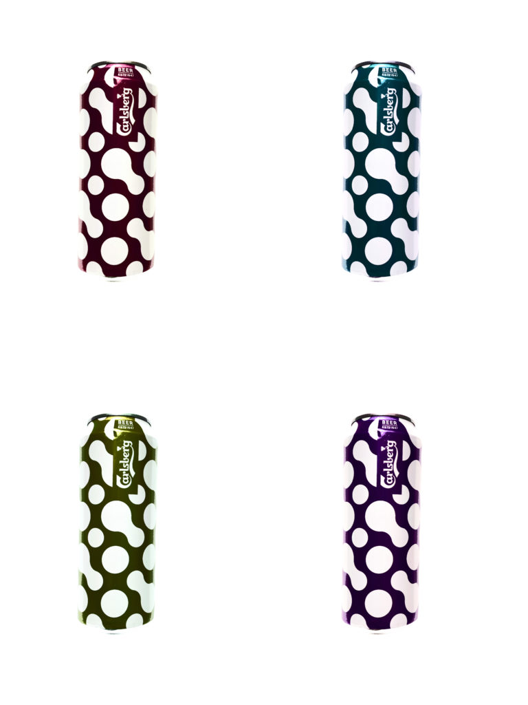
These images were successful, however i thought that i could explore this project in another way which was more obvious with the message of consumerism behind it. After Looking at the Becher’s for their Typology I realised that this would be an interesting way to incorporate into my work. I then also explored the pop art movement looking particularly at Andy Warhol and his prints of the ‘Campbell soup tins’ which then led me onto the idea for my next shoot. After this i decided to photograph lots of different products that would be found in everyday homes. To keep the images focused on the products I photographed them with a white background so that it was only the products with a clean background. This fit with the theme of commercialism perfectly as it highlighted the brands which would just be consumed without much recognition of the actual product. In the editing i experimented with typologies as well as creating pop art within photograph editing the hue colours of the images. The overall outcome of this final outcome of this shoot clearly fits with the exam theme ‘Variation and Similarity’ as it shows the variations between the products in the way they are produced to fit to the demand of consumers as well as showing the similarity between the way they package their products.
Concluding my project, I believe that my work successfully represents the Exam topic ‘Variation and Similarity’ which is visible in my final outcomes. I feel that my final outcomes and presentation shows an aesthetically pleasing view of everyday products and brands that we all consume without realising and they bring a closer view of these products to the consumers. The use of very vibrant Images as well as presenting the opposite of black and white images shows two different dimensions to the products.
